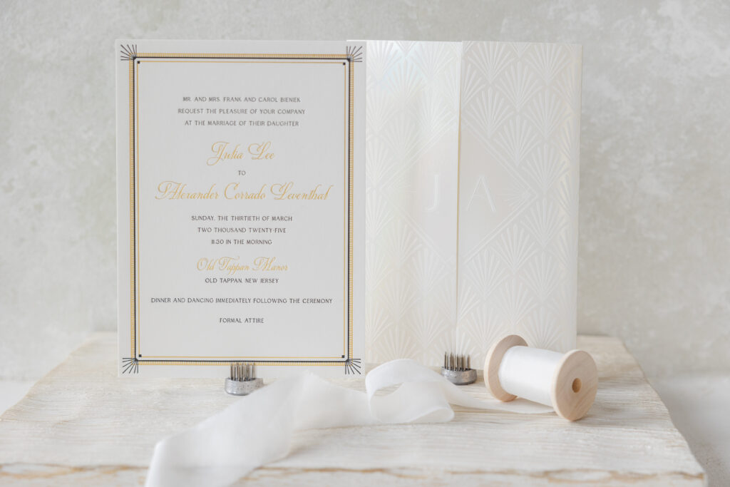
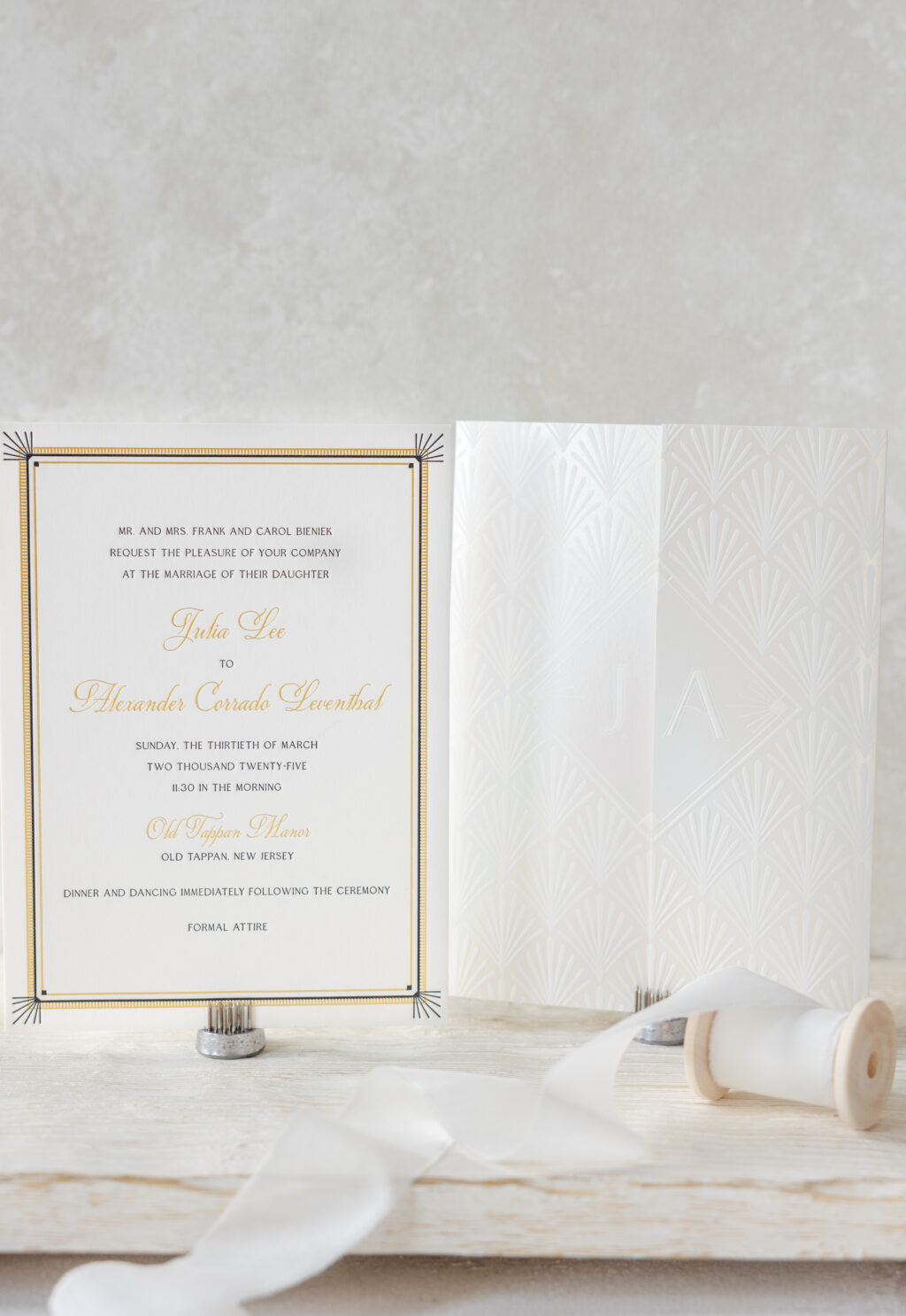
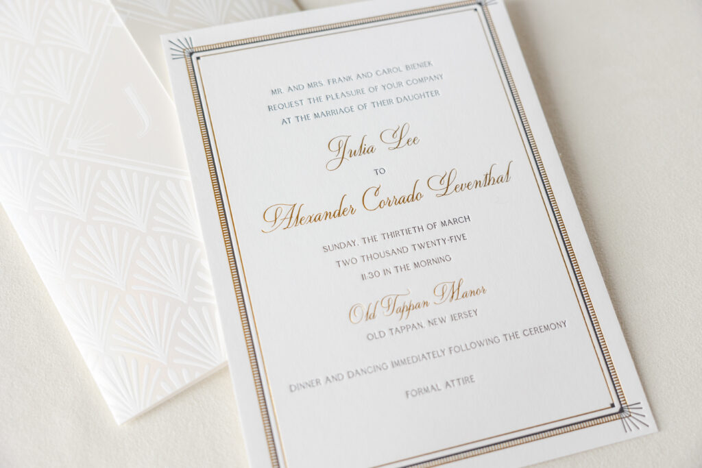
Julia and Alexander worked with our dear friend Sheryl of Arabesque of Naples to create their custom Art Deco wedding invitation. The invitation is lovely and glamorous, and it is also paired with a stunning foil-stamped gatefold that elevates this invitation suite.
Invitation
letterpress ink: black
foil stamping: gold matte
fonts: quita + edith
paper: bella smooth cotton white 2-ply
card size: 5.81” x 7.94”
inner invitation envelope: white cotton text
outer invitation envelope: white cotton text
digital envelope addressing: black digital on the front and the back
job: 73989
Gatefold
foil stamping: opaline shine
fonts: edith
paper: bella smooth cotton white 1-ply
size: 11.77” x 7.94” flat, 5.87” x 7.94” folded
finishing: score
job: 73989
The invitation features a delicate border with thin, alternating lines in gold matte foil and black letterpress, along with a ladder-like pattern in foil. Letterpress sunbursts accent the corners. The frame is geometric and highly detailed, and does an excellent job of drawing the eye to the text. The text also alternates between letterpress and foil stamping, with the names appearing prominently in a larger script font and foil-stamped in gold matte.
The gatefold is a showstopper. This enclosure features an Art Deco shell pattern on the exterior. The bride and groom’s first initials appear on the front, but on opposite sides of the opening, lining up perfectly when the gatefold is closed. Opaline shine foil gives the gatefold an ethereal quality.
We are delighted to have had the opportunity to bring Julia and Alexander’s vision to life, and we wish them all the best. Do you have your heart set on an Art Deco wedding invitation or a luxurious gatefold? Locate one of our dealers so you can see samples and receive expert tips and guidance to create your custom invitations!
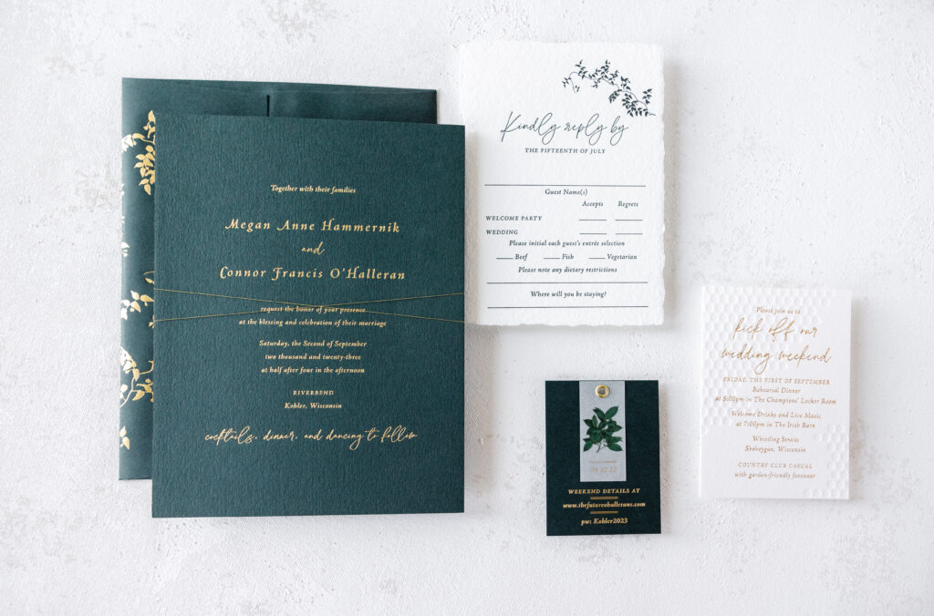
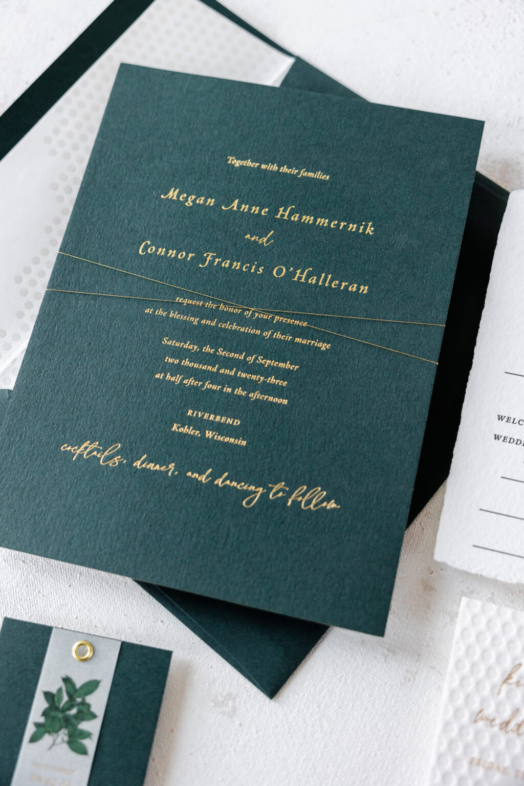
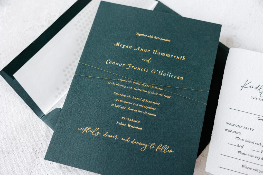
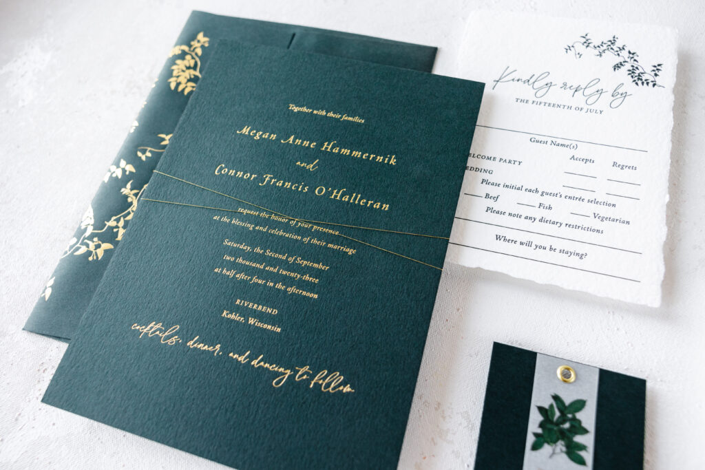
Our dear friends at Smitten Boutique brought us the invitation design for Megan and Conner’s big day, and it is amazing. This lovely wedding invitation suite combines elements from various designs, creating something utterly unique that perfectly fits together in an elegant and stylish way.
Invitation
foil stamping: gold matte
fonts: la luxes + adobe jenson
paper: bella holly 2-ply
card size: f-8
foil edging: gold matte
thread: metallic gold
envelope liner: custom sweet christine pattern in pearl shine foil on white text
envelope: holly text
envelope foil stamping: gold matte on the back flap
job: 67150
Reply Card
letterpress ink: holly
fonts: la luxes + adobe jenson
paper: bella handmade white
card size: a-6 deckle edge
envelope: holly text
envelope foil stamping: gold matte on the front
job: 67150
The invitation features the layout of our Ines design. Gold matte foil on our holly paper is elegant, while the 2-ply stock features a deep impression. Foil edging in gold matte adds even more decadence. The envelope also features our holly stock with gold matte foil stamping on the flap. The artwork is our Everly vine motif. All of our motifs can be reimagined as accents on any piece in a suite, from cards to envelopes.
The Everly vine motif is also found on the reply card, creating consistency between the pieces. Our Leone reply card is the design inspiration behind Megan and Conner’s reply card. For this card, the holly color is introduced via letterpress printing.
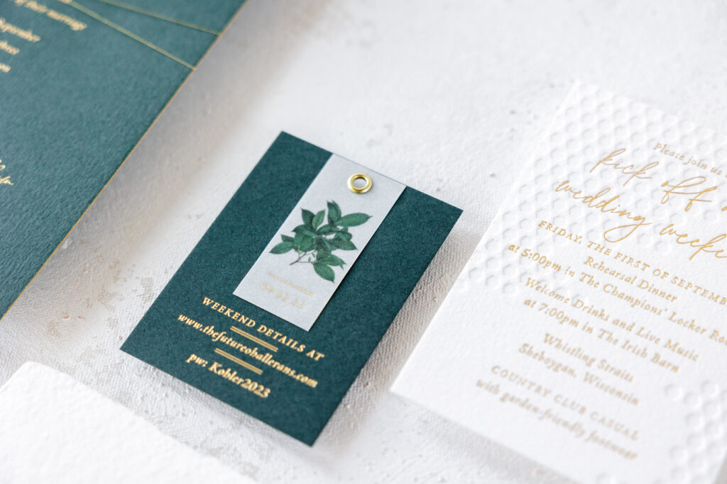
Details Card
foil stamping: gold matte
fonts: la luxes + adobe jenson
paper: bella holly 1-ply
card size: no. 17
finishing: hole drill (3/16″); assemble with details tag and gold grommet
job: 67150
Details Card Tag
foil stamping: gold matte
digital printing: cmyk
fonts: la luxes + adobe jenson
paper: 40# vellum
card size: 1×2.25”
diecut shape: cd-342
finishing: hole drill (3/16″)
The details card combines gold matte foil with our holly paper and a vellum overlay, held in place with a gold grommet. The inspiration behind this piece is the details card from our Ichabod design. The concept was reworked to fit within this suite, and the design is seamless.
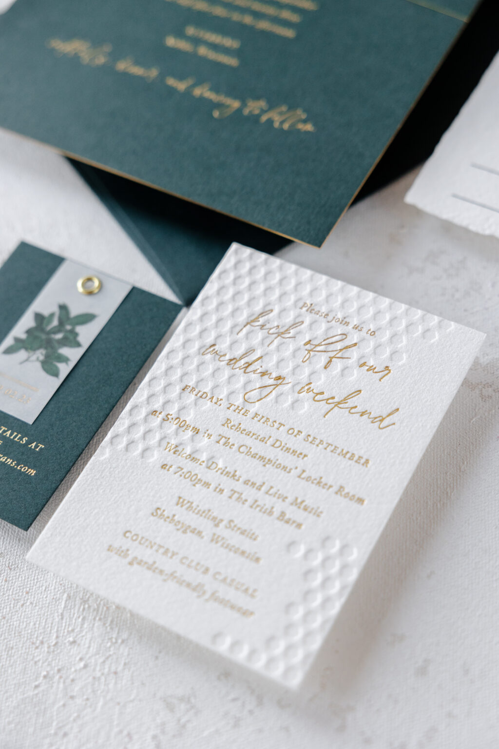
Events Card
deboss: blind
foil stamping: gold matte
fonts: la luxes + adobe jenson
paper: bella cotton white 2-ply
card size: a-5
job: 67150
The events card borrows the honeycomb artwork from our now-retired Sweet Christine design. The text appears in gold matte foil, while the patterned artwork is blind debossed, or printed without ink. Our 2-ply paper holds a crisp impression, even when the foil-stamped text overlaps. The honeycomb pattern also appears on the envelope liner, although this iteration is in foil. Pearl shine foil adds a subtle shimmer.
The entire suite is held together with metallic gold thread wrapped around the stacked pieces in a criss-cross pattern before being slipped inside the envelope.
This charming wedding invitation suite includes nature motifs and geometric patterns, as well as different print methods and various paper stocks, and everything beautifully works together in a perfectly orchestrated way. We wish the best to Megan and Conner, and we are so appreciative to Smitten Boutique for bringing us such a lovely design. Locate one of our dealers to create your own custom wedding invitation suite.
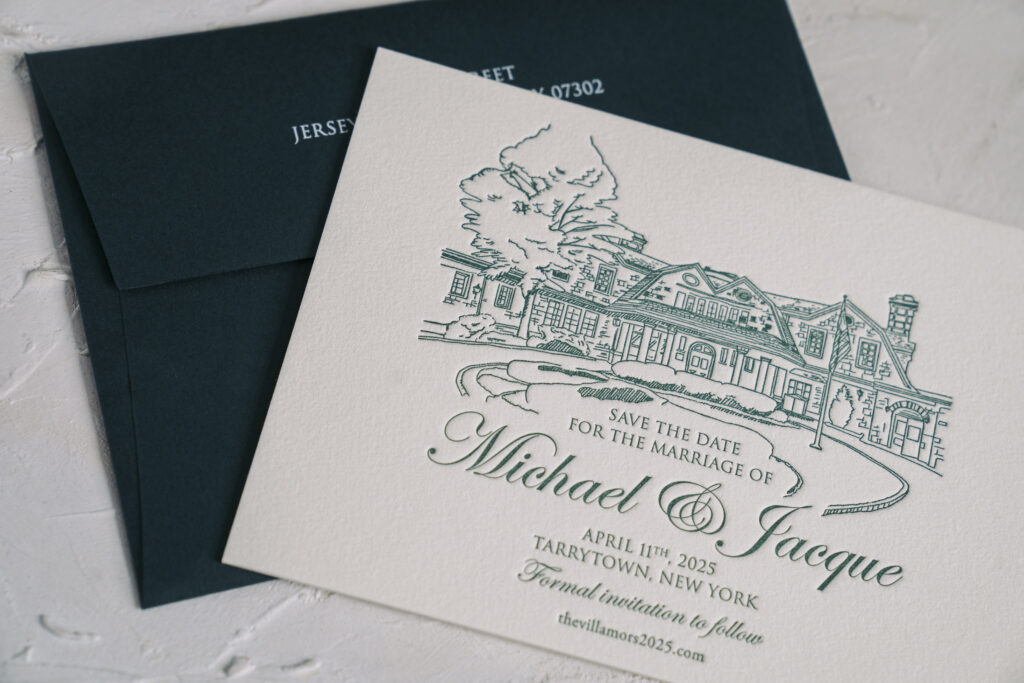
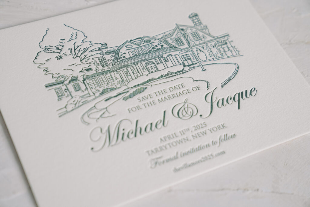
These striking letterpress save the dates are completely custom and feature an illustration of the venue for a personal touch. Michael and Jacqueline worked with our NYC store for their custom save the date.
The couple chose our cotton 2-ply, which has a pillowy feel and soft texture. The stock holds a nice, deep impression and perfectly showcases the thin lines of the supplied artwork. The standout feature of this save the date card is the illustration of the wedding venue, the Tappan Hill Mansion.
Specifications
letterpress ink: myrtle
fonts: trajan + edwardian script
paper: bella cotton ivory 2-ply
card size: a-6
envelope: holly text
digital envelope addressing: white digital on the back
job: 71616
Myrtle letterpress ink, paired with our ivory paper, is stately and elegant, and sets the perfect tone for a spring wedding. Our holly envelope coordinates beautifully with the letterpress ink. White envelope addressing on the holly envelope is on trend and elevates the look.
Are you interested in creating elegant letterpress save the dates? Or incorporating an illustration? We can make it happen. You can work with us or you can work with one of our dealers to create your dream save the date cards.
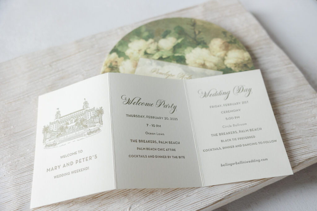
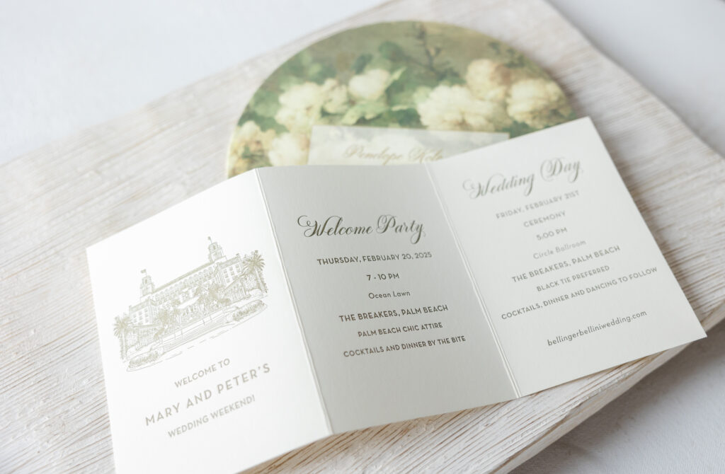
It’s always exciting when we hear from our dear friend Heather from Posh Parties & Paper because we know we’re in for something spectacular. The day of pieces for Mary and Peter’s Palm Beach wedding did not disappoint.
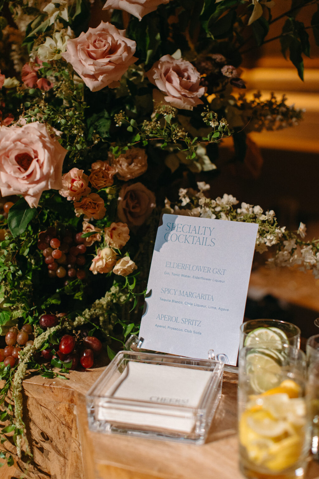
Guests received an itinerary listing all of the important details for the weekend. This tri-fold card is letterpress printed in olive and features an illustration of the venue, The Breakers Palm Beach, on the cover.
Weekend Itinerary
letterpres ink: olive
fonts: vena amoris + neutra
paper: bella smooth cotton ivory 1-ply
card size: a-5 trifold card (4.75 x 10.14 open, 4.75 x 3.38 closed)
finishing: score
job: 75393
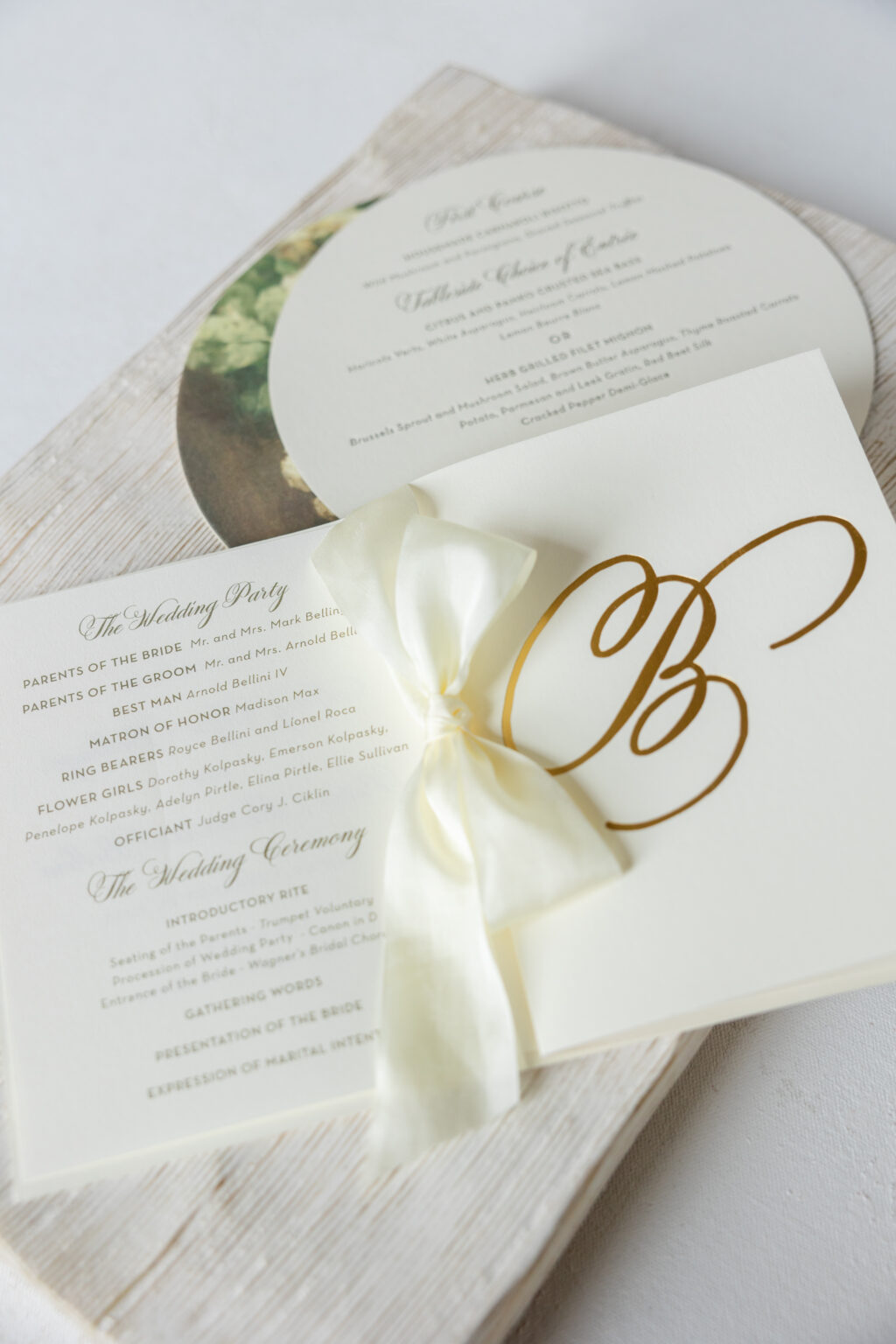
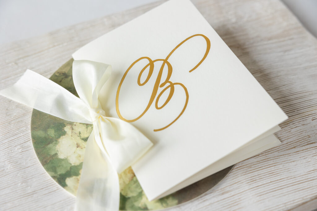
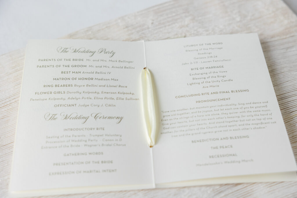
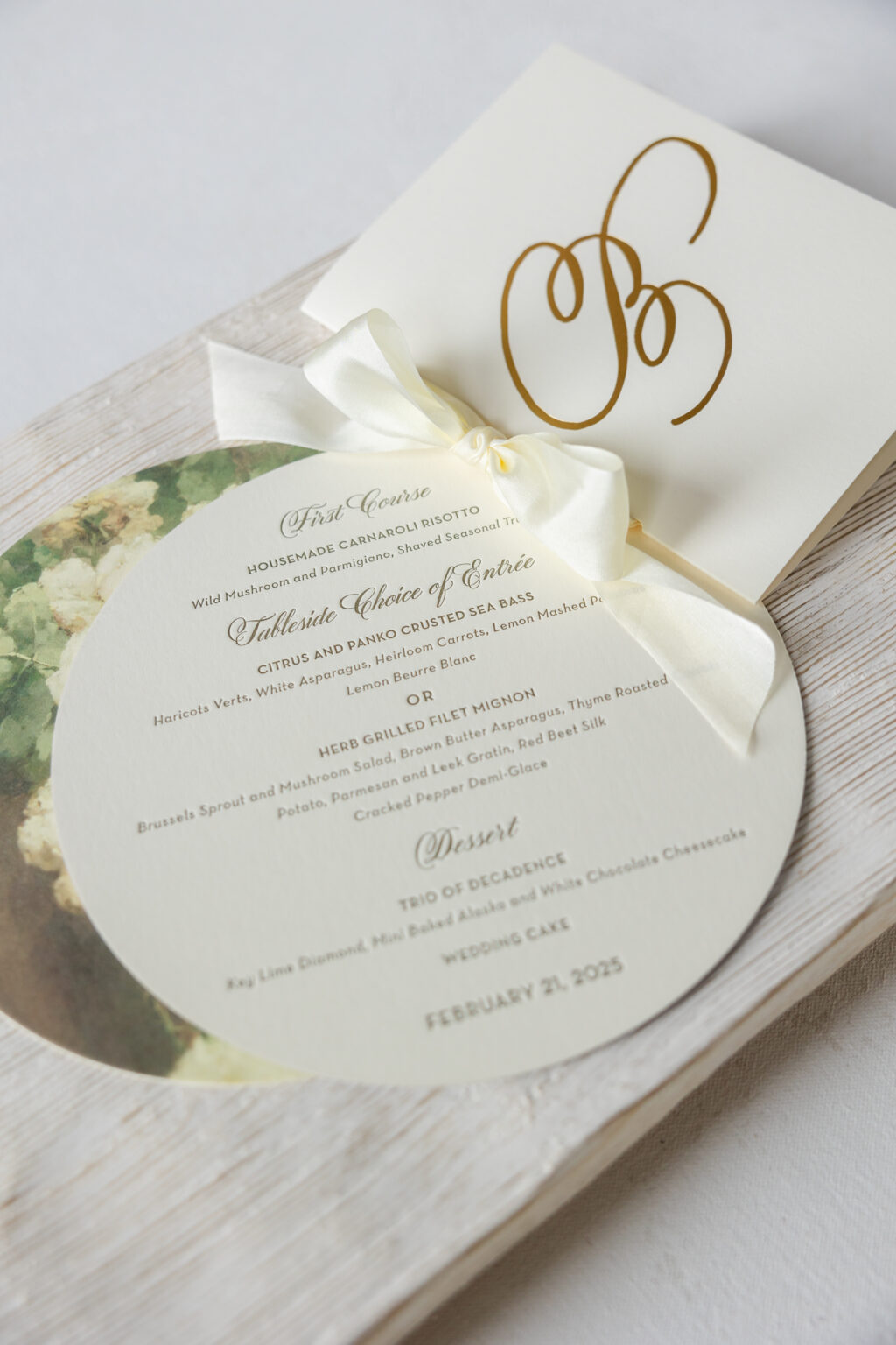
A script letter ‘B’ was foil-stamped in gold matte on the program cover, proving that less is more. The interior pages are digitally printed in olive and secured in the cover with a silk ribbon for a decadent touch.
Program Cover
foil stamping: gold matte
fonts: vena amoris
paper: bella smooth cotton ivory 1-ply
card size: a-6 folded (6.19 x 9.12 open, 6.19 x 4.56 closed)
silk ribbon: ivory buttercream
finishing: hole drill .1875″, assemble with interior pages and ribbon
job: 75393
Program Pages
digital printing: olive(front) / olive (back)
fonts: vena amoris + neutra
paper: ivory text
card size: a-6 folded (5.94 x 8.88 open, 5.94 x 4.44 closed)
finishing: hole drill .1875″, assemble with interior pages and ribbon
job: 75393
The double-sided menu features letterpress printing for the text, and floral artwork digitally printed on the reverse side. Each guest’s name appears digitally on the reverse side. The 7-inch circle menus perfectly fit into each place setting, making it a functional part of the tablescape.
Menu
letterpress ink: olive (back)
digital printing: antique gold + cmyk (front)
fonts: vena amoris + neutra
paper: bella smooth cotton ivory 2-ply
card size: 7-inch circle
diecut shape: circle (BP-11)
job: 75393
Day of pieces are an integral part of wedding stationery and help keep guests informed and involved in the event. We were so happy to create these items for Mary and Peter, and we wish them the best. Are you in need of day of pieces for your wedding or event? Contact one of our dealers to get started designing all of the pieces for your big day.
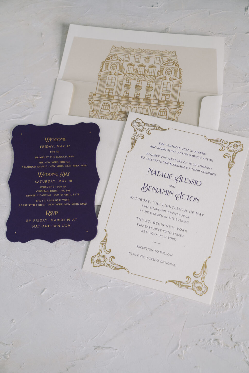
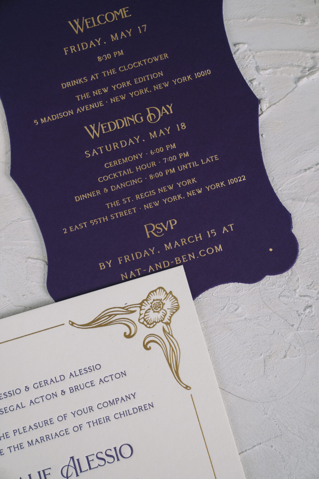
Natalie and Benjamin chose our Mirabella design for the nuptials, which was a perfect choice for their big day. The couple worked with our NYC store to create their letterpress and foil wedding invitations, and the results are stunning.
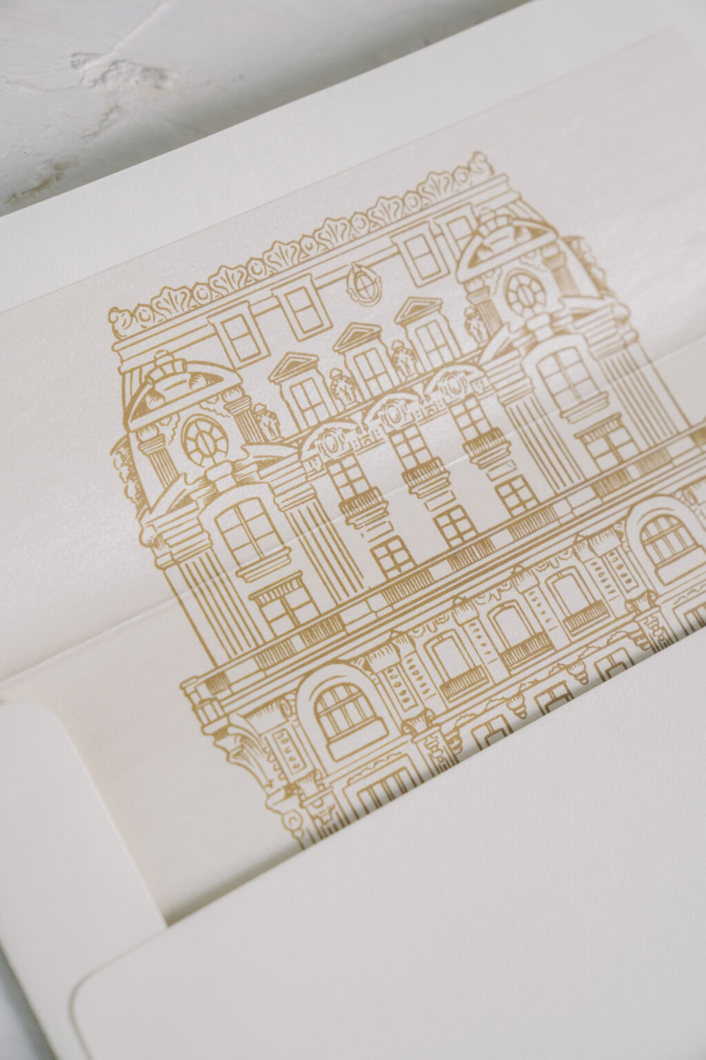
The grandiose invitation design perfectly set the tone for Natalie and Benjamin’s wedding, which was held at the St. Regis New York. This iconic venue is an excellent example of Beaux Arts architecture, and the extravagant foil-stamped frame of the invitation beautifully coordinates with the venue. The venue even made an appearance on the custom envelope liner. An illustration of the St. Regis New York appears in antique gold digital printing on the liner.
Invitation
letterpress ink: plum
foil stamping: gold matte
fonts: brilon 1.2 + coldiac regular
paper: bella smooth cotton ivory 2-ply
card size: f-8
liner: custom pattern in antique gold digital
envelope: ivory cotton text
digital envelope addressing: plum digital on the front and the back
job: 70367
The details card is on our plum 2-ply paper, and exclusively features gold matte foil. The result is ornate and lavish, and makes the perfect addition to this invitation suite. The couple printed two versions of the details card (only one is pictured). One version included details regarding the rehearsal dinner, eliminating the need for a standalone rehearsal dinner invitation, allowing for a more streamlined invitation suite.
Details Card
foil stamping: gold matte
fonts: brilon 1.2 + coldiac regular
paper: plum 2-ply
card size: a-6
diecut shape: charleston (BF-3)
job: 70367
Do you dream about elegant letterpress and foil wedding invitations? Are you interested in including Beaux Arts-inspired design elements or finding interesting ways to represent your venue? We are here to help, or you can work with one of our dealers to receive expert tips and assistance creating your perfect invitations!
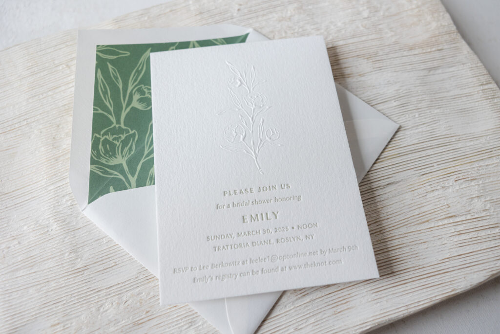
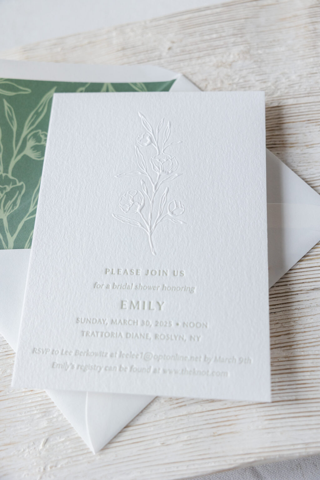
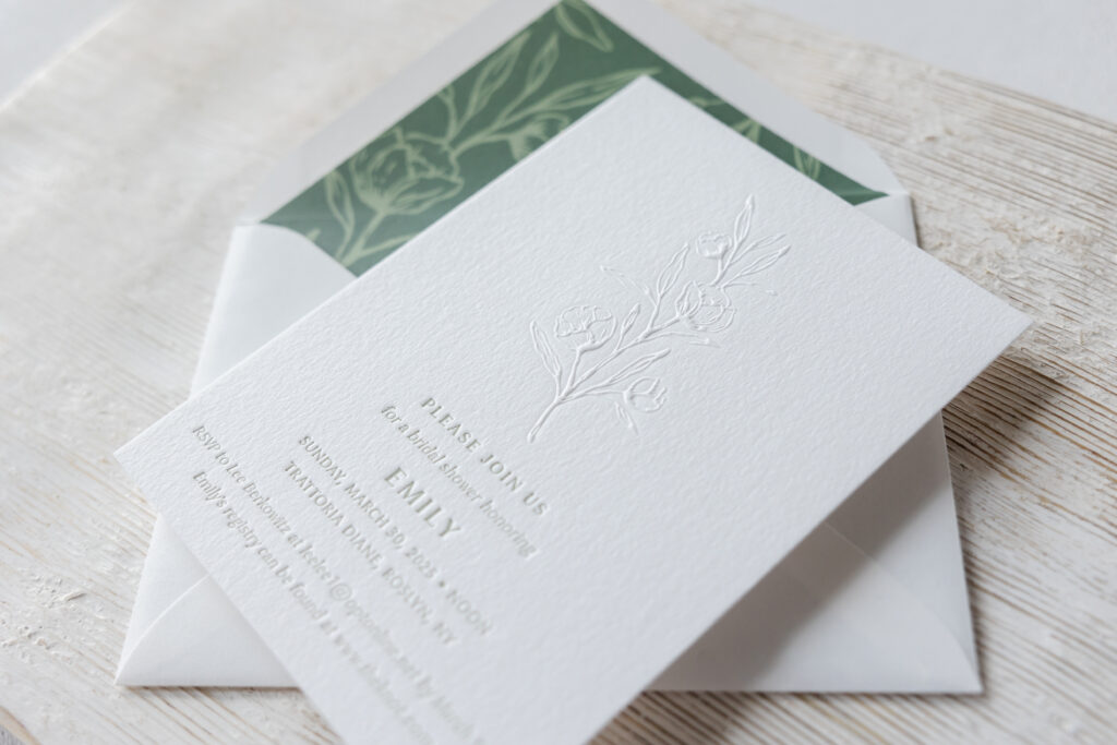
This darling blind emboss bridal shower invitation came to us from our friend Lindsay at Invite Me Invitations. The design is inspired by our now-retired Hazel save the date. The delicate floral artwork appears as blind embossing, while the text appears in spruce letterpress printing.
Specifications
letterpress ink: spruce
embossing: blind
fonts: optima + antique
paper: bella cotton white 2-ply
card size: a-6
liner: hazel pattern in spruce + cypress
envelope: pointed flap white cotton text
digital envelope addressing: spruce digital on the front and the back
job: 75311
Embossing is a printing technique that creates a raised impression. The embossing for this design does not feature ink, so the raised artwork stands above the texture of the paper. The impression of the floral artwork is crisp, yet subtle. All of the text appears in spruce letterpress. Letterpress printing presses into the paper, creating a depression. This bridal show invitation creates an interesting dichotomy between the raised artwork and the pressed text. The soft hue of our spruce ink maintains the gentle balance of the design.
The single floral sprig on the card appears as a pattern for the envelope liner. The pattern is digitally printed in spruce for a cohesive appearance with the invitation. While the background is digitally printed in cypress, providing contrast.
Just a reminder that when we retire a design, that means we no longer maintain samples. You can still select and customize any of our retired designs; however, samples of that design are no longer available. This customization also shows how easy it is to change the application of a design. A save the date can become a blind emboss bridal shower invitation, or any type of invitation.
Are you thinking about custom invitations for your next event? Whether you need invites for a bridal shower, baby shower, retirement party, or any other milestone occasion, we are here to help! Contact us to learn more or work with one of our dealers for expert assistance in creating your bespoke invitations.
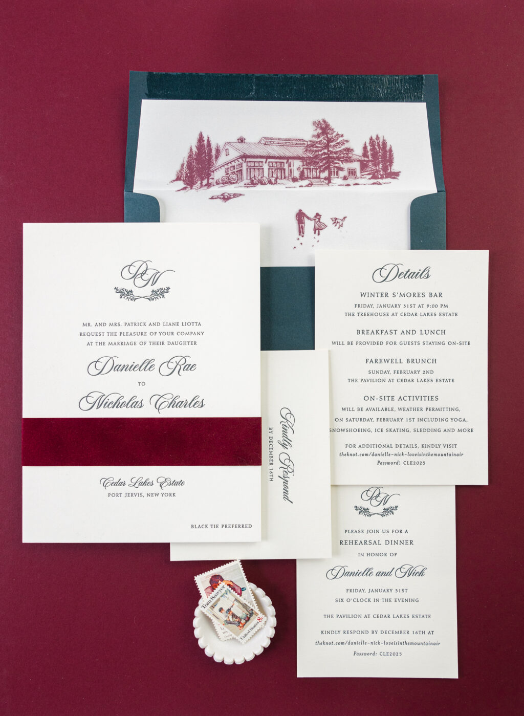
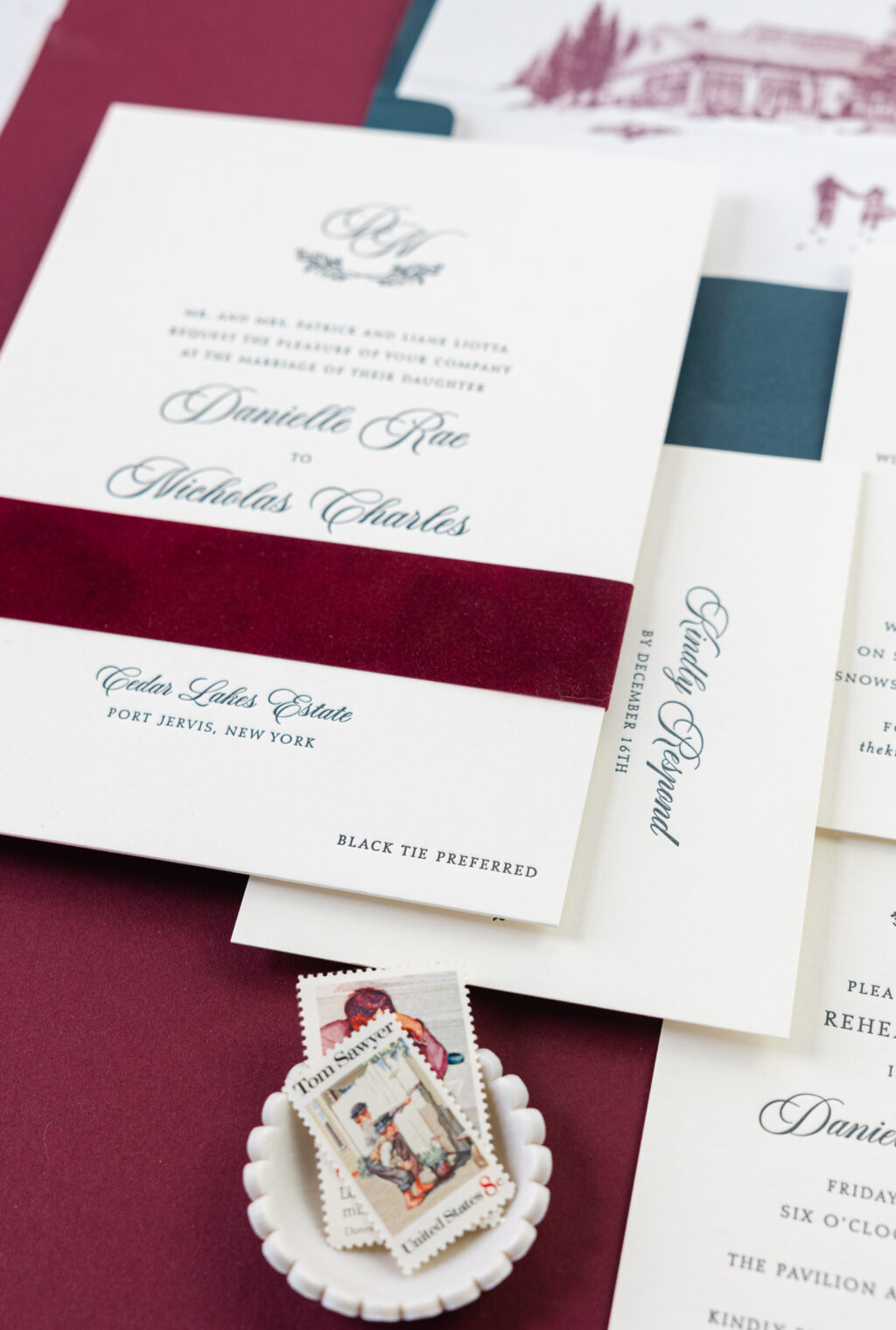
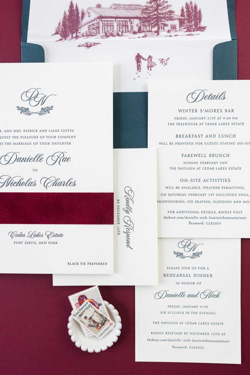
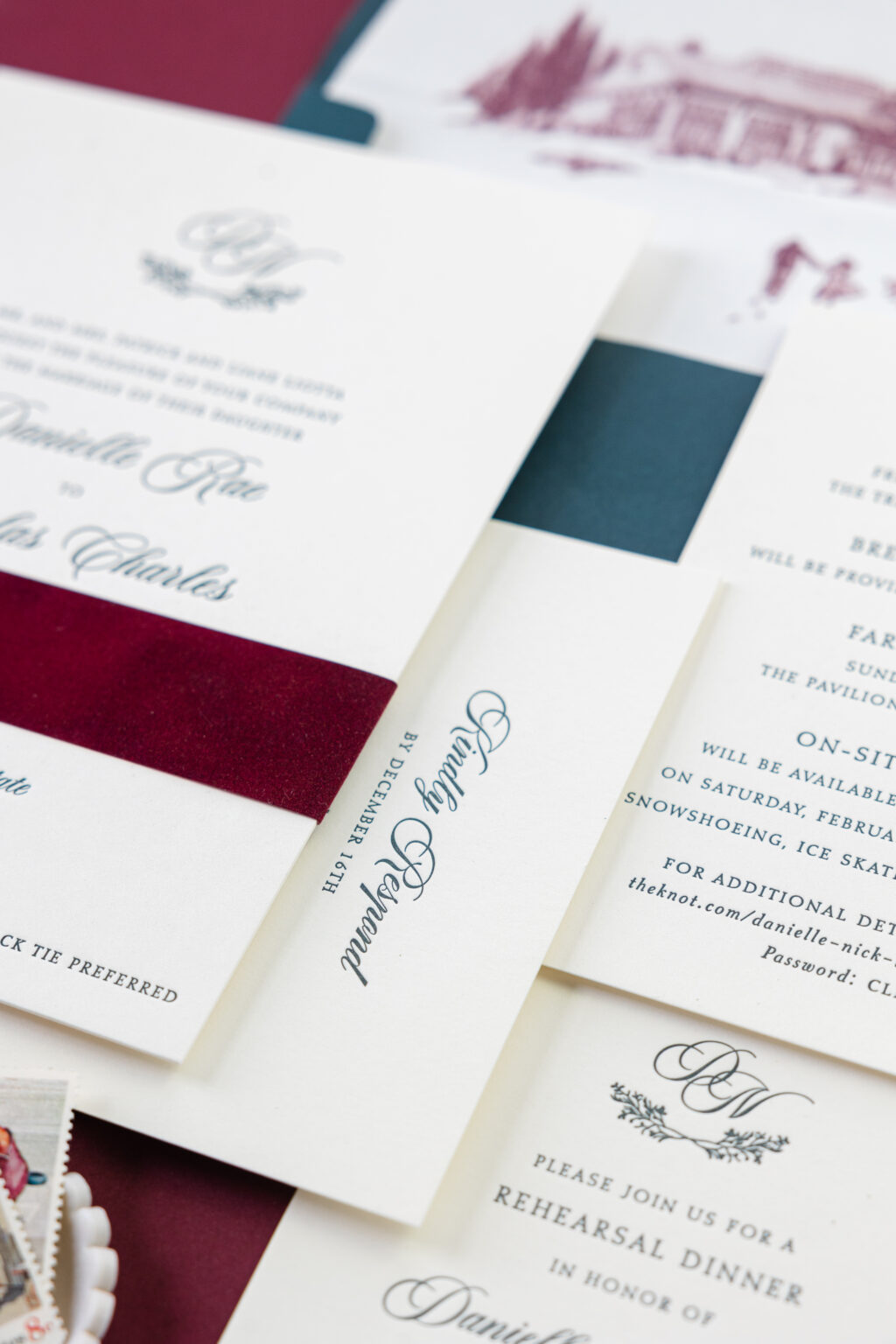
These letterpress wedding invitations have a cozy vibe and a subdued elegance, perfect for a winter wedding. Danielle and Nicolas worked with our NYC store to create these custom invitations, complete with a decadent velvet belly band and stunning one-of-a-kind envelope liner.
Invitation
letterpress ink: holly
fonts: aston script + diotima
paper: bella smooth cotton ivory 2-ply
card size: f-8
liner: supplied pattern in marsala digital on ivory text
envelope: evergreen text
envelope addressing: ivory digital on the front and back
job #73960
Belly Band
paper: bella velvet in wine
card size: short f-8 vertical belly band (1.25 x 13.25 open, 1.25 x 6.24 closed)
job #73960
A custom monogram, featuring the bride and groom’s first initials, appears at the top of the invitation. Underneath the initials is a branch frame, adding a rustic element to the monogram and a subtle nod to the venue, Cedar Lakes Estate. We offer a wide selection of frames and borders, enabling you to create a unique monogram for your invitations.
Reply Card
letterpress ink: holly
fonts: aston script + diotima
paper: bella smooth cotton ivory 1-ply
card size: a-2
job #73960
Details Card
letterpress ink: holly
fonts: aston script + diotima
paper: bella smooth cotton ivory 1-ply
card size: a-6
job #73960
Rehearsal Dinner Invitation
letterpress ink: holly
fonts: aston script + diotima
paper: bella smooth cotton ivory 1-ply
card size: a-2
job #73960
Our Bella smooth cotton paper in 2-ply has a smooth surface and holds a lovely letterpress impression. Holly ink paired with the ivory paper adds warmth to the design. The velvet belly band in wine wraps around the invitation, introducing texture and even more richness to the overall aesthetic.
The bride and groom sent in a custom illustration for the envelope liner, which is so charming and adds a beautiful, personal touch to the overall suite. The illustration depicts a winter scene of the couple and their beloved dog, walking through the snow to the reception venue. The liner is digitally printed in marsala ink on ivory text-weight paper. Our marsala ink beautifully coordinates with the wine velvet used for the belly band, tying everything together.
It was a delight to work with Danielle and Nicolas on their letterpress wedding invitation. Do you have ideas for a monogram or a charming illustrated envelope liner? Contact us to design your invitation or work with one of our dealers to see samples and swatches in person and receive expert assistance creating your dream invitation.
We are so happy to share our 2025 Holiday release with you, and today, we have a behind-the-scenes look at the inspiration behind some of our new designs. From classic and cozy to elegant and sophisticated, see the inspiration behind some of our favorite designs, and get inspired to design your holiday cards.
Burlington
Burlington has a classic and rustic vibe. This holiday card features our handmade paper, and the natural deckle edge gives this design a cozy, nostalgic feeling. The clear shine foil stamping adds a glimmer to the falling snow and elevates the design.
Specifications
letterpress ink: cypress
foil stamping: clear shine
fonts: instrument serif + angeline
paper: bella handmade ivory
card size: a-7 (tier 3)
liner: burlington pattern in cypress + ruby + holly
envelope: evergreen
digital addressing ink: ivory
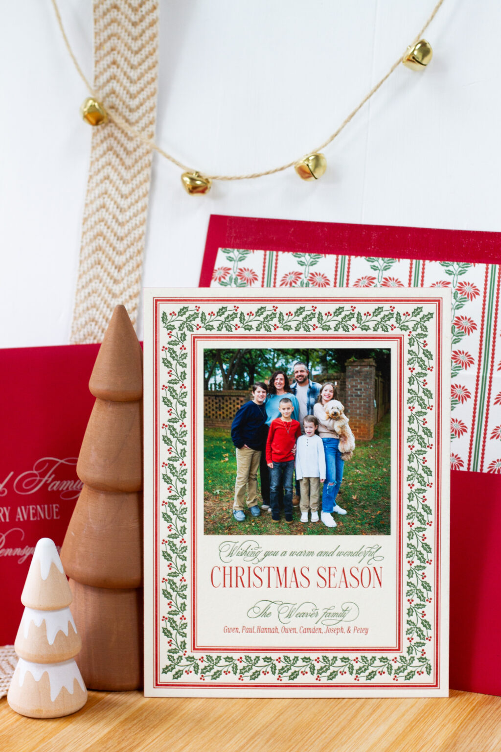
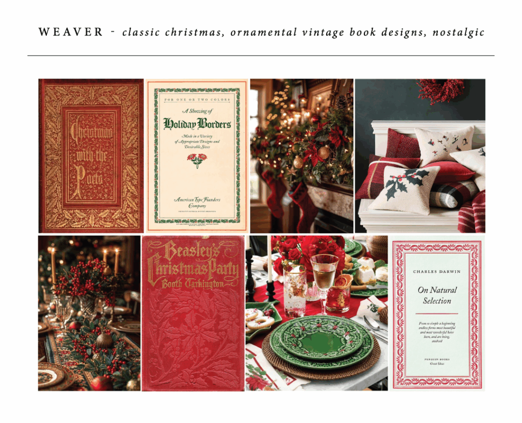
Weaver
The mistletoe border of Weaver is luxurious and has a quintessential Christmas look, for a design that is both vintage-inspired and contemporary. Our cotton paper in 2-ply holds a deep letterpress impression, and the ivory paper color coordinates beautifully with the vine and ruby inks. Ruby edge painting highlights the thickness of the stock while matching much of the printing on the front.
Specifications
letterpress inks: vine + ruby
fonts: desirable calligraphy + valentino
paper: bella cotton ivory 2-ply
card size: f-8 (tier 3)
edge painting: ruby
mounted photo print: 3.75 x 3.75 matte
liner: weaver pattern in vine + ruby
envelope: ruby
digital addressing ink: ivory
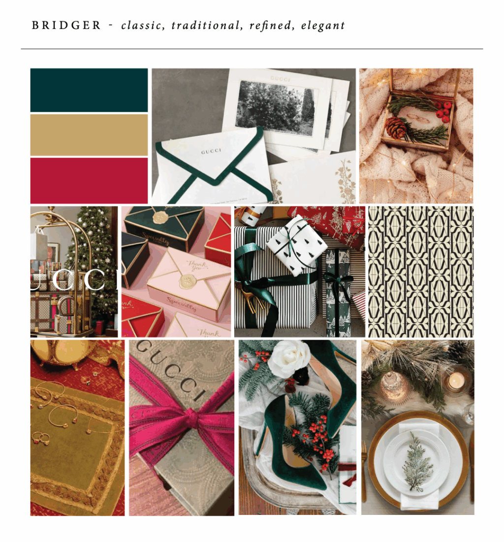
Bridger
Metallic gold engraving is traditional and refined, and elevates the look of Bridger. This design is both die-cut and beveled. The 45° bevel is emphasized with metallic gold edge painting. The mounted family photo adds a personal touch while marking an important milestone.
Specifications
engraving inks: holly + metallic gold
fonts: juliette + didot
paper: bella cotton ivory 3-ply
card size: sq-7 (tier 3)
mounted photo print: 4 x 3 matte
bevel: 45° winston
edge painting: metallic gold
liner: bridger pattern in holly + cypress
envelope: bella cotton ivory
digital addressing ink: holly
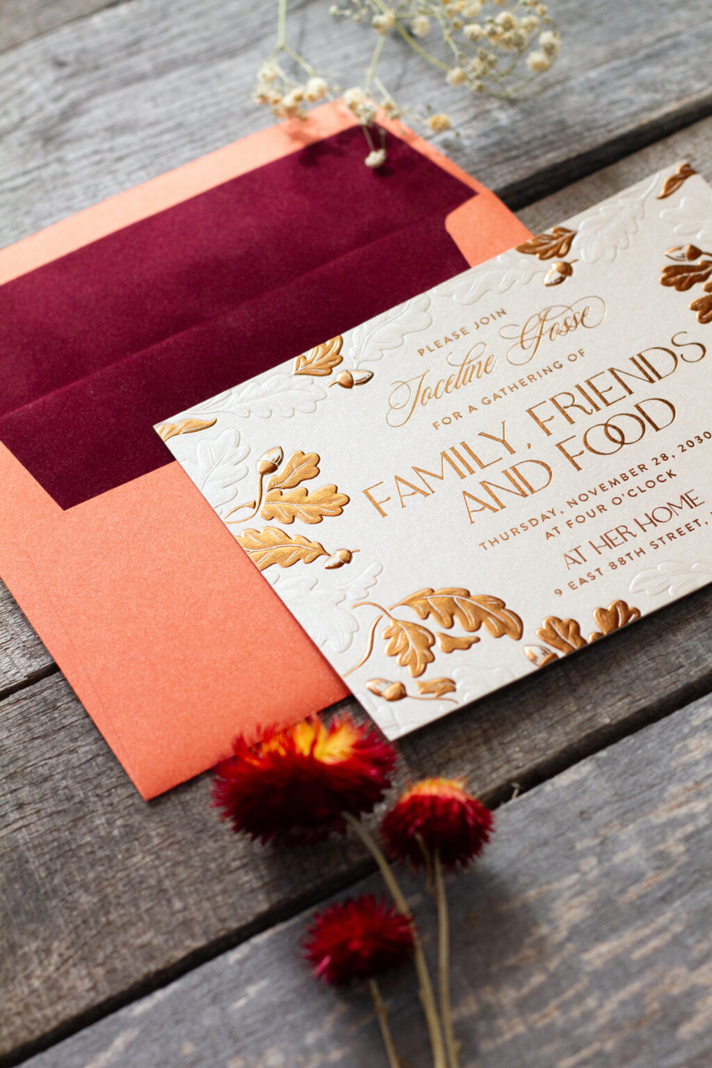
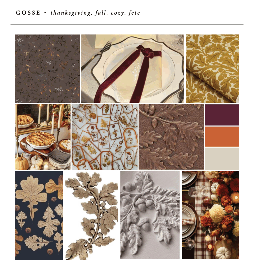
Gosse
Sculpted embossing combined with sculpted foil embossing gives our Gosse design dimension and adds movement to the foliage artwork. Cedar shine foil adds a seasonally appropriate shimmer. The velvet liner brings everything together and adds an element of grandeur.
Specifications
foil stamping: cedar shine
sculpted embossing: blind
sculpted foil embossing: cedar shine
fonts: angelline + brandon grotesque + adele moon
paper: metallic sand 2-ply
card size: a-6 (tier 2)
liner: wine velvet
custom converted envelope*: mesa | digital addressing ink: bordeaux
*peel and stick tape is available to seal the envelope.
Now is the time to get your holiday orders in, and we can help! Contact us to design your 2025 holiday card or work with one of our dealers to see samples, color swatches, and receive expert guidance!
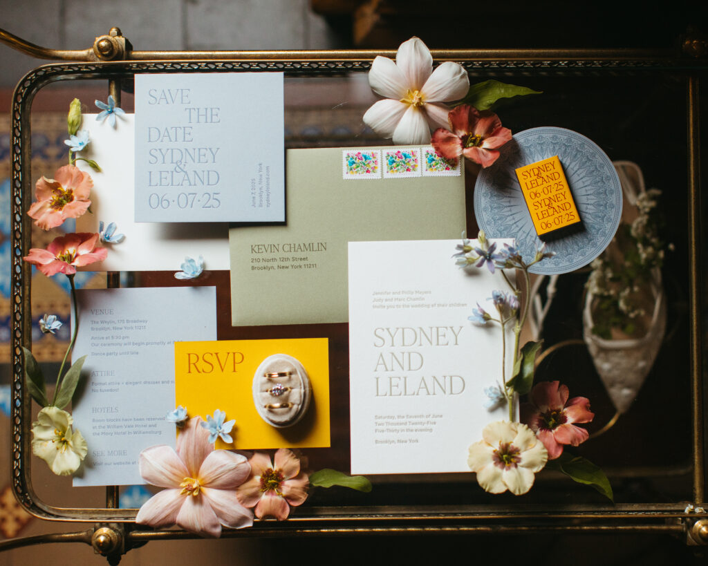
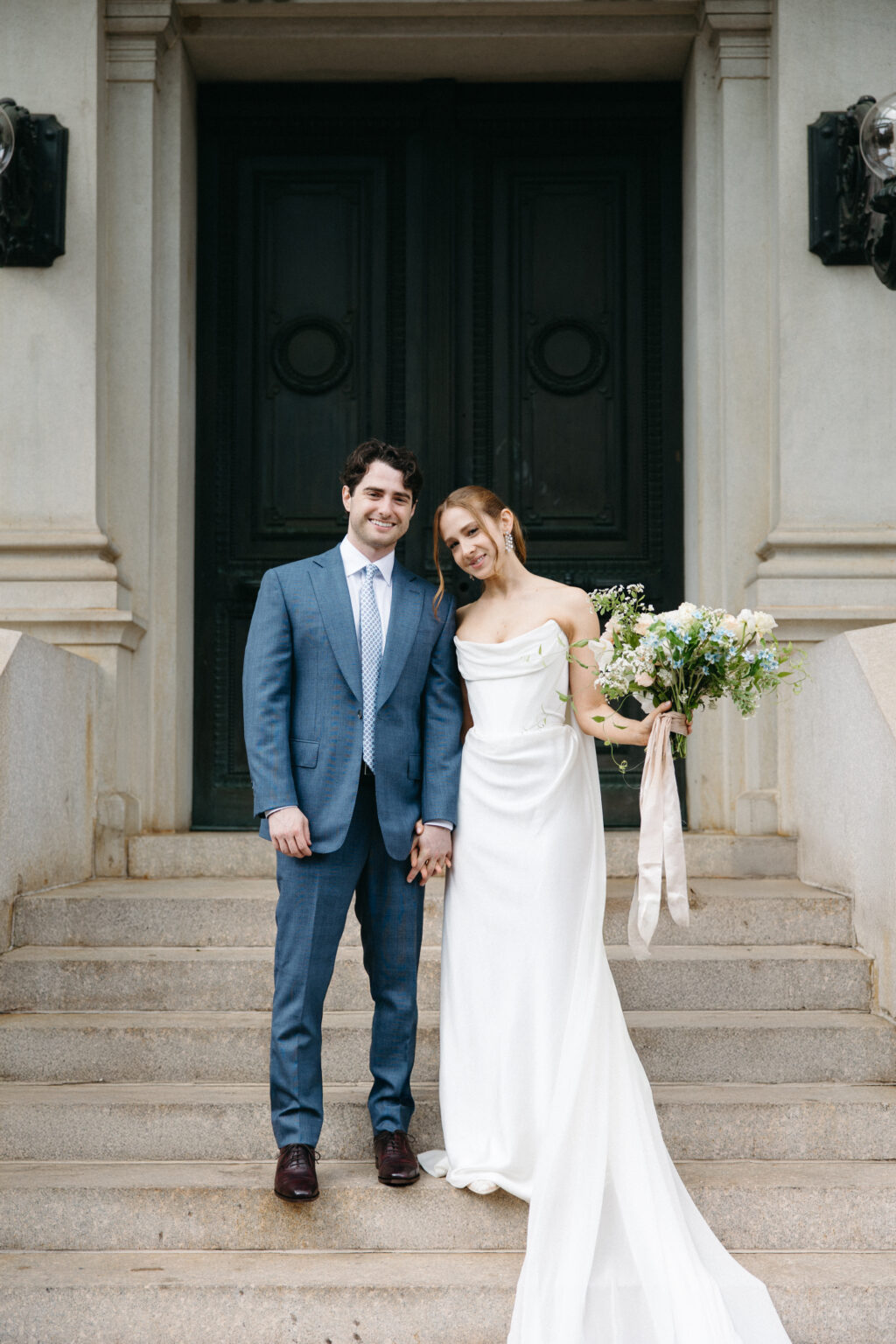
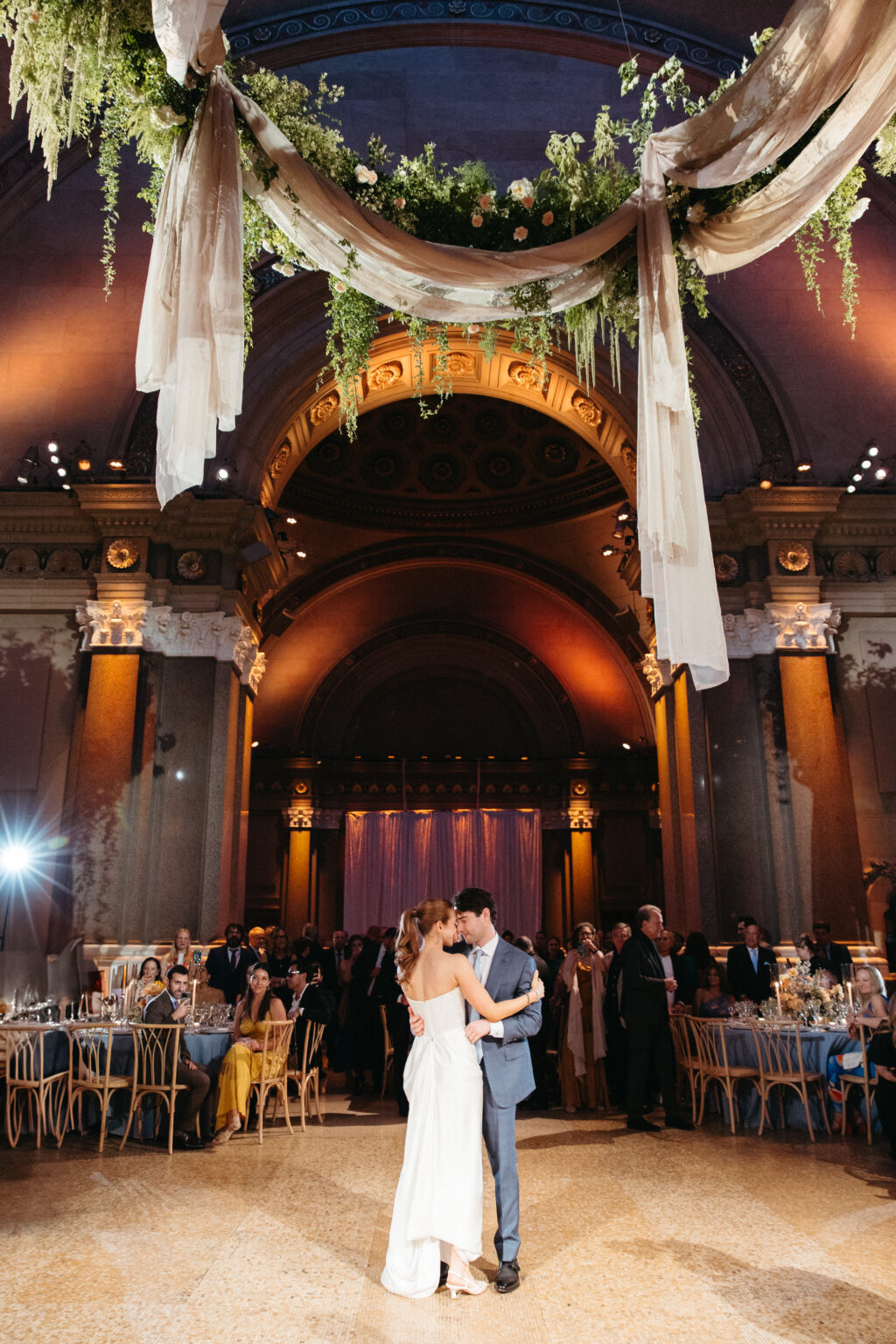
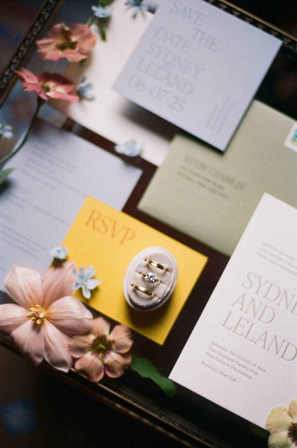
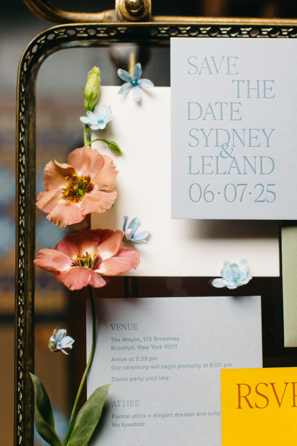
We were delighted to work with Sydney and Leland on their letterpress wedding invitation and day-of pieces, having had the pleasure of helping this couple create their stunning save the date. The minimalist design had an understated elegance that perfectly set the tone for their stunning nuptials held at a quintessential NYC venue.
The invitation is printed on our 2-ply cotton paper, which has a soft texture and holds a deep letterpress impression. The spruce letterpress ink perfectly coordinates with the spruce edge painting on the invitation and the envelope.
Invitation
letterpress ink: spruce
fonts: figtree regular, ivy presto display thin AT
paper: bella cotton white 2-ply
card size: a-7
edge paint: spruce
liner: brooklyn 3 pattern in deep blue digital on white text
envelope: spruce text
envelope addressing: cypress digital on the front and back
job #73480
Reply Card
letterpress ink: nutmeg (front) / nutmeg (back)
fonts: figtree regular, ivy presto display thin AT
fonts: figtree regular, ivy presto display thin AT
paper: cloud 1-ply
card size: a-6
job #73480
The invitation beautifully coordinates with the streamlined design of the couple’s save the date, featuring the same fonts and aesthetic. We previously highlighted the save the date, which includes artwork based on the venue, The Weylin.
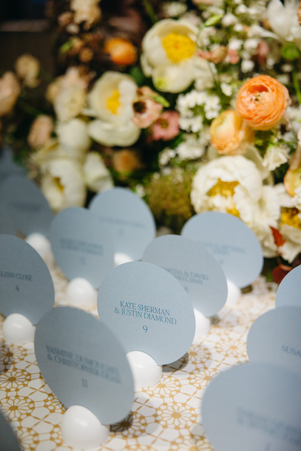
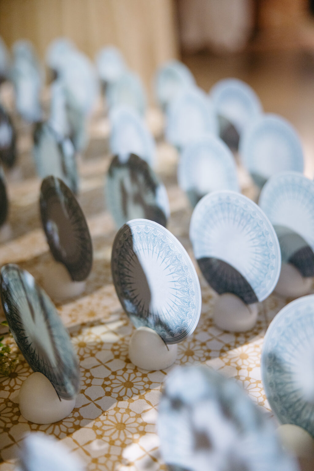
Flat Escort Card
digital ink: chambray (front) / chambray (back)
fonts: figtree regular, ivy presto display thin AT
paper: cloud 1-ply
card size: 4.75″
diecut shape: circle (BP-6)
job #77010
The detailed artwork from the save the date made another appearance on the back of the circular die-cut escort card. This was a charming detail guests could enjoy while at the iconic venue. With the exception of the domed fresco-inspired artwork, the entire suite is typography-focused. Featuring the geometric artwork on the escort cards only highlights this feature, making it more special and eye-catching.
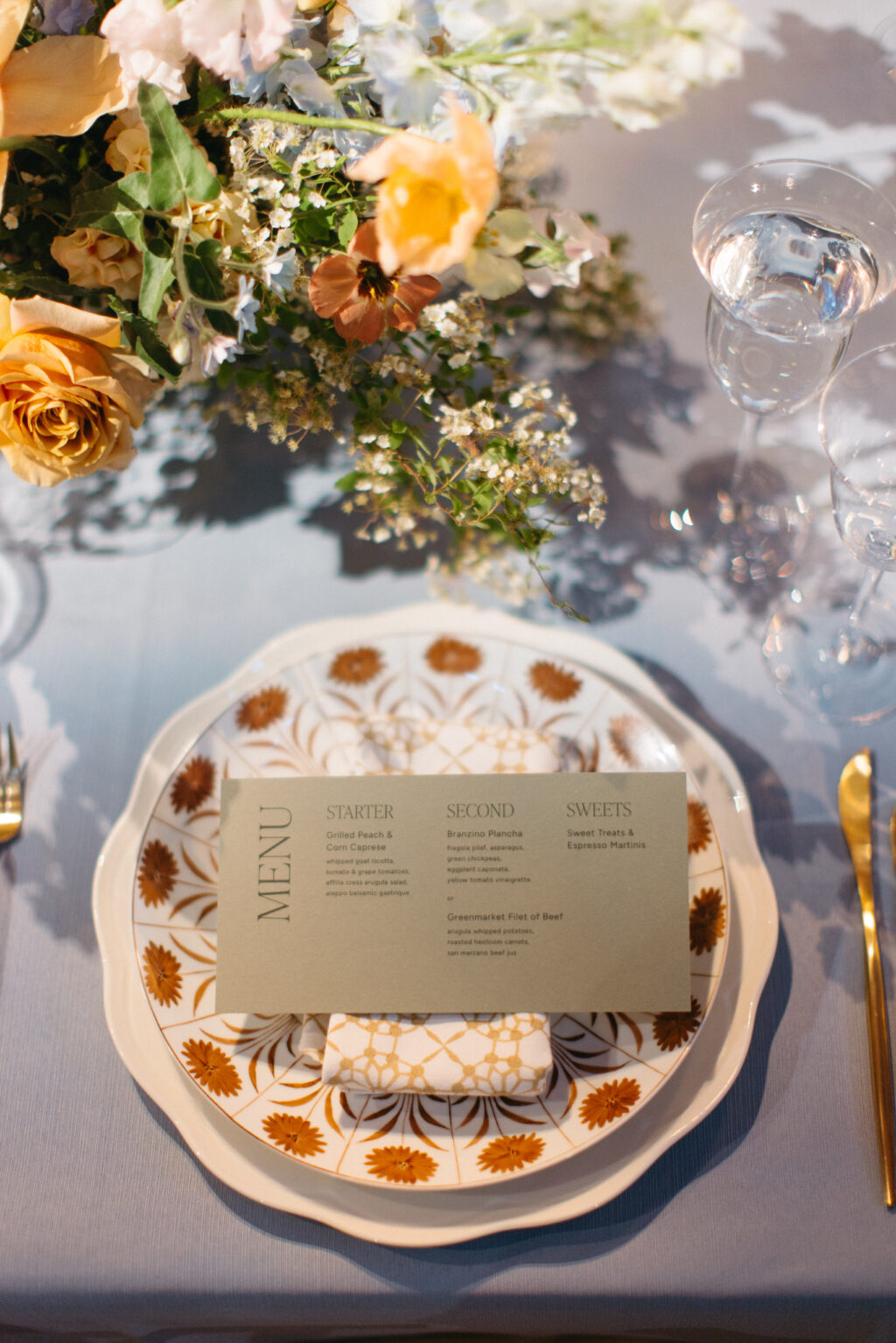
Menu
digital ink: chambray (front) / chambray (back)
fonts: figtree regular, ivy presto display thin AT
paper: spruce 1-ply
card size: 4 x 8
job #77010
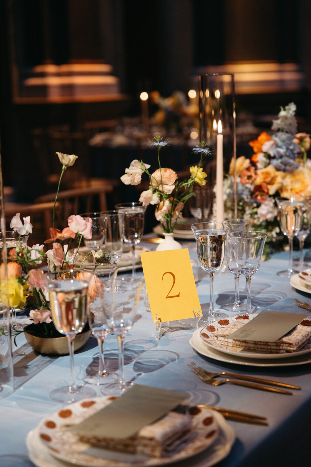
The remaining cards are printed on Bella color papers and feature a coordinating ink for a trendy yet elegant tone-on-tone look. The monochromatic look and bold colors of the day-of pieces were the perfect complement to the floral arrangements and table settings.
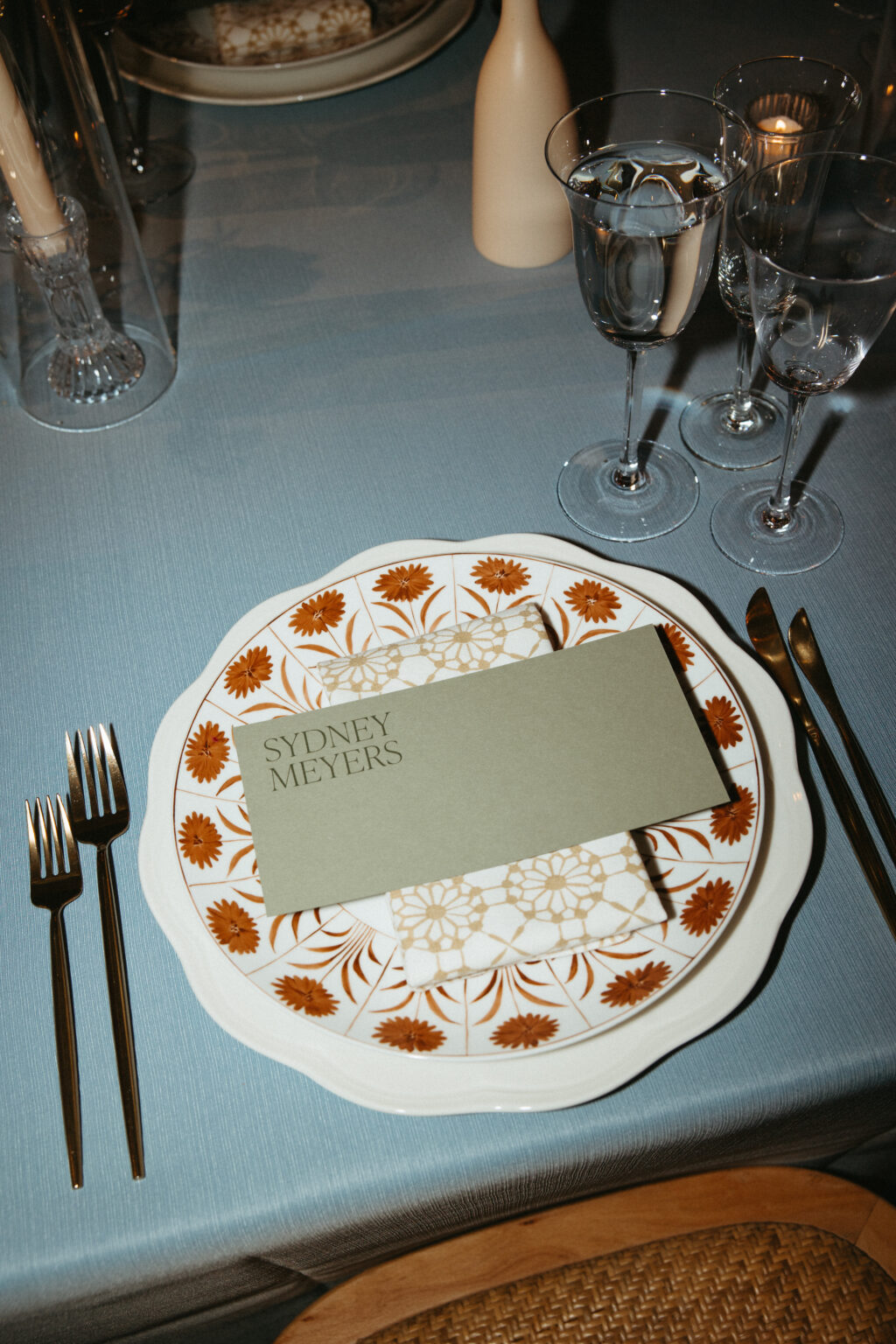
Table Card
digital ink: nutmeg (front) / nutmeg (back)
fonts: ivy presto display thin AT
paper: maize 1-ply
card size: a-6
job #77010
Bar Sign A
digital ink: chambray
fonts: figtree regular, ivy presto display thin AT
paper: cloud 1-ply
card size: f-8
job #77010
Bar Sign B
digital ink: nutmeg
fonts: figtree regular, ivy presto display thin AT
paper: maize 1-ply
card size: f-8
job #77010
Best wishes to Sydney and Leland! It was a joy to work with this couple and to help create their stunning letterpress wedding invitations. Are you inspired by the architecture of your venue or interested in a tone-on-tone look for your letterpress wedding invitation, save the date, or day-of pieces? Contact us with questions or work with one of our dealers to see samples in person and receive expert tips and guidance.
We had the pleasure of chatting with Nika Smernoff at Calligraphette & Co. in Washington, DC. Nika is a calligrapher and designer with a decade of experience in the industry. Below, Nika explains how she got her start, what keeps her going, her favorite trends, and more!
Q: Tell us about yourself and how your studio came to be? What was your inspiration?
During my first semester of graduate school in 2015, studying the relationship between pandemics and national security of all things, I found calligraphy and quickly fell in love with spending meditative evenings practicing my letters. In 2016, I started a business doing envelope calligraphy to help pay my way through school. When I received my degree in 2018, I figured I could either wonder where Calligraphette & Co. could’ve gone or jump into working for myself full-time. I had fallen in love with the wedding industry and loved the thrill of being able to see someone else’s vision and help translate it into something beautiful and tactile.
Q: What are some of the most rewarding aspects of your job?
Weddings are just such a happy time in people’s lives. My clients are figuring out how to express their love for each other and their personality as a couple for a once-in-a-lifetime celebration. In particular, I get to make people realize they’re creative, help them make something that they didn’t realize was possible, and hopefully ease a little of the stress that other parts of wedding planning can create.
Q: What are your hopes for the future of your business?
My end goal is for my clients to have an invitation tucked away somewhere in a keepsake box, to find with their children one day, and be transported 25 years back in time to when they were engaged. Whether that means curating and personalizing a Bella Figura design or creating something from scratch, I want to create heirloom pieces for people to enjoy. Not everyone wants to take on the work it takes to create custom designs, even if they have the taste for it. If I can continue to help couples send out invitations that rise to the occasion of their wedding, I’ll always consider that a success.
Q: Do you have any current trends you’re loving?
I’m loving the trend of non-rectangular inserts! Whether it’s a circle or a custom die-cut, playing with shapes is such a fun way to bring life into an invitation suite. Velvet is a trend I’m excited to try, especially with letterpress and foil printing. Although this isn’t a new trend, I’m always a fan of putting pets on wax seals! It’s a great way to give a nod to an important family member without necessarily making them the focus of the invitation suite. Lastly, I’d say custom match boxes because they’re so unexpected and also so much fun to have after the wedding!
Q: What do you think your clients enjoy most about working with you to create their event stationery?
One theme that I’ve noticed in reviews is that I always go the extra mile and put myself fully into the design process with each client, making it easy for the client and bringing their vision to life. Almost all of my clients apologize early in the process for being picky and too detail-oriented, and I always tell them that the best clients are the ones who care about the small details. I’m always happy to refine font choices and make adjustments to colors in order to have a design reflect exactly what you see in your head, even if it’s hard to describe.
Clients usually say that I was their most responsive vendor, combining warmth and professionalism to make their decisions as easy as possible. I’m also notorious for becoming good friends with my local clients, so chances are, if you’re located in DC, we’ll be grabbing a glass of prosecco after your wedding to catch up!
Q: Anything else we should know or that you would like to share?
There can be a lot of focus on how to make your wedding about other people. Don’t get me wrong. Of course, you want your guests to have a wonderful time, for your friends and family to mingle and create memories, and for the day to run smoothly. Invitations are perhaps the one aspect of your wedding where you don’t really have to consider anyone else and do just what you want. This doesn’t have to mean spending months crafting something from scratch, but getting to play with paper and colors and discuss what designs you and your fiance like is such a joyful part of the planning process. A good stationer will make it feel like fun, with minimal to no homework for you to do, providing a glimmer of ease in an otherwise email and logistics-heavy process.
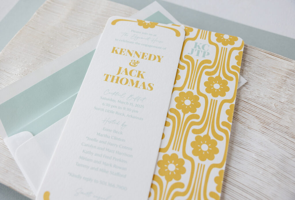
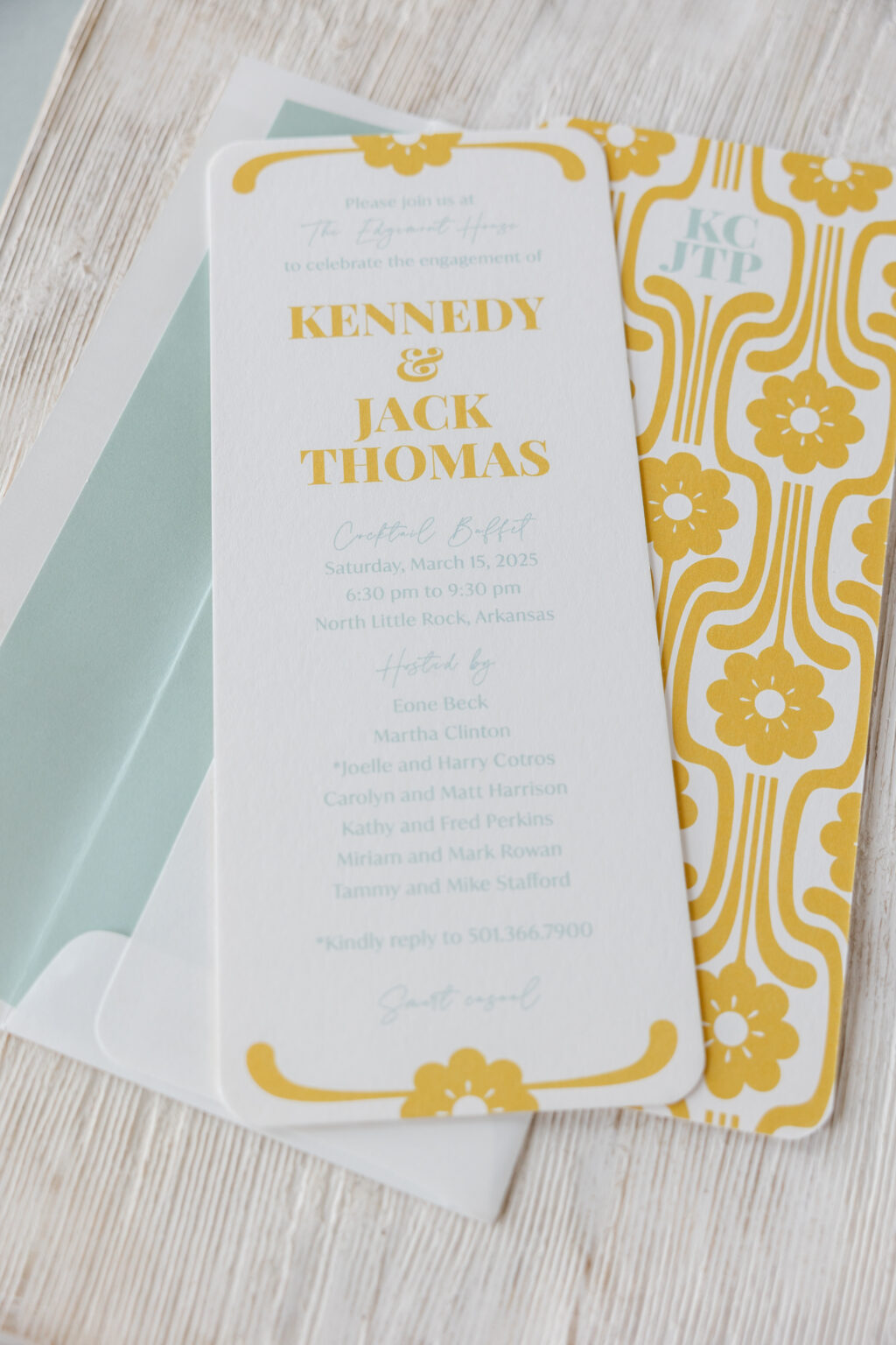
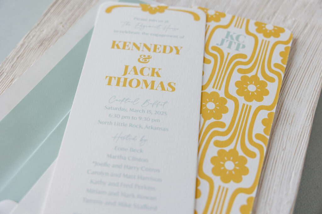
This engagement celebration invitation came to us from our dear friend Mickey of the Social Type, and it’s stunning. This invitation is inspired by our Midge design, specifically the reply card. Get the details and find out how the clean lines and a geometric pattern make this invitation an homage to Mid-Century Modern design.
The invitation is the same size as the Midge invitation, a no. 10, which measures 9.19 x 3.81 inches and features rounded corners. A floral cartouche, digitally printed in goldenrod, adorns the top and bottom, coordinating with the bride- and groom-to-be’s names. The rest of the text appears in sea mist.
font: playfair display black + la luxes script + ivy mode regular
paper: bella smooth cotton white 2-ply
card size: no. 10
finishing: rounded corner
liner: classic color pattern in sea mist digital on white text
envelope: white text
envelope addressing: goldenrod + pool digital on the front and back
job #75476
Double-sided printing takes this engagement party invitation to the next level. The broad, geometric floral artwork is our Midge 2 pattern. This pattern appears on the back of the Midge reply card and the envelope liner for the save the date, where it was foil-stamped. The couple’s initials are digitally printed on the back of the invitation in sea mist for a charming and personal touch.
Are you daydreaming about patterns and subtle details that transform an invitation into something custom and meaningful? Work with one of our dealers to create a stunning engagement celebration invitation!
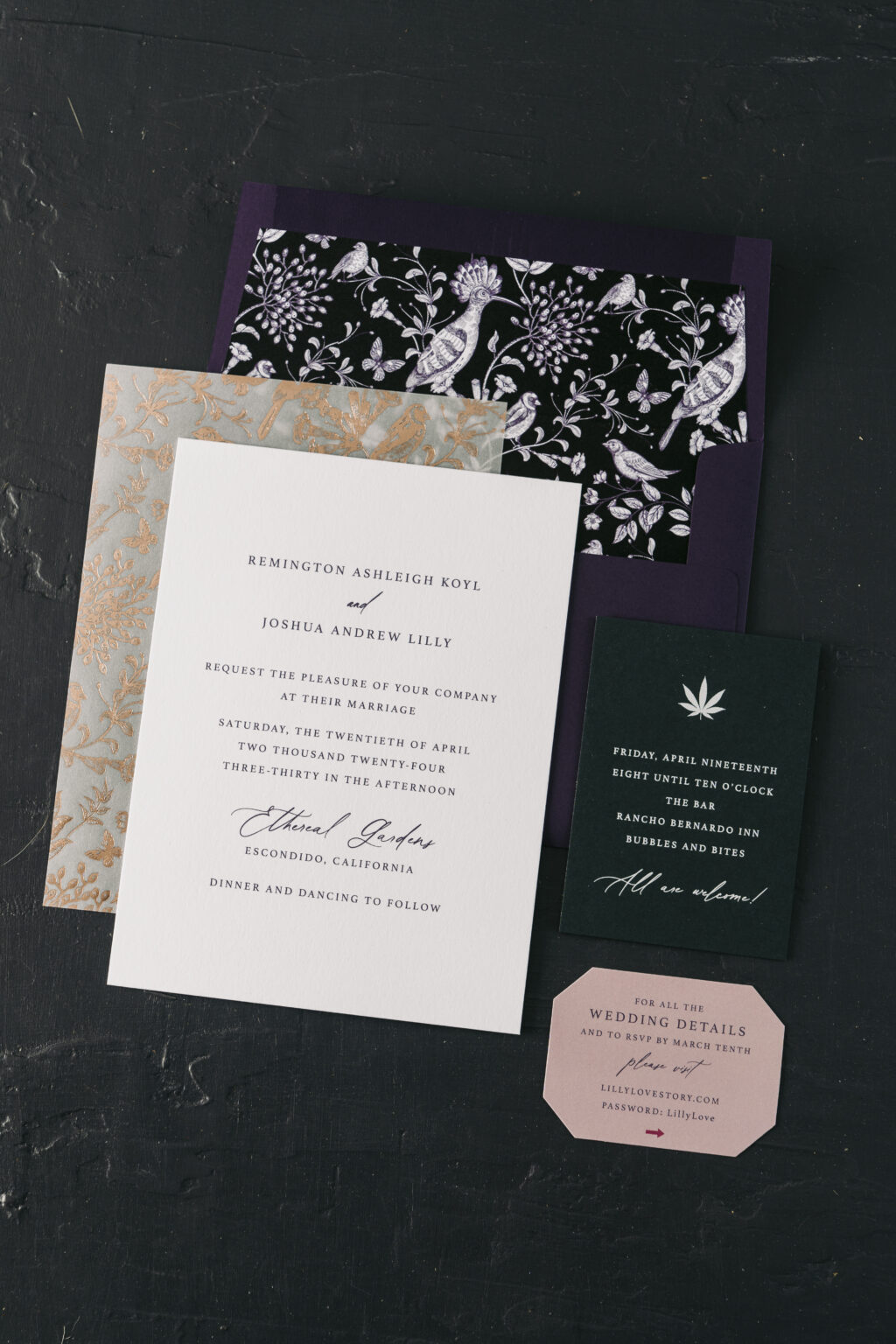
This custom wedding invitation came to us from our dear friend Candy of Where’s the Party?, and this entire set is a stunner. Remington and Joshua chose a decadent aesthetic for their California nuptials.
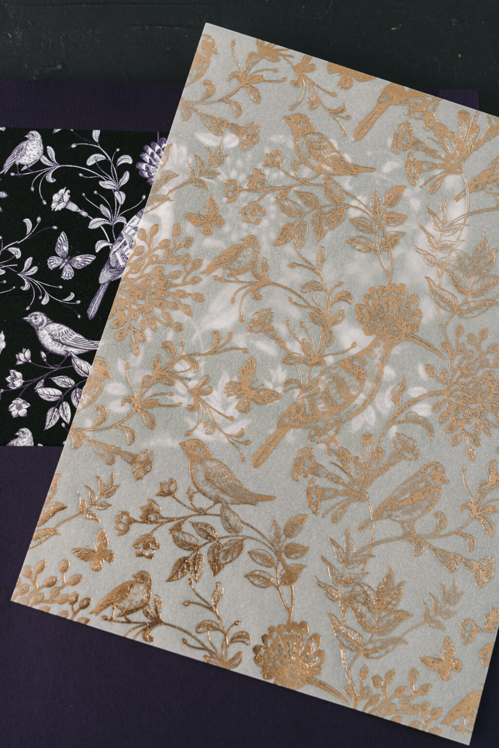
While this invitation is a custom design, it pulls elements from our Sibgha and Harro designs. The couple selected our Sibgha pattern for the back of the invitation. The front of the invitation is digitally printed in plum and has a very traditional yet edgy appearance. The deep, rich ink color gives the invitation a decadent look. The invitation is complemented by a vellum overlay, featuring our Harro pattern in rose gold foil. The overlay is a luxurious touch to the already elegant invitation. The Harro pattern makes a second appearance as the envelope liner, except this time it is digitally printed. The plum envelope perfectly coordinates with the plum letterpress ink on the invitation.
Invitation
digital ink: plum (front) / holly + cmyk + black (back)
font: athelas + vintage heirloom
paper: bella smooth cotton bright white 2-ply
card size: f-8
liner: harro pattern in black + plum digital on bright white text
envelope: plum text
envelope addressing: white digital on the front and back
job #70639
Overlay
foil: rose gold shine
Paper: 40# vellum
card size: f-8 overlay (6.19 x 8.31)
job #70639
The details card is printed using our Bella smooth cotton bright white in 1-ply. A digital flood of old rose ink creates the illusion of color paper. The reverse side (not shown) does not feature a digital flood, creating contrast between the sides. The text appears in plum on both sides of the details card. Lastly, the welcome party card features white digital printing on our holly 1-ply paper. The white text provides sharp contrast and easy legibility, while the dark green paper adds to the moody vibe of this decadent wedding invitation set.
Details Card
digital ink: old rose + plum (front) / plum (back)
font: athelas + vintage heirloom
paper: bella smooth cotton bright white 1-ply
card size: no. 17
die cut shape: franklin (BF-56)
job #70639
Welcome Party Card
digital ink: white
font: athelas + vintage heirloom
paper: holly 1-ply
card size: a-5
job #70639
We are so happy for Remington and Joshua, and thank you to Candy for bringing this unique invitation to us. This invitation is an excellent example of how you can pick and choose components from our existing designs to create something extraordinary for your big day. Contact us to share your design inspiration or work with one of our dealers to create something curated for your wedding.