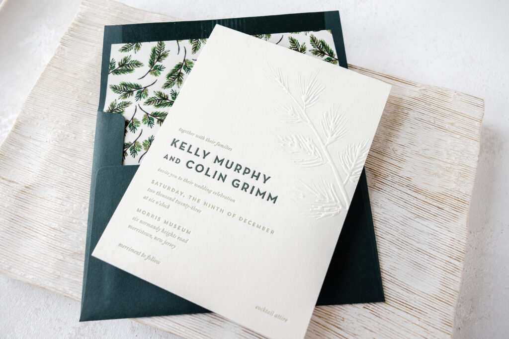
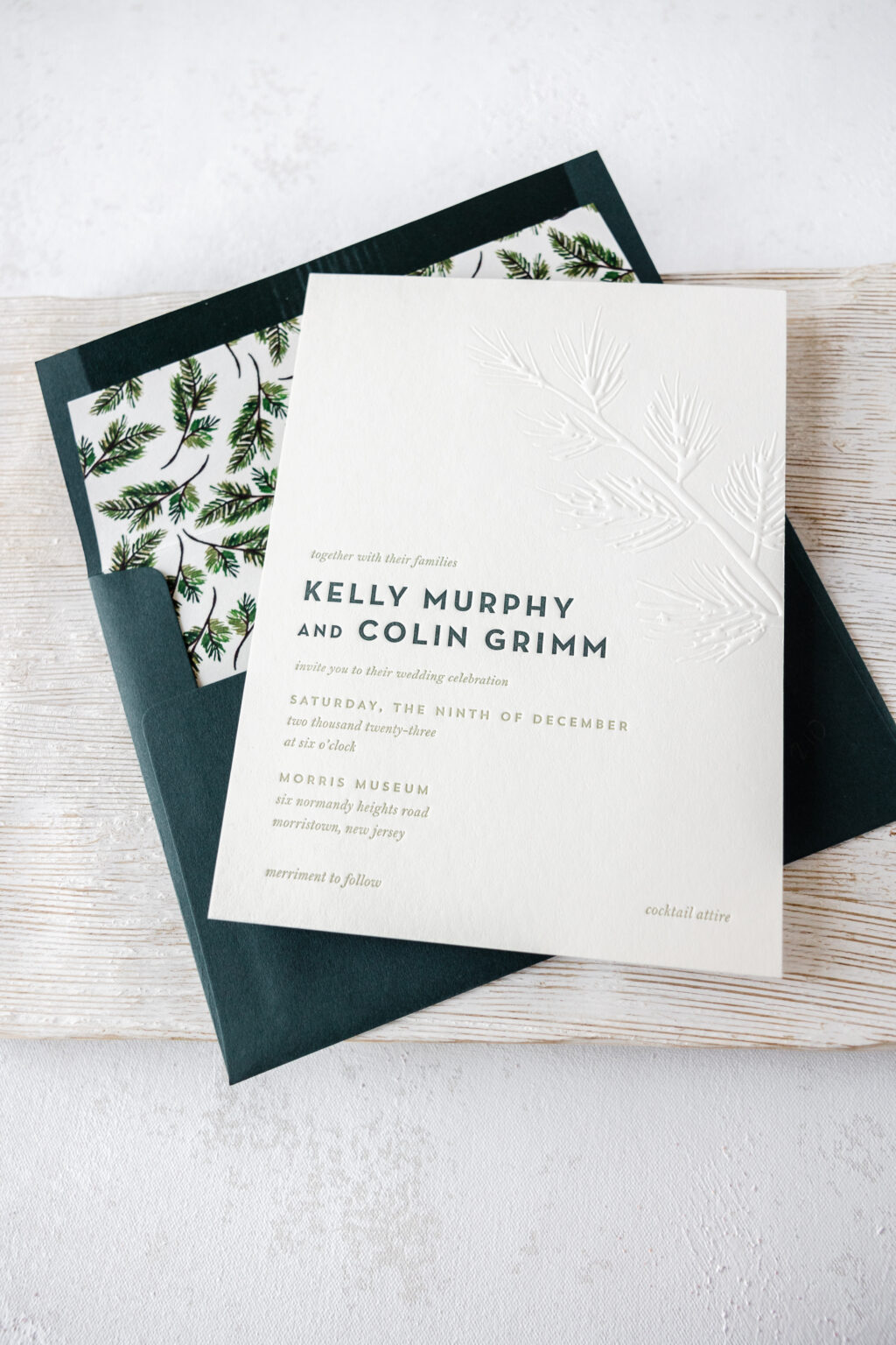
We were thrilled to bring Kelly and Colin’s vision to life for their custom wedding invitations. The wedding was held at the stunning Morris Museum in New Jersey in December. The dreamy blind emboss accents and coordinated custom envelope liner to create something seasonal yet timeless. Get the details of these custom blind emboss wedding invitations.
Invitation
letterpress ink: holly + spruce
emboss: blind
font: neutra text + bell mt + trend sans
paper: bella smooth cotton ivory 2-ply
card size: f-8
liner: vintage custom pattern in cmyk digital on ivory text
envelope: holly text
envelope addressing: white digital on the front and back
job #67210
Belly Band
digital ink: spruce
paper: ivory text
card size: f-8 vertical belly band (1.75 x 13.25 open, 1.75 x 6.24 closed)
finishing: adhere with double-sided adhesive
job #67210
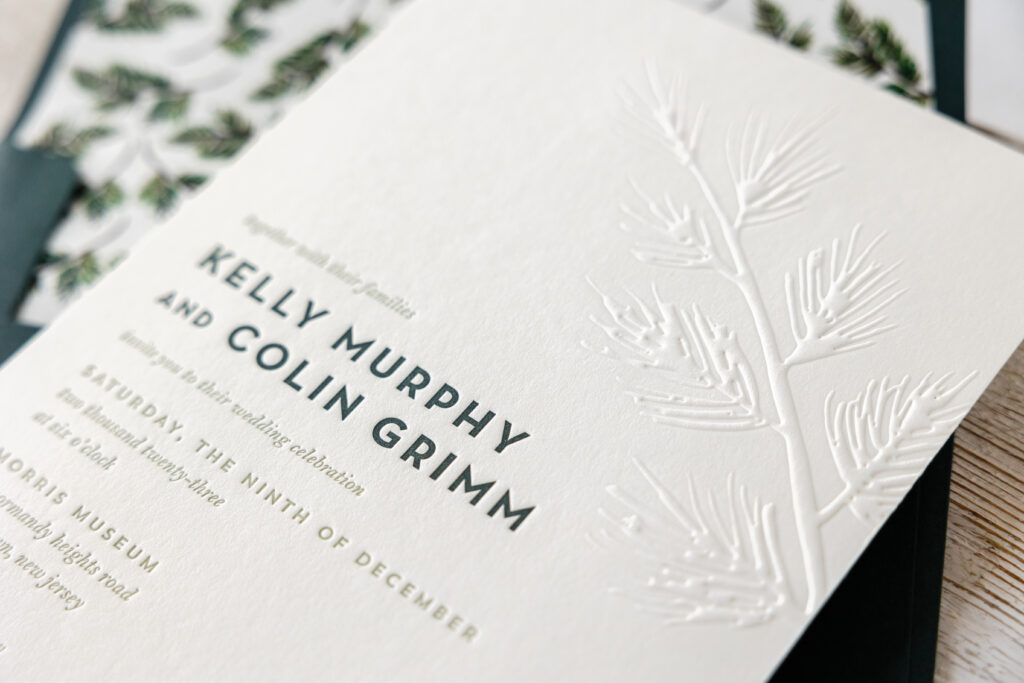
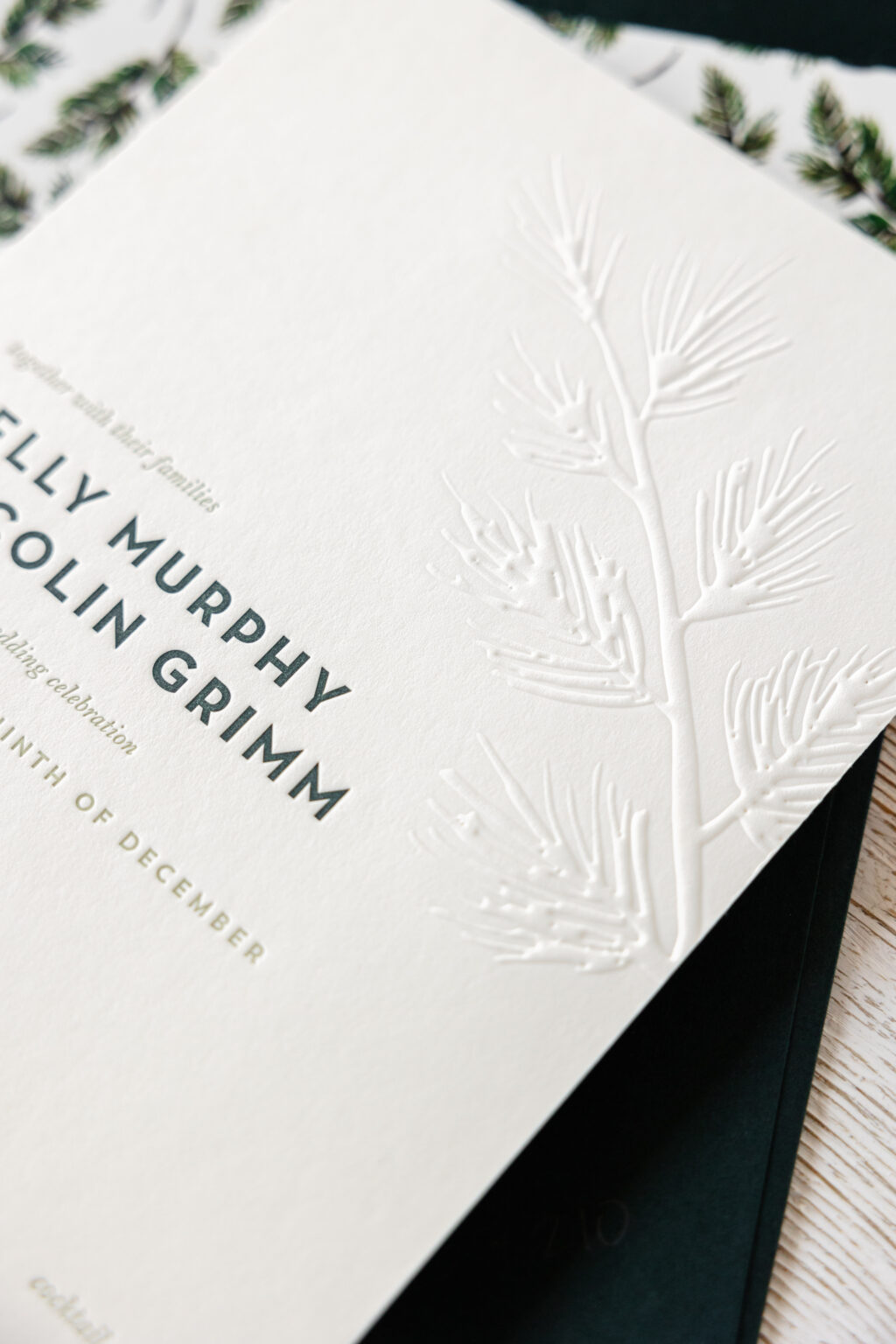
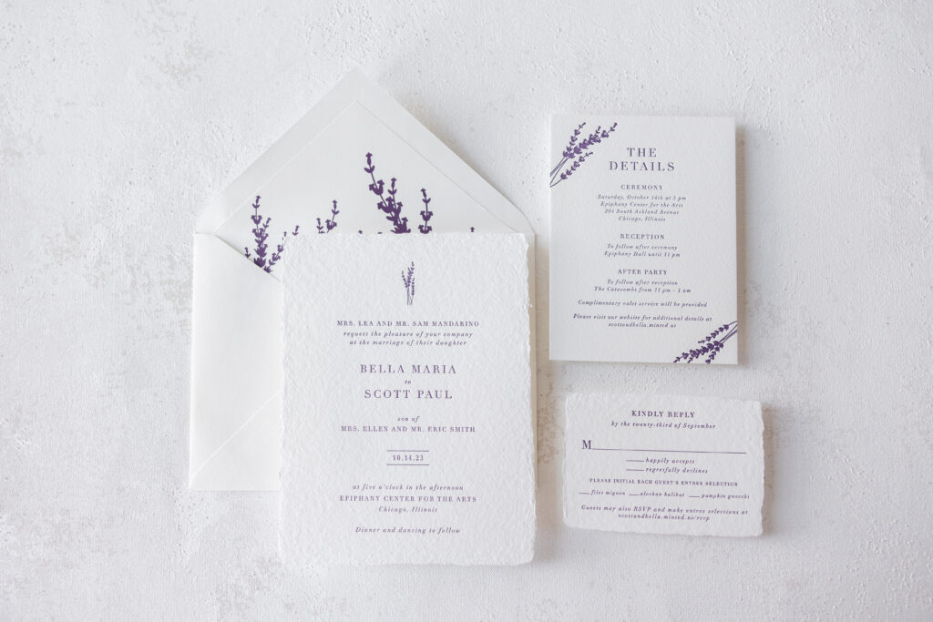
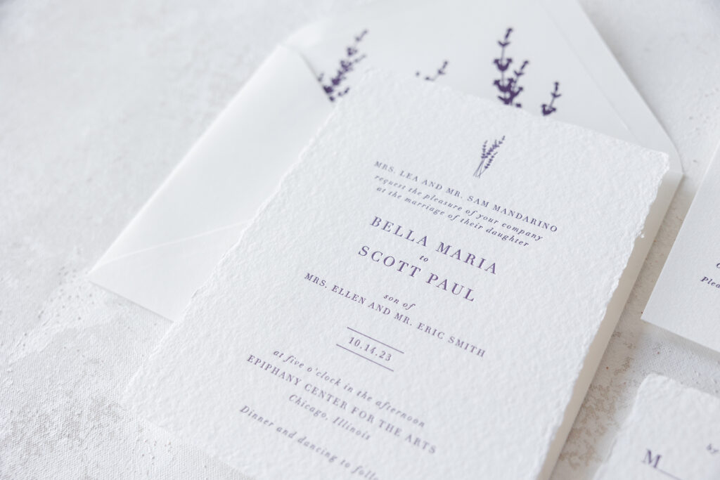
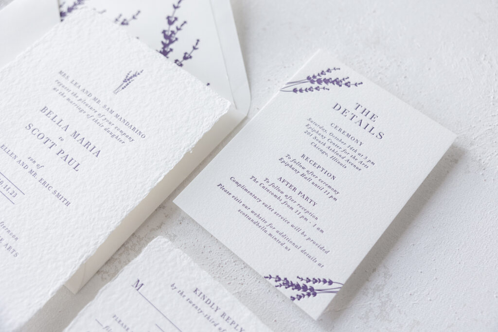
The couple chose our 2-ply smooth cotton paper in ivory. Our smooth cotton paper is made just for us, and it has a smooth surface with a satiny feel. The bride and groom’s names appear in holly letterpress with the remaining text appearing in spruce letterpress. A single pine branch accent appears in blind emboss. Embossing is a printing technique that utilizes heat and pressure to create a raised design. The absence of ink, known as blind emboss, emphasizes the paper, adding a subtle texture.
The pine bough accents are a nod to the season while still maintaining a formal and elegant, yet minimalist design. The pine branch accent is repeated on the custom envelope liner. Featuring a digitally printed pattern for a cohesive look. We offer a wide selection of envelope liner patterns, but we can also create something unique.
Reply Card
letterpress ink: holly + spruce
font: neutra text + bell mt + trend sans
paper: bella smooth cotton ivory 1-ply
card size: a-5
envelope: holly text
envelope addressing: white digital on the front
job #67210
Accommodation Card
letterpress ink: holly + spruce
font: neutra text + bell mt + trend sans
paper: bella smooth cotton ivory 1-ply
card size: a-6
job #67210
We wish the best of luck to Kelly and Colin! Do you have an idea for a custom blind emboss wedding invitation or a one-of-a-kind envelope liner? Contact us to share your design inspiration, and we can help you create something beautiful for your special day!
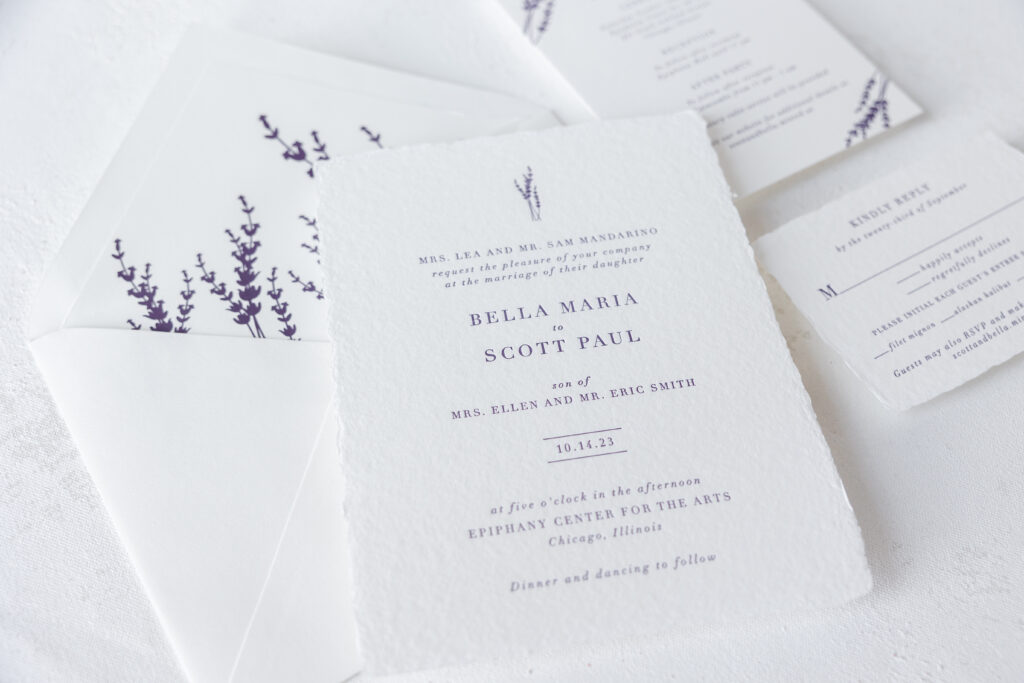
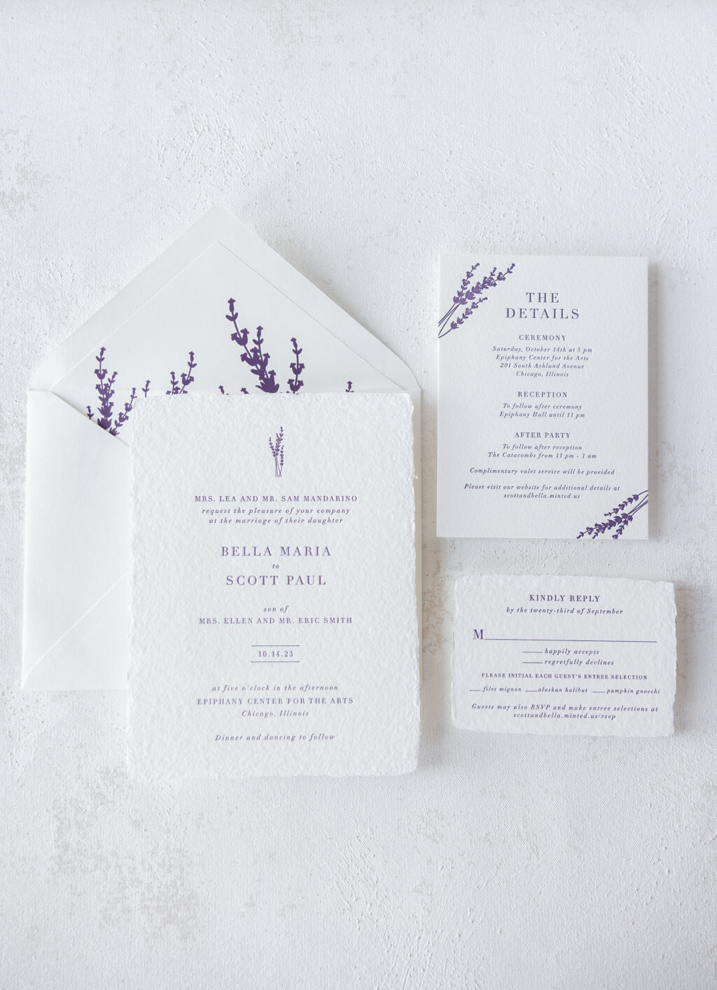
What’s not to love about handmade paper? The feathery edges and gentle texture create a tactile element while still holding a crisp letterpress impression. We were thrilled to help Bella and Scott create their dream letterpress invitation on handmade paper.
This charming invitation is based on our now-retired Novella design. Just a reminder, we no longer maintain samples when a design is retired, but the design and artwork are still available.
Invitation
letterpress ink: plum
font: didot
paper: bella handmade white
card size: f-8 deckle edge
liner: custom pattern in plum digital on white text
envelope: pointed flap white text
envelope addressing: plum digital on the front and back
job #68514
Reply Card
letterpress ink: plum
font: didot
paper: bella handmade white
card size: a-5 deckle edge
envelope: pointed flap white text
envelope addressing: plum digital on the front
job #68514
The floral artwork and handmade paper give off a rustic vibe while still maintaining a subtle refinement. We partner with North America’s preeminent papermaker for our handmade paper, and we could not be happier with the quality of this paper. The invitation and reply card use on our white handmade paper, while the details card is on our cotton 1-ply, also in white. Even though the papers are produced using different techniques at different locations, the color is consistent so that both paper types can be used within the same suite.
Details Card
letterpress ink: plum
font: didot
paper: bella cotton white 1-ply
card size: a-6
job #68514
The floral artwork on the invitation also appears on the details card and became a custom envelope liner. Bella and Scott kept things formal with a pointed flap envelope using white cotton text. We recently added the ability to convert our handmade paper into envelopes for a completely coordinated set.
Bella and Scott’s letterpress invitation on handmade paper is dreamy, and we are so happy for this couple. Are you looking for custom wedding invitations or interested in incorporating handmade paper into your wedding stationery? Reach out, and we can help!
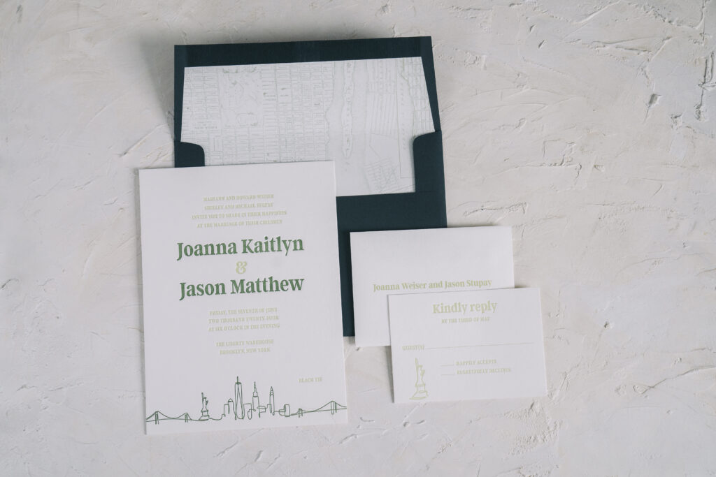
Joanna and Jason’s invitations came to us from our dear friend Donna of Designs by Donna. This customization of our Bright Lights design has a definite New York City vibe. See more and find out how this NYC skyline wedding invitation highlights this couple and the Big Apple.
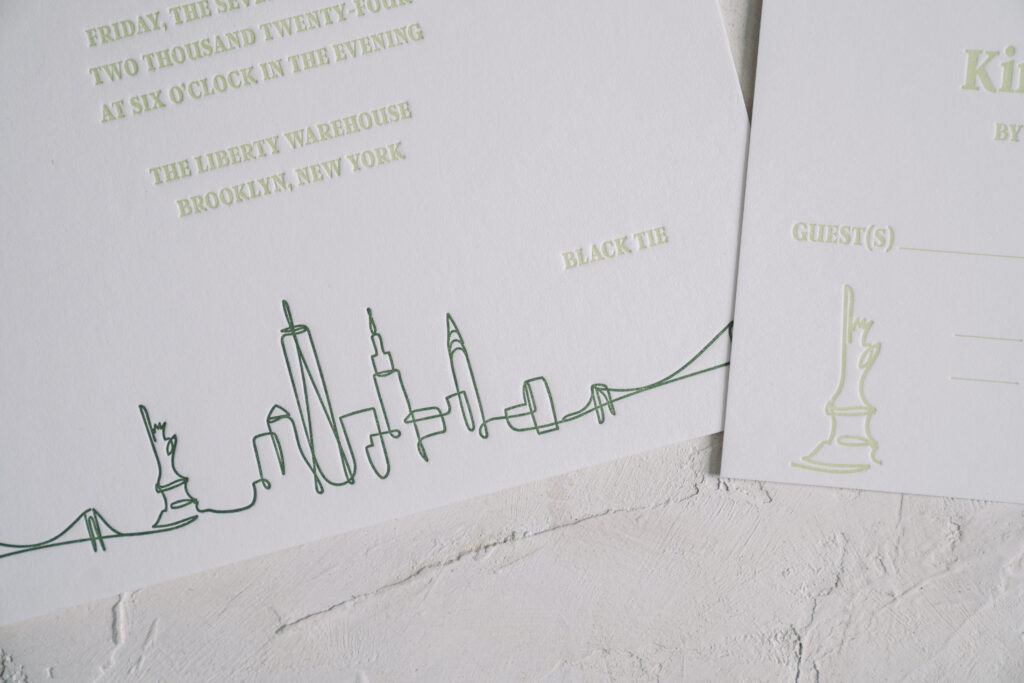
One font is used throughout the design for consistency. The bride and groom’s names appear in vine letterpress ink while the remaining text appears in clover ink. This design choice highlights the bride and groom’s names and coordinates with the artwork at the bottom of the invitation. The NYC skyline appears as a continuous line-inspired artwork in vine letterpress. The artwork stretches completely across the bottom of the invitation. The Statue of Liberty artwork also appears on the reply card, creating a cohesive feel across both printed pieces.
The skyline is a fitting choice for this NYC couple, and it is even more appropriate given that the wedding was held at Liberty Warehouse in Brooklyn. Many of the landmarks noted in the line drawing are visible from the venue location.
Invitation
letterpress ink: clover + vine
font: argent CF
paper: bella smooth cotton white 2-ply
card size: f-8
liner: vintage nyc pattern in acadia digital on white text
envelope: holly text
envelope addressing: white digital on the front and back
job #69445
Reply Card
letterpress ink: clover
font: argent CF
paper: bella smooth cotton white 1-ply
card size: a-5
envelope: white cotton text
envelope addressing: clover digital on the front
job #69445
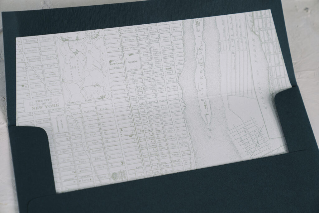
The final nod to NYC can be found on the envelope liner. The liner bears a vintage map of NYC digitally printed in our acadia ink. This NYC skyline wedding invitation is representative of the couple and their love story. Envelope liners are a great way to introduce a personal touch that is meaningful to the couple or relevant to the location.
Work with one of our dealers to create the wedding invitation of your dreams! Our highly talented dealers provide expert guidance to make the entire process easy and ensure your invitations are exactly what you envision.
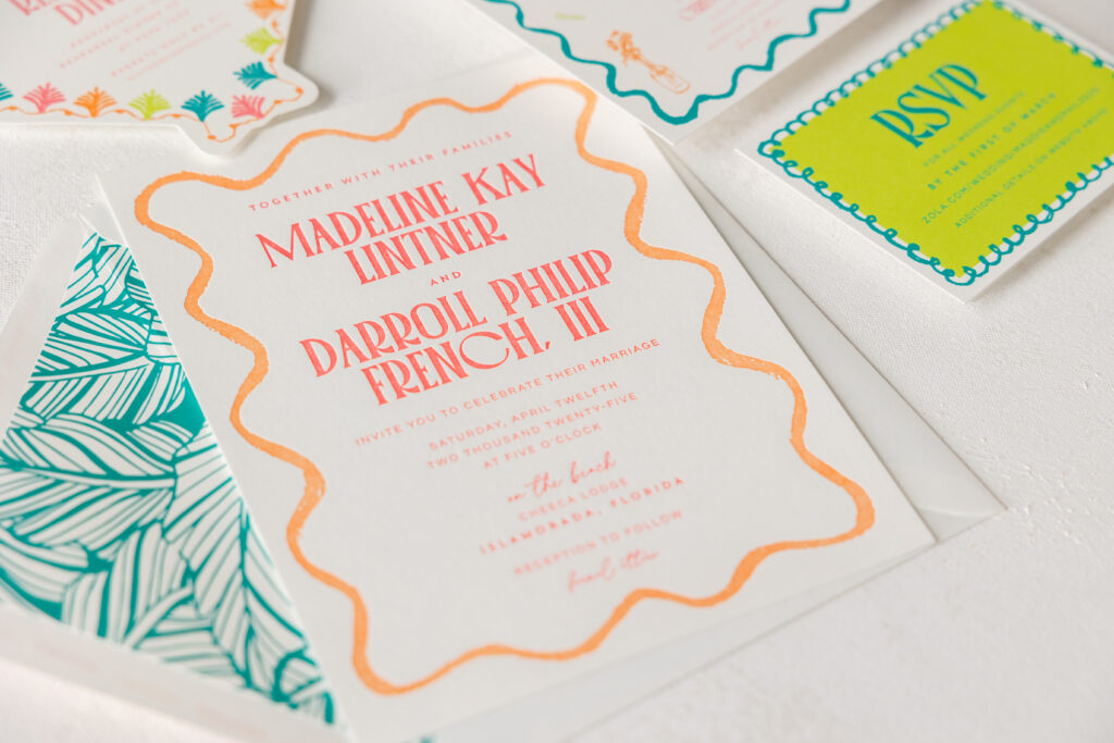
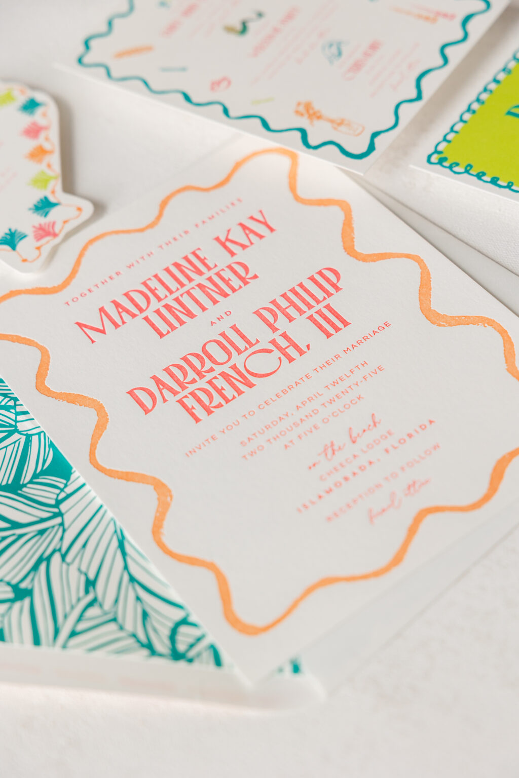
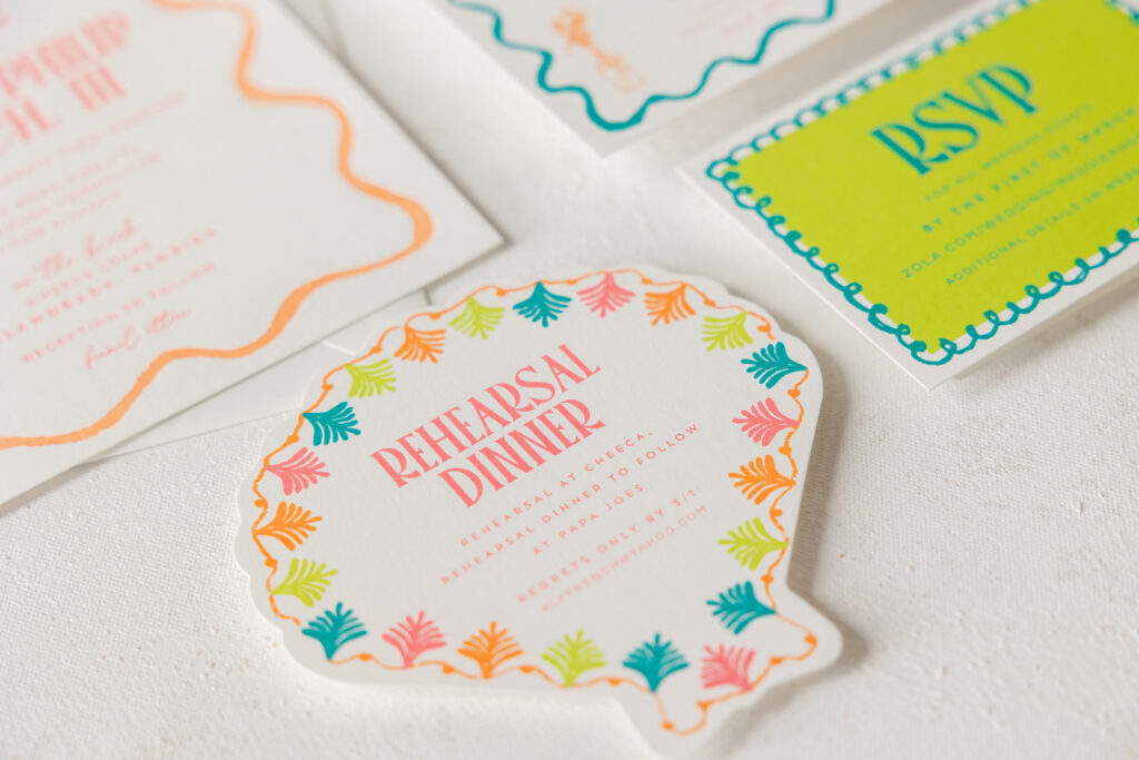
The bold, vibrant colors and fun, tropical look of our Gigi design were an excellent starting point for Madeline and Darroll’s wedding invitations. The festivities were held in the Florida Keys, so the bright colorway coupled with beachy motifs and a clamshell die-cut card set the perfect tone. Our dear friend Kristyn of Oliver’s Twist brought us this lovely tropical letterpress invitation suite.
Invitation
letterpress inks: watermelon + persimmon
font: palmore + questrial + la luxes script
paper: bella smooth cotton white 1-ply
card size: f-8
liner: l’anana pattern in aquamarine digital on white text
envelope: white cotton text pointed flap
envelope addressing: watermelon + persimmon digital on the front and back
job #73386
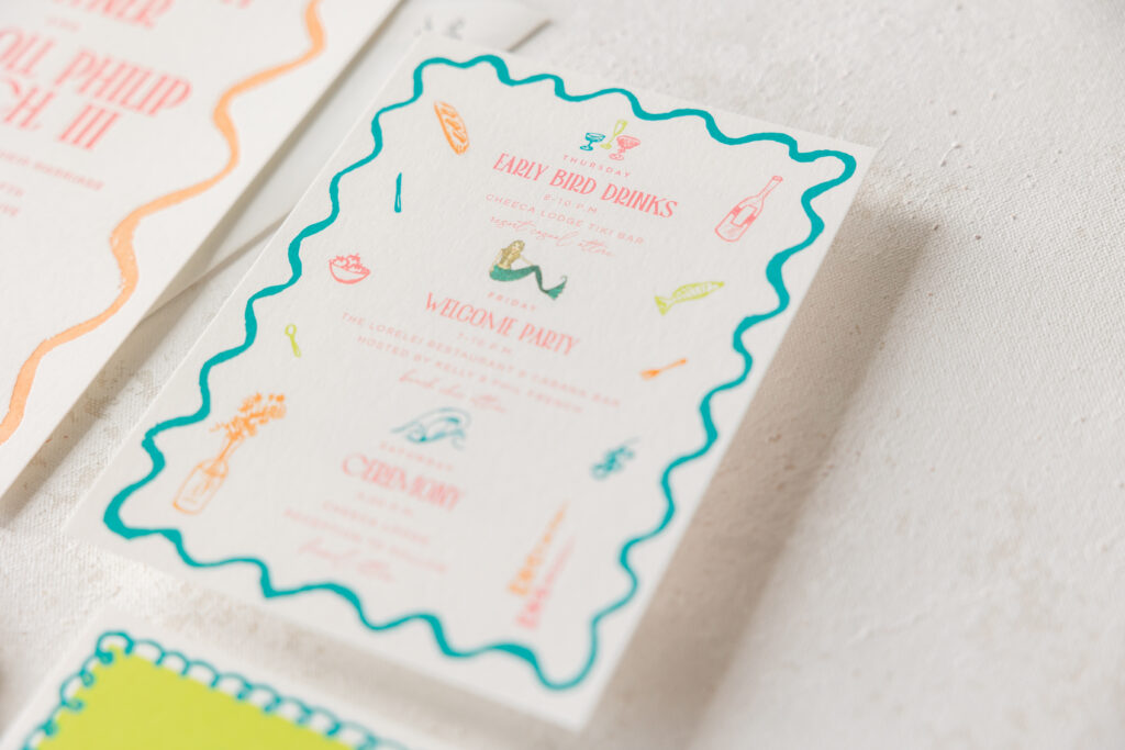
This two-color letterpress invitation features an organic border in persimmon ink that almost looks hand-drawn. Madeline and Darroll chose our l’anana pattern for the envelope liner, which beautifully coordinates with the tropical locale of the ceremony. The same border from the invitation is repeated in digitally printed aquamarine on the whimsical details card. The details card also features a variety of motifs for a fun, personalized, and playful look. The die-cut rehearsal dinner invitation is adorable and perfectly fits the tropical theme.
digital inks: lime-aid + aquamarine + watermelon + persimmon
font: palmore + questrial + la luxes script
paper: bella smooth cotton white 1-ply
die cut shape: cd-341
card size: 5 x 5
job #73386
Reply Card
digital inks: lime-aid + aquamarine
font: palmore + questrial + la luxes script
paper: bella smooth cotton white 1-ply
card size: a-5
job #73386
It was a joy to work on Madeline and Darroll’s tropical letterpress invitation suite, and we always look forward to working with Oliver’s Twist. The right invitations set the tone and get your guests excited for your big day. Find one of our dealers so you can see samples and swatches and get expert guidance to create your perfect invitation!
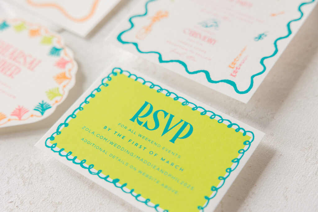
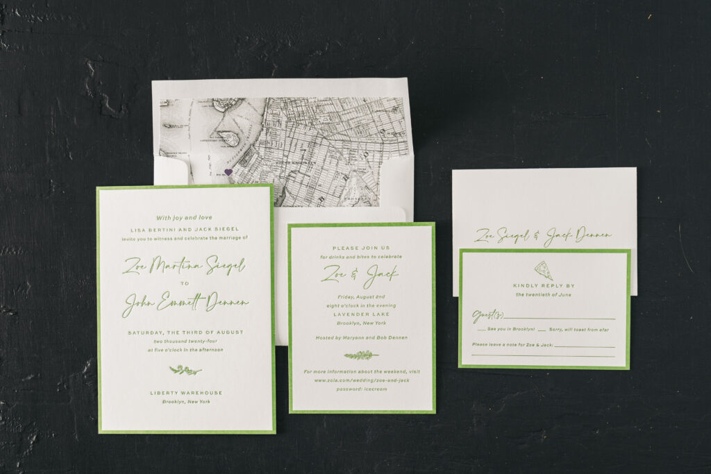
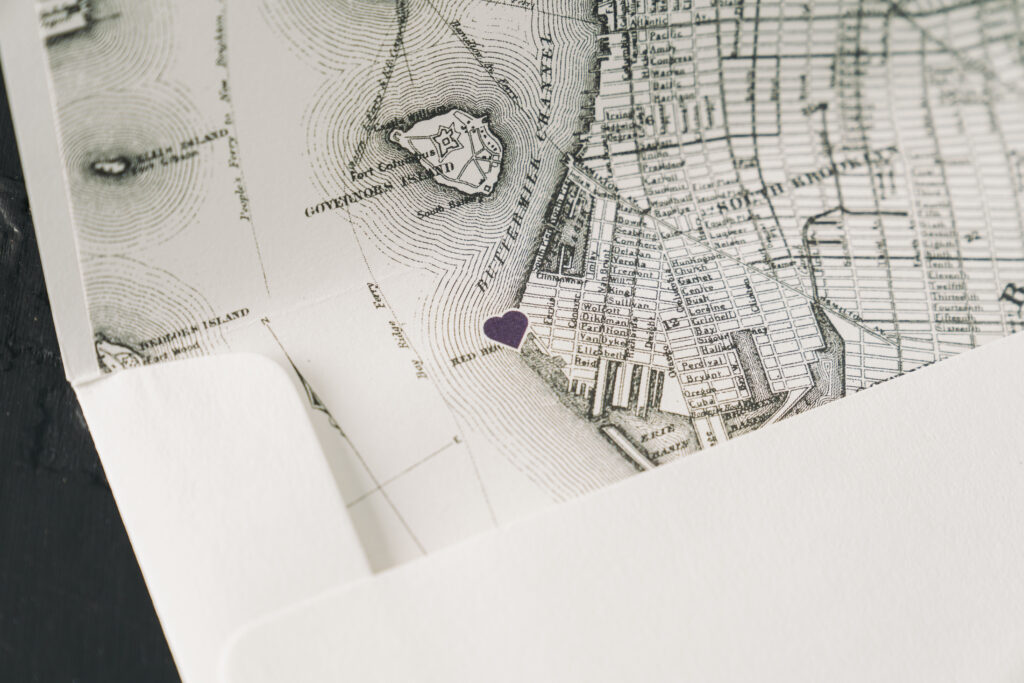
This letterpress wedding invitation suite captures the ambience of a Brooklyn wedding held during the summer. Zoe and John worked with our store, Bella Figura NYC, to create these touchingly personal invitations that include a lovely custom map envelope liner.
At first glance, Zoe and John’s wedding invitation design has a lot in common with Hadaway, the original inspiration design. The overall layout is similar, including the stunning letterpress printed border. The garden letterpress ink is seasonal and lovely. Swapping out the original fonts completely changes the look and feel of the invitation. Using a script font for the bride and groom’s names maintains the formality, while making the invitation more contemporary and modern.
Invitation
letterpress ink: garden
font: calson + slight
paper: bella smooth cotton white 2-ply
card size: a-7
liner: brooklyn 2 pattern in charcoal and regalia digital on white text
envelope: white cotton text
envelope addressing: garden digital on the front and back
job #70313
Reply Card
letterpress ink: garden
font: calson + slight
paper: bella smooth cotton white 1-ply
card size: a-5
envelope: white cotton text
envelope addressing: garden digital on the front
job #70313
Details Card
letterpress ink: garden
font: calson + slight
paper: bella smooth cotton white 1-ply
card size: a-2
job #70313
The couple added a personal touch by adding motifs to each card in the wedding suite. The nature-themed sprigs on the invite and the details card are charming and befitting a summertime affair. The pizza slice motif on the reply card is fun and a nod to the couple and Brooklyn, the location of the nuptials. The wedding locale is further emphasized on the envelope liner. The liner features a digitally printed map of Brooklyn with a heart marking Liberty Warehouse, the location of the wedding.
Are you interested in a custom map envelope liner? Or other ways to incorporate special details into your invitation suite? You can work with our store or one of our dealers to help you create the perfect invitation for your big day.
This invitation seamlessly blends tradition with a contemporary flair, crafting a finished piece that is both elegant and modern. This blind emboss & foil invitation came to us from our dear friend Susie of Pink House Productions.
This customization is an excellent example of just how much you can alter one of our designs to fit your vision. This invitation is based on our Province design. For the customization, the size was changed from an F-8 to a no. 10, and the orientation was flipped from portrait to landscape. The bride and groom’s initials were separated, instead of overlapping, and printed via blind embossing in place of letterpress.
Embossing creates a raised design, which is a tactile element in its own right, but the luxurious texture of our cotton paper further enhances the feel and look. The remaining text appears in gold shine foil, which presses the foil into the paper, creating even more texture and adding an elegant touch to the finished invitation. Gold shine foil also appears in a classic stripe pattern on the envelope liner.
Invitation
foil stamping: gold shine
emboss: blind
font: AW conqueror didot light, caslon 12 twelve OT -AT
paper: bella cotton bright white 2-ply
card size: no. 10
liner: sullivan stripe pattern #16 in gold shine foil on bright white text
envelope: bright white cotton text
envelope addressing: black digital on the front and back
job #70271
This blind emboss & foil invitation sets the tone for a lovely evening to celebrate the couple. Find one of our dealers to create the perfect invitation for your upcoming engagement celebration, rehearsal dinner, wedding, or other special event.
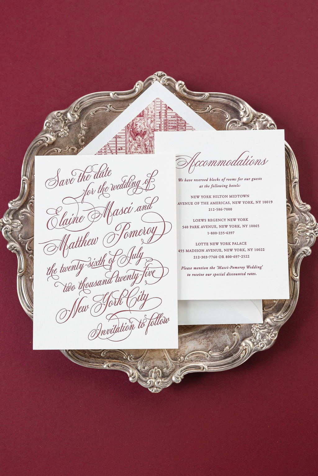
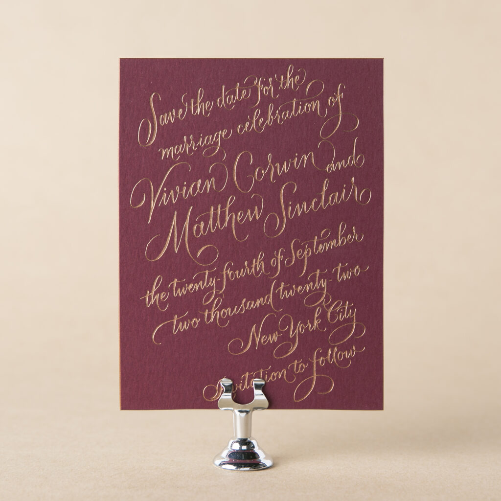
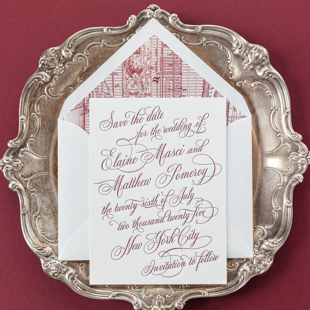
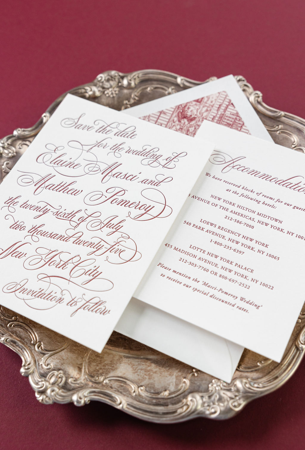
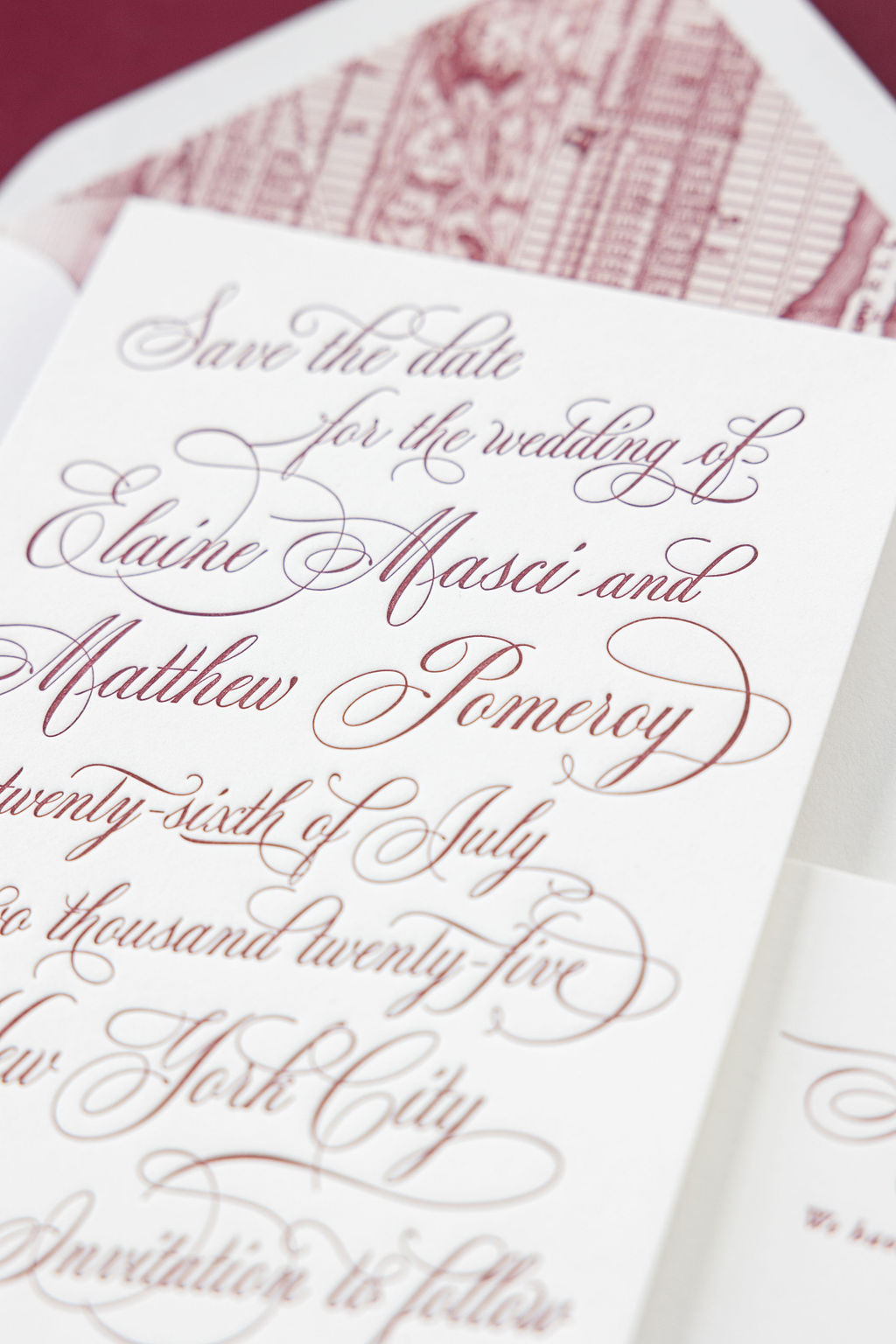
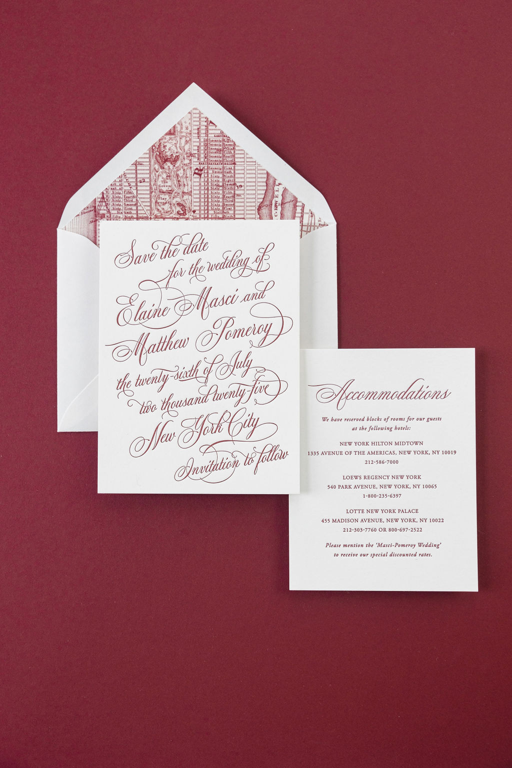
This bold letterpress save the date features an extravagant typography-inspired look. The couple, Elaine and Matthew, were inspired by the Gilded Era grandeur of the Metropolitian Club and worked with our NYC store to create their luxurious save the date and details cards.
The couple chose our now-retired Corwin save the date design. We periodically retire designs, which means we no longer maintain samples. Although you can still select and customize any of our retired designs.
The original design, seen above on the left, features foil stamping on our Bordeaux 2-ply paper. The couple opted to use a letterpress ink color reminiscent of the paper of the original, paired with our Bella smooth cotton white 2-ply stock, as seen above on the right. The contrast between the deep, rich color of the ink and the white paper adds to the design’s intensity, while the thick stock is luxurious and holds a deep letterpress impression, perfectly showcasing the exquisite flourishes of the sweeping script font. The text slightly tips upward across each line, creating a dramatic effect.
Save the Date
letterpress: currant
font: mozart script
paper: bella smooth cotton white 2-ply
card size: a-6
liner: custom map pattern in currant digital on white text
envelope: white cotton text pointed flap
envelope addressing: currant digital on the front and back
job #73830
Details Card
letterpress: currant
font: mozart script, adobe garamond pro regular, italic
paper: bella smooth cotton white 1-ply
card size: a-2
job #73830
The coordinating details card uses the same script font for the heading, but utilizes a serif font for the remaining text. The liner features a vintage map of the Upper East Side of Manhattan, the location of the wedding, which is such a charming detail.
A save the date is the first thing your guests see when it comes to your big day, so choose something that sets the right tone. In this case, the couple chose a simple yet extravagant design. Contact us to design your letterpress save the date!
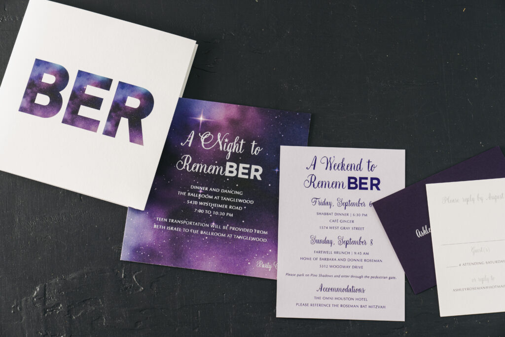
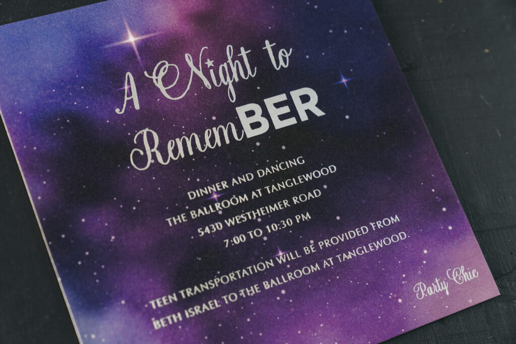
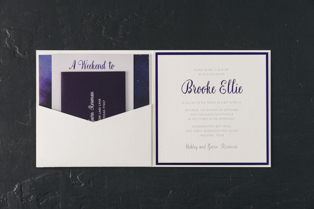
Brooke’s Bat Mitzvah invitation is lovely and formal, while also being fun and whimsical. This cosmic invitation suite design was sent to us by our dear friend, Hollis of Bering’s on Bissonnet in Houston, Texas. This custom design invitation features lots of celestial design elements, personal touches, and a pocketfold.
On the invitation, Brooke’s name and the border appear in purple shine foil while the remaining text appears in prism shine. The glimmer of the foil, particularly the prism shine foil, perfectly complements the cosmic theme.
The night sky artwork of the party card is digitally printed, allowing for stunning colors and a high level of detail. This artwork is also creatively used to fill in the block text on the cover of the pocketfold. Brooke’s initials, BER, are used throughout the suite. Twice, the initials are part of the phrase, ‘A Night to RememBER,’ for a fun and personal touch.
Invitation
foil stamping: purple shine + prism shine
font: natura + optima
paper: bella cotton white 2-ply
card size: 6.32 x 6.32
envelope: white cotton text
envelope addressing: regalia digital on the front and back
finishing: assemble with folded pocket card and back pocket
job #71382
Details Card
foil stamping: purple shine
font: natura + optima
paper: kunzite 1-ply
card size: a-6
job #71382
Folded Pocket Card
digital: cmyk
font: natura + optima
paper: bella smooth cotton white 1-ply
card size: 6.56 x 13.12 flat, 6.56 x 6.56 folded
finishing: assemble with pocket and invite
job #71382
Pocket
paper: bella smooth cotton white 1-ply
card size: sq-7 inner back pocket
die shape: ps-523
finishing: assemble with folded pocket card and invite
job #71382
Party Card
foil stamping: prism shine
digital: cmyk
font: natura + optima
paper: bella smooth cotton white 2-ply
card size: sq-6
job #71382
Reply Card
digital: regalia + fog
font: natura + optima
paper: bella smooth cotton white 1-ply
card size: a-5
envelope: plum text
envelope addressing: white digital on the front
job #71382
The invitation adheres to a pocketfold, and when opened, the remaining cards in the suite are nestled into a pocket on the opposite side of the folder. This sleek presentation is orderly and secures all the cards in place while in transit via mail.
We offer a wide array of Bar and Bat Mitzvah invitations to choose from, or you can create a custom design, as Brooke did, for something truly unique. Work with one of our talented dealers to create your next invitation or announcement!
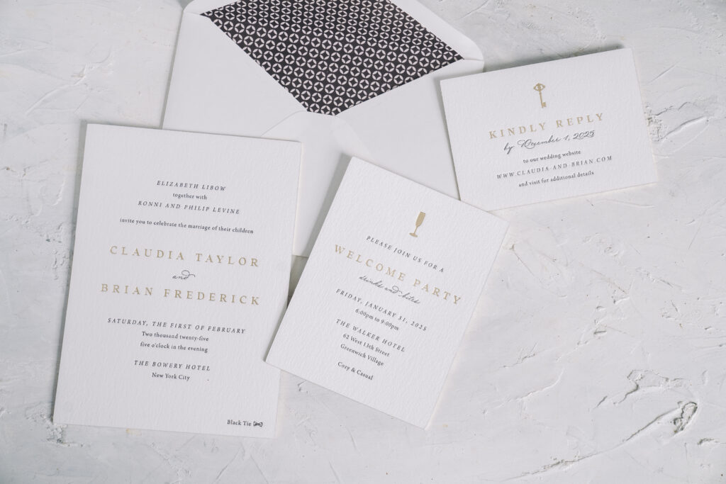
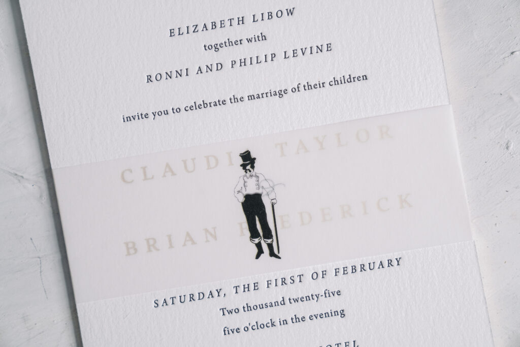
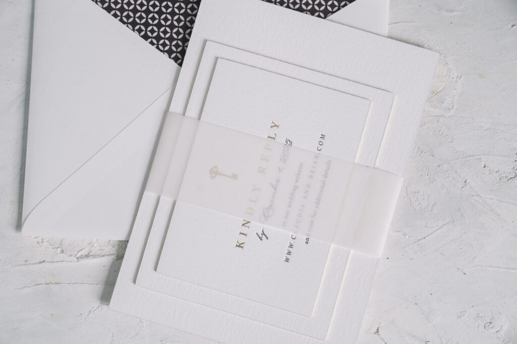
Claudia and Brian worked with our NYC store to create their custom wedding invitation suite. The design is refined and classic, while a belly band with a custom illustration introduces a fun, personal touch.
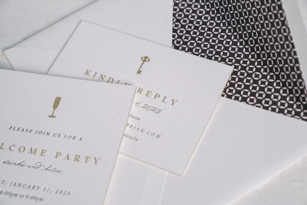
Our 2-ply cotton stock holds a deep impression to showcase the black letterpress printing and champagne matte foil stamping. The foil edge, also in champagne matte, adds an extra glimmer. The envelope liner is a custom pattern in dark gray digital on our ballet text, for a subtle use of color.
The wedding was held at The Bowery Hotel, so what better detail to include than an illustration of the Bowery Boy, the logo of this decadent hotel? The vellum belly band is just large enough to cover the bride and groom’s names when it is on the invitation, although the names are still visible through the 40# vellum. The jaunty Bowery Boy is centered on the belly band and is likely the first detail guests notice when they remove the invitation from the envelope. The belly band is more than a whimsical detail; it’s functional, securing all the cards in the suite and creating a bundle that neatly fits inside the envelope.
Invitation
letterpress: black
foil stamping: champagne matte
font: arno pro + addington CF + madison street pro
paper: bella cotton white 2-ply
card size: a-7
foil edge: champagne matte
liner: custom pattern in dark gray digital on ballet text
envelope: white cotton text pointed flap
envelope addressing: black digital on the front and back
job #73267
Belly Band
digital: black
paper: 40# vellum
size: A-7 vertical belly band (1.75 x 11.25 open, 1.75 x 5.24 closed)
job #73267
Details Card
letterpress: black
foil stamping: champagne matte
font: arno pro + addington CF + madison street pro
paper: bella cotton white 2-ply
card size: a-2
foil edge: champagne matte
job #73267
Reply Card
letterpress: black
foil stamping: champagne matte
font: arno pro + addington CF + madison street pro
paper: bella cotton white 2-ply
card size: a-5
foil edge: champagne matte
job #73267
There are so many ways to incorporate your venue into your wedding stationery, from a custom illustration to a die-cut card. We can help you add fun and personalized details to your invitations that represent you and your partner, or your venue, or whatever else you want to highlight. Reach out to get started designing your custom invitations!
The 2025 Louie Awards were held earlier this week, and we are so proud and happy to announce that one of our designs won! There are many talented designers and printers in this industry, so being named a finalist for a Louie Award is an honor in itself. To take home the top honors is exciting, and it also speaks to the hard work put in by everyone on our team, from design and prepress to production and finishing. We are fortunate to have a talented and skilled group of individuals who work together to create all the beautiful invitations, holiday cards, announcements, social stationery, and more.
This year marked the 36th annual Louies. The Greeting Card Association organizes this honor, which strives to recognize the art and design of stationery that marks life’s milestones.
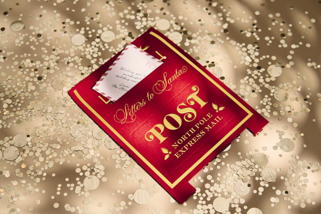
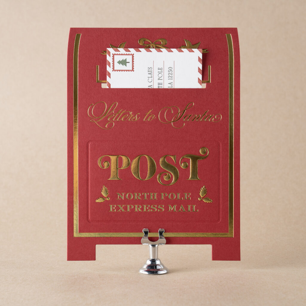
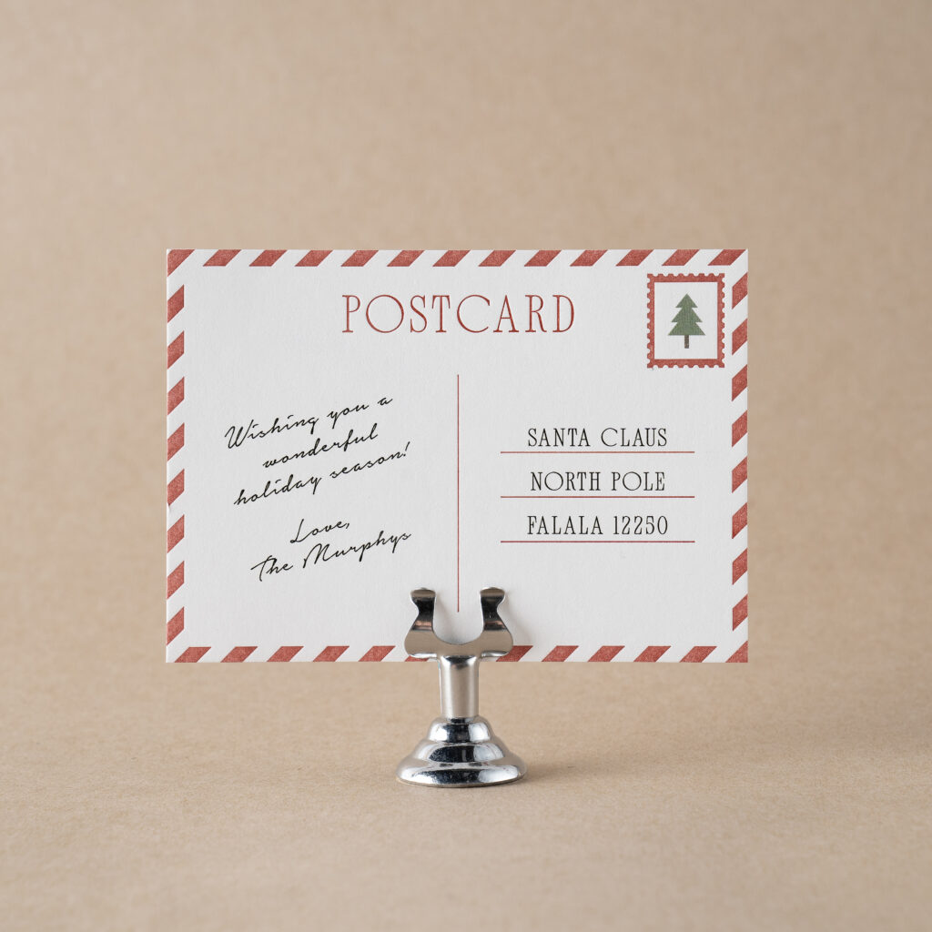
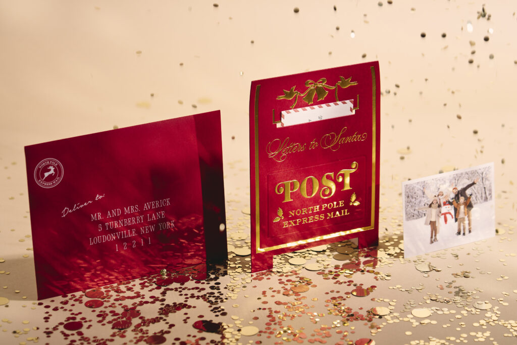
We had a total of three designs that were finalists for the 2025 Louie Awards. Our Murphy design by Meghan O’Brien won in the category of Invitations & Announcements. Murphy is a fun holiday card design that features a postcard that fits inside a larger die-cut card shaped like a mailbox.
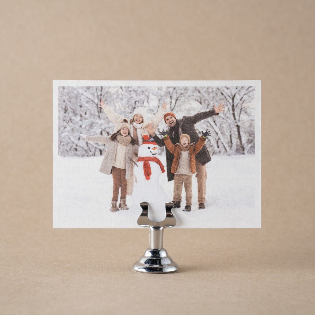
The postcard features ruby letterpress printing on the front, accompanied by a digitally printed message. A family photo adorns the back of the card.
The mailbox die-cut card features both foil stamping and foil embossing in gold shine on our 2-ply Ruby stock. Foil stamping presses the foil into the paper, while foil embossing creates a raised detail, which for this card is also highlighted with gold shine foil. A blind deboss accent creates a border around some of the text, adding even more dimension to the card.
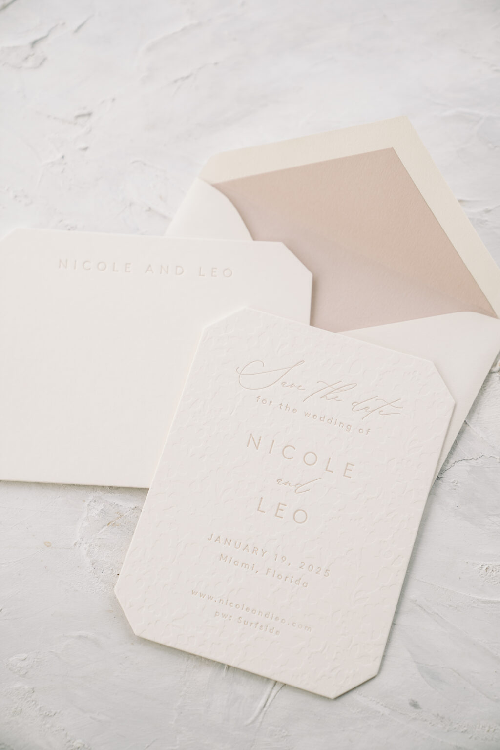
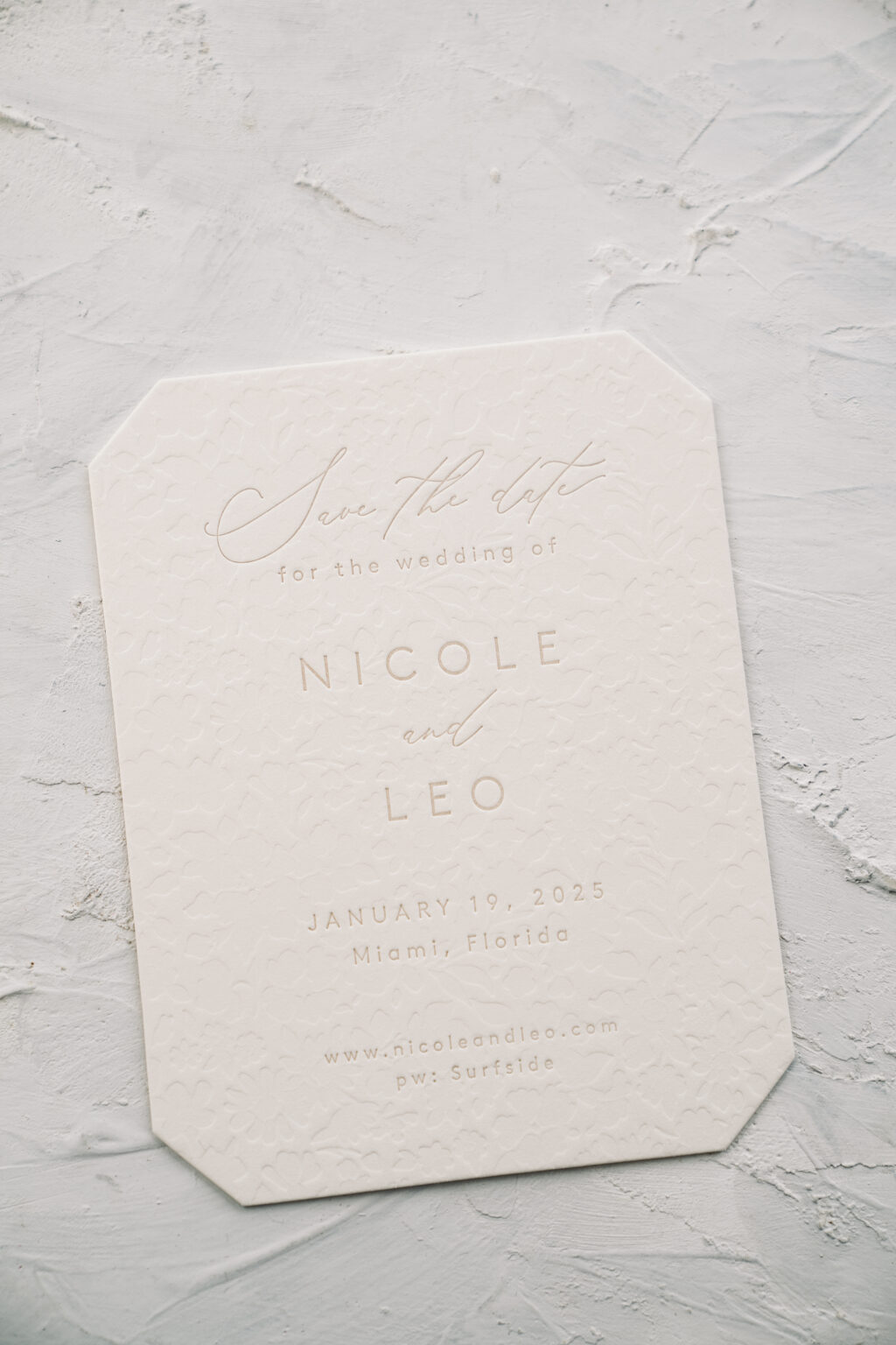
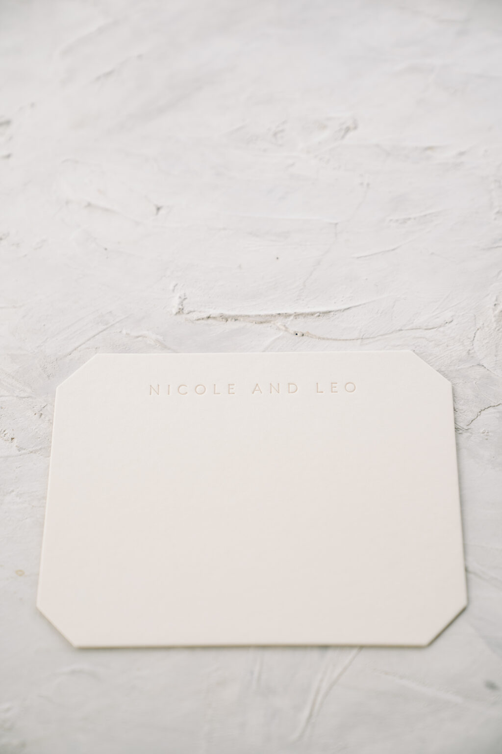
This save the date is elegant and understated, thanks to khaki letterpress and blind deboss accents. The couple, Nicole and Leo, worked with Bella Figura NYC to create not only a lovely save the date but also coordinated social stationery in the form of a flat thank you card.
The design is based on our Lawrence save the date. Nicole and Leo’s interpretation is the same size and die-cut shape. They eliminated the serif font from the original and utilized the script font more. The khaki letterpress on our ivory paper is very subdued, setting a tranquil tone, while the blind deboss pattern printed across the entire card adds a tactile element.
Save the Date
letterpress: khaki
deboss: blind
font: brown + beloved gray
paper: bella smooth cotton ivory 2-ply
card size: a-2
die cut shape: franklin (BF-71)
liner: khaki text
envelope: ivory cotton text pointed flap
envelope addressing: cinder digital on the front and back
job #70833
The couple decided to print coordinating thank you cards at the same time. The thank you card design closely mimics the save the date. The blind deboss pattern appears on the back of the thank you card, maintaining consistency across the pieces while allowing for a smooth surface to write a note. The save the date and flat thank you card are the same size, so one style of envelope works for both.
Flat Thank You Card
letterpress: khaki (front)
deboss: blind (back)
font: brown
paper: bella smooth cotton ivory 2-ply
card size: a-2
die cut shape: franklin (BF-71)
liner: khaki text
envelope: ivory cotton text pointed flap
envelope addressing: cinder digital on the front and back
job #70833
Are you interested in a save the date or in need of social stationery? Contact us to customize one of our existing designs or to create something entirely new and one-of-a-kind.
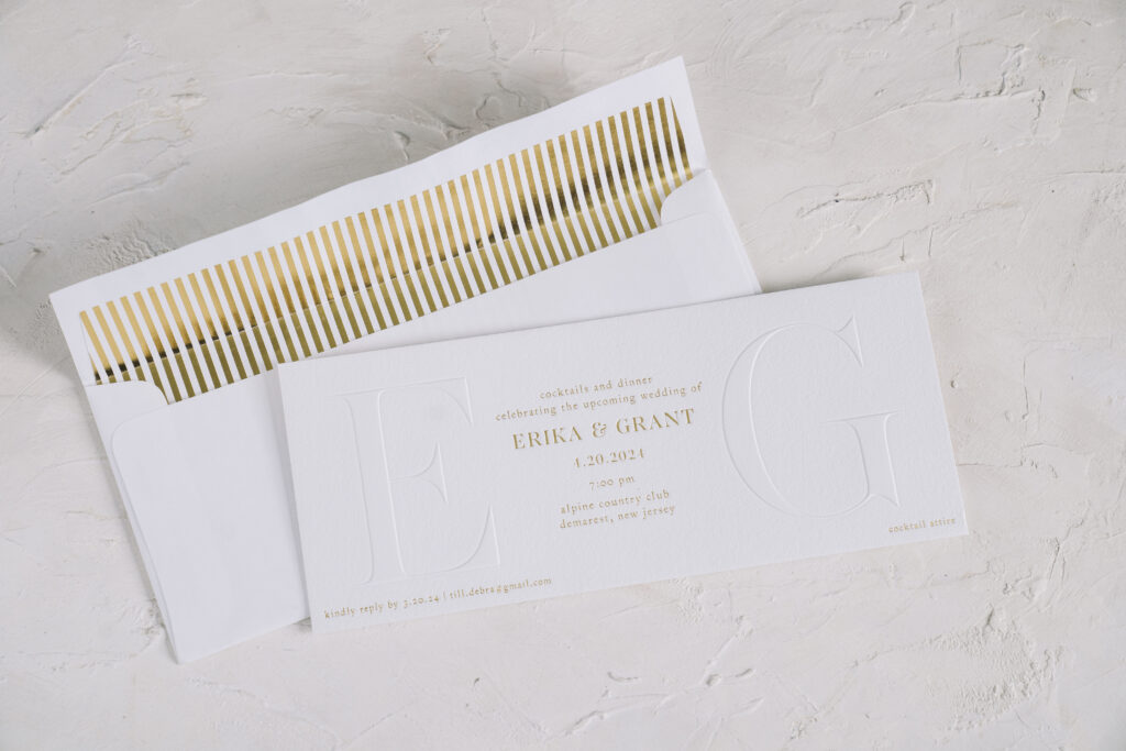
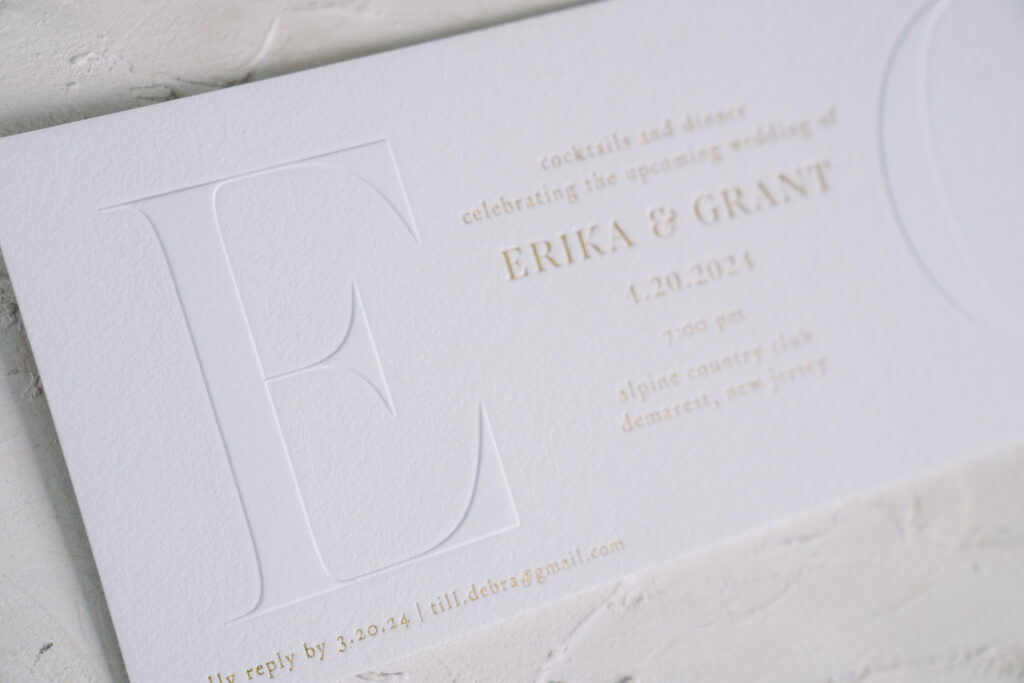
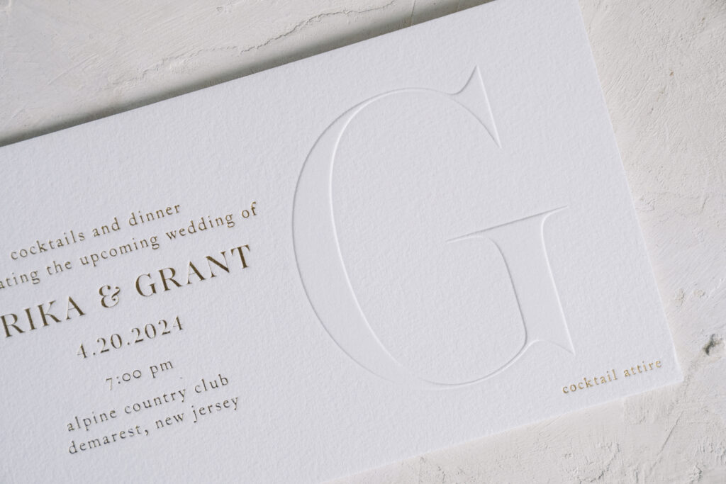
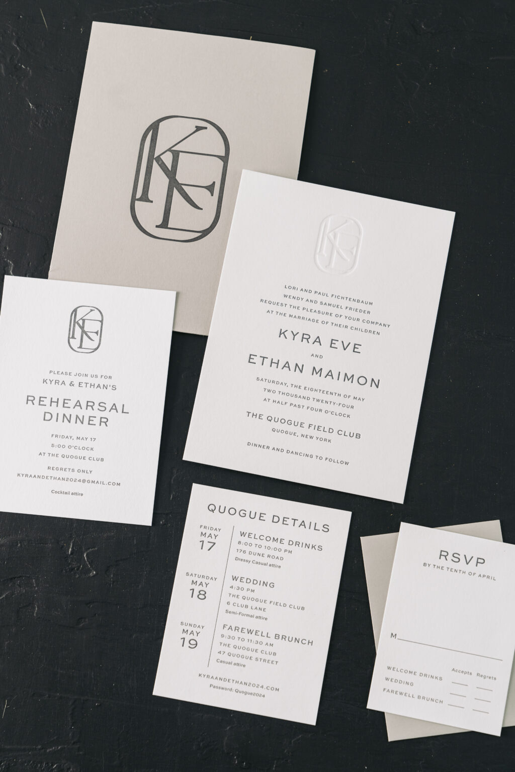
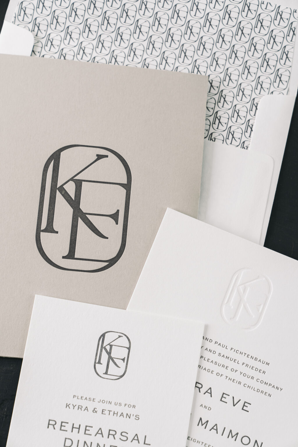
Kyra and Ethan’s wedding invitation suite is peak sophistication, and their custom two-letter monogram completely elevates the look. Our dear friend Laura of Fine Lines of Katonah brought this lovely design to us, and we could not have been happier. Discover all the details and learn what makes this custom monogram wedding invitation suite truly stand out.
Invitation
letterpress: charcoal
deboss: blind
font: sweet sans + la luxes serif (custom monogram)
paper: bella smooth cotton bright white 2-ply
card size: f-8
liner: custom pattern in charcoal digital on bright white text
envelope: bright white cotton text
envelope addressing: charcoal digital on the front and back
job #70585
Details Card
letterpress: charcoal
deboss: blind
font: sweet sans
paper: bella smooth cotton bright white 1-ply
card size: a-2
Kyra and Ethan customized our Giles design, making it entirely their own. The original design has a formal black-tie flair. The customization retains the elegance of the original, but it has a more modern feel. The couple opted to use the same font for all the text, a contemporary sans-serif font. The custom monogram was explicitly designed for this pair. The monogram features a serif font enclosed in an oval border. The minimalist design proves that less is more. The monogram is blind debossed on the invitation and appears letterpress printed on the rehearsal dinner invitation and pocket panel. The custom monogram was also used to create a pattern that appears on the envelope liner.
Pocket Panel
letterpress: charcoal
font: la luxes serif (custom monogram)
paper: light gray 1-ply
die cut: bf-91
size: f-8 square pocket panel (6.19 x 8.31 assembled)
Reply Card
letterpress: charcoal
font: sweet sans
paper: bella smooth cotton bright white 1-ply
card size: a-5
envelope: light gray text
envelope addressing: charcoal digital on the front
Rehearsal Dinner Invitation
letterpress: charcoal
deboss: blind
font: sweet sans + la luxes serif (custom monogram)
paper: bella smooth cotton bright white 1-ply
card size: a-6
The custom monogram elevates this invitation suite, creating consistency across the pieces. Are you interested in a custom monogram or a pocket panel to secure multiple cards? Our dealers are a great resource when it comes to designing your custom invitation suite, and you can see ink and paper swatches to help you visualize everything. Find a dealer near you or contact us to get started.