We are excited to share another regional collection that we created for our friends at Fete Collection. The beautiful city of Boston was the inspiration behind these designs as we created them. We’ll let our designers take it from here to describe more about the invitations below:
Dartmouth
Pulling inspiration from the Boston Public library we wanted a refined literary feel. The suite features illustrations to customize each piece and pay homage to the venue. You’ll find books, the guard lions, and even the icon banker’s lamps that make Dartmouth feel special.
Faneuil
Taking notes from The State Room, Faneuil is bold, modern, and stunning. The most unique piece has to be the pocket to hold the insert cards with the pop of blind embossed initials to customize.
Rowes Wharf
The quintessential Boston suite. Modern New England with a refined touch – look for Fenway Park and four-legged friends on the details card. What’s better than fun personal motifs for your guest to discover? Our Rowes Wharf suite has it all.
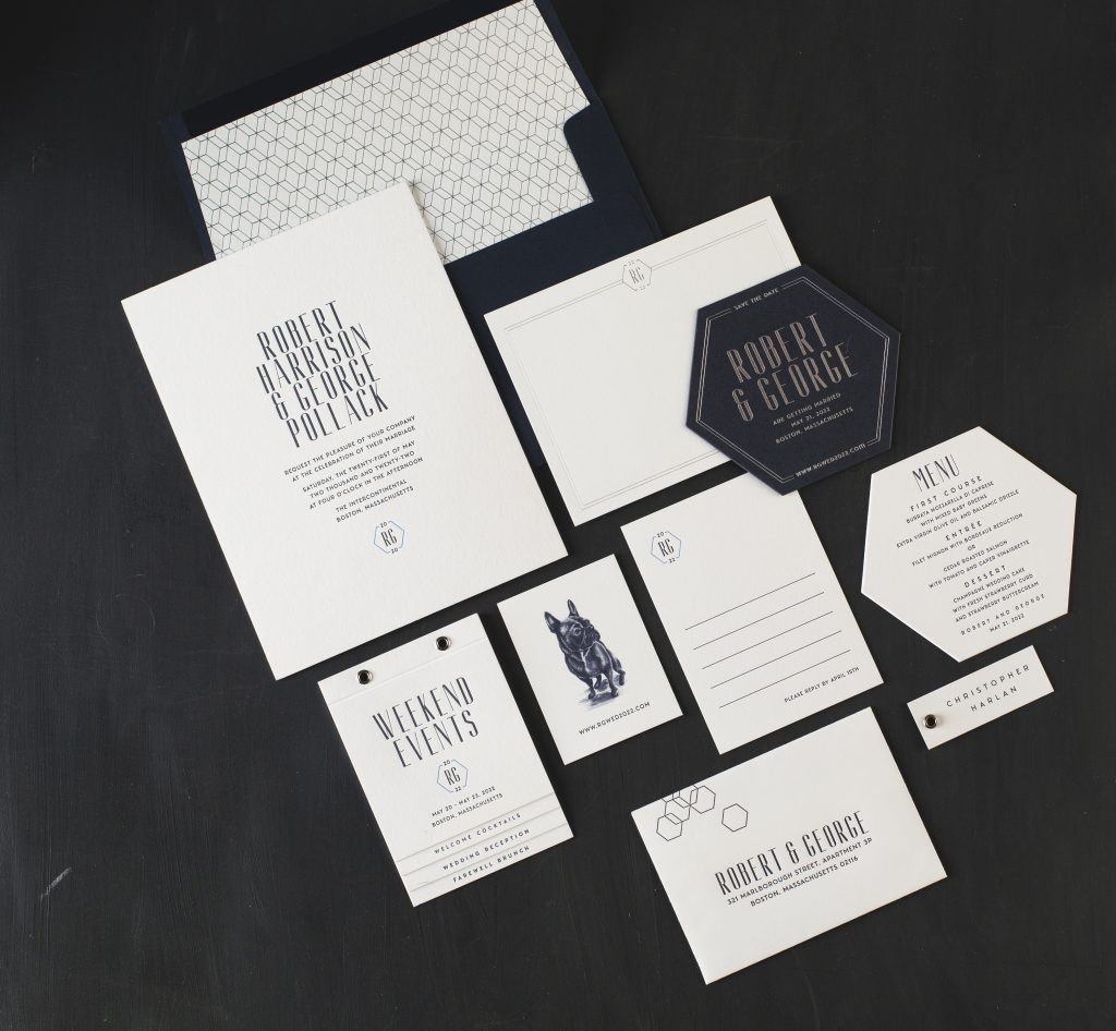
Atlantic
The Atlantic design is as unique and handsome as its muse, The InterContinental Boston. To borrow from this hotel’s striking backdrop of Fort Point Channel and its polished event spaces, we used monochromatic blues, modern fonts, geometric patterns and a sleek hexagon-shaped die-cut. A custom watercolor illustration of this couple’s lovable french bulldog added that oh-so-perfect personal touch to this suite.
Copley
If splendor, elegance and tradition are what you are looking for in a wedding invitation, then the Copley design is for you. We were captivated by the Grand Ballroom of the Fairmont Copley Plaza in Boston. Its exquisite details, including sparkling crystal chandeliers and gilded, thirty-foot ceilings, provided us with endless inspiration for this suite. By using our luxurious handmade paper, gold matte foil accents, silk ribbon and a hand-illustrated monogram fit for royalty, we’ve made this suite simply perfect for anyone’s happily ever after.
Wellesley
Wellesley, Massachusetts is home to the Gardens at Elm Bank – a one-of-a-kind property that includes thirty-six acres of gardens, open fields, and historic structures. The Wellesley design was created with this tranquil location in mind. To keep things soft and sweet, we used muted grays and greens along with simple typography. For a bit of whimsy and romance, we used a beautiful vintage botanical print.
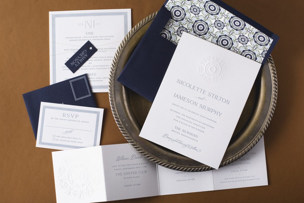
Arlington
Arlington reflects the timeless elegance and chic, fashion forward approach to design that was use used in recently renovating The Newbury Hotel, it’s luxurious inspiration. A sophisticated color palette of neutrals with soft blues and greens and elegant pops of tawny shine foil were brought in from its grand ballroom. And the embossing detail was inspired by the hotel’s magnificent ceiling tiles. All tied together with a liner pattern using both elements to create a one-of-a-kind design.
Boylston
Boylston was designed with the modern sophistication of the Four Seasons hotel in mind. A fall wedding in Boston was ultimately the driving inspiration for the illustrations of the iconic Ducklings, perfect fall foliage views at Boston’s Public Garden and the tawny shine foil to pop against the currant ink and papers.
From weddings to mitzvahs, we always love seeing different kinds of invitations made for a variety of special occasions come through our shop and bridal showers are no exception to that! The host of this particular day, Joan Bergen, worked with Fete Collection to create these romantic letterpress bridal shower invitations for the bride to be. They chose a color palette of Prussian Blue letterpress and Carolina letterpress with our Bella Blue envelopes to match creating an overall sense of monochromatic harmony. Our popular Sophia script font made sure the bride to be’s name stood out from everything else while hydrangeas printed in Carolina gave this sweet invitation an added touch of romance.
When looking for traditional invitations that will reflect the elegance and formality of your wedding, look no further than calligrapher Sarah Hanna. Joanne and William worked with our friends at Fete Collection to customized Sarah’s Napa design for their recent Massachusetts wedding and the end result is a picture of stationery perfection. Their hand calligraphy wedding invitations were letterpress printed in prussian blue on our ultra thick ivory smooth cotton paper and paired with a solid gold liner and bella blue reply envelopes for a touch of modern flair.
“We are over the moon and honored to win the Best of Boston Weddings award for Best Stationery this year! (and for the second year-in-a-row!),” says owner Julie Pike. “We are thrilled to be selected along with some of our amazing creative colleagues who make this work such a blast. We consider ourselves so lucky to be in this industry of many strong local entrepreneurs who kill it every day, 8 days a week, in the pursuit of creative freedom and work that inspires. And we are blessed to have amazing clients who trust us so wholeheartedly with their love stories and setting the tone for their special day.”
Congratulations to Fete Collection on receiving this prestigious award!
Pictured above is our Alchemy design by Jessica Downs, shown foil stamped in maple shine.
With help from our friends at Rugg Road Paper Company, Lauren and Bradley customized our Jorie design for their wedding at The Addison. They chose a palette of taupe letterpress ink and bronze shine foil and accented the sketched floral artwork with blind deboss printing. A metallic copper envelope liner added an additional hint of elegance to their formal, pointed-flap envelope.
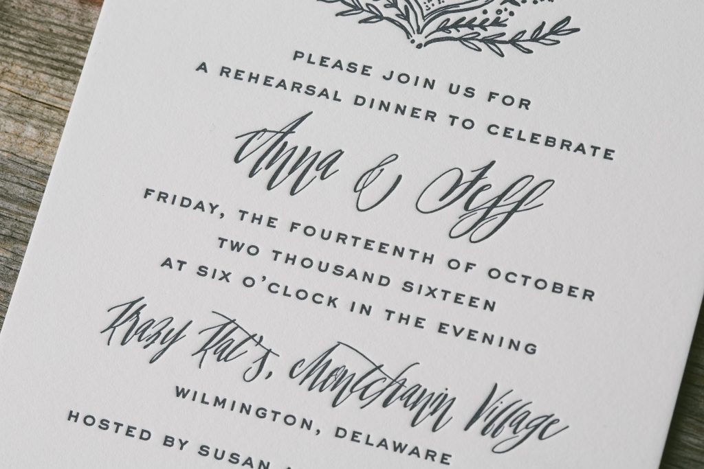
Anna and Jeff worked with our friends at Fete Collection to customize our Ophelia design for their rustic rehearsal dinner invitations. The hand illustrated crest and patterned envelope liner complimented the whimsical decor of their venue.
letterpress ink: prussian blue | fonts: sans capital + revival | paper: bella smooth cotton white 2-ply | envelope: bella cotton white | liner: drake pattern in prussian blue | Fete Collection | customization #34199