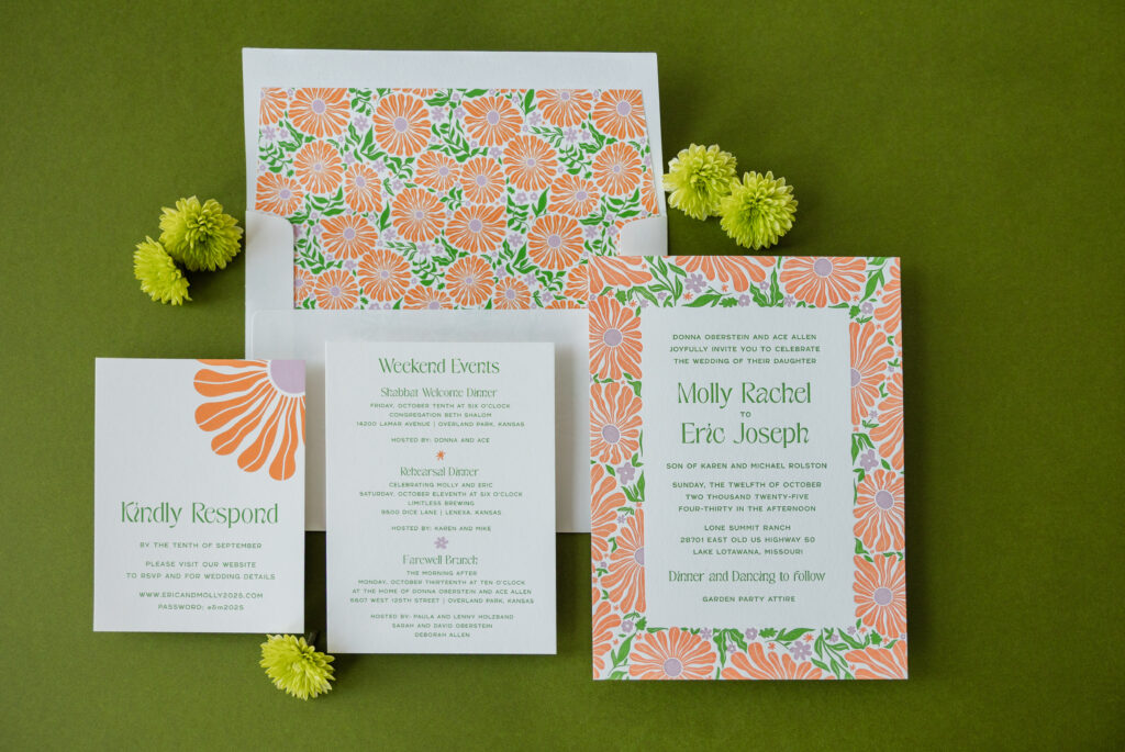
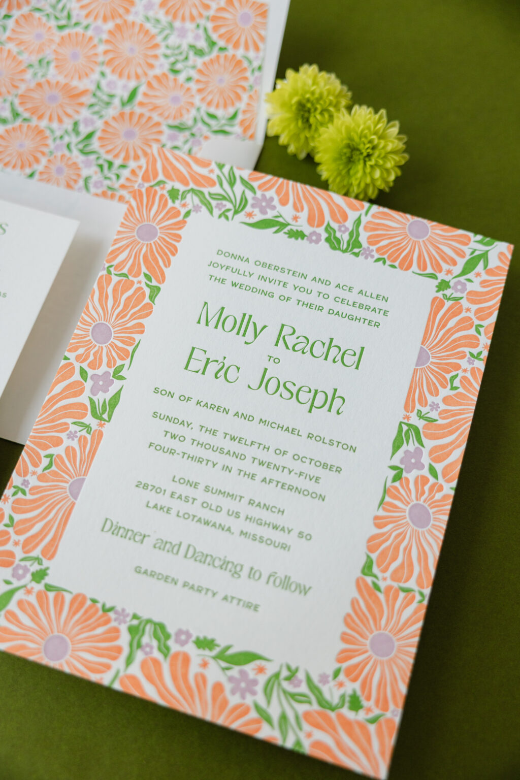
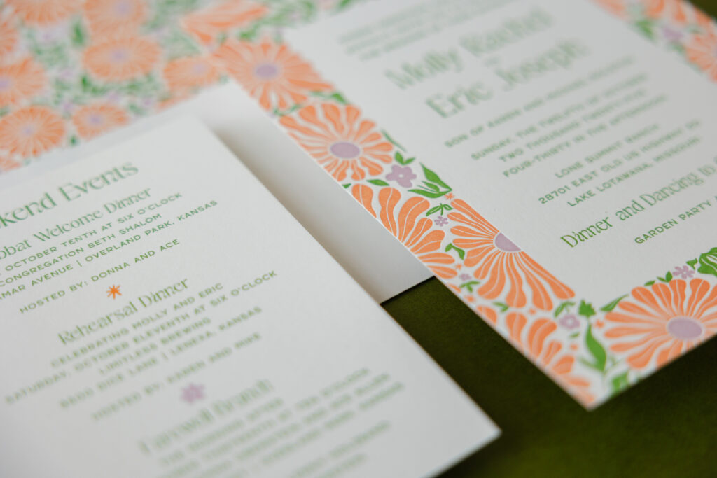
A striking color palette, plenty of vintage-inspired floral artwork, and expert printing had us obsessing over Molly and Eric’s wedding stationery. This couple worked with our dear friend Susie of First Impression to customize our Cyrus design, and we are so happy they did. Their playful botanical wedding invitations are cheerful, sophisticated, and full of personality.
Invitation
letterpress inks: garden + petal + persimmon
paper: bella smooth cotton 1-ply white
card size: f-8
envelope liner: cyrus pattern in garden + petal + persimmon digital on white text
envelope addressing: garden digital on the front / garden + petal + persimmon digital on the back
job #: 77824
Details Card
digital inks: garden + petal + persimmon
paper: bella smooth cotton 1-ply white
card size: a-6
job #: 77824
Reply Card
digital inks: garden + petal + persimmon
paper: bella smooth cotton 1-ply white
card size: a-2
job #: 77824
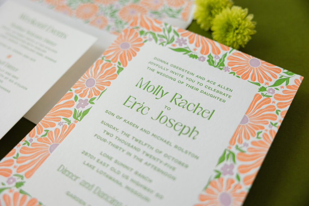
The whimsical daisy-like botanical pattern is absolutely eye-catching. The vibrant color choice of garden, petal, and persimmon ink only makes it more so. Each letterpress color requires its own press run, and the tight registration, or the spacing between the flowers and foliage in the pattern, showcases the skill of our press operators while also making the pattern almost jump off the card.
The floral border is exuberant, while the typography is restrained and spacious, creating a nice balance between maximalist pattern and minimalist composition. The floral arrangement is reminiscent of a vintage textile, especially when paired with the Art Nouveau-inspired font used for the couple’s names.
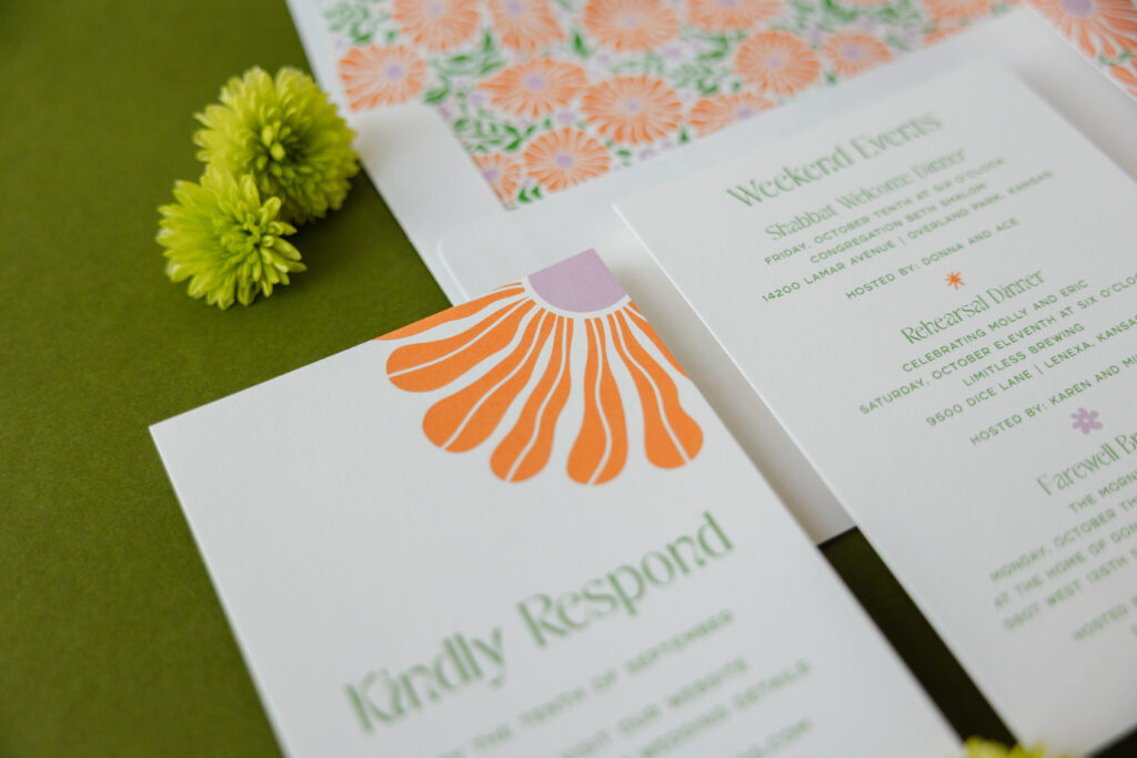
The details and reply cards feature much more subtle floral artwork, so they stay consistent with the look without competing with the invitation. Both of these cards are digitally printed. Although they use a different printing method, they still color-match the letterpress inks on the invitation.
Are you dreaming of an energetic color combination, a vintage-inspired pattern, or do you love the idea of invitations that feel festive, sociable, and welcoming? Work with one of our dealers to create your playful botanical wedding invitations.
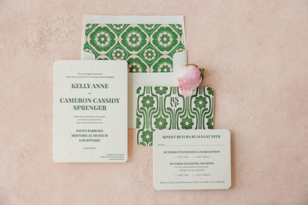
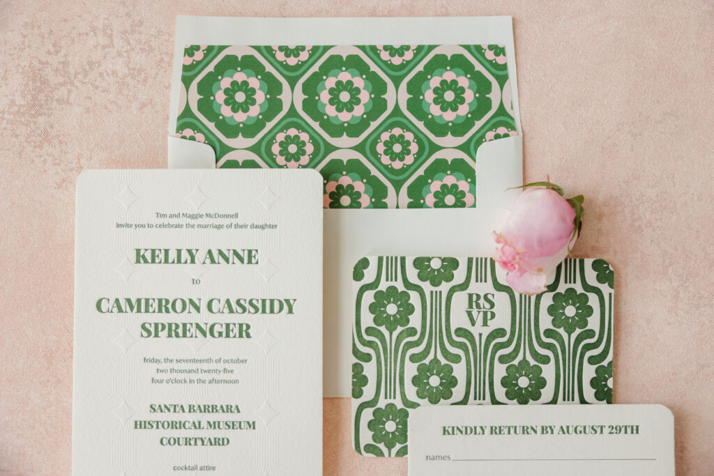
Kelly and Cameron’s Mid-Century Modern wedding invitations are a vibe. Bold fonts and vibrant geometric patterns with a botanical influence establish the aesthetic and set the tone for the event. This invitation suite, inspired by our Midge design, does a fabulous job of feeling simultaneously vintage and current. The couple worked with our dear friends Allison and Sara of Salutations Home to create their retro botanical invitations.
Invitation
letterpress ink: vine
emboss: blind
fonts: playfair display black + ivy mode regular
paper: bella cotton 2-ply ivory
card size: a-7
finishing: corner rounding
envelope liner: midge pattern in blush + vine + verdigris + cherry blossom digital on ivory text
envelope: ivory cotton text
envelope addressing: vine digital on the front and the back
job #: 77924
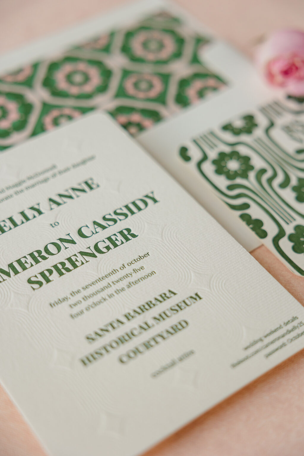
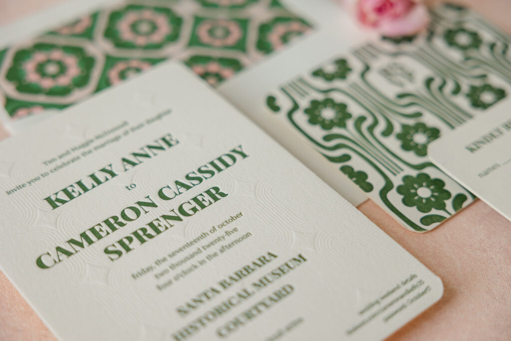
The invitation blends nostalgic Mid-Century patterns with refined, contemporary typography to create a wedding invitation that feels effortlessly chic. The blind-embossed pattern on the invitation is a lovely detail that maintains the aesthetic and accentuates the soft texture of our 2-ply cotton paper. Blind emboss creates a raised design on the paper without ink, so you get subtle dimension without color. Letterpress printing, meanwhile, presses into the paper. The text is letterpress printed over the pattern in our vine ink, adding even more of a tactile element.
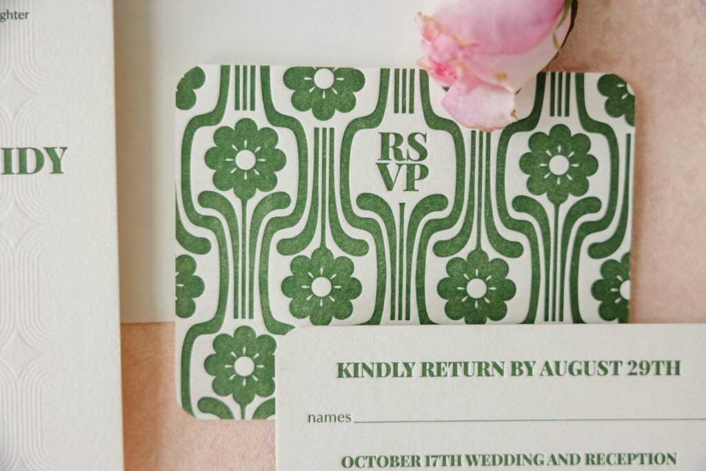
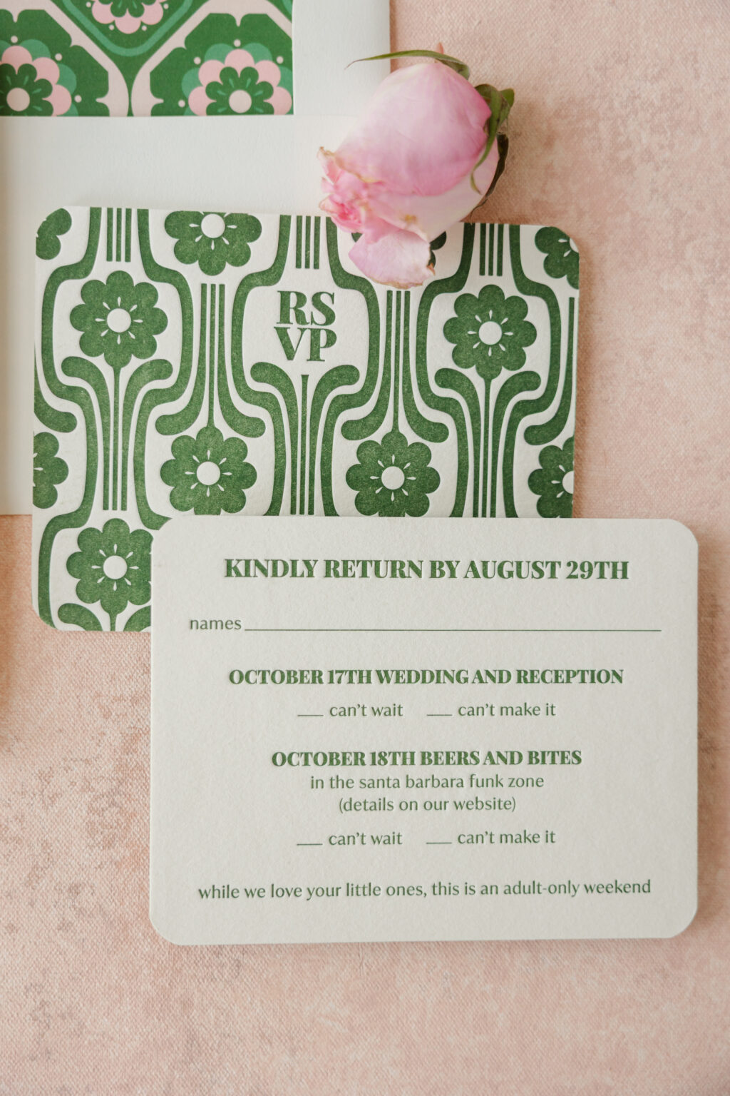
The back of the reply card features a fun geometric floral pattern in the same green hue. A more elaborate take on the floral pattern appears on the envelope liner. This version features varying shades of greens and pinks and evokes vintage tiles.
Reply Card
letterpress inks: vine (front) / vine (back)
fonts: playfair display black + ivy mode regular
paper: bella cotton 2-ply ivory
card size: a-2
finishing: corner rounding
envelope: ivory cotton text
envelope addressing: vine digital on the front
job #: 77924
The look is warm, welcoming, and bursting with personality. Do you love vintage design or bold patterns? Do you want your wedding stationery to be creative, memorable, and timeless? Whether you want retro botanical invitations or something that speaks to your style, work with one of our dealers to create your perfect wedding stationery.
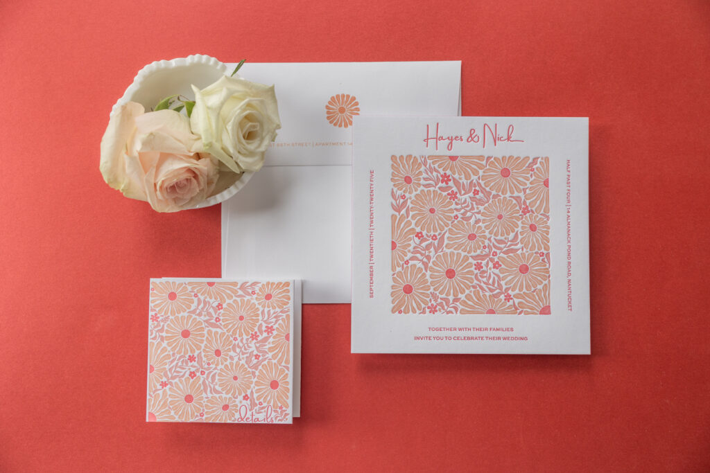
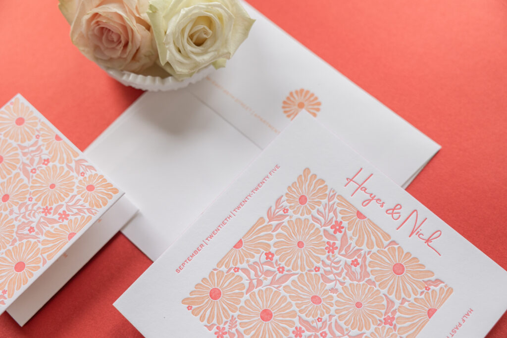
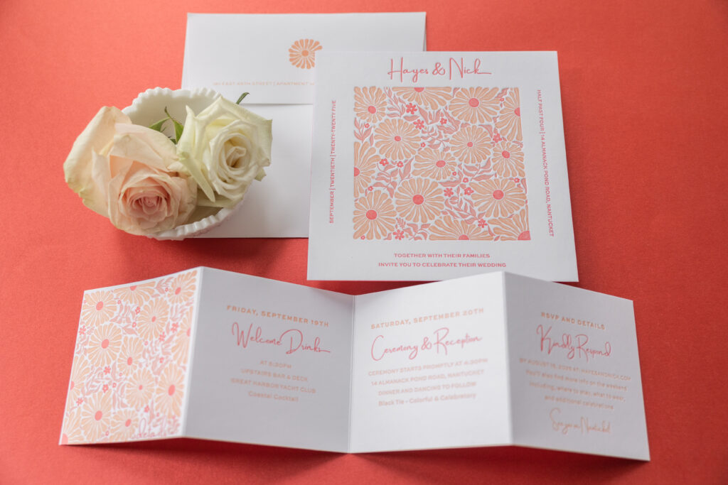
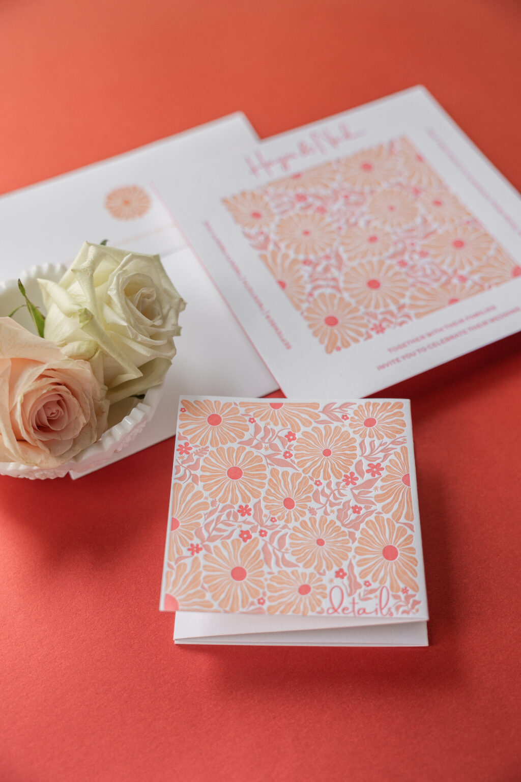
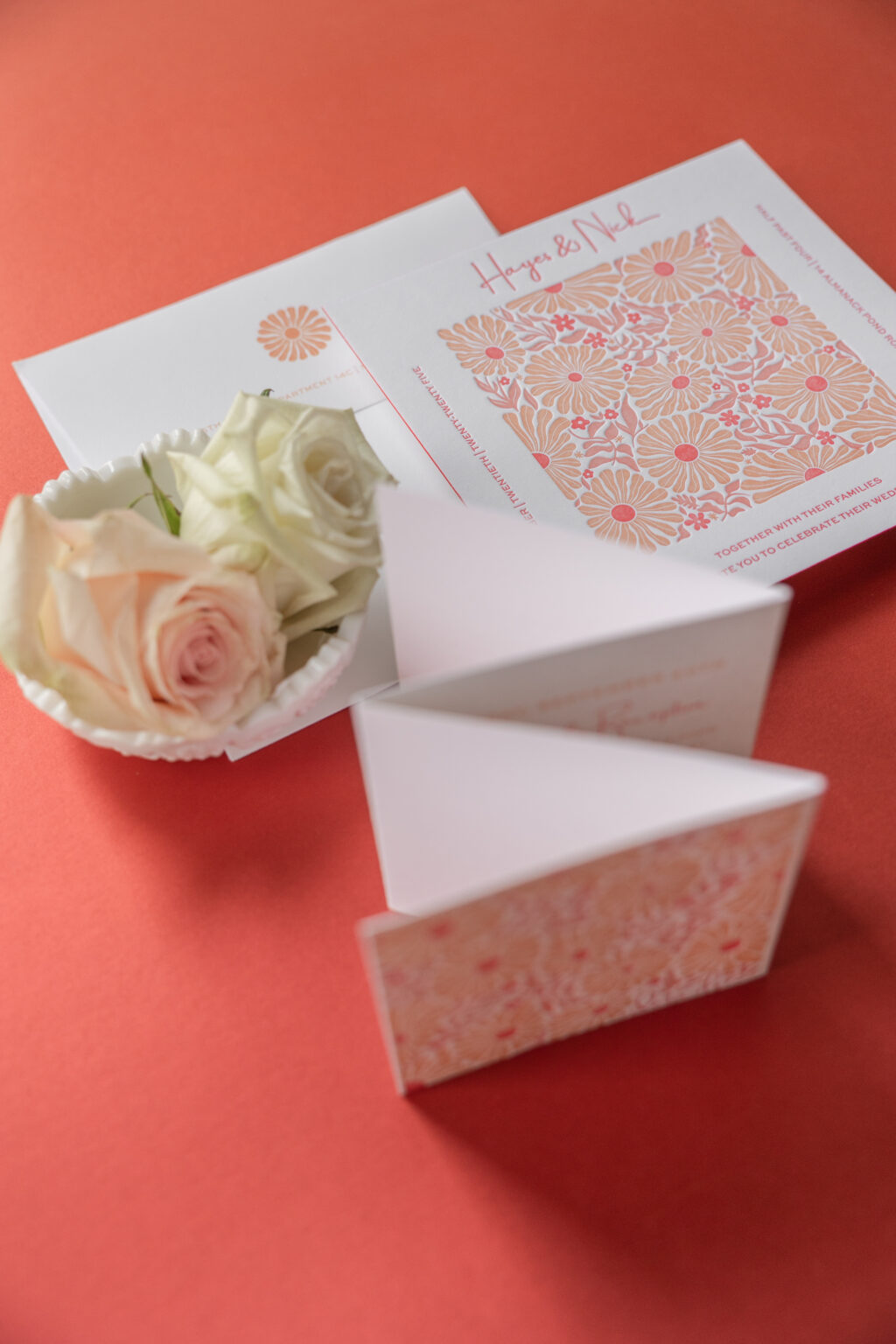
These letterpress invitations have playful botanical illustrations with a clean contemporary layout, creating a look that is cheerful, stylish, and slightly vintage. Hayes and Nick worked with us to customize our retro-inspired Cyrus design for their big day.
Invitation
letterpress ink: papaya + persimmon + cherry
font: amsterdam two + sweet sans
paper: bella smooth cotton 2-ply bright white
size: sq-7
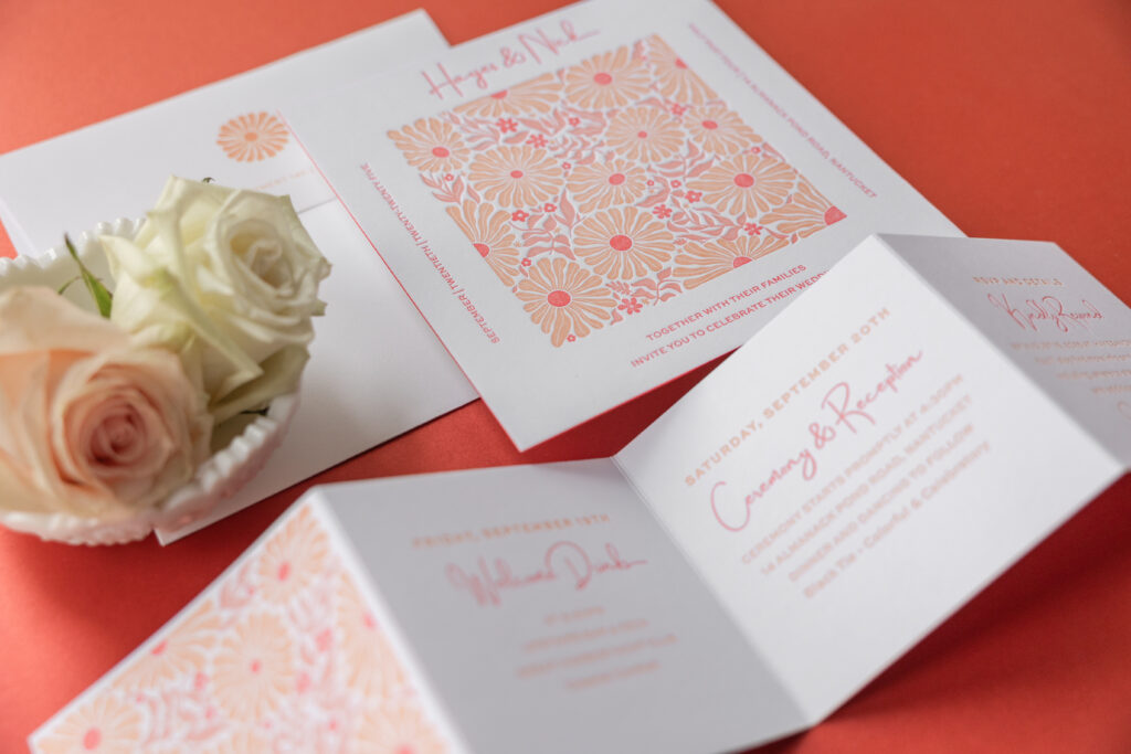
edge painting: cherry
envelope: cotton text bright white
envelope addressing: persimmon digital on the front and the back
job: 78005
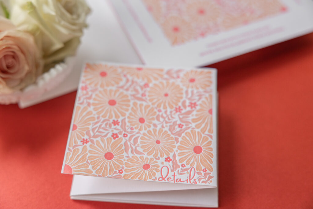
Accordion Details Card
letterpress ink: papaya + persimmon + cherry
font: amsterdam two + sweet sans
paper: bella smooth cotton 1-ply bright white
size: 4” x 16” flat, 4” x 4” square folded
job: 78005
The eye-catching floral artwork is lively and organic, and reminiscent of Scandinavian or mid-century textile patterns. The repeating pattern gives the artwork structure and a modern vibe, while the ample blank space along the edges of the card allows the bold artwork to stand out. The use of red and orange hues is perfect for a fall wedding, especially on the East Coast. Cherry edge painting adds an unexpected pop of color. Our Bright White smooth cotton stock is the perfect background, showcasing the stunning hues.
The typography mixes a casual script font for the couple’s names with a clean sans-serif font for the text. This complementary pairing balances playful elegance with a modern structure. The layout further emphasizes the square card.
A highly functional details card provides information for a welcome event, specifics for the big day, and also serves as a reply card. An accordion-fold design provides plenty of space for details and looks good, thanks to the artwork on the first panel and the bold color palette throughout.
Whether you have your heart set on something retro-inspired, want a bold, seasonally appropriate color palette, or want the functionality of an accordion fold, we can make it happen. Contact us to learn more about our design process and get started creating your dream invitations.
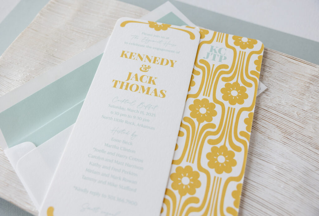
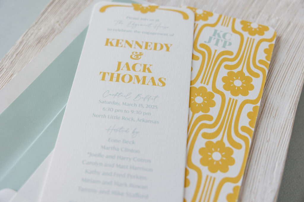
This engagement celebration invitation came to us from our dear friend Mickey of the Social Type, and it’s stunning. This invitation is inspired by our Midge design, specifically the reply card. Get the details and find out how the clean lines and a geometric pattern make this invitation an homage to Mid-Century Modern design.
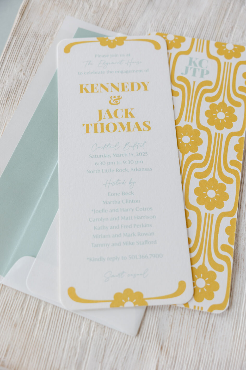
The invitation is the same size as the Midge invitation, a no. 10, which measures 9.19 x 3.81 inches and features rounded corners. A floral cartouche, digitally printed in goldenrod, adorns the top and bottom, coordinating with the bride- and groom-to-be’s names. The rest of the text appears in sea mist.
font: playfair display black + la luxes script + ivy mode regular
paper: bella smooth cotton white 2-ply
card size: no. 10
finishing: rounded corner
liner: classic color pattern in sea mist digital on white text
envelope: white text
envelope addressing: goldenrod + pool digital on the front and back
job #75476
Double-sided printing takes this engagement party invitation to the next level. The broad, geometric floral artwork is our Midge 2 pattern. This pattern appears on the back of the Midge reply card and the envelope liner for the save the date, where it was foil-stamped. The couple’s initials are digitally printed on the back of the invitation in sea mist for a charming and personal touch.
Are you daydreaming about patterns and subtle details that transform an invitation into something custom and meaningful? Work with one of our dealers to create a stunning engagement celebration invitation!