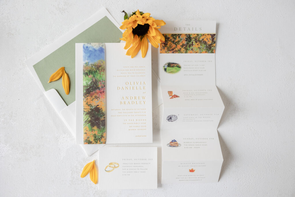
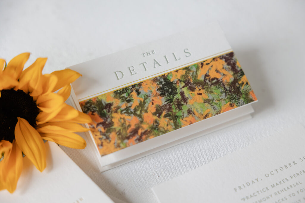
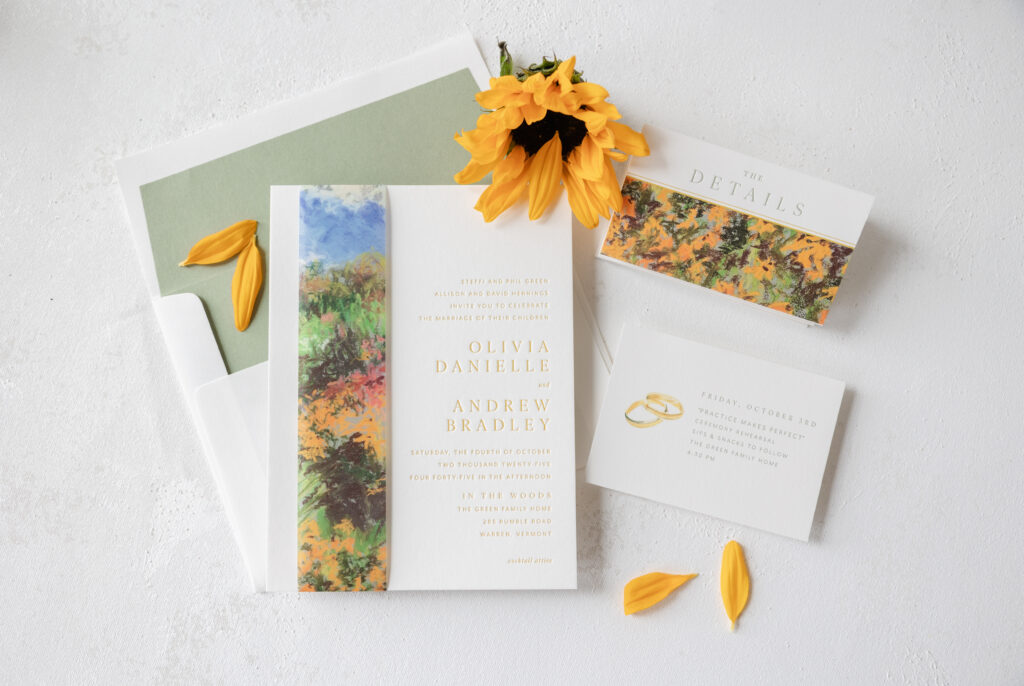
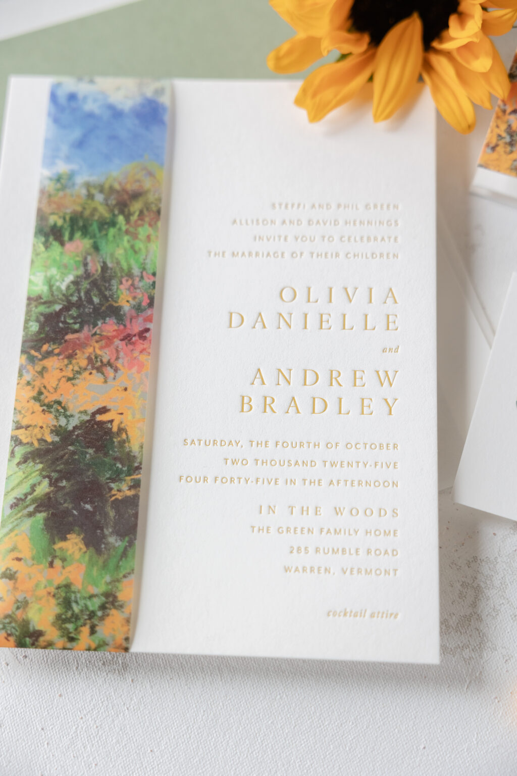
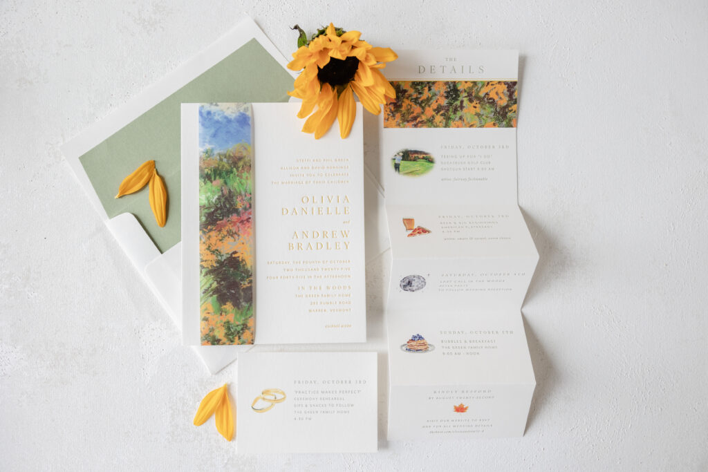
We always love seeing how couples customize our designs, and Olivia and Andrew took our breath away with their version of Sedna. They kept the contemporary layout, but featured a warm color palette and added impressionistic artwork to elevate the look. This couple worked with our dear friend Staci of Sincerely Staci to create their modern wedding invitations with a painterly belly band.
Invitation
letterpress ink: goldenrod
fonts: ivy ora + mr eaves
paper: bella smooth cotton 2-ply white
card size: 8.19” x 6.19”
envelope liner: spruce text
envelope: white cotton text
envelope addressing: spruce digital on the front and the back
job #: 76505
Belly Band
digital ink: cmyk
paper: 40# vellum
size: f-8 vertical tall belly band (1.75” x 17.11” open, 1.75” x 8.24” closed)
finishing: assemble with invitation
job #: 76505
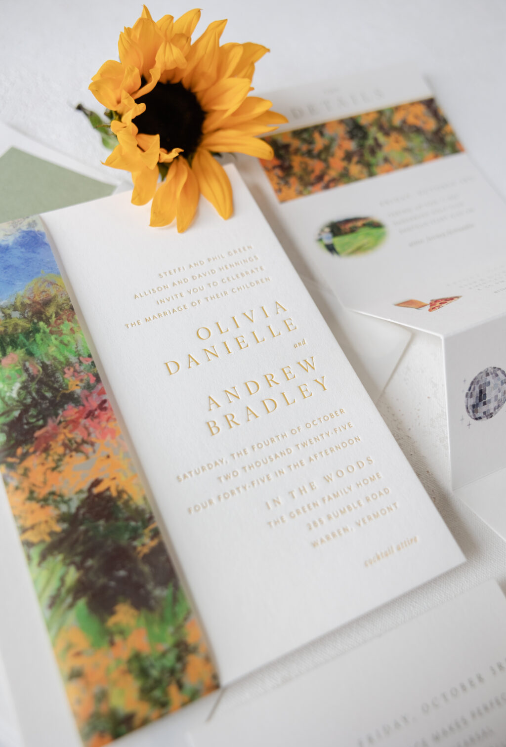
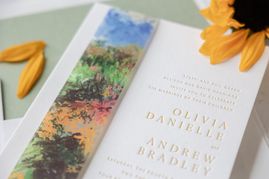
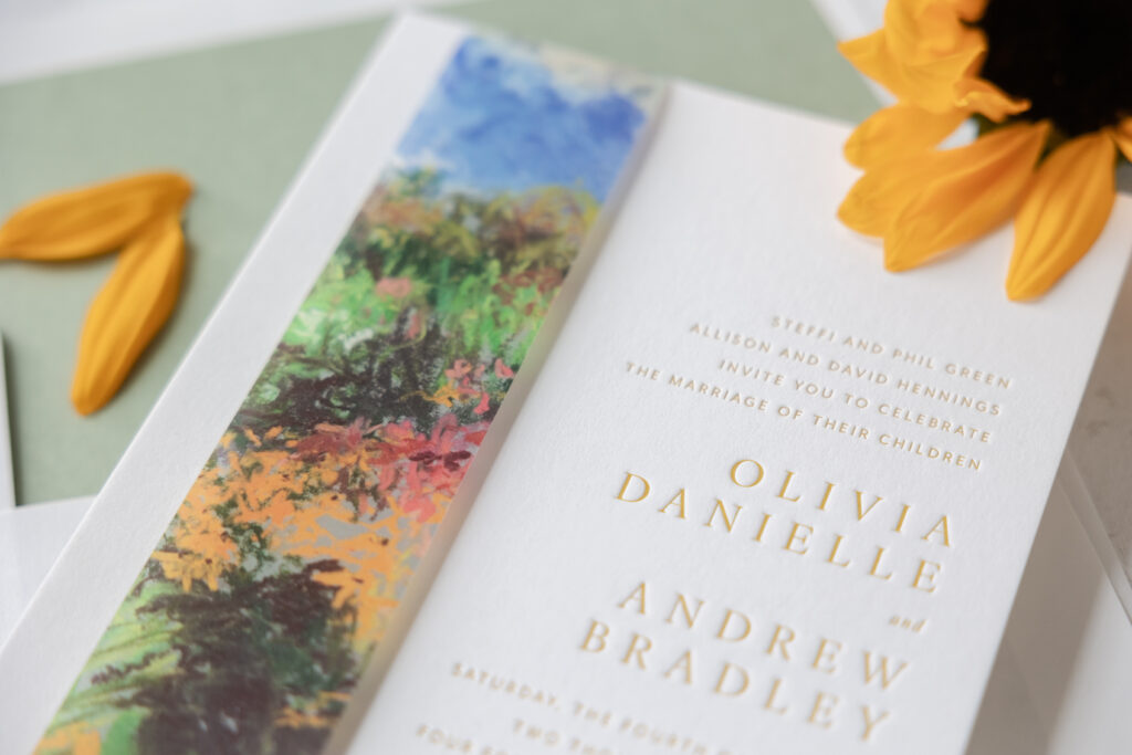
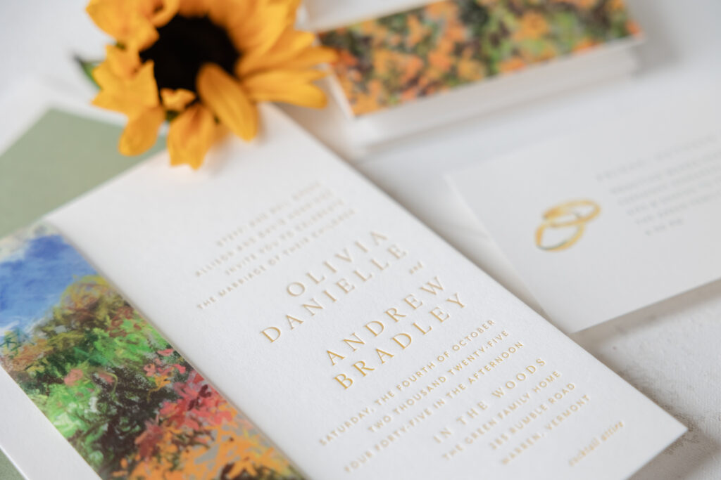
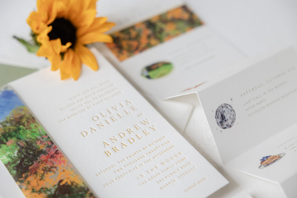
The typography is delicate, simple, and traditional, but right-justifying everything establishes a contemporary feel. Goldenrod letterpress ink is warm, inviting, and perfect for an autumn wedding.
The invitation is lovely on its own, but the belly band is truly superb. The painterly artwork features a vibrant mix of hues. It’s expressive and has a pastoral vibe. Flipping the orientation of the belly band, so it’s vertical, adheres to the contemporary aesthetic, and it nicely fits over the left side of the invite, so all of the text is still visible.
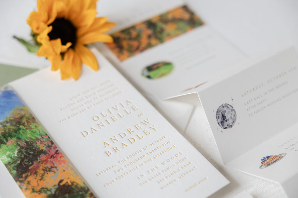
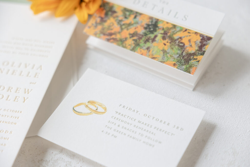
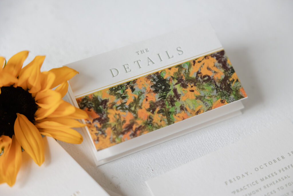
The accordion-fold details card is fun, charming, and informative. Each panel features a curated motif to coordinate with the corresponding activity. The folding design ensures plenty of space for the full itinerary, yet it easily fits inside the envelope. The first panel boasts artwork similar to the belly band, keeping everything cohesive.
Details Card
letterpress ink: spruce
digital ink: cmyk
fonts: ivy ora + mr eaves
paper: bella smooth cotton 1-ply white
card size: 6-panel accordion fold (16.25” x 4.75” flat; 2.71” x 4.75” folded)
job #: 76505
Rehearsal Dinner Invitation
letterpress ink: spruce
digital ink: cmyk
fonts: ivy ora + mr eaves
paper: bella smooth cotton 1-ply white
card size: a-5
job #: 76505
These modern wedding invitations with a painterly belly band are exquisite. Each piece is really lovely on its own, but collectively the suite is beautiful and charming, and we’re so happy to have been part of bringing this vision to life. Do you love the idea of a vertical belly band, featuring artwork in your design, or an accordion-fold details card? Work with one of our dealers to create your perfect invitation suite.
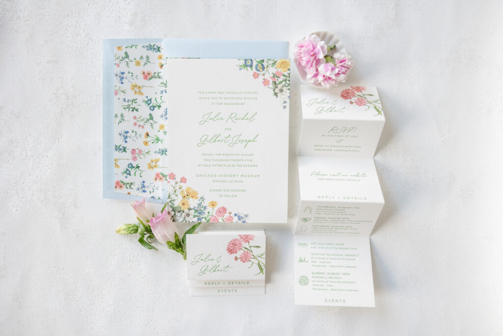
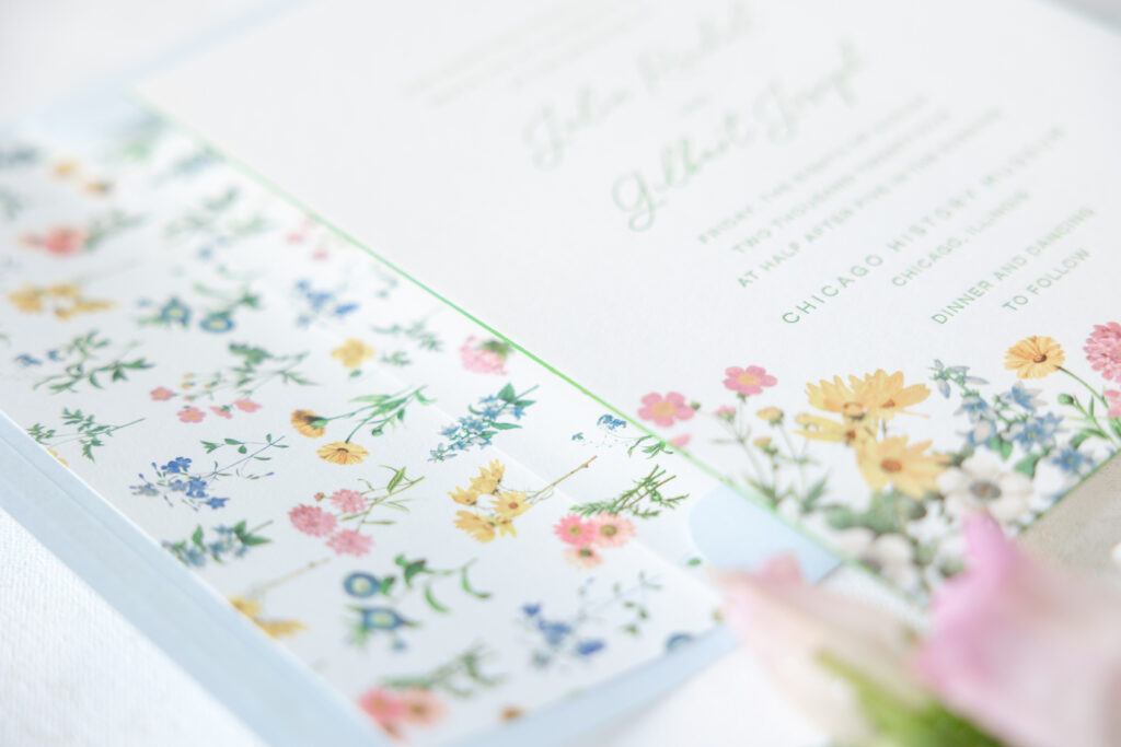
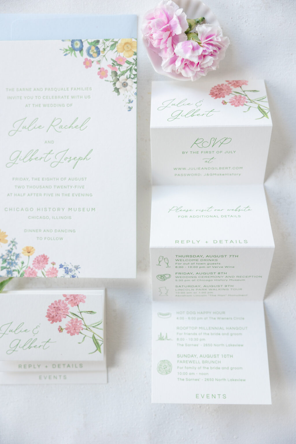
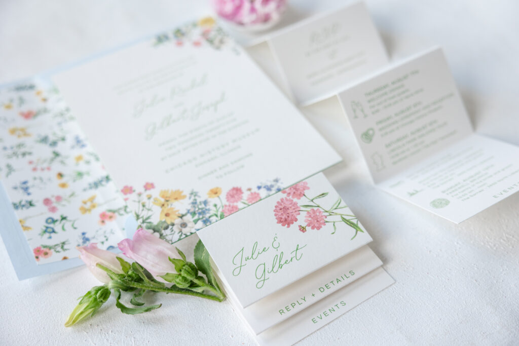
Julie and Gilbert’s wedding invitations feel like summer. Lovely, delicate florals, a romantic script font, and a soft color palette are quietly elegant, seasonally appropriate, and incredibly beautiful. This design merges elements from our Melrose and Hadaway designs, creating something enchanting and unique. This couple worked with our dear friend Karen of XOXO, Frances, to create their garden romance wedding invitations.
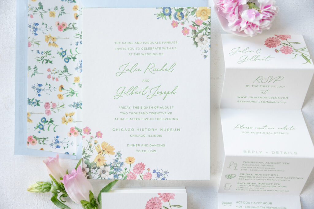
The airy layout is traditional yet laidback and approachable. The script font for the names lends the design a subtle formality while maintaining an affable nature. Our garden letterpress ink softens the look while simultaneously enhancing the botanical vibe. The layout is borrowed from our Melrose design. While the couple liked the floral border from Melrose, it just wasn’t what they had in mind, so they used the envelope liner pattern from Hadaway and repurposed parts of it to create a loose, organic border. The loose arrangement of the flowers is reminiscent of wildflowers naturally scattered, giving the design an effortless, meadow feel.
Invitation
letterpress ink: garden
digital ink: cmyk
fonts: questrial + lily paperie
paper: bella smooth cotton 2-ply white
card size: f-8
edge paint: garden
envelope liner: hadaway pattern in cmyk on white text
envelope: sky text
envelope addressing: garden digital on the front and the back
job: 75085
Details Card
digital ink: garden + cmyk
fonts: questrial + lily paperie
paper: bella smooth cotton 1-ply white
card size: (4” x 14.5” flat, 3.5” x 4” folded)
finishing: score
job: 75085
The details card is as lovely as it is functional. The accordion fold design means guests need to open it, almost like a gift. The various panels include RSVP details, direct guests to the couple’s wedding website, and include an itinerary of the entire wedding weekend. Fun motifs serve as bullet points for the itinerary list while introducing a fun, lighthearted vibe.
Julie and Gilbert did an amazing job of blending classic and contemporary elements to create their lovely garden-romance wedding invitations. As always, it’s a joy to work with XOXO, Frances. Do you need help choosing the perfect inspiration design or designs to create your invitations? Work with one of our dealers to receive expert tips and guidance throughout the entire process.
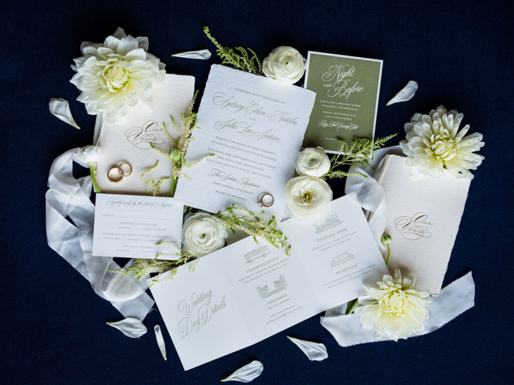
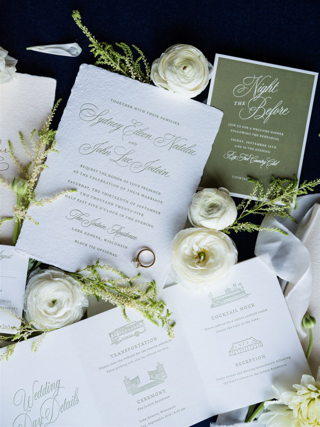
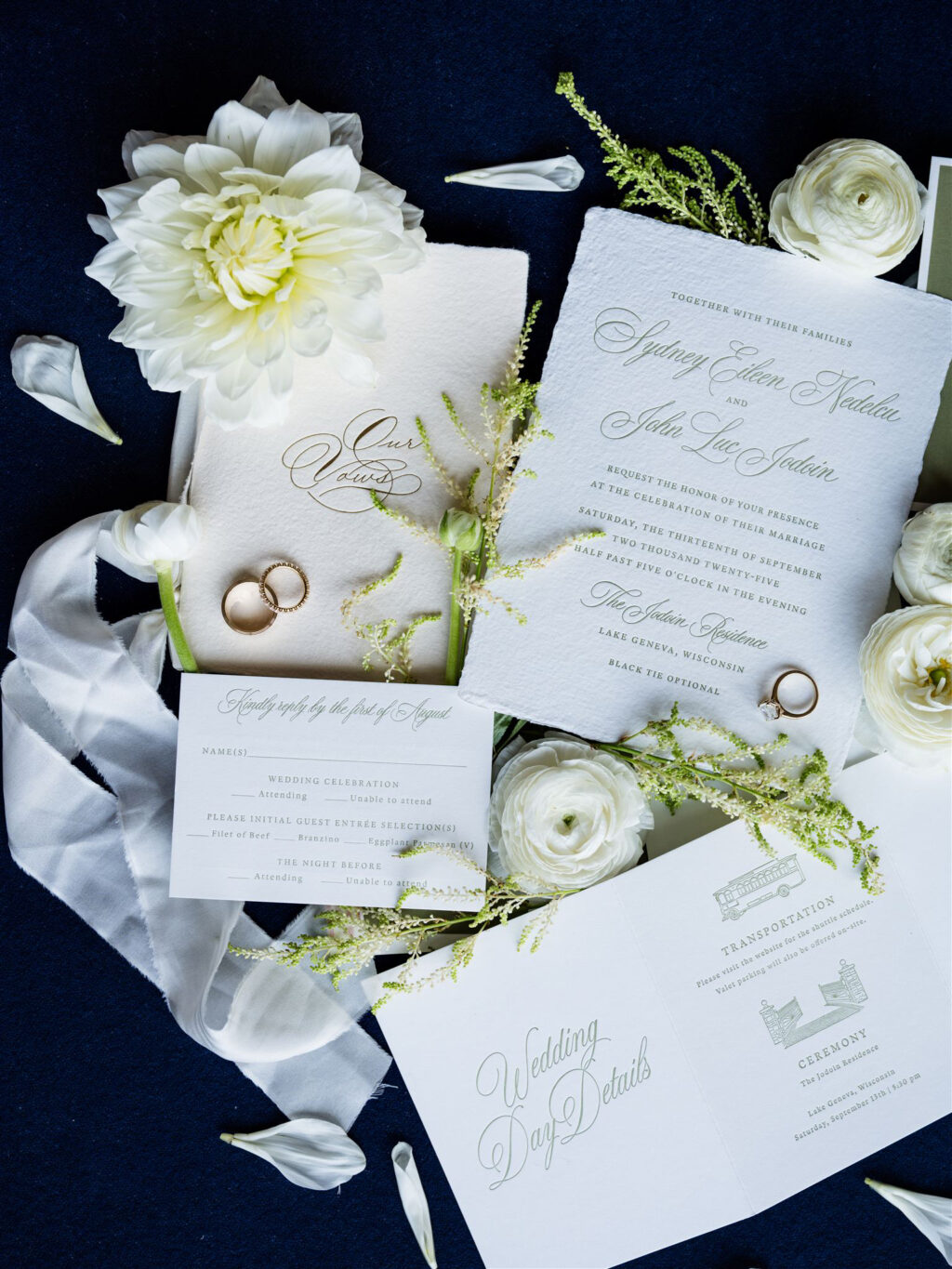
Sydney and John worked with our dear friend Colin of Pulp and Ink to create these lovely invitations for their lakeside wedding. The design blends elegance and luxury in an elevated and intentional way.
Invitation
letterpress ink: pms 7748 u
fonts: guyot press + juliette
paper: bella handmade white
card size: f-8 deckle edge
envelope liner: classic color pattern in pms 7748 u
envelope: white cotton text
envelope addressing: pms 7748 u digital on the front and the back
job: 76454
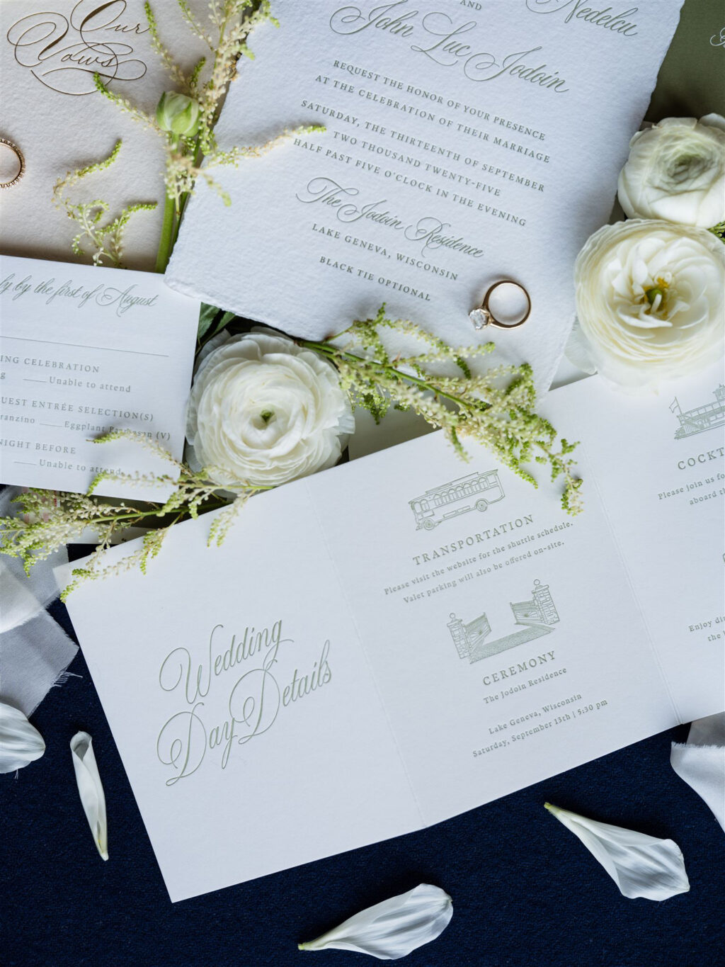
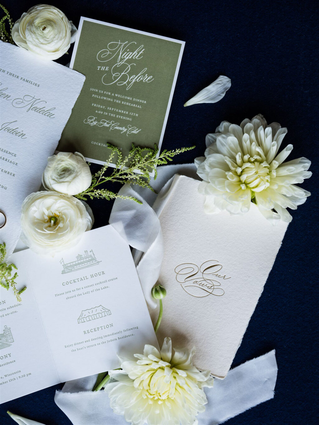
The flowing script font for the names is classic and traditional, while the refined serif font for the body text provides balance and extenuates the curves and flourishes of the script font. A custom sage green ink is perfect for the garden-party vibe of the reception and appears throughout the suite for a cohesive feel. Our handmade paper is luxuriously soft, and the feathery deckle edge adds another tactile element to the invitations.
Reply Card
letterpress ink: pms 7748 u (front) / pms 7748 u (back)
fonts: guyot press + juliette
paper: bella smooth cotton 1-ply white
card size: a-5
envelope: white cotton text
envelope addressing: pms 7748 u digital on the front
job: 76454
The events card is a four-panel accordion fold that is simply delightful. Each panel of this letterpress-printed card features details about the big day. The card is printed on our Smooth Cotton paper, which is decadent, soft, and holds a crisp letterpress impression.
Events Card
letterpress ink: pms 7748 u
fonts: guyot press + juliette
paper: bella smooth cotton 1-ply white
card size: a-2 accordion fold
job: 76454
Rehearsal Dinner Invitation
digital ink: pms 7748 u
fonts: guyot press + juliette
paper: bella cover white
card size: a-2
job: 76454
The rehearsal dinner invitation flips the script in a way by digitally printing a flood of the couple’s signature green on our cover stock. The text is created by the void in the printing, giving the illusion of color paper with white printing. This technique ensures a perfect color match across all of the stationery items. The digital printing was pulled back slightly from the edges, exposing the unprinted paper and creating a stately border.
Menu
digital ink: pms 7748 u
fonts: guyot press + juliette
paper: bella smooth cotton 1-ply white
size: 4” x 9”
job: 78018
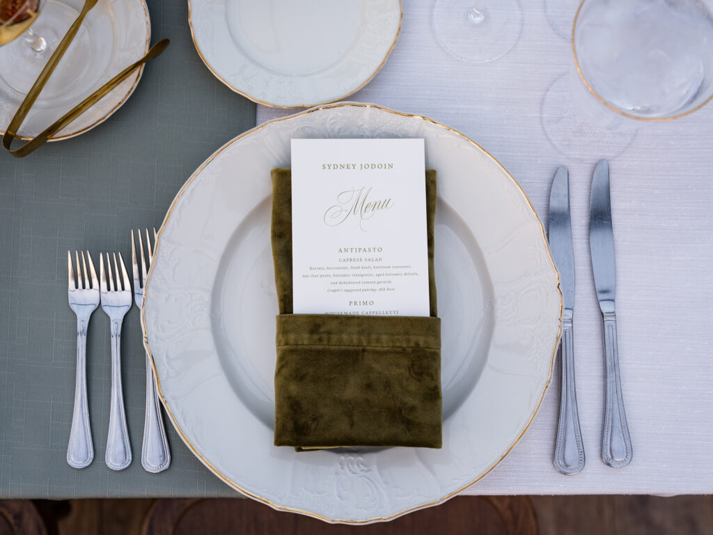
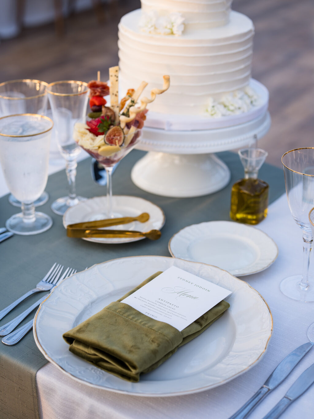
The final piece in this lovely wedding suite is the menu. Three versions of the menu were printed based on the menu selections, with each customized with the guests’ names. This detail is thoughtful and inviting.
It was a pleasure to work on Sydney and John’s wedding stationery, and it’s always a delight to work with Pulp and Ink.
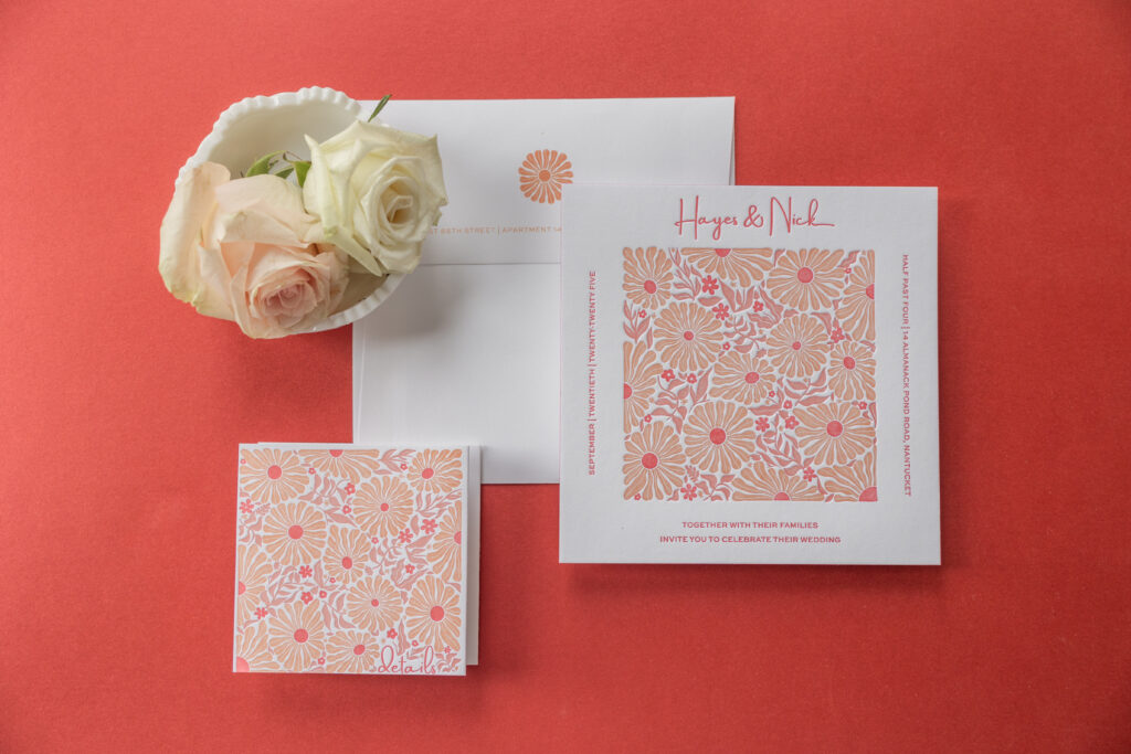
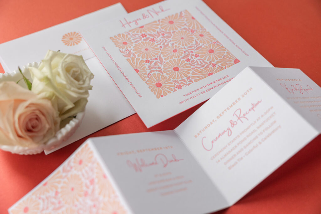
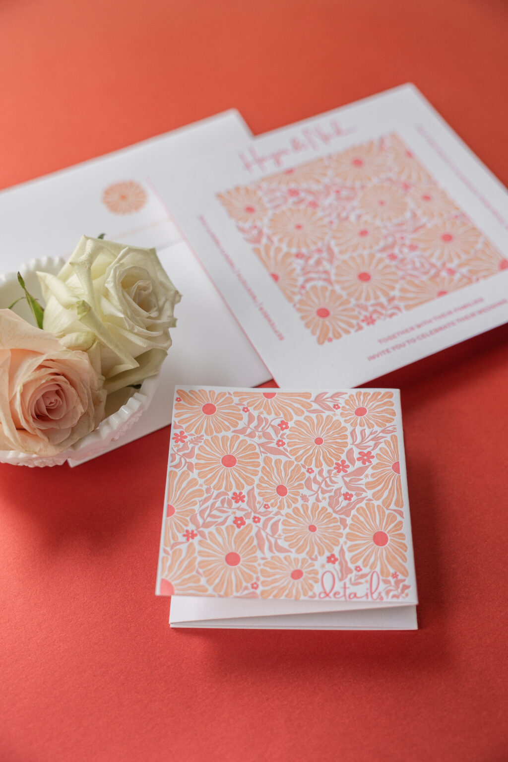
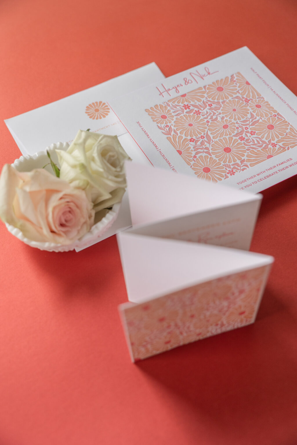
These letterpress invitations have playful botanical illustrations with a clean contemporary layout, creating a look that is cheerful, stylish, and slightly vintage. Hayes and Nick worked with us to customize our retro-inspired Cyrus design for their big day.
Invitation
letterpress ink: papaya + persimmon + cherry
font: amsterdam two + sweet sans
paper: bella smooth cotton 2-ply bright white
size: sq-7
edge painting: cherry
envelope: cotton text bright white
envelope addressing: persimmon digital on the front and the back
job: 78005
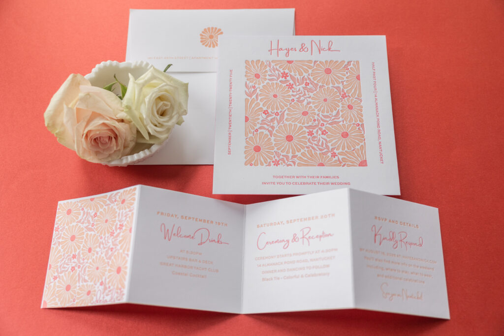
Accordion Details Card
letterpress ink: papaya + persimmon + cherry
font: amsterdam two + sweet sans
paper: bella smooth cotton 1-ply bright white
size: 4” x 16” flat, 4” x 4” square folded
job: 78005
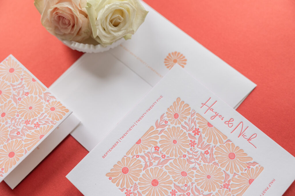
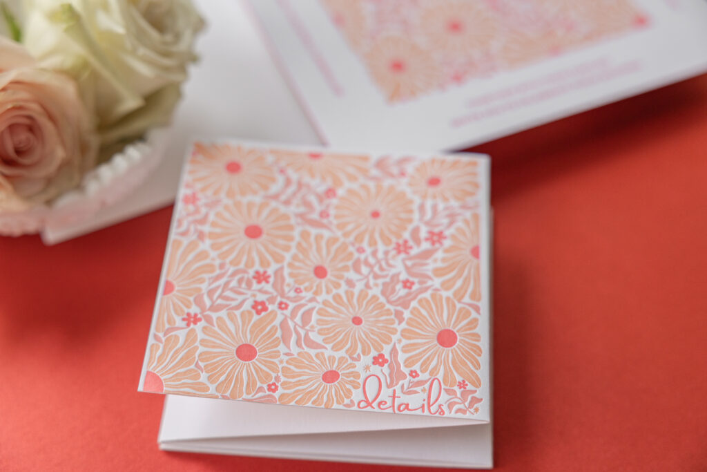
The eye-catching floral artwork is lively and organic, and reminiscent of Scandinavian or mid-century textile patterns. The repeating pattern gives the artwork structure and a modern vibe, while the ample blank space along the edges of the card allows the bold artwork to stand out. The use of red and orange hues is perfect for a fall wedding, especially on the East Coast. Cherry edge painting adds an unexpected pop of color. Our Bright White smooth cotton stock is the perfect background, showcasing the stunning hues.
The typography mixes a casual script font for the couple’s names with a clean sans-serif font for the text. This complementary pairing balances playful elegance with a modern structure. The layout further emphasizes the square card.
A highly functional details card provides information for a welcome event, specifics for the big day, and also serves as a reply card. An accordion-fold design provides plenty of space for details and looks good, thanks to the artwork on the first panel and the bold color palette throughout.
Whether you have your heart set on something retro-inspired, want a bold, seasonally appropriate color palette, or want the functionality of an accordion fold, we can make it happen. Contact us to learn more about our design process and get started creating your dream invitations.
These lovely bucolic wedding invitations set the perfect tone for a fall wedding in Vermont. Olivia and Andrew worked with our dear friend Staci of Sincerely Staci to create their letterpress wedding invitations, which feature a colorful belly band and a stunning accordion fold details card.
Invitation
letterpress ink: goldenrod
fonts: ivy ora + mr eaves mod
papers: bella smooth cotton white 2-ply
card size: f-8 (8.19” x 6.19”)
envelope liner: spruce text (no printing)
envelope: white text
envelope addressing: spruce digital on the front and the back
job: 76505
Belly Band
digital: cmyk
papers: 40# vellum
card size: f-8 vertical tall belly band (1.75” x 17.11” open, 1.75” x 8.24” closed)
finishing: assemble with the invitation
job: 76505
The inspiration behind these invitations is our Sedna design. The couple chose to maintain the invitation layout and keep the same fonts, but then they got creative. While they kept the belly band, they swapped out the Art Deco shell pattern of the inspiration design for artwork depicting a nature scene. The belly band secures all the cards in the suite when in the envelope. In this instance, it also introduces vibrant pastoral artwork. When wrapped around the invitation, the belly band also covers a part of the invitation that is void of printing. This attention to detail allows the pieces to complement one another.
The details card is equally stunning. This 6-panel accordion fold card features the full rundown of events during the wedding weekend. Everything from the Friday golf outing through Sunday brunch is represented on a panel. Each panel features artwork or a motif from our design library, with a hand-drawn look that coordinates with the custom artwork on the first panel. The final panel provides reply details, allowing this piece to serve as both a details card and an RSVP card.
Details Card
letterpress ink: spruce
digital: cmyk
fonts: ivy ora + mr eaves mod
papers: bella smooth cotton white 1-ply
card size: 6-panel accordion fold – 16.25” in x 4.75” flat; 2.71” x 4.75” folded
job: 76505
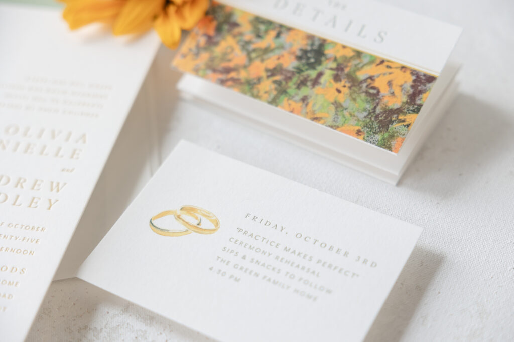
The rehearsal dinner invitation takes a much more simplified approach, while still coordinating with the other pieces. Spruce letterpress printing matches the envelope liner, while a digitally printed wedding band motif serves as the only adornment. This card is understated and charming.
Rehearsal Dinner Invitation
letterpress ink: spruce
digital: cmyk
fonts: ivy ora + mr eaves mod
papers: bella smooth cotton white 1-ply
card size: a-5
job: 76505
Olivia and Andrew started with an inspiration design but completely made it their own, designing lovely letterpress wedding invitations that perfectly represented their wedding weekend. Work with one of our dealers to create the wedding stationery of your dreams. Whether you want an artful belly band or an informative and stylish details card, or anything else, our dealers are experts who can guide you through the design process.