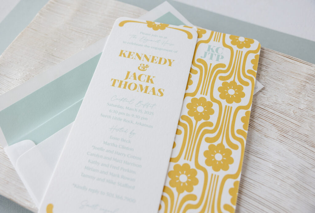
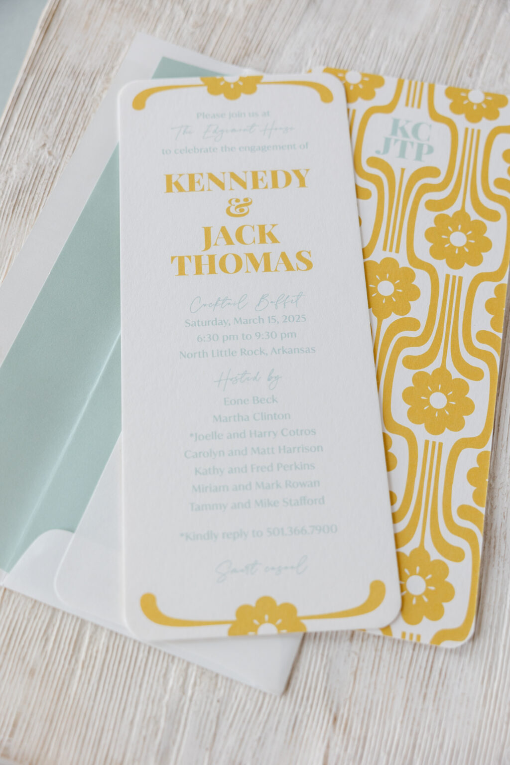
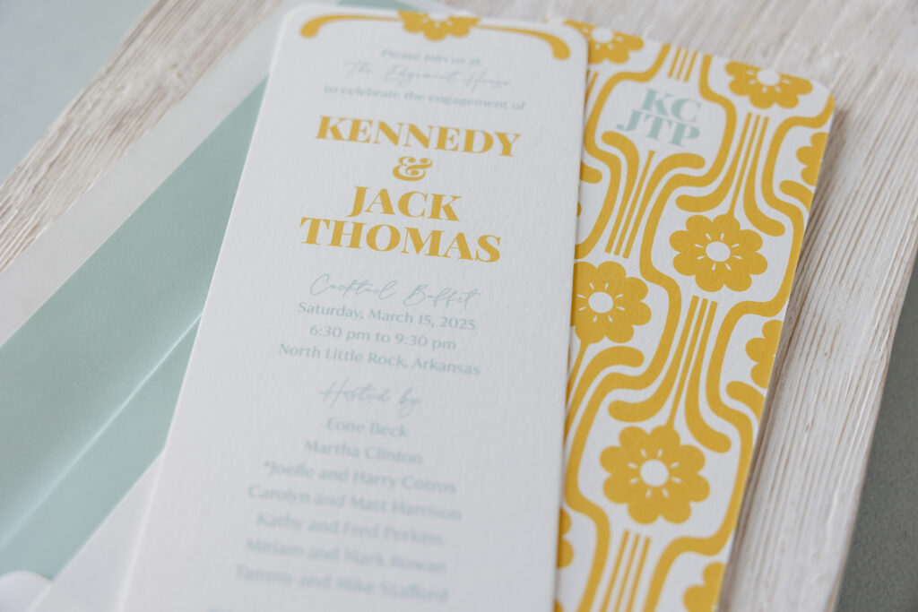
This engagement celebration invitation came to us from our dear friend Mickey of the Social Type, and it’s stunning. This invitation is inspired by our Midge design, specifically the reply card. Get the details and find out how the clean lines and a geometric pattern make this invitation an homage to Mid-Century Modern design.
The invitation is the same size as the Midge invitation, a no. 10, which measures 9.19 x 3.81 inches and features rounded corners. A floral cartouche, digitally printed in goldenrod, adorns the top and bottom, coordinating with the bride- and groom-to-be’s names. The rest of the text appears in sea mist.
font: playfair display black + la luxes script + ivy mode regular
paper: bella smooth cotton white 2-ply
card size: no. 10
finishing: rounded corner
liner: classic color pattern in sea mist digital on white text
envelope: white text
envelope addressing: goldenrod + pool digital on the front and back
job #75476
Double-sided printing takes this engagement party invitation to the next level. The broad, geometric floral artwork is our Midge 2 pattern. This pattern appears on the back of the Midge reply card and the envelope liner for the save the date, where it was foil-stamped. The couple’s initials are digitally printed on the back of the invitation in sea mist for a charming and personal touch.
Are you daydreaming about patterns and subtle details that transform an invitation into something custom and meaningful? Work with one of our dealers to create a stunning engagement celebration invitation!
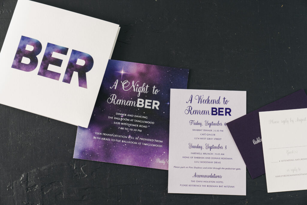
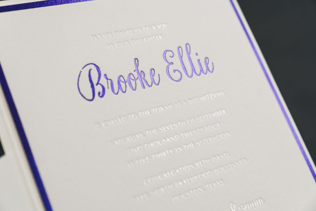
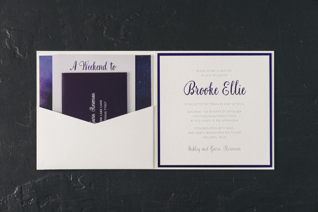
Brooke’s Bat Mitzvah invitation is lovely and formal, while also being fun and whimsical. This cosmic invitation suite design was sent to us by our dear friend, Hollis of Bering’s on Bissonnet in Houston, Texas. This custom design invitation features lots of celestial design elements, personal touches, and a pocketfold.
On the invitation, Brooke’s name and the border appear in purple shine foil while the remaining text appears in prism shine. The glimmer of the foil, particularly the prism shine foil, perfectly complements the cosmic theme.
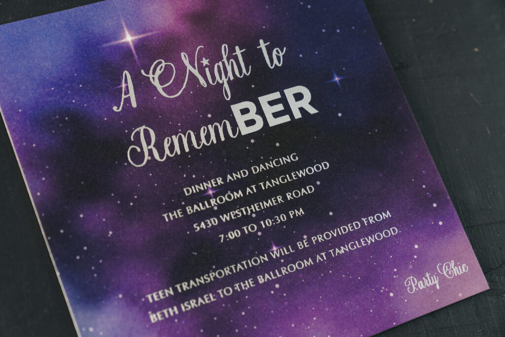
The night sky artwork of the party card is digitally printed, allowing for stunning colors and a high level of detail. This artwork is also creatively used to fill in the block text on the cover of the pocketfold. Brooke’s initials, BER, are used throughout the suite. Twice, the initials are part of the phrase, ‘A Night to RememBER,’ for a fun and personal touch.
Invitation
foil stamping: purple shine + prism shine
font: natura + optima
paper: bella cotton white 2-ply
card size: 6.32 x 6.32
envelope: white cotton text
envelope addressing: regalia digital on the front and back
finishing: assemble with folded pocket card and back pocket
job #71382
Details Card
foil stamping: purple shine
font: natura + optima
paper: kunzite 1-ply
card size: a-6
job #71382
Folded Pocket Card
digital: cmyk
font: natura + optima
paper: bella smooth cotton white 1-ply
card size: 6.56 x 13.12 flat, 6.56 x 6.56 folded
finishing: assemble with pocket and invite
job #71382
Pocket
paper: bella smooth cotton white 1-ply
card size: sq-7 inner back pocket
die shape: ps-523
finishing: assemble with folded pocket card and invite
job #71382
Party Card
foil stamping: prism shine
digital: cmyk
font: natura + optima
paper: bella smooth cotton white 2-ply
card size: sq-6
job #71382
Reply Card
digital: regalia + fog
font: natura + optima
paper: bella smooth cotton white 1-ply
card size: a-5
envelope: plum text
envelope addressing: white digital on the front
job #71382
The invitation adheres to a pocketfold, and when opened, the remaining cards in the suite are nestled into a pocket on the opposite side of the folder. This sleek presentation is orderly and secures all the cards in place while in transit via mail.
We offer a wide array of Bar and Bat Mitzvah invitations to choose from, or you can create a custom design, as Brooke did, for something truly unique. Work with one of our talented dealers to create your next invitation or announcement!
Looking for an invitation as lovely as your wedding? Look no further! These light and sweet letterpress wedding invitations created by Katherine McCutcheon are sure to fit the bill. While we in Syracuse are about to take on the snowy, winter months, the Avon design reminds of us those fresh, bright summer days. The designer said, “A garden wedding with colorful floral arrangements are the perfect compliment to the watercolor details of this design. There is a large focus on grays, geometric shapes, and abstract imagery in modern design. While that all has its place, I don’t think a traditional watercolor will ever go out of style.”
We see programs come in all different shapes and sizes, but Elizabeth and Joshua’s take the cake as being the most unique. These classic programs with a modern twist featured their bridal party represented as Bitmojis! For those who don’t know, a Bitmoji is an avatar that mimics your look as a cartoon-like illustration. Whereas, the rest of the layout of the program featured traditional fonts to keep the overall look clean. Finally, we couldn’t have brought this vision to life without the help of Magnificent Milestones in Chicago! We guarantee these programs brought a smile to the face of all Elizabeth and Joshua’s guests.
Digital color: Black | Fonts: Grace + Moravia | Design: Custom Created Design | Paper: 1 ply Bella Smooth Cotton | Size: 5 x 9 folded | Customization: 41915 | Magnificent Milestones
Earlier this spring we teamed up with Olli Studios on an incredible pastel inspiration shoot, which was featured recently on both Style Me Pretty and ModWedding! Inspired by the two Pantone colors of the year, Rose Quartz and Serenity, the shoot showcased a spectrum of design elements in varying shades of pastel blue and pink — including a stunning blue wedding gown! We also couldn’t get enough of the florals intertwined throughout the spread of desserts on the sweets table. To help set the tone for the shoot, we created additional pieces from our Vincent suite, including a custom envelope liner, menus, and place cards printed with a pale wash of digitally printed persimmon ink. Kelle McCarter hand calligraphed place cards and envelopes to match, adding the perfect finishing touch to the set. Take a look at some of our favorite shots (including several in front of the iconic New York Public Library!), but be sure to head over to Style Me Pretty to see more photos from the shoot!
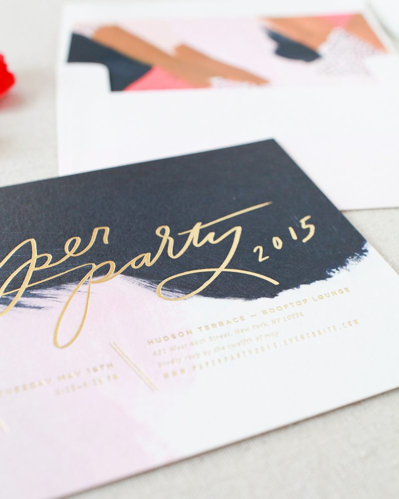
We were thrilled to collaborate with Oh So Beautiful Paper and Moglea for the invitations for Paper Party 2015! The Paper Party is an amazing event thrown by Nole Garey of Oh So Beautiful Paper every year during the National Stationery Show that brings press, retailers, and vendors from the stationery world together for an evening of fun. The invitations and envelope liners feature hand painted artwork by Meg from Moglea that we digitally printed on our white Bella Smooth Cotton paper. Gold matte foil stamping added a touch of shine to the invitations, and the envelopes were calligraphed in gold ink by Michele from Meant to Be Calligraphy. Vintage Rose stamps and a dip-dyed hint of pink finished the envelopes off beautifully. Take a look!
Inspired by lush florals and vibrant shades of pink and orange, Mariel Mirra began her design process for Blush with a paintbrush. This watercolor wedding invitation suite features hand-painted watercolors that we digitally printed on our new Bella Smooth Cotton paper, with gold matte foil and Holcombe style calligraphy accents adding some glamour. For a Blush inspired wedding, Mariel envisions lots of colorful flowers, festive ribbon streamers and the occasional pop of metallic gold. To see even more of the inspiration behind the design, check out Mariel’s Blush Pinterest board!