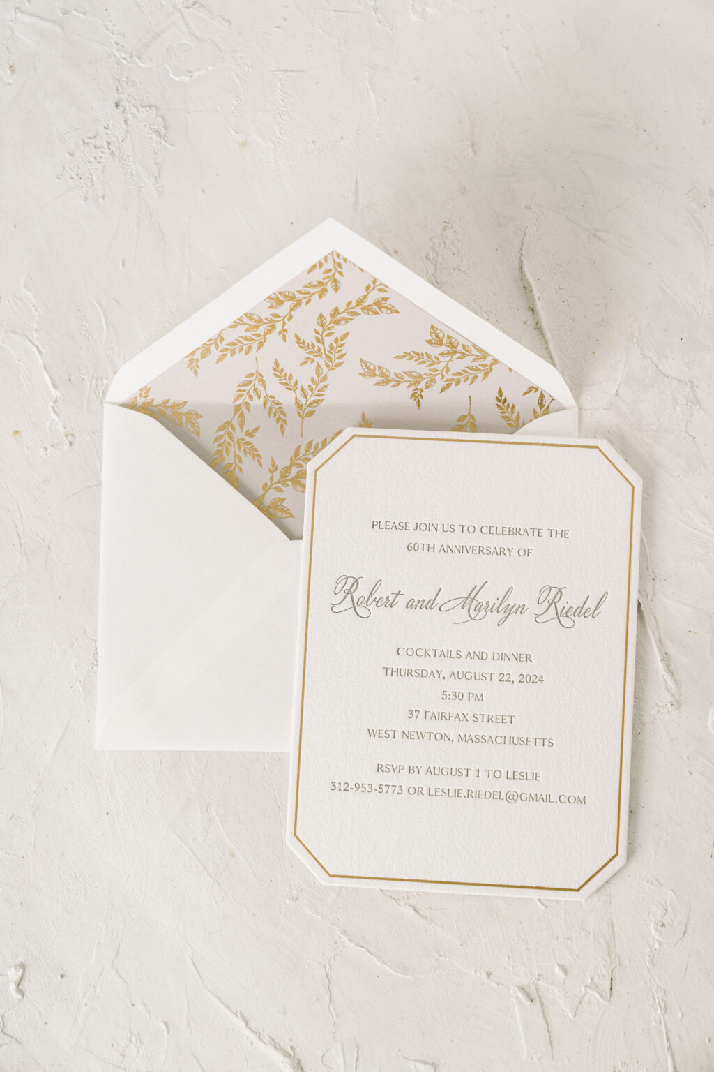
Everything about these stylish anniversary party invitations is timeless and elegant, from the die-cut shape to the combination of letterpress printing and foil stamping, and the foil-stamped envelope liner. We had the pleasure of working with our friend Lisa from Mark Harris Stationers to create these lovely die cut anniversary party invitations celebrating Robert and Marilyn.
Our Bella cotton paper is plush yet firm and holds a deep impression. Gold matte foil stamping creates a border that mimics the shape of our Franklin die-cut, accentuating the die-cut shape. Robert and Marilyn’s names appear in a script font that is formal yet still has a contemporary edge. The font’s flourishes add drama and contrast against the straight lines of the foil-stamped border.
Invitation
letterpress ink: pewter
foil stamping: gold matte
fonts: velvet hammer, antique regular, garamond
paper: bella cotton white 2-ply
card size: a-6
die cut style: franklin
die cut shape: BF-49
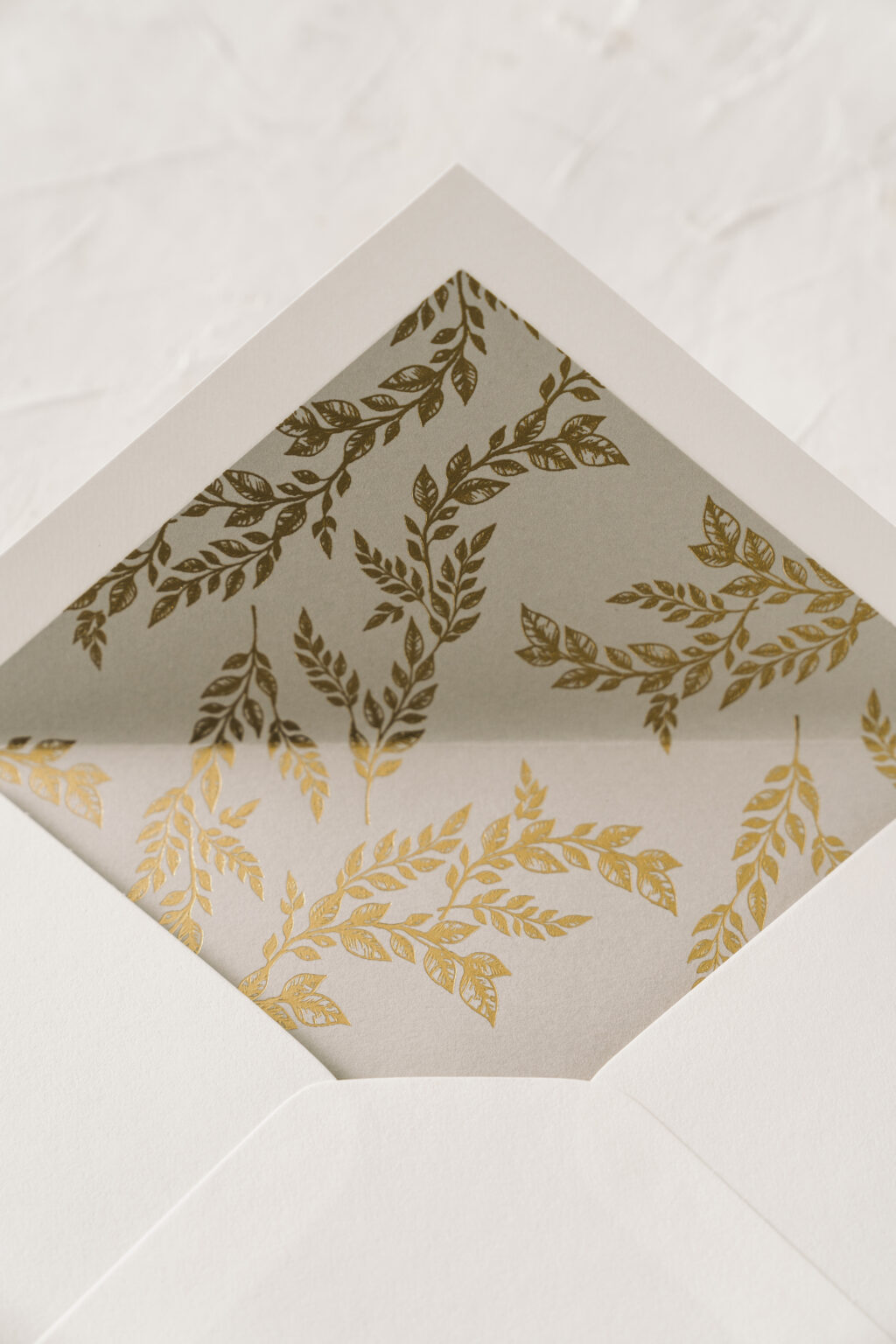
liner: marseille pattern in gold matte foil on light gray text
envelope: white text pointed flap
envelope addressing: pewter digital on the front and pewter letterpress on the back
job: 72325
The envelope liner features gold matte foil stamping on our light gray text, which beautifully coordinates with the pewter letterpress printing on the invitation.
It was a pleasure to create these custom die cut anniversary party invitations. Do you need invitations for an upcoming milestone celebration? Or are you interested in selecting the perfect die-cut shape or fonts for your design? Work with one of our dealers to receive tips and expert guidance on creating your custom invitations.
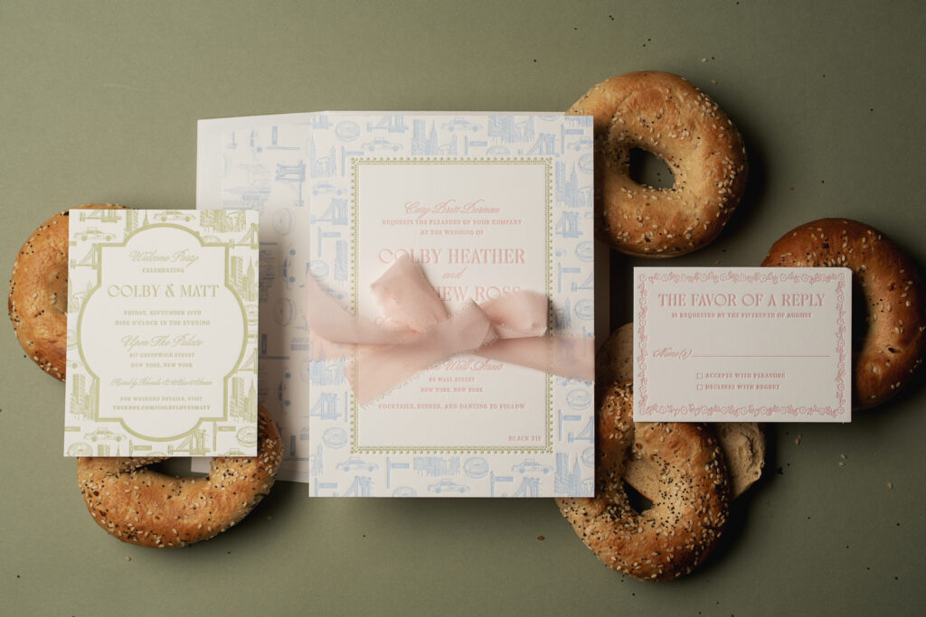
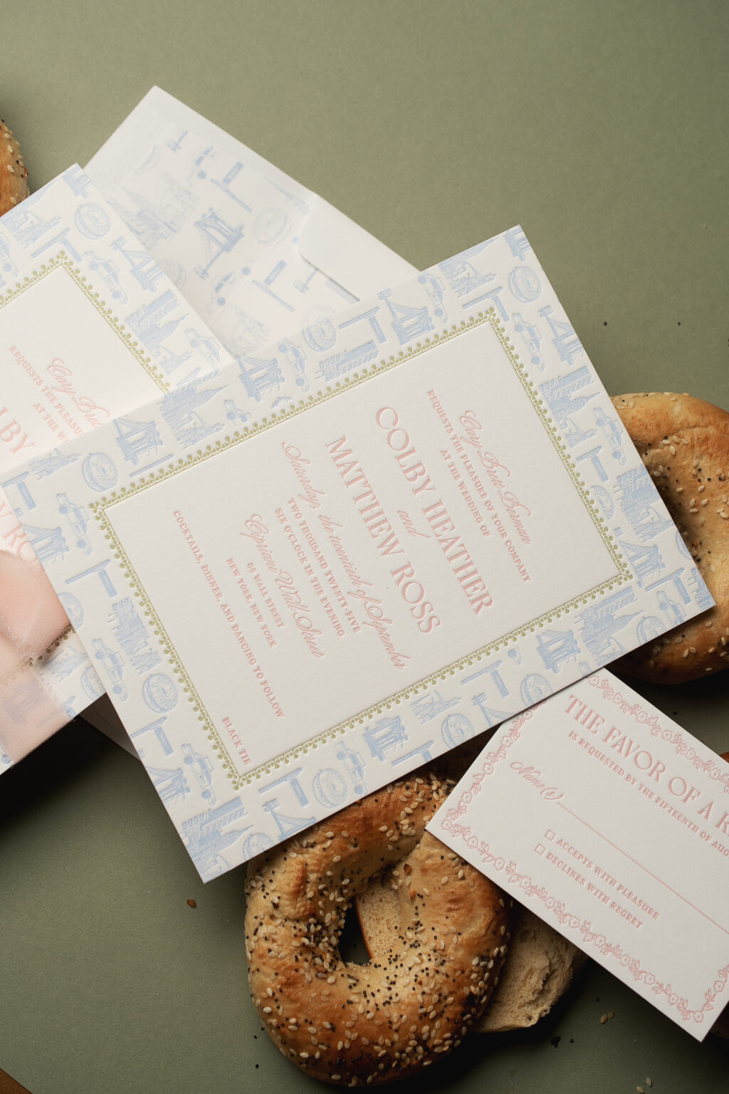
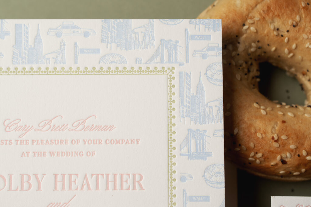
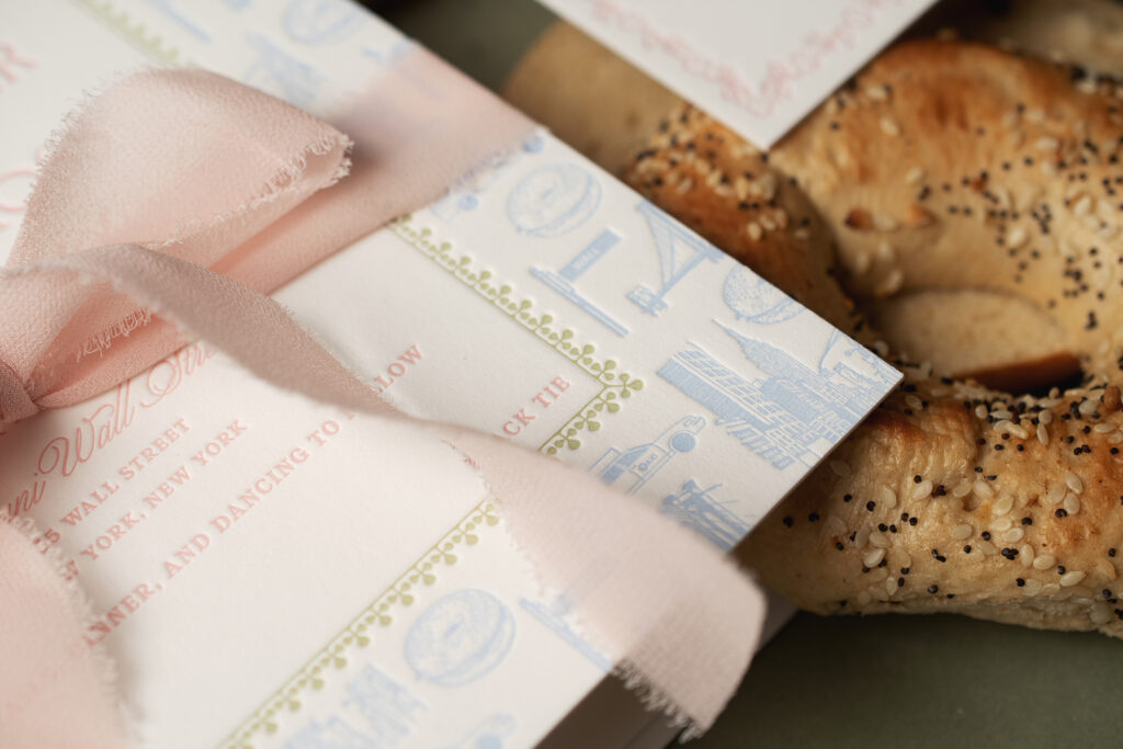
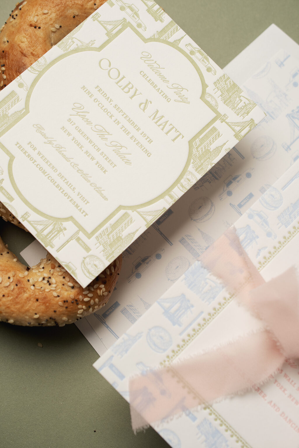
We created a custom pattern just for these NYC-inspired letterpress wedding invitations. The pattern appears on two of the cards in the suite and makes a charming envelope liner. The couple, Colby and Matt, worked with our Bella Figura NYC store, and we are so happy they did.
Invitation
letterpress ink: french blue + cherry blossom + acadia
fonts: wordless script + 1769 display + argent cf
papers: bella smooth cotton white 2-ply
card size: f-8
ribbon: chiffon pink blush (customer supplied)
envelope liner: custom pattern in french blue digital
envelope: white text
envelope addressing: carolina digital on the front and the back
job: 77040
The three-color letterpress invitation is printed on our 2-ply Bella smooth cotton stock, so it holds a deep impression. The couple had the idea for the custom pattern, and we brought their vision to life. Individual motifs representing iconic images from NYC were placed together, creating the pattern. A border appears in acadia letterpress ink, between the pattern in French blue and the text in cherry blossom ink. This border is reminiscent of the Greek Revival architecture of the venue, the Cipriani Wall Street.
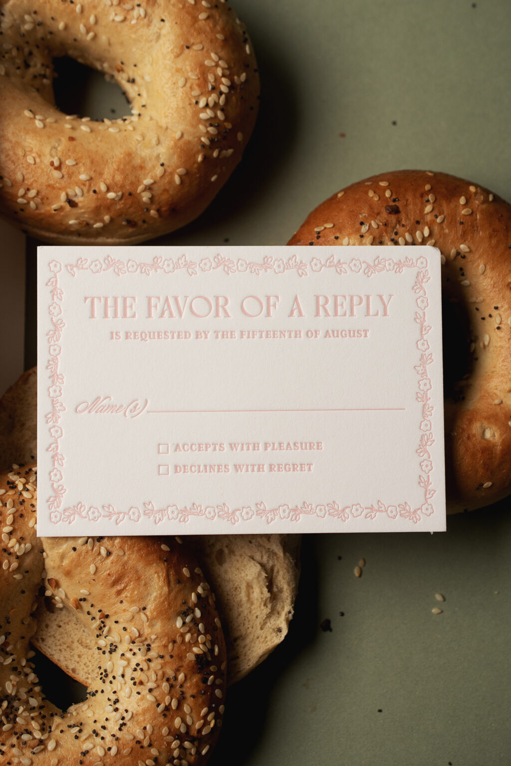
The reply card is letterpress printed in cherry blossom ink and features a delicate floral border. The ink color coordinates with the ribbon tied around the invitation.
Reply Card
letterpress ink: cherry blossom
fonts: wordless script + 1769 display + argent cf
papers: bella smooth cotton white 2-ply
card size: a-5
envelope: white text
envelope addressing: acadia digital on the front
job: 77040
The welcome party card closely mimics the design of the invitation. The same NYC-inspired custom pattern appears, but a thick, solid line border separates the pattern from the text.
Welcome Party Card
letterpress ink: acadia
fonts: wordless script + 1769 display + argent cf
papers: bella smooth cotton white 2-ply
card size: a-2
job: 77040
These custom NYC-inspired letterpress wedding invitations are both playful and formal, and one-of-a-kind. It was a pleasure to work with Colby and Matt, and we’re so happy to have turned their idea into a reality. Are you thinking about a custom pattern for your wedding invitations? Reach out, and we’ll be happy to help.
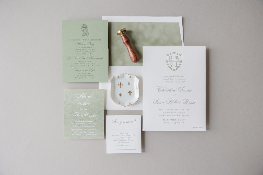
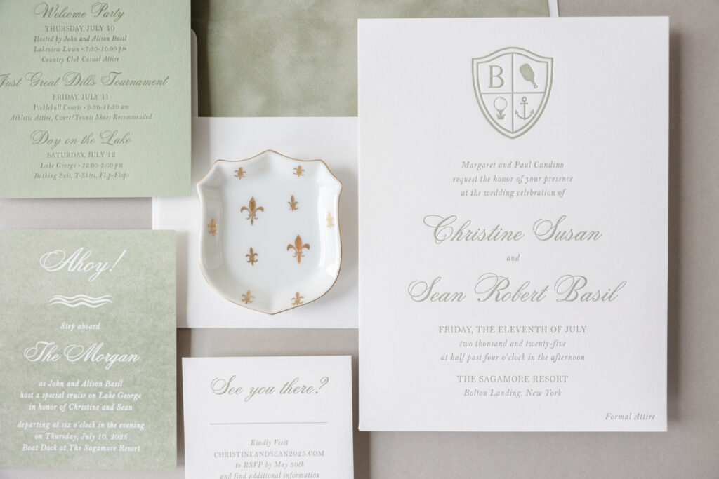
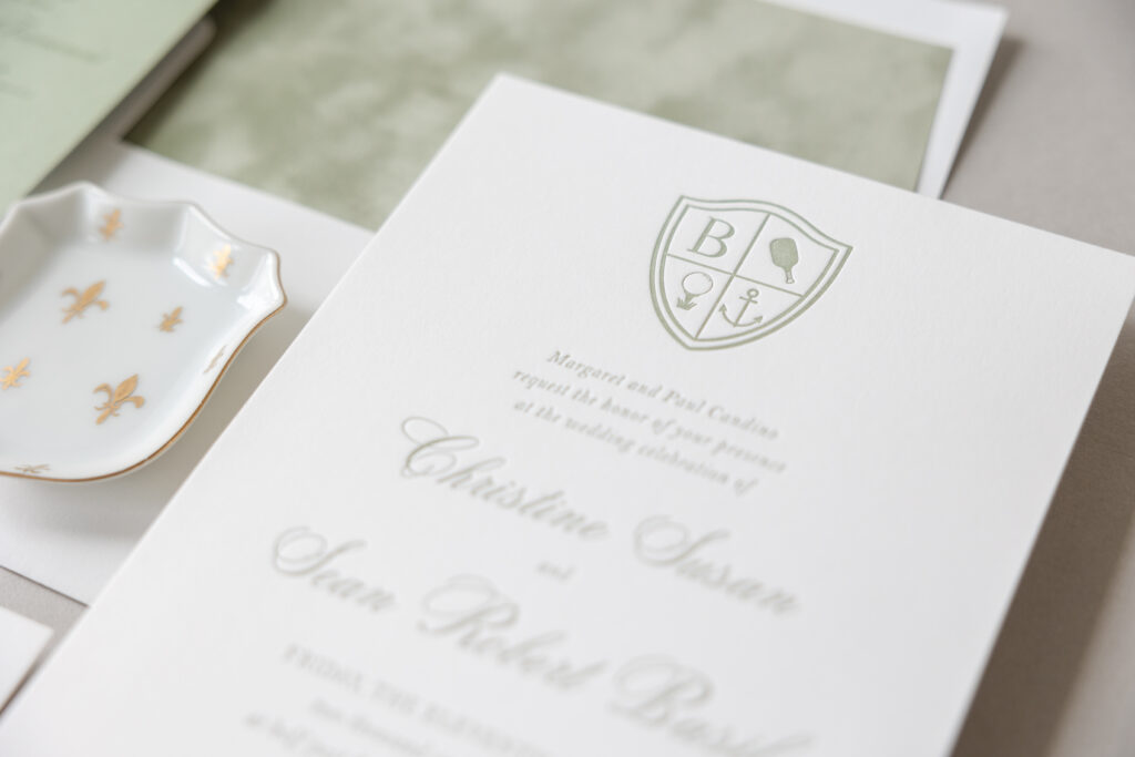
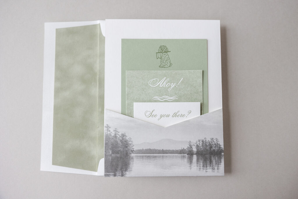
Christine and Sean’s wedding invitations are lovely and formal, and include many personal details that are special to the couple and their wedding. A soft color palette and a beautiful and functional back pocket elevate the design of these custom invitations. The couple worked with our dear friend Bridget of Wynwood Letterpress to create their wedding invitations.
Invitation
letterpress ink: spruce
fonts: citadel script std + bell mt regular/italic
papers: bella smooth cotton white 2-ply
card size: f-8
envelope liner: bella velvet asparagus
envelope: white cotton text
envelope addressing: hunter digital on the front and the back
job: 75801
Back Pocket
digital printing: cmyk
fonts: citadel script std + bell mt regular/italic
papers: bella smooth cotton white 1-ply
size: f-8 vertical back pocket (3.5 x 6.19),
die cut shape: ps-514
finishing: assemble to the back of the invitation
job: 75801
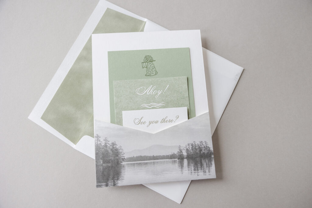
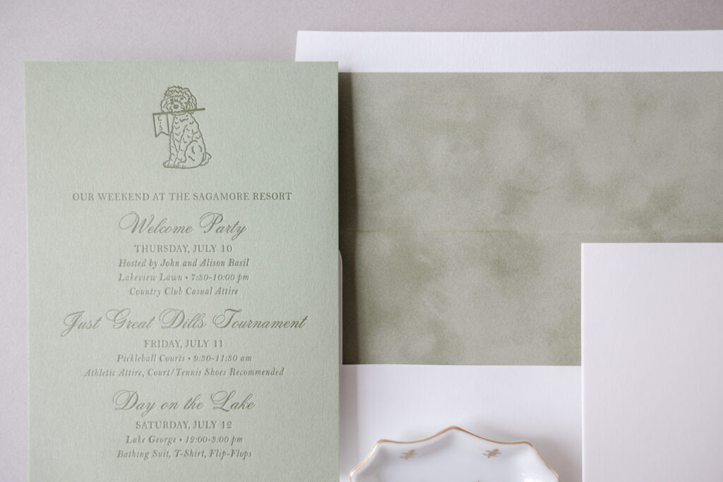
Weekend Events Card
letterpress ink: hunter
fonts: citadel script std + bell mt regular/italic
papers: spruce 1-ply
card size: a-6
job: 75801
The custom crest at the top of the invitation features the initial ‘B’ for the couple’s last name. The remaining sections of the crest contain different motifs representing activities from the weekend, including a golf ball on a tee, a boat anchor, and a pickleball paddle. This crest is fun and playful, and makes the invitation more personal. The traditional layout of the text, along with the stately fonts, establishes a more formal tone. The velvet liner is luxurious and introduces a soft texture.
A pocket adhered to the back of the invitation provides a spot to secure the additional cards in the suite. A digitally printed lake scene on the pocket panel is a nod to the location of the nuptials, The Sagamore Resort.
The weekend events card features our spruce paper, which matches the letterpress ink from the invitation. The standout detail of this card is the illustration of the couple’s beloved dog, who happens to be holding a banner with the couple’s initials. This is another charming detail that makes the suite feel personal and helps set the tone for the formal yet intimate weekend.
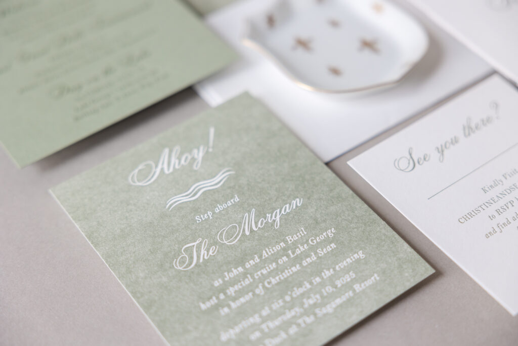
Boat Cruise Invitation
letterpress ink: spruce
fonts: citadel script std + bell mt regular/italic
papers: bella smooth cotton white 1-ply
card size: 4 x 5
job: 75801
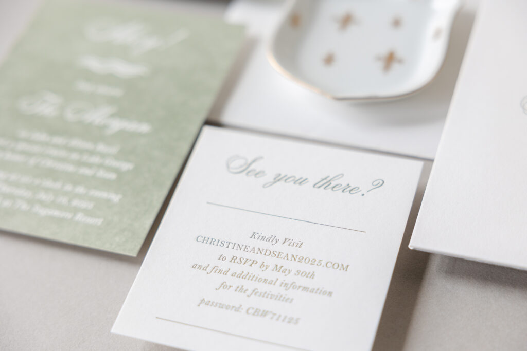
Reply Card
letterpress ink: hunter
fonts: citadel script std + bell mt regular/italic
papers: bella smooth cotton white 1-ply
card size: 3.44 x 3.75
job: 75801
The boat cruise invitation features spruce letterpress printing on our Bella Smooth Cotton white 1-ply paper. This card is unique because it features reverse printing. Instead of printing the text and leaving the rest of the card unprinted, the printing area is the entire card, except for the text and artwork. The text and artwork are the unprinted parts of the paper. When letterpress printing covers a large area, it creates an almost translucent, textured look. Utilizing this design technique distinguishes this card from the other pieces in the suite, while still maintaining a consistent appearance and theme.
Christine and Sean did an excellent job of balancing their fun personalities with formal invitations, creating something lovely and sentimental while still being traditional and elegant. Are you thinking about a custom crest, a venue-inspired back pocket, or a darling illustration of your pet? Work with one of our dealers to see ink and paper swatches, samples, and receive expert guidance in designing your dream wedding invitations.
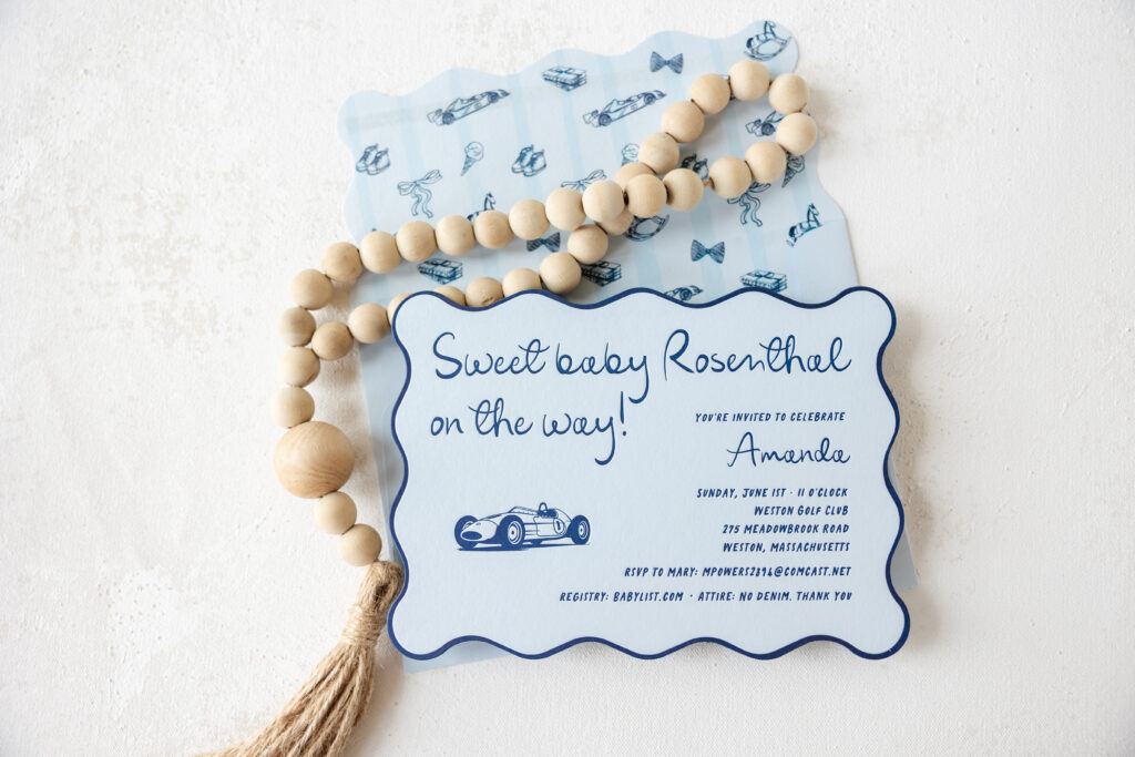
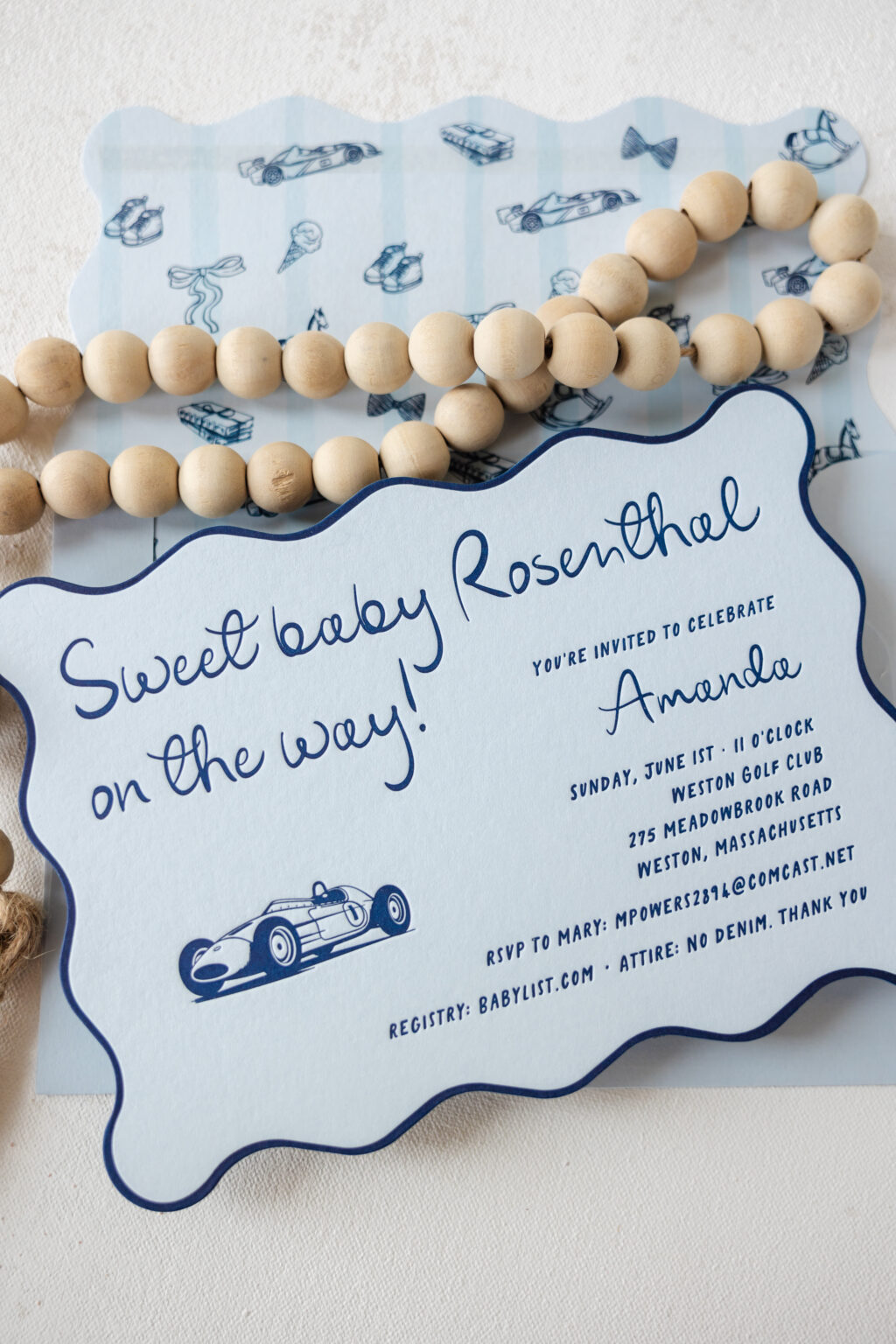
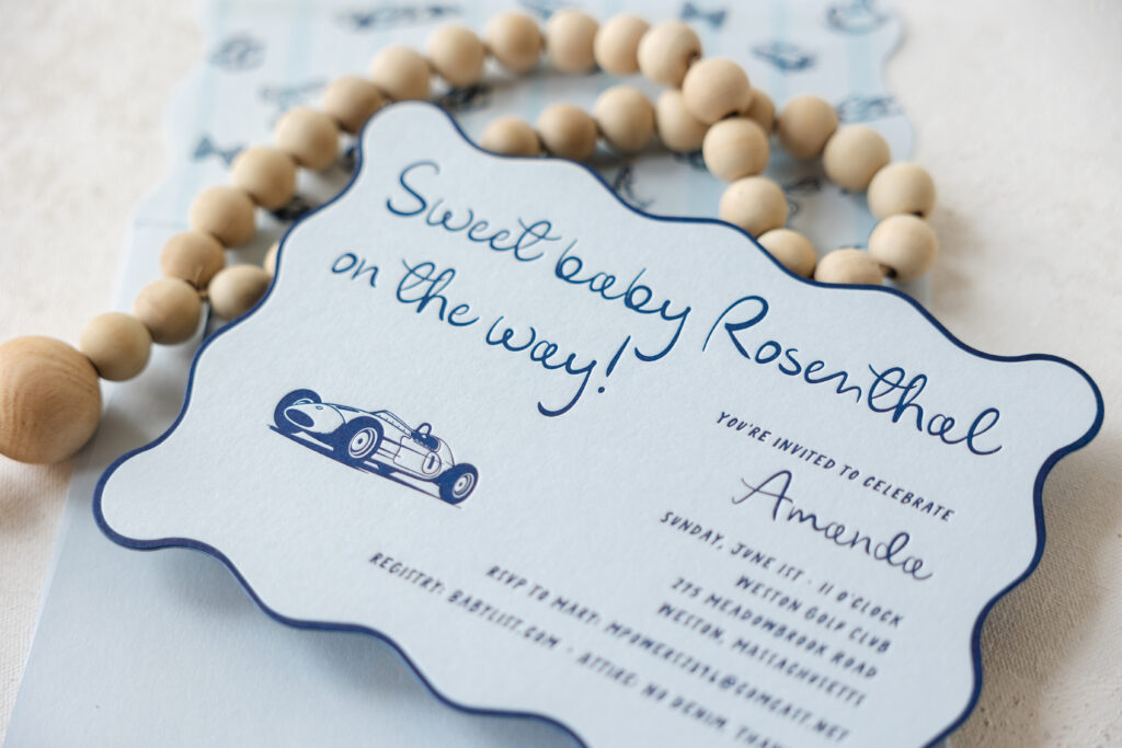
This darling baby shower invitation has a fun die-cut design and a custom envelope with an on-theme liner. Our dear friend Shayne, of Ink Papery, came to us with this charming design, and we can’t wait for you to see it.
Invitation
letterpress ink: navy
fonts: eternal blossom + california oranges
papers: sky 1-ply (front) duplexed to dark blue (back)
card size: a-7
card die cut shape: cd-591
custom converted envelope: sky text
envelope die cut style: e-401
envelope printing: rosalie pattern in navy + powder blue (interior) + navy (addressing)
job: 76246
The inspiration behind this baby shower invitation is our Rosalie wedding design. While the baby shower invite has a lot of similarities to the inspiration design, swapping the colors and artwork made it perfect for a baby shower. Navy letterpress printing on our sky paper is perfect for a mom-to-be welcoming a baby boy. The whimsical die-cut shape is both fun and playful, and the printing along the edge emphasizes its unique shape.
This invitation features a custom converted envelope, meaning it was custom-made in our shop to coordinate with the card perfectly. The envelope features text-weight stock in sky and digital printing in navy, as well as powder blue, so the colors match the paper and ink of the card. The scallop edge of the flap mimics the die-cut edge of the card for a cohesive appearance. The inspiration design envelope liner was reimagined using our wide selection of motifs to create a pattern that fits the theme and design.
Are you interested in a charming baby shower invitation, birth announcement, or custom converted envelopes? We can help bring your vision to life, or you can reach out to one of our dealers for expert tips and guidance, creating your custom invitations and more!
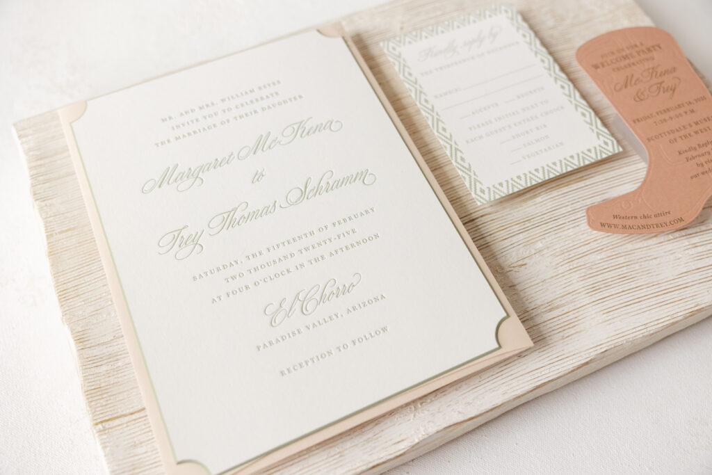
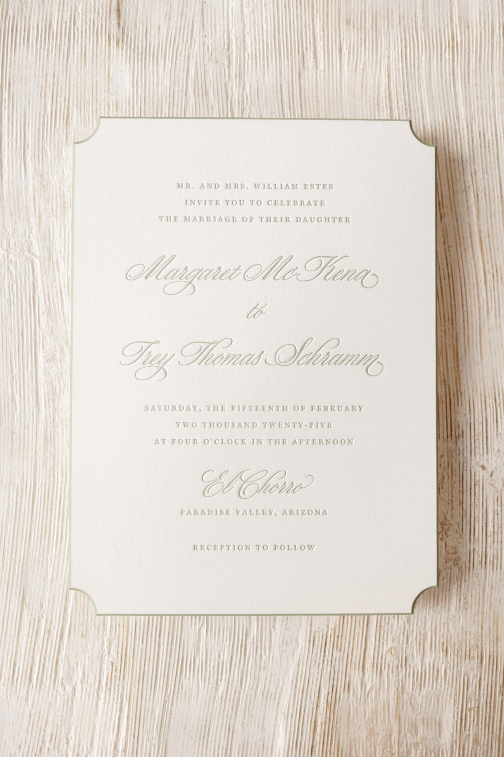
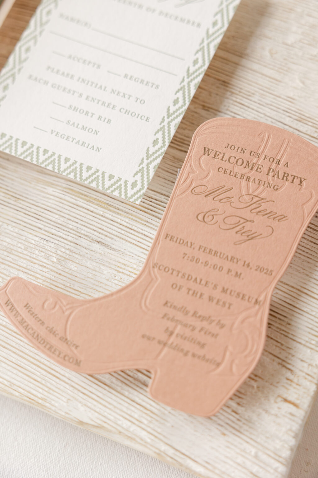
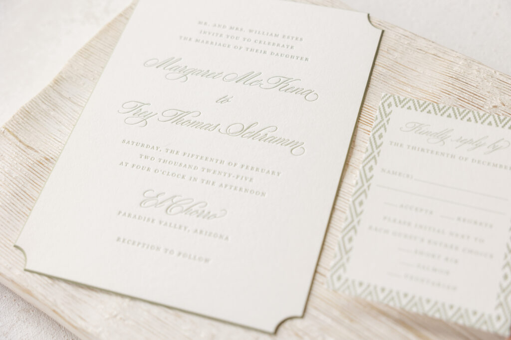
This invitation is traditional and formal, while the auxiliary pieces add a Southwest charm, making it unique, personal, and fun. Margaret and Trey worked with our dear friend, Kristyn of Oliver’s Twist, to customize our Elide design. The result perfectly captures the spirit of the festivities.
Invitation
letterpress ink: spruce
fonts: miller display + wordless script
paper: bella smooth cotton white 2-ply
card size: f-8
die cut shape: winston
bevel edge: 45°
edge paint: spruce
envelope: almond text
envelope addressing: spruce digital on the front and the back
job: 73385
The invitation is die cut into our Winston shape, which is sophisticated and formal. The edges are then beveled at 45° and edge-painted in spruce, perfectly coordinating with the letterpress ink used for the text. Adding edge painting highlights the bevel. The couple liked the look of the inspiration design, but opted for a different script font, selecting Wordless Script, which is still formal but more subdued and laidback than the script font from the inspiration design.
The additional cards in this suite diverge from the inspiration. The reply card has a geometric Southwest-inspired border that resembles woven fabric. The insert card is die-cut into the shape of a cowboy boot, which is fitting given that the card includes details of the welcome party, held at the Scottsdale Museum of the West. Blind deboss, or letterpress printing without ink, replicates the look of stitching on the boot, adding detail and dimension.
These Southwest inspired letterpress wedding invitations are lovely, and it was a joy to work on them. As always, it is a delight to work with Oliver’s Twist, and we wish the best to Margaret and Trey. We strive to offer a wide selection of designs to suit different looks and styles, and this invitation is an excellent example of how our designs can be reimagined and customized into a completely different aesthetic. Are you trying to figure out how to introduce a regional feel into your invitations? Or are you interested in using fun die-cut cards for additional pieces? Locate one of our dealers to help you create your dream invitations.
Social stationery or personalized stationery is gaining popularity, and for good reason. A heartfelt handwritten note perfectly conveys your sentiment, allowing you to connect with the recipient. Custom stationery has long been the standard for weddings, and many people are realizing the benefit of keeping personalized stationery on hand.
All social stationery orders receive a 20% discount off retail pricing. Social stationery pieces include flat and folded notes, calling cards, lettersheets, and gift tags.
Social Stationery Etiquette
1. Choosing the Right Stationery:
Formal vs. Informal: Formal stationery is generally used for more professional or significant occasions, while informal stationery is suitable for casual notes to friends and family.
Personalization: Consider whether to use your full name, initials, or a monogram on your stationery.
Style: Choose stationery that reflects your personal style and the tone of your message. You can opt for embossed stationery, colored paper, or more modern designs.
Ink Color: Black or dark blue ink is considered more formal, while other colors can be used for casual notes.
2. Considering the Recipient:
Relationship: If you’re writing to someone you’re on a first-name basis with, you might choose a more casual style.
Professional or Formal: When addressing professionals or people you’re less familiar with, using formal stationery and titles (if appropriate) is important.
3. Word Choice and Tone:
Formal: For formal occasions, use proper titles, formal greetings (e.g., “Dear Mr./Ms. Last Name”), and a more formal tone.
Informal: For casual notes, you can use nicknames, casual greetings (e.g., “Hi”), and a more relaxed tone.
Spelling: Always spell out words in full when writing to someone of a higher social standing.
Avoid Abbreviations: Avoid abbreviations unless they are common and easily understood.
4. Examples of Social Stationery Use:
Thank You Notes: Always send a thank you note for gifts, hospitality, or other acts of kindness.
Invitations: Use formal or informal stationery depending on the type of event (e.g., formal wedding invitation vs. casual birthday party invitation).
Condolence Notes: Use a formal and compassionate tone when sending a condolence note.
Birthday Notes: Use informal stationery and a cheerful tone when sending a birthday note.
5. Etiquette Considerations:
Handwriting: Always write thank you notes and other personal notes by hand.
Timing: Send thank you notes promptly, ideally within a week or two of receiving a gift. Address: It’s generally considered polite to hand-address envelopes, especially for formal occasions.
6. Where to Write Your Message:
Flat notes should be handwritten on one side only. Folded notes, often referred to as informals, should be written on the inside only, but it is appropriate, if you need more space, to write on the top inside of the card rather than the back.
Shop our Social Stationery Collection.
Create Your Own Social Stationery
Check out our social stationery designs. Like all of our designs, the social stationery designs are customizable. You can change the fonts, paper, printing methods, colors, envelope liner, and more to create something unique, or you can create your very own stationery design. Contact us to learn more and create your social stationery.
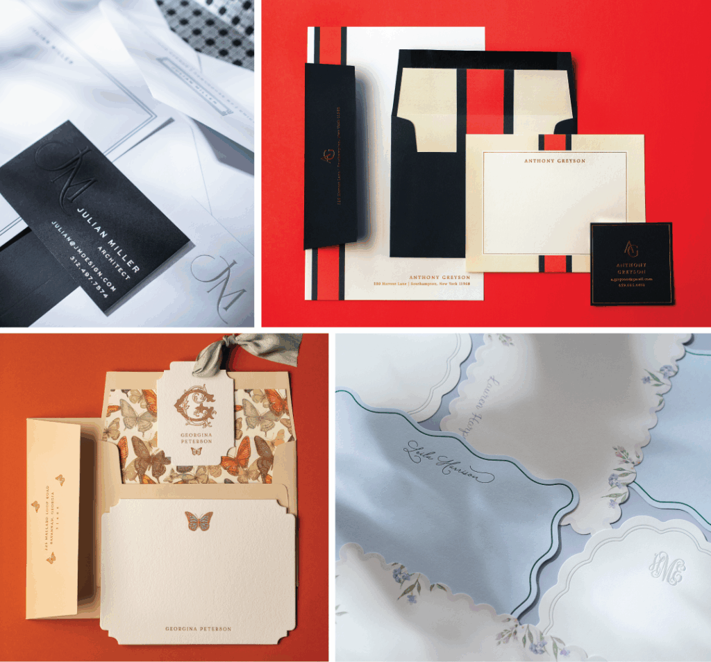
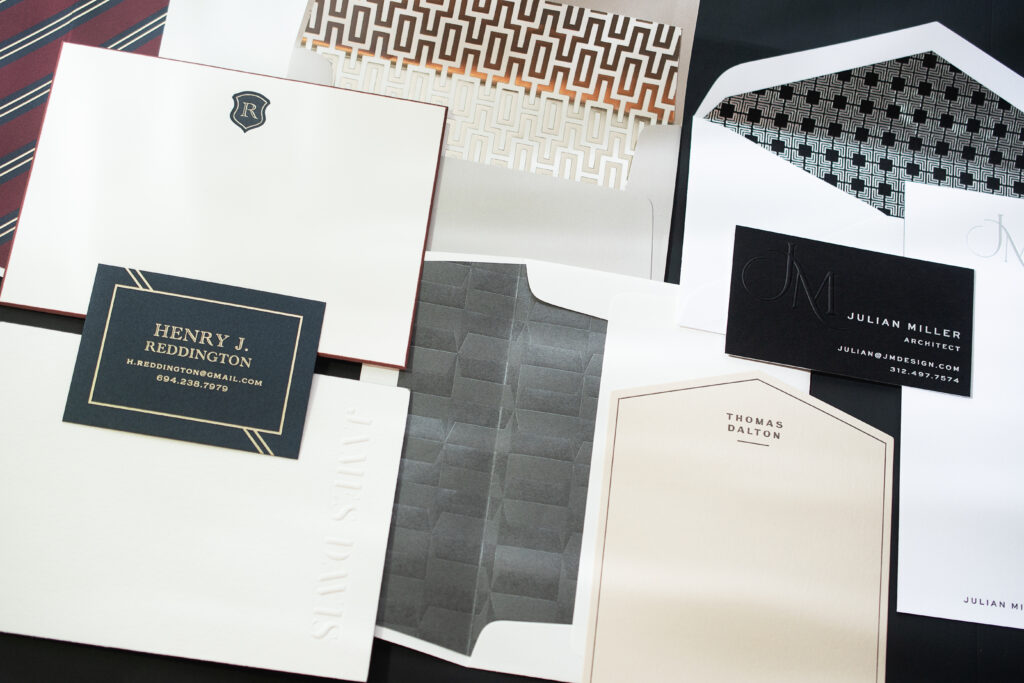
We recently released our first-ever social stationery collection, and we’re excited to share with you some of the inspiration behind this release. We wanted to elevate the look of the handwritten note with this collection. Stationery is an opportunity to let your personality shine through on paper and leave a lasting impression.
So we tried to create stationery suites that could speak to lots of different styles. From modern and tailored designs like Julian and Anthony. To whimsical and wonderful designs like Georgina and Lauren.
We paired together refined typography, elegant patterns, and bold die-cut shapes to create designs that will wow whoever receives them. But the customization options are endless, so we hope you can use these designs to inspire what is perfect for you!
See all of these new designs in our Social Stationery Collection. Are you ready to create your own social cards? Contact us to create your very own custom note card, calling card, tag, or more! You can also work with one of our dealers to see samples, paper and ink swatches, and receive expert tips and guidance.
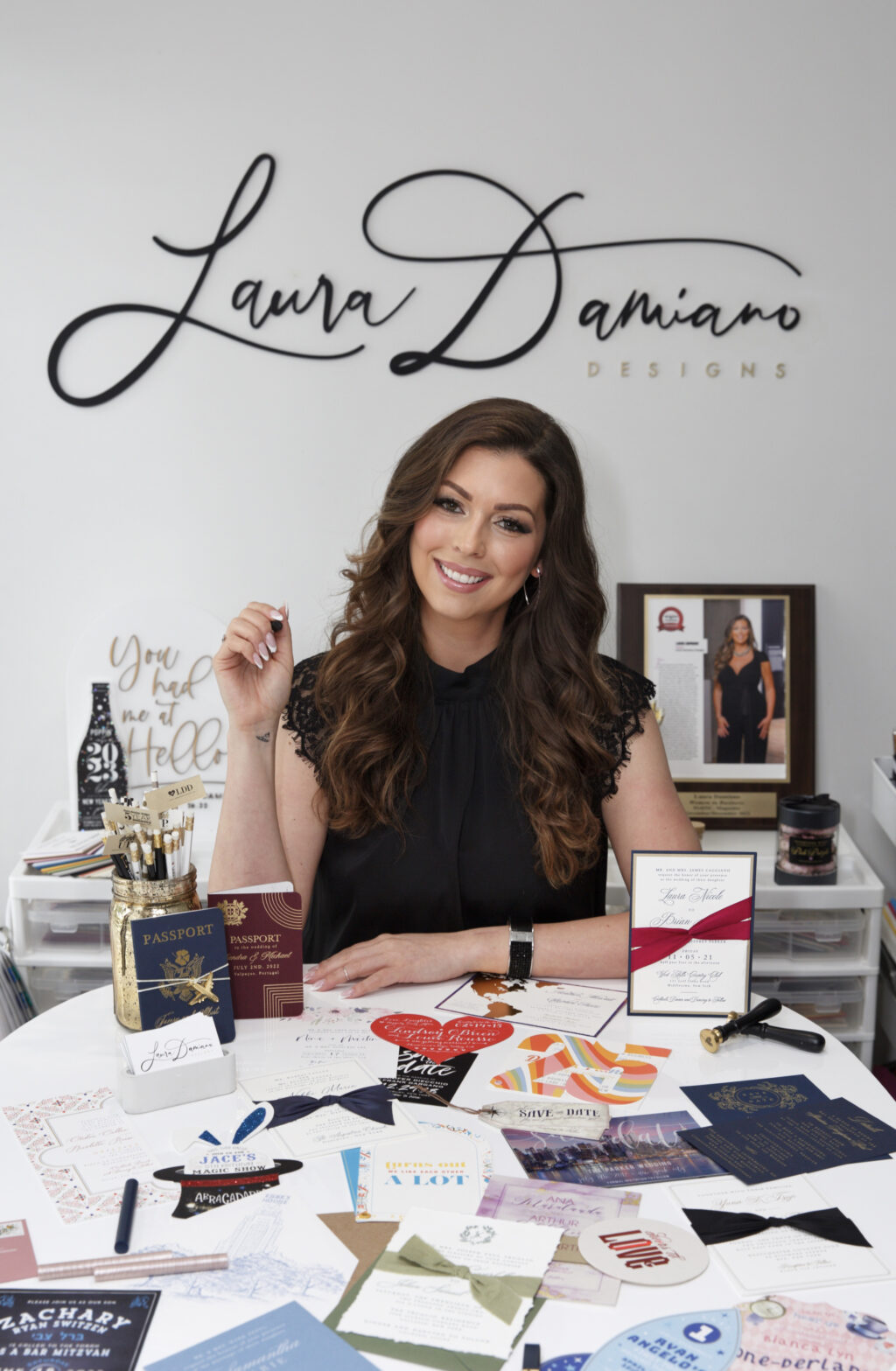
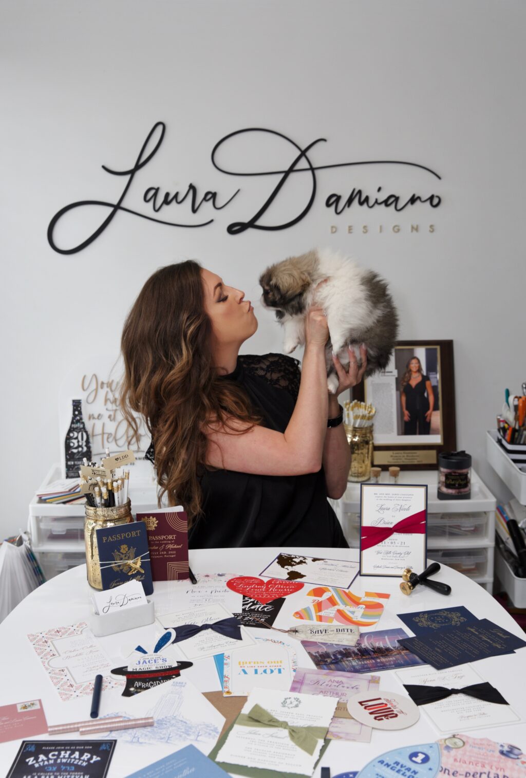
We recently caught up with Laura of Laura Damiano Designs and learned how she got her start in the industry, what inspires her to keep going each day, the best advice she ever received, and more!
Tell Us About Yourself and How You Got Into the Stationery Business
I’ve always been an artist at heart. Growing up, I was constantly drawing, coloring, and dreaming beyond the lines. What started as a childhood love for creativity quickly grew into a lifelong passion that shaped the first two decades of my life.
I began my journey in the stationery world purely out of a love for paper and typography. While working in corporate America, I had the opportunity to design all the stationery and signage for a wedding – and I instantly fell in love with everything and the process. Once people saw what I could do, they started reaching out for their own events. One thing led to another, and what began as a creative side hustle turned into a full-blown business. Fast forward, here I am 15 years later and still going strong!
Where Do You Find Inspiration?
I draw inspiration from everything around me. I’m always observing, absorbing, and creating in my head. I keep a notebook close to capture my thoughts – quick scribbles that often snowball into new ideas. One idea sparks the next, and before I know it, my imagination is exploding.
What is the Best Advice Anyone Has Ever Given You?
The best advice anyone has ever given me is to never be afraid to ask questions. To admit that you don’t know everything is not a weakness – it’s a strength. Because questions lead to answers, answers lead to growth, and growth allows us to adapt and conquer. Curiosity is not just the beginning of knowledge; it’s the beginning of transformation.
What Does a Typical Day in Your Life and Business Look Like?
As a single mom and business owner, my days are never short and never simple. But I refuse to let the busyness stop me. With organization, resilience, and moments of self-care, I create space for both responsibility and growth. Every day reminds me that strength is built in the balance.
What Can Couples Expect When They Work With You?
Couples can expect a truly personalized, one-on-one experience from start to finish. Every detail is carefully tailored to reflect their story, ensuring the design is completely unique to them. I never duplicate art. Each piece is intentionally crafted as a one-of-a-kind creation – never cookie-cutter.
More About Laura
Laura Damiano Designs is a multi-award-winning studio specializing in custom wedding invitations, event stationery, and brand design. Based in Westchester, New York, and serving clients throughout the Tri-State area and worldwide, Laura Damiano Designs offers bespoke creations that capture the unique stories and personalities behind life’s most meaningful moments and professional milestones.
Each piece is personally designed by me, Founder + Creative Director, Laura Damiano – ensuring a distinctive, handcrafted touch. From timeless elegance to bold modern styles, I bring limitless creativity to every project – carefully selecting colors, fonts, and design elements to reflect each client’s individual vision.
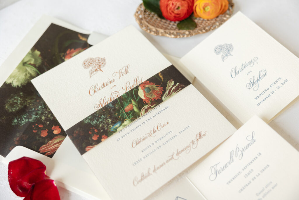
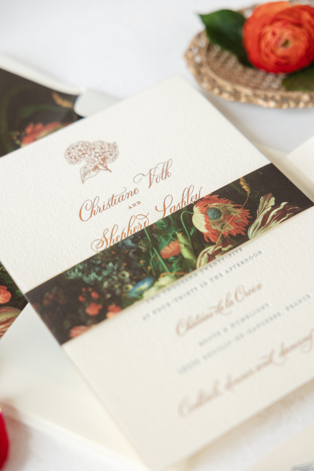
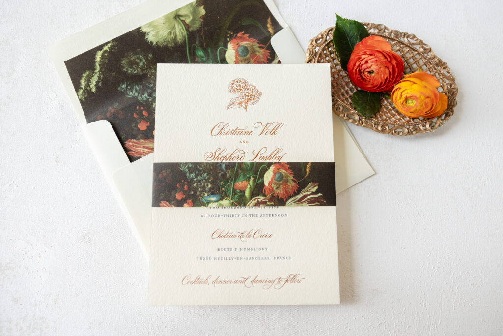
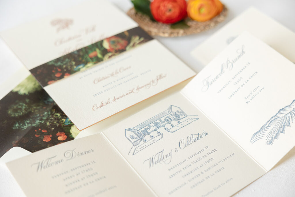
Everything about Christiane and Shepherd’s wedding invitation suite is charming and dreamy. This couple said ‘I do’ at Château de la Croix, located in the French Riviera, and their wedding stationery struck the perfect balance between a rustic French countryside feel and a black-tie affair. We were so happy to work with our dear friend Stacey of Union Street Papery on these French Riviera estate wedding invitations.
Invitation
letterpress ink: yale
foil stamping: copper matte
fonts: bodega + mrs eaves
paper: bella cotton ivory 2-ply
foil edging: copper matte
card size: f-8
envelope liner: viola pattern in cmyk
envelope: white cotton text
digital envelope addressing: yale digital on the front and the back
job: 75972
Belly Band
digital ink: cmyk
paper: ivory text
card size: f-8 vertical belly band (1.5 x 13.25 open, 1.5 x 6.24 closed)
job: 75972
The invitation features copper matte foil stamping and yale letterpress ink on our Bella cotton ivory 2-ply paper. The ivory stock has a soft texture but still holds a deep letterpress impression. Our viola pattern appears on the liner and the belly band. This rustic floral pattern has a refined yet moody vibe. We offer a wide array of patterns that make excellent envelope liners, and all of them can also be repurposed for use on belly bands, the back of cards, gatefolds, or anywhere else. The edges of the invitation are lined in copper matte foil, introducing a sense of glamour.
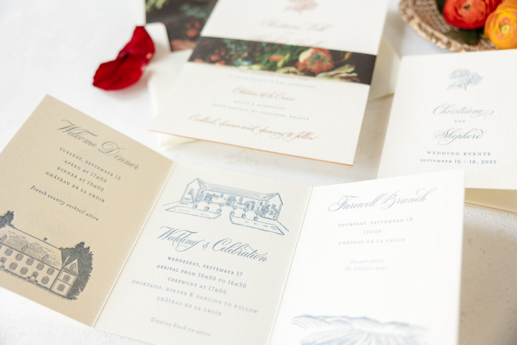
The tri-fold details card merges style and functionality. Yale letterpress printing appears on both the front and back, coordinating with the invitation. Illustrations of the venue adorn several panels, while the first panel features the same floral motif that appears on the invitation.
Details Card
letterpress ink: yale (front) / yale (back)
fonts: bodega + mrs eaves
paper: bella cotton ivory 1-ply
card size: a-2 tri-fold card (5.44 x 12.56 open, 5.44 x 4.19 closed)
finishing: score
job: 75972
These custom estate wedding invitations boast so many wonderful details, including custom artwork of the venue, foil edging, and a decadent floral belly band. Whether you’re daydreaming about a chic French countryside aesthetic or another look that perfectly aligns with your big day, we can make it happen, or you can work with one of our highly skilled dealers to receive the guidance and assistance you need.
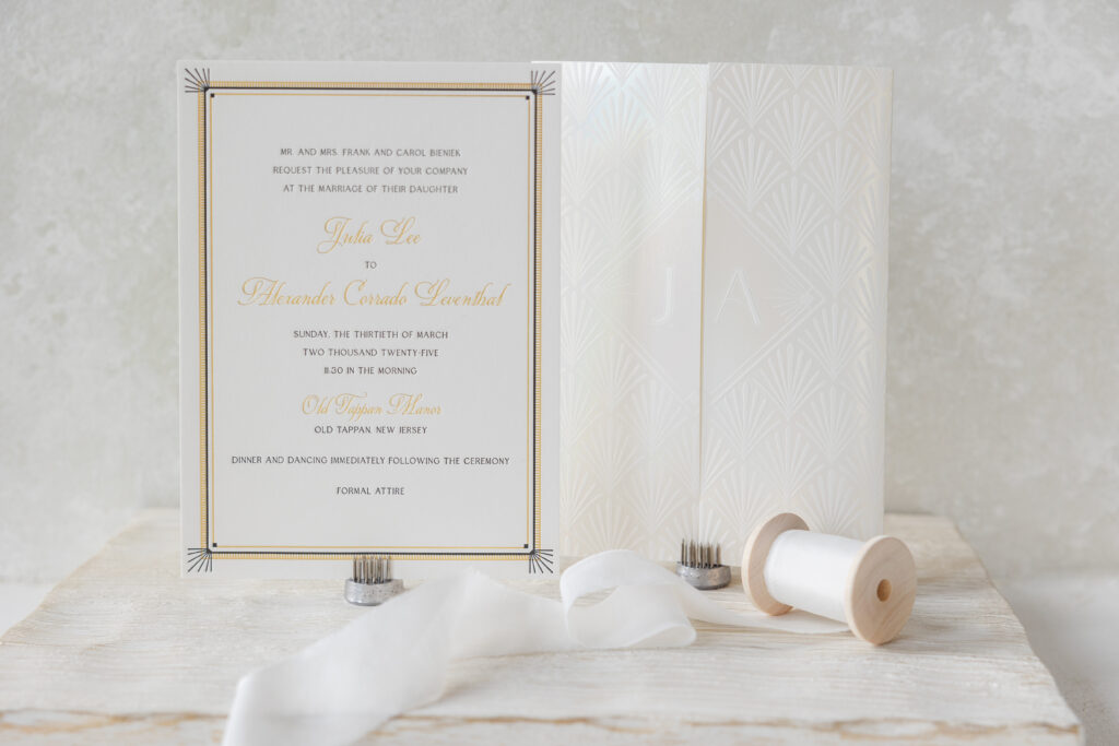
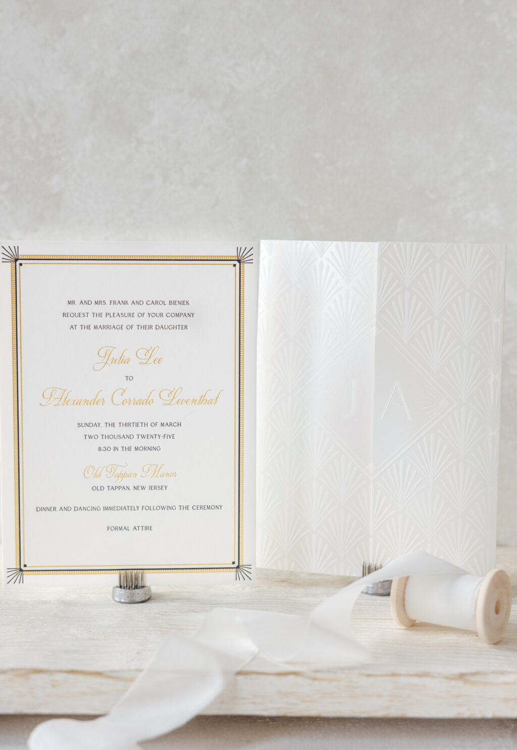
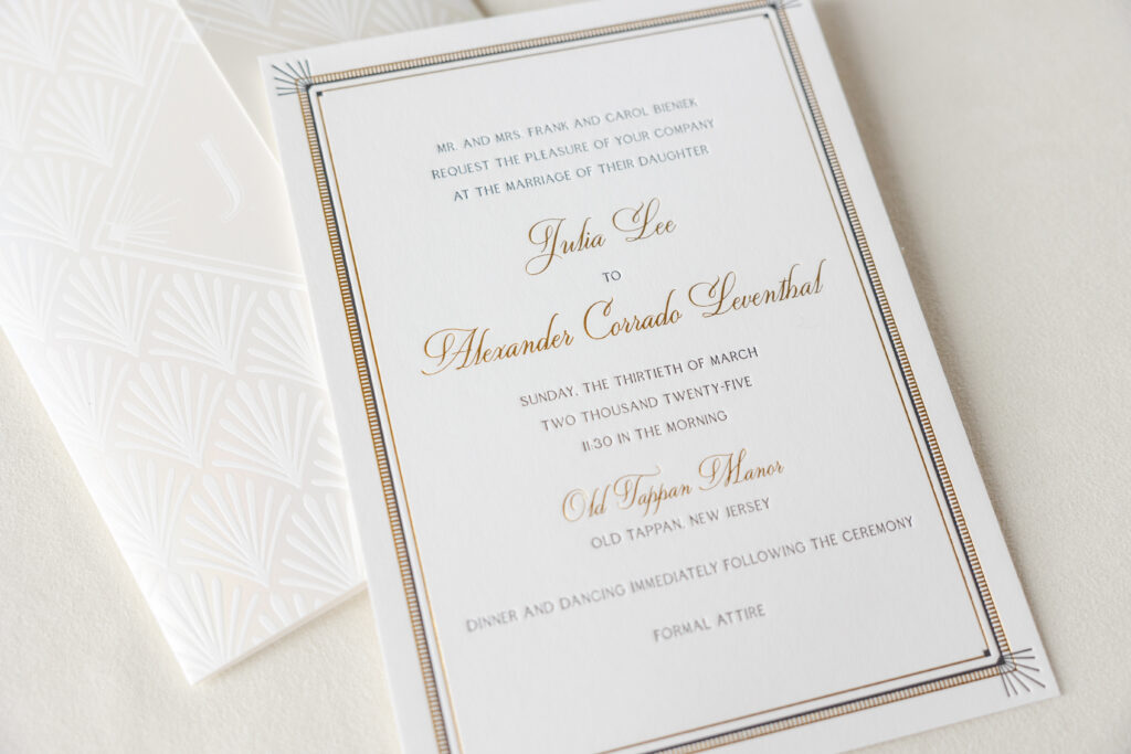
Julia and Alexander worked with our dear friend Sheryl of Arabesque of Naples to create their custom Art Deco wedding invitation. The invitation is lovely and glamorous, and it is also paired with a stunning foil-stamped gatefold that elevates this invitation suite.
Invitation
letterpress ink: black
foil stamping: gold matte
fonts: quita + edith
paper: bella smooth cotton white 2-ply
card size: 5.81” x 7.94”
inner invitation envelope: white cotton text
outer invitation envelope: white cotton text
digital envelope addressing: black digital on the front and the back
job: 73989
Gatefold
foil stamping: opaline shine
fonts: edith
paper: bella smooth cotton white 1-ply
size: 11.77” x 7.94” flat, 5.87” x 7.94” folded
finishing: score
job: 73989
The invitation features a delicate border with thin, alternating lines in gold matte foil and black letterpress, along with a ladder-like pattern in foil. Letterpress sunbursts accent the corners. The frame is geometric and highly detailed, and does an excellent job of drawing the eye to the text. The text also alternates between letterpress and foil stamping, with the names appearing prominently in a larger script font and foil-stamped in gold matte.
The gatefold is a showstopper. This enclosure features an Art Deco shell pattern on the exterior. The bride and groom’s first initials appear on the front, but on opposite sides of the opening, lining up perfectly when the gatefold is closed. Opaline shine foil gives the gatefold an ethereal quality.
We are delighted to have had the opportunity to bring Julia and Alexander’s vision to life, and we wish them all the best. Do you have your heart set on an Art Deco wedding invitation or a luxurious gatefold? Locate one of our dealers so you can see samples and receive expert tips and guidance to create your custom invitations!
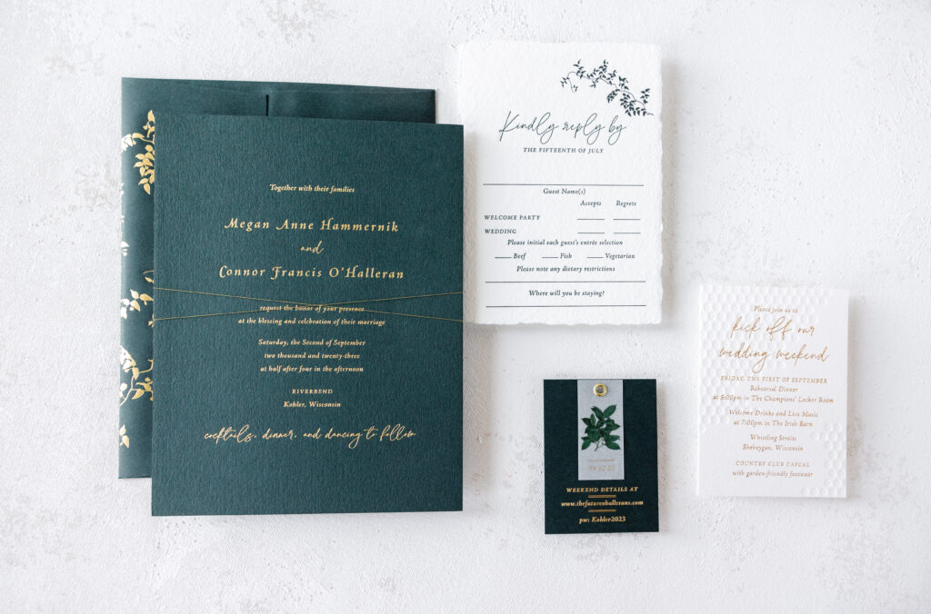
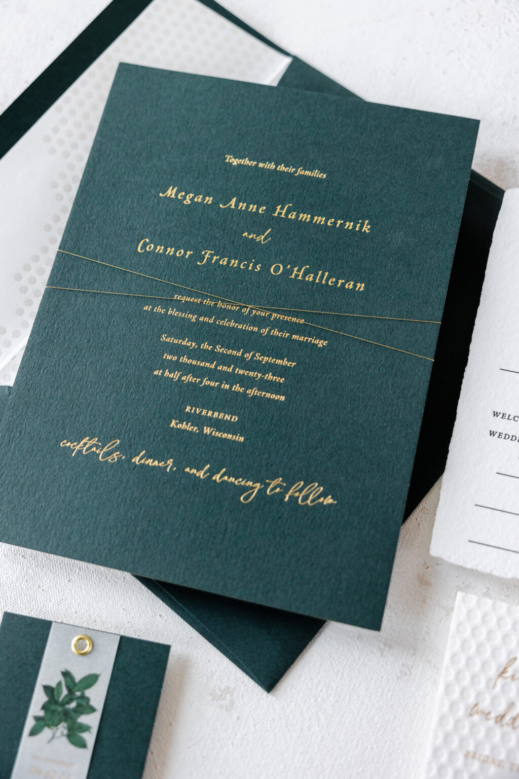
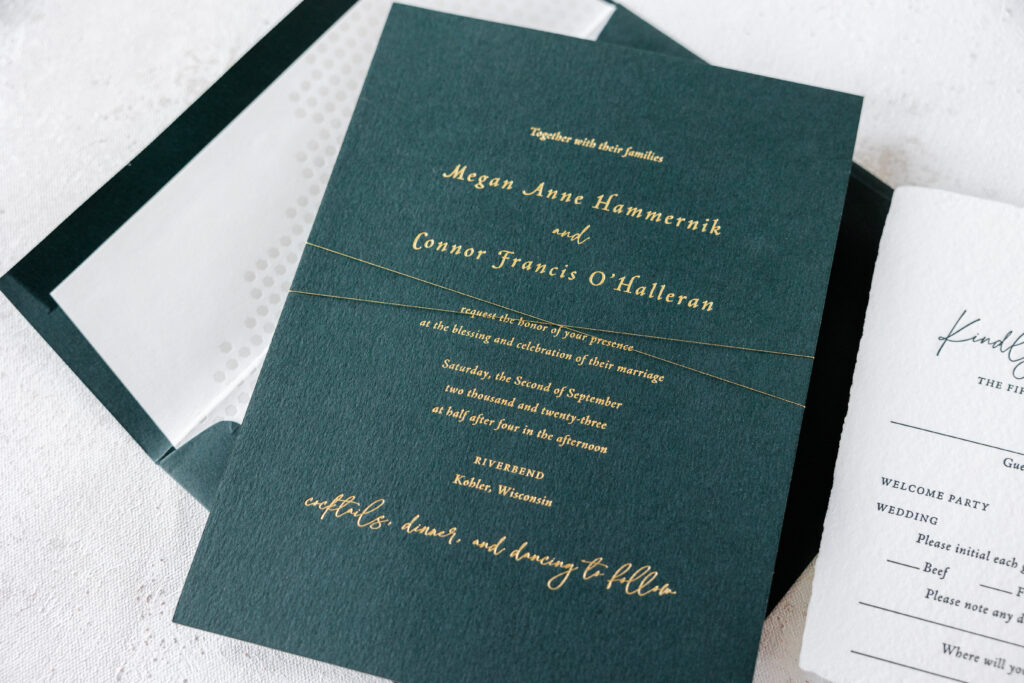
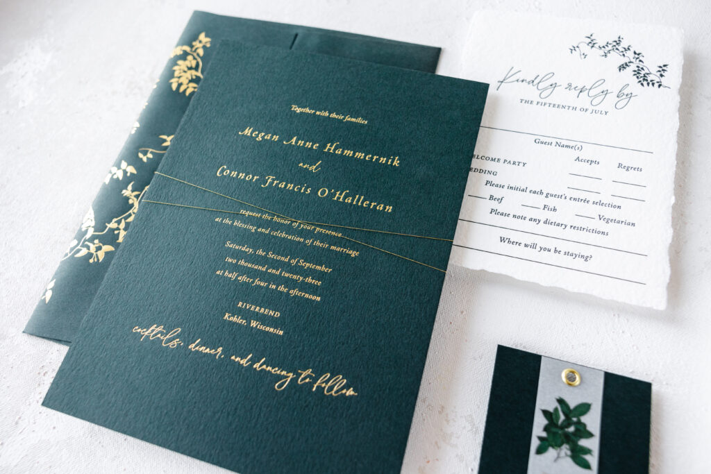
Our dear friends at Smitten Boutique brought us the invitation design for Megan and Conner’s big day, and it is amazing. This lovely wedding invitation suite combines elements from various designs, creating something utterly unique that perfectly fits together in an elegant and stylish way.
Invitation
foil stamping: gold matte
fonts: la luxes + adobe jenson
paper: bella holly 2-ply
card size: f-8
foil edging: gold matte
thread: metallic gold
envelope liner: custom sweet christine pattern in pearl shine foil on white text
envelope: holly text
envelope foil stamping: gold matte on the back flap
job: 67150
Reply Card
letterpress ink: holly
fonts: la luxes + adobe jenson
paper: bella handmade white
card size: a-6 deckle edge
envelope: holly text
envelope foil stamping: gold matte on the front
job: 67150
The invitation features the layout of our Ines design. Gold matte foil on our holly paper is elegant, while the 2-ply stock features a deep impression. Foil edging in gold matte adds even more decadence. The envelope also features our holly stock with gold matte foil stamping on the flap. The artwork is our Everly vine motif. All of our motifs can be reimagined as accents on any piece in a suite, from cards to envelopes.
The Everly vine motif is also found on the reply card, creating consistency between the pieces. Our Leone reply card is the design inspiration behind Megan and Conner’s reply card. For this card, the holly color is introduced via letterpress printing.
Details Card
foil stamping: gold matte
fonts: la luxes + adobe jenson
paper: bella holly 1-ply
card size: no. 17
finishing: hole drill (3/16″); assemble with details tag and gold grommet
job: 67150
Details Card Tag
foil stamping: gold matte
digital printing: cmyk
fonts: la luxes + adobe jenson
paper: 40# vellum
card size: 1×2.25”
diecut shape: cd-342
finishing: hole drill (3/16″)
The details card combines gold matte foil with our holly paper and a vellum overlay, held in place with a gold grommet. The inspiration behind this piece is the details card from our Ichabod design. The concept was reworked to fit within this suite, and the design is seamless.
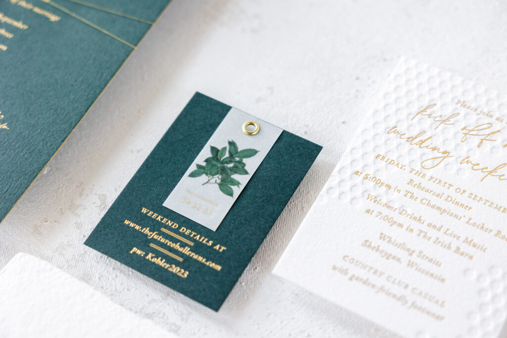
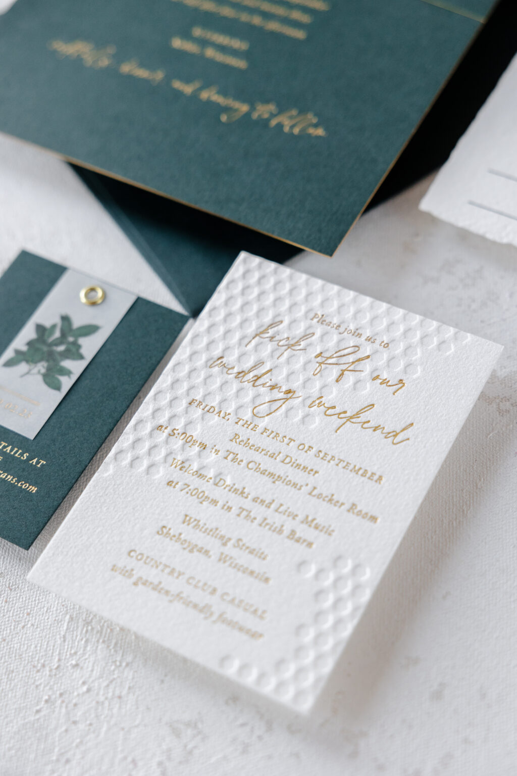
Events Card
deboss: blind
foil stamping: gold matte
fonts: la luxes + adobe jenson
paper: bella cotton white 2-ply
card size: a-5
job: 67150
The events card borrows the honeycomb artwork from our now-retired Sweet Christine design. The text appears in gold matte foil, while the patterned artwork is blind debossed, or printed without ink. Our 2-ply paper holds a crisp impression, even when the foil-stamped text overlaps. The honeycomb pattern also appears on the envelope liner, although this iteration is in foil. Pearl shine foil adds a subtle shimmer.
The entire suite is held together with metallic gold thread wrapped around the stacked pieces in a criss-cross pattern before being slipped inside the envelope.
This charming wedding invitation suite includes nature motifs and geometric patterns, as well as different print methods and various paper stocks, and everything beautifully works together in a perfectly orchestrated way. We wish the best to Megan and Conner, and we are so appreciative to Smitten Boutique for bringing us such a lovely design. Locate one of our dealers to create your own custom wedding invitation suite.
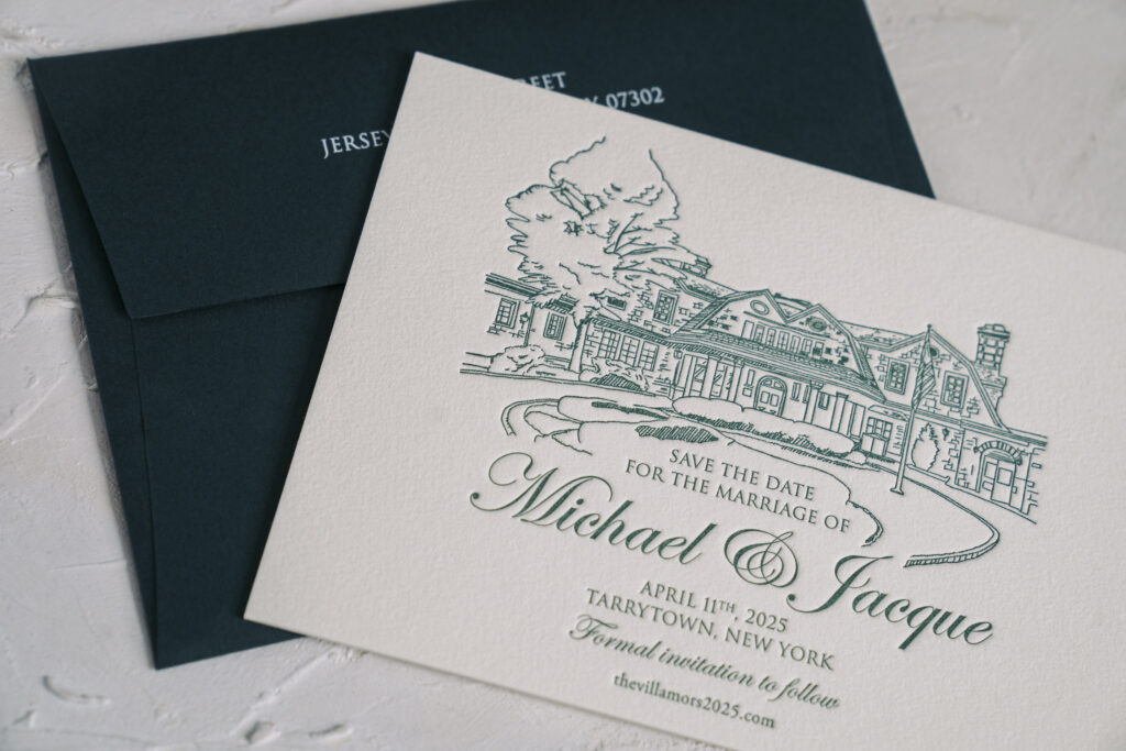
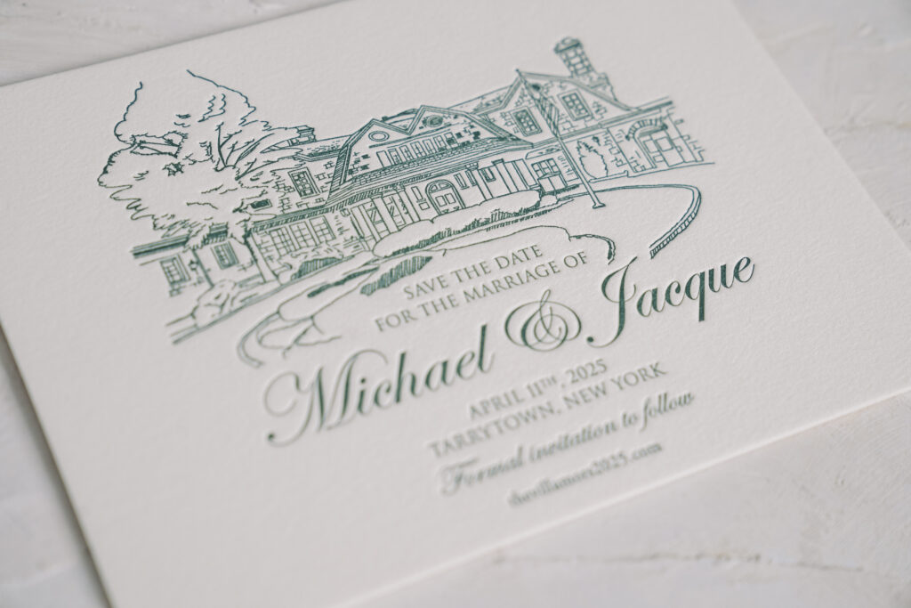
These striking letterpress save the dates are completely custom and feature an illustration of the venue for a personal touch. Michael and Jacqueline worked with our NYC store for their custom save the date.
The couple chose our cotton 2-ply, which has a pillowy feel and soft texture. The stock holds a nice, deep impression and perfectly showcases the thin lines of the supplied artwork. The standout feature of this save the date card is the illustration of the wedding venue, the Tappan Hill Mansion.
Specifications
letterpress ink: myrtle
fonts: trajan + edwardian script
paper: bella cotton ivory 2-ply
card size: a-6
envelope: holly text
digital envelope addressing: white digital on the back
job: 71616
Myrtle letterpress ink, paired with our ivory paper, is stately and elegant, and sets the perfect tone for a spring wedding. Our holly envelope coordinates beautifully with the letterpress ink. White envelope addressing on the holly envelope is on trend and elevates the look.
Are you interested in creating elegant letterpress save the dates? Or incorporating an illustration? We can make it happen. You can work with us or you can work with one of our dealers to create your dream save the date cards.