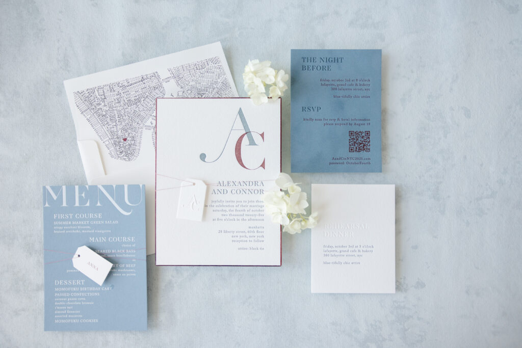
Contemporary typography, understated luxury, and meaningful personal details give Alexandra and Conner’s letterpress invitations a sophisticated feel while remaining timeless. This couple customized our Province design, making it their own. Our dear friend Alyssa of Erganic Design helped the couple create their perfect letterpress invitations, brimming with lovely details.
Invitation
letterpress inks: deep blue + currant
fonts: caslon + aw conquerer didot
paper: bella cotton 2-ply white
card size: f-8
bevel: 45 degrees
foil edge: burgundy shine
finishing: assemble with mounting card and belly band
envelope liner: custom pattern in black + currant digital on white text
envelope: white cotton text
envelope addressing: deep blue digital on the front and the back
job #: 77424
Invitation Tag
emboss: blind
paper: bella velvet french blue (front) / bella cotton 1-ply white (back)
card size: 1.25” x 2”
die-cut shape: cd-2
metallic thread: cranberry
finishing: assemble with the invitation and thread
job #: 77424
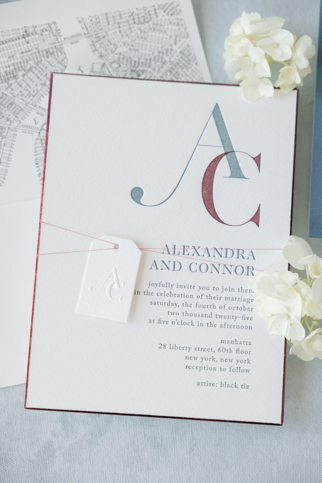
The layout embraces generous white space, allowing each design element to be admired and enjoyed. The beauty of this design comes from the restraint and subtle contrast. A mix of oversized, artistic initials creating a distinctive monogram and delicate serif fonts is a refined design feature.
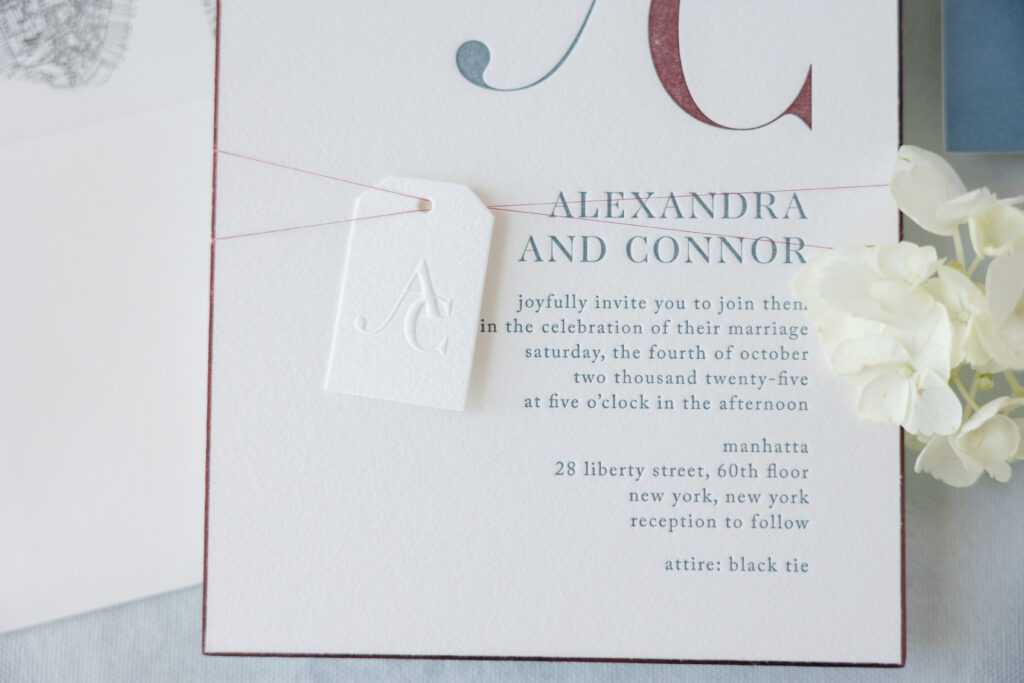
Burgundy shine foil showcases the bevel edge while adding some glimmer. A tag bearing the invitation’s monogram, this time blind-embossed, is secured to the invitation with metallic cranberry thread. The shimmer of the metallic thread beautifully coordinates with the foil edging.
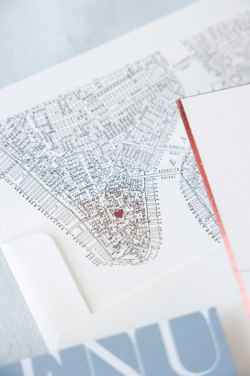
The vintage-style map envelope liner is a darling addition. A heart motif marks the location of the wedding and reception venue for a charming personal detail.
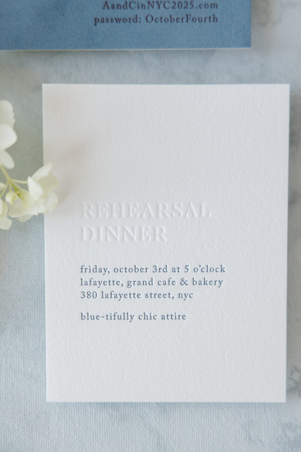
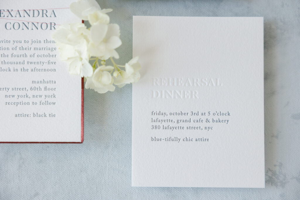
Rehearsal Dinner Invitation
letterpress ink: deep blue
deboss: blind
fonts: caslon + aw conquerer didot
paper: bella cotton 1-ply white
card size: a-2
job #: 77424
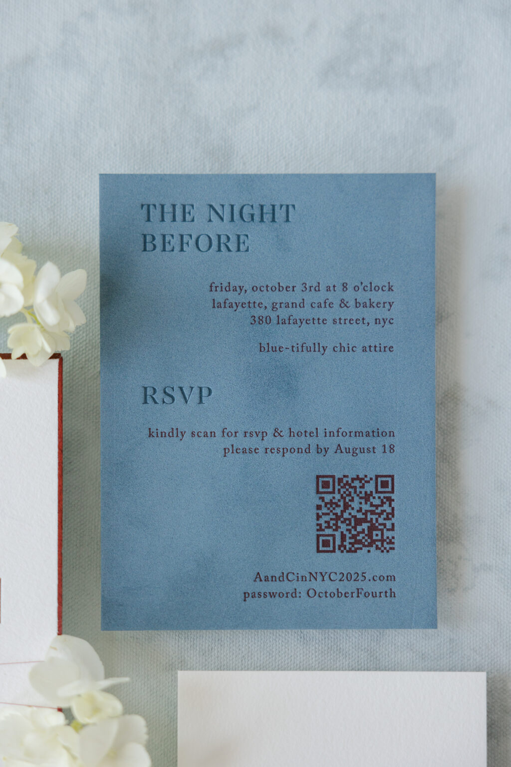
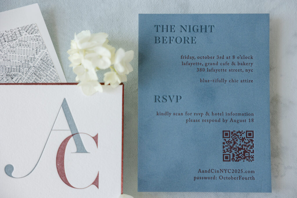
Details Card
letterpress inks: deep blue + currant
fonts: caslon + aw conquerer didot
paper: bella velvet french blue (front) / bella cotton 1-ply white (back)
card size: a-6
job #: 77424
The auxiliary cards in this wedding stationery suite are just as stunning as the invite. The details card features letterpress printing on our velvet stock. Velvet adds a lovely texture and holds a crisp letterpress impression. The use of our deep blue letterpress ink on our French blue velvet creates a stunning tonal look.
The rehearsal dinner invitation is a masterclass in minimalism. Blind debossing on our Bella cotton 1-ply paper mimics the look of tonal printing while showcasing the depth of the debossing and the stock’s soft texture. Utilizing letterpress printing in our deep blue ink for the remaining text maintains consistency across the rest of the suite.
Menu
foil stamping: white matte
fonts: caslon + aw conquerer didot
paper: bella storm 2-ply
card size: a-7
job #: 79002
Menu Tag
digital ink: currant
paper: bella smooth cotton 1-ply
card size: 1.25” x 2”
die-cut shape: cd-2
metallic thread: cranberry
finishing: assemble with the menu and thread
job #: 79002
Table Card
digital ink: currant
paper: bella smooth cotton 2-ply
card size: a-6
job #: 79002
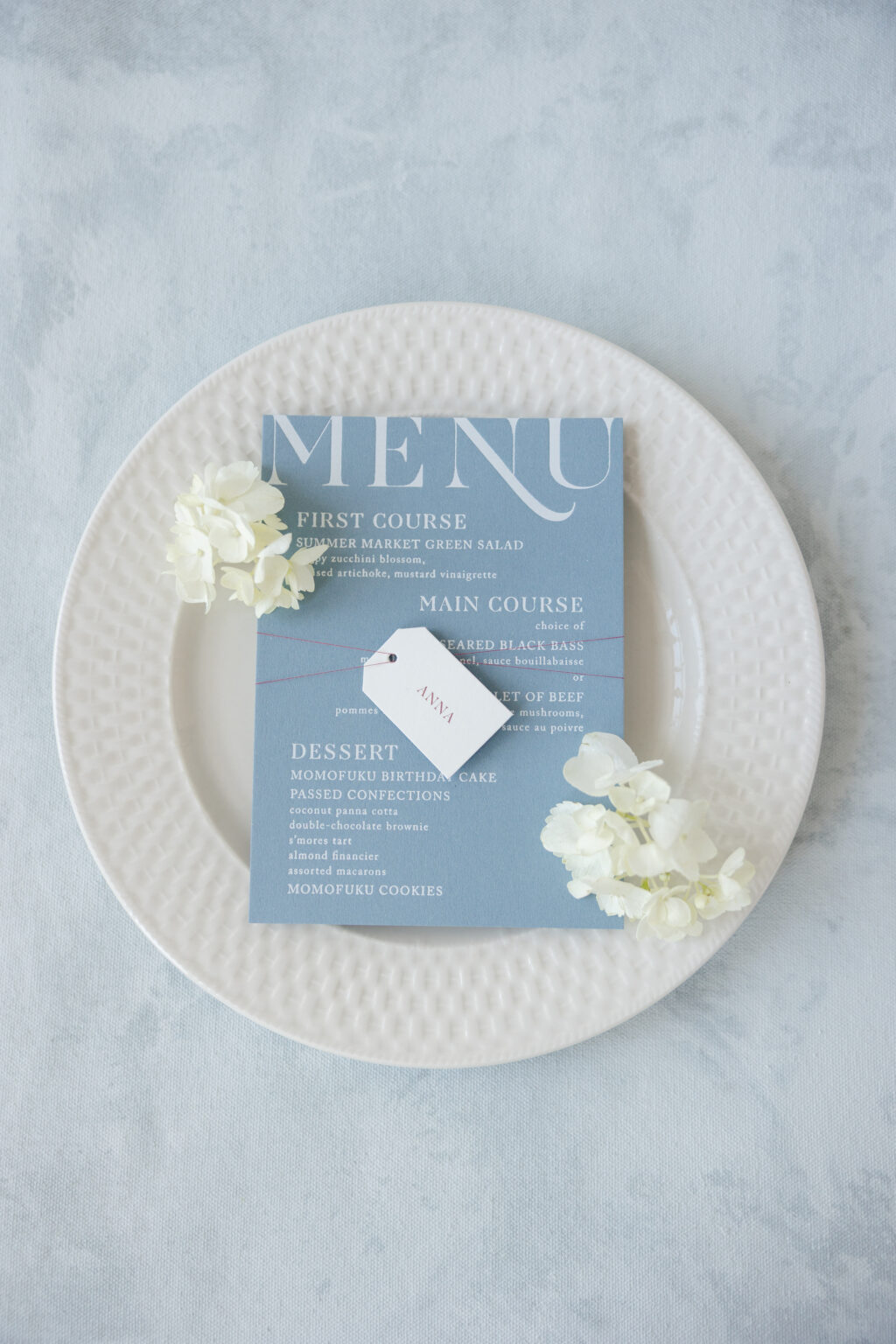
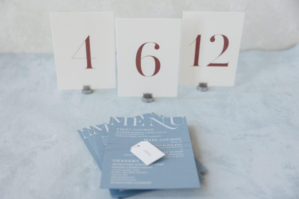
The menu switches things up while staying true to the design vibe, featuring white matte foil stamping on our storm color paper. A tag bearing the guest’s name is secured to each menu with the same metallic cranberry thread as the invitation.
The look is timeless yet contemporary, and it was such an honor to work on these letterpress invitations. Do you envision a bold monogram, a sleek foil edge, or a tag that serves as an escort card? Work with one of our dealers to design your dream invitations, and we can bring your vision to life.
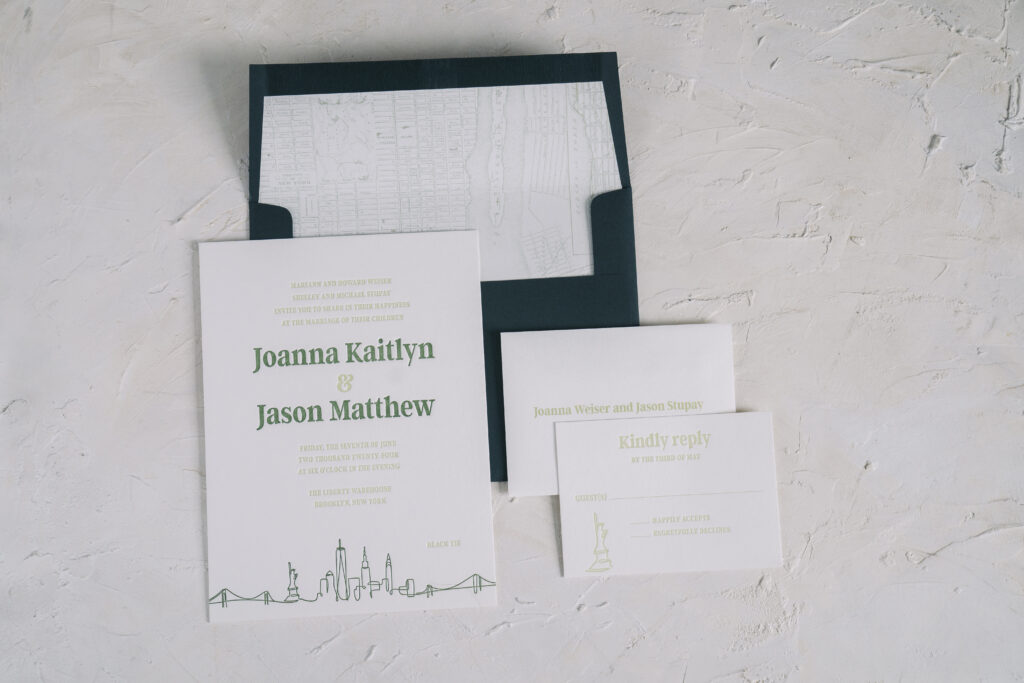
Joanna and Jason’s invitations came to us from our dear friend Donna of Designs by Donna. This customization of our Bright Lights design has a definite New York City vibe. See more and find out how this NYC skyline wedding invitation highlights this couple and the Big Apple.
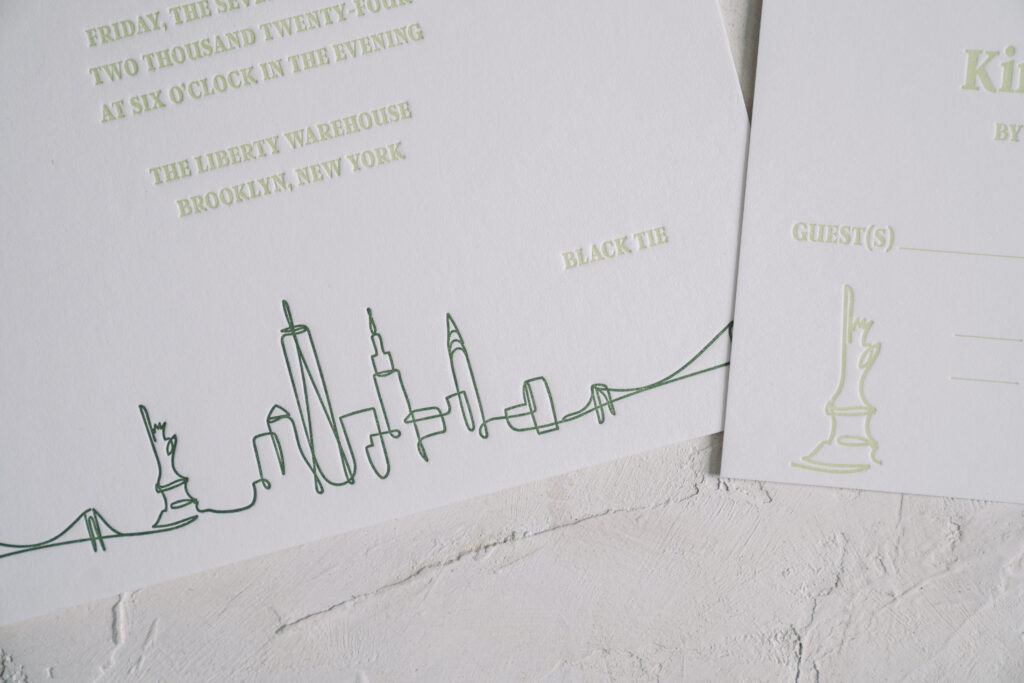
One font is used throughout the design for consistency. The bride and groom’s names appear in vine letterpress ink while the remaining text appears in clover ink. This design choice highlights the bride and groom’s names and coordinates with the artwork at the bottom of the invitation. The NYC skyline appears as a continuous line-inspired artwork in vine letterpress. The artwork stretches completely across the bottom of the invitation. The Statue of Liberty artwork also appears on the reply card, creating a cohesive feel across both printed pieces.
The skyline is a fitting choice for this NYC couple, and it is even more appropriate given that the wedding was held at Liberty Warehouse in Brooklyn. Many of the landmarks noted in the line drawing are visible from the venue location.
Invitation
letterpress ink: clover + vine
font: argent CF
paper: bella smooth cotton white 2-ply
card size: f-8
liner: vintage nyc pattern in acadia digital on white text
envelope: holly text
envelope addressing: white digital on the front and back
job #69445
Reply Card
letterpress ink: clover
font: argent CF
paper: bella smooth cotton white 1-ply
card size: a-5
envelope: white cotton text
envelope addressing: clover digital on the front
job #69445
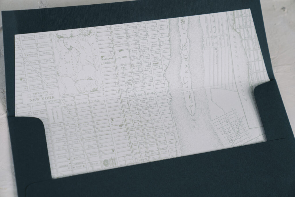
The final nod to NYC can be found on the envelope liner. The liner bears a vintage map of NYC digitally printed in our acadia ink. This NYC skyline wedding invitation is representative of the couple and their love story. Envelope liners are a great way to introduce a personal touch that is meaningful to the couple or relevant to the location.
Work with one of our dealers to create the wedding invitation of your dreams! Our highly talented dealers provide expert guidance to make the entire process easy and ensure your invitations are exactly what you envision.
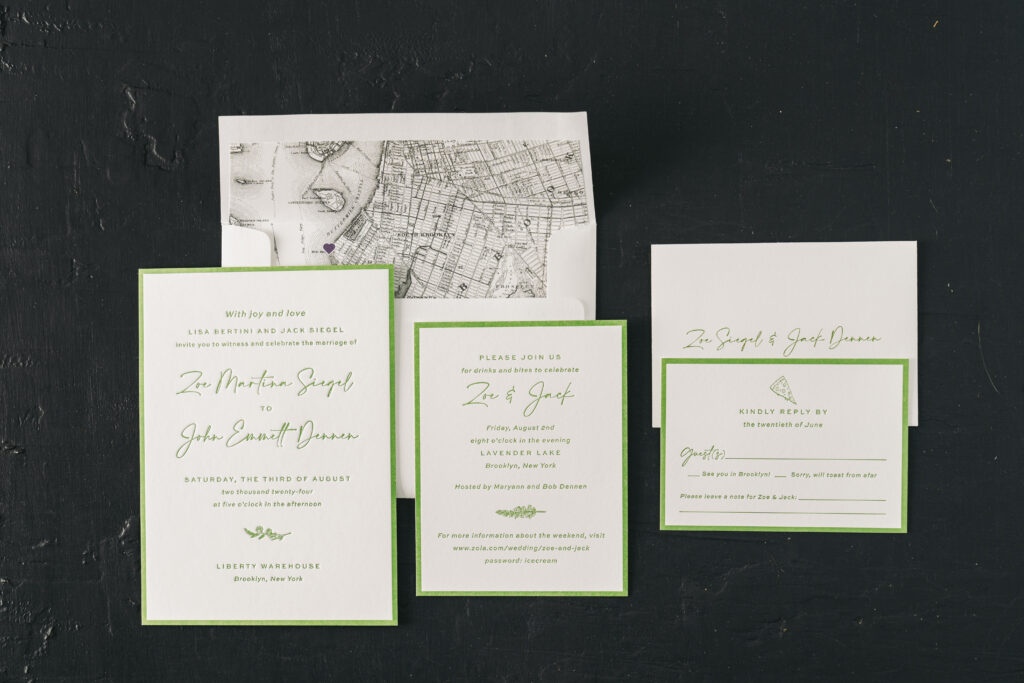
This letterpress wedding invitation suite captures the ambience of a Brooklyn wedding held during the summer. Zoe and John worked with our store, Bella Figura NYC, to create these touchingly personal invitations that include a lovely custom map envelope liner.
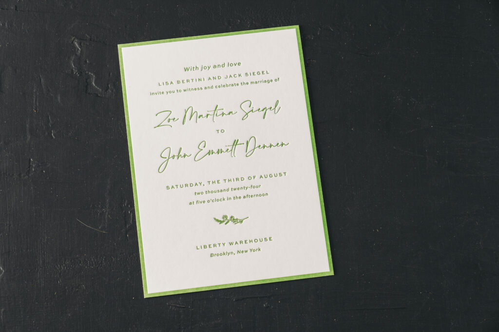
At first glance, Zoe and John’s wedding invitation design has a lot in common with Hadaway, the original inspiration design. The overall layout is similar, including the stunning letterpress printed border. The garden letterpress ink is seasonal and lovely. Swapping out the original fonts completely changes the look and feel of the invitation. Using a script font for the bride and groom’s names maintains the formality, while making the invitation more contemporary and modern.
Invitation
letterpress ink: garden
font: calson + slight
paper: bella smooth cotton white 2-ply
card size: a-7
liner: brooklyn 2 pattern in charcoal and regalia digital on white text
envelope: white cotton text
envelope addressing: garden digital on the front and back
job #70313
Reply Card
letterpress ink: garden
font: calson + slight
paper: bella smooth cotton white 1-ply
card size: a-5
envelope: white cotton text
envelope addressing: garden digital on the front
job #70313
Details Card
letterpress ink: garden
font: calson + slight
paper: bella smooth cotton white 1-ply
card size: a-2
job #70313
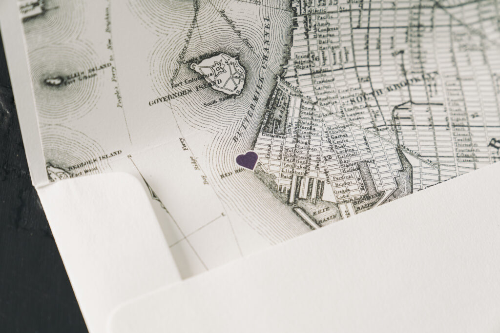
The couple added a personal touch by adding motifs to each card in the wedding suite. The nature-themed sprigs on the invite and the details card are charming and befitting a summertime affair. The pizza slice motif on the reply card is fun and a nod to the couple and Brooklyn, the location of the nuptials. The wedding locale is further emphasized on the envelope liner. The liner features a digitally printed map of Brooklyn with a heart marking Liberty Warehouse, the location of the wedding.
Are you interested in a custom map envelope liner? Or other ways to incorporate special details into your invitation suite? You can work with our store or one of our dealers to help you create the perfect invitation for your big day.