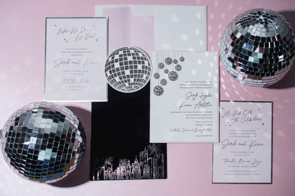
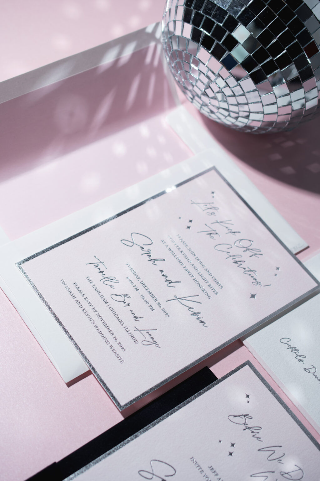
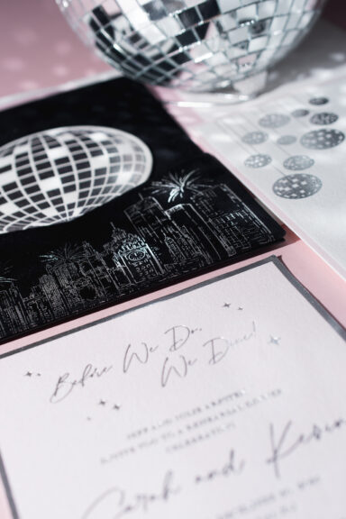
Happy New Year! We’re excited to share this modern, disco-glam invitation suite, brought to us by our dear friend Christy from Eventful Designs. This custom-designed suite features chic disco balls in silver shine foil and a dreamy velvet pocket panel with a hand-illustration of the Chicago skyline! See more of these glam New Year’s Eve wedding invitations.
Invitation
letterpress ink: black + PMS 9300U
foil stamping: silver shine
papers: bella cotton 2-ply white
card size: f-8 for pocketfold
envelope liner: classic color pattern digitally printed in PMS 9300U on white text
envelope: white cotton text
job: 777242
Reply Card
letterpress ink: black (back)
foil stamping: silver shine (front)
papers: bella cotton 2-ply white
card size: 4-inch circle
die cut: bp-23
job: 777242
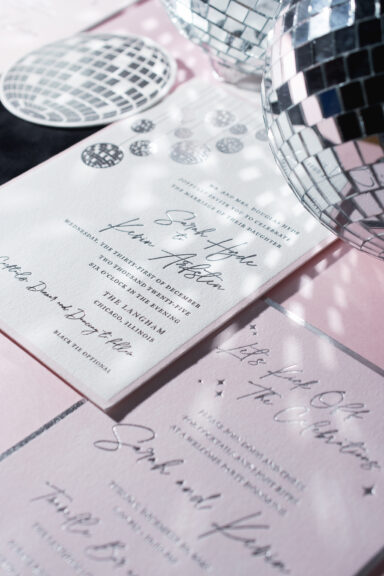
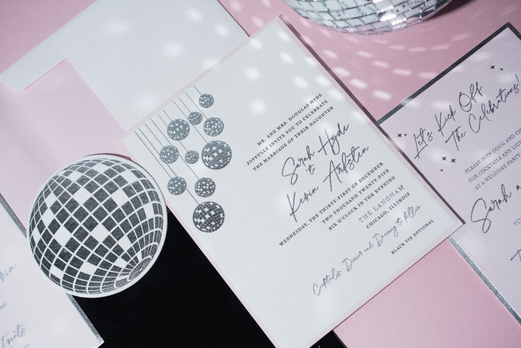
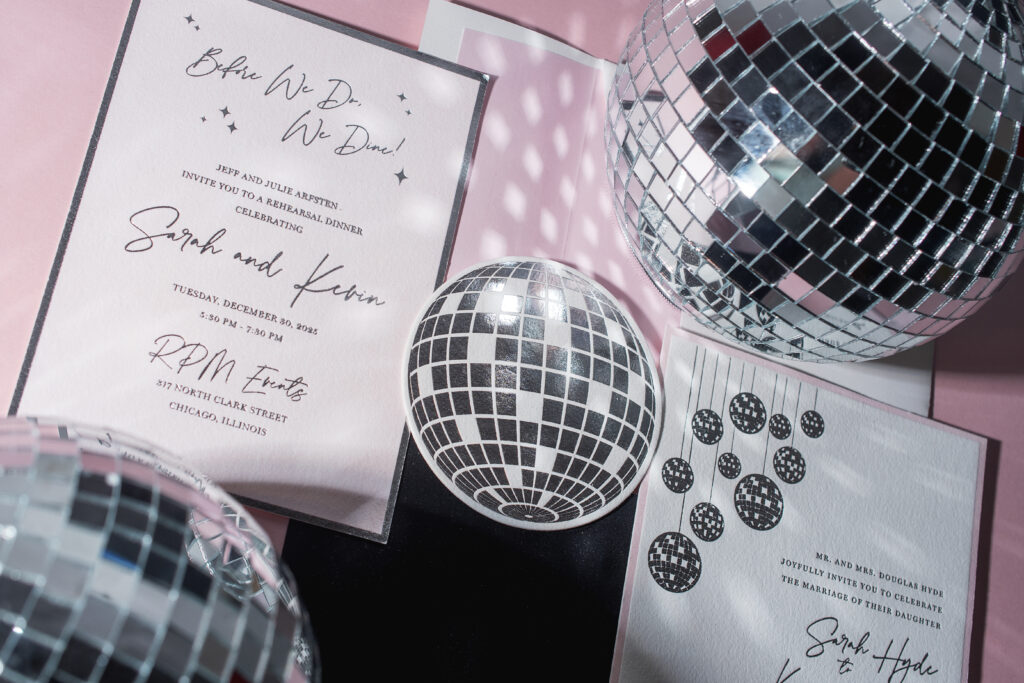
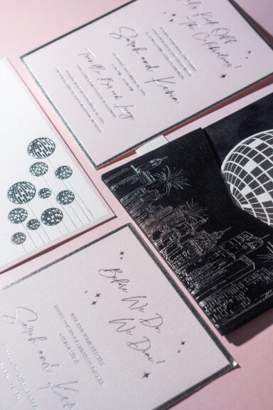
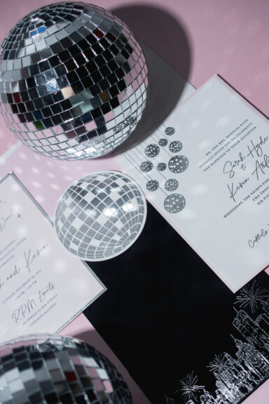
The invitation features disco-ball artwork that corresponds to the circular die-cut reply card. Silver shine foil stamping mimics the mirrored surface, adding sparkle, dimension, and a celebratory feel to these pieces. The double-sided reply card features black letterpress printing on the reverse (not shown in the pictures).
The bride and groom’s names appear on the invitation in silver shine foil, while the remaining text appears in black letterpress. A thick border is letterpress-printed in a delicate pink hue, introducing romance and glamour and balancing the modern sophistication of the black letterpress and silver foil.
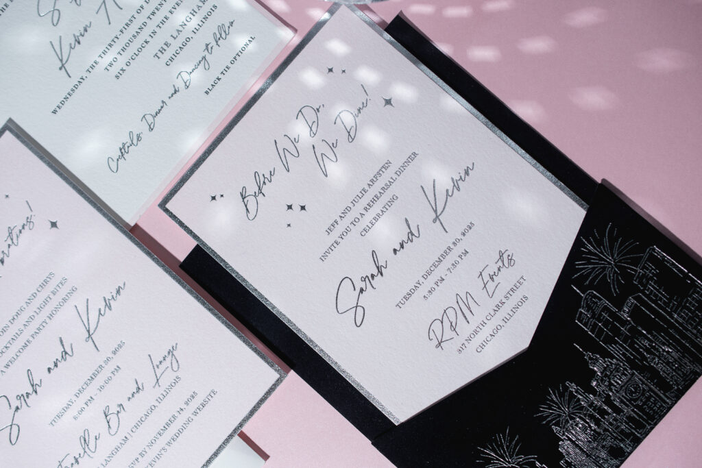
The rehearsal dinner invitation and welcome party card flip the look of the invitation. These cards are letterpress-printed with a pink flood. This technique creates the look of color paper while ensuring a perfect color match to the invitation and the envelope liner. These cards are then foil-stamped in silver-shine foil, complete with a thick border framing the text.
Rehearsal Dinner Invitation
letterpress ink: PMS 9300U
foil stamping: silver shine (front)
papers: bella cotton 1-ply white
card size: a-7
job: 777242
Welcome Party Card
letterpress ink: PMS 9300U
foil stamping: silver shine (front)
papers: bella cotton 1-ply white
card size: a-7
job: 777242
The pocket panel is next level. This piece is an F-8-sized card with a pocket adhered to it, creating a spot to stash all the cards in the suite for a neat, stylish presentation. The panel features our Bella velvet in Midnight. The velvet stock is adhered to our Ultra Black 1-ply stock to give the piece structure. The pocket bears a custom illustration of the Chicago skyline, complete with fireworks!
Pocket Panel
foil stamping: silver shine
papers: bella velvet midnight (pocket and panel front) / ultra black 1-ply (pocket and panel back)
card size: f-8 vertical back pocket
finishing: duplex velvet to ultra black stock, then adhere the pocket to the panel
job: 777242
The celebratory design is fun and luxurious, and perfect for a New Year’s Eve wedding. Congratulations to Sarah and Kevin! Do you want glamorous invitations with the shimmer of foil or a stunning velvet pocket panel? Would a city skyline illustration set the tone for your celebration? Locate one of our dealers to browse samples and swatches and receive expert guidance.
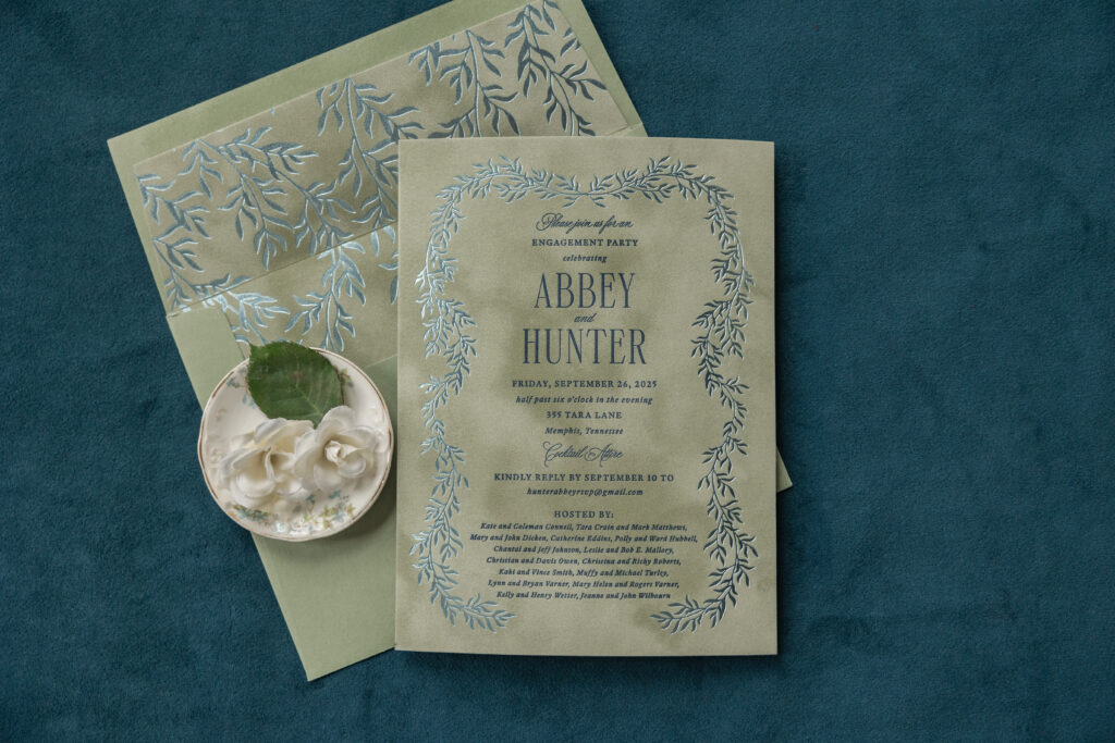
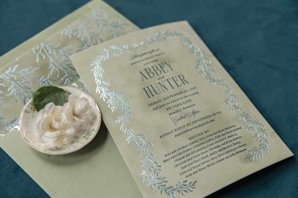
These engagement party invitations have a refined botanical design that is classic and elegant with a touch of vintage charm. Our velvet stock adds warmth and texture and holds a crisp impression for both the letterpress printing and foil stamping. This invitation is a customization of the welcome party card from our Kinsley design and came to us from our dear friend Lindsey at Mrs. Post Fine Stationery & Gifts.
envelope liner: kinsley pattern in ice shine foil on asparagus velvet
envelope: spruce text
envelope addressing: navy digital on the back
job: 77876
Velvet paper is soft and dreamy and introduces a wonderful texture. The cascading foliage in the design is almost rustic and complements the velvet’s texture. The branches gently bend and curve, creating a delicate wreath-like frame that encircles navy letterpress-printed text. The sheen of our ice shine foil elevates the design, creating a luxurious, upscale vibe. The velvet front is duplexed, or adhered to our spruce paper in 1-ply, giving the card structure and a more substantial feel.
A reimagined version of the foliage artwork appears as a pattern on the envelope liner. Velvet stock in asparagus is again paired with foil stamping in ice shine for a cohesive feel. The look is formal but still relaxed.
Congratulations to Abbey and Hunter on their engagement, and as always, it’s a pleasure to work with Mrs. Post Fine Stationery & Gifts. Are you thinking about romantic, garden-inspired engagement party invitations? Or do you want your invitations to feature the glimmer of foil against the texture of velvet? Locate one of our dealers to see samples and swatches and receive expert guidance.
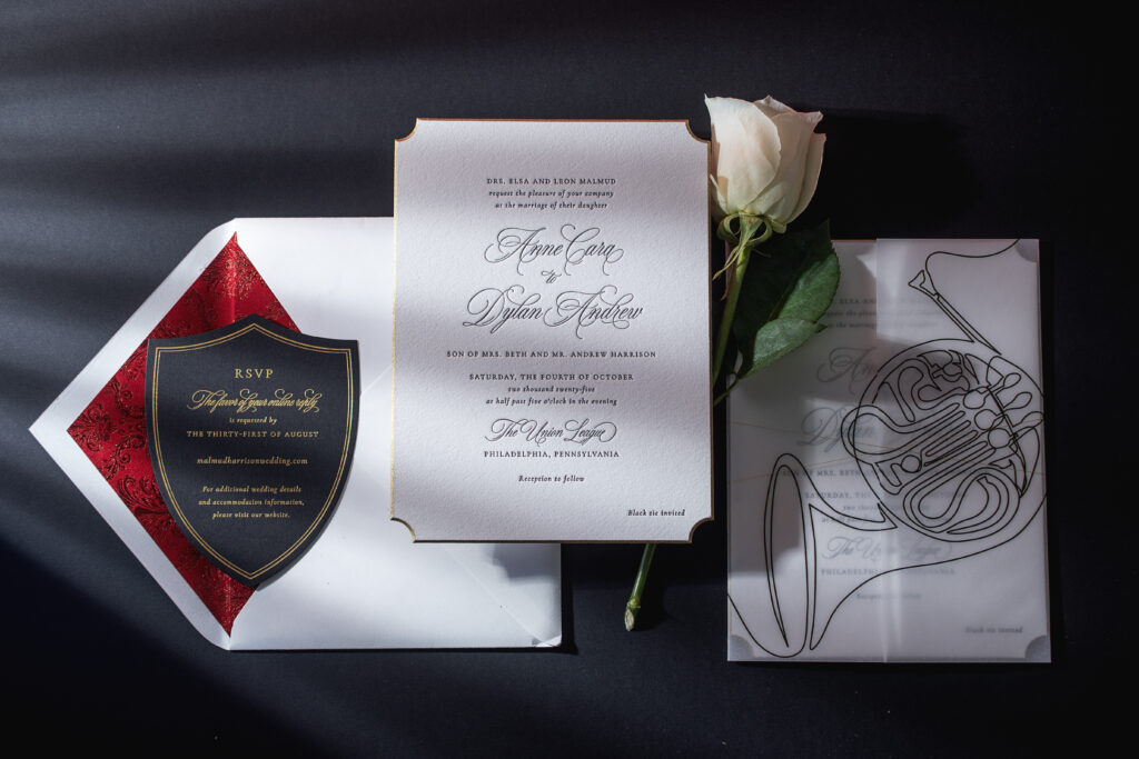
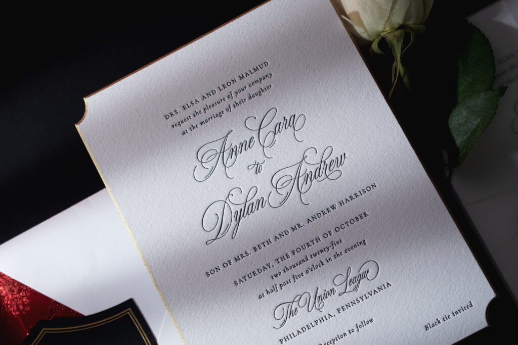
The decadent velvet envelope liner was the first part of this wedding invitation suite to catch our attention. The more we looked at the details that make up Anne and Dylan’s invitations, the more we love this design. The couple worked with our dear friend Colleen of Pen and Paper to create their elegant and formal invitations. This suite is a customization of our Rhea design, and while Anne and Dylan kept many elements from the original, they added sweet details to make it their own.
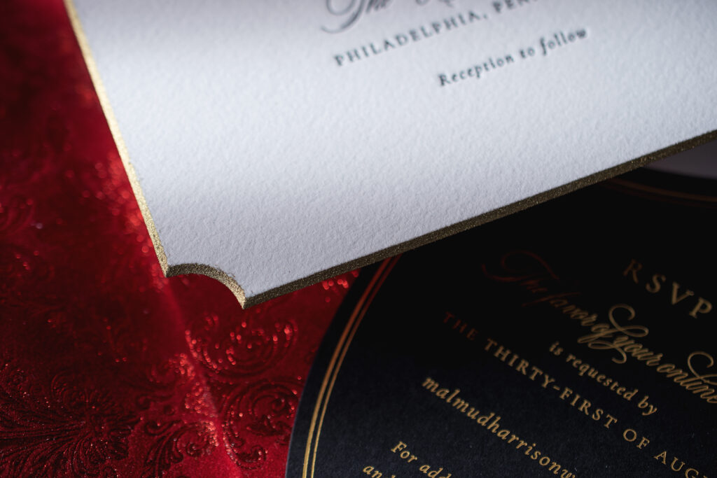
This invitation is perfect for a black-tie event and features classic black letterpress printing in a mix of serif and ornate script fonts. The layout is clean and symmetrical, and proves that less is more. For a touch of glamour, the invitation is die-cut into our Winston shape, and then beveled at a 45º angle, and then edge-painted in metallic gold. All of these embellishments are lovely on their own, but combined together elevate the look in a meaningful and luxurious manner. The shimmer of the metallic gold edge painting highlights the curve of the die cut and the slope of the beveling.
Invitation
letterpress ink: black
fonts: juliette + cormorant garamond
papers: bella cotton white 2-ply
card size: f-8
bevel: 45º
die cut style: winston
edge paint: metallic gold
thread: metallic gold
finishing: assemble with gatefold and thread
envelope liner: eris pattern in red shine foil on tomato velvet
envelope: white cotton text
envelope addressing: black digital on the front / black letterpress on the back
job: 76992
Gatefold
digital ink: black
papers: 40# vellum
card size: f-8 vertical gatefold (8.31 x 12.51 flat, 8.31 x 6.24 folded)
finishing: scored
job: 76992
Details Card
foil stamping: gold matte
fonts: juliette + cormorant garamond
papers: ultra black 1-ply
card size: 4.19 x 5.44
die cut shape: bf-130
job: 76992
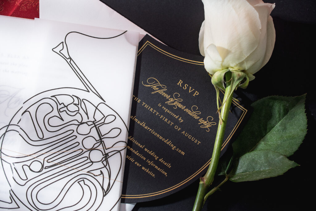
The invitation is wrapped with metallic gold thread for an added glimmer and placed inside a vellum gatefold. Digital printing on the gatefold depicts a continuous line illustration of a French horn.
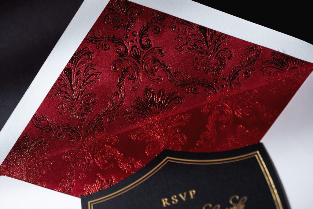
The velvet envelope liner takes things to the next level. Red shine foil stamping in our Eris pattern on our tomato velvet is peak opulence. The damask pattern introduces drama and a sense of old-world luxury.
Gold matte foil stamping on our Ultra Black stock ensures the details card is aligned with the invitation, while maintaining the regal, romantic, and high-contrast look.
Anne and Dylan’s invitation suite blends classic elegance, luxury finishes, and personalized musical elements to create a look that is timeless and refined yet artistic. It was a pleasure to work on this letterpress wedding invitation with a velvet envelope liner, and it’s always a joy to work with Pen and Paper. Do you want to include velvet or a gatefold in your invitation design? How about a beveled die cut? Our highly skilled dealers can walk you through the process to create your dream invitations. Find a dealer near you or contact us to create your perfect wedding invitations.
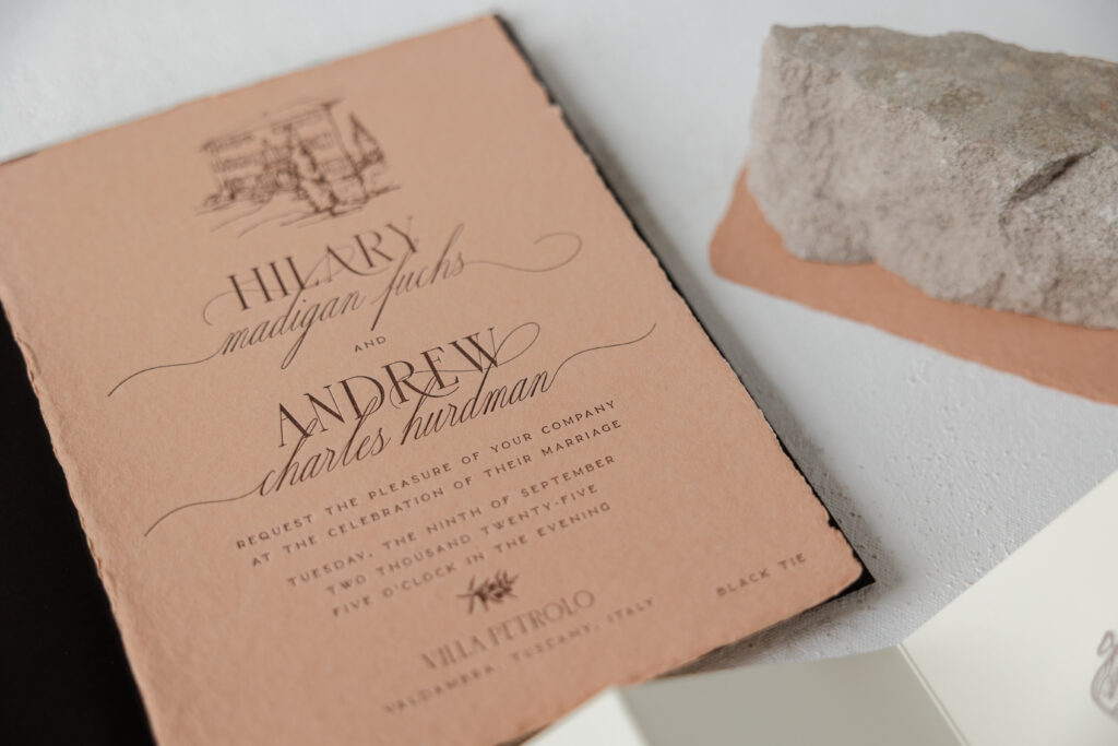
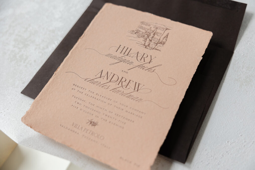
Hilary and Andrew created these dreamy letterpress invitations for their Italian villa wedding. This invitation suite has a rustic, artisanal feel and is brimming with old-world elegance. The couple worked with our dear friend Mel from Arni Paperie to create these luxurious and romantic letterpress invitations.
Our handmade paper is specially made for us and features a soft texture and deckled edges. The deckled edges are the result of the papermaking process and add charm and an artisanal quality to the overall design. Our handmade paper holds a crisp letterpress impression, and the terracotta color is a recent addition to our paper lineup. The terracotta paper of the invitation is paired with the deep tone of our walnut text envelope to reinforce the natural and sun-washed look of the Tuscan venue.
Invitation
letterpress ink: ganache
fonts: margarita script + sauvage + karin
papers: bella terracotta handmade
card size: f-8 deckle edge
envelope: walnut text
envelope addressing: ivory digital on the front and the back
job: 74577
The typography features a combination of refined serif fonts and a flowing script font to create a sophisticated, romantic contrast. The gentle swashes and curves of the margarita script font add movement and a classic feel.
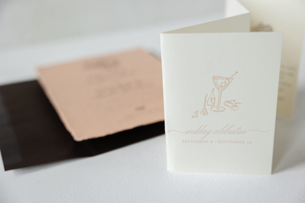
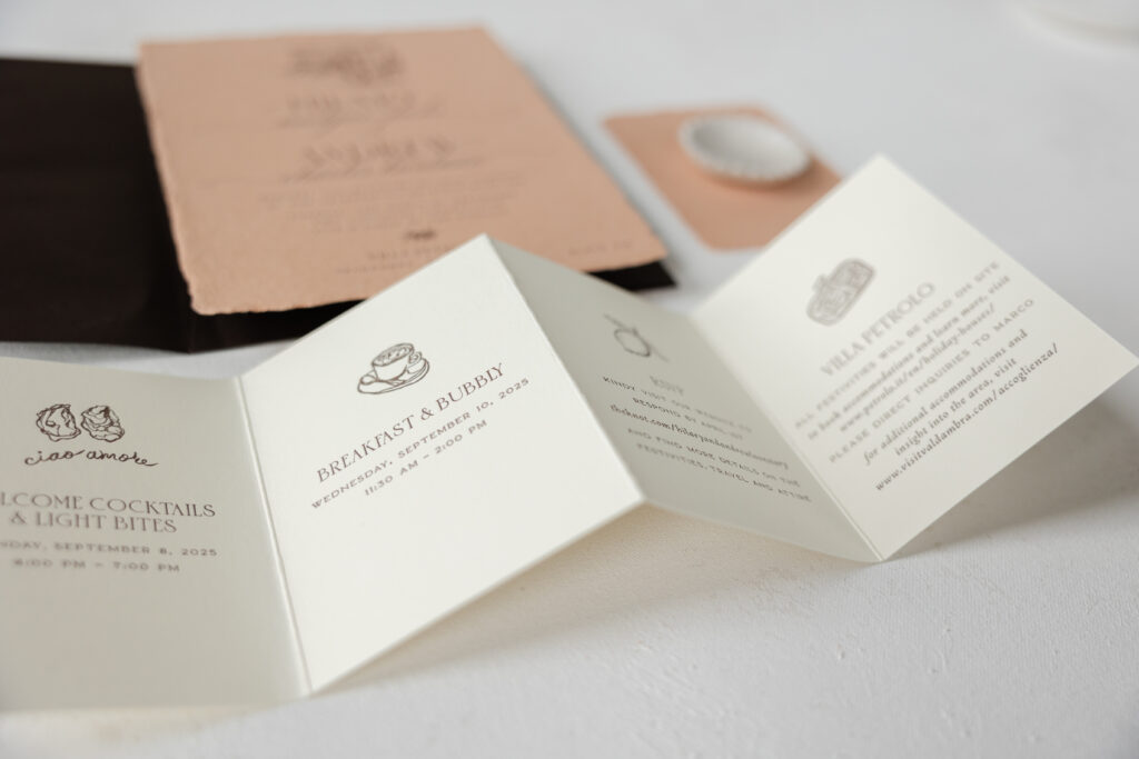
The talented bride created the sketches of the venue on the invitation, and the artwork featured on the folding details card. This is a lovely personal touch that highlights the charming details of this destination wedding. We can accept custom artwork for your invitations, and our design team can help you ensure the files are properly set up for us when creating your invitations and other pieces. We can also create custom illustrations for you! Let us know what you have in mind, and we can bring your vision to life.
card size: custom 4-panel roll fold card (13.33 x 4.75 open, 3.38 x 4.75 closed)
finishing: print on both sides and score
job: 74577
Blank Notecard
papers: bella terracotta handmade
card size: a-5
job: 74577
Best wishes to Hilary and Andrew on their wedding, and it’s always a pleasure to work with Arni Paperie. If you want an invitation that is timeless and full of personal details, or if you want to feature our handmade paper or custom artwork, we can make it happen. Contact us to learn more or reach out to one of our dealers for one-on-one help designing your dream wedding invitations.
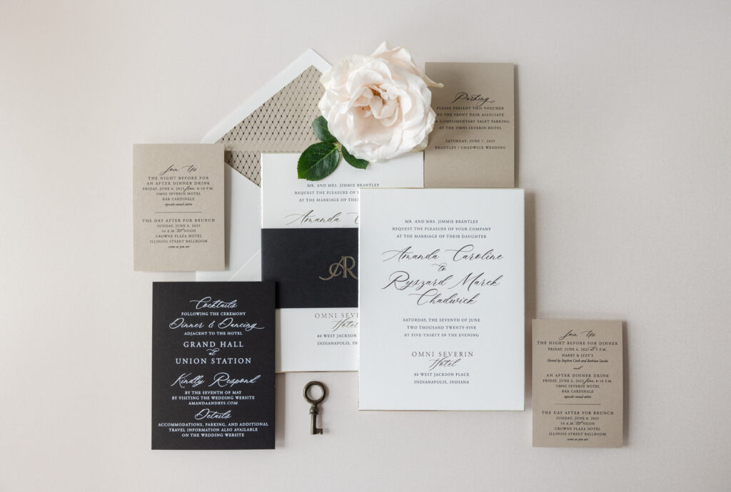
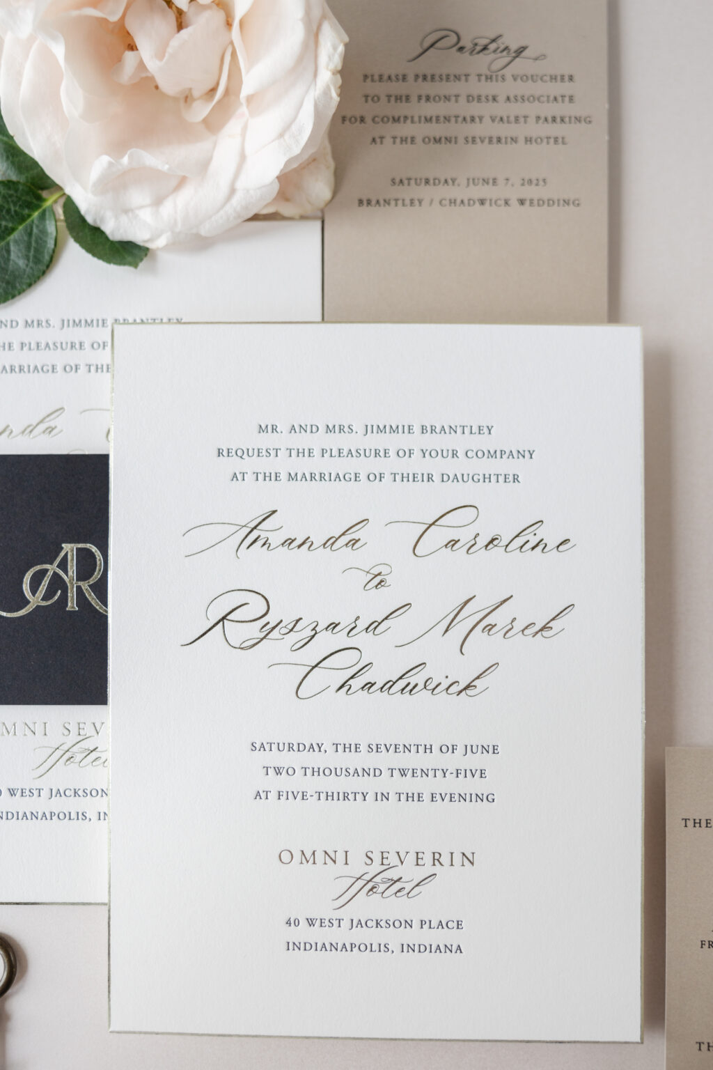
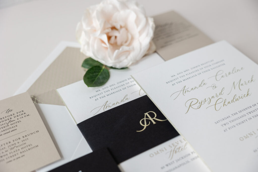
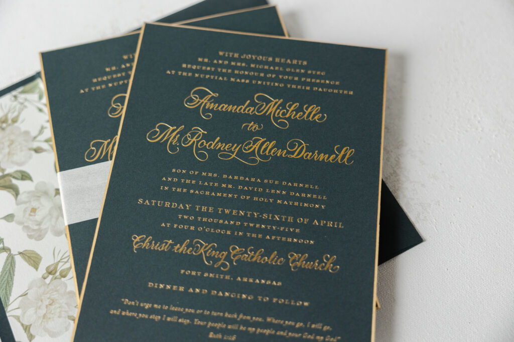
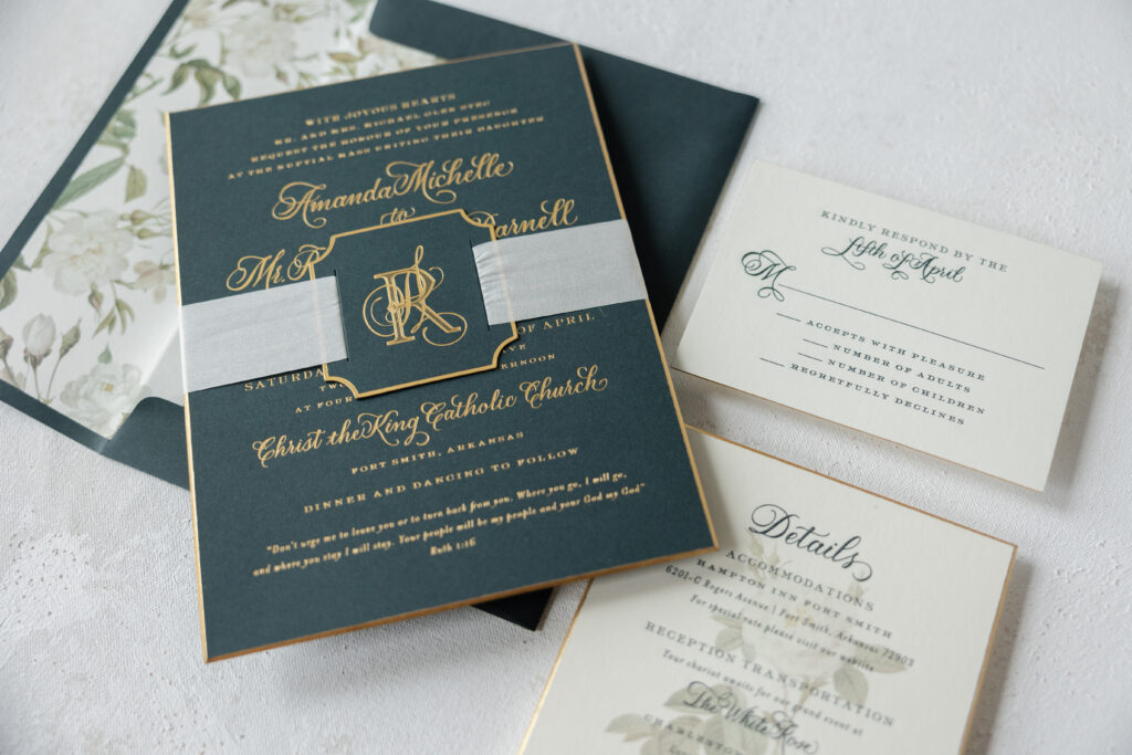
Amanda and Ryszard’s wedding invitation suite has a classic, refined, and timelessly elegant style with a modern luxury twist. This couple worked with our dear friend Kristyn from Oliver’s Twist to create these sophisticated and formal invitations.
A clean, minimal layout with generous white space draws the eye to the bride and groom’s names, set in a modern, sweeping script font. The use of foil stamping further emphasizes the couple’s names and adds some glimmer and contrast to the black letterpress printing. The same color foil, tawny shine, also appears on the beveled edge, highlighting the sharp 45-degree angle.
Invitation
letterpress ink: black
foil stamping: tawny shine
font: slight + garamond
papers: bella smooth cotton 2-ply white
card size: f-8
bevel: 45-degree
foil edge: tawny shine
envelope liner: richmond pattern in tawny shine foil on metallic sand text
envelope: white cotton text pointed flap
envelope addressing: black digital on the front and the back
job: 76120
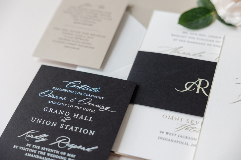
Belly Band
foil stamping: tawny shine
font: slight + garamond
papers: ultra black text
card size: f-8 vertical belly band (3 x 13.25 open, 3 x 6.24 closed)
job: 76120
The wide belly band, featuring the couple’s initials in tawny shine foil, adds an upscale vibe. The way the monogram merges the letters is symbolic and romantic and completely fits the look and feel of these bevel and foil-edge wedding invitations.
The envelope liner is neutral and subtle. Our Richmond pattern, which is both formal and geometric, is foil-stamped in tawny shine on our metallic sand text-weight stock. The look is elegant and perfectly coordinates with the entire suite.
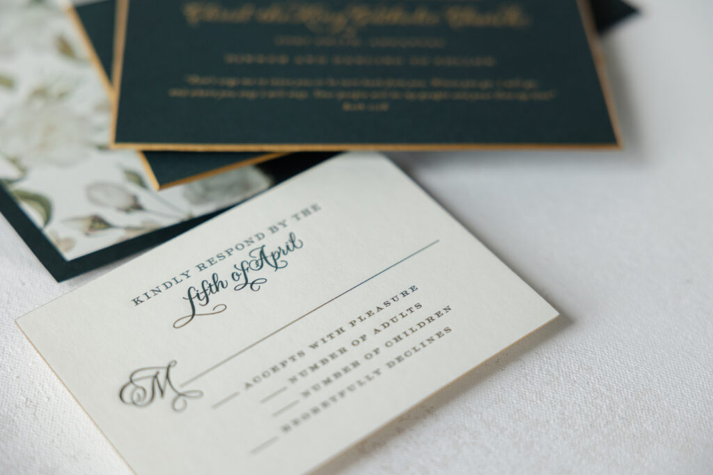
Reply Card
digital ink: white
font: slight + garamond
papers: ultra black 1-ply
card size: a-6
job: 76120
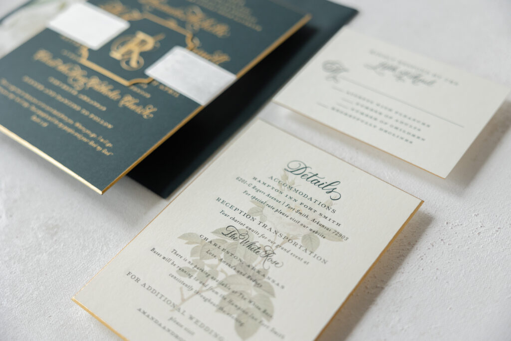
The reply card switches up the color palette from the invitation and features white digital printing on black stock. The design is modern and dramatic while maintaining the formal aesthetic. The event card follows suit by featuring black digital printing on our metallic sand stock. Multiple versions of the event card were printed to address the various events held during the wedding weekend.
Event Card
digital ink: black
font: slight + garamond
papers: metallic sand 1-ply
card size: a-5
job: 76120
It was a joy to work on Amanda and Ryszard’s bevel and foil-edge wedding invitations. The suite is refined and modern while featuring classic design elements. Are you dreaming of luxurious wedding invitations or a custom monogram? Work with one of our dealers to see ink and paper swatches and receive expert guidance to create the perfect invitation set for your big day.
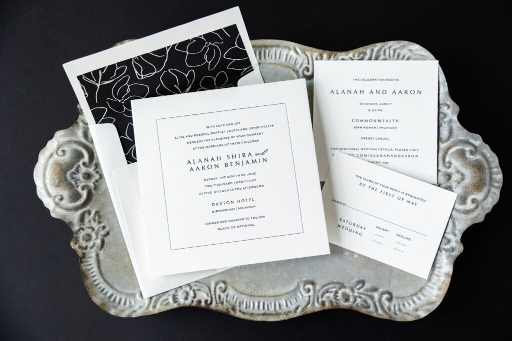
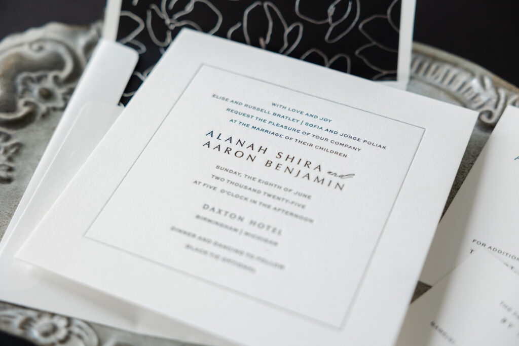
Alanah and Aaron’s wedding invitation suite has a modern, refined, and minimalist aesthetic with an envelope liner that is both edgy and artistic. The modern design is juxtaposed against the classic print method of engraving for an added sense of drama. The couple worked with our dear friend Carlyn of Lee’s Paperie to create their modern engraved wedding invitation.
Invitation
engraving: black
foil stamping: silver shine
font: optima + sweet sans + slight
papers: bella smooth cotton 2-ply white
card size: sq-7
envelope liner: loley pattern (#121) pattern in silver shine foil on ultra black text
envelope: white cotton text
envelope addressing: black digital on the front and the back
job: 75631
This customization is based on our Modernity design, which is elegant and contemporary with a minimalist sensibility. The square card is formal, but edgy in a low-key way. The clean and contemporary layout boosts generous white space, allowing the typography to draw the eye. The text is engraved in black ink, which is perfect for a black tie affair. A subtle single-line border frames the invitation, giving it structure without feeling heavy. The border is foil-stamped in silver shine, adding a touch of glamour to the invitation. Our Bella smooth paper is soft and textured, enhancing the sense of luxury.
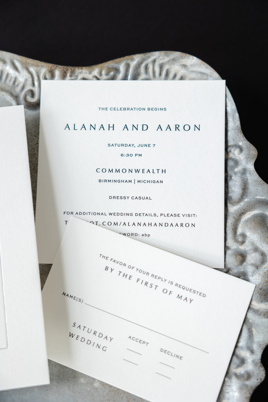
Event Card
engraving: black
font: optima + sweet sans
papers: bella smooth cotton 1-ply white
card size: sq-5
job: 75631
Reply Card
engraving: black
font: optima + sweet sans
papers: bella smooth cotton 1-ply white
card size: a-5
envelope: white cotton text
envelope addressing: black digital on the front
job: 75631
The envelope liner adds a bit of high style while adhering to the modern aesthetic. The black envelope liner features floral line art in silver shine. The liner is abstract, eloquent, and glamorous.
It was a joy and a pleasure to work on Alanah and Aaron’s wedding invitation suite, and we always look forward to what Lee’s Paperie has in store for us. Whether you want something black-tie ready or you want to add subtle, artistic details to your invitation suite, we can make it happen. Work with one of our dealers to create your dream wedding invitations.
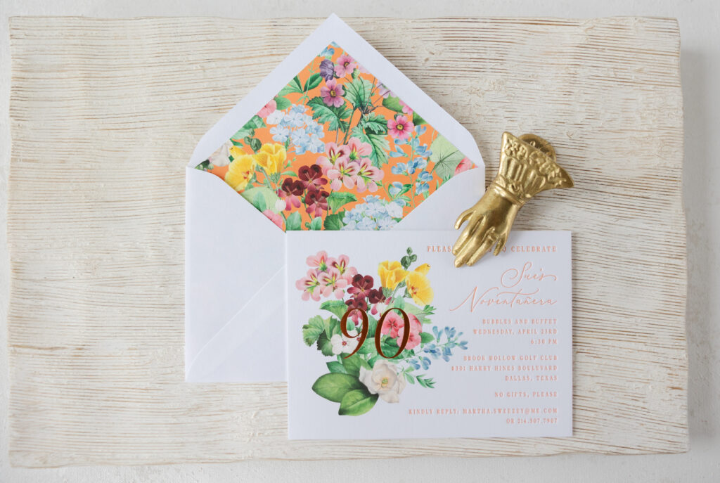
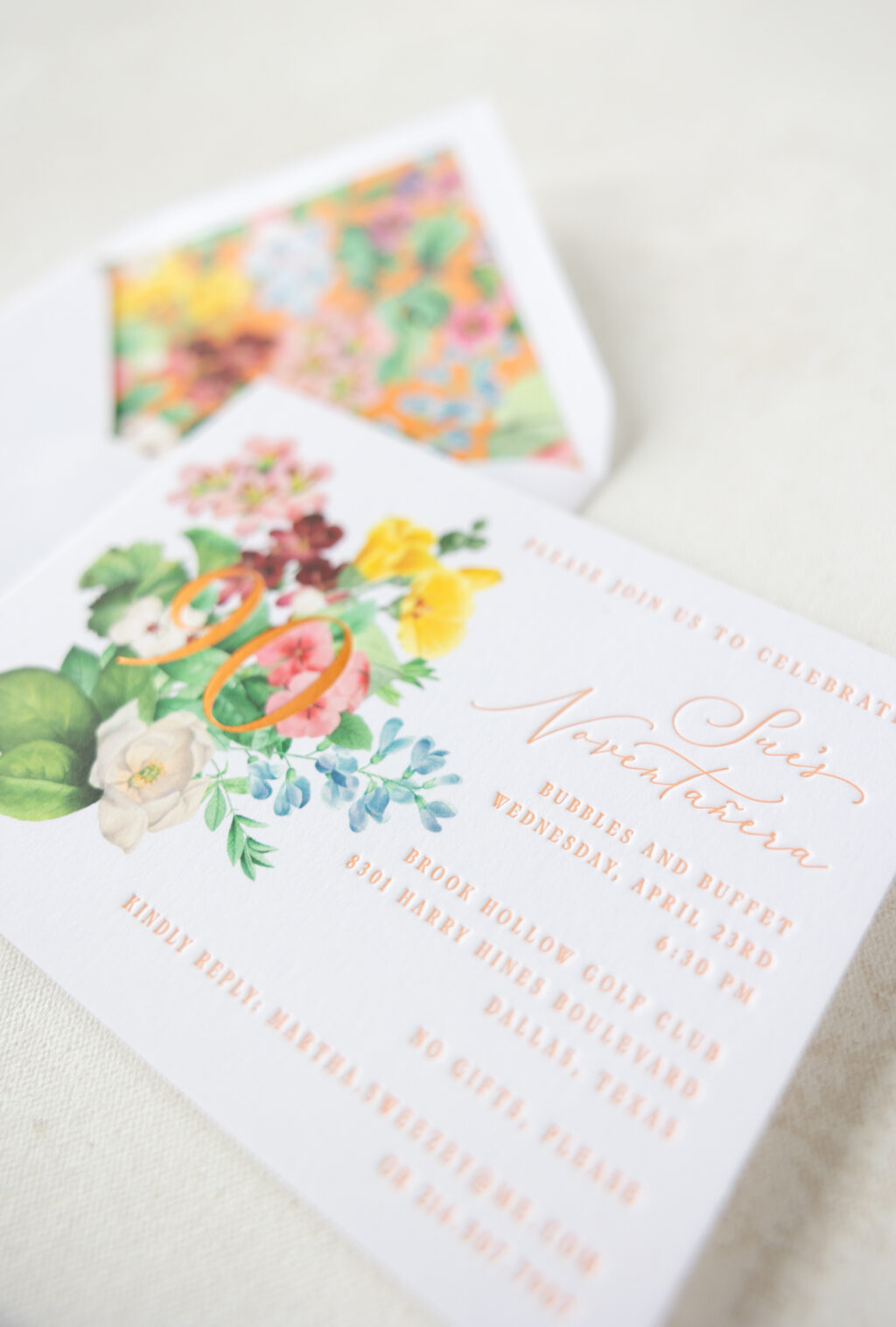
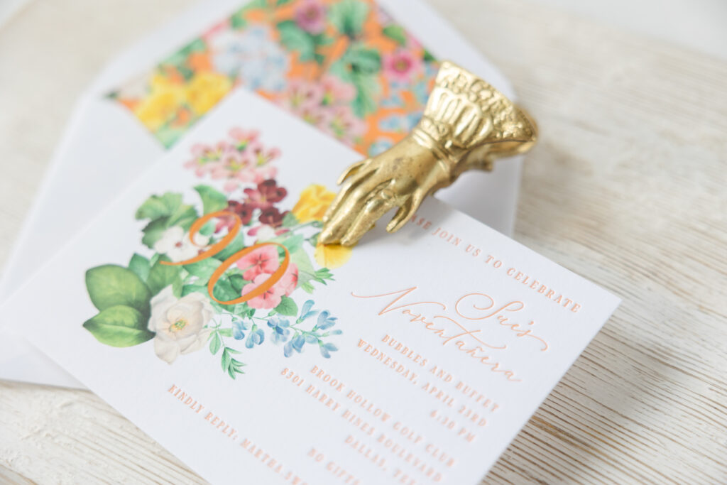
We worked with our dear friends at Ellis Hill to create these bright, cheerful, and garden-inspired birthday party invitations. This invitation blends vintage floral artwork with modern typography for a classic yet still contemporary look. The card is modeled after our Gweneth save the date design, and it’s a great example of how our designs can be customized for various events.
Invitation
letterpress ink: persimmon
foil stamping: copper matte
digital: cmyk
fonts: white garden + dark paradise
papers: bella smooth cotton bright white 2-ply
card size: a-6
envelope liner: gweneth pattern in cmyk + persimmonin digital on bright white text
envelope: bright white cotton text pointed flap
envelope addressing: cmyk + persimmonin digital on the back
job: 75870
Bold floral artwork introduces a celebratory tone and anchors the design. The guest of honor’s age is foil-stamped in copper matte over the digitally printed floral bouquet. The overlapping foil adds some glimmer and contrast against the lush, detailed flowers. Our Bella Smooth Cotton paper, in bright white, perfectly complements the bold, vibrant florals and the letterpress printing in our persimmon ink. The refined, flowing script font announces Sue’s Novetañera, or 90th. The supporting text appears in a serif font and is clean, structured, and easy to read, balancing the ornate florals.
The envelope liner is a statement piece on its own and showcases the lively, full-coverage floral pattern. The liner pattern uses the same floral artwork from the card over a digital flood of our persimmon ink, and is borrowed from the Gweneth invitation.
This birthday party invitation is joyful, celebratory, and absolutely perfect for such a milestone event. We hope Sue had the happiest of birthdays, and thank you to our dear friends at Ellis Hill for entrusting us with this job. Are you in need of invitations for an upcoming event? Contact us to start creating your invitations, or work with one of our dealers for expert guidance.
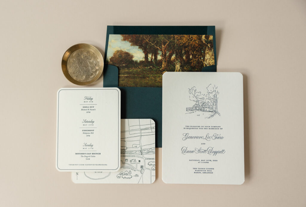
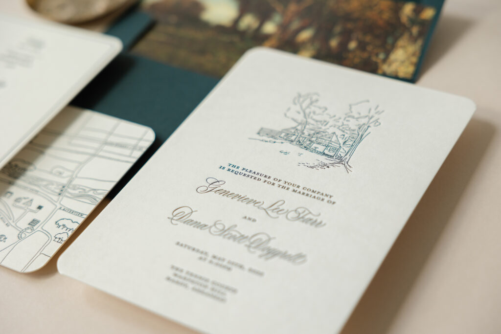
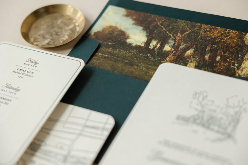
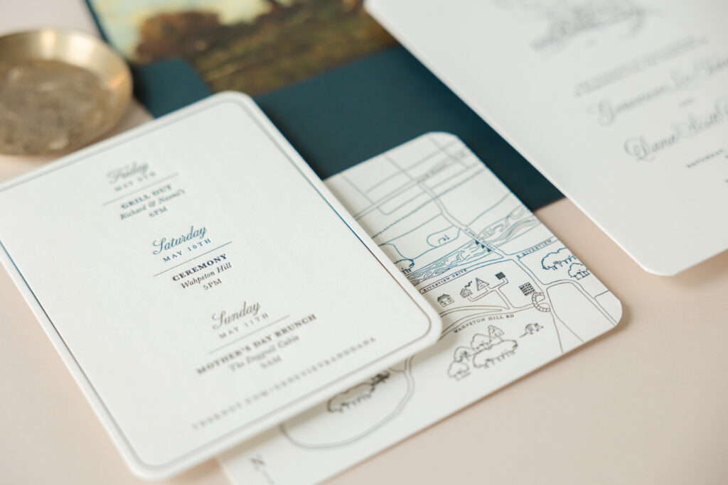
Genevieve and Dana worked with our dear friend Lindsey of Mrs. Post Fine Stationery & Gifts to create their contemporary yet charming letterpress wedding invitations. This design holds extra meaning for the pair because one half of the happy couple is a graphic designer who personally designed their invitations, including both of the illustrations.
The invitation features a traditional layout. The bride and groom’s names are highlighted in an elaborate script font while the remaining text appears in a serif font. The standout feature of the invitation is a custom illustration of a building from the wedding venue. The building peaks out from the trees, setting the tone for an intimate celebration. Both the text and the illustration are letterpress printed in our holly ink. The dark green color suits this outdoor wedding perfectly, and our 2-ply smooth cotton paper leaves a deep impression. Rounded corners give the card a contemporary look, while still maintaining a sense of formality.
Invitation
letterpress ink: holly
paper: bella smooth cotton ivory 2-ply
card size: a-7
finishing: corner rounding
liner: cosette forest pattern in cmyk on ivory text
envelope: evergreen
envelope addressing: white digital on the back
job: 75721
Details Card
letterpress ink: holly (front) / holly (back)
paper: bella smooth cotton ivory 2-ply
card size: a-2
finishing: corner rounding
job: 75721
The details card features the same aesthetic. A thin line border on the front of the card hugs the curve of the rounded corners. A darling hand-drawn map on the back of the details card highlights the locations of various events held during the wedding weekend.
We’re always happy to create an invitation or customize one of our designs, but it’s special when we’re given the opportunity to bring someone’s vision to life. We wish all the best for Genevieve and Dana, and thank you again to Mrs. Post Fine Stationery & Gifts for bringing this wedding suite to us. Would you like to include illustrations on your invitations or a map on the details card? We have a skilled team of graphic designers who can create custom artwork for your invitations and other items in your suite. Contact us to learn more or work with one of our dealers to receive expert assistance as you design your invitations.
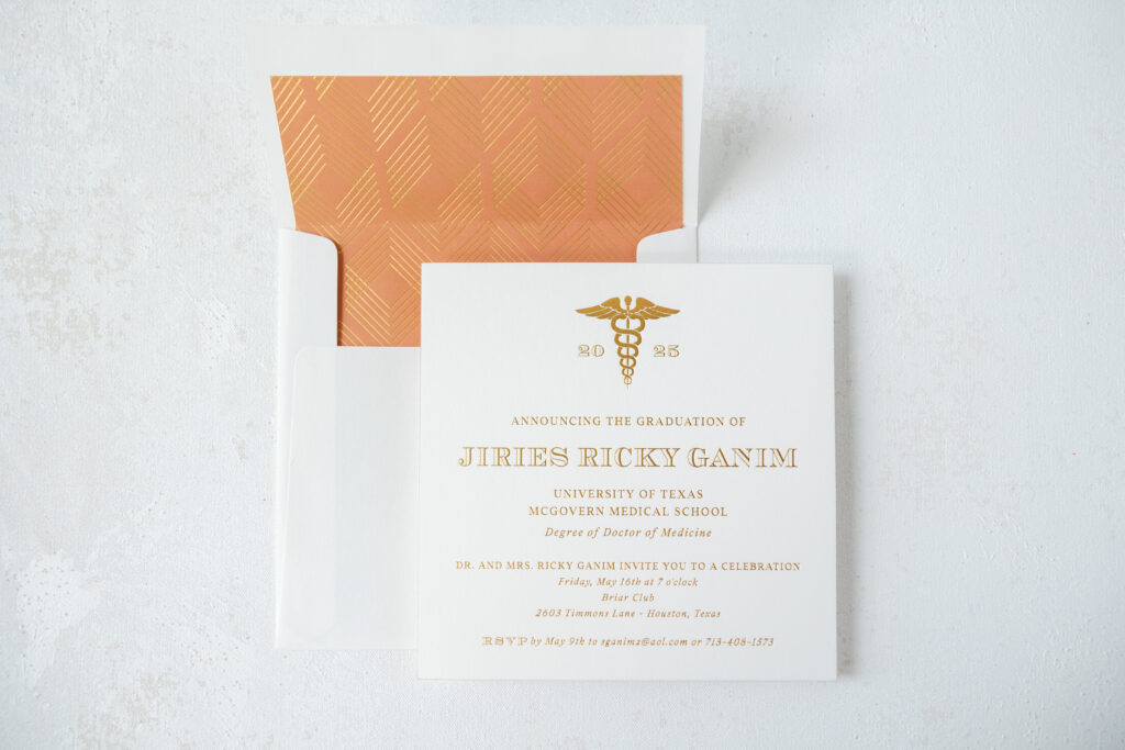
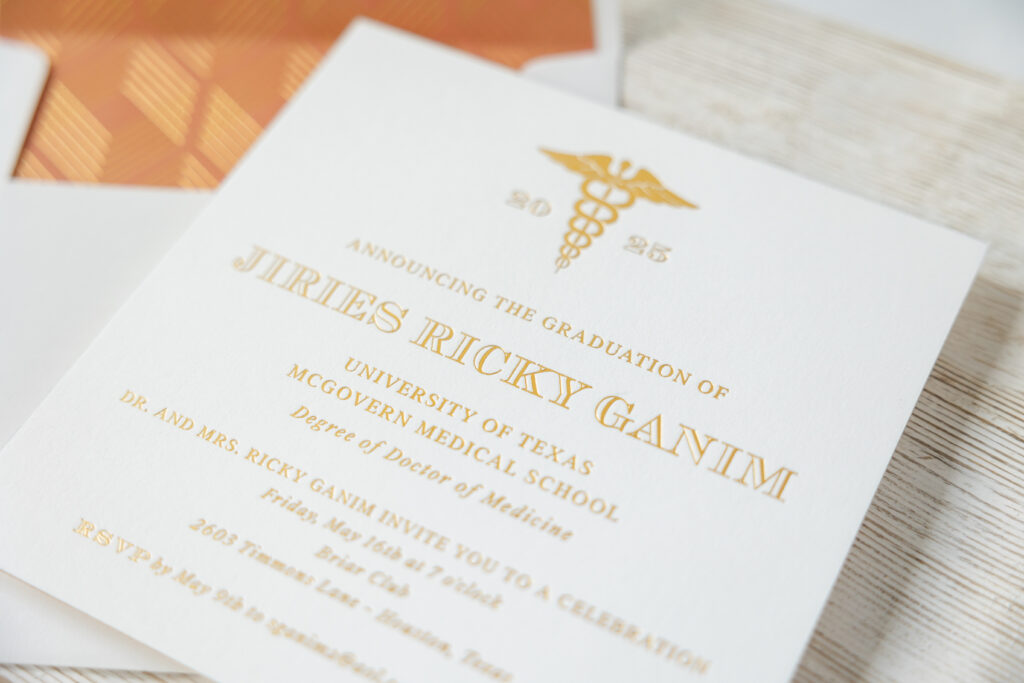
We worked with our dear friend Hollis of Bering’s to create Jiries’ graduation announcement and party invitation. This square card is classic and contemporary. The layout and the color palette work together to create a card that is equal parts celebration and professional.
This graduation announcement has a classic and refined style with a clean, professional design. The layout is elegant and symmetrical, centered around gold matte foil that conveys a sense of sophistication. The typography is minimalist, sleek, and formal. The Caduceus symbol, coupled with the class year at the top, anchors the design. The emblem features heavy foil coverage, which is contrasted by the open font used for the graduate’s name.
Invitation
foil stamping: gold matte
fonts: addington chevalier open
papers: bella smooth cotton white 2-ply
card size: sq-7
foil edge: gold matte
envelope liner: capone pattern in rust digital + gold matte foil on white text
envelope: white cotton text pointed flap
envelope addressing: rust digital on the front and the back
job: 75581
The envelope liner is an opportunity to show pride for the University of Texas. Our rust digital ink is a close match to the school’s signature burnt orange. The liner features gold matte foil stamping in our capone pattern over a full flood of rust digital. The envelope liner pattern is modern and contemporary, keeping it aligned with the card design. The overlapping diamond shape of the pattern is reminiscent of the twirling and twisting snakes from the Caduceus symbol, further tying all of the elements together.
Overall, the style is modern classic elegance. The design blends clean minimalism with traditional academic prestige and a touch of luxury through the use of gold matte foil. Congratulations to Jiries! We are thrilled to have had the opportunity to create this card. Do you need a custom-designed card to announce a milestone or invite people to a celebration? Our dealers can help you create a card that conveys the right look, style, and message. Locate a dealer near you to view samples and swatches in person.
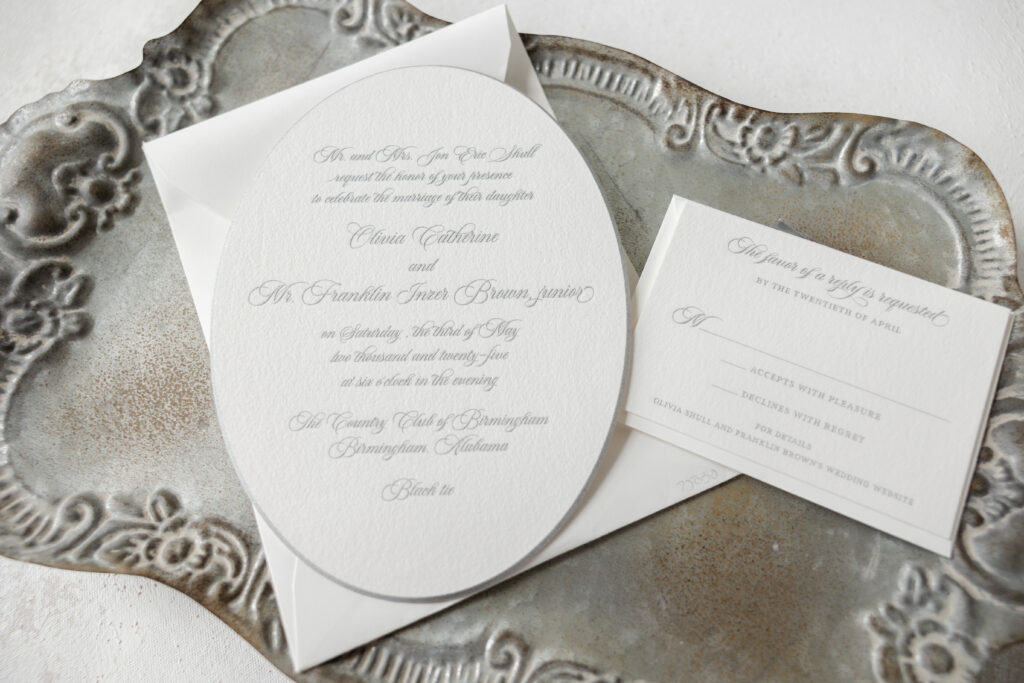
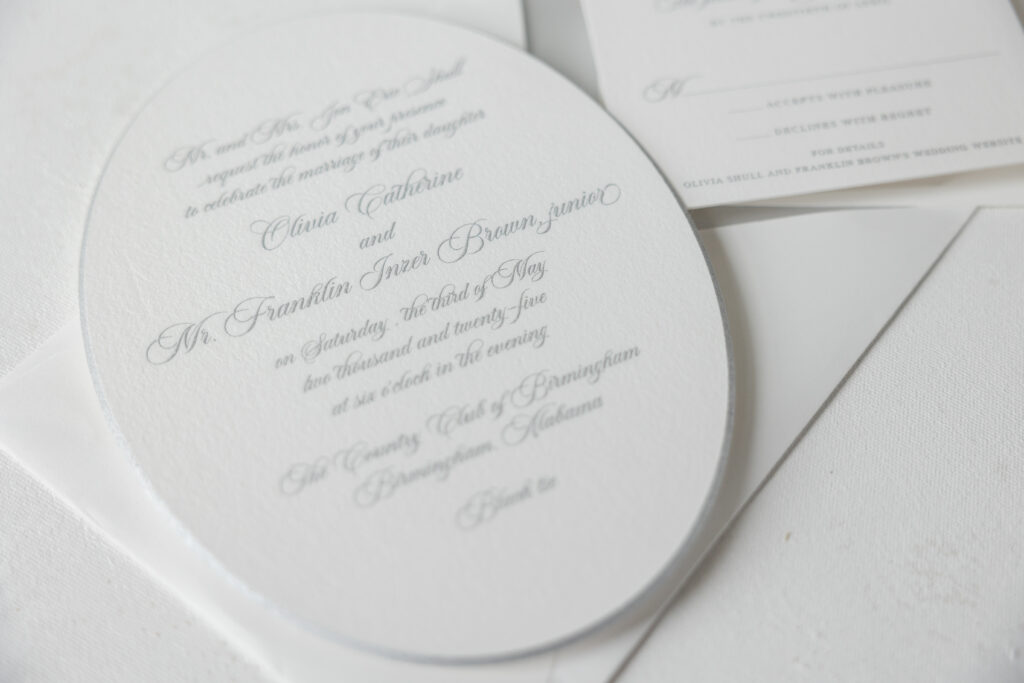
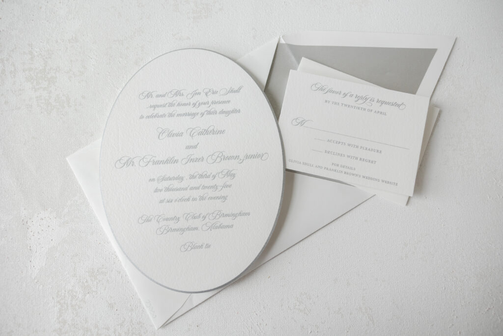
These custom invitations feature a classic and refined style. The distinctive oval shape adds a touch of uniqueness while maintaining a timeless elegance. The look is traditional, luxurious, and completely bespoke. The couple, Olivia and Franklin, worked with our dear Dorothy of Dorothy McDaniel’s Flower Market to create these oval engraved wedding invitations.
Engraving is a time-honored print method that involves pressing the paper into an etched metal plate to create a raised impression. It is historic and elegant. The use of engraving for this invitation in a script font and metallic silver ink is beautiful, sophisticated, and formal. The edges are beveled at 45º and then edge-painted in metallic silver to perfectly match the printing. Both of these embellishments add an understated opulence. Our 3-ply cotton paper is thick and luxurious, introducing a subtle texture. The paper displays a crisp impression and showcases the flourishes of the script font.
Invitation
engraving ink: metallic silver
fonts: aston script
papers: bella cotton white 3-ply
card size: f-8 oval
bevel: 45º
edge paint: metallic silver
envelope liner: metallic silver text
envelope: white cotton text 6.5” x 8.63” assembled, 11.5” x 20.13” flat (die #e-236)
envelope addressing: shale digital on the front and the back
job: 75030
The reply card keeps things straightforward and features metallic silver engraving. The same script font appears as an accent, while the majority of the text appears in a serif font. The envelope is custom-made to fit the large, oval invitation and features a simple metallic silver liner that complements the invitation and reply card.
Reply Card
engraving ink: metallic silver
fonts: aston script + addington
papers: bella cotton white 2-ply
card size:a-5
envelope: white cotton text pointed flap
envelope addressing: shale digital on the front
job: 75030
Overall, this wedding invitation is elegant and traditional, and is perfect for a black-tie celebration. Create your own timeless engraved wedding invitations or include elegant details like beveling and edge painting to take your invitation to the next level. Work with one of our dealers to create your perfect custom invitations.
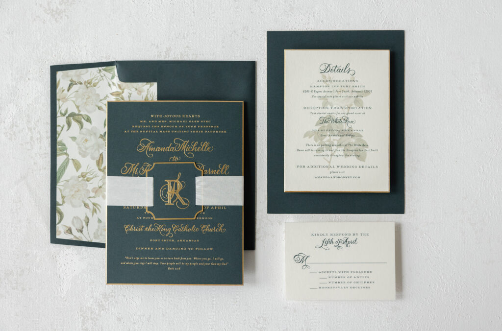
This custom-designed wedding invitation suite features hand calligraphy, a darling tag emblazoned with a monogram, and luxurious details, such as beveling, foil edging, and silk ribbon. We worked with our dear friend Mickey from the Social Type on this extravagant suite.
This invitation suite is lovely, but the use of hand calligraphy elevates the look. The couple chose the Wisteria hand by our dear friend, Debi Zeinert. Adding hand calligraphy to your invitation suite tacks on a few days to the design process, as the calligrapher requires time to create the artwork; however, the results are well worth it. Please note that revisions require additional turnaround time. The calligraphy looks dazzling, and the gold matte foil highlights the flourishes. The serif font maintains the formality of the look and beautifully coordinates with the hand calligraphy.
Invitation
foil stamping: gold matte
hand calligraphy: wisteria
font: impression
papers: evergreen 3-ply
card size: f-8 for inner envelope
bevel: 45º
foil edge: gold matte
job: 75437
Envelope
inner envelope liner: custom elide pattern in cmyk on ivory text
inner envelope: evergreen text
outer envelope: evergreen text
envelope addressing: gold matte on the back
job: 75438
Tag
foil stamping: gold matte
font: impression
papers: evergreen 2-ply
card size: 2.5” x 2.5”
diecut shape: cd-563
silk ribbon: mother of pearl
finishing: assemble with ribbon around the invitation
job: 75437
A die-cut tag bearing the bride and groom’s initials is secured around the invitation with silk ribbon. The tag features the bride’s initial in extravagant hand calligraphy, intertwined with the groom’s initial, which appears in a regal serif font.
Gold matte foil is also used to accentuate the beveled edge on both the invitation and the details card. The glimmer of the foil extenuates the 45º edge. The envelope liner is also custom and was designed using the Elide rose motif. The floral envelope liner softens the overall look of this suite while adding a hint of romance.
Reply Card
engraving ink: holly
hand calligraphy: wisteria
font: impression
papers: bella smooth cotton ivory 2-ply
card size: a-5
foil edge: gold matte
envelope: evergreen text
envelope addressing: gold matte digital on the front
job: 75437
The details card features engraving, which is a print method that uses etched metal plates to create a raised impression. The engraved text appears over digitally printed floral artwork.
Details Card
engraving ink: holly
digital ink: cmyk
hand calligraphy: wisteria
font: impression
papers: bella smooth cotton ivory 2-ply
card size: a-6
bevel: 45º
foil edge: gold matte
job: 75437
Whether you want classic, formal wedding invitations with modern luxury accents, such as beveled edges accented with foil, hand-calligraphy details, or a touch of romance with a floral liner, we can make it happen. Work with one of our dealers to receive expert guidance and assistance in creating your dream wedding invitations.
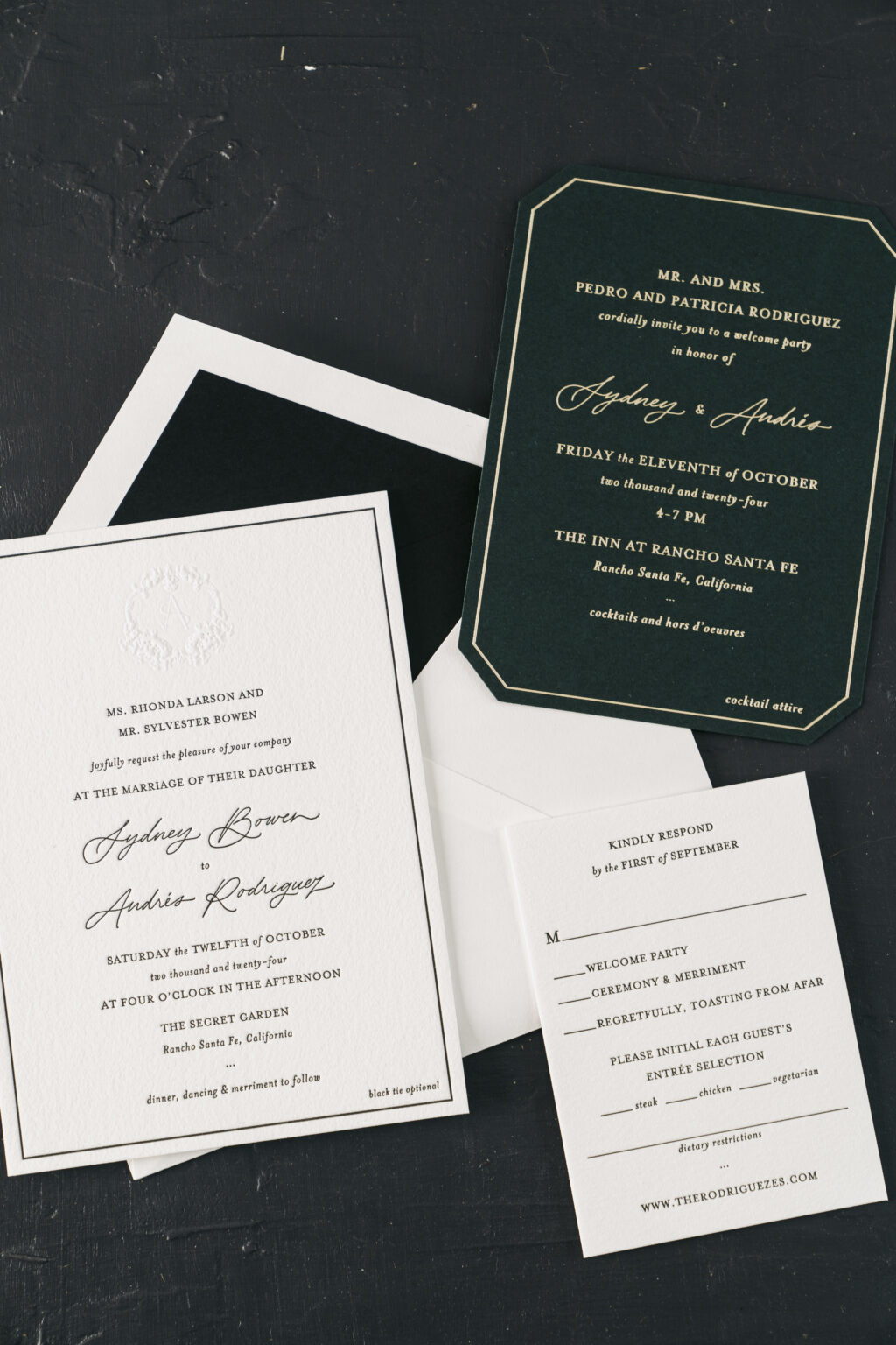
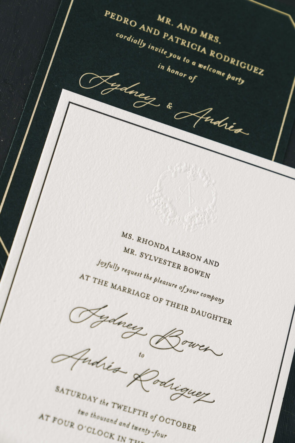
A custom crest, letterpress printing on pillowy-soft paper, and metallic thread make Sydney and Andres’ invitation suite meaningful, modern, and highly sophisticated. Our dear friend, Karly from Sweet Paper, worked with the couple to design these letterpress wedding invitations and the blind emboss crest.
This wedding invitation suite has a classic style with timeless elegance and a touch of sophisticated formality. The design blends minimalist typography with a refined color palette and luxurious details. The clean and structured layout features generous white space and a fine black border, contributing to a polished, high-end presentation. Our 2-ply Bella cotton paper holds a deep letterpress impression while also showcasing the intricate detail of the blind embossed crest at the top. The custom crest features floral accents surrounding the bride and groom’s first initials.
Invitation
letterpress ink: black
emboss: blind
font: mrs eaves + roman/italic/petite caps
paper: bella cotton white 2-ply
card size: a-7
thread: tawny metallic
inner envelope liner: midnight velvet
outer envelope liner: black text
envelope: white cotton text pointed flap
outer envelope addressing: black digital on the front and the back
job: 71406
The crisp champagne matte foil stands out against the deep, holly green of the welcome party card. The geometric shape of our Franklin die cut, coupled with the thin line border, mimics the border of the invitation while maintaining the modern and formal aesthetic. Tawny metallic thread holds the cards together in the envelope, while adding some extra glimmer.
Reply Card
letterpress ink: black
font: mrs eaves + roman/italic/petite caps
paper: bella cotton white 1-ply
card size: a-5
envelope: white cotton text pointed flap
envelope addressing: black digital on the front
job: 71406
Welcome Party Card
foil stamping: champagne matte
font: mrs eaves + roman/italic/petite caps
paper: holly 1-ply
card size: a-6
die cut style: franklin
die cut shape: bf-49
envelope: white cotton text pointed flap
envelope addressing: black digital on the front
job: 71406
Overall, this suite exudes a refined, formal, and upscale ambiance. It is perfect for an elegant black-tie wedding celebration. The suite embodies both tradition and modern luxury through its thoughtful blend of classic design and contemporary details.
Are you interested in creating a custom blind emboss crest or featuring a die-cut card in your invitation suite? Work with one of our dealers to design the letterpress wedding invitations of your dreams. Our talented dealers will help you sort through the details to create something bespoke and stunning that perfectly reflects your style.