We’re so excited to show off some of the pretty new things we’ve been working on over here at Bella Figura! We’ve just added 7 gorgeous new letterpress invitations to our collection and couldn’t wait until next year to share them. Check out the new designs below!
Modern Light – designed by Ian Koenig – features clean typography and minimal design – ideal for a modern celebration.

Simple Stripes, designed by Jessica Tierney, is modern and sweet – we love the playful fonts used throughout the suite!

Four new cities! Charmed Sydney, Charmed Washington DC, Charmed Chicago & Charmed San Francisco. Also designed by Jessica Tierney (and based on her Charmed New York design), these cityscape invitations are perfect for an event based in any of these iconic cities.

(more…)
These cheerful String Calligraphy (by Patricia Mumau) letterpress wedding invitations sure have a whimsical and contemporary feel! Submitted to us by our friends at The Village Invites in New York, NY we think the lavender ink paired with our black ink looks impeccable. It’s absolutely charming that the couple carried the two color theme onto all of their cards. The perfect pairing of our modern floral envelope liner in lavender ink looks sensational. We are in love with the the distinguishing look of this set!
inks: black + lavender | calligraphy style: harrison by patricia mumau | paper: 2-ply white | invite size: f8 | liner: the modern floral pattern in lavender ink | client coordinator: jessica hanaman| in-house designer: racheal decker


Bright green and yellow flowers paired with light, intricate birdcages are the perfect inspiration for a soft and romantic twist on our Allegory Modern letterpress wedding invitation design.
allegory modern customization = inks: amber + taupe | fonts: sakura + social | paper: white | invite size: f-8 | liner: european formal pattern in garden ink | original design by Bella Figura | customized by in-house designer Sarah Walroth |
embellishment suggestions: edge painting in garden

(Photo Credits: Hazelnut Photography)
by Sarah Walroth, In-House Designer
Our vintage chic Cartoccio (by Ian Koenig) letterpress wedding invitations are modernized in this customization that screams with 2011’s popular colors. Letterpress printed in watermelon and pewter inks on 1-ply white paper, our free eco specs message is also featured in watermelon on the back of the invitation. A #17 (typically our place card or website card size) reception card to match is also an unexpected element of detail. We adore the wording featured at the top of the invitation which adds such a personal touch- how romantic! Our modern floral envelope liner in pewter adds character to this whimsical set. Nothing is sweeter than a Italian summer wedding!


Our Lana letterpress invitations (by Jessica Tierney) look chaste and quite sharp in pool and umber inks. This customization was submitted to us by our friends at Sweet Paper in La Jolla, California. We adore the natural feel, and earthy tones of this simplistic set. With the stellar pairing of a classic color envelope liner in pool, this has us dreaming of the beautiful oceanic view in California!
inks: pool + umber | font: streamline | paper: 1-ply white | invite size: sq7 | liner: the classic color pattern in pool ink | client coordinator: jessica hanaman| in-house designer: sarah walroth


We get to work with amazing people from every corner of this beautiful world on a daily basis, but it’s not everyday we get to ship invitations all the way to Bahrain (and that’s too bad really). These Connemara (by Beth Ann Seal) letterpress wedding invitations are printed larger than our largest standard invitation sizes. Measuring in at an impressive 8.25″ x 8.25″ they’re so big in fact that we needed to run them on our larger 13″ x 18″ Heidelberg Windmill press (affectionately nicknamed ‘Hindenburg‘ by our printers because it tends to be a little cranky). Sea Mist and Navy inks, Metallic Gold edge painting, rounded corners, and hand calligraphed Arabic text, all come together beautifully here on our 2-ply ivory paper. We particularly love the way the fluid Arabic calligraphy compliments the repeating floral motif of the background.
inks: sea mist + navy | paper: 2-ply ivory | invite size: 8.25 x 8.25″ | edge painting: metallic gold | client coordinator: chris gannon | in-house designer: sarah walroth


Watery ink colors paired with the preppy Alouette Monogram letterpress wedding invitation is sure to make your heart float – think row boats, sun hats and sweet underwater kisses.
alouette monogram customization = inks: aquamarine + taupe | fonts: salzberg + social | paper: white | invite size: f-8 | liner: the reverse rustic crosshatch pattern in celadon ink | corner rounding |original design by Jessica Tierney | customized by in-house designer Lindsy Aragona |
embellishment suggestions: edge painting: aquamarine

(Photo Credits: Max Wanger)
by Lindsy Aragona, In-House Designer.
Totally regal and totally gorgeous this wildly customized rendition of our Plume design (by Amy Graham Stigler) was sent over to us for printing by our BFFs at Judy Paulen Designs in NYC. It features the Spencerian style hand calligraphy accents of the ever-amazing Debi Zeinert as well as crest artwork that was submitted by the bride for inclusion in the set. Cap that off with our 2-ply paper, two color printing in Cream and Tea Rose, edge painting, and digitally printed belly bands to hold it all together, and you’ve got what you see here – one SICK letterpress invite set.
inks: cream + tea rose | font: impression | calligraphy accents: spencerian by debi zeinert | paper: 2-ply ivory | edge painting: tea rose |


by Chris Gannon, Client Coordinator.
We love the glamorous feel of our Jolie (by Aimee O’Boyle) letterpress wedding invitations that were recently printed in this regal color combination of custom Pantone #233 and antique gold inks. What’s not to love? Matching letterpress printed menus and folded place cards carry on the ornate flair. We love the vintage luxurious look that will echo throughout their Santa Barbara affair!
inks: antique gold + custom pantone 233 | fonts: poetica + nysa| paper: 2-ply ivory | invite size: a-7 | edge painting: metallic gold | client coordinator: christie jones | in-house designer: sarah walroth


by Christie Jones, Client Coordinator.
A recent favorite is a clean customization to our Soleil (by Beth Ann Seal) letterpress wedding invitations. The simplicity of our sea mist and taupe inks on white paper, combined with our Luster Roman font creates a natural quality that is perfect for a garden themed wedding. A matching sea mist envelope liner balances the understated letterpress set.
inks: sea mist + taupe | font: luster roman | paper: 1-ply white | invite size: a-7 | liner: the classic color pattern in sea mist | client coordinator: christie jones | in-house designer: kyle laatsch

by Kyle Laatsch, In-House Designer.
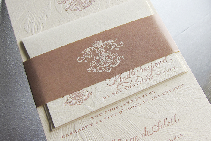
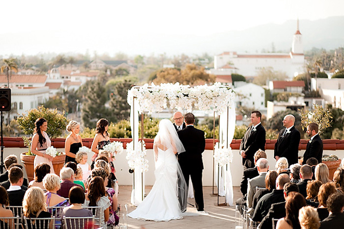
We were absolutely thrilled to see this real wedding on Style Me Pretty recently – a stunning white affair that took place in beautiful Santa Barbara. The couple’s Majorca wedding invitations set the tone for their intimate celebration, and romantic hints of blush were found throughout the decor. The bridesmaids wore stunning, custom-made dresses by Lauren Bradley, and the bride wore an incredible pair of bright blue Christian Loubouton peep toe shoes, a gift given to her by the groom while they were dating. We love their coordinating day-of pieces, too – gorgeous table cards and menus are the perfect way to tie everything together.


(more…)
Letterpress booklets are hands down one of the coolest things we get to work on around here. I mean come on, a personalized letterpress booklet just for your wedding – what could be more awesome than that? Submitted for your approval, is by far one of the nicest ones we’ve been able to work on.
To welcome their guests to a destination wedding in Bali, this couple had us custom design and print ceremony programs and welcome booklets loaded with all kinds of amazing touches. The programs are composed of two double-sided pages (one fits inside the other) with a score line in the middle and hole drilling so that they can be assembled together with ribbon. The 7 page welcome booklets are bound together with brass grommets and include a subtly patterned one piece cover that wraps around the spine of the booklet. What’s inside the booklet you ask? Pretty much a condensed Lonely Planet! They included all the details their guests might have possibly needed for a wedding in this island paradise, right down to a primer in basic Indonesian and a list of all the local hot spots. The entire set is printed on our white paper in a combination of Cream ink and a custom mix of Pantone 618 ink.
inks: cream + custom pantone 618 | fonts: danube + sans capitals | paper: 1-ply white | client coordinator: chris gannon | in-house designer: sarah walroth


by Chris Gannon, Client Coordinator.
