One of the loveliest stationers we work with became a bride herself this past December. We created these foil welcome booklets for Julie of Fete Collection’s Delaware affair. She opted for a Tawny Matte foil hexagon pattern as well as a calligraphy monogram. Charcoal letterpress used throughout maintained as the neutral color. Finally, we have no doubt Julie’s wedding was equally as lovely as she is!
What could be cooler than a two page letterpress save the date booklet that’s grommeted together in the corner so it swivels open and shut? I don’t have a followup for that intro, but personally I think these are pretty rad. It’s a great way to include additional details and to make the whole card interactive and fun. This set is a customization of one of Amy Graham Stigler‘s designs, Gramercy, and besides the grommeted save the date it also features letterpress invitations with a pocketfold and a design-coordinated envelope liner. We owe the privilege of printing this beautiful set to the lovely bunch at Union Street Papery.
inks: pms 7529 + clover | calligraphy accents: harrison by patricia mumau | paper: 2-ply white | save the date size: a6 | invite size: f-8 |
In a really cool twist (literally!) on Ben Whitla‘s original Avant design, this letterpress invitation booklet includes a cover page, an invite page, and an RSVP page that have all been grommeted together into a tidy little package. The grommet allows the individual pages to swivel open and close and a perforated tear-out RSVP postcard on the last page lets guests reply without having to worry about envelopes. Great stuff!
inks: chartreuse + charcoal | font: geometric | paper: 1-ply white | invite size: a7 | client coordinator: chris gannon | in-house designer: sarah walroth
Letterpress booklets are hands down one of the coolest things we get to work on around here. I mean come on, a personalized letterpress booklet just for your wedding – what could be more awesome than that? Submitted for your approval, is by far one of the nicest ones we’ve been able to work on.
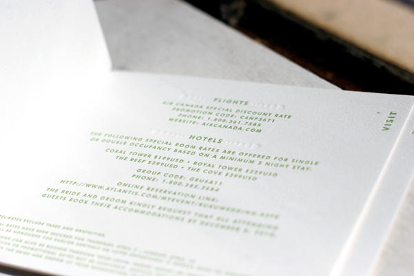
To welcome their guests to a destination wedding in Bali, this couple had us custom design and print ceremony programs and welcome booklets loaded with all kinds of amazing touches. The programs are composed of two double-sided pages (one fits inside the other) with a score line in the middle and hole drilling so that they can be assembled together with ribbon. The 7 page welcome booklets are bound together with brass grommets and include a subtly patterned one piece cover that wraps around the spine of the booklet. What’s inside the booklet you ask? Pretty much a condensed Lonely Planet! They included all the details their guests might have possibly needed for a wedding in this island paradise, right down to a primer in basic Indonesian and a list of all the local hot spots. The entire set is printed on our white paper in a combination of Cream ink and a custom mix of Pantone 618 ink.
inks: cream + custom pantone 618 | fonts: danube + sans capitals | paper: 1-ply white | client coordinator: chris gannon | in-house designer: sarah walroth
We absolutely love this unique customization of our Champagne design! Letterpress printed in clover and blind deboss for a tropical destination wedding, we worked with this couple to create a small booklet by fastening the different elements of their invitation suite together with grommets. The page sizes are stepped to create tabs and labeled to identify which page contains what information. The booklet contains an invitation, an events card, a directions and accommodations card, and a reply card that is perforated to be torn out and returned.
We worked with our friends at The Social Type in Little Rock, Arkansas to create Kelsey and Lawson’s invitations. Inspiration came from our Aiden design, with a venue illustration foil stamped on the invitation card. This was repeated in the pocket-sized details booklet. How smart to have an easy-to-carry guide for your guests! The suite was completed with our tapestry envelope liner pattern, which was accented by a blacked pearl ribbon.
The first glimpse of a wedding typically starts with the save the date. A card kept by guests for plenty of months, setting the tone for what’s ahead. For Olivia and Will, a grommeted save the date was their style of choice. This little booklet is a great choice for weddings that require a little more information right off the bat. If it’s to make sure guests are aware of accommodation bookings or if it’s destination wedding heads-up. A grommeted save the date is the solution! We send a huge thanks to JoEllen Bax of Slightly South for helping us make these save the dates come together!
Our Designer of the Month Nicole Black recently offered a penmanship class with Southern Fried Paper, and she’ll be offering more classes again soon! Today we’re sharing details on what Nicole’s class entails, along with some quick tips for how to improve your own penmanship. We love how the class began: out of a love for beautiful, heartfelt words, carefully crafted with patience and pride. We’ll let Nicole take over from here!
This is a traditional penmanship class. One that will teach you how to write with the grace of our grandmothers or great grandmothers. To slow down and think about each letter and each word and make them count to make a meaningful statement that the recipient will enjoy reading.
We spend some quality time on the foundations: doing warm up drills and learning the basic hand motions. Lower case and capital letters are covered in this class so you can leave able to write notes. Not to leave you hanging there, we go over connecting letters, making words, writing sentences and how to write a traditional letter (by hand!).
Everyone gets a one-on-one progress review to help work out any trouble areas. For those afraid you will forget what we have learned — a wonderful class booklet is provided along with a pen, notepad and pencils.
We end the class with a pen round table where the participants get to test out different pens to find their favorite… because what works for your neighbor may not be your favorite.
Quick and easy tips for improving your penmanship at home – slow down! Develop a rhythm of writing and stick to it, slow down with the pen and you will see an ease of flow with the letters develop. Also, it is okay to write on lined paper. I’m a seasoned letter writer and still use guides to keep my lines straight. If you want to write on unlined correspondence paper – just place a piece of notebook paper underneath and follow the lines. When you are finished, you have written in straight lines without them being there and your recipient will be soooo impressed!
Many thanks to Nicole for sharing a peek inside her penmanship workshop! Looks fun, doesn’t it? Be sure to check out Nicole’s designs this month – they’re on sale through the end of February (and Bella Figura customers save on calligraphy addressing from Nicole, too!).
Thinking about your letterpress reception pieces? Think program covers! To get everyone swooning we’ve pulled together a collection of programs covers we’ve printed recently so you can see a variety of styles, colors and designs. Whether vintage or modern, colorful or classic black – let your feelings shine through your programs! You can include a sweet line of prose, a saying that pulls on your heartstrings, a scripture verse that has held true, or a design element that’s bold and beautiful. Whatever your style, feast your eyes on some of our Client Coordinator’s favs!
To coordinate with their booklet letterpress invitations, we worked with Jennifer and Aret to create special letterpress pieces for their wedding weekend. A welcome booklet detailed weekend events and details and we also printed tea length letterpress dinner menus and table number cards. Oversized letterpress thank you cards (which will later hold a wedding photo) were the perfect finishing touch. Everything was printed in clover and blind deboss on our white cotton paper for a chic and completely sophisticated look.