We had so much fun creating our two new Pinterest inspired designs that we’re having another Pinterest contest and giving you the chance to inspire a new design for our 2013 collection! Plus, you’ll have the chance to win 100 letterpress party invitations that you could use for save the dates, a birthday party, baby announcements, or even a backyard BBQ!
Here’s how it’s going to work: we’re looking for inspiration from a place that you love. It could be anywhere: your favorite vacation spot, where you got engaged (or married!), a pretty spot in the woods, or even your own backyard. Create a board on Pinterest and name it My Favorite Place, then upload an inspiring photo of your special place to the board to get started. In the caption, tell us why it holds an important place in your heart. Don’t spare any details – we want to hear your stories!

Then, fill your board with at least 20 other pins that match the look and feel of your initial pin. What we’re looking for: a cohesive board overflowing with beauty! Pin images that mimic the feeling and match the style of your original photo. Feel free to continue telling your story in the captions of the other pins! Check out our sample board for ideas to get you started.
In addition to the 20 pins, you must pin the image below to your board, as well as your favorite Bella Figura envelope liner. To pin your favorite liner pattern, just use the handy tool on our website to customize an envelope liner with a pattern and colors that match your style, and in the caption, include the name of the pattern (like this!).

Our lead designer Jessica Tierney will be judging the contest and one of our talented designers will be creating an invitation suite based on the winning board. Judging will begin on July 23, and the winner will be announced on July 27. The new Pinterest-inspired design will be released with our new collection in January 2013.
Entry deadline: The contest runs from July 16, 2012 through 12pm EST on July 23, 2012. To enter, follow the instructions above and submit the URL of your Pinterest board to the comments section below.
The grand prize: The person with the winning board will receive 100 free letterpress party invitations printed on our A6 sized cards in two inks on our 1-ply cotton paper with 1-color letterpress printed envelopes. Choose from any of our 300+ invitation designs and create the perfect piece for your next event! Be sure to take a look at our Social Album for inspiration.
*The fine print: additional invitations, custom design fees, additional ink colors, double-sided printing, added embellishments or rush orders will incur charges.
Need an invitation to join Pinterest? Email hello@bellafigura.com and we’ll send you one right away! We can’t wait to see your entries — good luck!
Did you know that all of our letterpress wedding invitation designs can be customized for social occasions? We can print lots of pieces for your big day (like wedding announcements and
save the dates, as well as engagement party, rehearsal dinner or bridal shower invitations), but we can also print the paper goods for the other special occasions in your life! Customize any of our designs to be used for baby showers or birth announcements, holiday cards, Bar Mitzvah, Bat Mitzvah, moving announcements, birthday party invitations, and more. You can
work with us directly, or view our new Social Album at one of our
custom letterpress dealers.
We have Lin Logan at the Stationery Company to thank for this amazing customization of our Hoxton design. Our guest judge — Amanda from Ruffled, one of the prettiest wedding blogs around — selected this cool invitation set as the first place winner for our 2012 Design Contest! Amanda loved the fresh and airy feel to this design and the modern pop of color and shape. As Amanda mentions, “geometric motifs are also super easy to follow a theme, and the colors are open to any style wedding.”
Lin was kind enough to share what Emily had envisioned for her wedding invitations: The bride had seen a geometric pattern in magazine and just thought “Wow, I wish I could incorporate that!” She found it in Hoxton — perfectly clean and modern. The bride also wanted to incorporate edge painting for an extra pop and felt with these colors, it would happen and create a nice contrast. She was thrilled with the invitations! — As are we! The three-color invitation printed beautifully, and the hint of neon (our lime-aid ink color!) adds a fun twist to the design. We also love the way the geometric look is carried throughout the entire suite, with variations of the patterns and colors on each piece (and the envelope liners)! This suite is perfectly coordinated and incredibly chic.

Congratulations to Lin at the Stationery Company for coming in first in our 2012 Design Contest, and best wishes to the happy couple on their wedding day! A special thanks goes out to Amanda from Ruffled for judging this year’s contest! Be sure to stop over to Ruffled for all sorts of pretty inspiration.
inks: charcoal + lime-aid + pale gray | font: moravia | paper: 2-ply white | invite size: sq7 | liner: simple geometrics pattern in charcoal ink | edge painting: lime-aid |
This design won first place in our Bella Figura design competition for 2012. This annual competition recognizes outstanding and inspired designs submitted by our beloved dealers.
Our second place design contest winner was sent to us by Hailey at Elizabeth Grace in Chicago, and we couldn’t get enough of this four-color customization of our Chapin design! Our contest judge — the talented Amanda from one of our favorite wedding blogs, Ruffled — loved the fresh color scheme and all of the attention to detail. “The green used throughout the design adds just the right amount of detail without overwhelming the suite and is a beautiful teaser for what’s in store for guests on the wedding day” – which is exactly what the couple was hoping for. They were kind enough to share the inspiration behind their unique invitations with us:
Dave and I knew we wanted our invitation to be totally original. We hoped the invitation would set the tone for our big day, and we wanted it to be romantic, feminine, and soft. We are getting married outside of the museum facing gorgeous Lincoln Park, so we wanted the invitation to also be fresh and natural. We are currently working on the design of the arbor we will get married under and are selecting flowers to convey the same feelings of romanticism, naturalness, and softness.
It was helpful that we came in to look at invitations right after a floral appointment! We brought in a couple of flowers for inspiration – all featuring beautiful pinks and fresh greens. We saw many elements that we really loved when looking through the Bella Figura album, but not one that was exactly right. Essentially, we took a design and changed the flowers, colors, selected fonts, and had the flowers vine around the wording. It took a few tries to get the colors right, but we’re glad we took the leap to actually design our own invitation because the end result is so lovely! We can’t wait to get them in our hands and out to our friends and family.
 We love the way the whimsical roses from our motif library were used to customize our Chapin design, and the Spencerian hand calligraphy accents added the perfect amount of elegance and romance! The roses were also used in a custom, design-inspired envelope liner and on the insert cards, which made for a cohesive look throughout the set. Congratulations to Elizabeth Grace for winning second place in our second annual Design Contest, and best wishes to Colleen and David on their upcoming wedding!
inks: clover + olive + british rose + shell | font: jubilant | calligraphy accents: spencerian by debi zeinert | paper: 2-ply white | invite size: f8 | liner: custom design-inspired liner in shell ink
This design won second place in our Bella Figura design competition for 2012. This annual competition recognizes outstanding and inspired designs submitted to us by our beloved dealers.
Remember the Pinterest contest we held back in February? Well today, we’re excited to share the designs that the contest inspired! The first, A Bientot, is a romantic design with Parisian flair and was design by Jessica Tierney. A Bientot was inspired by the carefully curated images of our Pinterest contest winner’s Dream Wedding board. Lovely photos of delicate vintage china, french macaroons, elegant lace and sophisticated florals all tied together with soft shades of pink, peach, cream and lavish metallic accents of copper and gold. It wasn’t hard to start designing a suite based on these awe-inspiring images! Tierney instantly pictured an elegant Parisian inspired soirée complete with vintage plates stacked high with Ladurée macaroons, lush florals in feminine shades, and soft candlelight illuminating golden accents. The A Bientot suite is perfect for the couple looking to evoke a feeling of chic sophistication and classic charm on their special day!

Photo credits, from left to right: Row 1: Bella Figura, Jose Villa via The Wedding Chicks | Row 2: Martha Stewart Weddings, Vintage Plate Rental, Musee Des Spontan | Row 3: Eric Kelley Photography, Martha Stewart Weddings | Row 4: Rensche Mari via Southern Weddings | Row 5: Bella Figura, Jessica Janae Photography via Bridal Musings
Gilded Romance — our second Pinterest inspired design — was designed by Sarah Walroth and is simply overflowing with shimmering foil goodness! The design features silver shine and purple shine foil stamping, and the fuchsia shine foil edging brings in a third color. Debi Zeinert’s Revolution hand calligraphy accents brought an elegant, flourished look to the invitation, which is filled with vibrant, confetti-styled bursts of foil shine. Sarah loved the celebratory twist to an otherwise reserved and elegant Pinterest board — the colors, sparkle, and textures carried throughout the board gave it a very cohesive, directed look. And everything on the board — from the makeup to the shoes to the cake — made it easy to create an invitation inspired by the gorgeous event! In particular, Sarah was inspired by the calligraphy, the sparkle and light throughout, and of course the gorgeous, deep plum dress. The Gilded Romance suite is perfect for the couple looking for a rich, glamorous design overflowing with romance and just a hint of formality.

Photo credits, from left to right: Row 1: Plum dress, 100 Layer Cake | Row 2: Southern Weddings | Row 3: Bella Figura, Style Me Pretty | Row 4: Martha Stewart Weddings | Row 5: Elizabeth Anne Designs, Bella Figura
Stay tuned — we’ll be announcing a brand new Pinterest contest on Monday and you’ll have the chance to inspire a design for our 2013 collection – plus you could win an amazing prize!!
Our 2012 Design Contest is in full swing, and today we’re excited to begin announcing our finalists! The lovely Amanda from Ruffled — one of our all-time favorite wedding blogs — was our judge for this year’s contest. If you’re looking for pretty wedding inspiration with a vintage touch, Ruffled is the place to go!
Amanda selected this modern customization of our Ribbon design from Judy Paulen Designs in Tenafly, New Jersey as the third place winner for our contest. Amanda said, “This invitation immediately has me daydreaming of a flowy wedding gown and a garden wedding. The scripted font is perfect for this style – whimsical and chic, just how this wedding would be.”
We think the added embellishments — bold edge painting, rounded corners and a statement pocketfold — definitely upped the wow-factor on this invitation set. The bride, Danielle, worked with Judy for her invitation suite, and she shared a snippet of Danielle’s vision with us: Danielle loved the sample in the Bella Figura album. She was looking for an unusual invitation that would intrigue and excite her international guest list, and the Ribbon design worked perfectly!
Congratulations to Judy Paulen Designs for placing third in our 2012 Design Contest! We’ll be announcing our second place winner tomorrow!

inks: garden + taupe | fonts: futura + ribbon | paper: 2-ply white | invite size: f8 | liner: the classic color pattern in taupe ink | edge painting: garden | rounded corners
This design won third place in our Bella Figura design competition for 2012. This annual competition recognizes outstanding and inspired designs submitted to us by our beloved dealers.
Today we share with you our trendy letterpress and foil design New Washi by Kamal. When Smudge Designs submitted this Bat Mitzvah order we were so excited to print it! The washi tape pattern is such a perfect design element and looks great on our envelopes!
Joanna from Smudge shares their story:
“They didn’t have a “theme” so they were just searching for a beautiful design, something that was fun but still formal and elegant. Julia fell in love with the New Washi design, but deciding to turn it landscape made it even more unique. We even noticed that it slightly resembled the Star of David, which was perfect for a Bat Mitzvah. Julia knew very early on that she needed this exact shade of purple. They had been shopping at Sephora, and noticed it on a lipstick. Her mother had sent us a picture of the lipstick shade that we then matched to a pantone swatch. We thought the silver foil would be a perfect way to jazz up the invitation, and complement the purple.”
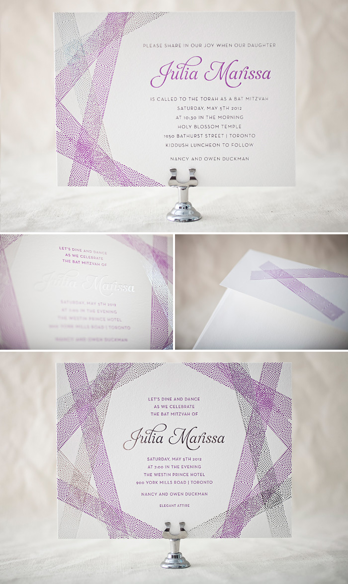
We love seeing our wedding invitations transform into Bat Mitzvah and Bar Mitzvah invitations! This design translates effortlessly into a classy yet youthful party choice.
ink: custom pantone 253U | foil: silver shine | fonts: neutra text + aurora | paper: 2-ply white | invite size: f8 |
This design won an honorable mention in our Bella Figura design competition for 2012. This annual competition recognizes outstanding and inspired designs submitted by our beloved dealers.
Our next design contest honoree features a sophisticated customization of our Classic Destination invitation design and we love the way this set turned out! The bride and groom worked with Nathalie from The Village Invites on their wedding invitations, which feature clean fonts and a modern color combination. The couple created the suite to invite guests to both of their wedding celebrations — one in San Francisco, one in Taipei — and we thought the end result was beautifully balanced. We especially admire how this couple reduced their carbon footprint by including an insert card directing guests to reply online on their wedding website instead of by mail!
Congratulations to The Village Invites for being selected as one of our 2012 Design Contest honorees!

inks: deep blue + sand + persimmon | fonts: typology + marzo + renaissance | paper: 2-ply ivory | invite size: f8
This design won an honorable mention in our Bella Figura design competition for 2012. This annual competition recognizes outstanding and inspired designs submitted to us by our beloved dealers.
We can’t tell you how much we love working with Gus and Ruby Letterpress in Portsmouth, New Hampshire. It’s just too much! We were just tickled when they submitted this order pairing our new sea-side ink with our Camilla design by Jamie Lea Bertsh. Samantha from Gus and Ruby let us in on the vision behind this unique customization:
“Rachel & David wanted a design that showcased their love of the Maine coast (their wedding location) without being absolutely literal or obvious. The outline of the Maine coast mixed with the funky graphic “wave” pattern representing the ocean set the tone perfectly! The oceanic blue/green ink really spoke to this couple and their coastal venue while the whimsical calligraphy and abstract pattern added a level of fun and playfulness to the whole piece.”

The A5 sized reply and reception cards alternate layouts so that each card looks fresh and unique. We particularly like how the extra touch of hand calligraphy on the reception card makes the reception location stand out. We love the nautical details in this suite and the creativity that inspired this gorgeous outcome. Congrats, ladies!
ink: sea-side | font: moravia | calligraphy: Sloan hand calligraphy, by Kelle McCarter | paper: 1-ply white | invite size: f8 |
This design won an honorable mention in our Bella Figura design competition for 2012. This annual competition recognizes outstanding and inspired designs submitted to us by our beloved dealers.
This design contest honoree features not one, but two of our letterpress invitation designs! The couple worked with Elizabeth from Urbanic (one of our amazing West-coast retailers) to create a double-sided invitation that featured our True Vintage design for their wedding ceremony invitation, and on the reverse side used our Byzantine design to invite guests to the party back at home in California! Elizabeth gave us the scoop on this pretty set:
The couple wanted to do a double-sided design because they are having two events — the wedding ceremony & celebration in Sweden, and then a reception back here in California. They knew not everyone would be able to attend both, but still wanted them to know they were included!
Since the wedding is in Sweden, there was no question on the use of blue and yellow, along with the crown motif, to pay homage to the country’s history. For the front side (the formal ceremony) they wanted something classic but not too old-fashioned. When they saw True Vintage they knew it was the one! They came to Urbanic knowing they wanted to include the Byzantine border on the backside to add something a little more fun and “beachy” for the California party. We think the combo came out great!

We couldn’t agree more! We loved the way the designs worked together (both original designs were created by Ellie Snow) and the pairing of our navy and champagne inks created a distinct look with a rich, royal feel. The crown motif was repeated on the information card and on the envelopes, and matched the look of both designs perfectly! Kudos to Urbanic for creating such a fabulous customization, and best wishes to Molly and Aaron for their upcoming wedding!
inks: navy + champagne | fonts: strana & streamline | paper: 2-ply white | invite size: F8
This design won an honorable mention in our Bella Figura design competition for 2012. This annual competition recognizes outstanding and inspired designs submitted to us by our beloved dealers.
This next design contest honoree created a lot of buzz here at Bella Figura! Letterpress and foil stamping make for a unique take on our Victrola invitation in this ticket-inspired customization, sent to us by Alexa and Julie at The Dandelion Patch in Reston, Virginia. Katie and Ryan – the bride and groom – shared the inspiration behind the invitations for their fall wedding with us:
Initially, our venue choice was going to be this amazing outdoor amphitheater in Southern Oregon called the Britt Festivals. It is a venue that hosts various musicians during the summer months. Unfortunately, they were unable to accommodate a wedding, so we went elsewhere. Lucky for us, our new venue has all of the elements we originally wanted, plus some! While we may not have a stage, we have the ability to create one that is tailor-made to us! Beyond that, we also have some amazing musicians in our family who will be performing during the ceremony. Since the feel of the wedding is so organic and artistic, we thought it would be neat to have the invitations be more like a ticket to a show.
We searched tickets and found some that had elements that we really liked, so we drew from those. I wanted to put the most important information in the forefront, such as the date and our names. By having our names in a different color, we were able to bring the focus there and make it less monotonous. Red just seemed to pop out more against the white and black colors. It was either red or copper to go with the fall colors, and red won out!

These invitations feature a really great mix of typography, and the foil stamped hand calligraphy accents add the perfect hint of elegance! We especially loved the way the modern herringbone envelope liners complemented the invitations – the perfect finishing touch. Congratulations to Alexa, Julie and everyone at the Dandelion Patch for being selected as a design contest honoree, and best wishes to the happy couple – we hope your wedding day is wonderful!
ink: black | foil: red shine | fonts: impression + bennington + sans capitals | calligraphy: sloan hand calligraphy by kelle mccarter | paper: 1-ply white | invite size: no. 10 | liner: modern herringbone in black ink | rounded corners
This design won an honorable mention in our Bella Figura design competition for 2012. This annual competition recognizes outstanding and inspired designs submitted to us by our beloved dealers.
We’re excited to announce that we have 9 new letterpress invitation designs available on our website now! Our mid-year release includes two new Pinterest inspired designs (A Bientot and Gilded Romance – more to come on those!), two new cityscape designs (Charmed Philadelphia and Charmed Seattle) to our Charmed series, a new calligraphy hand from Debi Zeinert called Paisley, and more! Click here to take a look at all of the new designs today.