We’ve seen lots of customizations of our classic Deveril invitation design, but this one is definitely one of the best we’ve ever seen! Sent to us by Jahna at The Pleasure of Your Company in Baltimore, Maryland, this customization has lots of nautical touches – and with good reason. Jahna shared the bride’s vision for this gorgeous invitation set with us:
The inspiration for her invitation is who she is marrying and where they are getting married. Her fiancé is in a Merchant Marine and they are getting married on Maryland’s Eastern Shore.
The main wedding color is Kelly green, and the custom liner is actually a nautical chart of where the wedding will be held. As for the welcome party coaster, when the bride was making final plans for the welcome party, her fiancé came in with her and while they were looking through the samples he noticed a coaster. They both thought it was perfect since the party will be at a brewery.
We love the way the the different motifs from our (free!) destination motif library were incorporated throughout the invitation suite to create a completely customized design with a perfectly nautical feel. Congratulations to The Pleasure of Your Company for being selected as a 2012 design contest honoree!

inks: garden + taupe | fonts: impression & danube | paper: 1-ply ivory | invite size: f8 | liner: custom | rounded corners
This design won an honorable mention in our Bella Figura design competition for 2012. This annual competition recognizes outstanding and inspired designs submitted to us by our beloved dealers.
It’s that time again…drumroll please….The Bella Figura Design Contest! We’ve collected the best, most exciting, jaw-dropping designs that our retailers have sent to us this year, and over the next couple weeks we are going to feature our contest honorees and then finish with our top 3 winners! Are you excited? We sure are!

There was really no surprise that this custom letterpress and foil invitation from Lion in the Sun in Brooklyn, New York made it in to the top 10 designs; it’s one of those we were thrilled to see come to life. Hayley from Lion in the Sun shared the lovely couple’s story:
“Veronique and Ben came into the store enthusiastic and full of ideas. First and foremost they are a world traveling duo, who wanted to add elements of their experiences in their invitation. As a personal touch they decided to phonetically depict “I LOVE YOU” in the languages from each country they traveled together. The bride wanted the invitation to really stand out, and what better way then with gold foil? The couple brought in a vintage poster that they found, and loved, to give the designers at Bella Figura some kind of direction. Sarah Walroth really took all of these elements and conveyed the couples unique style beautifully. lt was a group endeavor that created a truly unique invitation that the couple are so in love with.”

The Bella Figura team fell in LOVE with this design as well for many reasons – not the least of which is the flawless type and the use of foil stamping (a new printing method we started offering this year). The mixture of papaya ink and gold shine foil is on trend and totally hits the mark. Our Willow and Aloutte fonts look fresh and clean. The couple also chose to include motifs from our free motif library and we are glad they added that extra touch!
ink: papaya | foil: gold shine | fonts: alouette + willow | paper: 2-ply white | invite size: f8
This design won an honorable mention in our Bella Figura design competition for 2012. This annual competition recognizes outstanding and inspired design submitted by our beloved dealers.
Pressed in a really vibrant combo of our Surf and Aubergine inks, this customization of Jessica Tierney‘s Popular Country design turned out beautifully, and so we thought we’d share it. This design tends to have a pretty vintage style to it, but it’s amazing how just throwing some bright inks into the picture really turns things around completely. Love it.
inks: surf + aubergine | paper: 1-ply ivory | save the date size: a6 | client coordinator: chris gannon |

We have some amazing in-house designers here at Bella Figura who know all about this year’s hottest wedding trends! We asked a few of our designers to share their favorite trends for 2012 weddings and beyond, and they dished on everything from dresses to wedding colors – take a look at the trends our designers are loving!
Sarah Walroth: Couples are making their invitations unique to them, and incorporating special accents that make their invitations pop! Bold color combinations – like geranium + mediterranean or hot pink + silver shine foil; geometric patterns – chevron, stripes, etc.; oversized text, and foil – are all popular options that couples are using to make their design stand out. I also love the hand made details we’ve been seeing in weddings lately. Customized soda bottle labels, chalkboard menus & seating guides, and cards directing guests to different stations that match the rest of the paper goods in the wedding are great personal touches that really make the wedding unique to the couple. I’m happy to see more and more tea-length and knee-length bridesmaids’ dresses, too – they have a fun feel and are definitely practical for summer weddings. And for shoes, I’m thrilled that sparkly platform pumps are in style because they make perfect wedding shoes!

Clockwise from top right: Shoes | Chair | Escort Cards | Soda Bottles
Lindsy Aragona: Coral colors are going to continue to be huge this year and beyond – corals work so well with both warm or cool neutrals like sand or pewter. And the multiple shades of coral, pales to brights, can fit any wedding theme – formal to destination! I love vintage, quirky and rustic looks – and outdoor weddings with personal touches are my favorite. Pale colors, rustic accents, nature and romance are my inspiration! 
Clockwise from top right: Happy couple | Bouquet | Groomsmen | Centerpieces
Racheal Decker: I’m predicting that personalized elements will continue to be huge! (monograms, customized & creative wording, pocketfolds, and more). Eye catching colors – from soft and subtle blushes to nautical blues, to anything bold and saturated (hello neons!!) are also popular for weddings right now and will continue to be well through next year. Couples are also choosing themes — everything from fairytales to dreamy destinations and everything in between. Themes are everywhere, and like it or not you probably have one! I’m also loving the rustic weddings we’ve been seeing lately — sweet earth tones with handmade accents simply “woo” your guests with the natural romance of your event.

Clockwise from top right: Signs | Suitcase | Flowers | Venue
Brenda Fox: I think we will continue to see lots of bold oranges & reds coming into play paired with muted, earthy tones. Lots of stripes and more thin, light typefaces. My favorite wedding trend right now is roof top weddings for sure! I imagine a warm summer night with unique, white lights in a chic city space or garden. I think it helps make for an intimate setting with your closest friends and family on your special day. I also really love a really rustic venue, which makes the bride look all the more beautiful (like the movie the Proposal with Sandra Bullock, when she got married in the old wooden church in Alaska!).

Clockwise from right: City scene | Sparkler exit | Outdoor reception
Planning a Beach Wedding? This customization of our Petaline design is perfect for a summer time celebration.
Petaline Customization = inks: pool + taupe | fonts: grace + jubliant | paper: white | invite size: f-8 | liner: the classic color pattern in cream ink | original design by Tara Hogan | customized by in-house designer Brenda Fox|
embellishment suggestions: edge painting in metallic silver

[Photo Credits: Jessica Numbers ]
Our charitable favor cards were featured yesterday on the Today Show! Brides magazine editor-in-chief Anne Fulenwider included several of our letterpress charity favor cards in a segment filled with helpful wedding planning tips for brides to be. We think it’s pretty amazing when couples make a heartfelt gift to charity in honor of their guests, so we’ll print your favor cards for free if you’re donating to charity in lieu of traditional favors. We’ll also match your highest quantity, too – so if you order 150 letterpress invitations, we’ll give you 150 free letterpress favor cards. Click here for more details on this promotion, and be sure to check out the video!

We couldn’t be more excited to announce that we’re heading to California next week to host a trunk show with Urbanic, one of our favorite Bella Figura retailers! Come in to Urbanic on June 16 for an afternoon of dazzling inspiration, sweet treats & bubbly, and lots of fun! You’ll have the chance to sit down with stationery experts from Bella Figura + Urbanic and view the new Panorama wedding album (which is filled with stunning foil-stamped and letterpress invitation designs!). You can even learn how to make your own DIY centerpieces! And the best part? Come in for the trunk show to order a set of invitations, and you’ll get 25 free invitation sets when you order 75 or more! That includes everything – invitations, reply cards, insert cards, embellishments – the works! The trunk show runs from 11am-4pm, so if you’ll be in the area, RSVP to hello@urbanic.com today. We hope to see you there!

Our Harp design (by Tara Hogan) is so beautiful it brings music to our ears! These letterpress wedding invitations look so beautiful here in a combination of pewter and pale gray letterpress inks. Adding that touch of color certainly enhances the elegant swirls and gives it a timeless look.
inks: pewter + pale gray | fonts: moravia + parisian | paper: 1-ply white | invite size: a7 | liner: the vintage stripes pattern in british rose and pale gray inks | client coordinator: christie jones | in-house designer: racheal decker
What could be cooler than a two page letterpress save the date booklet that’s grommeted together in the corner so it swivels open and shut? I don’t have a followup for that intro, but personally I think these are pretty rad. It’s a great way to include additional details and to make the whole card interactive and fun. This set is a customization of one of Amy Graham Stigler‘s designs, Gramercy, and besides the grommeted save the date it also features letterpress invitations with a pocketfold and a design-coordinated envelope liner. We owe the privilege of printing this beautiful set to the lovely bunch at Union Street Papery.
inks: pms 7529 + clover | calligraphy accents: harrison by patricia mumau | paper: 2-ply white | save the date size: a6 | invite size: f-8 |

A night full of dancing, pretty lights, starfish decorations, and sand captures a summer beach theme perfectly. Topping things off, close the night with a kiss and a heart shaped silhouette of sparklers for that picturesque moment! This Addison Vintage customization is a perfect simple fit for a perfect summer affair!
addison vintage customization = inks: prussian blue + antique gold | fonts: aiden + nysa | paper: ivory | invite size: f-8 | liner: vintage stripes pattern in prussian blue | corner rounding | edge painting in champagne | original design by Jessica Tierney | customized by in-house designer Racheal Decker |
embellishment suggestions: pocketfold: iris

(Photo Credits:Cheri Lehnow)
With all of the different elements to consider when ordering your wedding invitations, envelope choices can wind up being somewhat of an afterthought. After all, they’re just going to be ripped open and thrown away anyway, right? Well, yes – but that doesn’t mean that they’re not important. They are the first things your guests will see when the invitation set arrives in the mail, after all.
The old standby for envelopes is to have them match the invitations – our standard envelopes are made from a text-weight version of the same cotton paper we print our letterpress invitations on – so the paper and envelopes will be a perfect match. If you’re looking for simplicity and complete uniformity throughout your set, this is definitely the way to go. There’s absolutely nothing wrong with white or ivory envelopes, by the way! They’re elegant and are designed to coordinate perfectly with your invites.
That being said, sometimes you don’t necessarily want everything to perfectly match your invitations – sometimes you want the envelopes to have a little pizazz of their own. And that’s where colored envelopes can fit the bill nicely.
New for 2012, we now offer several different colored envelope options (available in select sizes only for now): bullion, silver, jute, steel blue, and opal. Perhaps you want to add a touch of metallic to your invites (but you don’t want the invitation itself to be foil stamped)? A silver or bullion envelope would be a great option! Looking to add a crafty, hand-made sort of vibe to your invites? Try our jute envelopes! Planning lots of pearlescent touches for the wedding? Think opal envelopes!
Oh, and the best part? Our colored envelopes are priced exactly the same as our white and ivory envelopes, so they’re definitely more budget-friendly than some other color-adding embellishment options such as pocketfolds or envelope liners. Not that these colored envelopes don’t look awesome with liners too – because they definitely do! We especially love the look of a metallic envelope paired a metallic envelope liner – think metallic bronze envelope liners paired with opal envelopes — it’s a stunning combination!
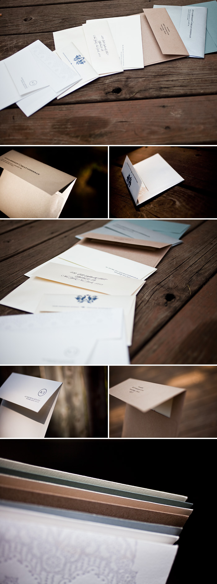
Once you’ve finalized all the details for your letterpress invitations and picked the perfect envelopes for your invitation set, add a beautiful finishing touch by having them hand addressed by one of our master calligraphers! And be sure to check out these tips for all of your envelope addressing needs.
Our new office favorite is this summery customization of our La Salle (by Ian Koenig) design. If these letterpress wedding invitations look familiar that’s because we previously featured a similar design customization. Now we can see that this whimsical design is even prettier when letterpress printed! We have Danielle from Bells & Whistles in Belmont, Massachusetts to thank for these!
inks: sea-side + light peach | fonts: conquerer + memimas | paper: 1-ply white | invite size: f8 | liner: the refined mosaic pattern in light peach and sea-side inks |