Our designer Cassidy created the Gigi suite for our 2024 wedding collection, and walks us through her inspiration:
My 2023 summer trip to the south of France inspired me to design Gigi. I was taken by all the wonderful colors and beautiful scenery of the seaport city of Nice. Visiting the south of France was always a dream of mine, particularly after I found out that Alfred Hitchcock filmed several scenes there from his 1955 classic “To Catch A Thief” with Grace Kelly and Cary Grant. It’s one of my favorite classic movies! I explored from downtown Nice to the Old Town, to a nearby town called Menton.
My favorite town in Nice was Menton; it was like walking onto a movie set it was so stunning with all the bright and warm colors of the buildings, the French Riveria right at your feet, and you’re right next to the border of Italy. I drew much of my design inspiration from that town and Old Nice with the color palette, typography, and drawings. The colors were perfect for a summer wedding and I wanted it to feel vintage inspired using a similar old-style block font used on the buildings in Nice, (Palmore) but also modern with a simple style of textured line drawings, and two new fonts, Questrial and La Luxes script. I decided to set the wedding venue at Le Negresco Hotel, as it is a very famous hotel in vibrant area of downtown Nice, next to Old Nice where you can see more of the city’s history!
This was my first wedding release design for Bella Figura and I loved creating it! I hope it inspires you too!
Here is Gigi in a more cool tone / masculine colorway: using Espresso, Carolina, Royal Blue, Messa, and French Vanilla.
letterpress inks: watermelon + aquamarine | fonts: palmore + questrial + la luxes script | paper: bella smooth cotton white 2-ply | invite size: f-8 | edging painting: lime-aid | liner: gigi pattern in persimmon | envelope: bella cotton white pointed flap | digital addressing inks: cherry + aquamarine
We were lucky enough to work with Joanna of Smudge Designs on these hand lettered foil and letterpress birth announcements introducing her son Abraham. Based on Joanna’s vision, Patricia Mumau created custom lettering styles and sweet motifs that we then printed in lime-aid letterpress and blue shine foil. Using baby Abe’s crib sheets as inspiration, we designed a custom envelope liner using animal motifs from our library.
letterpress ink: line-aid | foil stamping: blue shine | hand calligraphy: custom style | paper: bella cotton white 2-ply | envelope: bella cotton white | liner: custom pattern in prussian blue + cerulean + cobalt + navy | Smudge Designs | customization #31366
We were thrilled to see our invitations in two recent issues of Martha Stewart Weddings! For the Fall 2015 edition, we printed our Annalise design by Sarah Hanna in rich, cardinal red ink for their “Red-Letter Day” feature, and for the Spring 2016 issue we worked with the editorial team to create a custom letterpress invitation in our lime-aid ink. Many thanks to the team at Martha Stewart Weddings for including us in both of these issues!
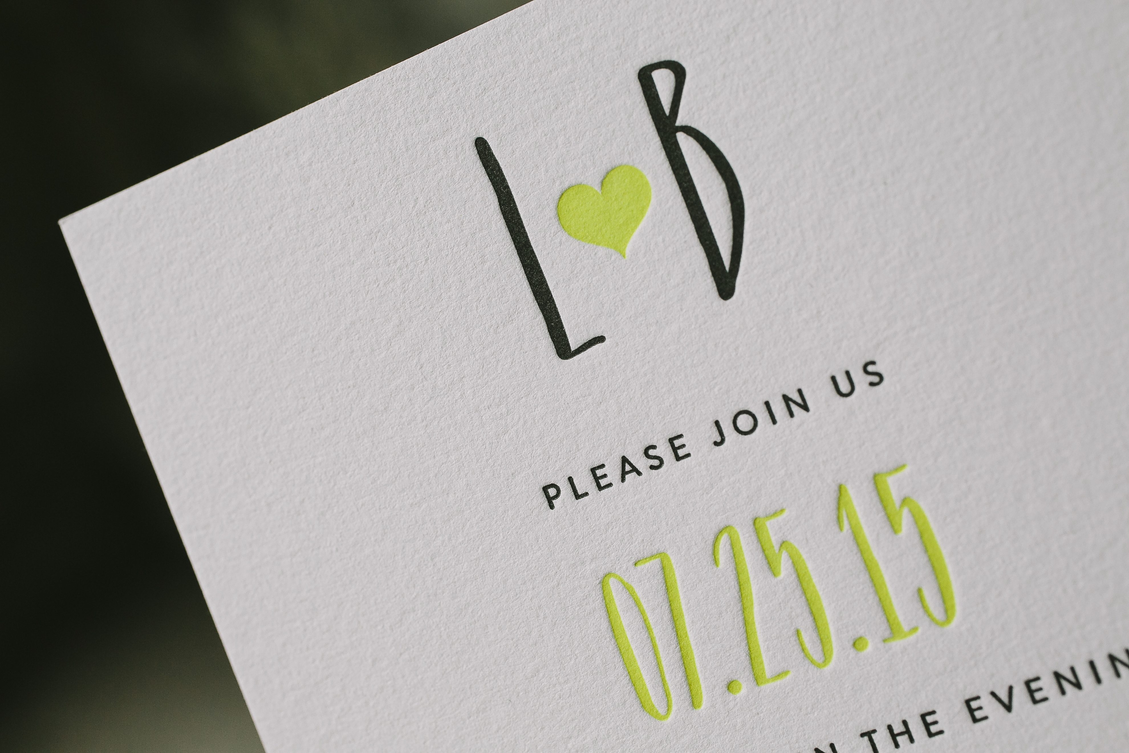
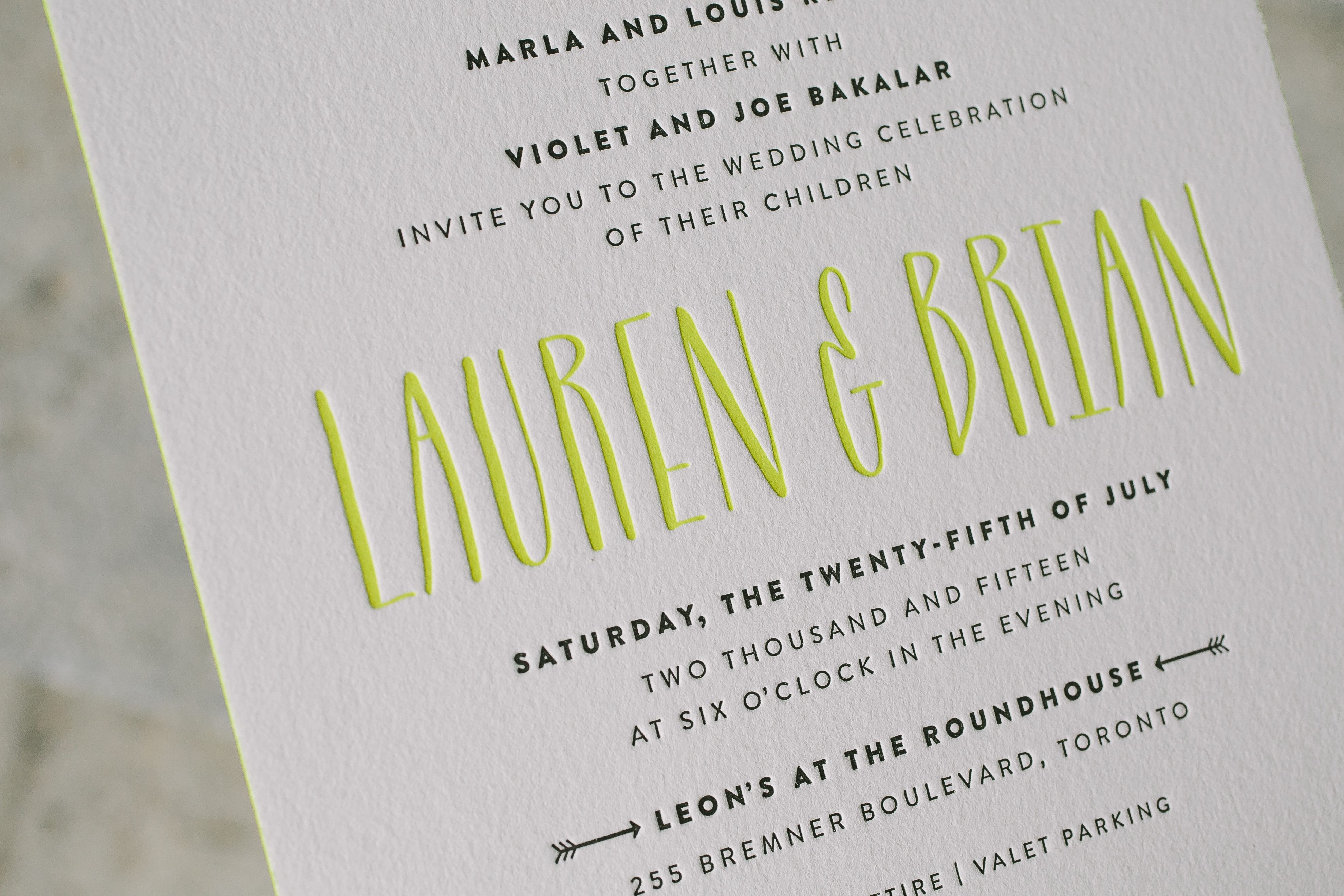
To compliment their one of a kind venue, Lauren and Brian chose neon wedding invitations in a modern, text-based design. They chose Blakesly but passed on the banner motif to keep things simple and customized their reception card with a sweet duogram.
A fun loving couple is sure to adore Blakesly, a geometric wedding invitation with modern style. Brenda Fox created Blakesly with a lively wedding celebration in mind – complete with fun touches like a photobooth and a candy buffet. Love this look? Check out more of Brenda’s inspiration for Blakesly on Pinterest!
To celebrate her upcoming nuptials, Mara’s friends hosted a dinner party in her honor – complete with fun, festive invitations. Neon letterpress inks and edge painting along with Copper Shine foil make our Modern Dot invitation design the perfect way to announce a party.
foil stamping: copper shine | letterpress inks: day-glo + lime-aid | fonts: futura + bordeaux | paper: bella cotton white 2-ply | edge painting: day-glo | envelope: bella cotton white | liner: classic color pattern in spring green | customization #: 17894 | Judy Paulen Designs
Here is a timeless take on our Viceroy design that is simply perfect for a bright summer affair. For this customization, we took the tropical branches and leaves from the Viceroy Save the Date, paired it with clean modern fonts and added splashes of bight colors – think tropical, sunny getaway!
Here’s a really cool customization of Kamal‘s Joie de Vivre design that features a vivid combo of Lime-Aid and Aubergine inks. The color palette seems really appropriate for the tropical locale of this wedding, which took place in Ko Sumui, Thailand. Can we go back in time and go to this wedding, please?
We have Lin Logan at the Stationery Company to thank for this amazing customization of our Hoxton design. Our guest judge — Amanda from Ruffled, one of the prettiest wedding blogs around — selected this cool invitation set as the first place winner for our 2012 Design Contest! Amanda loved the fresh and airy feel to this design and the modern pop of color and shape. As Amanda mentions, “geometric motifs are also super easy to follow a theme, and the colors are open to any style wedding.”
Lin was kind enough to share what Emily had envisioned for her wedding invitations: The bride had seen a geometric pattern in magazine and just thought “Wow, I wish I could incorporate that!” Shefound it in Hoxton — perfectly clean and modern. The bride also wanted to incorporate edge painting for an extra pop and felt with these colors, it would happen and create a nice contrast. She was thrilled with the invitations! — As are we! The three-color invitation printed beautifully, and the hint of neon (our lime-aid ink color!) adds a fun twist to the design. We also love the way the geometric look is carried throughout the entire suite, with variations of the patterns and colors on each piece (and the envelope liners)! This suite is perfectly coordinated and incredibly chic.
Congratulations to Lin at the Stationery Company for coming in first in our 2012 Design Contest, and best wishes to the happy couple on their wedding day! A special thanks goes out to Amanda from Ruffled for judging this year’s contest! Be sure to stop over to Ruffled for all sorts of pretty inspiration.
This design won first place in our Bella Figura design competition for 2012. This annual competition recognizes outstanding and inspired designs submitted by our beloved dealers.