Fonts play a significant role in the overall look of your letterpress wedding invitations. They add personality and style and really reflect the mood of your event! Because choosing the perfect font for your wedding is so important, we know it can sometimes feel overwhelming with all the amazing options we offer, but here are some helpful tips to guide you in choosing the perfect font to match your style. If you like the Modern look: We suggest fonts that have sleek, clean lines. Nothing too fussy or fancy. Simplicity is always key. Scale these chic fonts up in size to make a bold, graphic and attention grabbing statement! 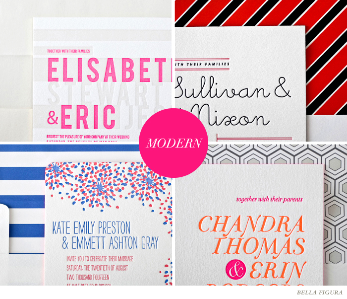 If you like the Vintage look: We suggest fonts that have a wise and worldly appeal. Slightly quirky and full of character to convey days of old. To achieve the perfect vintage vibe, we love to combine several fonts together to create an eclectic look that will last for ages. Elegant script fonts paired with traditional Serif styles tend to tug at our heartstrings the most!
  If you like the Formal look: We suggest elegant and traditional fonts that will never go out of style. Think Script fonts with big swash capitals reminiscent of the finest hand calligraphy or formal Serifs with straight lines and regal form. We love to pair them together to create a sophisticated style that will surely charm all of your guests!
 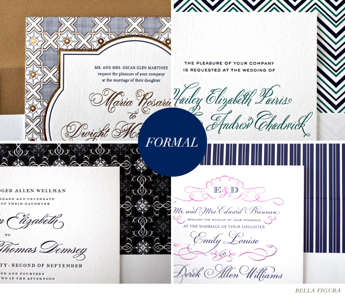 (more…)
Adding a monogram to your letterpress wedding invitation suite is a stylish and sophisticated way to personalize your paper goods. We offer a variety of options for 1, 2 and 3 letter monograms, and you can add a monogram to any of our 300+ invitation designs for no additional charge! Monograms can be created from any of our fonts for free, but if you’re looking for a custom, hand-calligraphed monogram, those are also available (additional charges do apply). Today we’re sharing some inspiration for monograms that will go perfectly with a destination, formal, modern or vintage wedding invitation set — use these ideas to help pick the perfect monogram for your own letterpress wedding stationery!
DESTINATION
This destination invitation not only uses sea-inspired colors, but a monogram created from the indigo font paired with star motifs. Both the font and stars of the monogram reflect the tailored look of a sailor’s uniform – making it a perfect addition to this nautical inspired invitation. If you’re having a destination wedding, consider incorporating a symbolic motif into the monogram.

FORMAL
Formal invitations tend to work best when an ornate, yet elegant monogram is added, so keep this in mind if you’re having a traditional wedding. Monogram 1o takes on the appearance of a royal seal and gives this invitation a completely dignified look.

MODERN
Bright colors and quirky, over-sized, hand drawn fonts can really modernize an invitation. We used monogram 2j on this wedding invitation for a fun, playful look that represents the bride and groom’s connection. If you’re having a modern wedding, consider a monogram that reflects the personalities of the bride and groom.
 (more…)
What kind of wedding features the Pixies’ Here Comes Your Man during the groom’s trip down the aisle? A completely rad one, naturally. Simple and sweet, these no. 10 or ‘tea length’ program panels are printed in Erin Jang‘s popular Handdrawn design.
inks: mediterranean + pewter | paper: 1-ply white | size: no. 10 | client coordinator: chris gannon | in-house designer: racheal decker

This customization of our Modern Light letterpress wedding invitation design (by Ian Koenig) is just in time for Valentine’s Day. With soft pinks and subtle details paired with a customization of our Vintage Stripes liner, this invitation is perfect for a romantic, sweet event any time of the year.
modern light customization = inks: papaya + taupe | fonts: requiem + vessa | paper: white | invite size: f-8 | liner: customized vintage stripes in sand and papaya inks | original design by Ian Koenig | customized by in-house designer Sarah Walroth |
embellishment suggestions: opal colored envelope

(Photo Credits: Jennifer Bowen).
Are you looking for affordable letterpress wedding invitations? Look no further – our invitation designs can be customized to fit within a budget. Not sure where to start? We selected 15 of our new 2012 letterpress invitation designs and provided pricing for 3 popular quantity tiers. Find out which price point will work for you depending on how many invitations you’ll need. Keep in mind, 75 invitations traditionally leads to 150 guests, 125=250 guests, and so on!

In love with Vintage Charm? Why not order invitations that are 1 color letterpress printed on 1-ply paper with edge painting in one of your favorite ink colors? You can include reply postcards that are 1 color letterpress on 1-ply paper with outer envelopes (letterpress printed with your return address in 1 color and lined) for $1,335.
If your wedding won’t be complete without the La Salle design, you can order invitations and reply cards both in 1 color letterpress on 1-ply paper, along with 1 color printed outer envelopes and reply envelopes for only $1,045.
Our Gotham design is modern and refined. You can keep the invitation looking sleek by letterpress printing it in 2 colors on our 1-ply paper but make the rest of the set 1 color: choose a 1 color, 1-ply reply card, outer envelopes and reply envelopes (both printed in 1 color letterpress) for a total of $1,180.
If you are looking to mix letterpress and foil stamping but you are on a budget, try this option! Order our Amadore Antique invitations with 1 color letterpress and 1 color foil on 1-ply paper, and then add foil edging! It gets better – a website card that can direct your guests to rsvp via email or your wedding website printed in 1 color foil, on 1-ply cotton paper will eliminate the need for a reply envelope (and extra postage!), so you’ll only need outer envelopes with 1 color letterpress printing. This set rings in at just $1,310.
Are calligraphy wedding invitations one of your “must-haves”? Pick one of our newest calligrapher’s Mitty Calligraphy design! Order invitations in 1 color letterpress, on our luxuriously thick 2-ply paper. Choose an A6 sized direction card that includes wedding details and a website for an electronic rsvp that is 1 color letterpress and opt for 1-ply paper. Lastly, choose outer envelopes that are both letterpress printed in 1 color and embellished with a chic envelope liner for only $1,435. (more…)
Our lovely pals at Social Graces in Nashville, Tennessee requested this stunning customization of our Victoria Calligraphy (by Sarah Hanna) in charcoal ink. Our European Formal envelope liner design is letterpress printed in our inkless blind deboss as a background that we think gives an elegant touch.
ink: charcoal + blind deboss | calligraphy: victoria hand calligraphy, by sarah hannah style. | paper: 2-ply ivory | invite size: f8 | corner rounding |

Candy hearts, flowers, sweet love notes – this can only mean one thing – Valentine’s Day is coming up quick! Get inspired and share some love with this simple, sweet customization of our Hailey Modern letterpress design.
hailey modern customization = inks: powder blue + lavender | fonts: henry + madaline | paper: white | invite size: f-8 | liner: modern herringbone in lavender | original design by sarah walroth | customized by in-house designer racheal decker
embellishment suggestions: edge paint in british rose

(Photo Credits: Love Joy Faith)
We’re always searching for a little extra “Omph”. That cherry on top but never too bold. Make a subtle announcement with a metallic liner. What a great way for your guests to open a little sparkle with your light and airy announcement.
La Salle customization = inks: celadon + sea side + peach | fonts: Eros + Memimas | paper: white | invites size: f-8 | metallic liner: opal | original design by Ian Koeing | customized by in-house designer Brit Hammett

photo credits: Josh Goleman
Our latest letterpress wedding invitation release was full of many modern gems, but today we’re sharing the top 6 modern invitations so far from 2012. We’ve noticed neon shows its pretty little head in a sophisticated way (or think about neon edge painting on a very formal invite!). Black ink on a modern letterpress design keeps things formal while still feeling new. Foil, of course, is on the list — we are especially loving double foil (think matte silver and shiny silver, or silver paired with gold). You’ll find names in oversized fonts, along with slightly untraditional text layout and minimal design. Want to see more? Check out all of our modern wedding invitations here.
What are your favorite colors, fonts, and invitation designs for a modern wedding? Tell us in the comments section below!

1. New Horizon | 2. Gotham | 3. Dash | 4. Byzantine | 5. Fugue | 6. La Salle
Our stomachs rumble on a daily basis when we read the delicious menus that our lovely clients (you!) choose for their wedding receptions. With choices like organic greens and crabcakes, spicy tuna and beef tenderloin, we see tasty options for everyone. For all the foodies out there, feast your eyes on these gorgeous letterpress wedding menus!
[Make the menu stand out with a bold title. Weber by Jessica Hische.]

[Our popular Bejeweled design is letterpress printed in 2 colors for a crisp, modern menu. Design by Kamal.]

[Did you know our menus can be printed in any language? This menu features the Harp design by Tara Hogan.]

[Tie in the details of your invitations and your decor with our free motifs! We love this elegant Walden menu, designed by Beth Ann Seal.]

[ A classic Deveril menu, another popular design suite from Beth Ann Seal.]

[Keep things sweet with our colorful Somersby, a whimsical design by Beth Ann Seal.]

Our standard menu size is the A6, which measures in at 4.625 x 6.25 inches. We can also print tea-length menus (3.875 x 9.25 inches) for an additional charge.

Wondering about wording? View our menu etiquette and wording or feel free to contact us!
Earth tones, metallics and foil accents can bring warmth to any wedding invitation, even amongst the cold winter months! With a little inspiration from a setting sun, a glistening metallic liner in gold dust and sparkly foil edging in copper makes this Soleil customization absolutely breathtaking!
Soleil customization = inks: hazel + persimmon | fonts: cooper + sunshine | paper: ivory | invite size: f-8 | metallic liner: gold dust | foil edging: copper | original design by Beth Ann Seal | customized by in-house designer Lindsy Aragona

(Photo Credits: Allyson Magda)
Last week we showed you a look at some of our new 2012 letterpress invitation designs before and after they were customized, and this week we’re back with more design transformations! We’ve redone 5 of our favorite new modern invitation designs to show you just how much different an invitation can look with a color change, new fonts, and some design adjustments.
Neo Luna by Ian Koenig is charming and simple in the original design, but takes on a bolder look with a font change, added color and silver shine foil stamping.
Suggested embellishments: We think this design would look stunning with surf edge painting and a colorful envelope liner in the sea stripes pattern, printed in surf, marigold and mesa inks.
Details: letterpress ink: surf | foil stamping: silver shine | fonts: ollie + swiss | paper: bella cotton white 2-ply | size: f-8 | rounded corners

The Drawing Room design by in-house designer Sarah Walroth features fresh new fonts and a custom pocket-fold, but takes on a more whimsical look after a bit of customizing. We love this design as a square invitation with corner rounding, along with a playful font and fuchsia ink for the names.
Suggested embellishments: A white cotton pocketfold, letterpress printed with prussian blue ink and a blue pearl metallic envelope liner would add the perfect amount of shine to this pretty invitation set.
Details: letterpress inks: fuchsia + prussian blue | fonts: saint-andrew + lady rene | paper: bella cotton white 2-ply | size: sq-7 for pocketfold | pocketfold: white, letterpressed in prussian blue ink

Ellie Snow designed the Classic Chevron invitation, which features on-trend chevron patterning, two lines of Belle hand calligraphy, and pretty sea-side and jade letterpress inks. The switch of jade ink to mustard and the repositioning of the chevron pattern gives this design customization a retro feel with a modern twist.
Suggested embellishments: A pretty custom postage stamp along with a custom envelope liner featuring the sweet polka pattern in mustard + sea-side inks would be lovely accents for this wedding invitation.
Details: letterpress inks: mustard + sea-side | fonts: sans capitals + hollow | paper: bella cotton white 2-ply | size: f-8  (more…)
