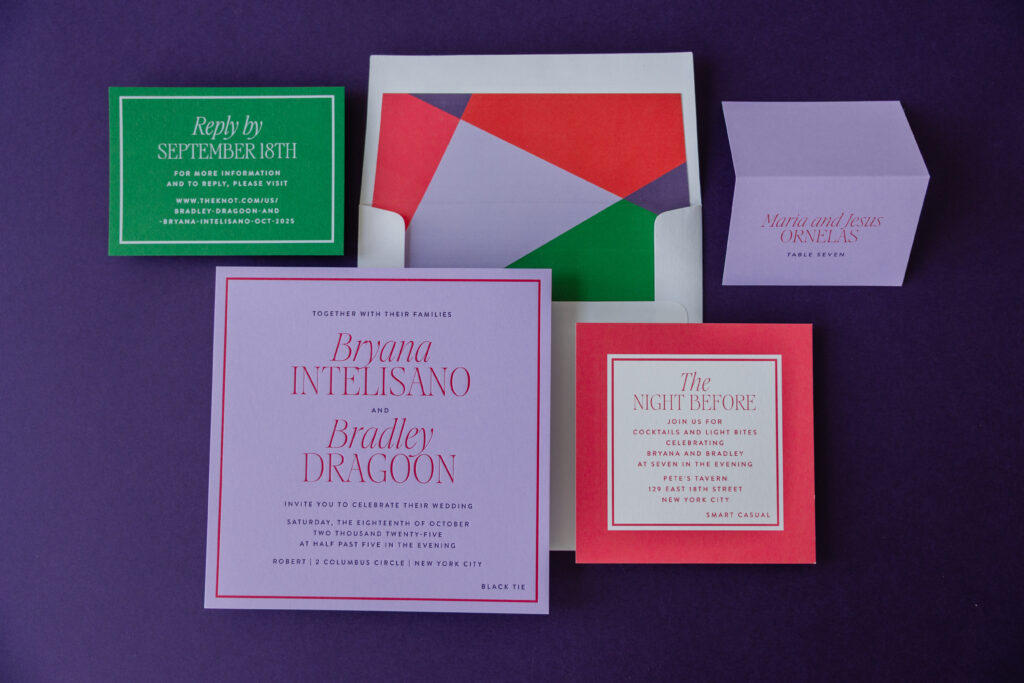
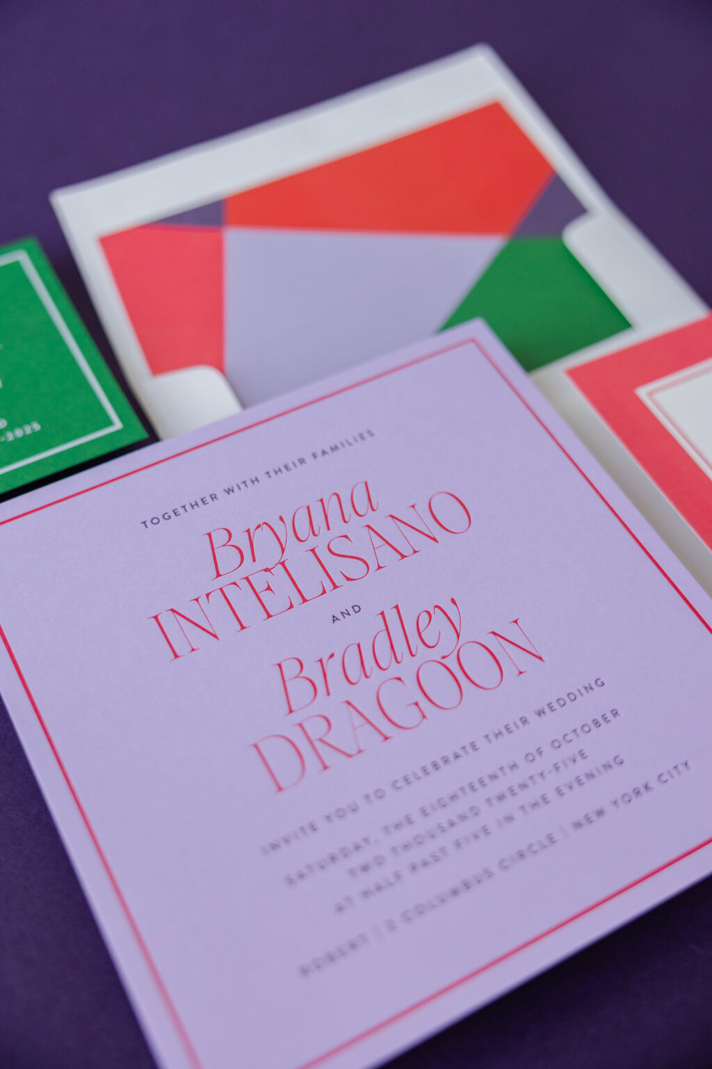
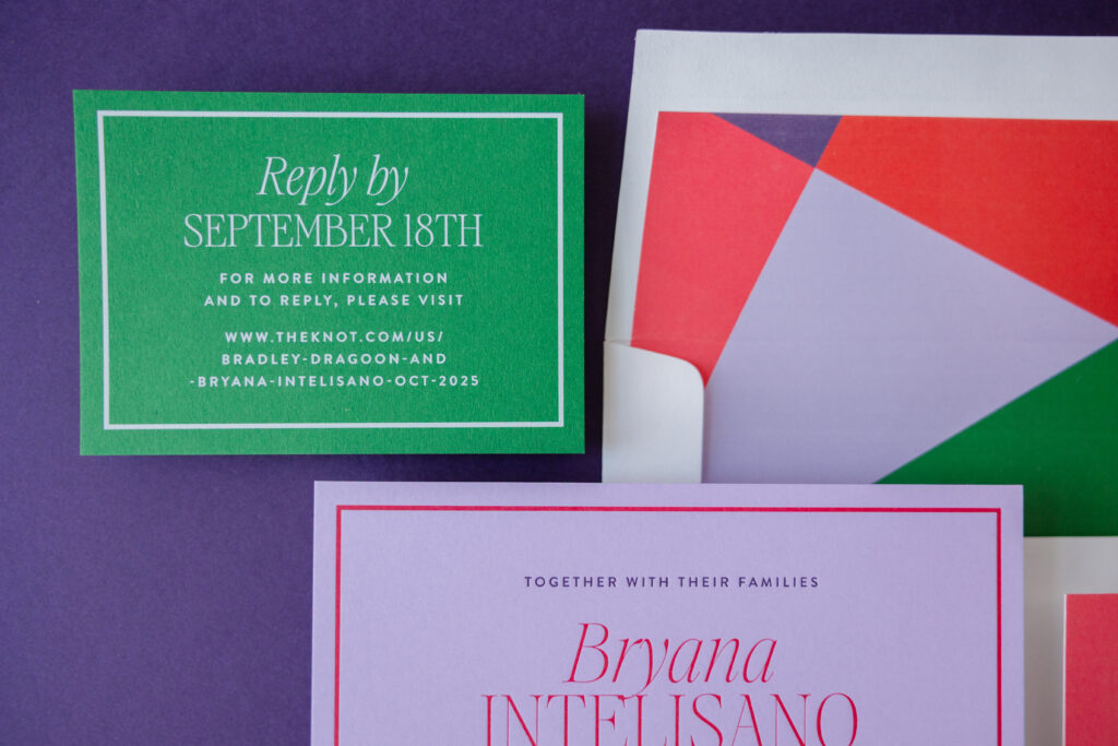
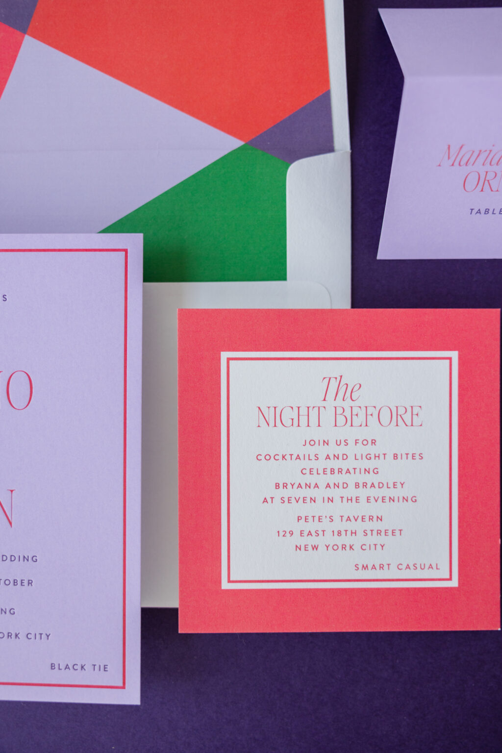
Bold geometric design and sophisticated typography ensure that Bryana and Bradley’s modern color blocking wedding invites stand out for all of the right reasons. This suite embraces a clean, vibrant aesthetic that is perfect for a celebration held in the restaurant above the Museum of Arts and Design. We are so happy this couple worked with our dear friend Tracey of Written and Wrapped to bring their contemporary invitation suite to life.
Invitation
letterpress inks: plum + flamingo
fonts: aida + brandon
paper: bella amethyst 2-ply
card size: sq-7
envelope liner: charletto pattern in plum + amethyst + flamingo + chili + leaf digital on white text
envelope: white cotton text
envelope addressing: plum digital on the front and the back
job #: 77344
Reply Card
digital ink: white
fonts: aida + brandon
paper: bella leaf 1-ply
card size: a-5
job #: 77344
The invitation features a striking, high-contrast palette of our plum and flamingo letterpress ink on our amethyst paper. The color combination is playful and elevates the look. Rather than relying on florals or ornamental details, the design uses geometric shapes, crisp borders, and bold color blocking to create visual interest. This modern design is juxtaposed with the traditional technique of letterpress printing. Our 2-ply color paper holds a deep, crisp impression, introducing a tactile element to the design.
A contemporary serif font with dramatic strokes gives the names a fashionable prominence, while clean sans-serif text provides balance and readability. The restrained use of typography allows the vivid colors to remain the focal point.
Rehearsal Dinner Invitation
digital ink: flamingo
fonts: aida + brandon
paper: bella smooth cotton 1-ply white
card size: sq-5
job #: 77344
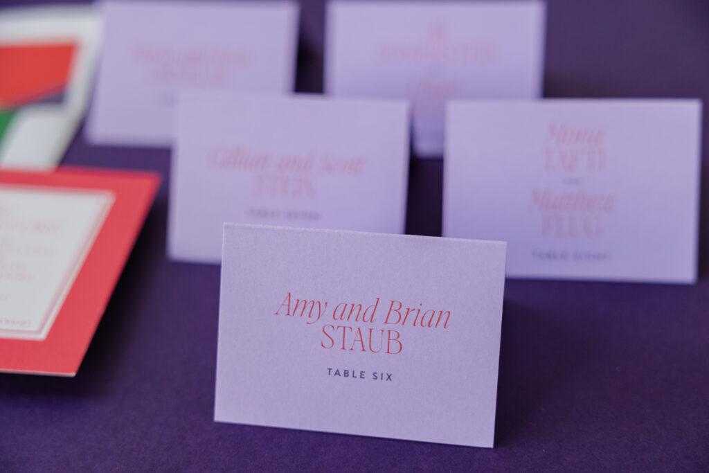
Folded Escort Card
digital inks: chili + plum
fonts: aida + brandon
paper: bella amethyst 1-ply
card size: no. 17 folded
job #: 79030
It’s impossible to miss the geometric envelope liner, which introduces abstract shapes in coordinating colors, creating a surprise element when the envelope is opened. The matching design for the reply card and rehearsal dinner invitation continues the cohesive visual identity with framed layouts, saturated backgrounds, and disciplined spacing.
Every piece feels carefully curated, embracing simplicity while making a confident visual statement. Do you love the look of clean borders and structured layouts? Do you want an abstract geometric envelope liner or bold color-blocking? Whatever you want for your wedding invites, our dealers can help you make it happen.
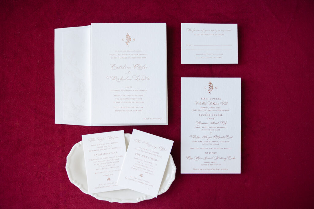
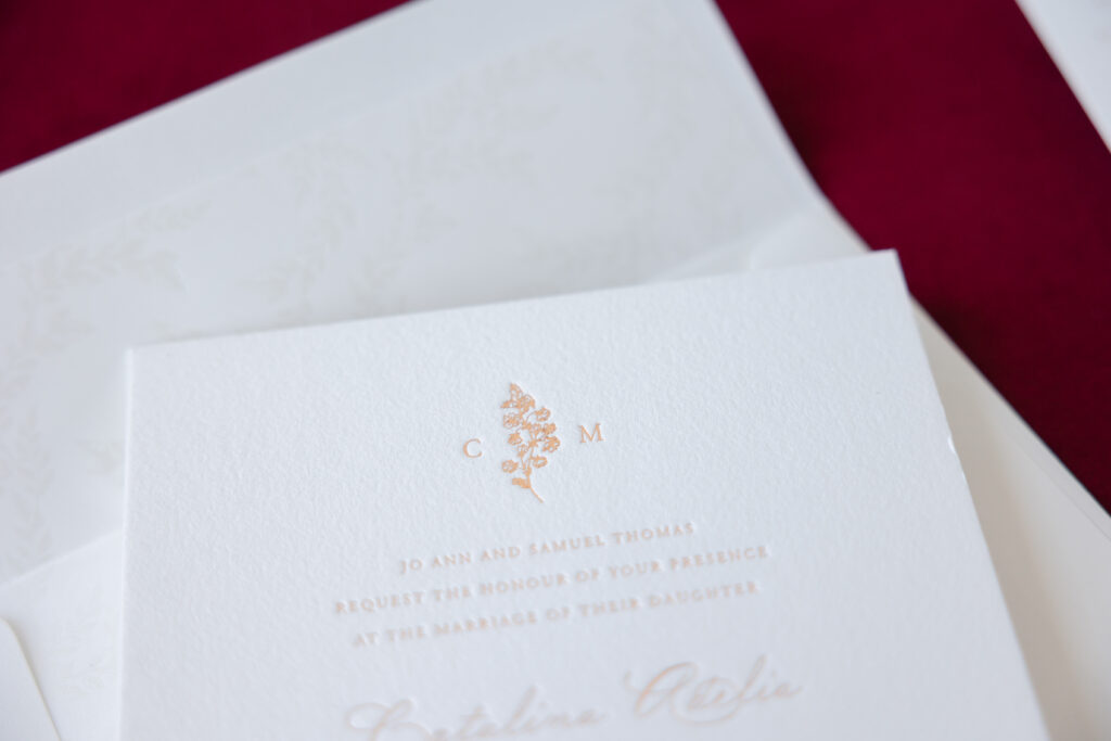
A clean, balanced layout with exceptional attention to detail gives these foil stamped wedding invitations warmth and a minimalist luxury sensibility. Catalina and Malcolm worked with our dear friend Staci of Sincerely Staci to create their wedding stationery, which is loosely inspired by our Margaret design.
Invitation
foil stamping: bronze shine
fonts: madison street pro + adobe garamond
paper: bella cotton white 2-ply
card size: f-8
envelope liner: marseille pattern in pearl shine foil on white text
envelope: white cotton text
envelope addressing: umber digital on the front and the back
job #: 76658
Welcome Party Card
foil stamping: bronze shine
fonts: madison street pro + adobe garamond
paper: bella cotton white 1-ply
card size: a-5
job #: 76658
Brunch Card
foil stamping: bronze shine
fonts: madison street pro + adobe garamond
paper: bella cotton white 1-ply
card size: a-5
job #: 76658
A charming monogram at the top introduces a subtle personalized touch. The floral spring separating the initials is understated and delicate. A flowing script font is reserved for the couple’s names, while the remaining text is set in a refined serif typeface with generous spacing, creating a balanced visual hierarchy. The combination of formal script and restrained typography gives the suite a romantic yet contemporary feel. The fine lines of the text still catch the light and offer some shimmer, thanks to the bronze shine foil.
An almost imperceptible foil-stamped botanical pattern on the envelope liner adds texture and depth without overwhelming the design.
The accompanying cards maintain the same minimalist approach, relying on thoughtful typography, ample blank space, and consistent bronze shine foil stamping to create cohesion across every piece. The beauty comes from intentional design, precision, and impeccable craftsmanship.
Rehearsal Dinner Invitation
foil stamping: bronze shine
fonts: madison street pro + adobe garamond
paper: bella cotton white 1-ply
card size: a-5
job #: 76658
Reply Card
foil stamping: bronze shine
fonts: madison street pro + adobe garamond
paper: bella cotton white 1-ply
card size: a-5
envelope: white cotton text
envelope addressing: umber digital on the front
job #: 76658
Menu
foil stamping: bronze shine
fonts: madison street pro + adobe garamond
paper: bella cotton white 1-ply
card size: 5” x 8”
job #: 78636
Catalina and Malcolm’s foil stamped wedding invitations are warm, traditional, and inspired. Do you dream of invitations with delicate details like a personalized floral monogram or a stunning foil envelope liner? Whatever you dream up, we can help make it happen. Work with one of our dealers to create your perfect wedding stationery.
Each year, the Foil & Specialty Effects Association (FSEA) hosts the Gold Leaf Awards to highlight creativity in the printing industry. We are so proud to share with you that we took home four awards in the FSEA’s 33rd Annual Gold Leaf Awards Competition! We are so proud of our entire Bella Figura team for bringing these beautiful designs to life. The design is exquisite, and the level of dedication and craftsmanship from our entire production team is evident in the strikingly lovely printed pieces.
Gold Leaf Award Recipient for Best Use of Special Diecut
Tomlin, designed by Katie Magee, is romantic, understated, refined, and luxurious. Blind embossing of the floral artwork on the invitation adds depth, while foil stamping brings warmth and shimmer. The invitation is lovely on its own, but a laser die-cut folder elevates the design. The folder features the same floral artwork, perfectly positioned over the blind-embossed artwork of the invitation, but this time it is brilliantly detailed with various foils.
Silver Leaf Award Recipient for Best Use of Letterpress
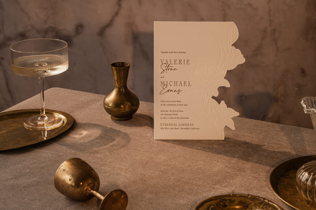
Valerie, by Kait White, blends modern minimalism, fine art, and skilled craftsmanship. Dramatic embossing and a custom die-cut silhouette that flows organically along the floral artwork are striking. The typography features a combination of classic serif lettering and a delicate script font for the couple’s names. The left-justified layout balances the dramatic floral edge with clean, open space, creating a design that feels contemporary, airy, and sophisticated.
Bronze Leaf Award Recipient for Best Use of Foil/Embossing Announcement/Invitation (Ensemble)
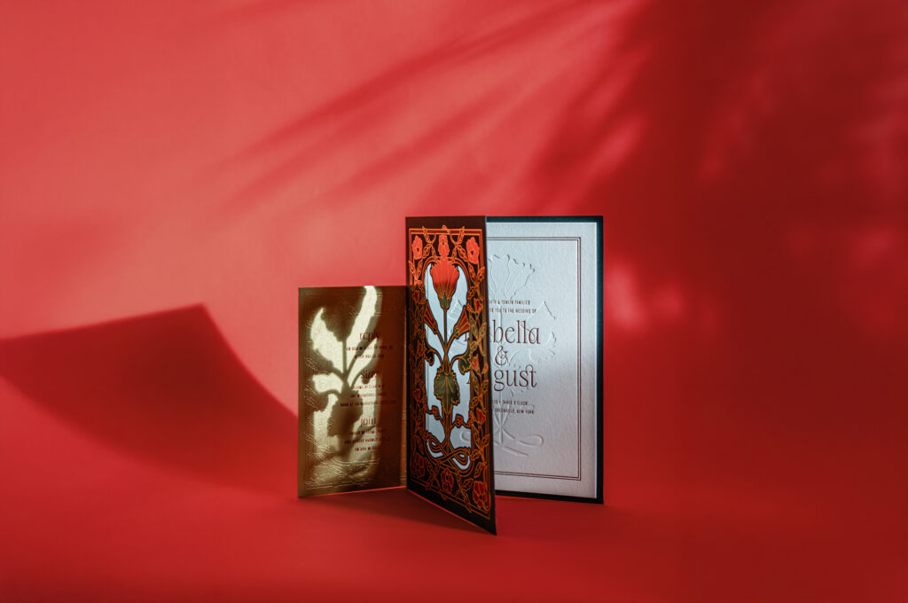
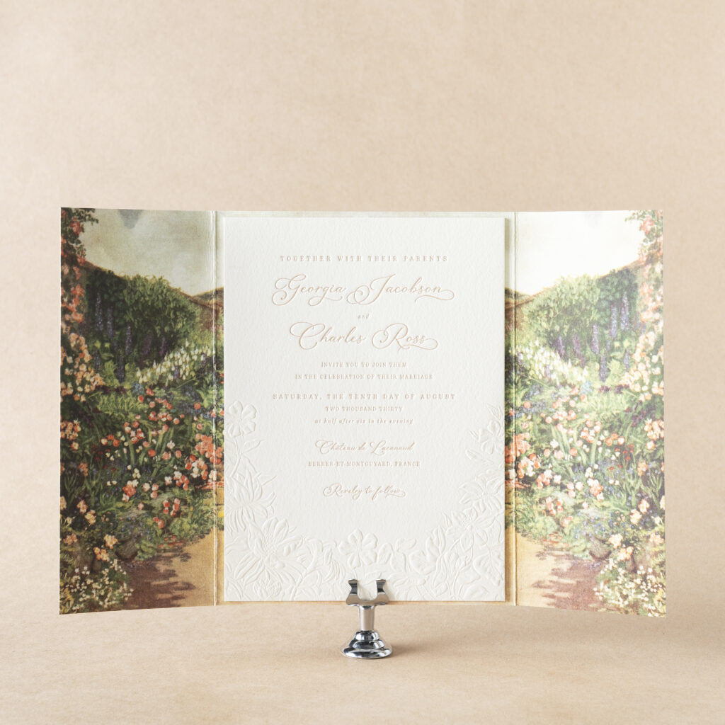
Delevingne, by Katie Magee, features a gorgeous gatefold with a romantic, classically inspired panoramic garden landscape. The gatefold unfolds to reveal the invitation, creating an almost immersive experience. Decadently deep letterpress printing highlights the typography, while a meadow of flowers in blind sculpted embossing wraps along the bottom edge of the invitation. The highly detailed sculpted embossing is stunning and creates a continuation from the garden artwork of the gatefold to the invitation.
Bronze Leaf Award Recipient for Best Use of Foil/Embossing Announcement/Invitation
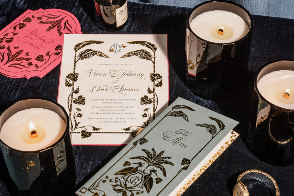
Vivien, by Leslie Johnston, embodies a tropical Art Deco style, blending glamorous vintage details with refined botanical motifs and luxurious printing techniques. Tall palm fronds create a symmetrical frame that draws the eye inward. Gold-shine foil stamping lends the design a luminous, upscale finish and features an incredible level of detail, showcasing both the heavy coverage of parts of the foliage as well as the thin, wispy splits in the leaves and the delicate, looping curves of the script font. The overall aesthetic feels sophisticated, destination-inspired, and timeless.
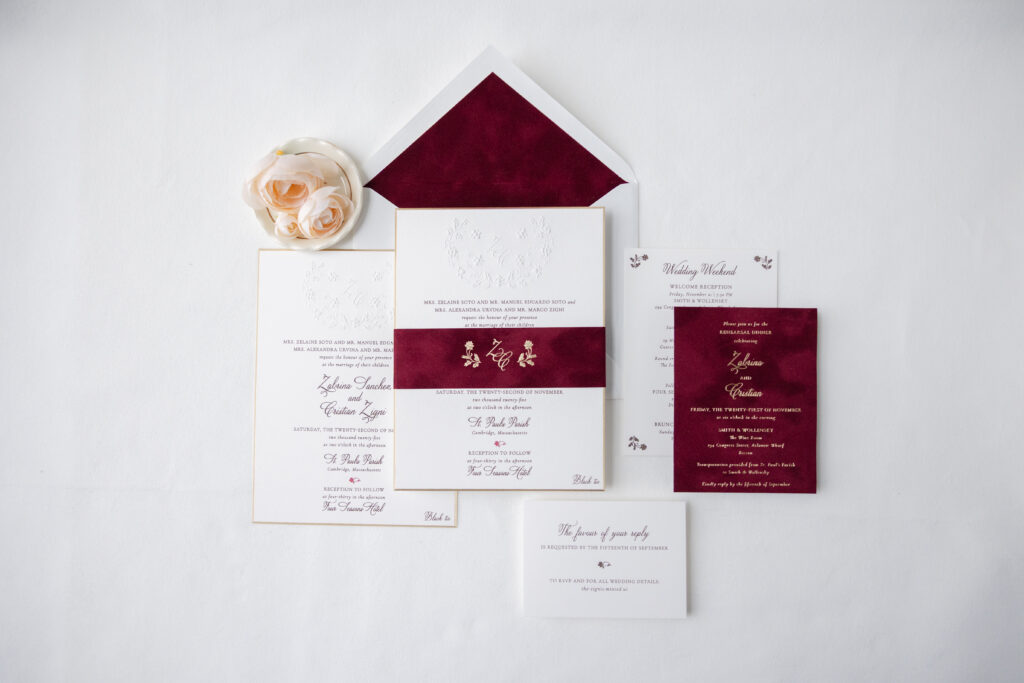
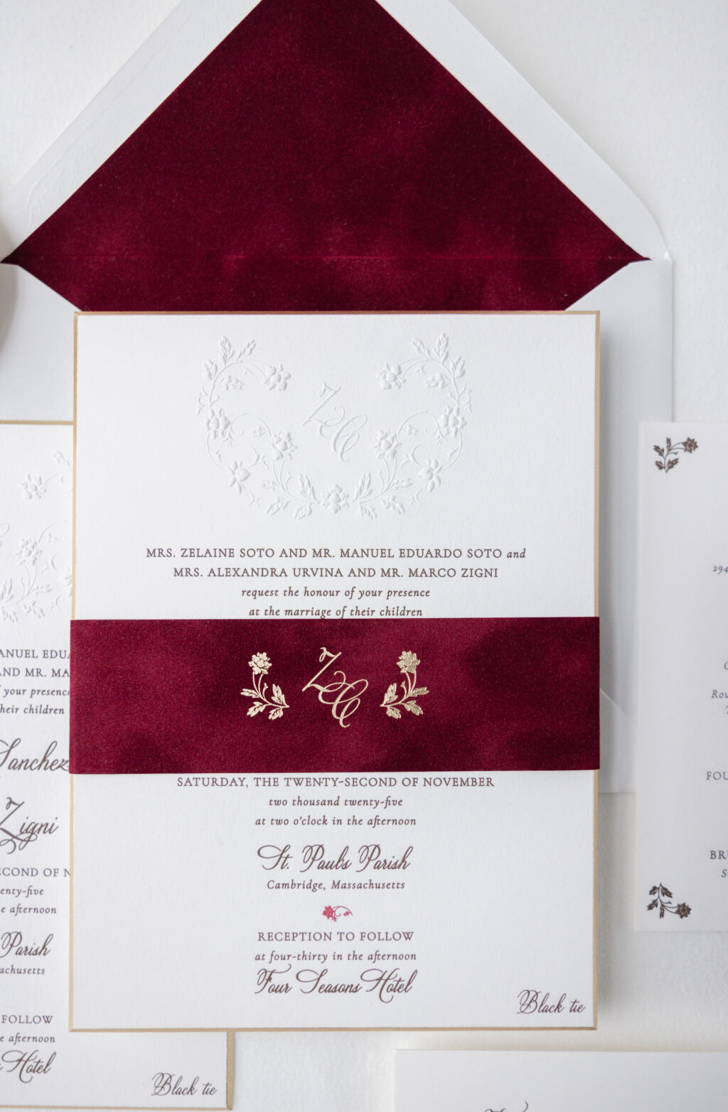
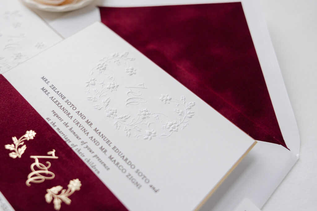
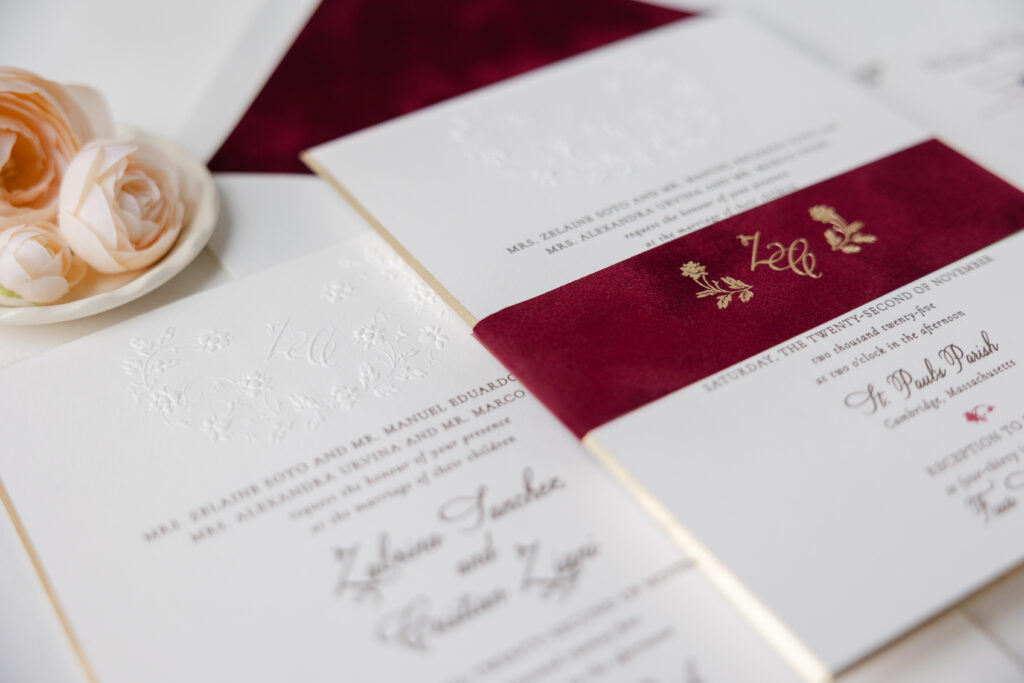
Moody romantic details like delicate floral embossing, decadent velvet, and hints of foil all work together to ensure Zabrina and Cristian’s wedding invitations are worth swooning over. This couple worked with our friend Lisa of Mark Harris Stationers to customize our Imari design.
Invitation
engraving ink: espresso + currant
emboss: blind
fonts: velvet hammer + cormorant garamond
paper: bella smooth cotton white 3-ply
card size: f-8
bevel: 45 degrees
foil edge: champagne matte
envelope liner: wine velvet (no printing)
envelope: white cotton text pointed flap
envelope addressing: espresso digital on the front/espresso engraving on the back
job #: 76970
Belly Band
foil stamping: champagne matte
fonts: velvet hammer + cormorant garamond
paper: bella velvet wine
size: f-8 vertical belly band
job #: 76970
The invitation is formal and refined. The graceful script font features restrained looping flourishes for an understated vibe that is still black-tie-ready. All of the text is engraved, creating a tactile raised impression.
Like the inspiration design, this customization features a monogram. The initials use the same script font as the couple’s names, keeping the look cohesive. The wreath-like florals wrap around the monogram, adding a touch of romance. The monogram crest is blind-embossed, a print technique that creates a raised impression without ink, mimicking the look of engraving while highlighting the paper’s color and texture.
The beveled foiled edge is a subtle yet showstopping detail that adds an opulent glimmer to the already stunning invitation.
The script monogram from the invitation appears again on the belly band. This time, the monogram is foil-stamped in champagne matte on our Bella wine velvet for a strikingly gorgeous look.
Whether you want to feature a custom monogram, blind embossing, sophisticated velvet accents, or any combination of these features, we can bring your vision to life. Work with one of our dealers to create your perfect wedding invitation with blind emboss and velvet.
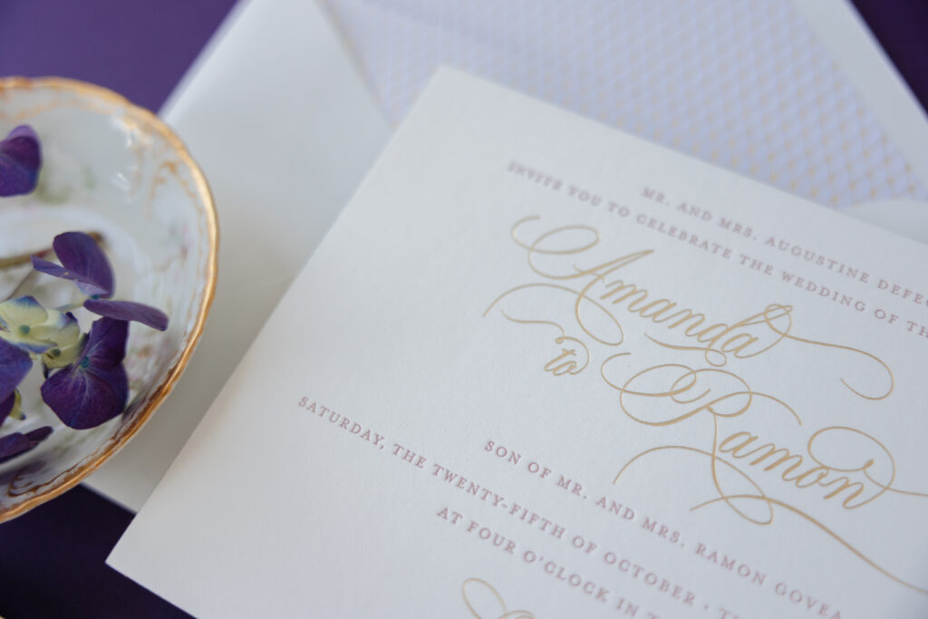
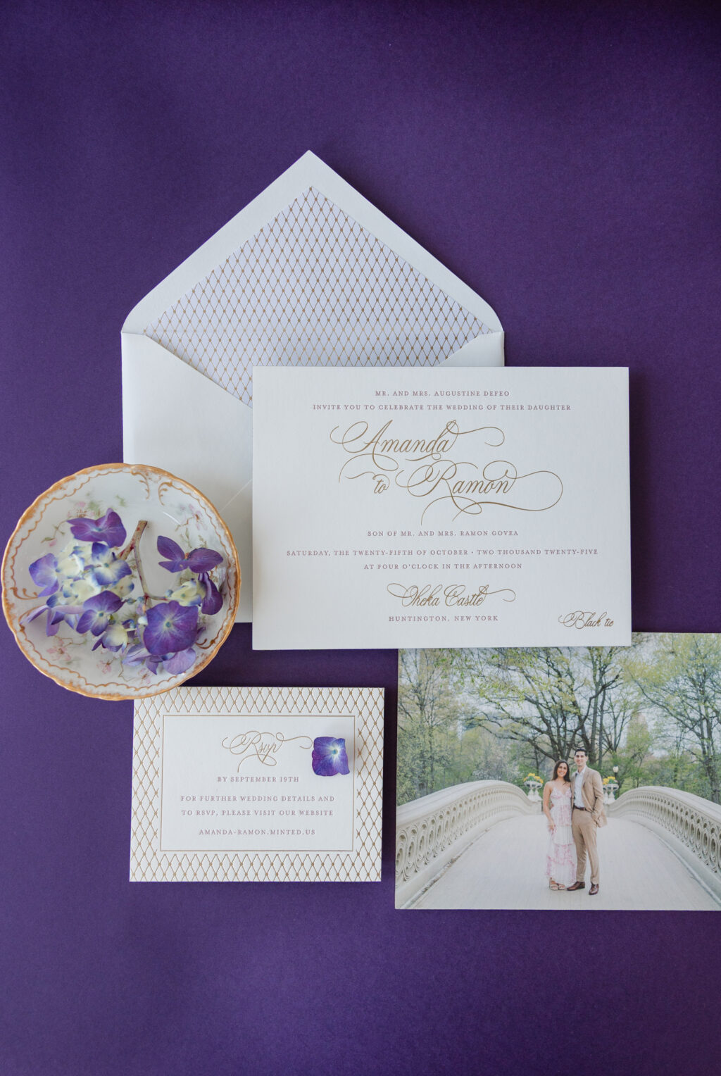
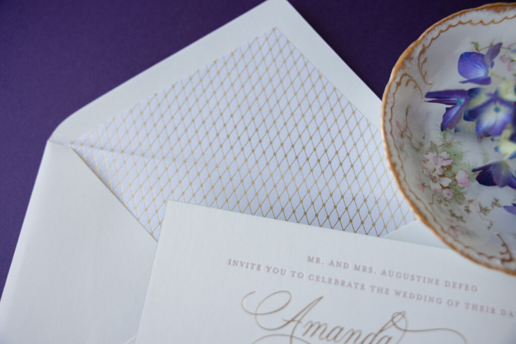
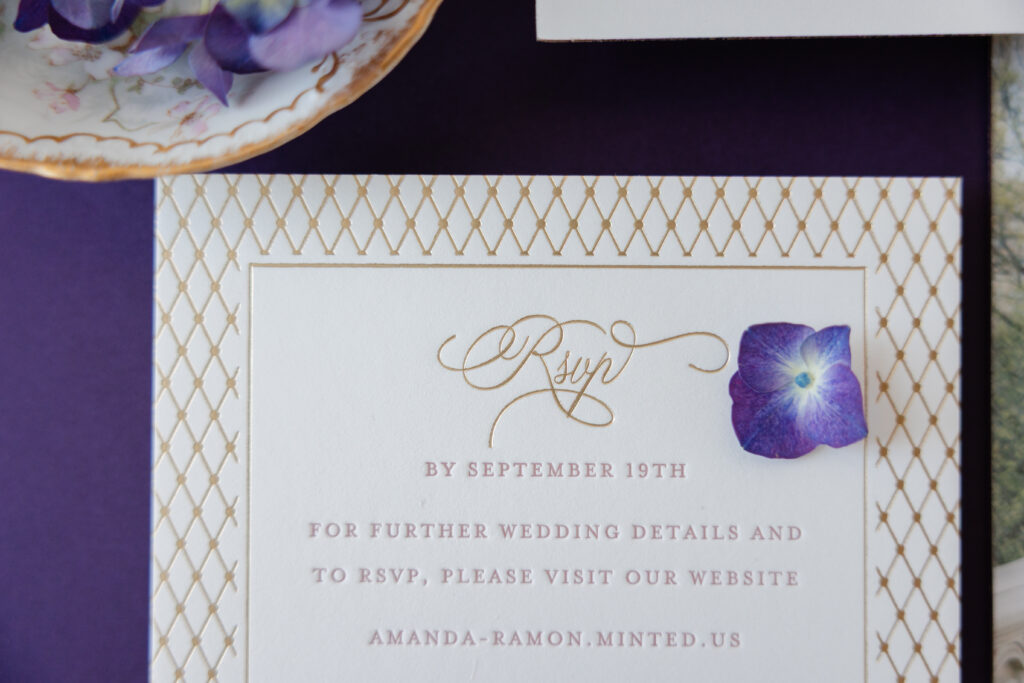
Artful design, opulent materials, and attention to detail ensure these wedding invitations with champagne matte foil stamping are elegant, personal, and completely dreamy. Amanda and Ramon worked with our dear friend Linda of Phantastic Papers to customize our Richmond design for their special day.
Invitation
letterpress ink: rosette (front)
foil stamping: champagne matte (front)
digital: cmyk (back)
fonts: stipa willington + mrs eaves
paper: bella smooth cotton white 3-ply
card size: f-8
foil edge: champagne matte
envelope liner: richmond pattern in champagne matte foil on metallic crystal text
envelope: white cotton text
envelope addressing: rosette digital on the front and the back
job #: 76858
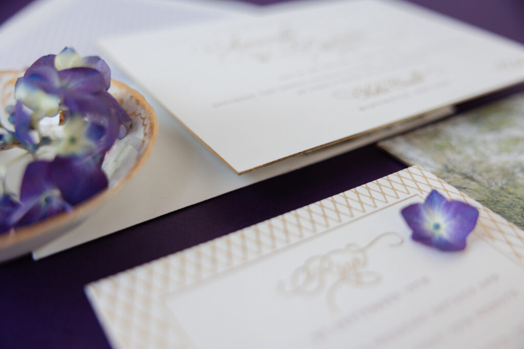
Reply Card
letterpress ink: rosette
foil stamping: champagne matte
fonts: stipa willington + mrs eaves
paper: bella smooth cotton white 2-ply
card size: a-2
job #: 76858
Champagne matte foil stamping is regal and traditional, adding warmth and sophistication to the design. The remaining text is letterpress printed in our rosette ink for a subtle burst of color. Both the foil and letterpress printing stand out on our Bella Smooth Cotton paper, which is incredibly soft and has a satiny feel. The 3-ply weight is luxurious and allows our printers to create a decadently deep impression that is clean and crisp. Foil edging adds a glimmer that is sure to catch the eye as guests remove the invitation from the envelope.
The dramatic script font is open and airy with grand flourishes. The sweeping script font is balanced by the smaller serif font that is timeless and understated. Amanda and Ramon gave their invitation a personal touch by including a photo of themselves digitally printed on the back of the invitation. It’s a lovely photo and turns the invitation into a treasured keepsake.
The delicate envelope liner pattern appears in champagne matte on metallic crystal stock and is nuanced and understated. The pattern from the envelope liner was repurposed into a border for the reply card, creating consistency across the cards.
Are you daydreaming about your perfect wedding invitations? Whether you want foil stamping, luxurious paper, a charming photo, or any combination of these elements, work with one of our dealers to bring your vision to life.
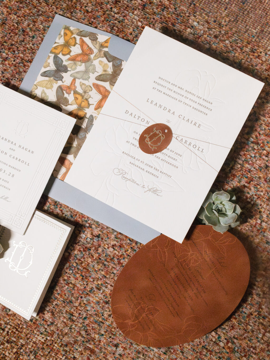
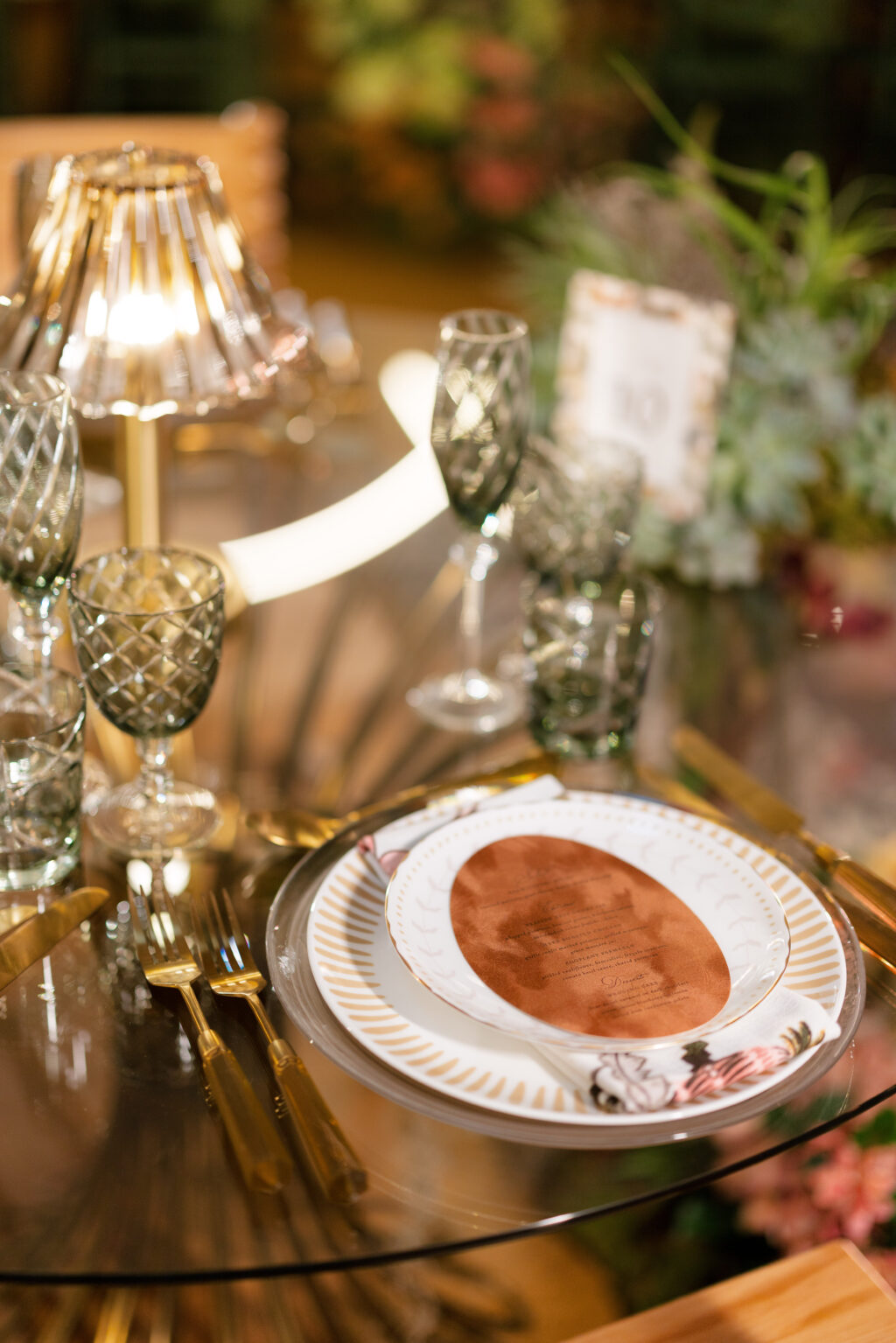
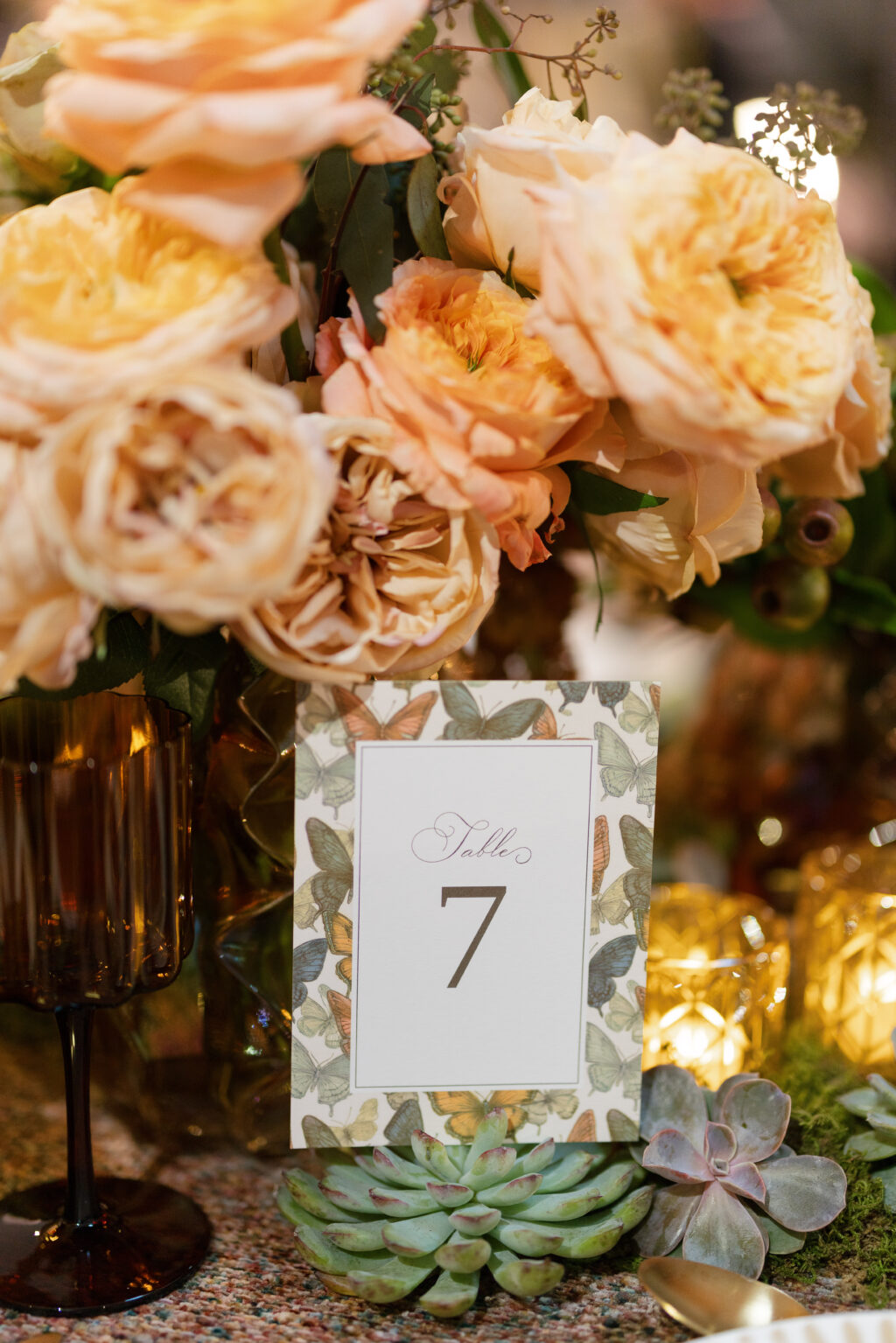
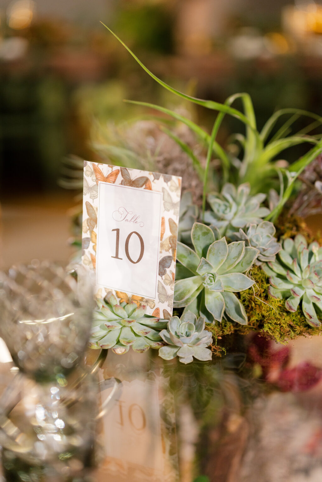
All is a flutter at this photo shoot at The Norton Museum of Art in West Palm Beach, Florida. Our dear friends Jessica and Michael of Masi Events created this stunning shoot, and we were thrilled to be a part of it. Our Leandra design, which effortlessly blends timeless romance and formality with modern luxury details, was the perfect match for this botanical-inspired shoot.
The invitation is refined and understated. Formal typography paired with letterpress printing in espresso is contemporary and warm. The text overlays crisp blind embossing of floral artwork, elevating the invitation’s design while adding dimension. Foil-stamping on a velvet tag adds even more tactile appeal.
Invitation
letterpress ink: espresso
emboss: blind
fonts: vendetta ot + gatlik saphir + monogram couture
paper: bella cotton white 2-ply
card size: f-8
finishing: assemble with tag and thread
envelope liner: georgina butterflies pattern in cmyk on white text
envelope: cloud text
envelope addressing: espresso digital on the front and the back
Tag
foil stamping: mink matte
papers: mocha velvet + khaki duplexed 1-ply
tag size: 1.3” x 1.675”
diecut style: cd-382
metallic thread: bronze
finishing: assemble with the invitation and thread
Menu
letterpress inks: black
deboss: blind
fonts: vendetta ot + gatlik saphir
papers: mocha velvet + almond duplexed 1-ply
card size: 5″ x 7″
diecut style: bp-125
Folded Thank You
foil stamping: mink matte
font: monogram couture
paper: bella cotton white 1-ply
card size: a-5f
Save the Date
letterpress ink: espresso
embossing: blind
fonts: vendetta ot + gatlik saphir + monogram couture
paper: bella cotton white 2-ply
card size: a-6
foil edging: mink matte
Table Card
digital ink: espresso + cmyk
fonts: vendetta ot + gatlik saphir + monogram couture
paper: bella smooth cotton white 1-ply
card size: a-6
Elements from the invitation found their way into the design of the day-of pieces. The darling butterfly pattern of the envelope liner is repurposed into a border for the table cards. The mocha velvet of the monogram tag makes for a luxurious die-cut menu. The velvet menu also features swoon-worthy blind-embossed floral accents.
This stunning photo shoot boasts timeless wedding formality with warm, tactile materials and subtle contemporary styling. The look is romantic but tailored with curated, intentional elegance. It is a joy to work with Masi Events, and we always look forward to what Jessica and Michael have in store. All of the photos from this shoot, from the stationery to the floral arrangements, tablescapes, and more, are absolutely lovely, and we were so happy to be a part of it.
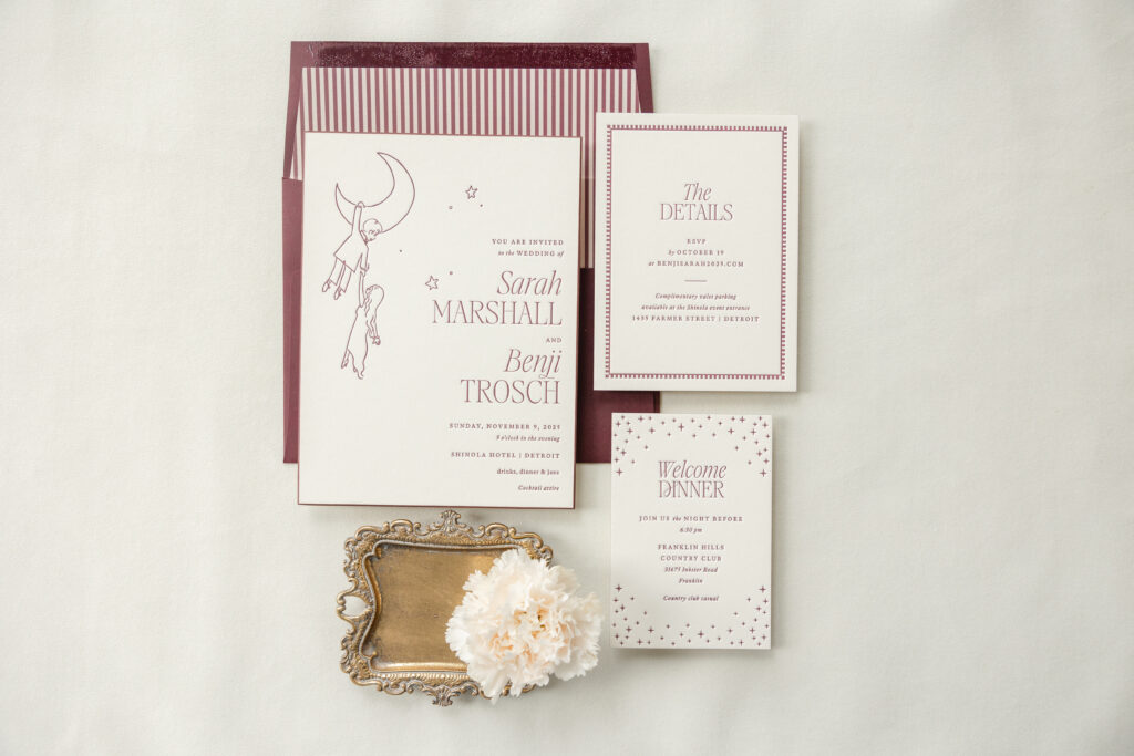
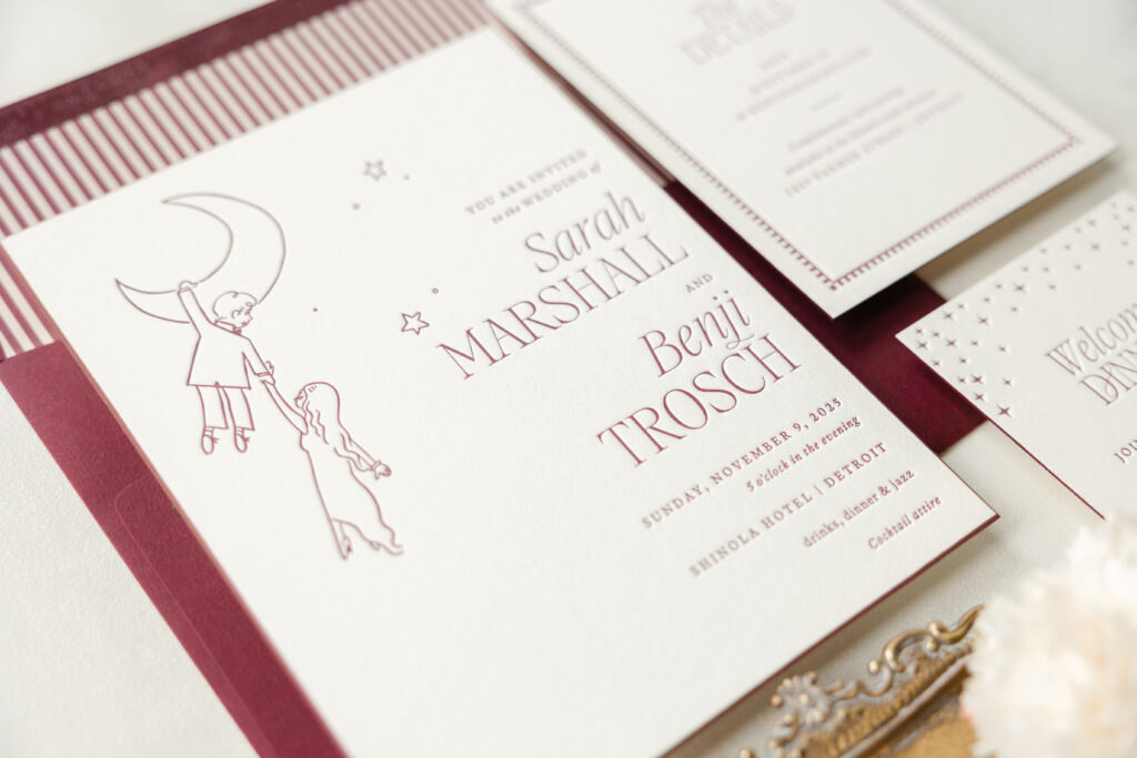
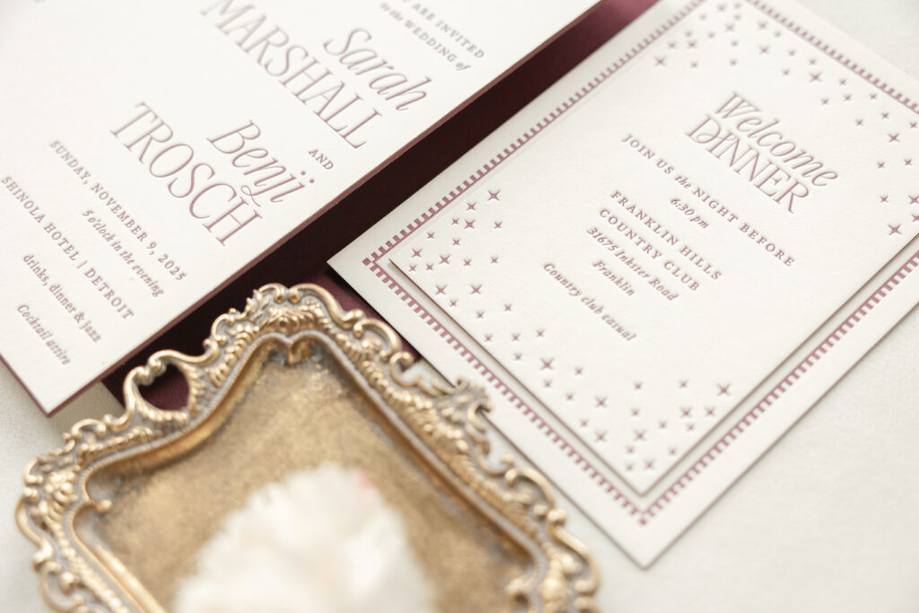
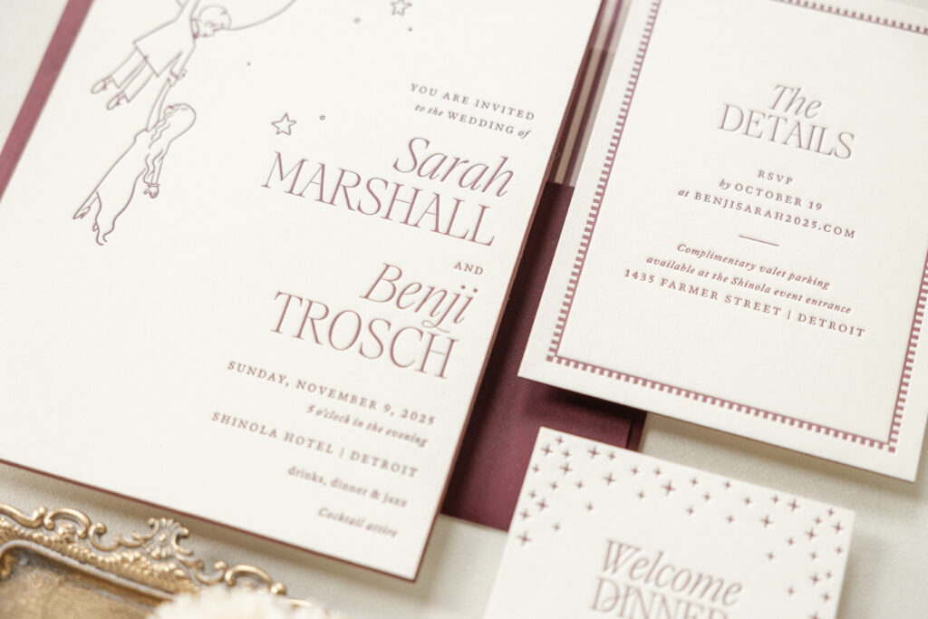
There is so much to love about Sarah and Benji’s wedding invitation suite, from a charming storybook-inspired illustration to dramatic painted beveled edges, a stately envelope liner, and more. This couple worked with our friend Nicola at Lee’s Paperie to create their whimsical invitation set.
Invitation
letterpress ink: bordeaux
fonts: aida + guyot press
paper: bella smooth cotton 2-ply ivory
card size: f-8
bevel: 45-degree
edge paint: bordeaux
envelope liner: sullivan stripe pattern in bordeaux + khaki on white text
envelope: bordeaux text
envelope addressing: ivory digital on the back
job: 77857
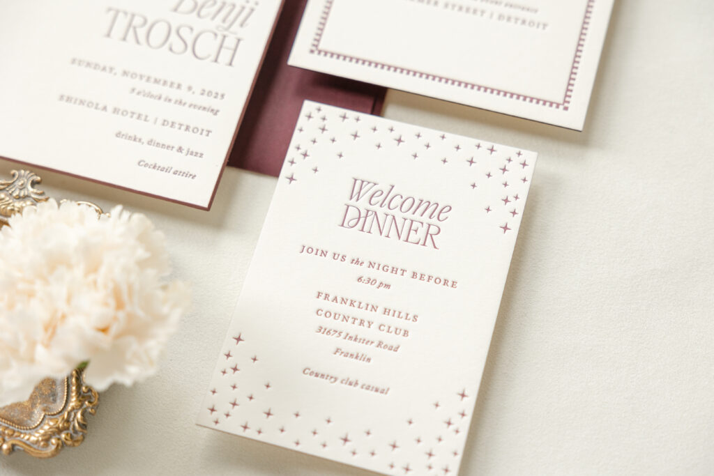
Welcome Dinner Invitation
letterpress ink: bordeaux
fonts: aida + guyot press
paper: bella smooth cotton 2-ply ivory
card size: 3.6” x 5.25”
edge paint: bordeaux
job: 77857
Details Card
letterpress ink: bordeaux
fonts: aida + guyot press
paper: bella smooth cotton 2-ply ivory
card size: a-6
edge paint: bordeaux
job: 77857
The line illustration of the couple has a romantic, vintage French vibe and immediately catches the eye. It’s adorable and fanciful, and we absolutely adore it. An interesting thing about this invitation set is that if you were to remove the illustration from the invite, it would still be a lovely suite.
Bordeaux letterpress ink is stunning and displays a richness when printed on our Bella Smooth Cotton ivory paper. The ivory gives the cards a classic, vintage feel, and the 2-ply stock holds a crisp letterpress impression, which really shows off the fine lines of the artwork and the fonts, particularly the modern font used for the bride and groom’s names. The mix of delicate italics and all capitals is edgy and modern. The typography feels elegant without being overly ornate, and it complements the minimalist artwork, which features just enough detail to be complete but not over the top.
We always love a beveled edge, and edge painting highlights the gentle slope. The other cards in the suite are also edge-painted, carrying the pop of color throughout. Bordeaux edge painting beautifully matches the letterpress ink, as well as the envelope and the liner. Using a single color throughout the stationery set is refined and contemporary.
The stars on the welcome dinner invitation call back to the dreamy moon-and-stars illustrations of the invitation. The traditional border of the details card aligns with the envelope liner’s classic stripes.
Are you interested in a custom illustration or creating a whimsical yet sophisticated fairytale aesthetic? Whatever you dream up, we can make it happen. Work with one of our dealers to create your perfect wedding invitation suite.
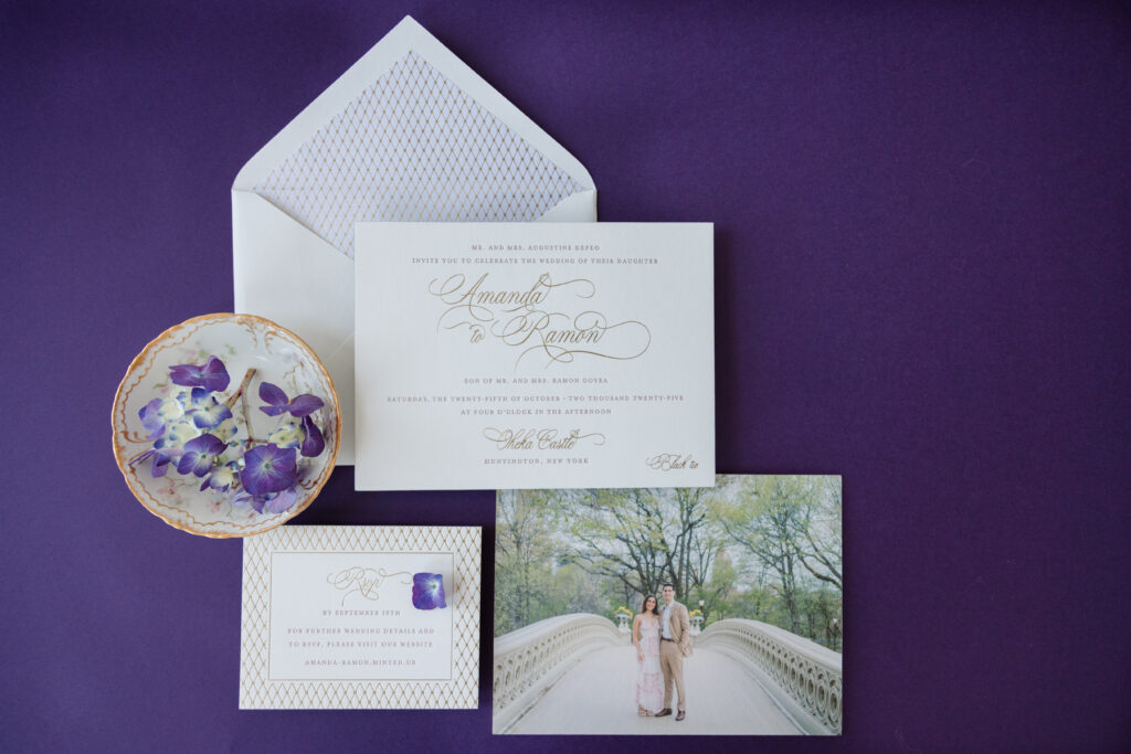
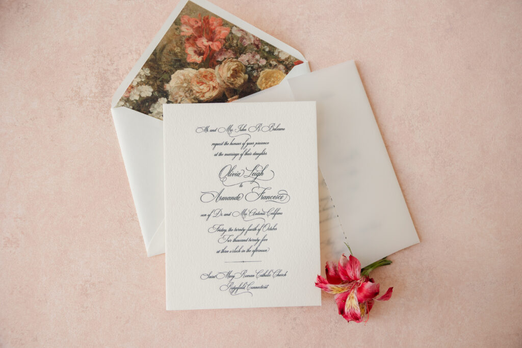
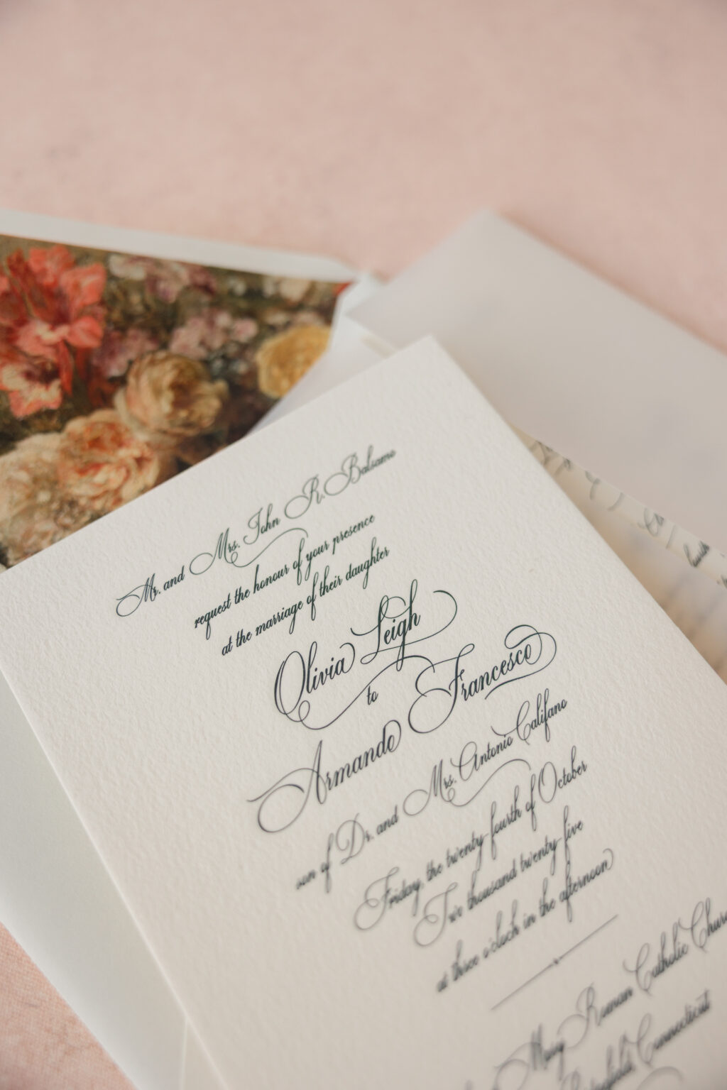
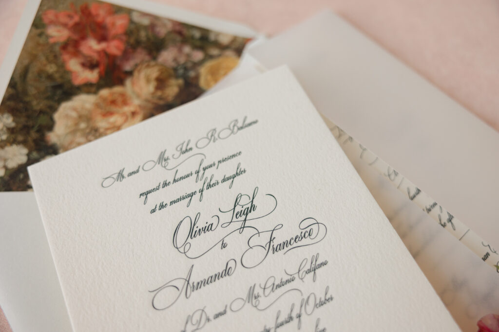
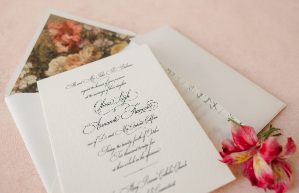
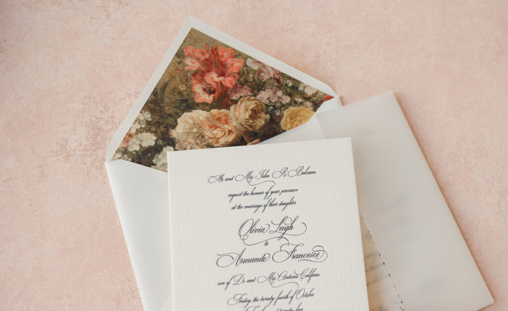
Elegant design combined with painterly botanicals has us swooning over Olivia and Armando’s engraved wedding invitation suite. This couple worked with our dear friend Michelle of Ink Fine Stationers to customize our Neve design, and the results are absolutely stunning.
Invitation
engraving ink: holly
fonts: ecatherina + walbaum
paper: bella cotton 2-ply ivory
card size: f-8
envelope liner: vintage rose pattern in cmyk digital on white text
inner envelope: ivory text pointed flap
outer envelope: ivory text pointed flap
outer envelope addressing: holly digital on the back
job: 76763
Gatefold Wrap
paper: 40# vellum
card size: f-8 inner vertical gatefold
finishing: score
job: 76763
This design features engraving, a traditional print method that utilizes etched metal plates to create a raised impression. This technique is classic and timeless, and looks completely amazing when paired with our Bella 2-ply Cotton paper. The thin, delicate typography stands out against the thick, plush texture of the paper.
The font selection feels formal and romantic. The couple’s names appear in a flowing script with dramatic swashes that serve as the focal point. While the remaining text appears more subdued than the bride and groom’s names, there are still plenty of dramatic flourishes, giving the overall design an intensity and vibrancy.
Although romantic, the design remains uncluttered. Large amounts of white space emphasize the typography, creating a sophisticated feel. The invitation fits into a vellum gatefold for an added level of sophistication.
The envelope liner features a painterly floral artwork reminiscent of classical oil paintings. The flowers have a vintage gallery-like quality that evokes classic still-life paintings.
Whether you want the drama of an elaborate script font, the romance of a floral envelope liner, or the tradition of engraving, you can create what you want with any of our designs. Work with one of our dealers to create your perfect engraved wedding invitation set.
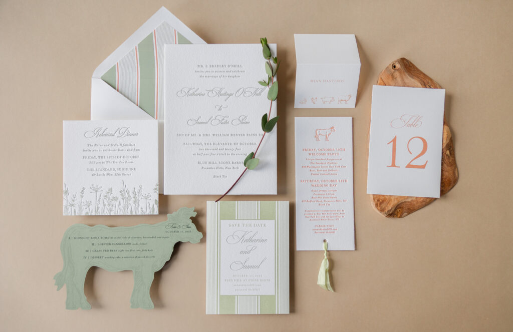
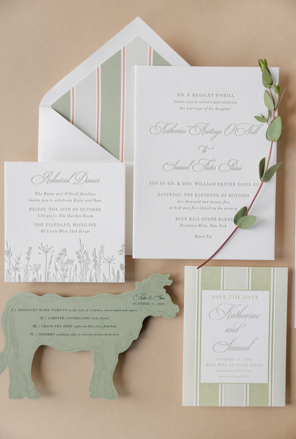
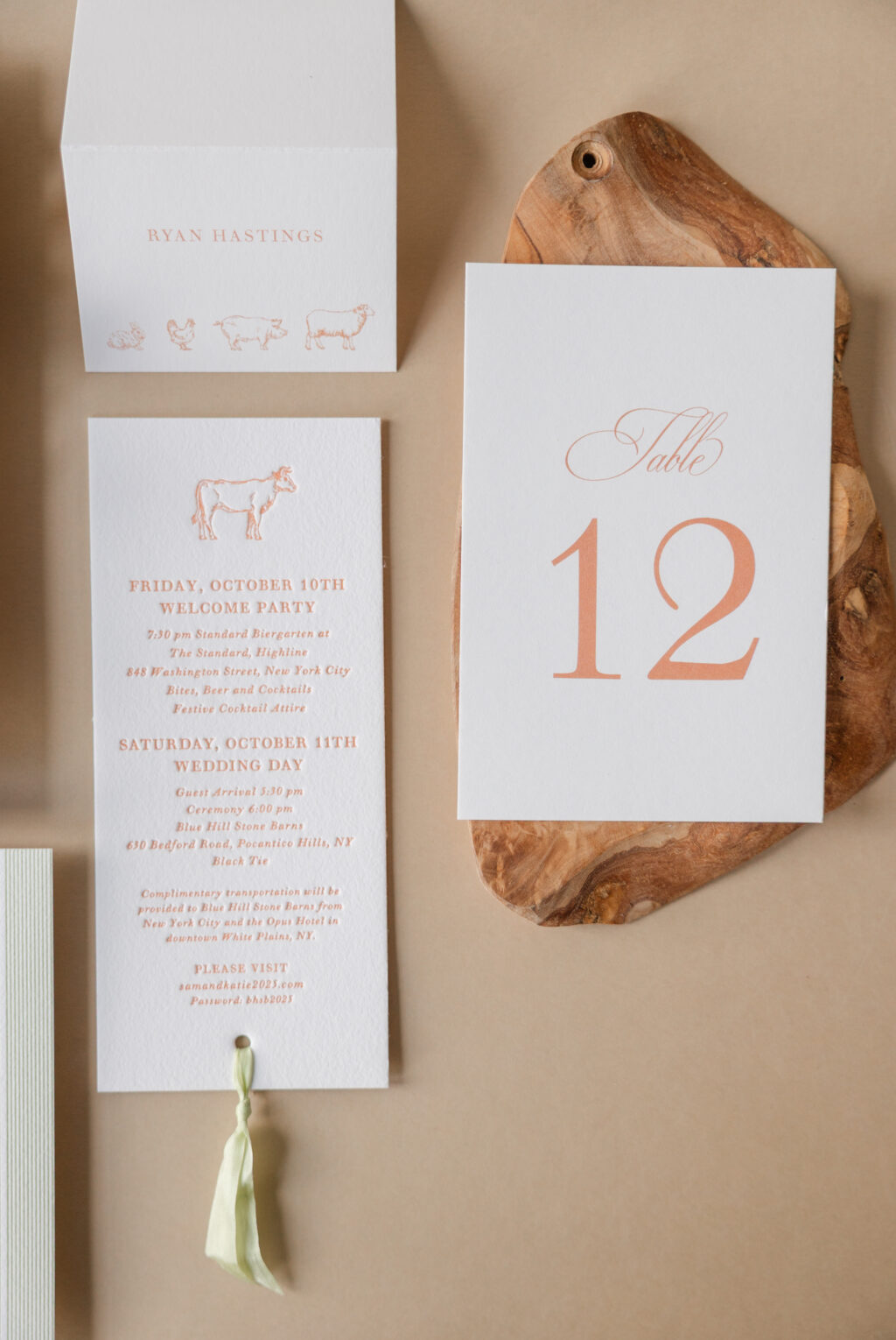
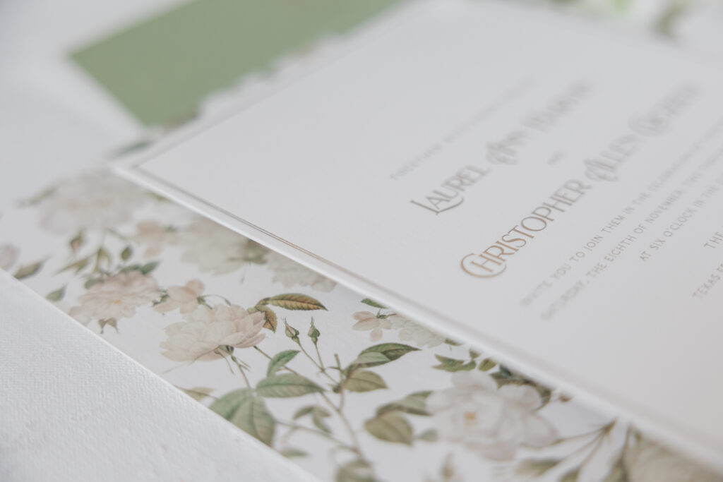
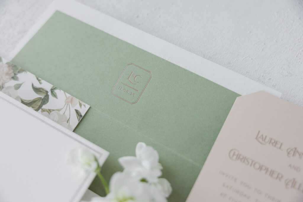
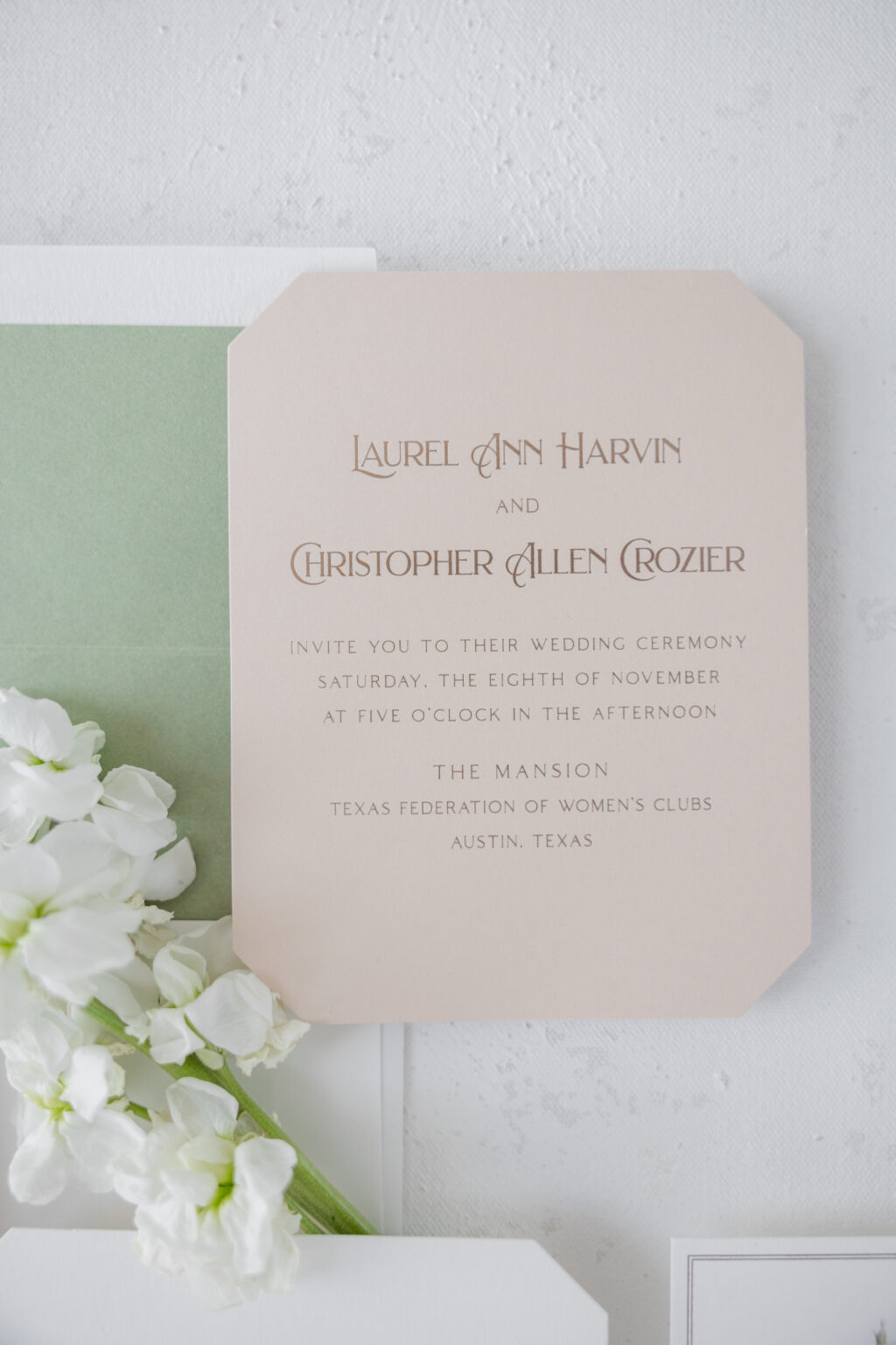
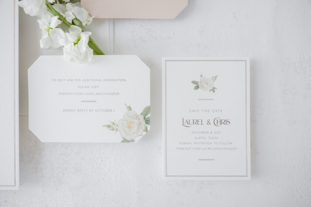
We had the pleasure of working with Katharine and Samuel every step of the way, from their save-the-dates to the day-of pieces. This invitation suite blends formal elegance with pastoral charm, creating a look that feels both luxurious and deeply personal. This couple, who held their wedding at Blue Hill Stone Barns, worked with our dear friend Ashley, of Ashley Douglass Events, to create this polished, romantic, and thoughtfully curated wedding stationery.
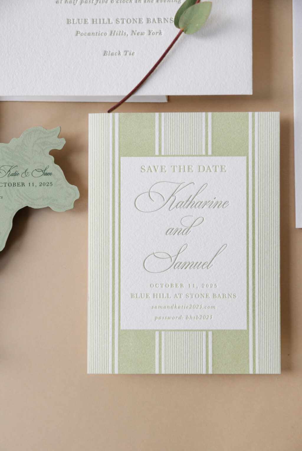
First up, the couple chose to customize our Payton Save the Date. The original design features an A-5 card featuring handmade paper duplexed to an A-6 made from Bella smooth cotton. Katharine and Samuel replicated the look, while making it their own. Their version features our Bella Cotton paper, which has a decadent, pillowy texture and holds a crisp letterpress impression. The alternating strip pattern for the border is casual and somewhat preppy, with a hint of vintage sentiment.
The green color palette is calming and perfect for a late summer wedding at a bucolic farm estate. The couple’s names are printed in Spruce, while the remaining letterpress printing is done in a slightly lighter shade, Acadia, ensuring the names take center stage.
The invitation is both formal and traditional, featuring a symmetrical layout with ample spacing, creating a clean, luxurious look. The ornate script font for the couple’s names features dramatic flourishes which are offset by the delicate serif font used for the remaining text.
Save the Date
letterpress ink: acadia + spruce
fonts: ecatherina + walbaum
paper: bella cotton 1-ply white
card size: a-6
envelope: white cotton text
envelope addressing: spruce digital on the front and the back
job: 73908
Invitation
letterpress ink: spruce
fonts: ecatherina + walbaum
paper: bella cotton 2-ply white
card size: f-8
envelope liner: payton pattern in rust + spruce digital on white text
envelope: white text pointed flap
envelope addressing: spruce digital on the front and the back
job: 76711
Website Card
letterpress ink: rust
fonts: ecatherina + walbaum
paper: bella cotton 2-ply white
card size: a-5
job: 76711
The border pattern from the save-the-date is repeated on the invitation’s envelope liner, except this time it is a two-color pattern. Adding a second color elevates the look while carrying over the style and influence of the original inspiration.
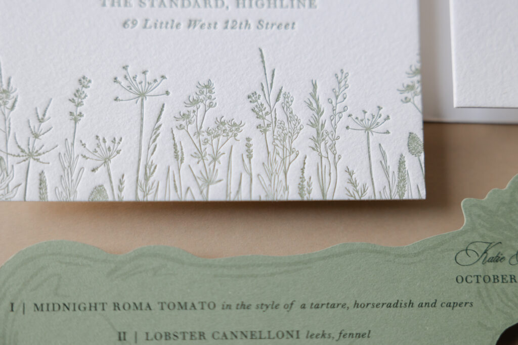
Darling botanical line illustrations set the rehearsal dinner invitation apart. The delicate meadow-inspired artwork features a high level of detail, beautifully displayed when letterpress-printed on our Bella cotton 2-ply paper.
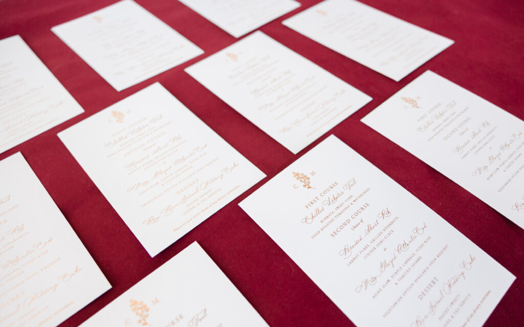
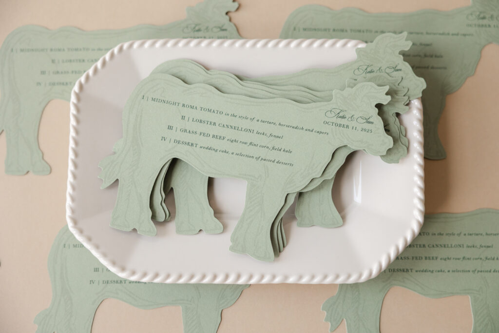
The menu is downright charming. Our Spruce paper coordinates with the established colorway, while Spruce and Holly digital inks give this unique menu an on-trend monochromatic look. The cow die-cut shape is playful and whimsical, and perfect for a menu of a wedding reception held at a farm. The cow silhouette immediately introduces a sense of personality, while the restrained color palette keeps the overall aesthetic sophisticated rather than rustic.
Rehearsal Dinner Invitation
letterpress ink: spruce
fonts: ecatherina + walbaum
paper: bella cotton 2-ply white
card size: 5.25” x 5.25”
job: 76711
Menu
digital inks: spruce at 25% + holly
fonts: ecatherina + walbaum
paper: bella spruce 1-ply
card size: 8.23” x 5.64”
die cut shape: cd-830
job: 78812
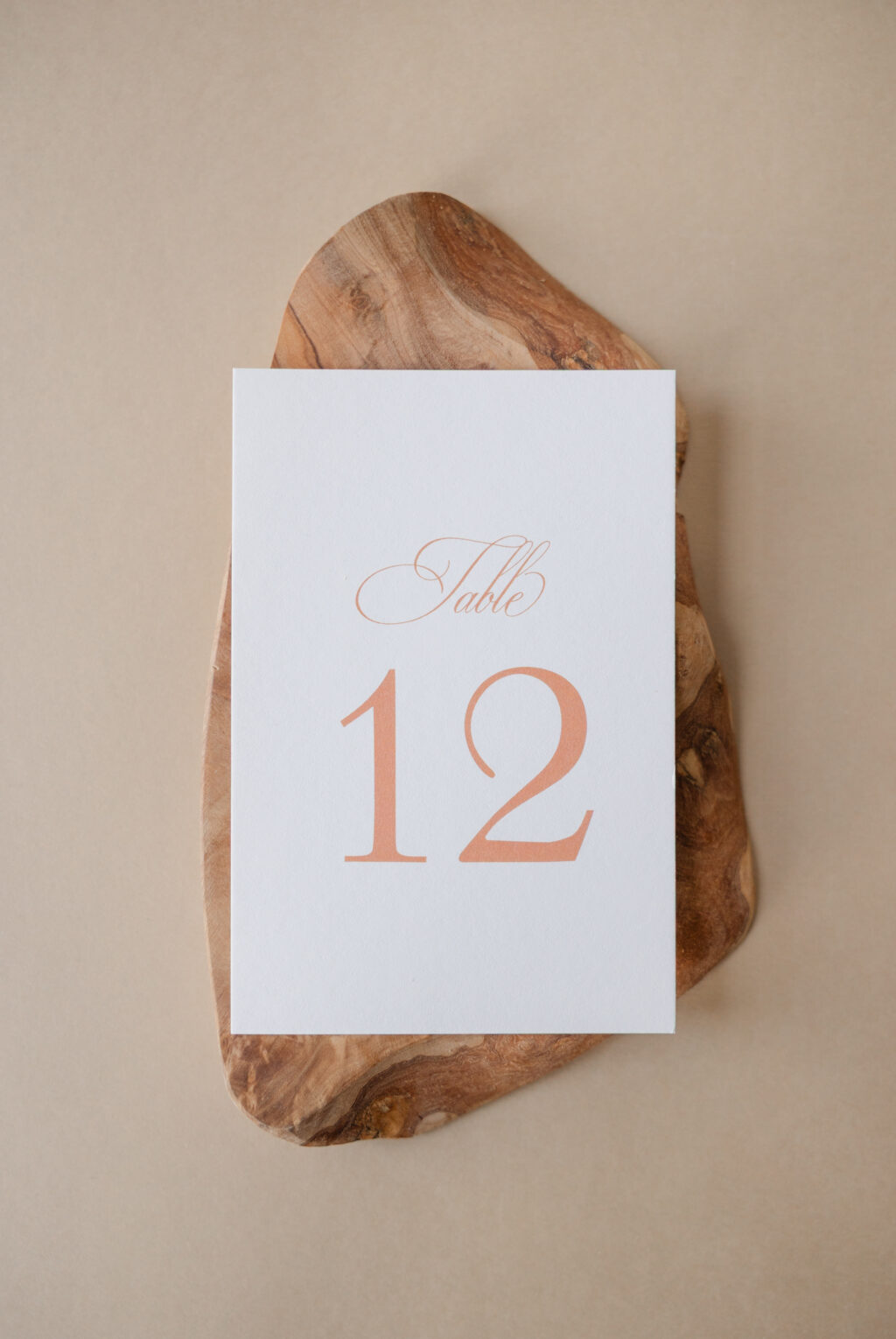
Table Card
digital inks: rust
fonts: ecatherina + walbaum
paper: bella smooth cotton 1-ply white
card size: 4” x 6”
job: 78812
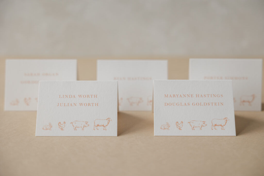
Folded Escort Card
digital inks: rust
fonts: ecatherina + walbaum
paper: bella smooth cotton 1-ply white
card size: no. 17 folded
job: 78812
Details Card
letterpress ink: rust (front) / rust (back)
fonts: ecatherina + walbaum
paper: bella cotton 2-ply white
silk ribbon: celery (customer supplied)
finishing: 0.25” hole drill and assemble with ribbon
card size: 3.25” x 7.5”
job: 76711
This is a refined countryside wedding invitation style that combines elegance, effortless pastoral style, and whimsical details for a romantic, opulent celebration. It’s always a joy to work with Ashley Douglass Events, and we wish the best to the couple, Katharine and Samuel. Do you want your wedding stationery to be opulent yet rustic? Would a fun die-cut set the perfect tone for your menu card? Or would a charming line illustration create just the right vibe? Work with one of our dealers to create your perfect wedding stationery.
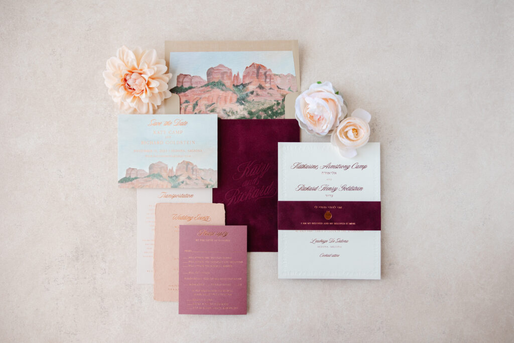
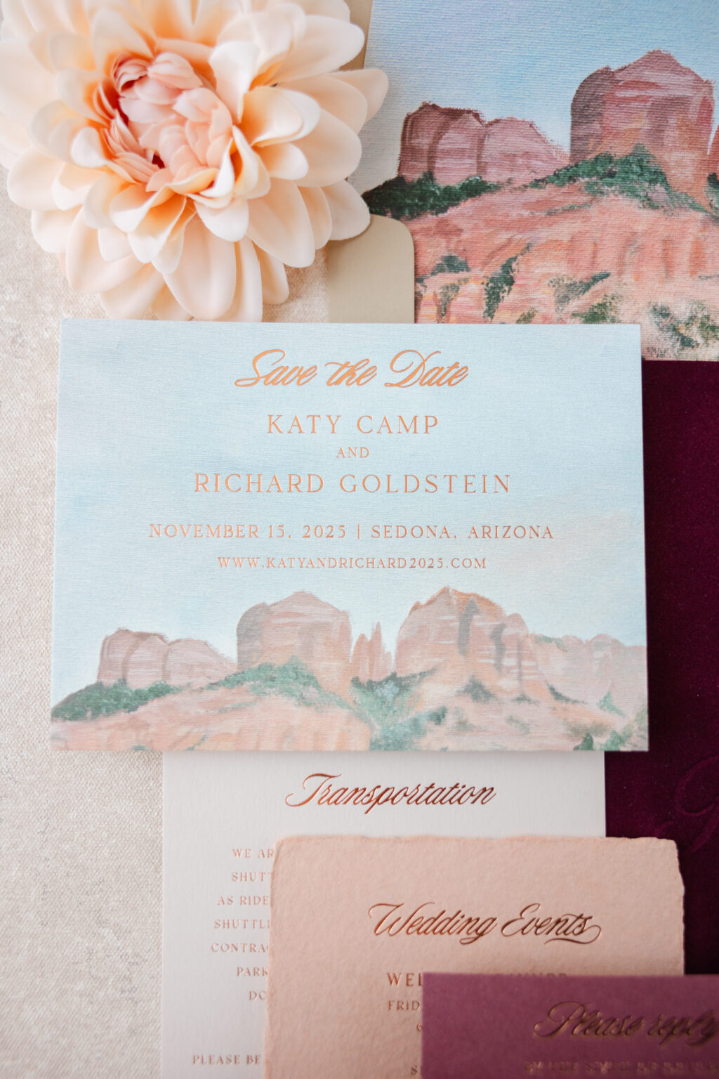
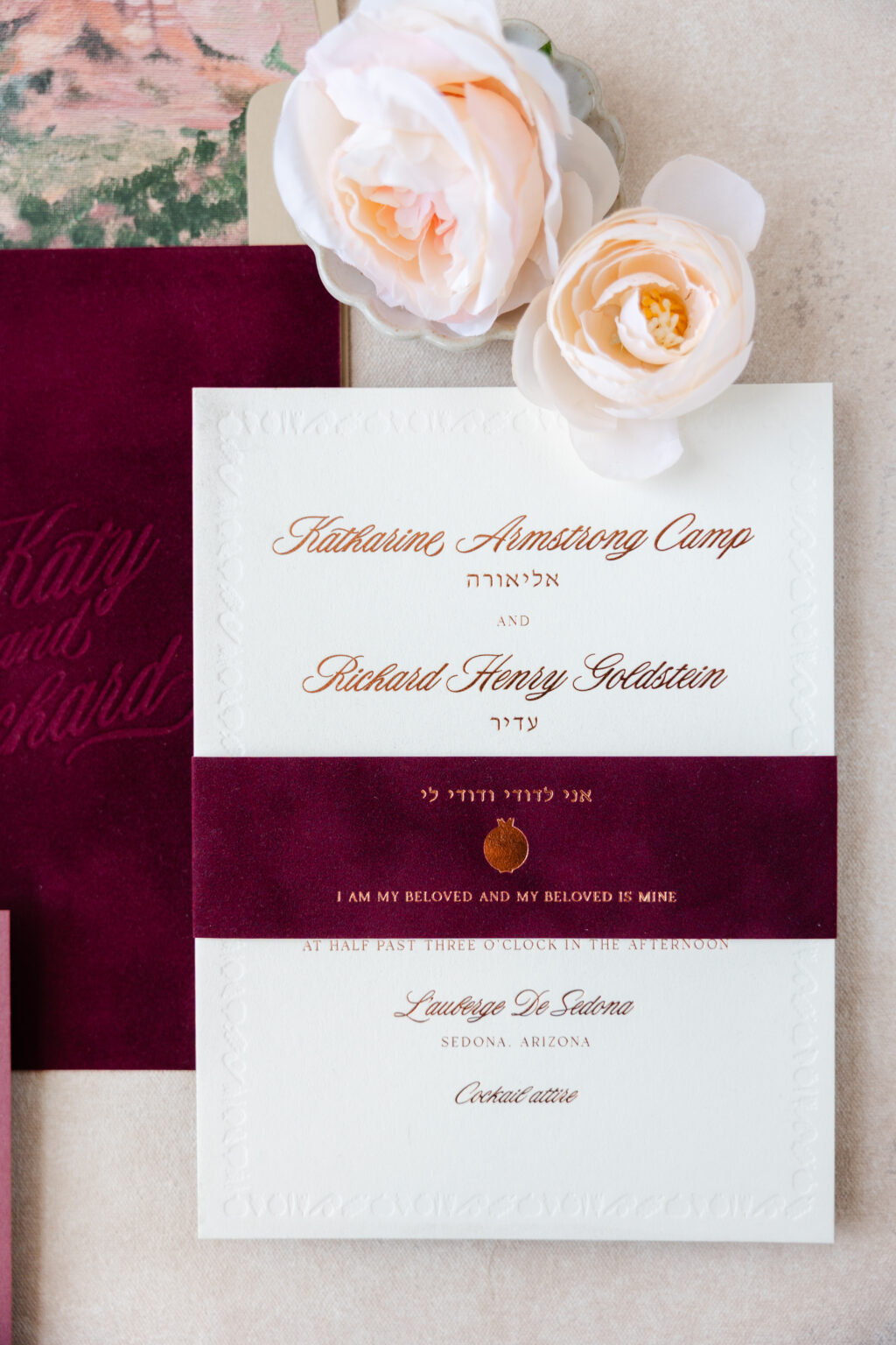
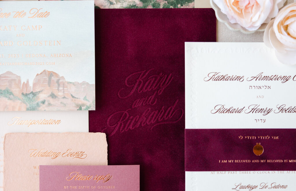
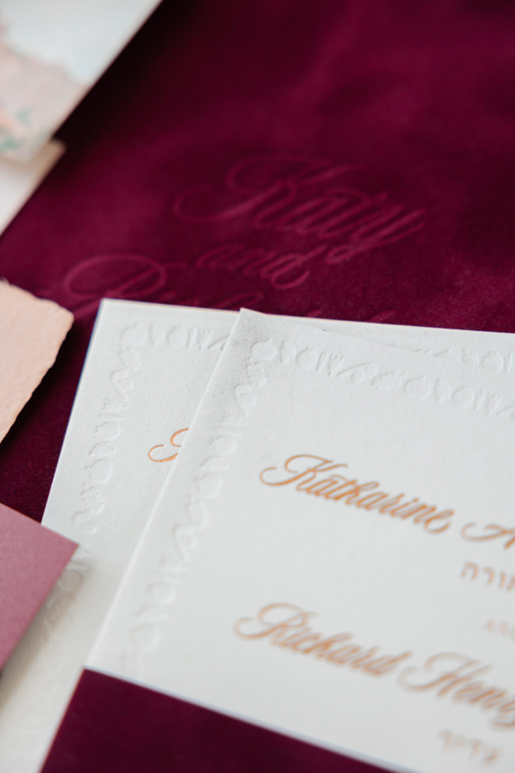
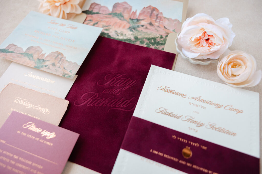
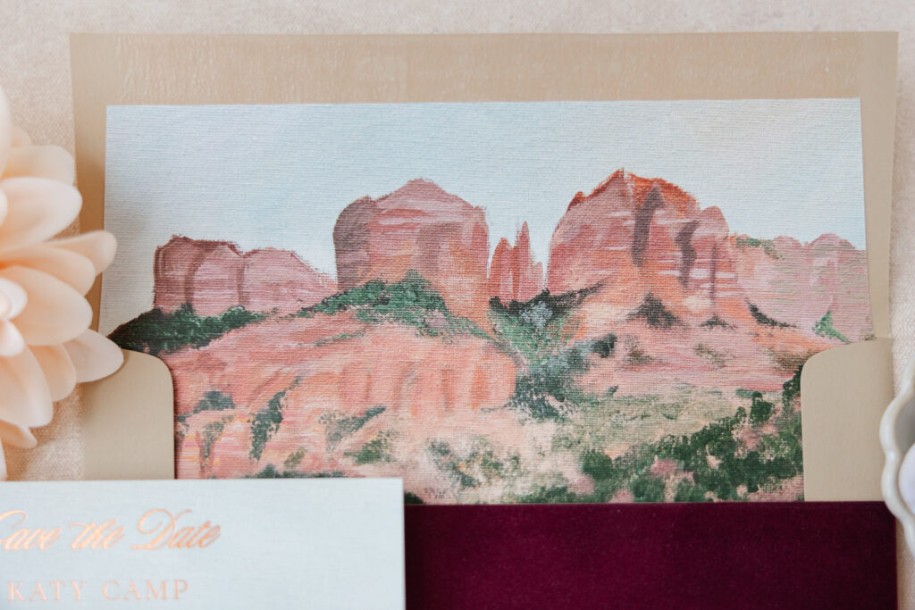
There are so many wonderful details surrounding Katherine and Richard’s Southwestern wedding invitation set that it’s hard even to know what to swoon over first. There is so much texture from velvet to handmade paper, plus painterly artwork, decadent foil stamping, and artful blind debossing. The couple drew inspiration from our Nash design, including the Save the Date, and worked with our dear friend Phyllis of By Invitation Only.
Save the Date
foil stamping: copper shine (front)
digital ink: cmyk
fonts: the original + branch
paper: bella smooth cotton 1-ply ivory
card size: a-6
envelope: bella latte text
envelope addressing: nutmeg digital on the front / copper shine foil on the back
job: 77093
A custom illustration on the save the date features dusty blush tones that beautifully capture the sandstone buttes of the wedding location in Sedona, Arizona. Copper shine foil complements the warm tones of the Southwestern landscape artwork while adding a touch of glamour.
envelope liner: custom pattern in cmyk digital on ivory text
envelope: bella latte text
envelope addressing: nutmeg digital on the front / copper shine foil on the back
job: 76477
The invitation features a driving script font and a formal layout. The concept of a border was borrowed from the inspiration design, but customized to fit the couple’s vision, and includes pomegranates, a traditional symbol of good fortune and prosperity.
Belly Band
foil stamping: copper shine
fonts: the original + branch
paper: bella velvet wine
card size: f-8 vertical belly band
finishing: assemble with the invitation
job: 76477
The invitation features a velvet backing with the bride and groom’s names blind-debossed into it. This is an unexpected yet charming detail. Pressing the text into the velvet without ink creates a tonal look that is both on-trend and timeless while accentuating the texture of the velvet.
A velvet belly band wraps around the invitation, securing the additional cards for an orderly presentation when guests open the envelope. Copper shine foil stamping on the front of the belly band, including a pomegranate motif, is a lovely addition. Our wine velvet gives a subtle nod to the desert landscape and the recurring pomegranate theme.
The painterly artwork from the save-the-date is just too good not to feature again, so it makes another appearance as the invitation’s envelope liner.
Transportation Card
foil stamping: copper shine
fonts: the original + branch
paper: bella almond 1-ply
card size: 4.75” x 6.4”
job: 76477
Details Card
foil stamping: copper shine
fonts: the original + branch
paper: bella handmade terracotta
card size: a-6 deckle edge
job: 76477
Reply Card
foil stamping: copper shine
fonts: the original + branch
paper: bella mauve 1-ply
card size: a-2
envelope: bella latte text
envelope addressing: copper shine on the front
job: 76477
The remaining pieces in this Southern-themed suite, the reply card, details card, and transportation card, feature the same typography for consistency, but different papers. The cascading color effect of our mauve, almond, and handmade terracotta stocks mimics the warm tones of the Sedona landscape while introducing more color.
This entire wedding invitation suite is incredible, and we are so happy to have been part of creating something so lovely and meaningful. The vibe is intimate and luxurious, and the look perfectly captures the destination while including plenty of meaningful details. Are you inspired to create your own Southwestern wedding invitation? Or do you like the idea of creating a tonal look through blind debossing or painterly style artwork? Work with one of our dealers to create your dream invitations.
This foil-stamped wedding stationery suite has us envisioning a candlelit reception with soft table linens and stunning floral arrangements. The stationery look is romantic and formal with modern influences and abundant floral artwork. The couple, Lauren and Christopher, worked with our friend Renée of Paper Place to customize our Ichabod design.
Invitation
foil stamping: mink matte (front)
digital ink: cmyk (back)
fonts: coldiac + brilon
paper: bella smooth cotton 2-ply white
card size: f-8
envelope liner: custom pattern in mink matte foil on spruce text
envelope: white cotton text
envelope addressing: spruce digital on the front and the back
job: 76033
Artful lettering for the couple’s names is inspired and sophisticated, and leans toward a modern feel. Mink matte foil provides glimmer while setting the tone for the color palette. A border consisting of thin, parallel lines frames the invitation, lending the design a sense of formality. A lush pattern featuring decadent blooms and trailing greenery adorns the back of the invitation, providing a fun, unexpected detail. The couple’s monogram foil-stamped on the envelope liner is a charming personal touch. The monogram also includes the wedding date and a border similar to that of the invitation, but also in the die-cut shape of some of the cards in the suite.
The octagonal corners and generous spacing of the ceremony card and the website card balance the florals with subtle modernity. The tone of our almond stock in 1-ply for the ceremony card beautifully coordinates with the botanical artwork on the reverse of the invitation. The inclusion of a bloom on the website card maintains consistency with the suite.
Ceremony Card
foil stamping: mink matte
fonts: coldiac + brilon
paper: bella almond 1-ply
card size: a-2
die-cut style: franklin
die-cut shape: bf-71
job: 76033
Website Card
foil stamping: mink matte
digital ink: cmyk
fonts: coldiac + brilon
paper: bella smooth cotton 1-ply white
card size: a-5
die-cut style: franklin
die-cut shape: bf-48
job: 76033
Save the Date
foil stamping: mink matte
digital ink: cmyk
fonts: coldiac + brilon
paper: bella smooth cotton 1-ply white
card size: a-5
envelope: white cotton text
envelope addressing: spruce digital on the front and the back
job: 76033
The design expertly balances delicate floral details, muted colors, empty space, and understated typography, resulting in a romantic but polished look that is timeless and graceful. Are you considering a foil-stamped monogram envelope liner or a bold pattern on the reverse of the invitation? Work with one of our dealers to create your dream foil-stamped wedding stationery!
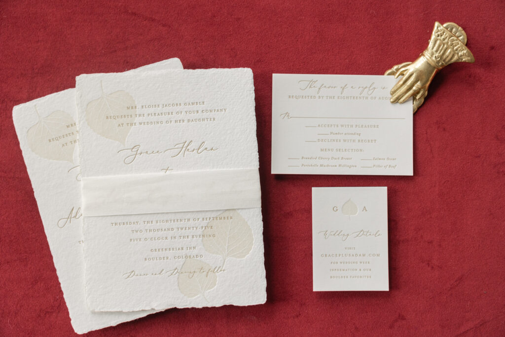
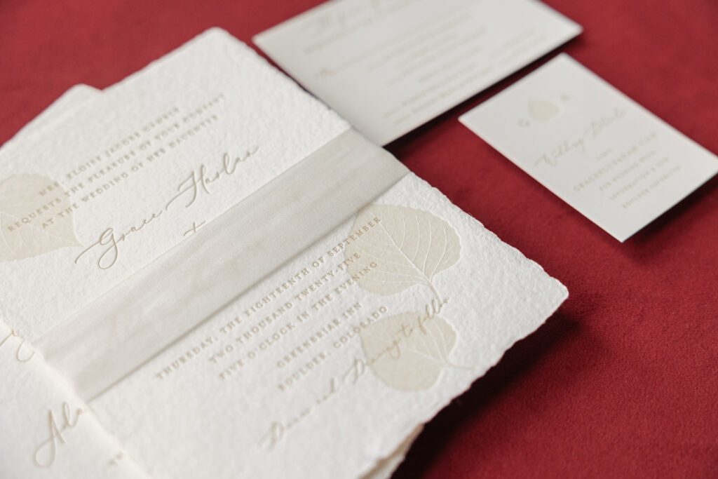
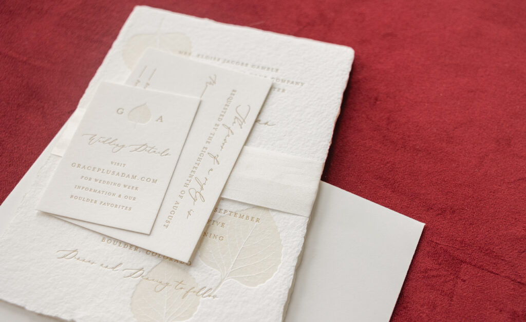
Soft texture, cultivated typography, and subtle yet personal details make these invitations timeless, intimate, and luxurious. Grace and Adam worked with our dear friend Sasha of Paper Twist to customize our Camber design for their special day.
Invitation
letterpress inks: antique gold + sand
fonts: maison de fleur + adobe caslon
paper: bella handmade white
card size: f-8 deckle edge
silk ribbon: mother of pearl
finishing: assemble with ribbon
inner envelope: white cotton text pointed flap
inner envelope addressing: antique gold digital on the front
outer envelope: white cotton text pointed flap
outer envelope addressing: antique gold digital on the front and the back
job: 77439
The flowing script paired with a classic small caps serif font creates a balance between romance and formality. Handmade paper elevates the look while the feathery deckle edge adds a lovely texture. The soft paper holds a clean letterpress impression, showcasing both the crisp lines of the fonts and the details of the foliage artwork. The foliage, aspen leaves, give a gentle nod to the nuptials’ location in Colorado, adding a personal detail to the invitation.
Reply Card
letterpress inks: antique gold
fonts: maison de fleur + adobe caslon
paper: bella smooth cotton 1-ply white
card size: a-5
envelope: white cotton text pointed flap
envelope addressing: antique gold digital on the front
job: 77439
Details Card
letterpress inks: antique gold + sand
fonts: maison de fleur + adobe caslon
paper: bella smooth cotton 1-ply white
card size: no. 17
job: 77439
The symmetry of the couple’s initials on either side of an aspen leaf is a charming detail that accentuates the details card. Everything is intentionally understated, from the neutral color palette to the fine serif typography and the decadent silk ribbon, which adds softness and even more texture.
Do you love the texture of handmade paper, or are you excited to include a subtle detail, such as foliage artwork, in your invitations? Work with one of our dealers to create your perfect wedding invitation.