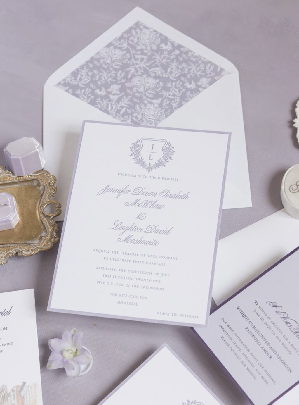
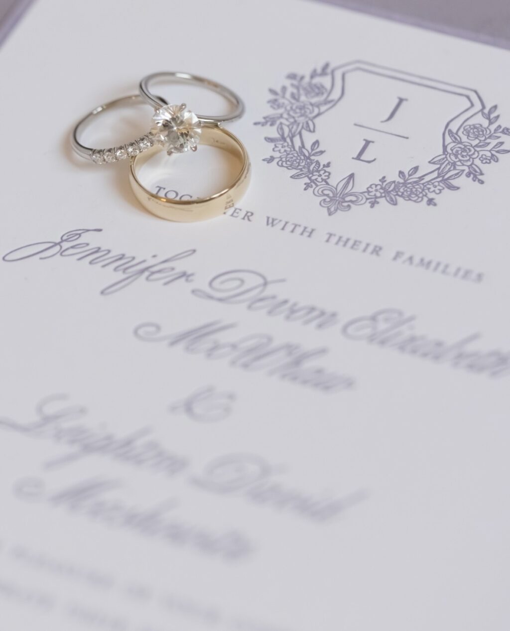
Jennifer and Leighton’s letterpress wedding invitation suite is elegant, blending traditional formality with a delicate, modern vision. This couple worked with us at our Bella Figura NYC location and customized our Hadaway design for their summer wedding.
Invitation
letterpress ink: lavender
fonts: bellissima script pro + angeline + serlio lh caps
paper: bella smooth cotton 2-ply bright white
card size: f-8
envelope liner: toile pattern in lavender digital on bright white text
envelope: bright white text
envelope addressing: plum digital on the front and the back
job: 75583
Belly Band
letterpress ink: lavender
fonts: bellissima script pro + angeline + serlio lh caps
paper: bella bright text
card size: f-8 vertical belly band
job: 75583
Our Bella smooth cotton stock in 2-ply holds a clean, deep letterpress impression, adding a subtle texture. Lavender ink is romantic, almost ethereal, and regal. This color also coordinates with the venue, The Ritz-Carlton Montréal. The script font used in the inspiration design was highly stylized, but swapping it for something more delicate, graceful, and refined changes the entire look while setting the tone for this elegant and traditional affair. The sophisticated serif font balances the flourishes of the script font.
A generous layout with ample white space creates a minimalist composition that allows the custom monogram crest to stand out. The monogram features the couple’s initials and a fleur-de-lis, making it personal and elevating the look while paying homage to the location of the nuptials. Our design team crafted the custom crest based on the couple’s direction. A letterpress border is pressed into the stock, framing the entire invitation and showcasing the thickness of the paper.
Our toile pattern in lavender adds a vintage vibe to the envelope liner and beautifully complements the botanical accents that adorn the crest.
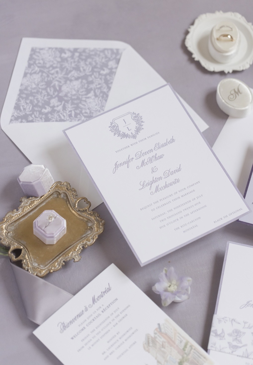
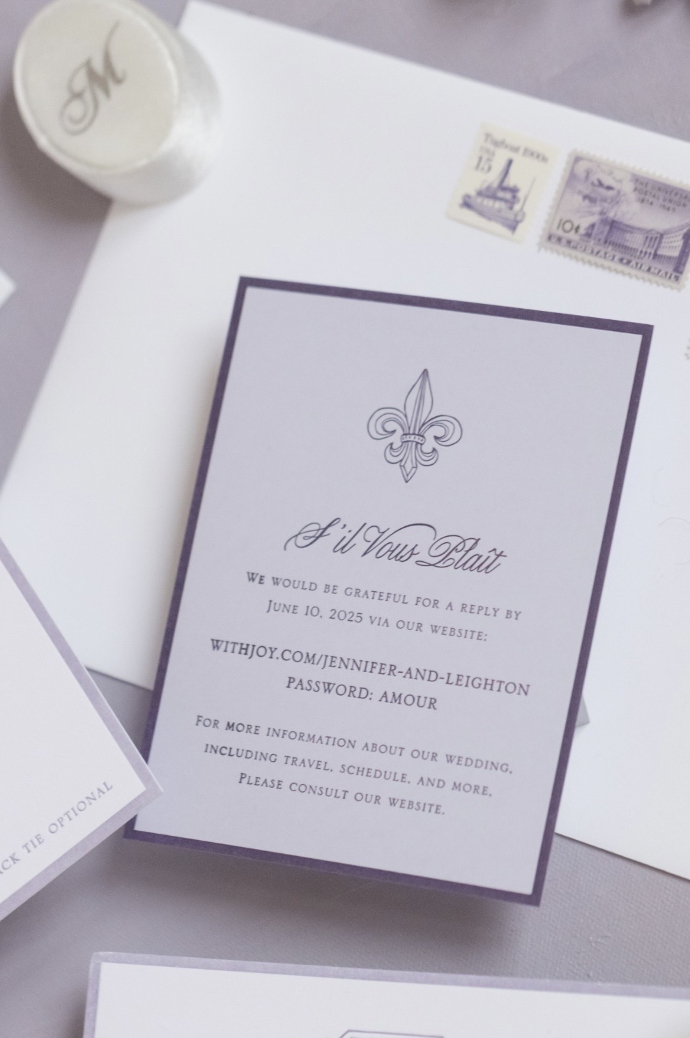
Reply Card
letterpress ink: plum
fonts: bellissima script pro + angeline + serlio lh caps
paper: bella 1-ply lilac
card size: a-2
job: 75583
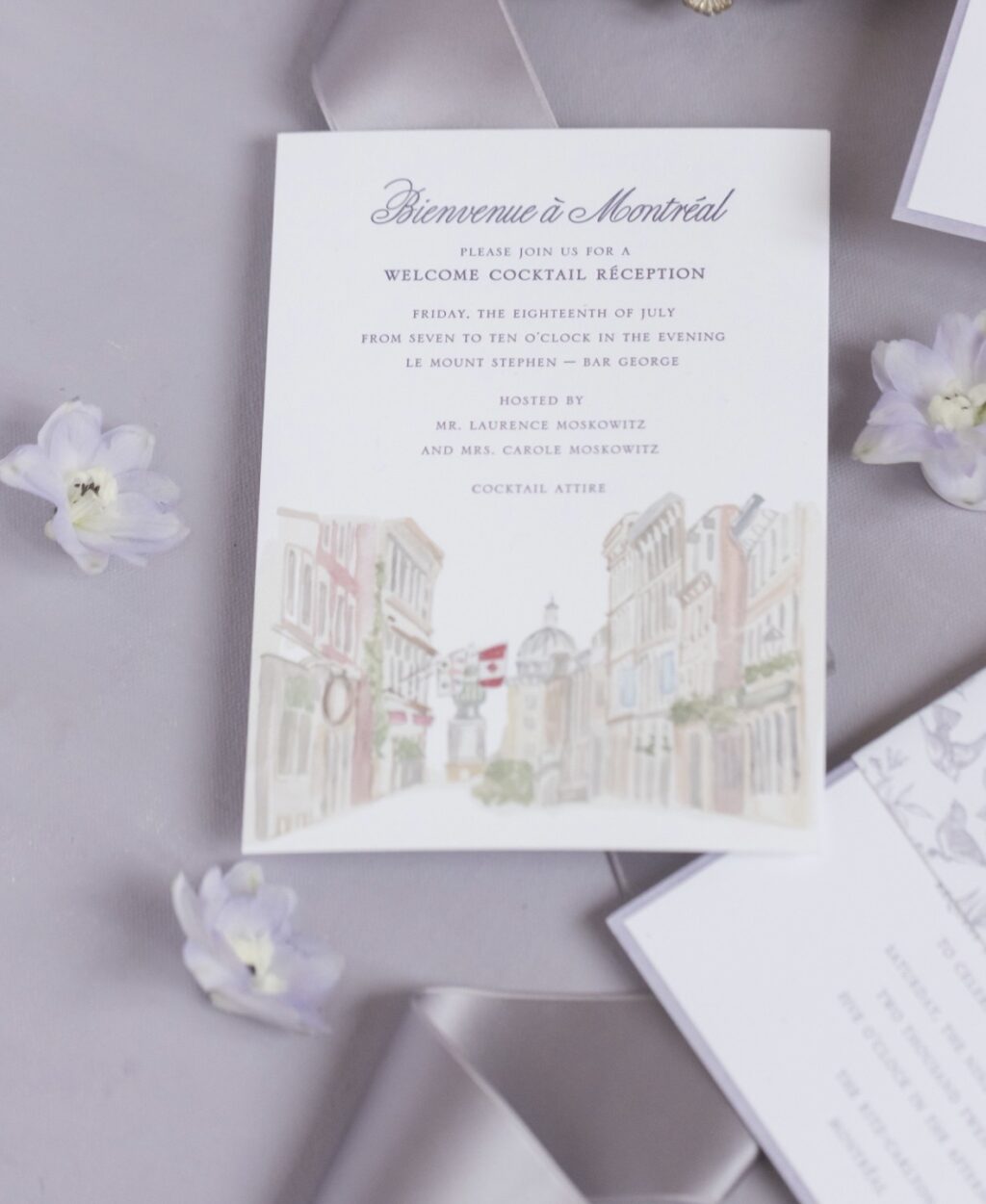
Welcome Party Card
letterpress ink: plum
digital ink: cmyk
fonts: bellissima script pro + angeline + serlio lh caps
paper: bella smooth cotton 1-ply bright white
card size: a-7
job: 75583
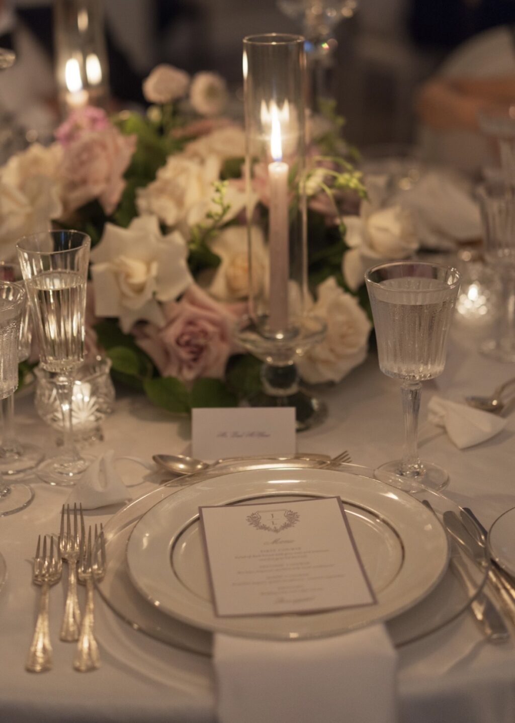
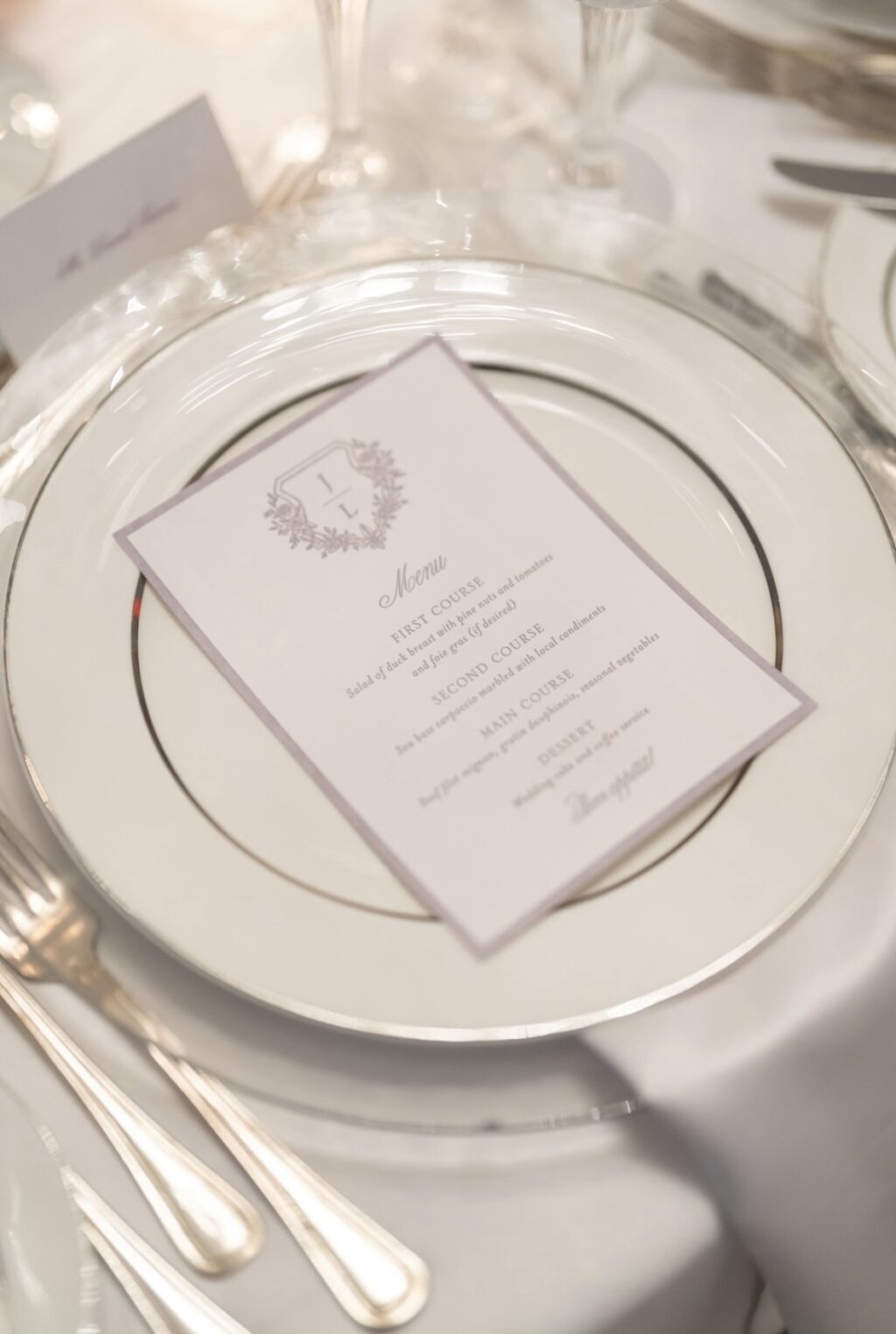
Menu
letterpress ink: lavender
fonts: bellissima script pro + serlio lh caps
paper: bella smooth cotton 1-ply bright white
card size: 5” x 7”
job: 77499
The reply card follows the same style, but features plum letterpress ink on our lilac paper, for a stylish monochrome look. The monogram crest from the invitation is replaced with a stately fleur-de-lis, providing a focal point. The Welcome Party Card features a darling watercolor illustration that highlights the location. The crest makes a second appearance on the menu, providing consistency with the invitation.
It was such a joy to work with Jennifer and Leighton, and we wish them the best. Do you like the idea of a monogram crest or an illustration? Whatever you envision, we can help make it happen. Contact us or work with one of our dealers to create your perfect letterpress wedding invitations.
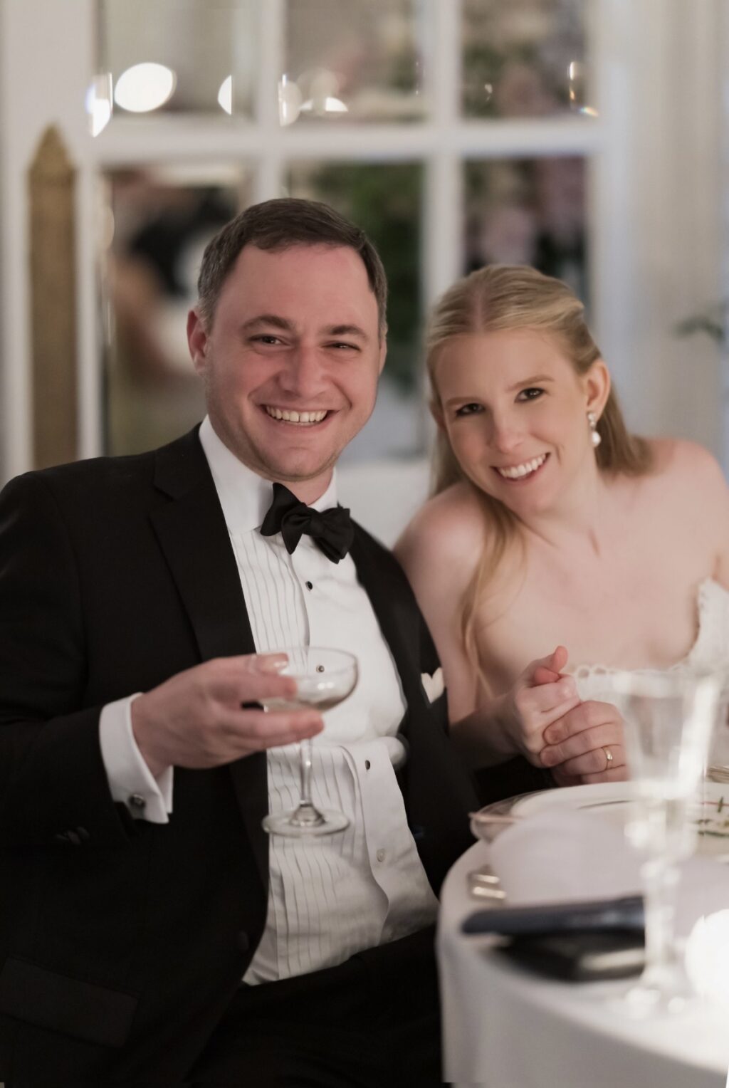
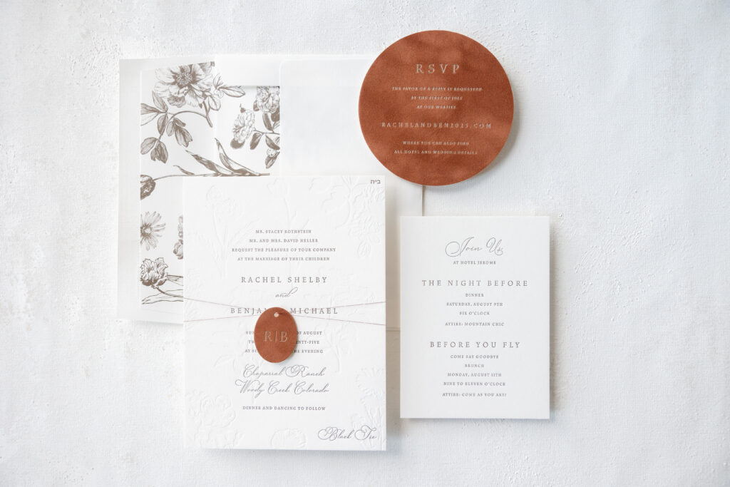
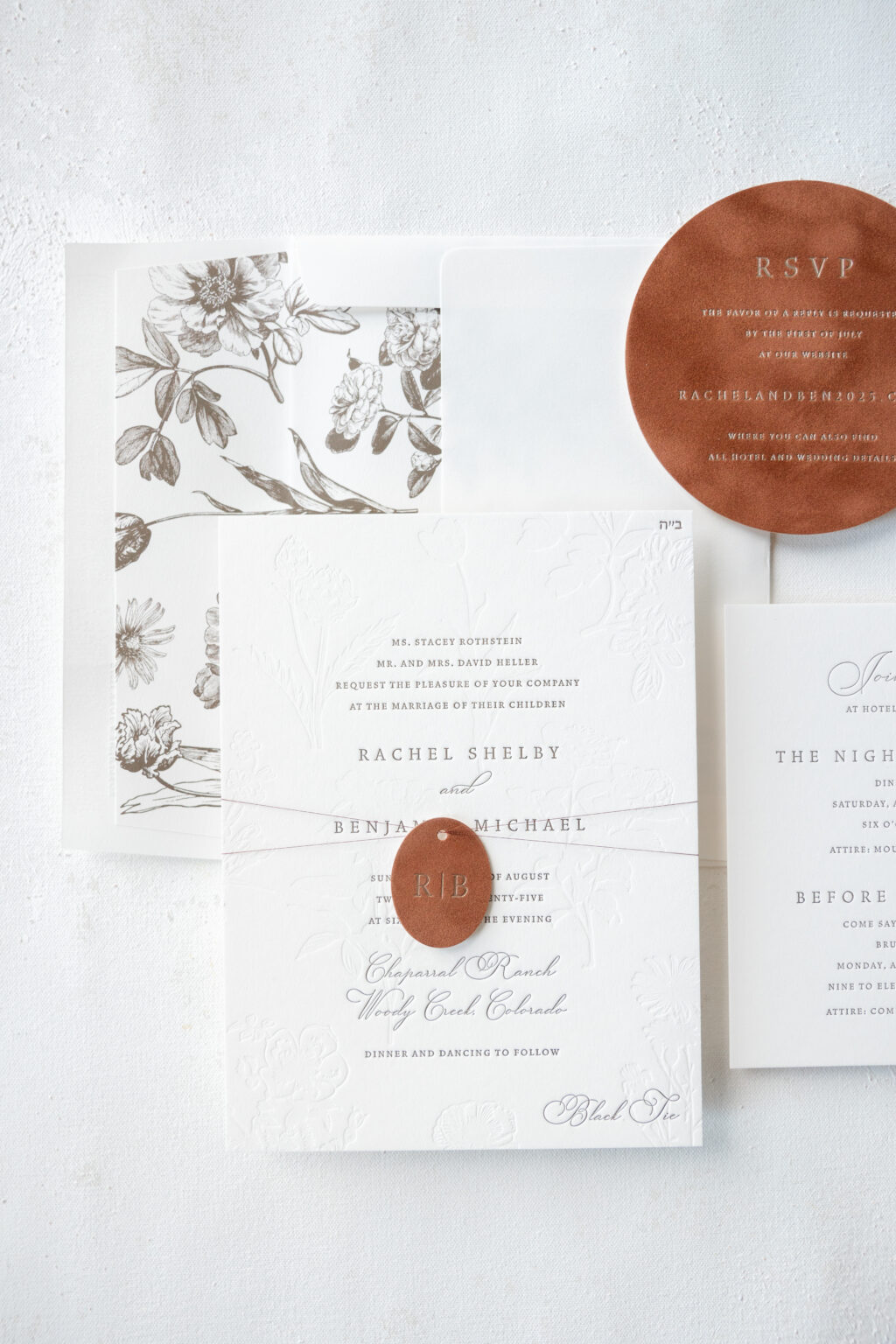
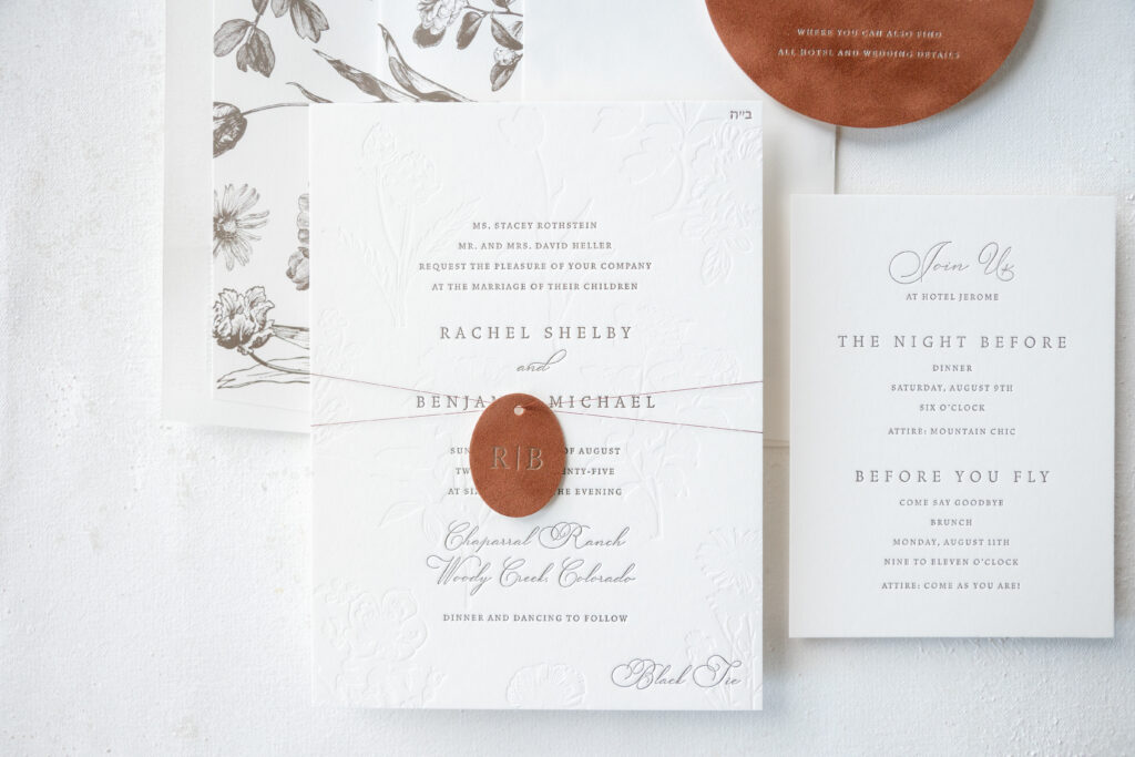
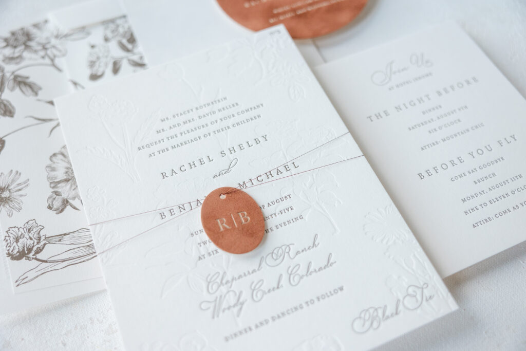
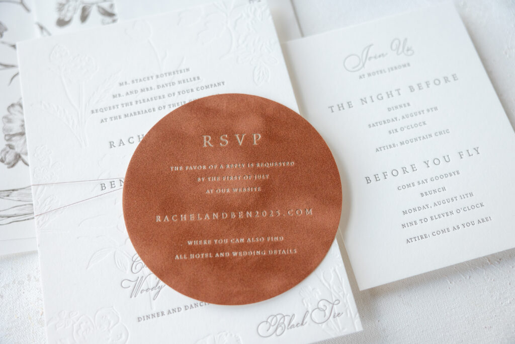
These swoon-worthy blind emboss invites are lovely, and we can’t stop thinking about them. A velvet tag and reply card, both with foil-stamping, add so much style and texture, and take this stationery suite to the next level. Rachel and Benjamin worked with our dear friend Diane of Sincerely Yours Diane to create their custom wedding stationery suite.
Invitation
letterpress ink: espresso
deboss: blind
foil stamping: champagne matte
fonts: vendetta ot medium/light + gatlik saphir
paper: bella smooth cotton 2-ply white
card size: f-8
thread: metallic bronze
finishing: assemble with thread and tag
envelope liner: underwood v.2 pattern in espresso digital on white text
envelope: white cotton text
envelope addressing: espresso digital on the front/espresso letterpress on the back
job: 75202
The look blends soft romance with a modern luxe edge. The typography is stately and traditional. There is a delicate formality to the fonts, which work together beautifully for a timeless look. Blind embossed floral artwork subtly fills in the generous blank space without overwhelming the design. Blind emboss is letterpress printing without ink, so you get the impression pushed into the paper without the color. The feel is elegant and intimate with plenty of tactile details. The botanical artwork from the invitation is digitally printed for the envelope liner. The detail gives the flowers a vintage feel and creates consistency between the invite and the liner.
Mocha velvet for the tag and reply card adds warmth and even more texture. There is a slightly western, mountain vibe to the mocha velvet, perfect for this Colorado wedding. The serif font monogram is refined and gracefully toes the line between a black-tie and ranch aesthetic.
This wedding suite is equal parts luxury celebration and western romance. It is warm and inviting, yet still black-tie formal, and we can’t get enough of it. Are you daydreaming of blind emboss invites with velvet accents? Do you want hints of Western style or a monogram tag? Work with one of our dealers to create your perfect wedding stationery suite!
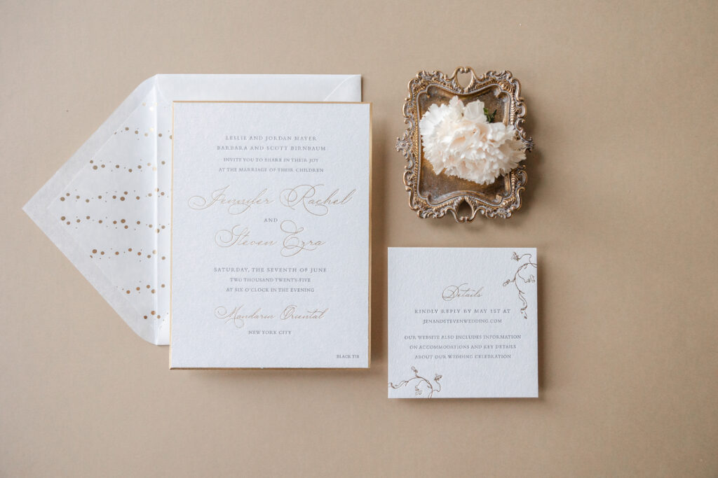
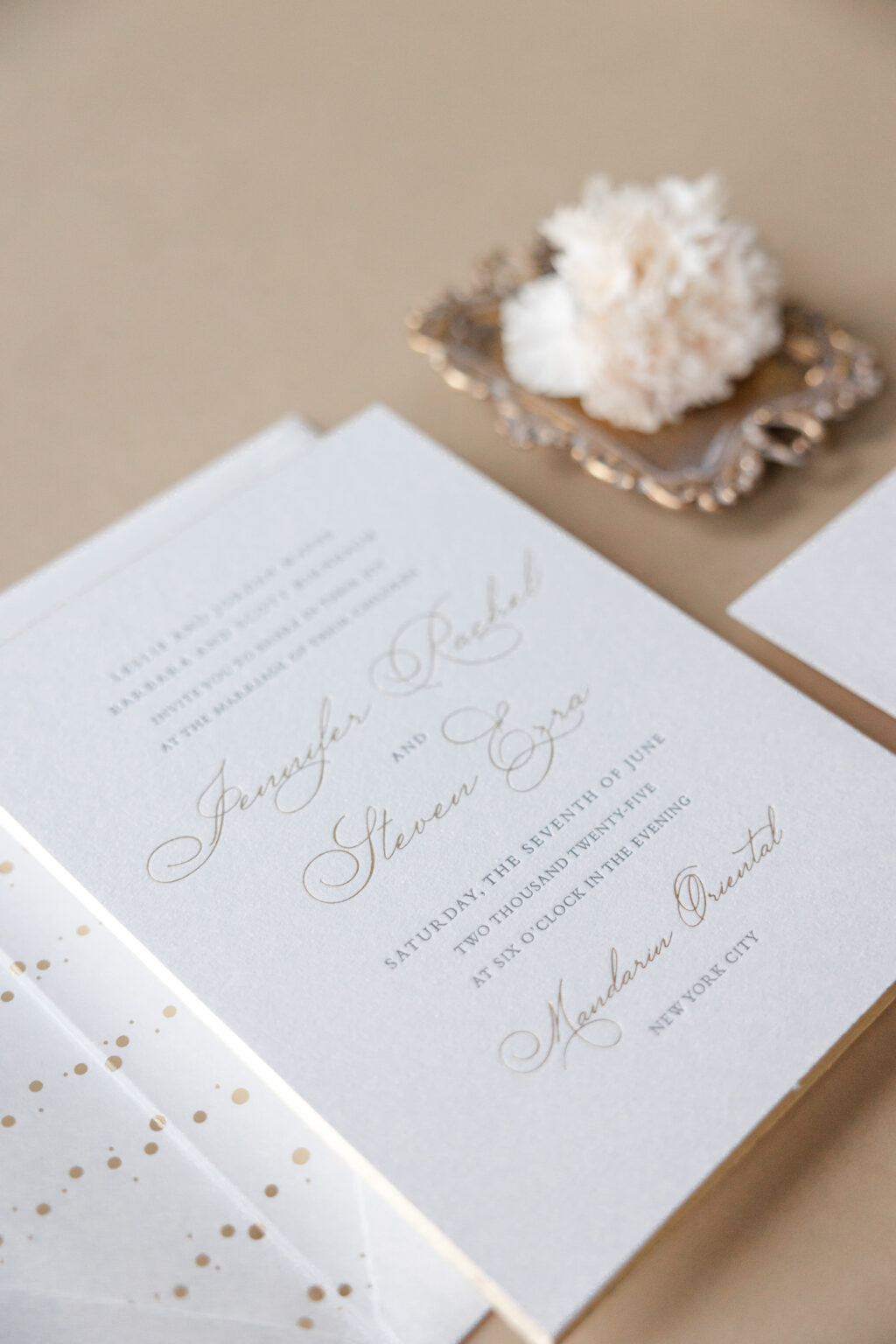
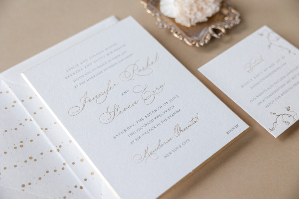
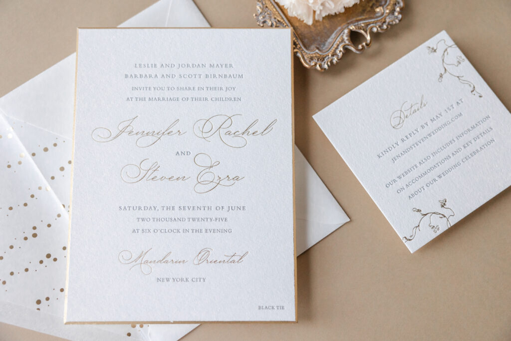
We’re head over heels for these elegant letterpress and foil-stamped wedding invitations. Jennifer and Steven’s wedding stationery is classic and features opulent details, such as beveled foil edges, making it stylish and exquisite. The couple worked with us at our Bella Figura NYC location, and it was an absolute pleasure helping bring their vision to life.
Invitation
letterpress ink: charcoal
foil stamping: champagne matte
fonts: lile dalihya + bembo
paper: bella cotton 3-ply white
card size: f-8
bevel: 45-degree
foil edge: champagne matte
envelope liner: thalassa pattern in champagne matte foil on white text
envelope: white cotton text
envelope addressing: charcoal digital on the front and the back
job: 75404
A swooping, driving script font highlights the couple’s names, which are foil-stamped in champagne matte. Their venue, the Mandarin Oriental, also appears in champagne matte foil. The remaining text is letterpress-printed in charcoal ink. Generous spacing keeps everything airy and elevates the look.
Perhaps one of our favorite features of this design is the use of our 3-ply cotton paper. This paper is soft and plush, with a slight texture. It holds a clean and crisp impression, really showcasing the depth of the printing. A 45-degree bevel edge gilded in champagne matte foil further highlights the thick stock.
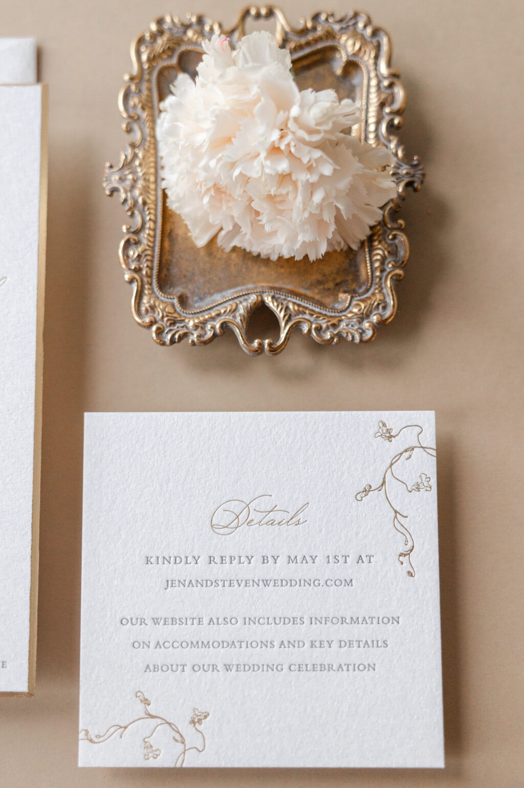
Details Card
letterpress ink: charcoal
foil stamping: champagne matte
fonts: lile dalihya + bembo
paper: bella cotton 2-ply white
card size: sq-5
job: 75404
Organic vine illustrations on the details card soften the formality and add a whisper of romance to the suite. The foil-stamped envelope liner is subtle and maintains the elegant, curated look.
Overall, these foil-stamped wedding invitations are sophisticated, intimate, and impeccably curated. It was a joy to work with Jennifer and Steven, and we wish them all the best. Do you have an idea or a vision for your wedding stationery? Work with us, and we can help bring your vision to life.
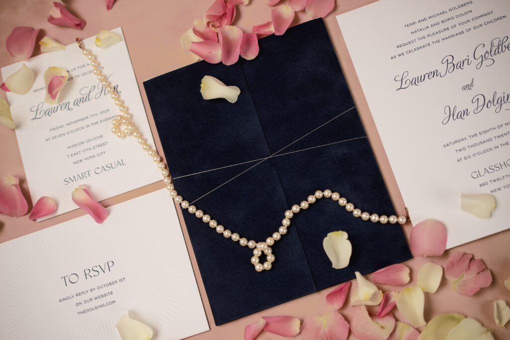
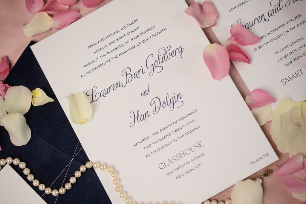
If you envision the invitations for a black tie wedding that is city-chic and opulent yet romantic, then Lauren and Han’s invitations are it. The couple worked with our friend Debra of Informally Yours to create their decadent wedding invitations.
Our now-retired Anastasia design served as a starting point for Lauren and Han’s invitation set. The couple opted to remove the floral accents for a more traditional look. They kept the formal layout, but swapped out the fonts, selecting a sweeping script font for their names.
Invitation
letterpress ink: navy
fonts: adios script + gotham light + classico
paper: bella smooth cotton 3-ply bright white
card size: 5.94” x 8.06”
finishing: assemble with gatefold and thread
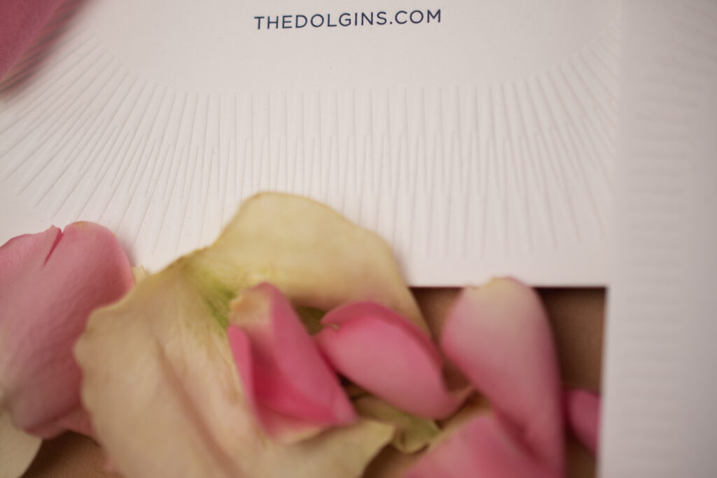
envelope liner: new york skyline 3 pattern in navy digital on bright white text
envelope: matte navy (customer supplied)
envelope addressing: white matte foil stamping on the back
job: 76418
Our smooth cotton paper is soft and satiny, and the bright white color is crisp, providing a sharp contrast to the navy letterpress ink. Our 3-ply paper is luxurious and holds a deep letterpress impression. The invitation is nestled within a velvet gatefold and secured with metallic silver thread. The velvet and thread introduce more texture and a touch of lavishness.
Gatefold
paper: bella navy velvet (interior and exterior) / bella dark blue 1-ply (middle)
size: f-8 inner vertical gatefold
finishing: triplex velvet to dark blue 1-ply and assemble with invitation and thread
metallic thread: silver
job: 76418
Reply Card
letterpress ink: navy
emboss: blind
fonts: gotham light + classico
paper: bella smooth cotton 2-ply bright white
card size: a-6
job: 76418
Rehearsal Dinner Invitation
letterpress ink: navy
emboss: blind
fonts: adios script + gotham light + classico
paper: bella smooth cotton 2-ply bright white
card size: a-2
job: 76418
The reply card and rehearsal dinner invitation maintain the typography and navy letterpress printing, but introduce a blind-embossed border with a subtle modern flair. Blind embossing creates a raised area for even more texture.
Everything about these invitations, from the typography to the 3-ply paper, the velvet gatefold, and the blind-embossed accents on the auxiliary cards, works beautifully together to create these decadent wedding invitations. Are you daydreaming of invitations suitable for a black-tie affair? Or do your ideal invitations feature velvet accents or a clean, modern design? Work with one of our dealers to create your custom wedding stationery.
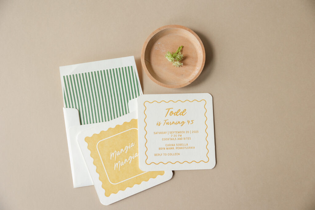
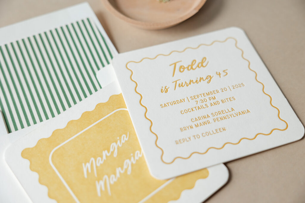
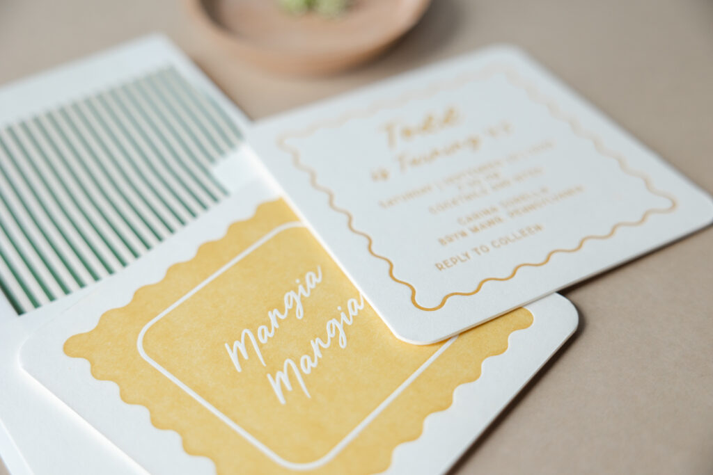
These charming birthday party invitations are pure chef’s kiss. When our friend Colleen of Pen and Paper came to us with this design, we knew the printed cards would be amazing. While this invitation drew inspiration from our Midge save-the-date, the design took a very different yet equally creative and stunning direction.
The style is playful and has an effortlessly retro twist. One side bears ravioli-inspired artwork that is fun, whimsical, and minimalist. The other side features the text. A scalloped edge border mimics the shape of the artwork on the reverse side, creating consistency. The typography demonstrates an effortless balance between a breezy script for personality paired with simple, structured sans-serif text to keep it grounded. The soft, rounded corners reinforce that friendly, approachable feel and keep everything casual.
envelope liner: sullivan stripes pattern in vine digital on ivory text
envelope: ivory cotton text
envelope addressing: vine digital on the front/goldenrod and vine digital on the back
job: 77691
Warm goldenrod letterpress paired with our ivory smooth cotton paper gives the invitation a vintage sun-washed vibe, reminiscent of the Italian coast. Our luxuriously thick 3-ply paper lends the invitation a lavish, tactile component. The striped liner adds a subtle preppy touch, giving just enough pattern without overwhelming the clean layout. These birthday party invitations are casual yet curated. They are light, laid-back, and celebratory, and perfect for a gathering involving good food and good company. We hope Todd had an amazing birthday, and we are so happy to have brought this vision to life. Do you have an idea for charming birthday party invitations? Are you interested in finding a balance between sophisticated minimalism and laid-back elegance? Work with one of our dealers to create your perfect invitations.
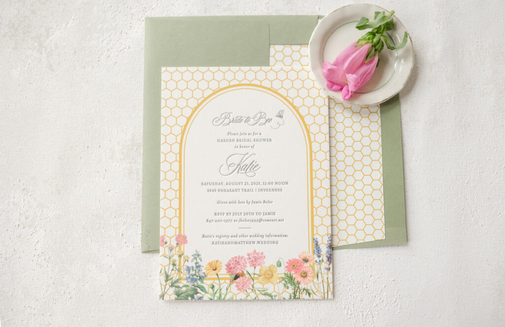
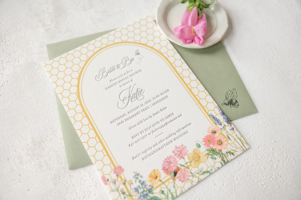
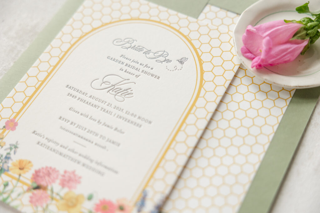
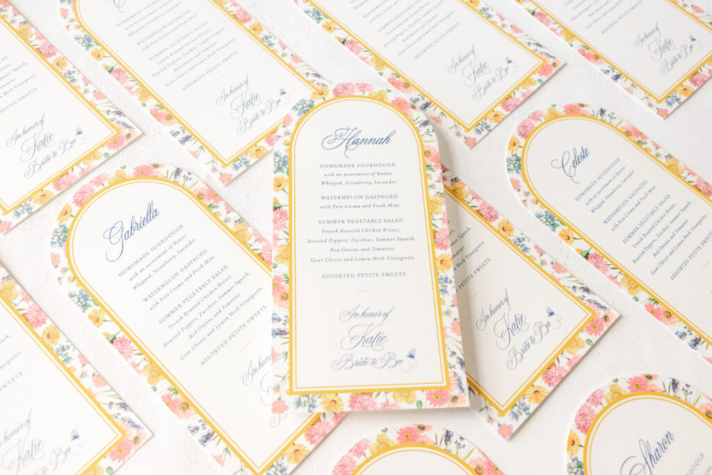
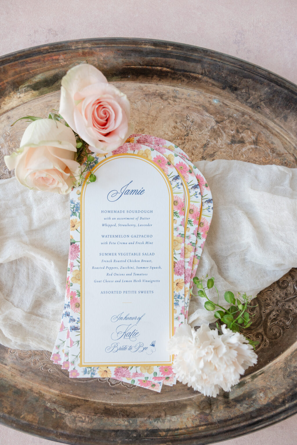
A sweet design with a touch of whimsy and a polished, refined edge has us enamored of these bridal party invitations. The coordinating menus are equally charming and feature a personalized touch for each guest. These invitations, celebrating the bride-to-be, came to us from our friends at Great Events.
A charming bee motif on the envelope’s exterior sets the tone for these garden party invitations. The honeycomb pattern grounds the design while adding a modern, geometric structure. The fresh and modern double-line arch border separates the background from the text, creating an airy, open feel. Soft florals along the bottom break up the crisp lines of the background and the rounded top of the border. The clever ‘bride to bee’ text and the bride’s name appear in a swooping script font that is both elegant and romantic and has a slightly vintage vibe.
The arch frame from the invite also appears on the menu, providing consistency between the printed pieces. This time, the garden-inspired floral artwork is transformed into a background. A die-cut shape mimics the border’s gentle curve. Each guest’s name is printed on the menu, allowing the card to serve as a placecard as well.
Invitation
digital inks: charcoal + goldenrod + cmyk
fonts: juliette script + vendetta
paper: bella smooth cotton 2-ply white
card size: a-7
envelope liner: custom pattern in goldenrod digital
envelope: spruce text
envelope addressing: charcoal digital on the front and the back
job: 77059
Menu
digital inks: royal blue + goldenrod + cmyk
fonts: vendetta ot light/light italic + bp juliette regular
paper: bella smooth cotton 1-ply white
card size: 4.5” x 9.19”
die cut shape: cd-216
job: 78116
Darling honeybee accents and floral flourishes give these garden party invitations a playful, nature-inspired look that is perfect for a bridal shower. Do you want to include accents on the envelope that offer a sneak peek of the design? Or day-of pieces that reflect the theme while also featuring a personalized touch? Work with one of our dealers to create your perfect bridal shower party invitations.
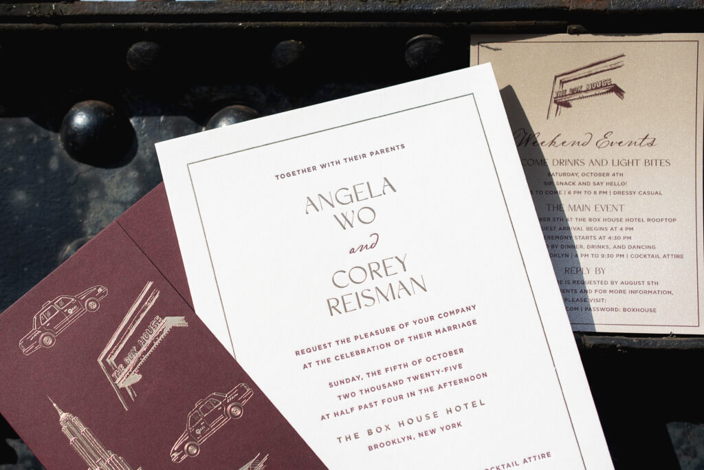
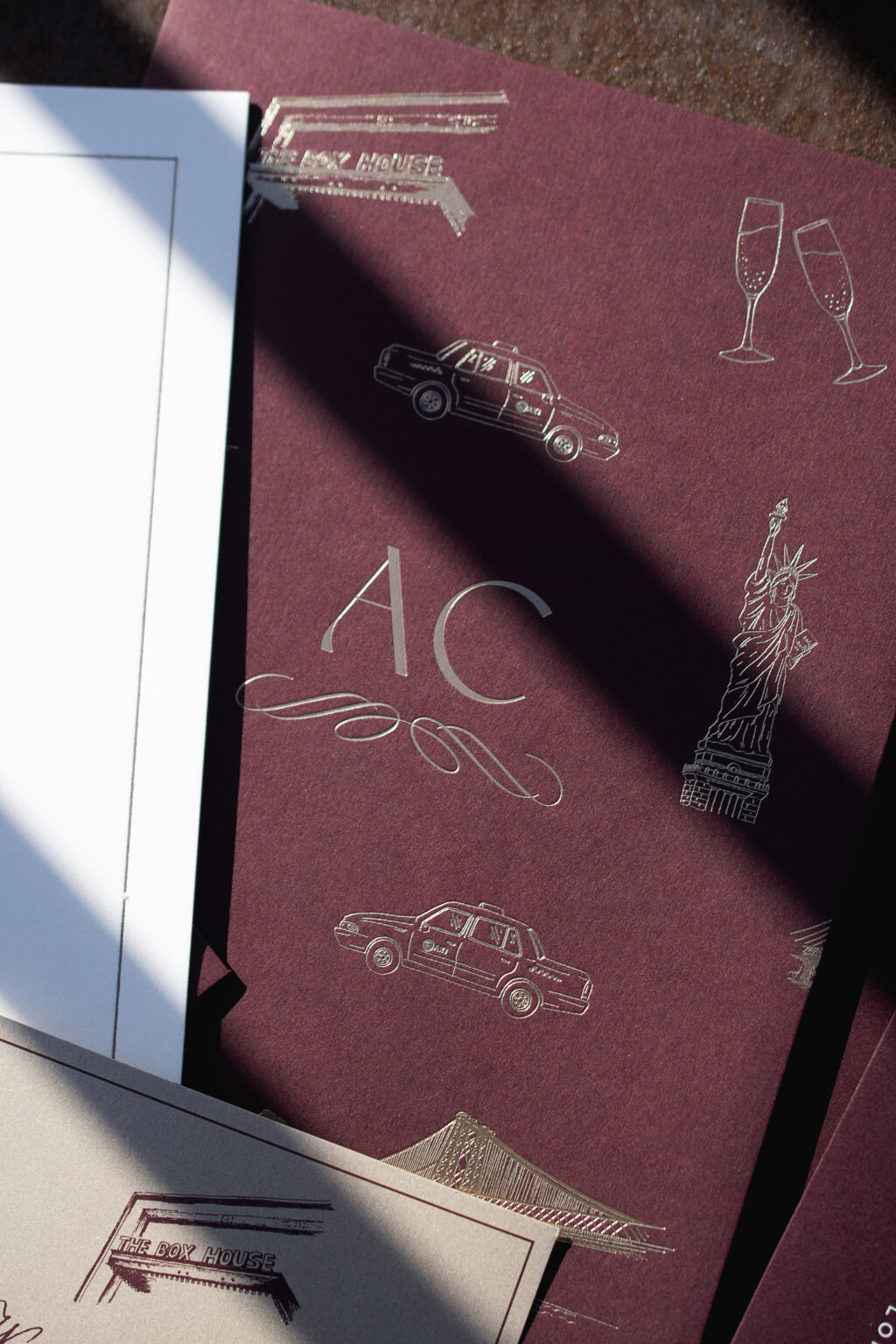
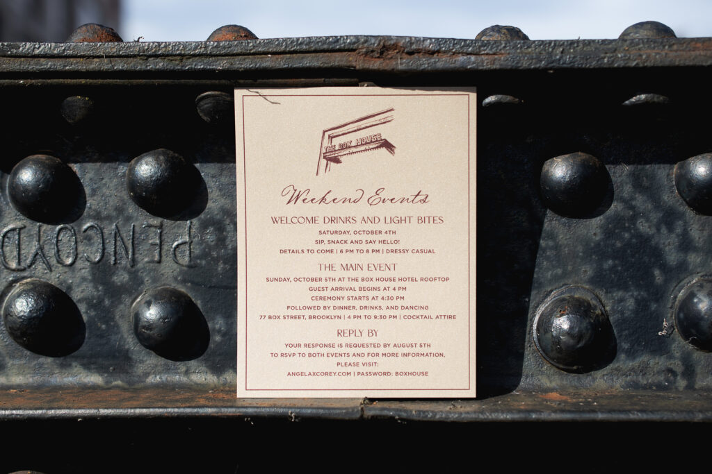
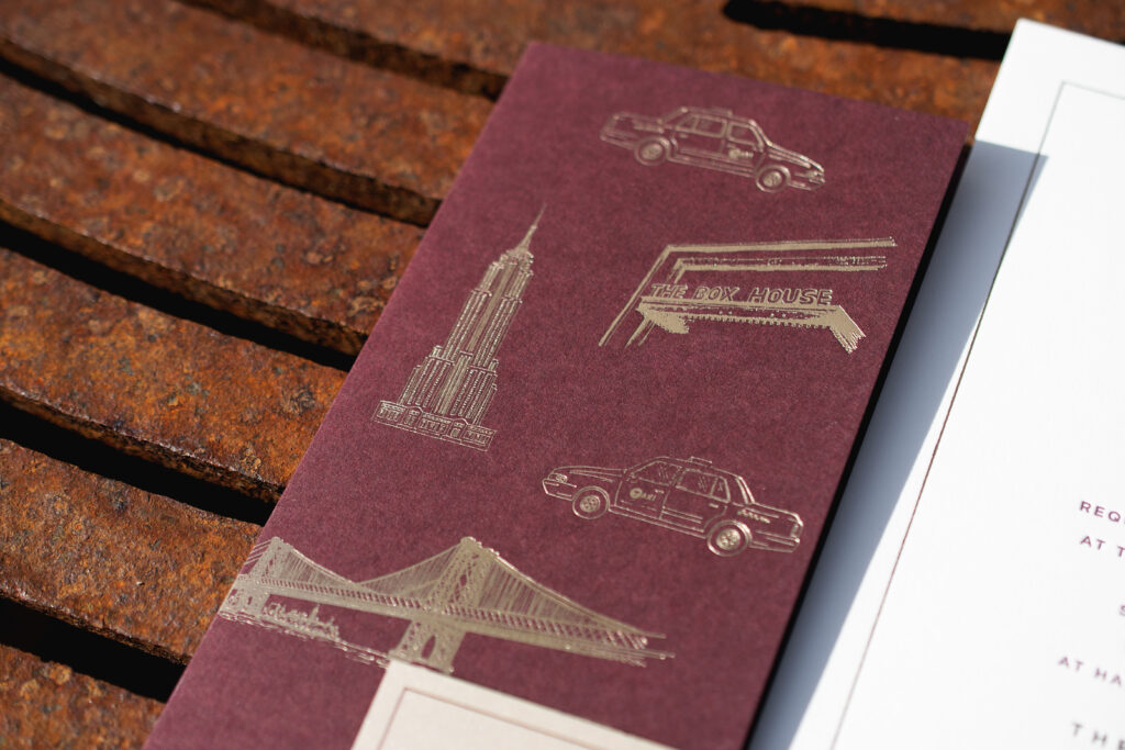
Angela and Corey’s wedding stationery boasts refined elegance with a metropolitan edge. The look is both glamorous and deeply personal. We worked with this lovely couple at our New York City store to create their custom NYC-inspired wedding invite and an equally charming gatefold wrap.
The invitation features our deep, rich bordeaux letterpress ink and mink matte foil on our 2-ply Smooth Cotton paper. This color combination adds warmth and drama and exudes an upscale feel. The sleek typography lends the invitation a daring, modern look, while the thin line border balances the design with a sense of formality.
envelope addressing: white digital on the front and the back
job: 76323
The details card features digital printing on our metallic sand paper for a subtle shimmer. An illustration of the venue, The Box House Hotel, is centered at the top.
The gatefold wrap is a stunning addition to this stationery set. Line illustrations of classic NYC architecture and icons, including the venue artwork from the details card, are expertly placed to create a one-of-a-kind pattern. This pattern is foil-stamped onto the gatefold. The couple’s initials appear on the back of the gatefold for a romantic, personalized touch. The look is distinctive and full of personality. The gatefold feels like a love letter to NYC, which is the setting for Angela and Corey’s love story.
We can create custom illustrations based on your vision, or you can browse our extensive collection of motifs to find the perfect artwork for your wedding stationery.
This NYC-inspired wedding invite is full of unforgettable charm, intimate details, and iconic style. It was a pleasure to work with Angela and Corey, and we wish them the best. We would love to work with you to create your dream wedding invitations!
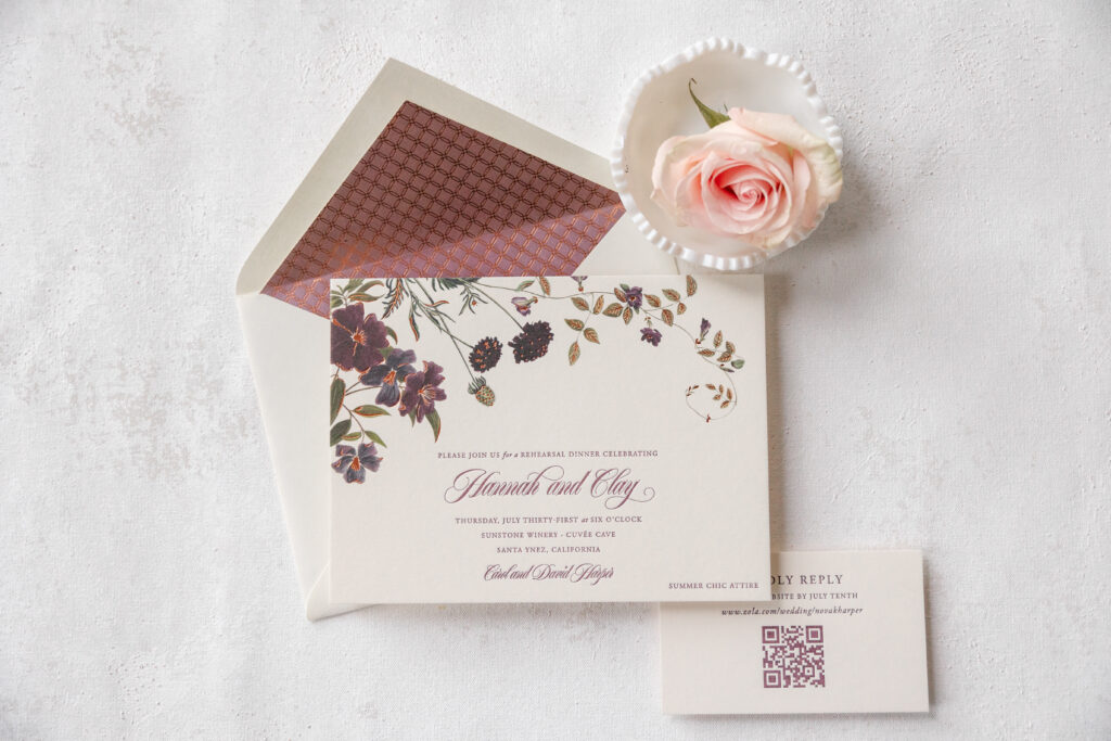
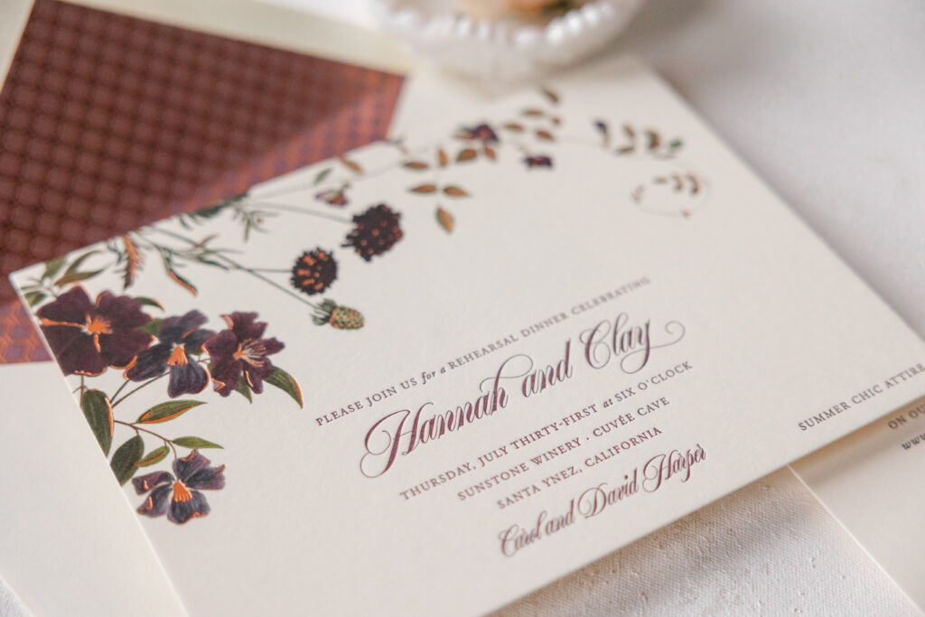
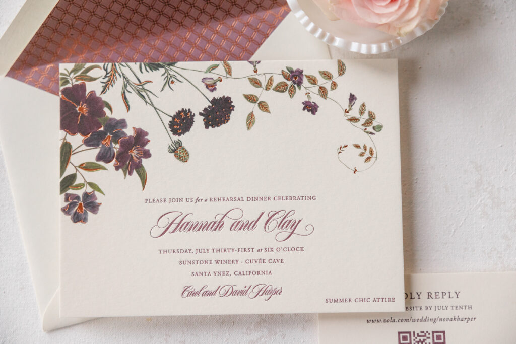
Delicate botanical illustrations, highlighted with foil accents and a rich, dramatic color palette, are perfectly blended into this romantic invitation set. Hannah and Clay worked with our dear friends at Needle In A Haystack to customize our Arden design.
Deep plum and muted purple tones give the invitation a vintage feel, while the copper foil accents add a layer of warmth and luxe shimmer. The asymmetrical floral framing keeps it organic and airy, creating an effortlessly chic feel.
Typography plays a huge role here; the sweeping script font for the names feels elegant and romantic. A classic serif font provides balance and keeps everything polished.
Invitation
letterpress ink: marsala
foil stamping: copper matte
digital ink: cmyk
fonts: adobe garamond + erotica small script
paper: bella smooth cotton 2-ply ivory
card size: f-8
envelope liner: hector pattern (#9) in copper matte foil over marsala digital on ivory text
envelope: ivory cotton text
envelope addressing: marsala digital on the front/marsala letterpress on the back
job: 77402
Reply Card
letterpress ink: marsala
fonts: adobe garamond + erotica small script
paper: bella smooth cotton 2-ply ivory
card size: 3” x 5”
job: 77402
The envelope liner features an intricate geometric pattern in copper matte foil, overlaying a digital flood of our marsala ink.
This dreamy garden romance invitation set is absolutely lovely. Arden, the inspiration design, has since been retired, which means we no longer maintain samples, but you can still choose it and customize the look to fit your vision. We can help you create the wedding invitation of your dreams whether you’re in love with vintage florals, foil accents, or geometric envelope liners. Work with us or one of our dealers to create your wedding stationery.
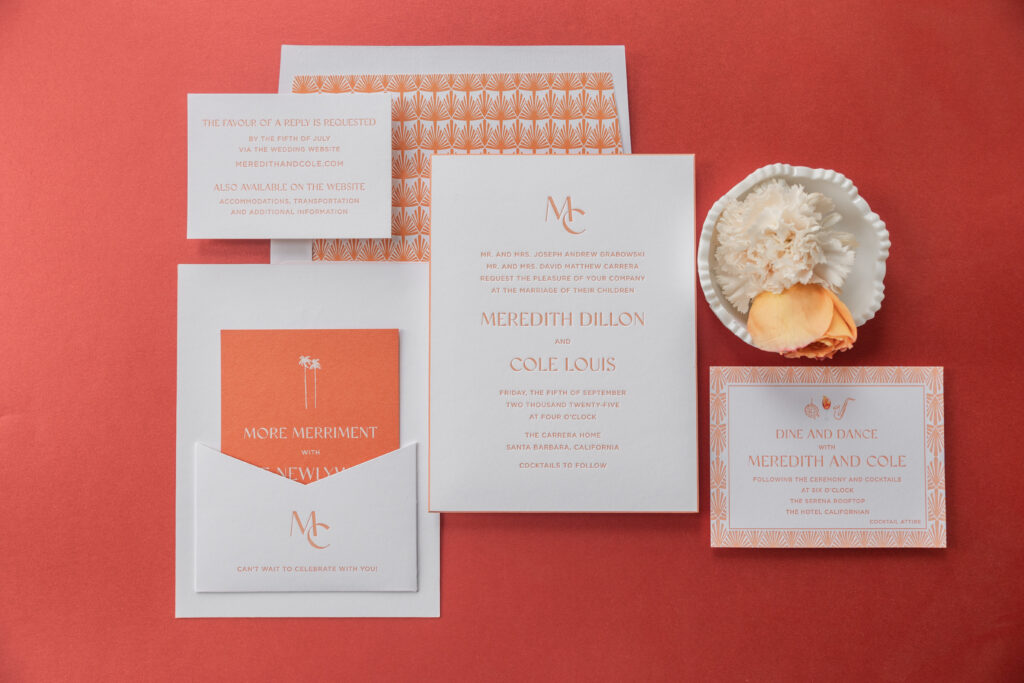
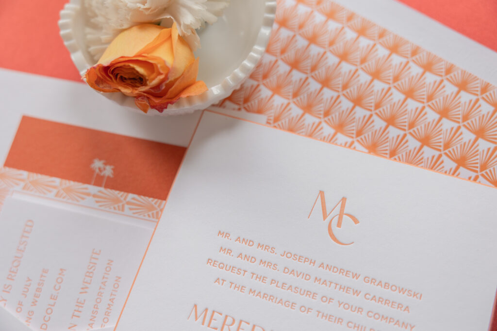
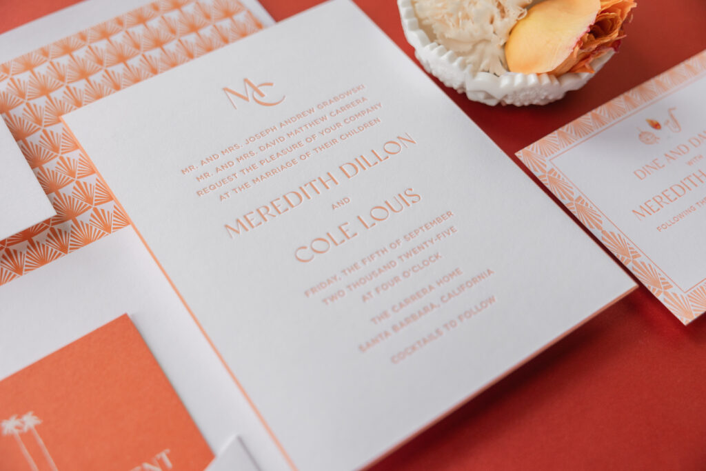
This invitation set is a masterclass in Art Deco glamour, with a subtle hint of sun-soaked California vibes. A back pocket adds function while adhering to the look. Meredith and Cole worked with our dear friend Judy of Papers Plus to design their bold Art Deco letterpress invitations.
Invitation
letterpress ink: persimmon
fonts: gotham + classico
paper: bella smooth cotton 2-ply bright white
card size: f-8
bevel edge: 45-degree
edge paint: persimmon
finishing: assemble with the back pocket
envelope liner: gatsby pattern in persimmon digital on bright white text
envelope: bright white cotton text
envelope addressing: persimmon digital on the back
job: 76597
Back Pocket
letterpress ink: persimmon
fonts: gotham + classico
paper: bella smooth cotton 1-ply bright white
card size: a-7 vertical back pocket
die-cut shape: ps-516
finishing: assemble with the invitation
job: 76597
Our persimmon letterpress ink is warm, especially when paired with our bright white Smooth Cotton paper. Our Smooth Cotton paper has a satiny feel and holds a striking letterpress impression. The typography is elegant and streamlined, blending refined lettering with crisp, modern spacing for an upscale look. A minimalist monogram adds a personalized, polished touch. Persimmon edge painting highlights the gentle slope of the beveled edge.
A geometric fan pattern for both the envelope liner and the border of the reception card perfectly embodies the Art Deco feel and creates consistency across the cards.
Reply Card
letterpress ink: persimmon
fonts: gotham + classico
paper: bella smooth cotton 1-ply bright white
card size: a-5
job: 76597
Reception Card
letterpress ink: persimmon
digital ink: cmyk
fonts: gotham + classico
paper: bella smooth cotton 1-ply bright white
card size: a-2
job: 76597
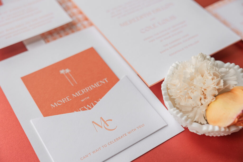
Merriment Card
digital ink: white
fonts: gotham + classico
paper: bella mesa 1-ply
card size: a-2
job: 76597
The merriment card is a fun twist on the design, since it flips the color palette and features white digital printing on our mesa 1-ply stock.
The darling monogram makes a second appearance on the back pocket, which is adhered to the back of the invitation. This pocket creates a spot to stash the auxiliary cards in the suite, ensuring a perfect presentation when guests open the envelope.
This bold Art Deco letterpress invitation suite evokes a retro, old-Hollywood charm and has us dreaming of stylish summer evenings and rooftop parties. Whether you want something vintage-inspired yet modern, or if you love the idea of a back pocket to secure additional cards, we can make it happen. Contact us or work with one of our dealers to create your dream wedding invitations.
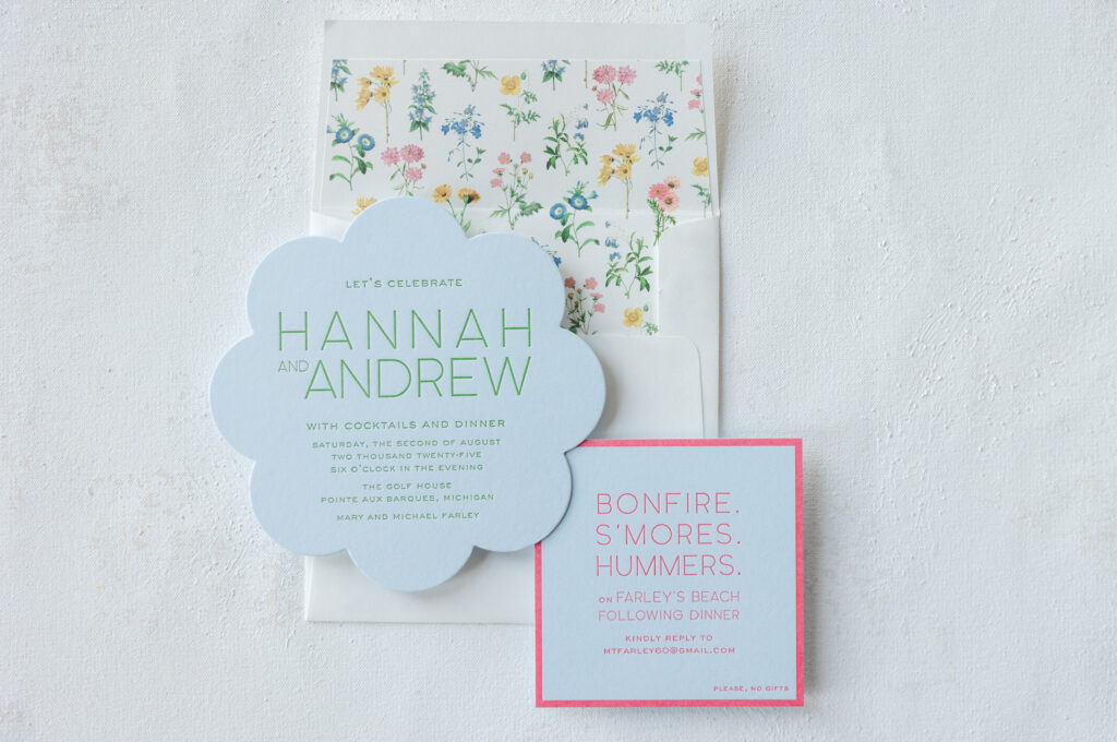
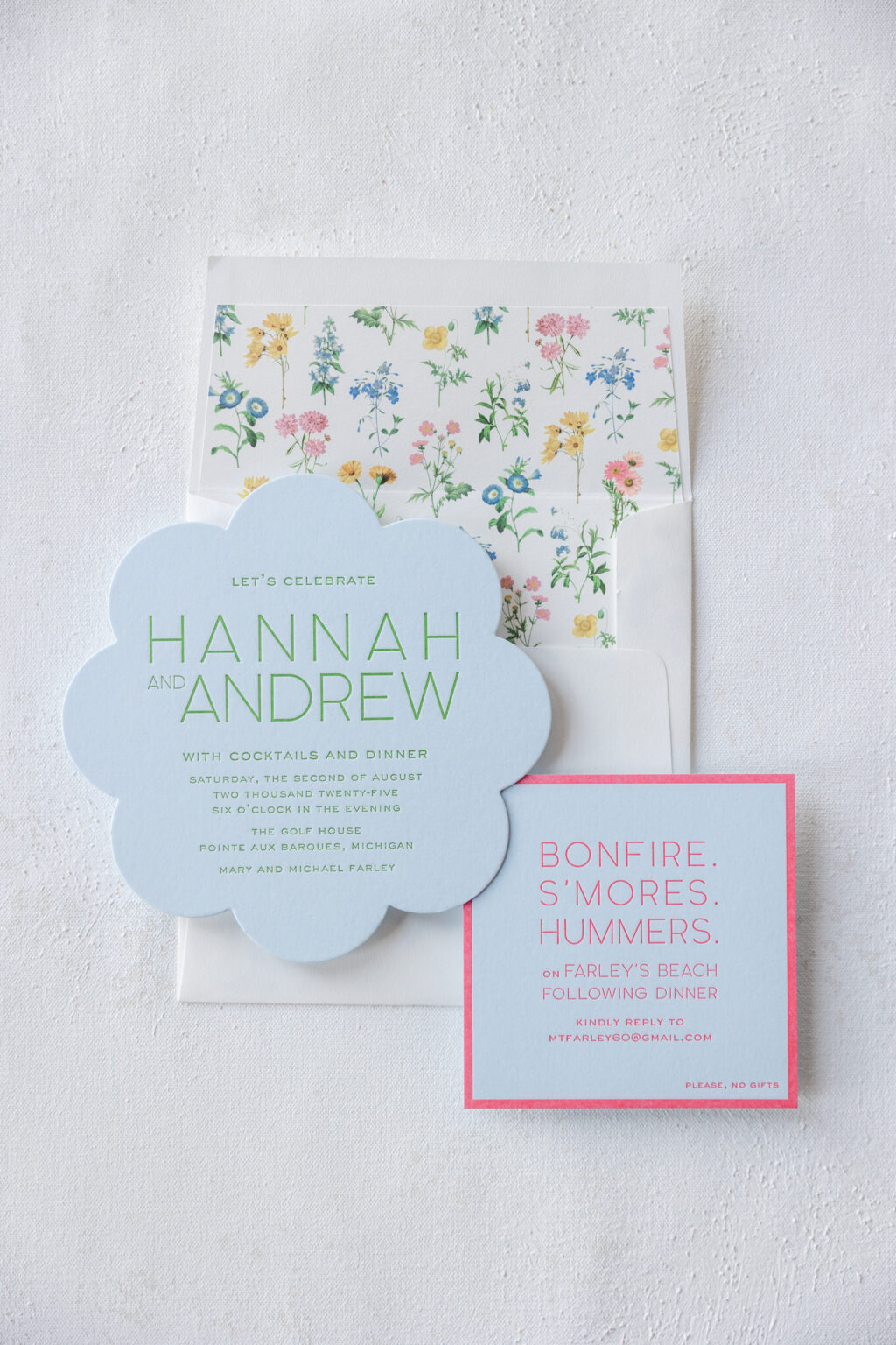
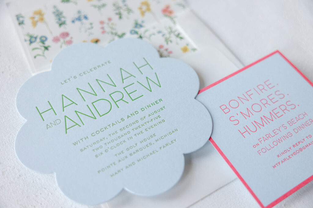
These die-cut rehearsal dinner invitations perfectly capture the excitement and energy of the evening before a wedding. Mary, the hostess, worked with our dear friend Carlyn of Lee’s Paperie to create both a rehearsal dinner invitation and an after-party invitation to celebrate Hannah and Andrew before their big day.
This invitation set drew garden-party inspiration from our Hadaway design in terms of the cheerful color palette and envelope liner, borrowed typography from our Pura Vida design, and included some custom components to round out the look. The vibe is fresh, whimsical, and modern.
Rehearsal Dinner Invitation
letterpress ink: garden
fonts: quartz grotesque + at sackers gothic light
paper: bella sky 2-ply
card size: sq-6
die-cut shape: bf-83
envelope liner: hadaway pattern in cmyk digital on white text
envelope: white cotton text
envelope addressing: garden digital on the front and the back
job: 76324
After Party Invitation
letterpress ink: watermelon
fonts: quartz grotesque + at sackers gothic light
paper: bella sky 1-ply
card size: 4.19” x 4.19”
job: 76324
A scalloped-edge die-cut shape for the rehearsal dinner invitation is bold and unexpected yet adds personality and charm. Minimalist typography balanced the die-cut’s flower shape. Tiny botanical illustrations dot the envelope liner, giving the set a curated feel.
The text of the after-party invitation is laid out to mimic the square shape of the card, while a thick letterpress-printed border adds visual interest. This aesthetic suits a celebration that feels elegant but fun. It’s romantic without being formal, and playful without losing refinement.
This invitation set does an amazing job of mixing components from other designs to create something unique and cohesive. Are you interested in fun die-cut shapes, modern typography, or lovely floral envelope liners? Work with one of our dealers to create the right aesthetic for your invitations.
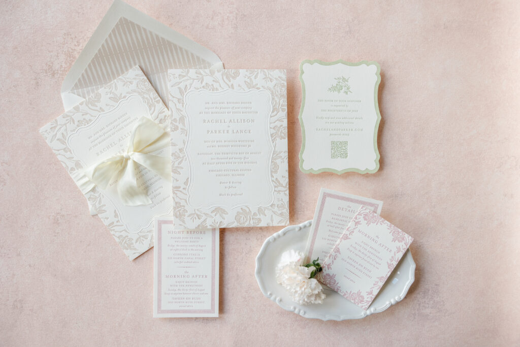
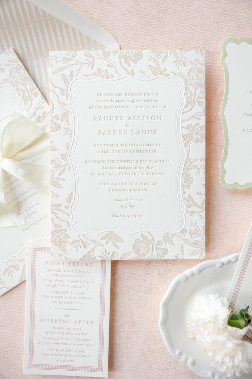
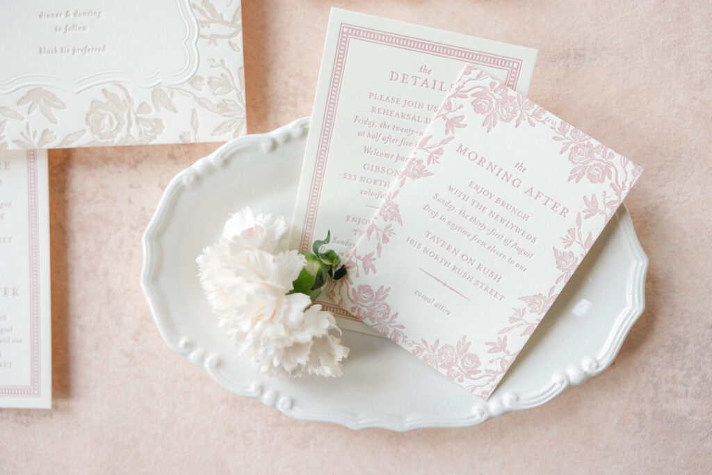
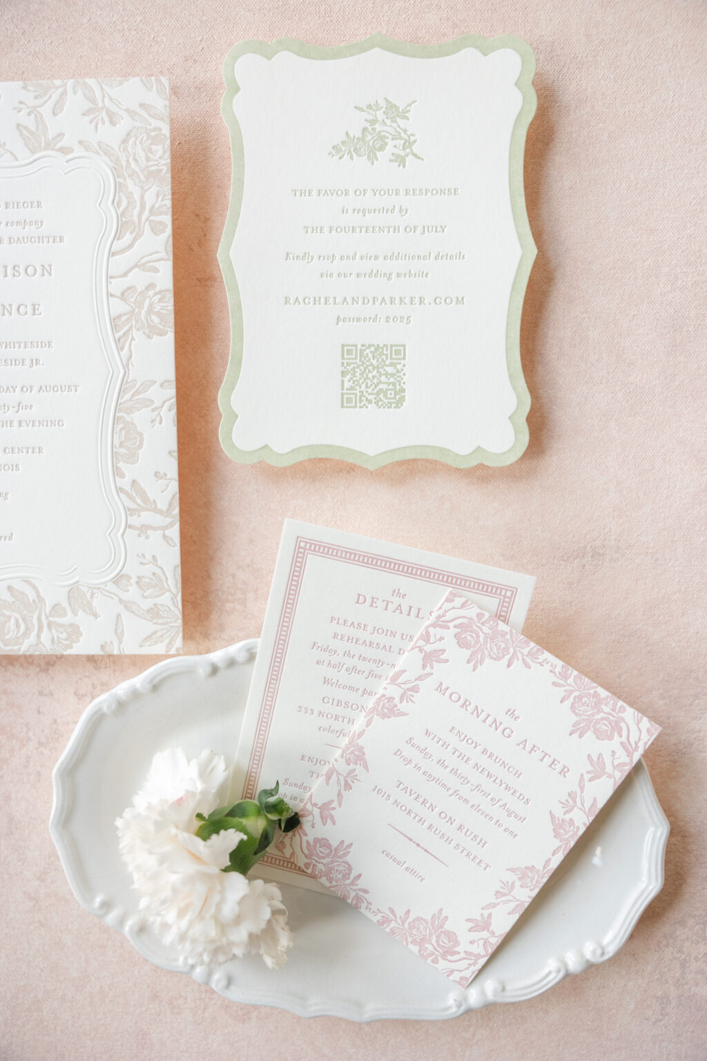
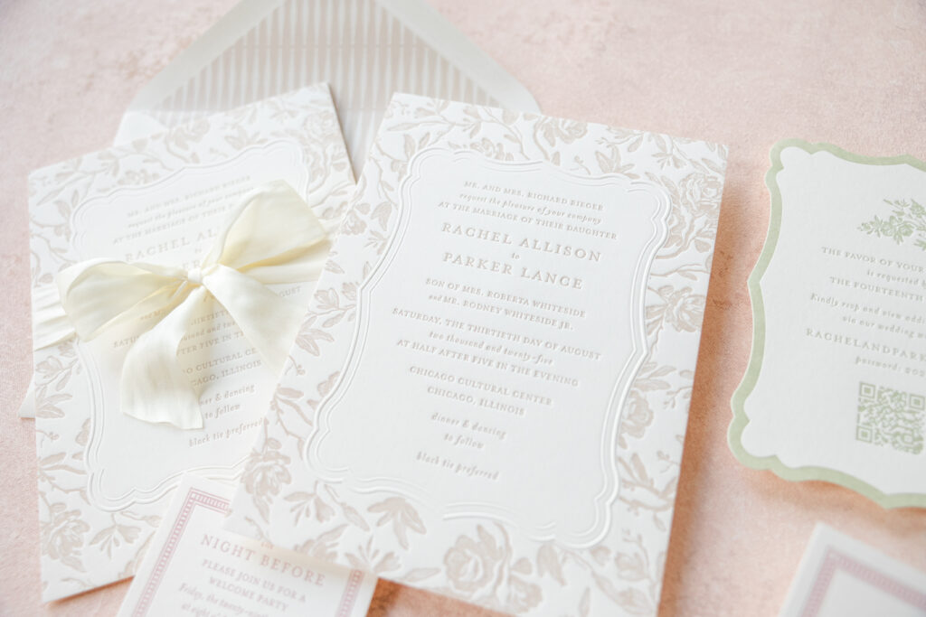
Delicate details, charming florals, and a timeless style are all expertly woven together for Rachel and Park’s wedding stationery. The couple worked with our dear friend Erin of Smitten Boutique to customize our Tristan design and transform it into these romantic letterpress wedding invitations.
Invitation
letterpress ink: khaki
emboss: blind
font: mrs eaves
paper: bella smooth cotton 2-ply ivory
card size: f-8
silk ribbon: ivory buttercream
envelope liner: burklyn pattern in khaki digital on ivory text
envelope: ivory cotton text
envelope addressing: spruce digital on the front and the back
job: 76652
Rehearsal Dinner Invitation
letterpress ink: old ose
font: mrs eaves
paper: bella smooth cotton 1-ply ivory
card size: 3.5” x 5.44”
job: 76652
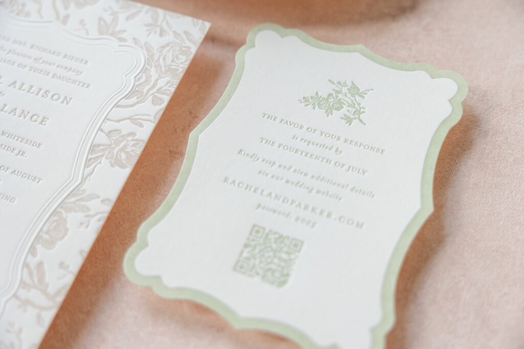
The floral toile pattern from the inspiration design appears as a border on the invitation and brunch card. The border is more organic on the brunch card, while a blind embossed double-line border separates the text from the floral artwork on the invitation. The embossed border shape of the invitation is a recreation of our Charleston die-cut, which is used for the reply card. The thick letterpress border of the reply card follows the gentle curves of the die cut and mimics the invitation’s dual-line border.
The color palette is warm and gentle. The use of a single ink color for each card in the suite is monochromatic and on trend, but it’s also simplified, approachable, and effortlessly classic. The silk ribbon tied in a bow adds a couture touch.
Reply Card
letterpress ink: acadia
font: mrs eaves
paper: bella smooth cotton 1-ply ivory
card size: a-6
die-cut style: charleston
die-cut shape: bf-3
job: 76652
Brunch Card
letterpress ink: old ose
font: mrs eaves
paper: bella smooth cotton 1-ply ivory
card size: a-5
job: 76652
Welcome Party Card
letterpress ink: old ose
font: mrs eaves
paper: bella smooth cotton 1-ply ivory
card size: 3.5” x 5.44”
job: 76652
Everything about this design is graceful and deeply intentional. There is a curated feel to the suite. This job is an excellent example of how you can take one component of a design, such as the floral artwork, and transform it into something drastically different yet equally lovely.
Do you like the idea of recreating a die-cut shape with a blind emboss? Or would a silk ribbon add the perfect finishing touch to your romantic letterpress wedding invitations? Work with us or one of our dealers to create your dream invitations.
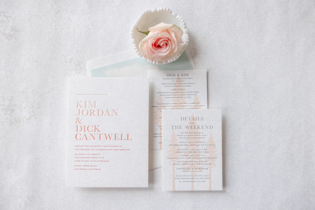
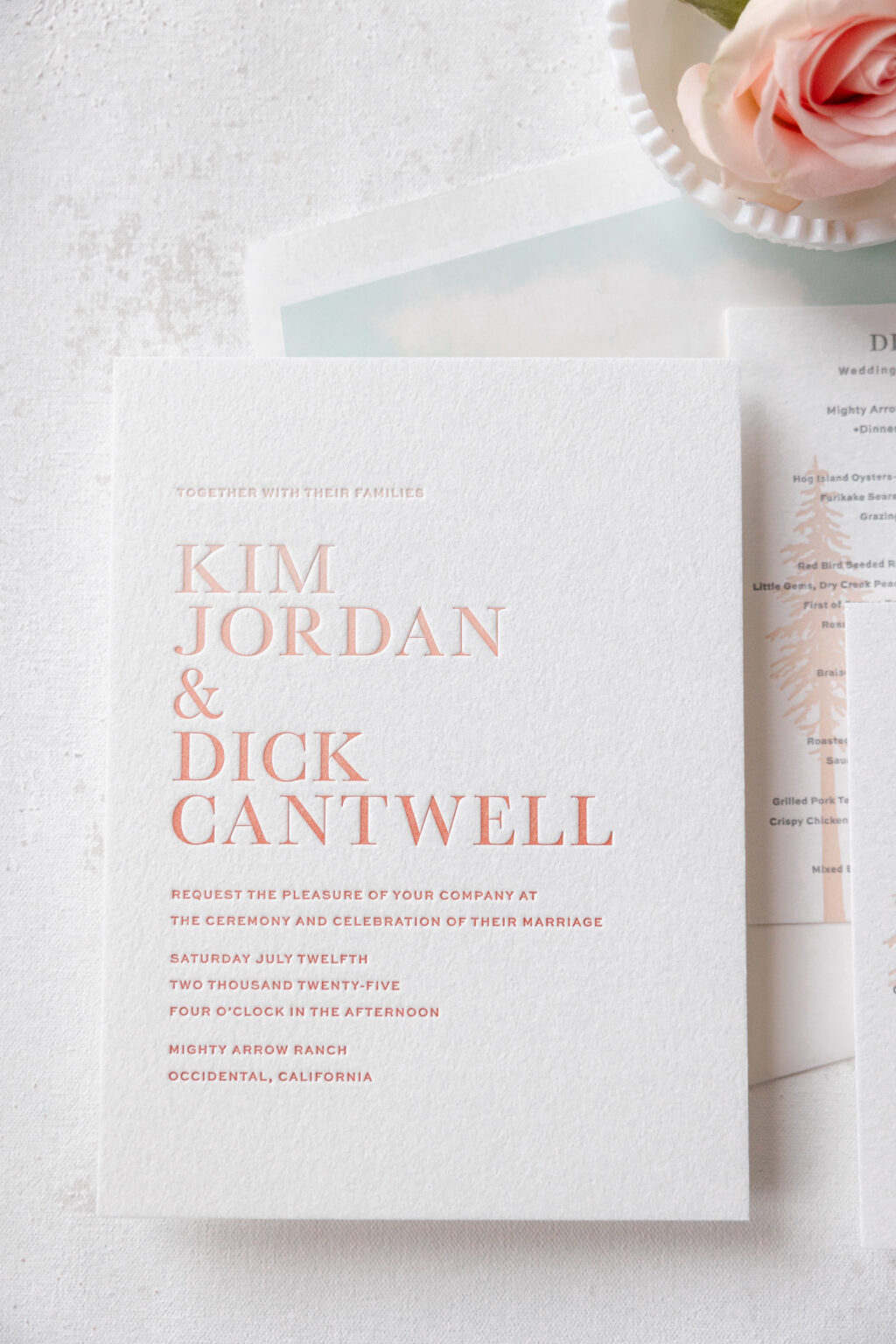
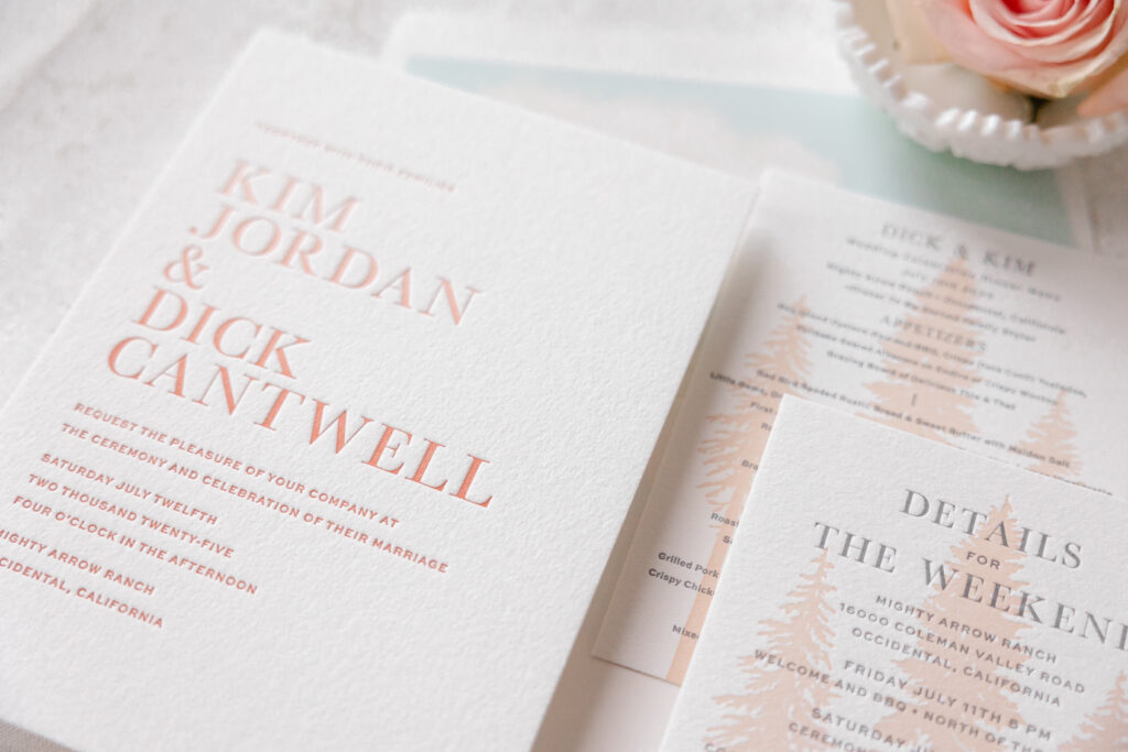
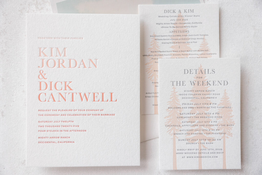
This wedding stationery suite blends timeless formal typography with delicate natural motifs, creating something that feels elevated, romantic, and quietly luxurious. An ombre fade gives these letterpress wedding invitations a modern edge. We helped the couple, Kim and Dick, customize our Bourne V.2 design for their Northern California wedding.
Invitation
letterpress inks: shell + mesa
fonts: manhattan regular + sweet sans regular + sweet sans medium
paper: bella cotton 2-ply white
size: f-8
envelope liner: custom bourne pattern in bellini and sea mist digital on white text
envelope: white cotton text
envelope addressing: mesa digital on the front and on the back
job: 75888
A mix of serif and sans-serif typography anchors the design. Generous spacing establishes a sophisticated presence, while the oversized names create a bold statement. There’s a beautiful contrast between the structure of the text and the softness of the color palette.
Our Bella Cotton paper is lush and pillowlike and holds a crisp letterpress impression, making it the perfect choice for this stationery set. All of the printing is done using an ombre fade technique with our shell and mesa letterpress inks. Shell ink appears at the top, with mesa ink at the bottom. During the printing process, the inks converge near the middle, creating a stunning and gradual transition. There is a slight variation to the fade as the cards are printed, ensuring each invitation is unique.
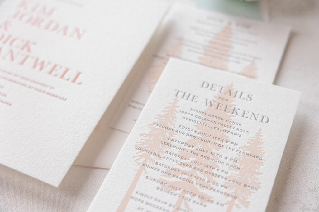
Details Card
letterpress inks: charcoal + bellini
fonts: manhattan bold + sweet sans medium
paper: bella cotton 1-ply white
size: a-6
job: 75888
Menu
letterpress inks: charcoal + bellini
fonts: manhattan bold + sweet sans medium
paper: bella cotton 1-ply white
size: a-6
job: 77545
The details card and menu feature an identical design, which we think was an excellent choice because the look is so lovely. The illustrated coastal redwood silhouettes introduce a subtle rustic element that ties the suite to the venue, the Mighty Arrow Ranch in Occidental, California. Because the artwork is tonal, it feels elegant, setting a more atmospheric vibe.
If you’re dreaming of a nature-inspired design or something fun and unexpected, like an ombre fade, then let’s talk. Contact us to design your perfect wedding invitations.