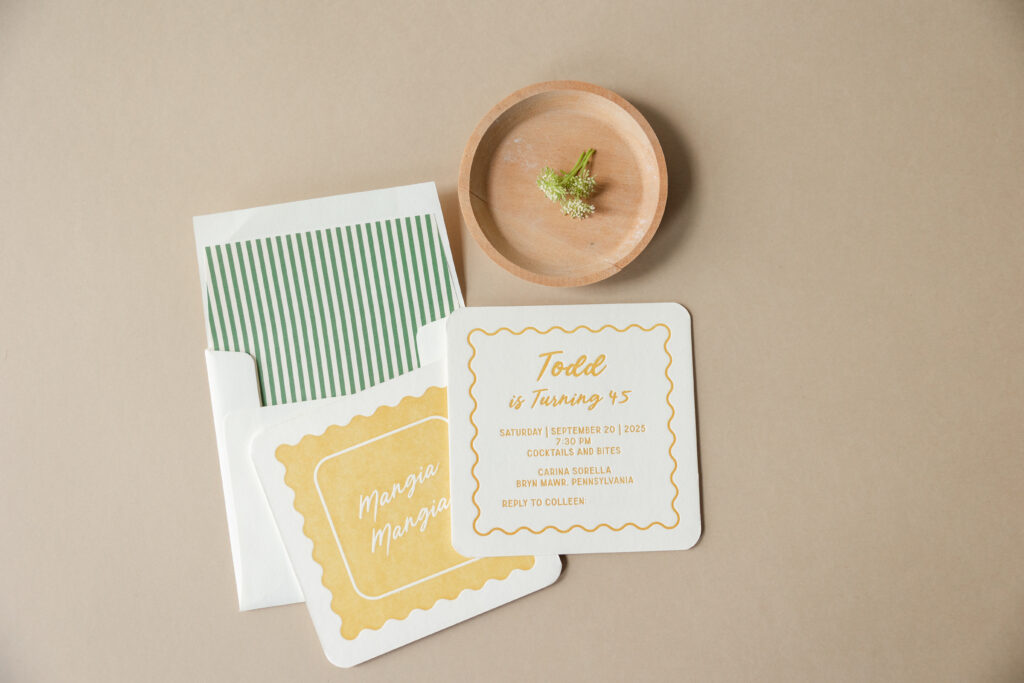
These charming birthday party invitations are pure chef’s kiss. When our friend Colleen of Pen and Paper came to us with this design, we knew the printed cards would be amazing. While this invitation drew inspiration from our Midge save-the-date, the design took a very different yet equally creative and stunning direction.
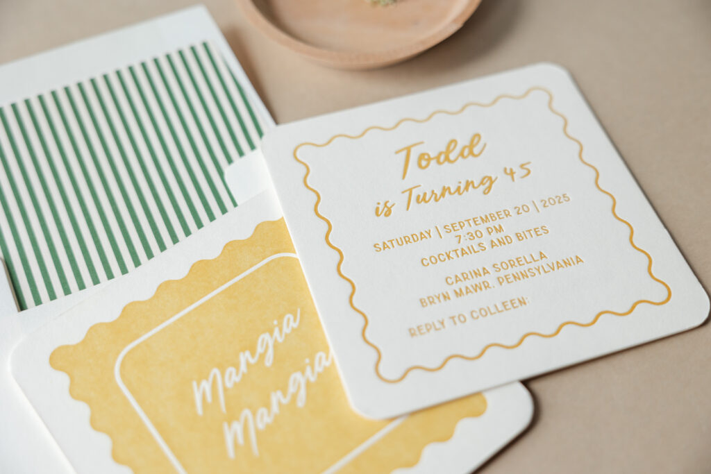
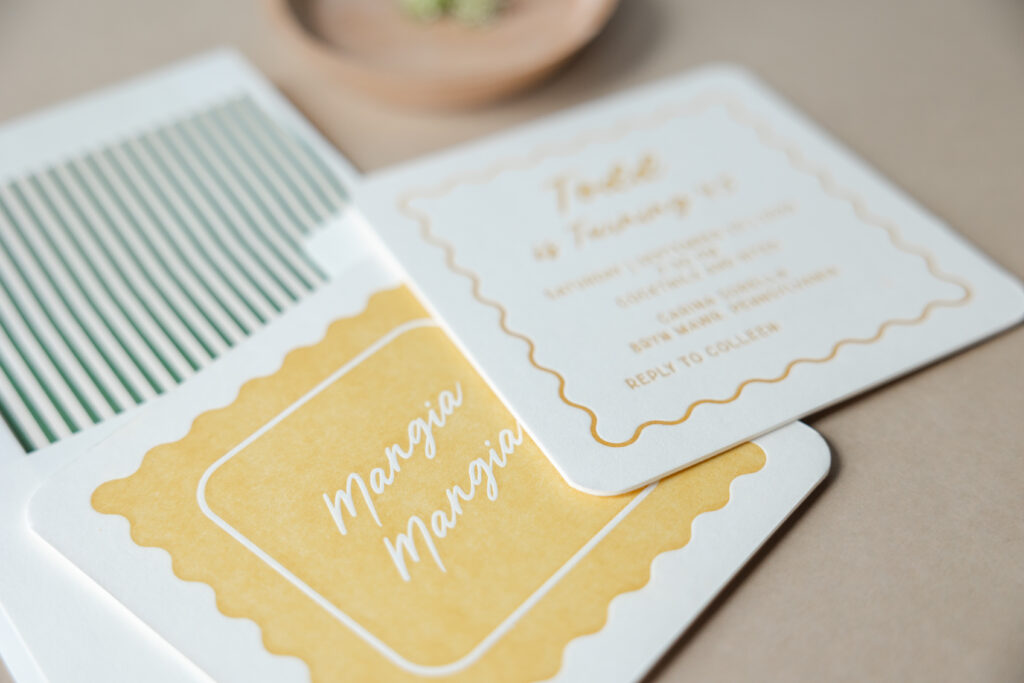
The style is playful and has an effortlessly retro twist. One side bears ravioli-inspired artwork that is fun, whimsical, and minimalist. The other side features the text. A scalloped edge border mimics the shape of the artwork on the reverse side, creating consistency. The typography demonstrates an effortless balance between a breezy script for personality paired with simple, structured sans-serif text to keep it grounded. The soft, rounded corners reinforce that friendly, approachable feel and keep everything casual.
envelope liner: sullivan stripes pattern in vine digital on ivory text
envelope: ivory cotton text
envelope addressing: vine digital on the front/goldenrod and vine digital on the back
job: 77691
Warm goldenrod letterpress paired with our ivory smooth cotton paper gives the invitation a vintage sun-washed vibe, reminiscent of the Italian coast. Our luxuriously thick 3-ply paper lends the invitation a lavish, tactile component. The striped liner adds a subtle preppy touch, giving just enough pattern without overwhelming the clean layout. These birthday party invitations are casual yet curated. They are light, laid-back, and celebratory, and perfect for a gathering involving good food and good company. We hope Todd had an amazing birthday, and we are so happy to have brought this vision to life. Do you have an idea for charming birthday party invitations? Are you interested in finding a balance between sophisticated minimalism and laid-back elegance? Work with one of our dealers to create your perfect invitations.
We worked with our friends at Please and Thank You Paper Co to create this beautiful suite for Emma and Daniel. A supplied family crest pairs perfectly with traditional fonts. Supplied pistachio envelopes are the perfect compliment to the custom color letterpress accents and edge painting. The suite has a timeless elegance, while the pops of light green keep it current.
letterpress inks: pewter + pms 7485u | paper: bella cotton white 2ply + 1ply | fonts: trajan pro + aston script | edges: corner rounded + edge painting in pms 7485u | envelopes: bella cotton white pointed flap + supplied pistachio euro flap | customization #66310
We worked with Slightly South to help bring these spruce and ruby letterpress rehearsal dinner invitations to life. The couple opted for rounded corners which brought a softness to the set. A border filled with whimsical illustrations added a touch of playfulness while the font remained classic and easy to read. They paired a matching reply card with a single illustration motif added to keep everything consistent. Their envelope liner using our dune pattern brought a geometric element into play.
We love the way Claire and Brenden infused pops of cobalt blue throughout their country club wedding – from the ink on their Leigha Spring invitation suite right down to the shoes of the groomsmen! Their outdoor ceremony had an amazing view of Phoenix, Maryland and their cake featured fresh hydrangeas reminiscent of the ones on their invitations. Claire worked with The Pleasure of Your Company for her Bella Figura stationery, which featured letterpress printing in cobalt ink on our white Bella Cotton paper, corner rounding, and a beautiful invitation envelope complete with petite dot envelope liners and a decorative floral flap.
We can hardly believe that Bella Figura’s first Design Contest came and went so quickly. Congrats again to all of the winners! Now that the contest has ended, we thought you’d like to see the gorgeous contest winner plaques we sent to the stores that had the top ten designs! Our internal designer Lindsy Aragona created a stunning customization of our Maile design. These beauties are letterpressed in an exciting color combination of sherbet and spring green inks on our 2-ply white paper. Corner rounding adds an extra touch, highlighting the natural curves of the leaves in the design. The wonderful Sarah Hanna is responsible for the stunning calligraphy. The photography in this post features our winners (first place Gus & Ruby Letterpress, second place Social Graces, and third place Union Street Papery).
Our Lush (by Jamie Lea Bertsch ) letterpress wedding invitations go from soft to stylish with this color customization submitted by Lion in the Sun in Brooklyn, NY. Letterpressed in Light Lavender and Charcoal inks on our 2-ply white paper, the design is highlighted with corner rounding and Champagne edge paint. The Reverse Simple Geometrics envelope liner in Champagne ink perfectly compliments the edge painting.
Hey letterpress fans – Happy Birthday indeed! Nothing celebrates another year passing better than a party invite like this customization, courtesy of the lovely ladies at Social Graces in Nashville. When planning her mother’s 70th birthday party, Gretchen wanted an invitation reminiscent of retro Broadway movie tickets. Social Graces altered Jessica Tierney’sPopular Country design to take maximum advantage of the beautiful Norah script by combining it with the Bennington and Popular fonts.
Espresso was the perfect ink to pull off the “old-timey” feel, and the corner rounding embellishment solidified the desired effect of bringing us back to simpler, carefree days of youth.
Madelyn, we hope your 70th year is as beautiful as this invitation!
This design won an honorable mention in our Bella Figura design competition for the first half of 2011. This twice-a-year competition recognizes outstanding and inspired design submitted by our beloved dealers.
In celebration of our October Design of the Month, we wanted to show off this beautiful customization of our Canopy design. It features a vertical orientation and 3-color letterpress on our 2-ply paper, printed in papaya, spring green and cream inks with corner rounding and papaya edge painting. The envelope is lined in papaya and letterpress printed in papaya and cream for a pretty, spring color palette we just can’t resist.
Just a reminder that all custom orders of our Canopy design receive 20% between now and October 29 – don’t miss out!
These letterpress wedding invitations feature a customization of our Anthology design in rich, fall colors. They were letterpress printed in espresso and antique gold inks with corner rounding, showcased in an espresso pocketfold. A bright cardinal envelope liner is a pretty coordinating touch for these beautiful fall wedding invitations.