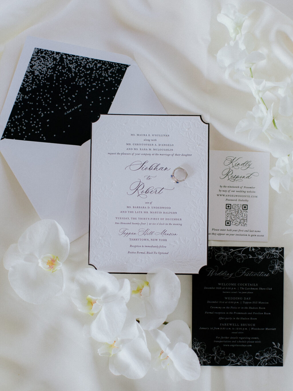
This entire wedding stationery suite effortlessly blends vintage glamour with modern elegance. Our dear friend Jennifer from Max and Maiden Ink assisted the couple, Siobhan and Robert, every step of the way as they created their glamorous New Year’s Eve wedding invitations.
Invitation
letterpress ink: black
deboss: blind
paper: bella smooth cotton 2-ply bright white
card size: f-8
die-cut style: winston
bevel: 45 degrees
edge paint: black
envelope liner: custom pattern in pearl shine foil on bella black text
envelope: bright white cotton text pointed flap
envelope addressing: black digital on the front and the back
job #: 72154
Reply Card
letterpress ink: black
paper: bella smooth cotton 1-ply bright white
card size: a-5
job #: 72154
Details Card
foil stamping: pearl shine
paper: bella black 1-ply
card size: 4.75” x 6.19”
job #: 72154
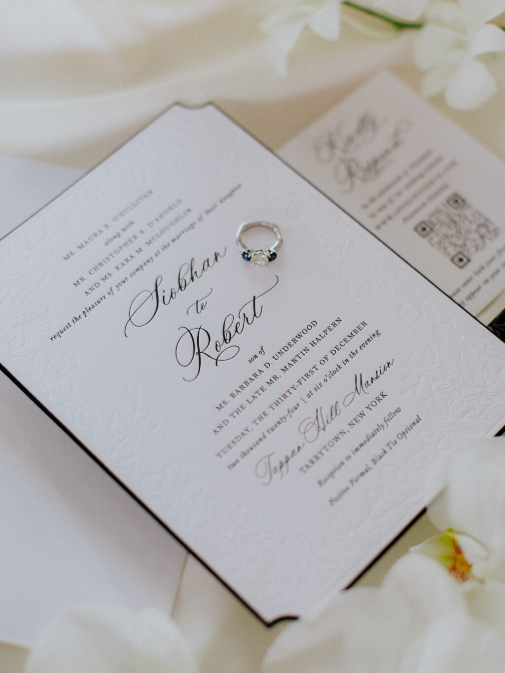
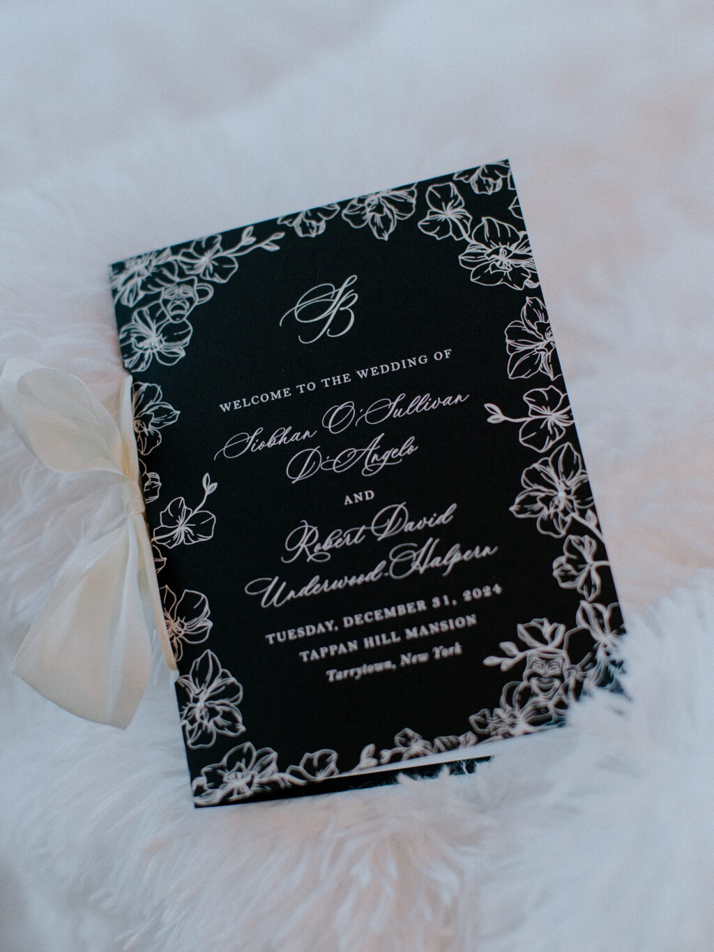
The invitation features an elegant, flowing script font for the couple’s names, contrasting with refined serif typography to create a classic, formal look. An ornate floral border is blind-debossed into our soft, satiny Bella smooth cotton 2-ply. Blind debossing gives the border a minimalist vibe while letting the typography stand out. The botanical border also hides a charming personal detail: comedy and tragedy masks (found in the upper left and lower right corners, respectively). These theatrical symbols appear as a subtle, touching tribute. The same border appears on the program cover, and it’s much easier to make out this detail because of the contrast of white ink on our ultra black stock.
The scalloped corners of our Winston die-cut shape have an architectural feel. The die-cut edges are beveled and painted in black ink, gracefully highlighting the gentle slope. The structure and firm lines of the die-cut beautifully complement the organic feel of the border’s delicate floral line artwork. The same floral artwork frames the details card, ensuring a cohesive feel throughout the suite.
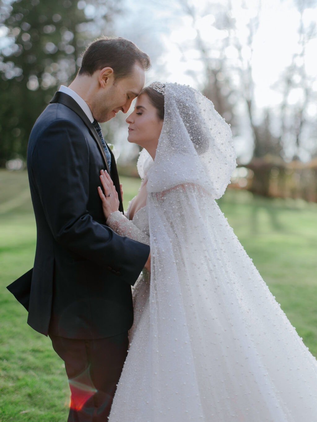
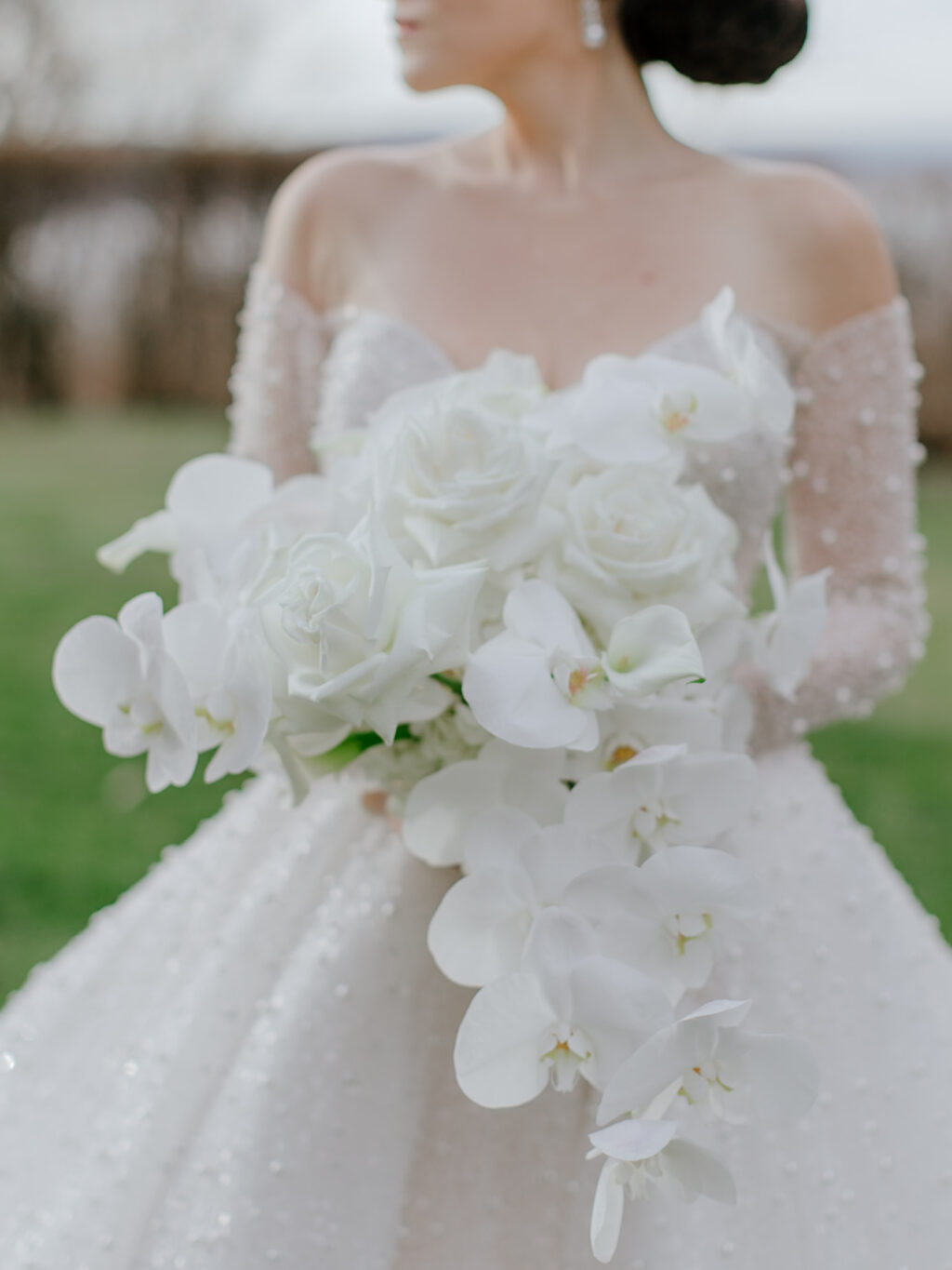
The custom envelope liner mimics the beadwork of the bride’s dress, adding yet another lovely personal detail. Pearl shine foil on black text is dramatic and adds the perfect amount of shimmer.
Program
digital ink: white (cover) / black (interior pages)
paper: bella ultra black 1-ply (cover) / bella bright white text (interior pages)
card size: f-9 folded
hole drill: 0.25”
silk ribbon: mother of pearl
finishing: score and assemble with ribbon, cover, and interior pages
job #: 72154
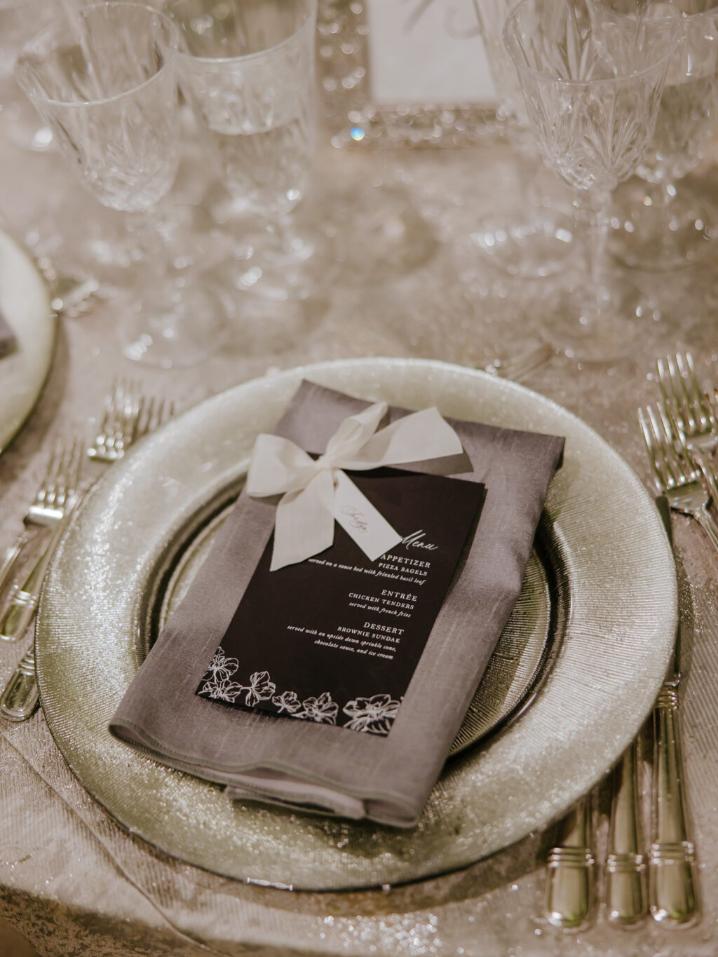
Menu
foil stamping: silver matte
paper: bella ultra black 2-ply
card size: 4.5” x 9”
hole drill: 0.25”
silk ribbon: mother of pearl
finishing: assemble with ribbon and place tag
job #: 74081
Place Tag
digital ink: black
paper: bella smooth cotton 1-ply bright white
card size: 0.75” x 2.5”
die-cut shape: cd-335
grommet: silver
finishing: assemble with ribbon and menu
job #: 74081
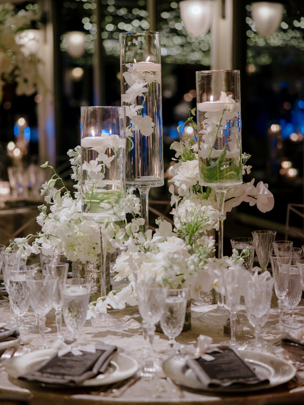
The crisp black-and-white color palette carried throughout this suite is formal and dramatic, and perfect for a New Year’s Eve affair. The look is glamorous and moody, and sets the tone for an intimate, black-tie wedding.
Do you want to incorporate charming personal details into your wedding stationery design? Or do you love the look of a beveled die-cut? Whatever you dream up, we can help make it happen. Work with one of our dealers to create your perfect wedding stationery!
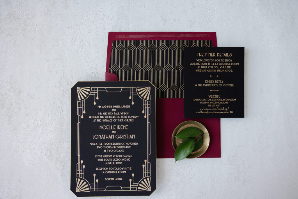
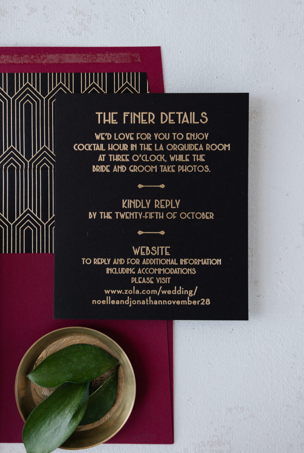
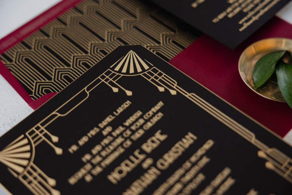
Art Deco glamour with a modern, formal aesthetic and a rich, dramatic color palette had us swooning over Noelle and Jonathan’s invitations. The couple was initially inspired by our Sherah design. While you can still see elements of that design in their invitations, they made some big, bold changes, taking everything in a completely different design direction, and we’re so happy they did because the final result is stunning and lovely. Noelle and Jonathan worked with our dear friend Colleen of Fitzgerald’s Fine Stationery to design their luxe Art Deco wedding invitations.
Invitation
foil stamping: champagne matte
font: metropolis regular
paper: bella ultra black 2-ply
card size: f-8
die-cut style: franklin
bevel edge: 45-degrees
edge paint: metallic gold
envelope liner: sherah pattern in champagne matte foil on ultra black text
envelope: currant text (paper discontinued; our bordeaux is a similar alternative)
envelope addressing: ivory digital on the front and the back
job #: 77807
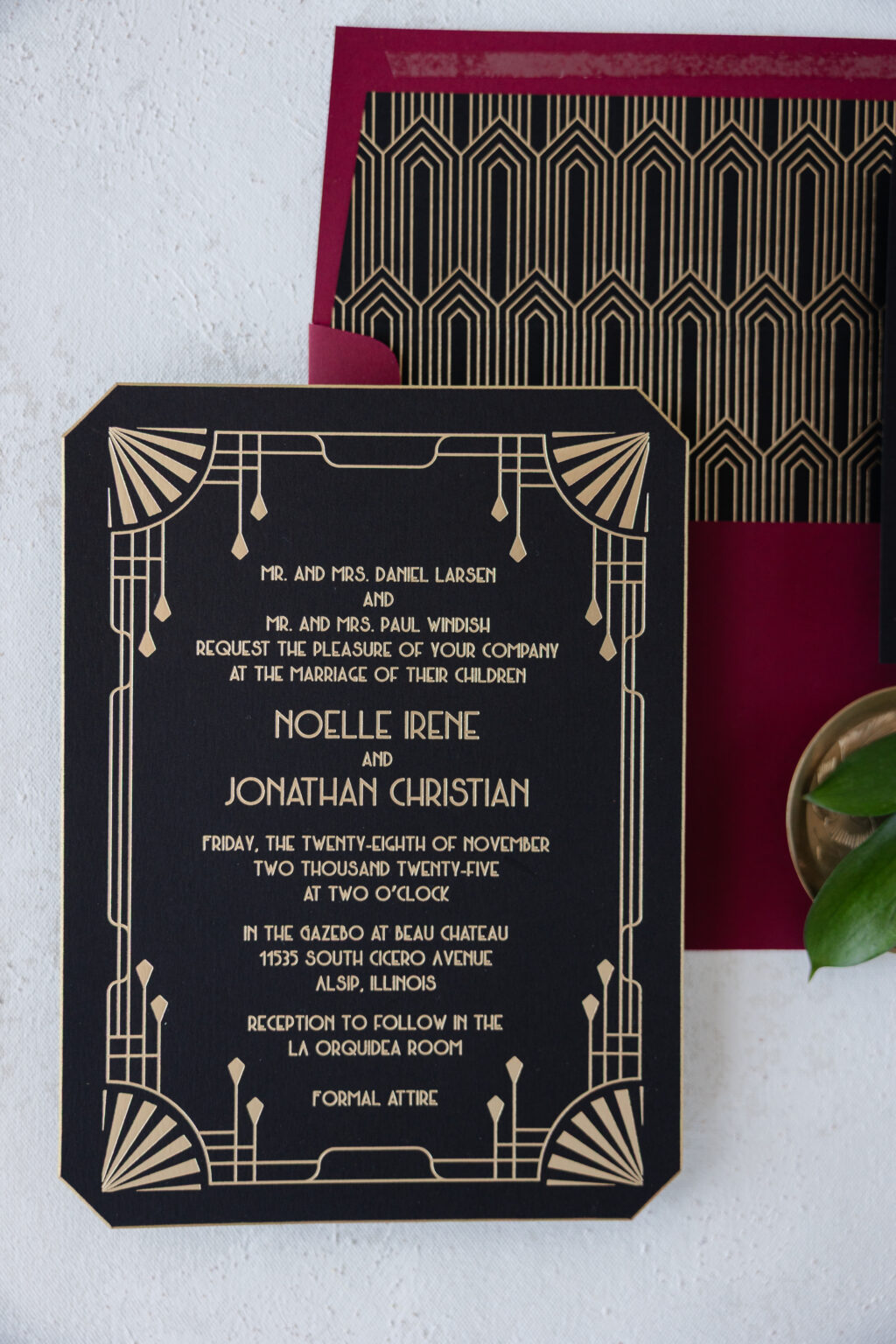
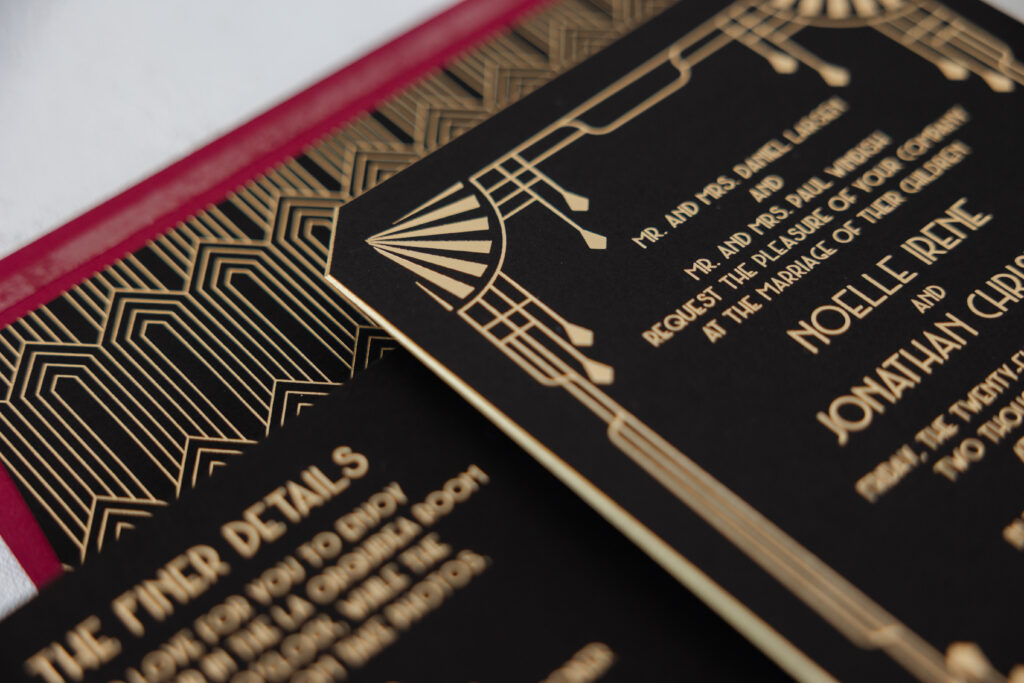
This invitation is full of classic Art Deco elements, from the border’s stepped lines and fan motifs to the envelope liner’s geometric diamond pattern. Champagne matte foil on our ultra black paper delivers shimmer and just the right level of sophistication. The use of one foil color for all of the printing ensures the decorative details stand out.
The narrow, geometric typeface fits the overall look while introducing an elegant symmetry and a slightly theatrical character.
Our Franklin die-cut shape was part of the inspiration design, and perfectly fits the couple’s vision. The edges were then beveled and painted metallic gold, adding an extra luxe detail while maintaining that Art Deco glamour and a vintage vibe.
Details Card
foil stamping: champagne matte
font: metropolis regular
paper: bella ultra black 1-ply
card size: 4.5” x 5.25”
job #: 77807
Despite the vintage inspiration, Noelle and Jonathan’s luxe Art Deco wedding invitations feel contemporary. Do you want something refined and timeless? Work with one of our dealers to create your perfect wedding invitations!
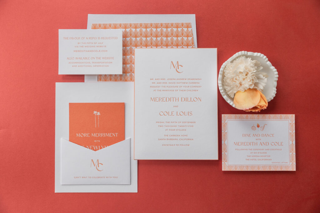
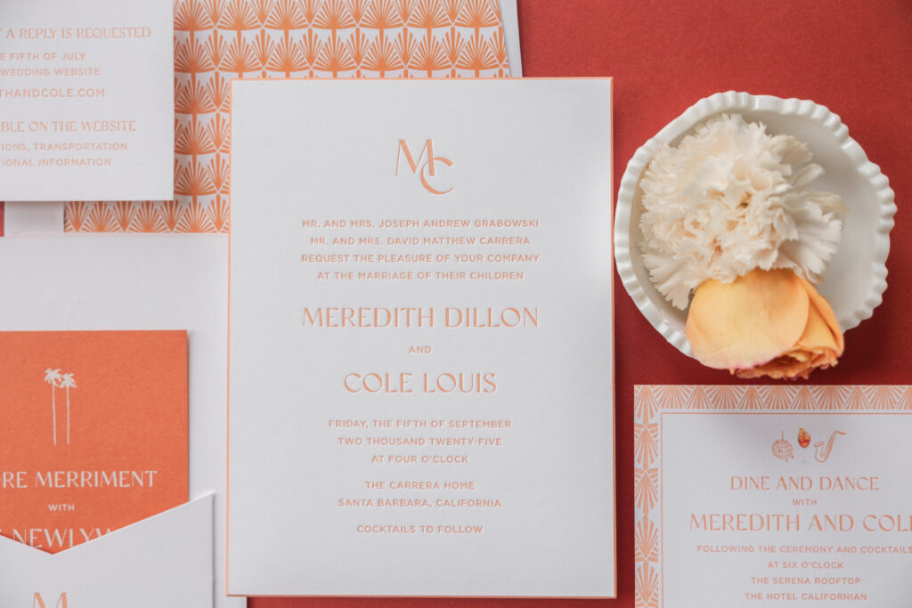
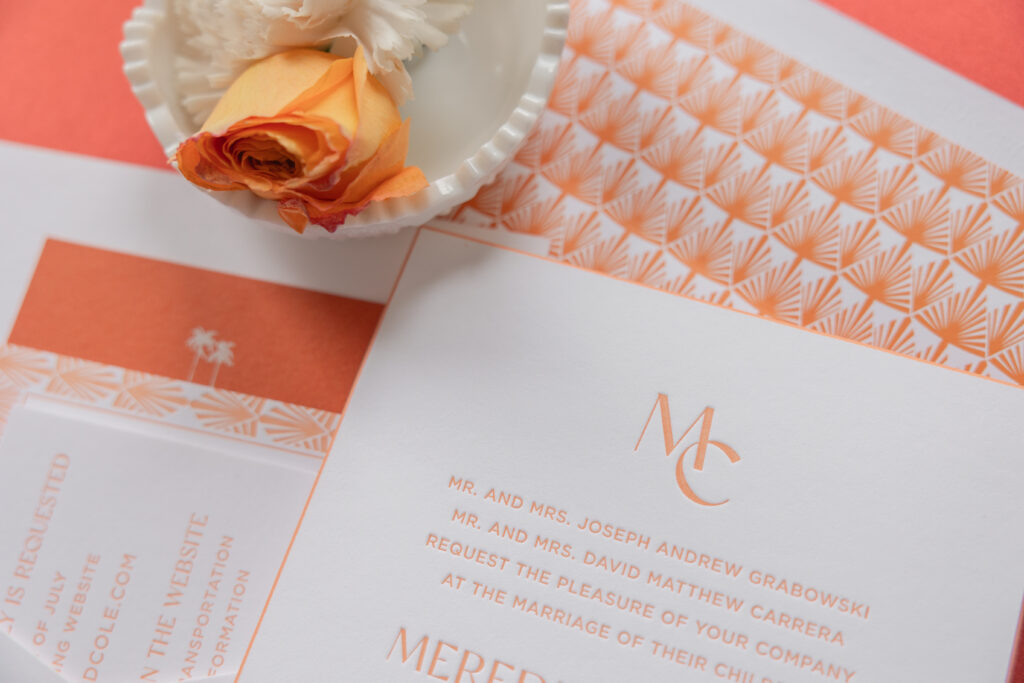
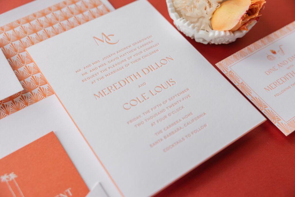
This invitation set is a masterclass in Art Deco glamour, with a subtle hint of sun-soaked California vibes. A back pocket adds function while adhering to the look. Meredith and Cole worked with our dear friend Judy of Papers Plus to design their bold Art Deco letterpress invitations.
Invitation
letterpress ink: persimmon
fonts: gotham + classico
paper: bella smooth cotton 2-ply bright white
card size: f-8
bevel edge: 45-degree
edge paint: persimmon
finishing: assemble with the back pocket
envelope liner: gatsby pattern in persimmon digital on bright white text
envelope: bright white cotton text
envelope addressing: persimmon digital on the back
job: 76597
Back Pocket
letterpress ink: persimmon
fonts: gotham + classico
paper: bella smooth cotton 1-ply bright white
card size: a-7 vertical back pocket
die-cut shape: ps-516
finishing: assemble with the invitation
job: 76597
Our persimmon letterpress ink is warm, especially when paired with our bright white Smooth Cotton paper. Our Smooth Cotton paper has a satiny feel and holds a striking letterpress impression. The typography is elegant and streamlined, blending refined lettering with crisp, modern spacing for an upscale look. A minimalist monogram adds a personalized, polished touch. Persimmon edge painting highlights the gentle slope of the beveled edge.
A geometric fan pattern for both the envelope liner and the border of the reception card perfectly embodies the Art Deco feel and creates consistency across the cards.
Reply Card
letterpress ink: persimmon
fonts: gotham + classico
paper: bella smooth cotton 1-ply bright white
card size: a-5
job: 76597
Reception Card
letterpress ink: persimmon
digital ink: cmyk
fonts: gotham + classico
paper: bella smooth cotton 1-ply bright white
card size: a-2
job: 76597
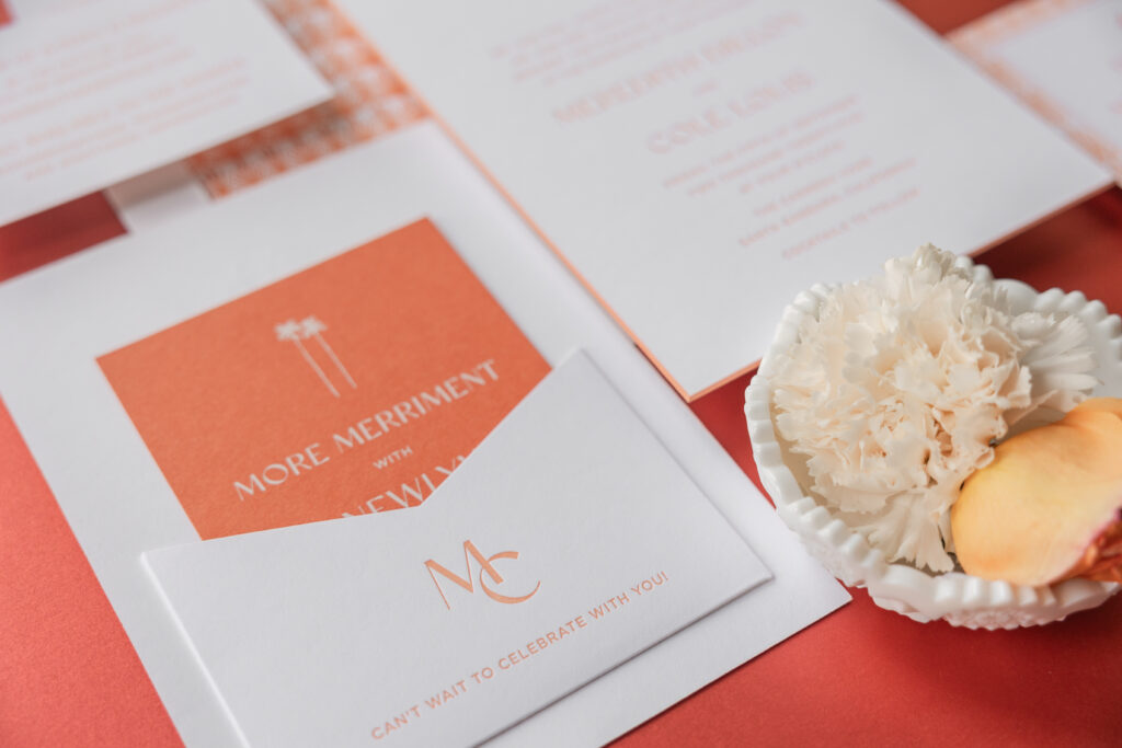
Merriment Card
digital ink: white
fonts: gotham + classico
paper: bella mesa 1-ply
card size: a-2
job: 76597
The merriment card is a fun twist on the design, since it flips the color palette and features white digital printing on our mesa 1-ply stock.
The darling monogram makes a second appearance on the back pocket, which is adhered to the back of the invitation. This pocket creates a spot to stash the auxiliary cards in the suite, ensuring a perfect presentation when guests open the envelope.
This bold Art Deco letterpress invitation suite evokes a retro, old-Hollywood charm and has us dreaming of stylish summer evenings and rooftop parties. Whether you want something vintage-inspired yet modern, or if you love the idea of a back pocket to secure additional cards, we can make it happen. Contact us or work with one of our dealers to create your dream wedding invitations.
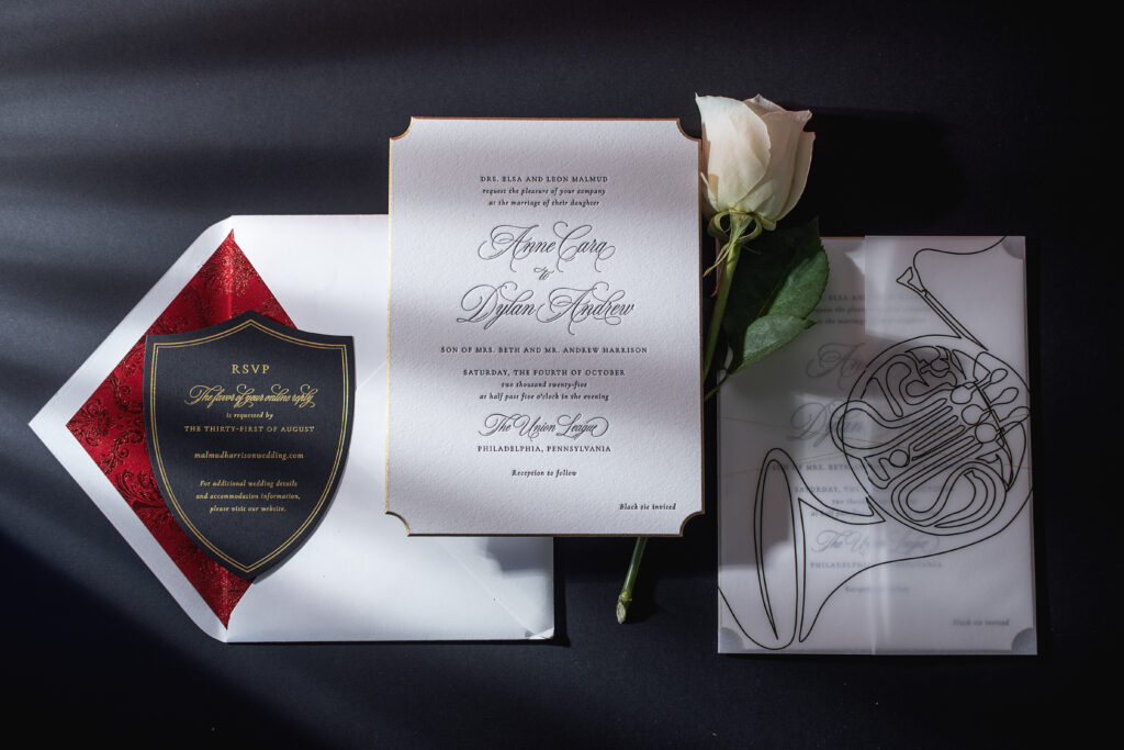
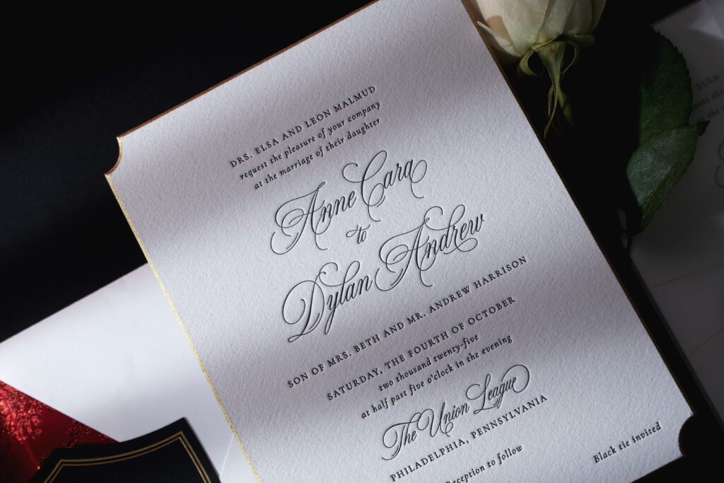
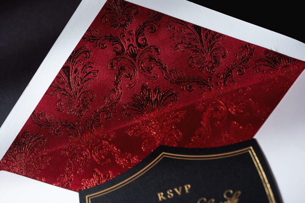
The decadent velvet envelope liner was the first part of this wedding invitation suite to catch our attention. The more we looked at the details that make up Anne and Dylan’s invitations, the more we love this design. The couple worked with our dear friend Colleen of Pen and Paper to create their elegant and formal invitations. This suite is a customization of our Rhea design, and while Anne and Dylan kept many elements from the original, they added sweet details to make it their own.
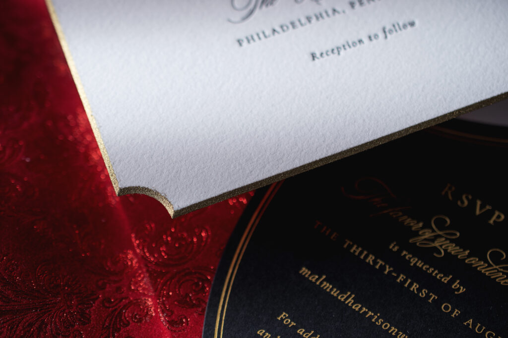
This invitation is perfect for a black-tie event and features classic black letterpress printing in a mix of serif and ornate script fonts. The layout is clean and symmetrical, and proves that less is more. For a touch of glamour, the invitation is die-cut into our Winston shape, and then beveled at a 45º angle, and then edge-painted in metallic gold. All of these embellishments are lovely on their own, but combined together elevate the look in a meaningful and luxurious manner. The shimmer of the metallic gold edge painting highlights the curve of the die cut and the slope of the beveling.
Invitation
letterpress ink: black
fonts: juliette + cormorant garamond
papers: bella cotton white 2-ply
card size: f-8
bevel: 45º
die cut style: winston
edge paint: metallic gold
thread: metallic gold
finishing: assemble with gatefold and thread
envelope liner: eris pattern in red shine foil on tomato velvet
envelope: white cotton text
envelope addressing: black digital on the front / black letterpress on the back
job: 76992
Gatefold
digital ink: black
papers: 40# vellum
card size: f-8 vertical gatefold (8.31 x 12.51 flat, 8.31 x 6.24 folded)
finishing: scored
job: 76992
Details Card
foil stamping: gold matte
fonts: juliette + cormorant garamond
papers: ultra black 1-ply
card size: 4.19 x 5.44
die cut shape: bf-130
job: 76992
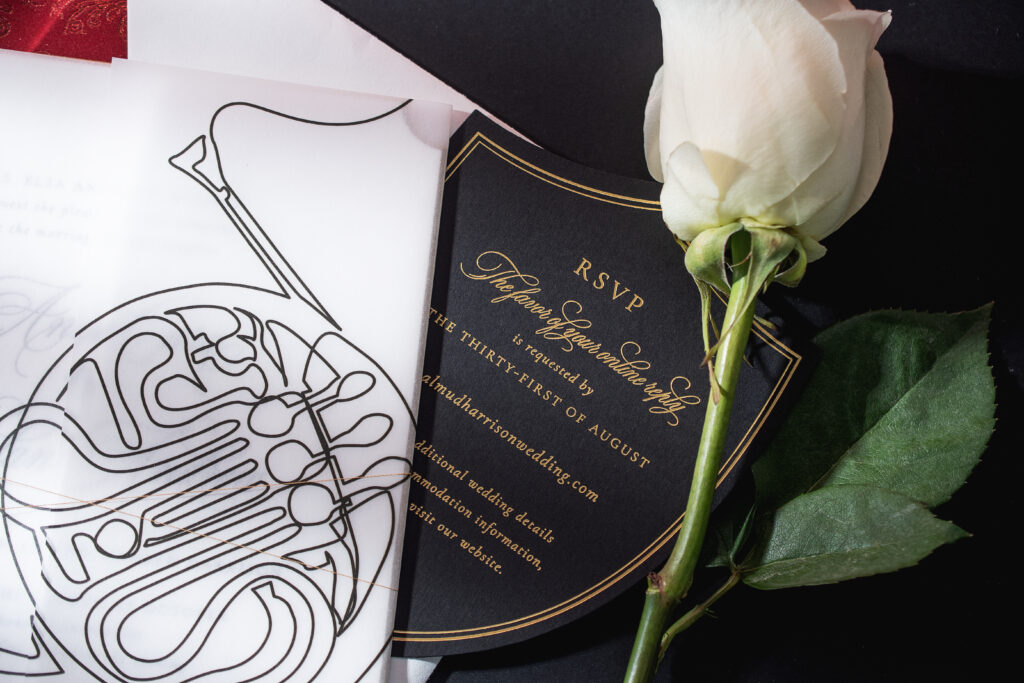
The invitation is wrapped with metallic gold thread for an added glimmer and placed inside a vellum gatefold. Digital printing on the gatefold depicts a continuous line illustration of a French horn.
The velvet envelope liner takes things to the next level. Red shine foil stamping in our Eris pattern on our tomato velvet is peak opulence. The damask pattern introduces drama and a sense of old-world luxury.
Gold matte foil stamping on our Ultra Black stock ensures the details card is aligned with the invitation, while maintaining the regal, romantic, and high-contrast look.
Anne and Dylan’s invitation suite blends classic elegance, luxury finishes, and personalized musical elements to create a look that is timeless and refined yet artistic. It was a pleasure to work on this letterpress wedding invitation with a velvet envelope liner, and it’s always a joy to work with Pen and Paper. Do you want to include velvet or a gatefold in your invitation design? How about a beveled die cut? Our highly skilled dealers can walk you through the process to create your dream invitations. Find a dealer near you or contact us to create your perfect wedding invitations.
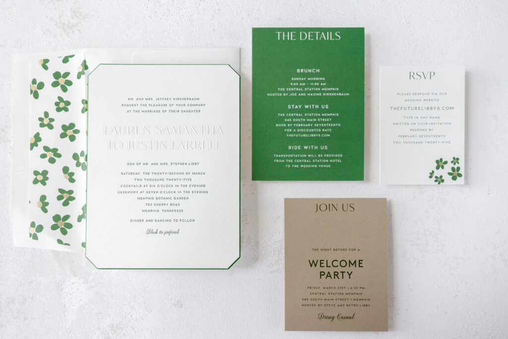
This invitation suite from our dear friends at RSVP in Omaha, Nebraska, features clean lines for a modern, sophisticated look. However, the whimsical liner adds an unexpected yet perfectly coordinated touch of personality. See all the pieces up close and discover what makes this blind embossed wedding invitation so special.
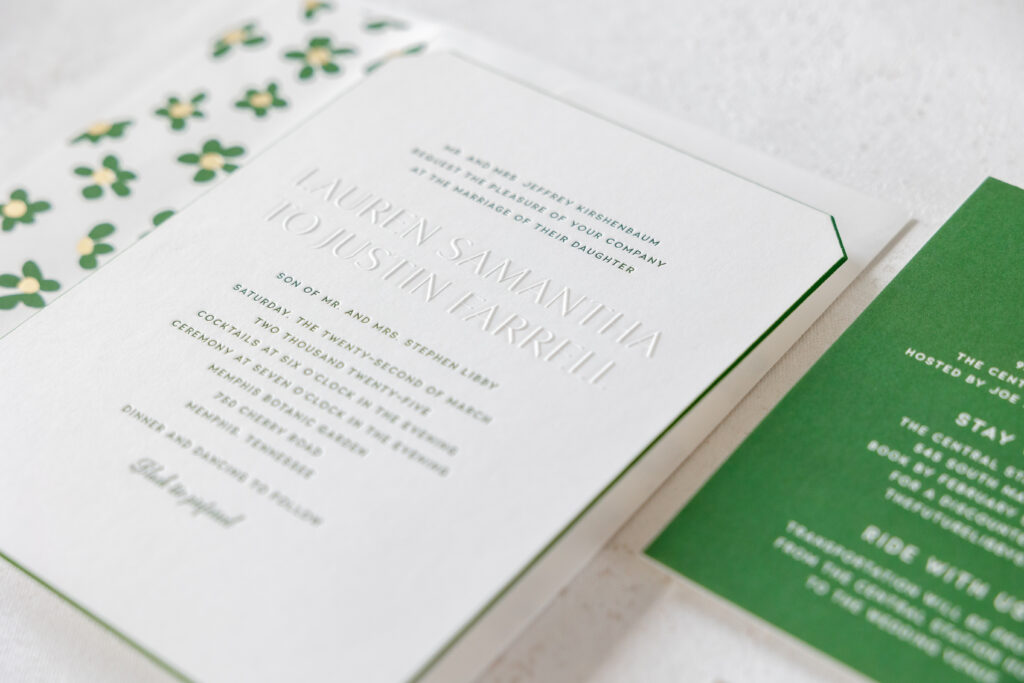
This client’s job is a customization of our Sherah design. At first glance, the final printed piece strongly resembles its inspiration, including the same die-cut shape combined with a beveled and painted edge. This custom wedding invitation swaps out foil stamping for letterpress printing in our vine ink, giving the card a more vibrant and springlike appearance. The bride and groom’s names are still blind embossed. The crisp, raised text provides a stately and sophisticated feel.
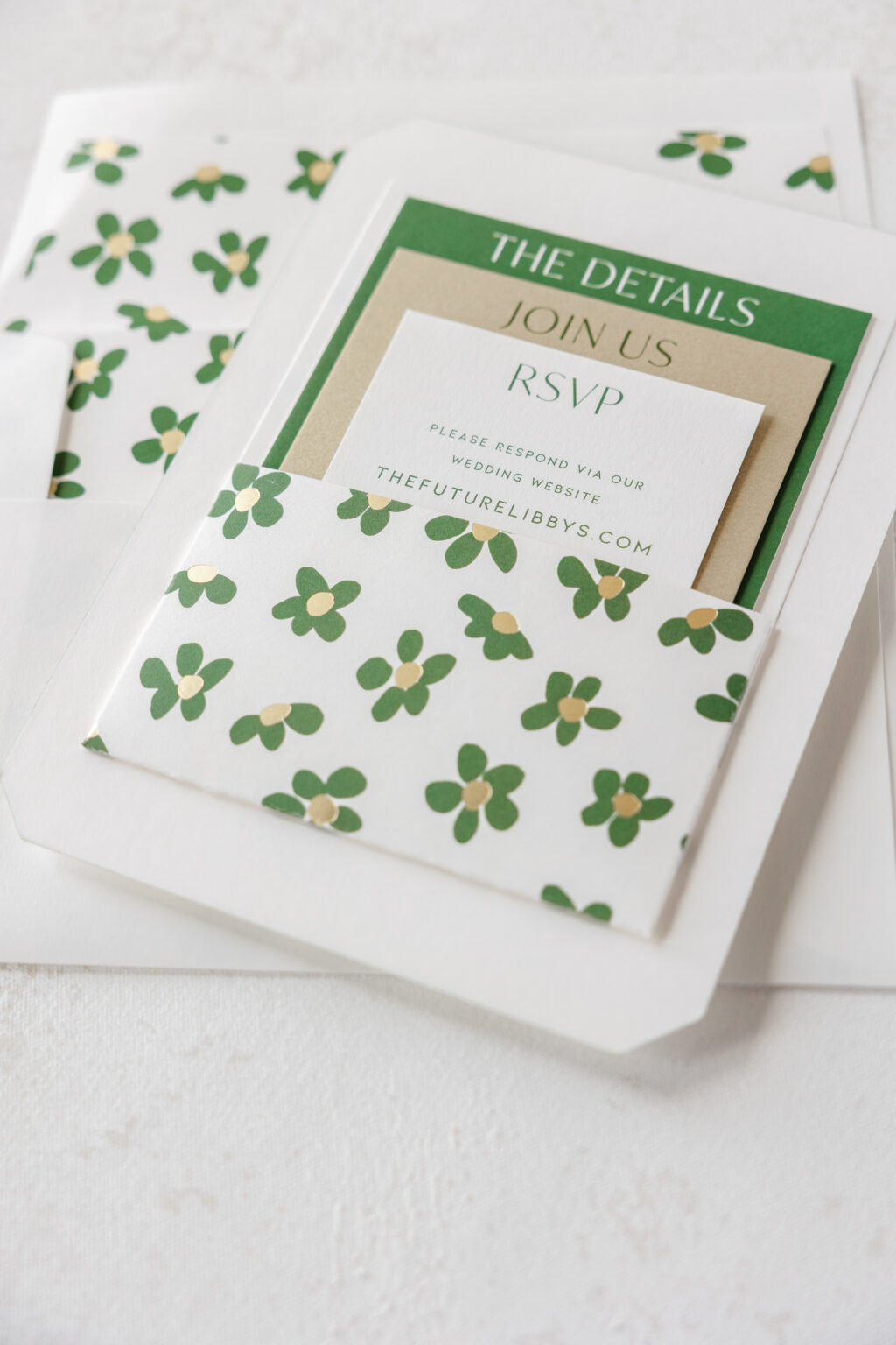
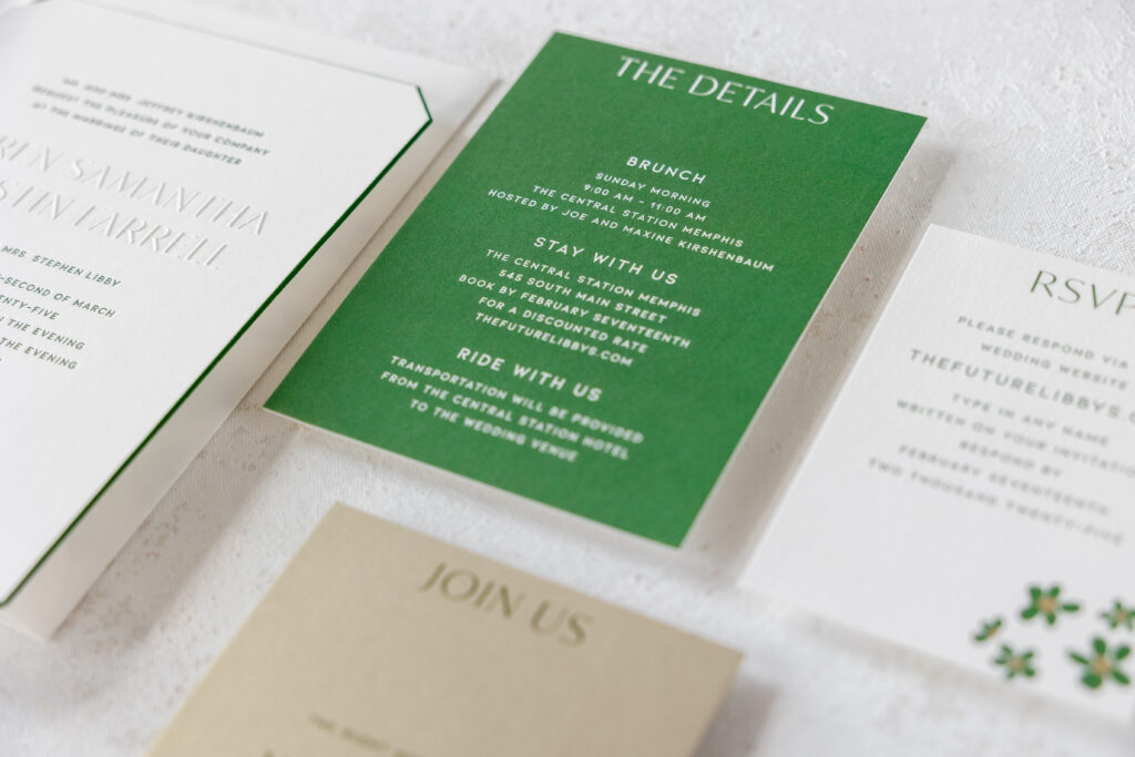
The Quinn liner, a fun floral pattern, replaces the art deco-inspired Sherah pattern featured in the original. The liner adds some whimsy while still maintaining the elegance of the invitation. The foil and digital Quinn pattern is repeated on the belly band and pocket panel, along with a few accent flowers on the reply card.
Invitation
letterpress ink: vine
emboss: blind
fonts: daughter script + kiona + ivy mode
paper: bella smooth cotton white 2-ply
invite size: f-8
diecut: franklin
bevel: 45-degree
edge paint: vine
envelope: f-8 white text
liner: quinn pattern in vine digital + champagne matte
envelope printing: return and guest address in vine digital
job #73441
The original suite had a separate pocket card to secure the auxiliary pieces. One version of the customization features a belly band secured to a mounting card, which is adhered to the back of the invitation to hold the reply card (not pictured). A second version of the suite features a pocket panel adhered directly to the back of the invitation. The larger pocket panel secures the rehearsal dinner invitation, details card, and reply card.
Pocket Panel
foil: champagne matte
digital: vine
paper: white text
size: 6.4235 x 9.5 flat, 5 x 6.5 folded, die-cut card
finishing: assemble and adhere to the back of the invitation
Rehearsal Dinner Invitation
digital: vine
fonts: daughter script +kiona + ivy mode
paper: metallic gold leaf 2-ply
size: a-2
Details Card
invite size: a-6
digital: vine
fonts: kiona + ivy mode
paper: bella smooth cotton white 2-ply
This lovely invitation suite creates the look and feel the couple strove to establish for their wedding. While it does draw heavily from the inspiration design, there are a lot of changes and fun additions that make it completely one-of-a-kind. Reach out to customize your blind embossed wedding invitation or find one of our dealers to see samples in person and receive expert guidance.