As fall moves into Upstate New York, we find ourselves in love with these letterpress wedding invitations, a customization of our Exuberance design bursting with fall colors on our ivory paper. The letterpress invitations and reception cards were printed in pumpkin and antique gold inks, while the directions cards, reply cards and thank you cards were each printed in 1-color letterpress – the directions cards were printed in marigold, the reply cards in antique gold, and the thank you cards in pumpkin. We love how this customization incorporates so many great coordinating colors resulting in a suite with warm, rustic charm that’s just perfect for this couple’s upcoming fall ranch wedding.


A while back we featured Megan and Liam’s beautiful Floweret letterpress wedding invitations and today we’re thrilled to share their gorgeous wedding with you! A visit to Linganore Winecellars early in their planning process inspired their celebration with a picturesque farm setting and rolling hills reminiscent of Megan’s hometown. Their ceremony took place on a hill overlooking the vineyard with expansive country views in all directions. With a great outdoor space for their cocktail hour, they envisioned friends sipping wine and playing croquet and bocce ball throughout the cocktail hour. That focus on friends and loved ones set the tone for their event.


Megan shares, “My mom collected items from antique stores and flea markets for the year we were planning the wedding. She found beautiful framed mirrors and turned them into chalkboards that we used to welcome guests to the wedding and tell them about the menu and the favors (Old Bay!) We found our ceremony arch in Lucketts, VA and painted it an ivory color (after accidentally painting it the wrong color twice!) Some other DIY projects that we completed were a fabric banner, table numbers, and candles. The candles were made using lace from my mom’s wedding dress. Of course, our Bella Figura letterpress invitations and ceremony programs were also a highlight. We added lots of customization, with more flowers added surrounding the wording and special touches like the navy envelope liners. We tied the ceremony programs with a blue ribbon and they looked great in a yellow basket!“


(more…)
These letterpress wedding invitations are a beautiful customization of our Irving design printed in black and pewter inks. Complete with a custom monogram featuring the first initials of the bride and groom, as well as Hebrew text, this set is beautifully personalized for this upcoming winter wedding.


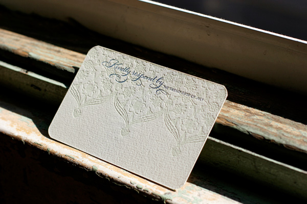
These letterpress wedding invitations are a stunning customized design boasting the gorgeous hand calligraphy of Bella Figura calligrapher Debi Zeinert of The Blooming Quill. The letterpress invitations were printed in black ink with lavender edge painting paired with a reply post card printed in lavender and black. Lavender envelope liners are the perfect coordinating touch. To keep things fun, our Harlow design is used for the letterpress ceremony programs, printed in black and lavender inks, and is accompanied by a pretty tea-length letterpress menu printed in black.


Recently we had the exciting opportunity to work with a couple on a really fun invitation project. We letterpress printed reply cards in our English Waltz design to accompany their invitations, silk-screened vintage handkerchiefs. Printed on our luxury 2-ply paper in taupe ink, these reply cards are a perfect complement to the hankie invitations. The bride, Kristy, shared the inspiration behind her lovely, one of a kind invitations:
We have tried our best to make the elements of our wedding personal and unique, and came across the hankie idea as a perfect way to accomplish that. We were fortunate enough to find Erin Raspberry Napier from Lucky Luxe Correspondence to help create the beautiful finished product. With some help from our moms, we searched antique shops, flea markets, garage sales, estate sales, and of course the internet to collect a wonderful variety of vintage hankies. After washing and ironing them, we sent them to Erin to be printed. When we received them back, I had a great time individually selecting who to send each hankie to. With the range of colors and patterns, I found one to perfectly represent each of our guests!
In addition to obviously using the handkerchiefs to invite our friends and family to join us on our wedding day, we have considered having our groomsmen use their invites as pocket squares, and hope that guests will carry them as we celebrate with tears of happiness!


{Silk-screened handkerchief invitations by Erin Raspberry Napier of Lucky Luxe Correspondence.}
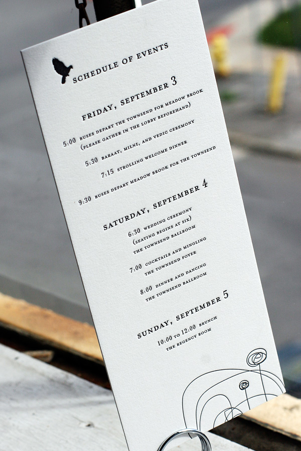
These letterpress wedding ceremony programs and reception pieces were printed in black ink on our white paper featuring our Urbanity design. It’s a chic, modern look that we just love. The ceremony programs, menus and escort cards were letterpress printed on our 1-ply paper, with square table number cards printed on our 2-ply paper. The letterpress menus feature geranium ink to highlight the couple’s names – a great way to add a fun pop of color! A tea-length letterpress events card on 2-ply paper informs guests of various weekend festivities.


(more…)
Today is Tuesday, which during the summer and early fall harvest season means only one thing here at Bella Figura – it’s CSA day! Bella Figura is proud to subsidize CSA (Community Supported Agriculture) memberships for employees through Grindstone Farm, a local organic farm. Once a week, a big van full of freshly picked organic veggies shows up at our door and we always love digging through the boxes to see what we have that week. This year we’ve been eating a lot of rainbow chard, kale, bokchoy, a variety of lettuces, onions, garlic, lots of beautiful tomatoes, potatoes, and zucchini galore.


Here is a quick peek at today’s share – parsley, patty pan squash, three varieties of tomatoes, baby carrots, two varieties of radishes, lemon basil, lots of tomatillos and the first of this season’s apples.

With tomatillos greeting us week after week, we’ve all been sharing ideas on how to best use them up. The verdict is that a great roasted tomatillo salsa can’t be beat. We love this recipe from epicurious – it’s simple, quick and tasty. Does it get much better?
Roasted Tomatillo Salsa
1 1/2 pounds fresh tomatillos
5 fresh serrano chiles (or sub the peppers of your choice; remove the seeds for less heat)
3 garlic cloves, unpeeled
1/2 cup fresh cilantro
1 large onion, coarsely chopped
2 teaspoons coarse salt
Preheat broiler or grill.
Remove husks from tomatillos and rinse under warm water to remove stickiness. Broil chiles, garlic, onion and tomatillos on rack of a broiler pan 1 to 2 inches from heat (or on the grill), turning once, until tomatillos are softened and slightly charred, about 7 minutes. Peel garlic and pull off tops of chiles. Purée all ingredients in a blender.
Allow to cool to room temperature and serve with your favorite chips or Mexican fare. Enjoy!
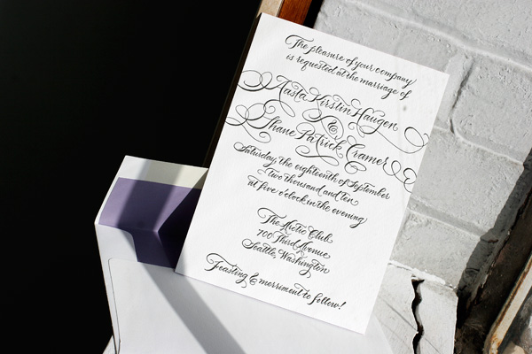
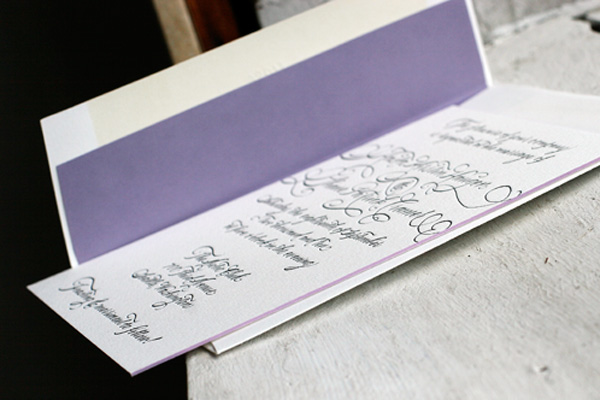
We recently printed letterpress wedding invitations for Cydney and Patrick in our Deveril design, a perennial Bella Figura favorite. It’s classic, traditional and timeless in black ink on white paper. We were thrilled to have Cydney send us a sample of her finished invitations. After receiving them from us, they finished off the look with DIY striped liners and gorgeous hand calligraphy addressing. Aren’t these just stunning? Thanks so much for sharing, Cydney!


Recently we had the pleasure of working with a local bride who designed her own letterpress wedding invitations that we then printed. The invitations are a square shape, printed in pewter and papaya inks on our 2-ply paper. To complete the playful design, the bride chose pewter edge painting and a bright pop of color with a fuchsia envelope liner.


Featuring gorgeous hand calligraphy accents from Bella Figura calligrapher Maybelle Imasa-Stukuls, we love this chic customization of our Flourish letterpress wedding invitation design. It was letterpress printed on our 2-ply paper in classic black ink and features edge painting in yarrow. We adore this pairing of modern meets traditional design and just can’t get enough of Maybelle’s stunning calligraphy.


We absolutely love this unique customization of our Champagne design! Letterpress printed in clover and blind deboss for a tropical destination wedding, we worked with this couple to create a small booklet by fastening the different elements of their invitation suite together with grommets. The page sizes are stepped to create tabs and labeled to identify which page contains what information. The booklet contains an invitation, an events card, a directions and accommodations card, and a reply card that is perforated to be torn out and returned.


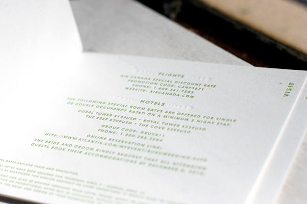


This pretty customization of our Connemara design was printed in celadon and navy inks, and features gorgeous hand calligraphy accents on the letterpress wedding invitations and reply cards by calligrapher Debi Zeinert of The Blooming Quill. The couple opted for our 2-ply paper for the invitations, and 1-ply reply postcards, both with rounded corners. We also letterpress printed their petite website cards printed in navy – a great way to provide guests with additional wedding information!