Take one last splash into summer with these deep sea inspired Nautilus (by Beth Ann Seal) letterpress wedding invitations. The adorable seahorse icon was featured on all of the pieces-which shows how much you can truly customize your set. The couple took advantage of our free favor card promotion (read more about our favor card promotion here) and had the most adorable favor cards as part of their set. The classic color mediterranean envelope liner completes their theme! We can just close our eyes and see the waterfront and feel the sand between our toes!
inks: pewter + mediterranean | fonts: quill + poetica | paper: 1-ply white | invite size: a-7 | liner: the classic color pattern in mediterranean | client coordinator: jessica hanaman | in-house designer: kyle laatsch


Oh beautiful for spacious skies! A soft blue hue paired with a rich and rusty yellow makes the transition between summer and autumn look seamless in this Labor Day inspired Harbor Beach letterpress wedding invitation customization.
harbor beach customization = inks: atlantic + marigold | fonts: nysa + harlow | paper: white | invite size: f-8 | liner: the antique geometrics pattern in prussian blue | original design by Jessica Tierney | customized by in-house designer Lindsy Aragona
embellishment suggestions: edge painting in metallic gold

Photography- Mark Brooke Photography
We love the classic, understated look of these recently printed String Calligraphy (by Patricia Mumau) letterpress wedding invitations. The entire set features harrison hand calligraphy which is one of Patricia Mumau’s most requested calligraphy hands- there is nothing quite like it! Letterpressed in prussian blue ink with edge painting and a solid envelope liner to match, these invitations are totally trendy. This is a perfect combination for the cutting-edge and fantastic wedding venue.
ink: prussian blue | calligraphy style: harrison by patricia mumau | paper: 1-ply white | invite size: f8 | liner: the classic color pattern in prussian blue ink | client coordinator: jessica hanaman | in-house designer: lindsy aragona


Our Lush (by Jamie Lea Bertsch ) letterpress wedding invitations go from soft to stylish with this color customization submitted by Lion in the Sun in Brooklyn, NY. Letterpressed in Light Lavender and Charcoal inks on our 2-ply white paper, the design is highlighted with corner rounding and Champagne edge paint. The Reverse Simple Geometrics envelope liner in Champagne ink perfectly compliments the edge painting.
inks: light lavender + charcoal | font: billhead | paper: white 2-ply | invite size: f8 | corner rounding | edge paint: champagne | liner: the reverse simple geometrics pattern in champagne ink


It’s that time of year again — our sample sale is back! Now through September 8, all of our letterpress invitation samples will be on sale for just $1! All proceeds from the sale will benefit Earthworks and will help aid their efforts to end dirty gold mining practices around the world. Sign the pledge today and make sure you know where your gold is coming from! The inventory for a few of our designs is limited, so you may receive samples in colors that are different from what’s shown on our website (but don’t worry — they’ll still be pretty!!). Samples may be ordered on our website – just click on your favorite designs, then select “order a sample” and proceed to checkout after you’ve selected all of the designs you’d like to see! The sale ends at 11:59pm on Thursday, September 8, so don’t wait — buy your samples today & help the environment in the process — it’s a win-win!

**The fine print: availability for select designs may be limited. If our inventory runs out for a sample that you’ve ordered, we’ll contact you to determine a suitable replacement option or to arrange a refund if necessary. We appreciate your understanding on this!**
Featuring Belle hand calligraphy these Flourish letterpress invitations (by Jamie Lea Bertsch) are what’s happening! This set features Maybelle Imasa-Stukuls’ Belle hand calligraphy which is one of the many different calligraphy styles we offer. The stellar pairing of our prussian blue and chartreuse inks looks amazing on our 1-ply ivory paper. The couple chose our save the date size (A6) for their reply card to better accommodate all of the details of their wedding weekend! With flat place cards and adorable website cards printed in prussian blue inks-their guests can get the lowdown on the wedding fun! We’re in love with their flawless tea length programs letterpress printed to match with their set. The couple even chose precious letterpress thank you cards to match to their invitations. This heartfelt gesture shows the true appreciation of their friends and family being such an important part of their special day.
inks: chartreuse + prussian blue | font: jubilant | calligraphy style: belle by maybelle imasa-stukuls| paper: 1-ply ivory | invite size: a7 | liner: the european formal pattern in chartreuse ink | client coordinator: jessica hanaman| in-house designer: racheal decker


A combination of soft and bold colors paired with the pretty and modern Marie letterpress wedding invitation is simply lovely for that late summer, early – autumn luxe bohemian wedding.
marie customization = inks: dusty pink + surf | fonts: spencer + moravia | paper: white | invite size: a-7 | liner: modern canopy pattern in pansy ink | original design by ellie snow | customized by in-house designer racheal decker |
embellishment suggestions: edge painting in pansy

(Photo Credits: Simply Bloom Photography)
by Racheal Decker, In-House Designer
What better way to make sure your guests don’t let your wedding date *ahem* coast by, than with some letterpress save the date coasters? We printed these Carte de Visite (by Ben Whitla) letterpress save the dates and matching coasters in Taupe, Papaya, and Sand inks, and we’ve got to say – we’re really into this color combo.
To make everything in this set as cohesive as possible we also custom designed and letterpress printed an envelope liner that coordinates with the cards and coasters. Between this letterpress envelope liner and the bright Papaya edge painting on the save the date, this set really has some amazing presence when you open the flap (even before you take the pieces out!).
inks: taupe + papaya + sand | fonts: sofia + sans capitals + archive | paper: 2-ply white + coaster stock | save the date size: a6 | liner: custom pattern letterpress printed in taupe ink | client coordinator: chris gannon | in-house designer: kyle laatsch


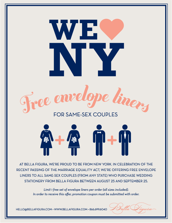
We’re so pumped that New York has joined the ranks of the small (but growing) number of states offering equal rights to same sex couples. In honor of this human rights triumph, Bella Figura is helping celebrate by offering free envelope liners to any same sex couple who orders their wedding stationery from us!

In addition to the promotion, we’ll be showcasing some recent real weddings, giving tips on wording, and offering advice from etiquette expert Mark Kingsdorf – an event planning pro who’s worked with the Emily Post Institute on several books.
The promotion runs from August 25 – September 25 — stop in to one of our Bella Figura retailers to place your order today! If you don’t have a retailer in your area, get in touch & we’ll help you get started.


Our AMAZING friends at Gus and Ruby Letterpress in Portsmouth, New Hampshire submitted this letterpress wedding invitation set to us. We were thrilled to see the Harbor Beach design, by Jessica Tierney, used in combination with the Anais design, by Ian Koenig. The final product was styled perfectly using pewter and navy inks, clean lines and bold text. It was no surprise that this nautical yet urban design won first place in the Bella Figura Design Contest!


(more…)

You really cannot get anymore romantic than this String Calligraphy letterpress wedding invitation customization submitted to us by Social Graces in Nashville, Tennessee. The whimsical style of Harrison hand calligraphy, by Patricia Mumau, looks weightless in pale gray and shell inks. It’s airy, sweet, and oh so lovely! The Bella Figura team fell in love with this design’s soft simplicity – so we just had to have it place second in our design contest.

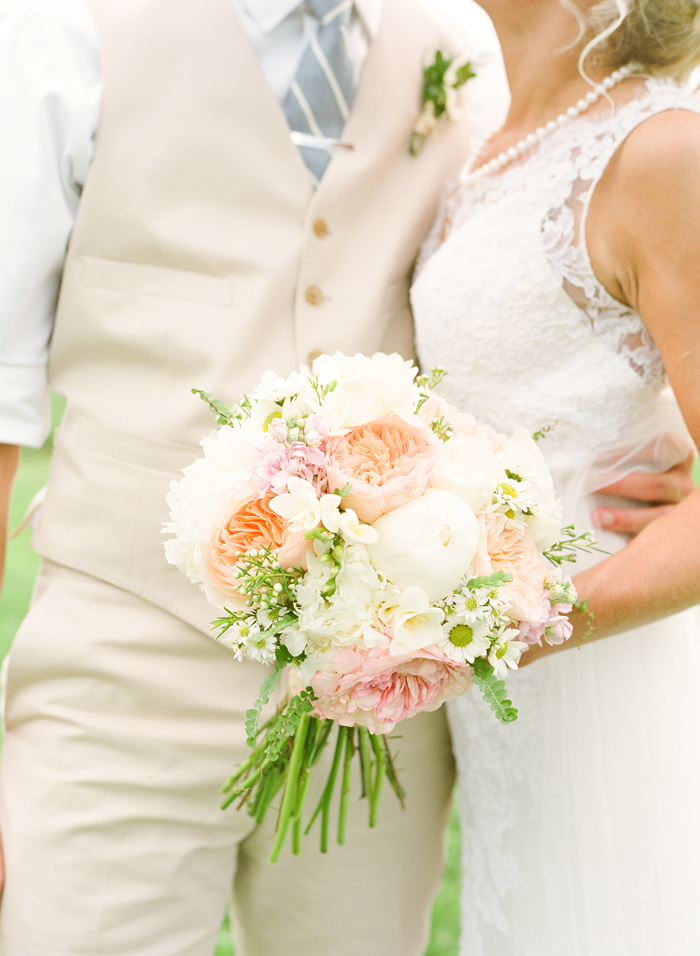
Erin, from Social Graces, surprised us with STUNNING photos from this wedding (thank you, thank you) and we were all blown away! The invitation fit this bride’s vision perfectly! From the detailed lace dress to the luscious, monochromatic flowers, this wedding looked like a dream!

Alisha, the beautiful bride, fills us in on her and her husband’s perfect wedding day and how they chose the String Calligraphy Design:
“Picking out my wedding invitations and paper goods was one of my favorite parts of the wedding planning process! I’ve always been a sucker for art, crafts, and design, so choosing the perfect invitations for my wedding was a very fun experience. The look I had in mind for our wedding was something whimsical, rustic, organic and vintage. While searching for the perfect invitation to reflect our farm wedding, I fell in love with Bella Figura’s String Calligraphy and couldn’t settle for anything else! The invitation that I chose struck me because of simplicity, uniqueness, and whimsical feel. I loved the softness and romantic touch that the pale gray and shell color inks gave off. The colors reflected our wedding color scheme perfectly – a soft palette of pale pinks and grays.
(more…)

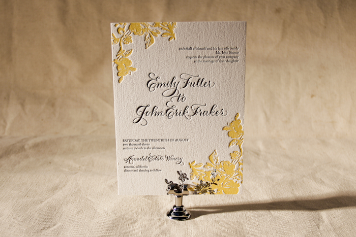
Working with Union Street Papery in San Francisco, California is always AMAZING!!! Stacey and her staff are the best people EVER! They are not only savvy business women, but are genuinely kind people – and they are all HILARIOUS. Love them! When you combine a wonderful dealer with a design like Vendage, from the utterly fabulous Kamal Patel, you are bound to create magic. The Vendage letterpress invitation customization features elegant hues of champagne and charcoal along with Debi Zeinert’s hand calligraphy accents in Spencerian. By eliminating the bird motif from the original design and using a vertical layout, this customization becomes romantic and sophisticated.


The beautiful bride, Emily, shared some words with us regarding her gorgeous suite!
“The design of the invitation was meant to evoke a summer garden party with a hint of modern design elements to make it current. Annadel Estate is a lovely winery located in Sonoma, but more than just a winery they have acres of rose gardens on the property. When I saw the floral print I knew it was perfect.”

… so perfect that our staff at Bella Figura chose Emily’s design as the third place winner!!!

A view inside Union Street Papery.
inks: champagne + charcoal | fonts: garamond | paper: 2-ply white | invite size: a-7 | calligraphy style: spencerian by Debi Zeinert | liner: the rustic crosshatch patter in charcoal
This design won third place in our Bella Figura design competition for the first half of 2011. This twice-a-year competition recognizes outstanding and inspired design submitted by our beloved dealers.


