This wonderful Dash (by Ian Koenig) letterpress wedding invitation set was sent to us by our friends at Aileen Invitations. What really ties this set together is the jute envelopes and the beautiful simple lace envelope liner.
inks: charcoal | fonts: quill + later | paper: 2-ply white | invite size: F8 | corner rounding | customization #: 14820

Soft pastels, romantic rose petals, and a summery breeze create an ambiance for a charming contemporary wedding. A show-stopper cake and a charming letterpress invitation suite to match (like our Rose design by Ellie Snow) makes for a picture-perfect wedding celebration. 
(Photo Credits: Style Me Pretty)
A Bientot is a beautiful design but may have a bit too much detail for some brides. The solution? Remove the superfluous design elements. That’s exactly what Judy Paulen Designs suggested. The border now stands on its own, framing the text in brilliant gold foil. Simple change, amazing results!
letterpress ink: prussian blue | foil: gold shine | fonts: utrecht + impression + nysa | paper: 2-ply ivory | printing: letterpress + foil | liner: nyc skyline in prussian blue | invite size: F-8 for inner envelopes | customization #: 15777 |

Come one, come all! Let your invitation be the Ringmaster of your bright and colorful celebrations with our Modern Bazaar customization.
modern bazaar customization = inks: geranium + antique gold | calligraphy: mitty hand calligraphy | font: moravia | paper: white | invite size: F8 | liner: pearse in prussian blue | original design by Kamal Patel | customized by in-house designer Racheal Bumbolo |
embellishment suggestions: pocketfold in metallic bronze

(photo credits: cameron ingalls photography)
Our Classic Monogram design is updated with a modern font combination. The navy ink is a great choice to keep this letterpress wedding invitation formal. Thanks Smudge Designs for sending this one our way.
ink: navy | fonts: submitted + lobster| paper: 1-ply ivory | invite size: F8 | customization #: 15834 |

Our popular Traditional Script design (by Beth Barr) has never looked so good! Both the regalia letterpress ink and the teal shine foil shine brightly on our white cotton paper. Thanks go out to The Village Invites for sending this our way.
letterpress ink: regalia | foil: teal shine | fonts: parisian + harlow + stadium | paper: white | invite size: F8 | customization #: 15964

If you are planning on getting married in your family’s estate or at a charming chateau, don’t overlook the details that make the place unique. Pulling inspiration from the style, decor or even the wallpaper can help you find the perfect letterpress wedding invitations. We love how effortlessly our Mae design pairs with the wallpaper behind the scenes in the photo of this beautifully captured wedding dress.

(Photo credit: Style Me Pretty)
Our Deveril (by Beth Ann Seal) design is often called one of the most classic and traditional in our entire letterpress collection, and with good reason. This sophisticated suite is complete with an exquisite black pocketfold, with an overflowing floral motif that has us all in love. Many thanks go out to Sweet Paper in California for sending us these to print!
ink: black | fonts: danube + impression | paper: 1-ply white | invite size: f8 for pocketfold | pocketfold: black | customization #: 16949

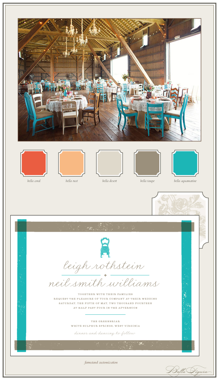
Splashes of teal and pink in an otherwise neutral color palette inspire this customization of our Farmstand letterpress wedding invitation design (by Erin Jang). Think rustic with a fun, contemporary twist!
farmstand customization = inks: aquamarine + taupe | fonts: irene + meadow | paper: white | invite size: f-8 | liner: elegant garden in sand and desert inks | original design by Erin Jang | customized by in-house designer Sarah Gluchacki |
embellishment suggestions: edge painting: aquamarine

(Photo Credits: Bobbi+Mike).
The Storybook Romance (by Jessica Tierney) design is brightly printed in our neon day-glo, and hot pink letterpress inks. From invitations to thank yous each piece features the perfect burst of color.
inks: day-glo + hot pink | fonts: memphis | paper: 1-ply white | invite size: F8 | edge painting: hot pink | customization #: 16097 |

Some times things work best just the way they are. That seems to be the case with the Flourish design (by Jamie Lea Bertsch). Brenda Himmel Stationery had the foresight to simply infuse a little bit of espresso and wisteria inks and the result speaks for itself.
inks: espresso + wisteria | font: jubilant | calligraphy: belle calligraphy by Maybelle Imasa-Stukuls | paper: 2-ply white | edge painting: wisteria | liner: classic color in wisteria | invite size: F-8 | customization #: 15758 |

If you’re planning a unique garden wedding with a touch of elegance and a hint of Victorian flair, look no further. Fidelia — one of our new botanical letterpress wedding invitations — is an ideal design if you’re envisioning lush ferns and rich greenery for your wedding day. Complete the look with some gold shine foil for a little hint of glamour.

(Photo credit: Style Me Pretty)


