These Balsam Calligraphy wedding invitations (by Patricia Mumau) printed in taupe letterpress are looking positively nature inspired. Paired with a jute colored envelope, the rustic look is definitely alive. The couple chose to print all of their reply by details on the front of the reply postcard, with only an oversized branch motif on the reverse. Many thanks to Urbanic Paper Boutique for submitting these for us to print.
letterpress ink: taupe| calligraphy: Harrison hand by Patricia Mumau | paper: 1-ply white| printing: letterpress | invite size: A-7 | liner: elegant ombre in sherbet and shell |customization #: 17153 |

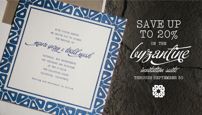
We’re excited to announce that our September design of the month is Ellie Snow’s Byzantine invitation suite! On sale now through September 30, this design is sure to make a statement for any modern wedding celebration. The entire suite is on sale for 10% when you order during the month of September, and you can save 20% if you order 6 printed pieces or more. The original design looks bold and beautiful in navy blue, but we love the different neutral looks our design team dreamed up when creating the customization ideas below!

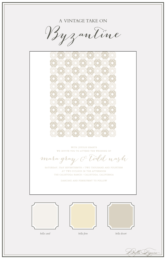
This vintage customization is subtle and elegant in sand and desert inks — and we love the way the design motif was used to create an eye-catching visual for the top half of the invitation.

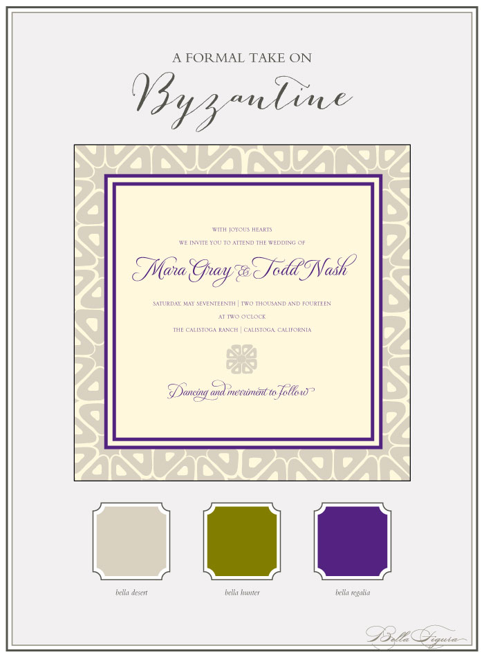
This more formal customization of Byzantine pairs desert ink with regalia for a rich look, and traditional fonts make this appropriate for a more sophisticated affair.

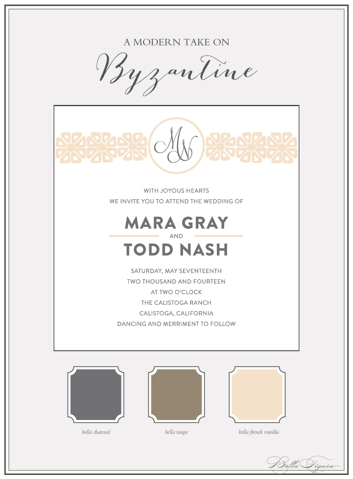
This modern take on Byzantine takes a more clean, minimalist approach, incorporating the original design elements and a monogram at the top with clean typefaces and a chic color palette of French vanilla and charcoal.

You can customize this design however you’d like — change the fonts, inks, layout and more to make it your own! Need more ideas on how to customize? Have questions? Please be in touch – we’d love to work with you!
The fine print: promotion is exclusive to the Byzantine design suite and does not apply to the purchase of other designs. Orders must be placed by 11:59pm EST on September 30, 2013 in order to receive the promotion.
Kelle McCarter’s Cascade design is looking rather jaw-dropping foil stamped entirely in red shine. Hand calligraphy accents always add a personalized touch and the swarm of petals “cascading” down adds to the romance. We have Rock Paper Scissors to thank for sending over this stunning suite!
foil: red shine | font: moravia | calligraphy: Sloan by Kelle McCarter | paper: 2-ply whit | printing: foil | invite size: F-8 | customization #: 16737 |

Saturated colors, warm candles, and earthy accents create an elegant vibe. Our Elegant Monogram is an excellent choice for autumn wedding invitations. The design is foil stamped in tawny matte and pink shine for added romance and regal flair, and the hand calligraphy monogram and calligraphy accents bring a unique and personal touch to an already sophisticated design.

(Photo Credit: Style Me Pretty)
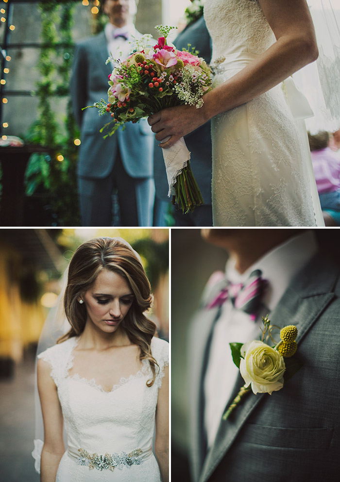
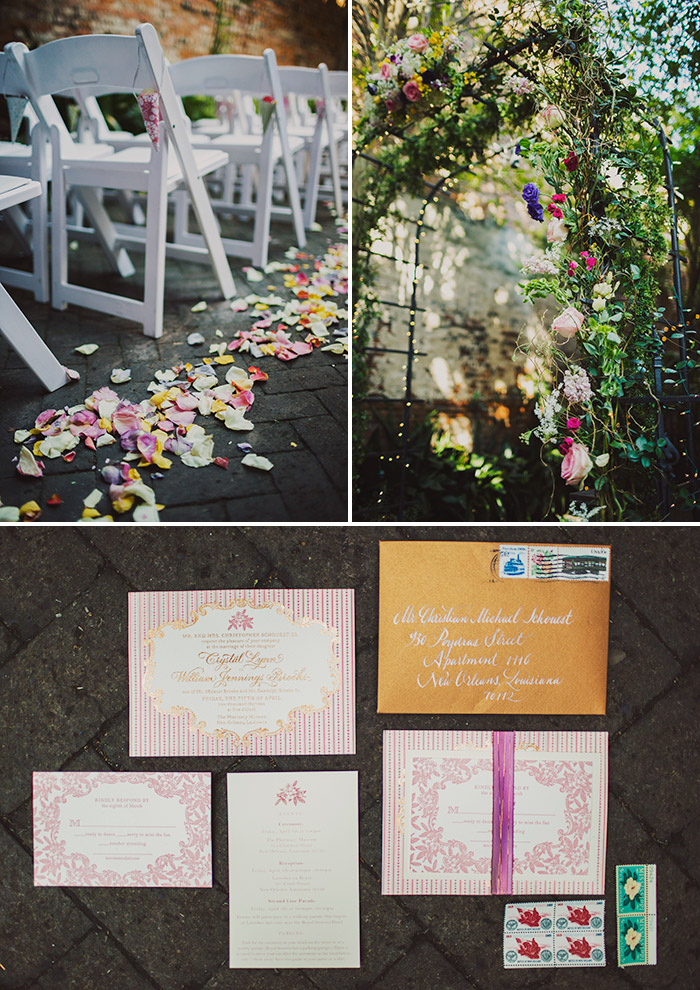
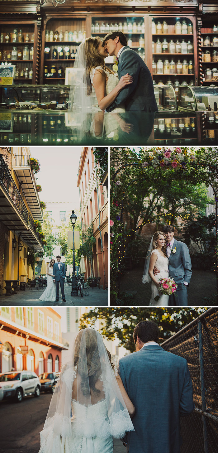
We love seeing a wedding that exudes personal style and unique taste. It looks like we aren’t the only ones impressed by this chic New Orleans wedding – it was recently featured on Green Wedding Shoes! From breath-taking floral arrangements to dapper suits and a stunning dress, every detail was well-thought out. Our A Bientot invitation design by Jessica Tierney displayed a gorgeous combination of letterpress and foil stamping with romantic Parisian flair, which was perfect for this wedding that took place in the French Quarter of New Orleans.


The ceremony was held at The New Orleans Pharmacy Museum, which provided character and an ideal backdrop for the stunning photos captured by Ariel Renae Photography.

Thank you Crystal & William for choosing us! We wish you all the best!
Vendors:
photography: Ariel Renae Photography | venue: Ceremony at The New Orleans Pharmacy Museum, Reception at Latrobe’s on Royal New Orleans, Louisiana | event design + planning: Crystal Schouest Brooks (the bride) | floral design: The Plant Gallery | wedding dress: Designer – Amy Kuschel purchased from Wedding Belles and the Stationer in New Orleans | hairpieces: Veil was custom Chantilly Lace design by Jennifer Leigh (Purchased at Wedding Belles), Reception Hairpiece was Designed by New Orleans local Erica Salm Rench of ESR design (Purchased at Wedding Belles) | shoes: Antonio Melani | bridesmaid dresses: Lela Rose and Alfred Sung, purchased from Bridesmaids Inc, Jr. Bridesmaid floral dresses, purchased from Modcloth | hair + makeup: hair from H20 Salon and Spa, make-up from Tisa’s Beauty Bar, 504.891.8992 | groom suit: Bachrach of Nashville, TN, 615. 649.0781 | catering: Chef John Besh via Latrobe’s on Royal | cake: Sucre | music: Souled Out out of Houma, LA | reception candle design: Luminous Events | second line parade: Selby Second Line Services | photo booth: Boogie Booth | favors: Coozie, Cup, and Mardi Gras Bead designed by the bride | coozie + cup printer: Personalized Drinkware | mardi gras bead printer: Promotion Beads
If you loved The Secret Garden and you’re planning a garden party, don’t forget the essentials: romantic florals, vintage china and your favorite second-hand classics. Our Rococo Elegance design has the perfect balance of whimsy and elegance and looks like it belongs in a storybook.

(Photo Credit: Ruffled Blog)
In a palette of our fuchsia and charcoal inks, these Drawing Room (by Sarah Gluchacki) letterpress wedding invitations are looking artsy and chic. Our friends at Sweet Paper submitted these for us to print – and we were so psyched to see these come off press!
inks: fuchsia + charcoal | fonts: geometric + sketch | paper: 1-ply white | invite size: f8 | customization #: 17024 |

Navy and Fuchsia inks pair so well with the motifs and type in this version of Ian Koenig‘s La Salle letterpress save the date. The design is still very elegant, but the brighter colors give it some great vibrancy and a modern feel. Thanks to Sweet Paper for sending us this order to print!
inks: navy + fuchsia | fonts: eros + conqueror | paper: 2-ply white | printing: letterpress | card size a6 | customization #: 16428

Our Refined Study design shows how classic letterpress wedding invitations can be. The prussian blue letterpress ink coupled with our simple geometrics liner in prussian blue looks phenomenal.
inks: prussian blue| fonts: adelais + harlow stripe + moravia + impression | paper: 2-ply white | invite size: F8 | customization #: 16345 |

Using custom calligraphy in a save the date is a great way to showcase the wonderful significance of a wedding. It can sometimes be difficult to embellish a save the date set when the invitations are still to come, but hand calligraphy is a great way to add a bit of style without lots of extra cost. These save the dates feature hand calligraphy by Maybelle Imasa-Stukuls, and definitely show how well calligraphy can add some character!
ink: taupe | font: chapin block | calligraphy: Belle by Maybelle Imasa-Stukuls | paper: 1-ply white cotton | printing: letterpress | std size: A-6 | customization #: 16320 |

These Gilded Romance (by Sarah Gluchacki) letterpress + foil stamped wedding invitations are in one word, show stopping. The always talented calligrapher, Debi Zeinert penned the most gorgeous Revolution hand calligraphy accents for this suite. Many thanks go out to Union Street Papery for sending over these lovelies!
We’re loving these Moda Contemporary letterpress wedding invitations. Printed in a combination of our pewter and sand inks, the softer color palette is the perfect pairing to the jute colored pocketfold. This particular couple actually chose our smaller square size card (SQ6) to be adhered to the pocketfold, as they liked the idea of the pocketfold creating more of a framed look. We thank our friends over at Urbanic Paper Boutique for sending over these beauties!
inks: pewter + sand | font: henry | paper: 2-ply ivory | printing: letterpress | edge painting: raspberry | pocketfold: jute| invite size: SQ-6 | customization #: 17170 |


