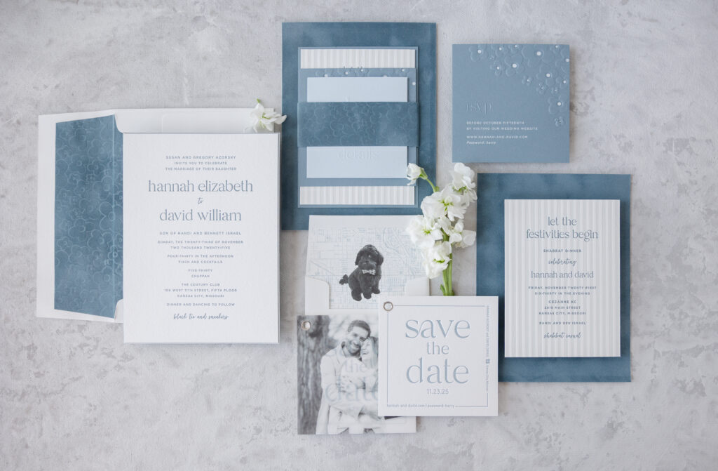
We had the absolute pleasure of working with our friend Susie of First Impression on the design and printing of her daughter’s wedding stationery. Lovely design, velvet accents, and a charming floral motif carry throughout the various pieces. There were so many fun elements to Hannah and David’s wedding weekend, and we are proud to have been a part of it.
Invitation
letterpress ink: deep blue
fonts: branch + quiverleaf
paper: bella cotton 1-ply white / bella sky 1-ply / bella cotton 1-ply white / bella velvet french blue
size: f-8
bevel: 45-degree
finishing: duplex paper
envelope liner: supplied pattern blind emboss on french blue velvet
envelope: white cotton text
envelope addressing: deep blue digital on the front / deep blue letterpress + powder blue digital on the back
job: 77381
We already showcased the couple’s modern yet charming save the date, complete with a custom envelope liner featuring their beloved dog. The design of the invitation and day-of pieces picks up where the save the date left off, leaning into simplicity yet still feeling extravagant.
Mounting Card
paper: bella storm 1-ply
size: 4.81” x 6.44”
finishing: assemble with invite layers + belly band
job: 77381
Belly Band
deboss: blind
paper: bella velvet french blue
size: 1.75” x 8” flat, 1.75” x 6.5” assembled
finishing: assemble with mounting card + invite layers
job: 77381
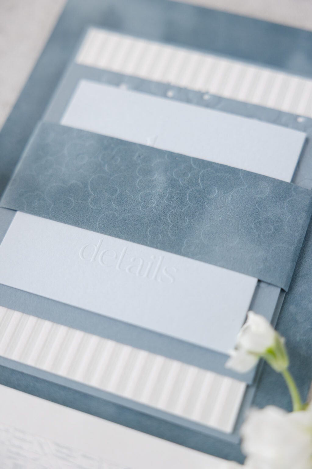
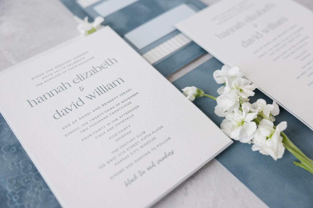
The muted blue color palette ties all the pieces together, ranging from deep blue and powder blue letterpress inks to French blue velvet for the invite backer and envelope liner, and our Sky and Storm papers for the details card, place card, and welcome card, respectively. The soft blue hues are serene, romantic, and timeless.
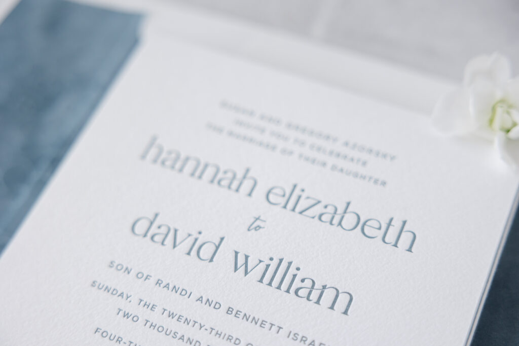
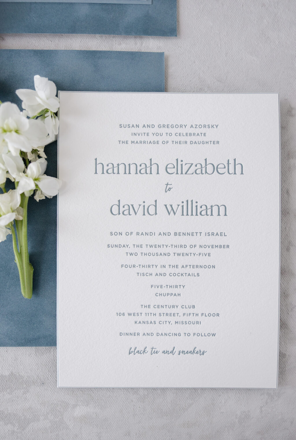
The invitation design is formal and a perfect fit for the glamorous venue, The Century Club in Kansas City, Missouri. The generous layout is intentional and airy, setting the tone for the opulent but comfortable event. The use of a modern serif font for the names adds contemporary elegance, while a fun script font interjects some whimsy and personality, especially when mentioning the dress code.
The invitation is a staggering multi-ply card that features our cotton 1-ply white adhered to sky 1-ply, another layer of cotton 1-ply white, and finally, French blue velvet. The invitation also features a 45-degree bevel, and the alternating layers ensure a pop of blue is visible on the gently sloped edges.
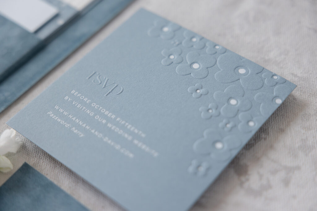
Reply Card
emboss: blind
fonts: branch + quiverleaf
foil stamping: white matte
paper: bella storm 2-ply
size: sq-5
job: 77381
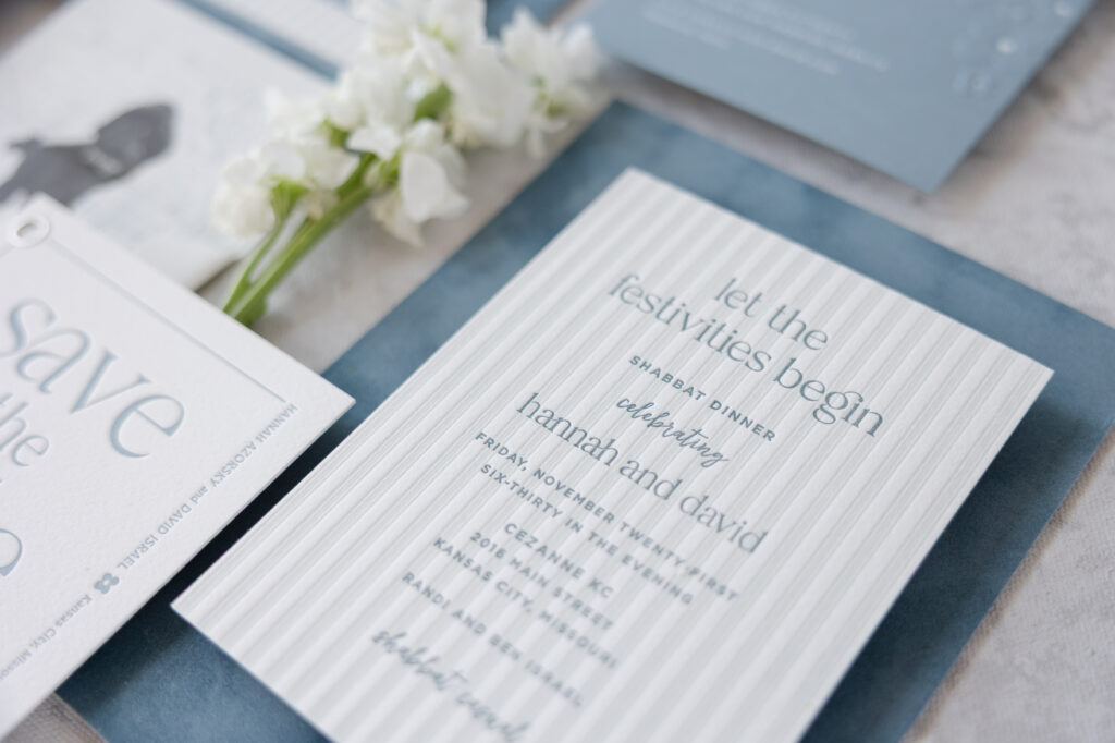
Shabbat Card
letterpress ink: deep blue + powder blue
fonts: branch + quiverleaf
paper: bella cotton 2-ply white
size: a-6
job: 77381
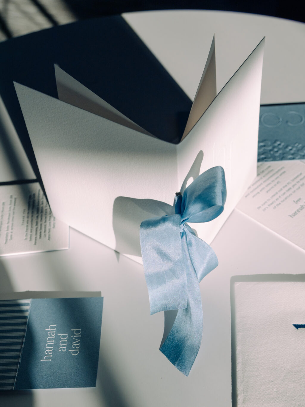
A mounting card secures a velvet belly band to the back of the invitation, providing a spot to hold the auxiliary cards. This ensures a neat presentation when guests remove the cards from the envelope. Blind debossing on the velvet belly band is decadent and further emphasizes the stock’s texture.
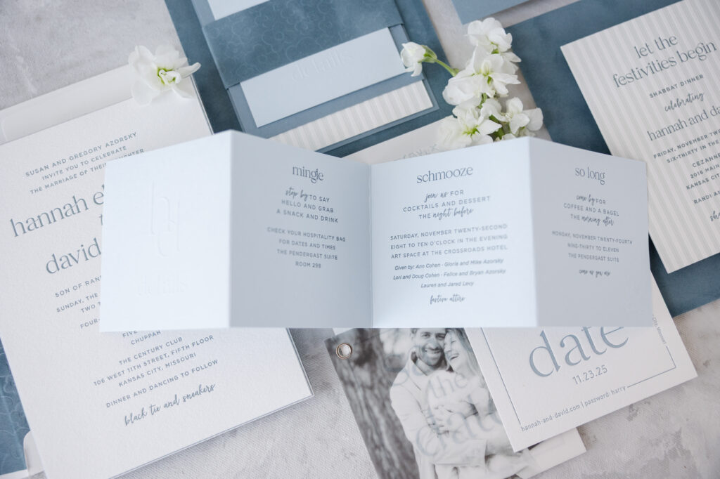
The whimsical floral pattern can be found throughout the suite, and the flower shape also appears on the escort cards.
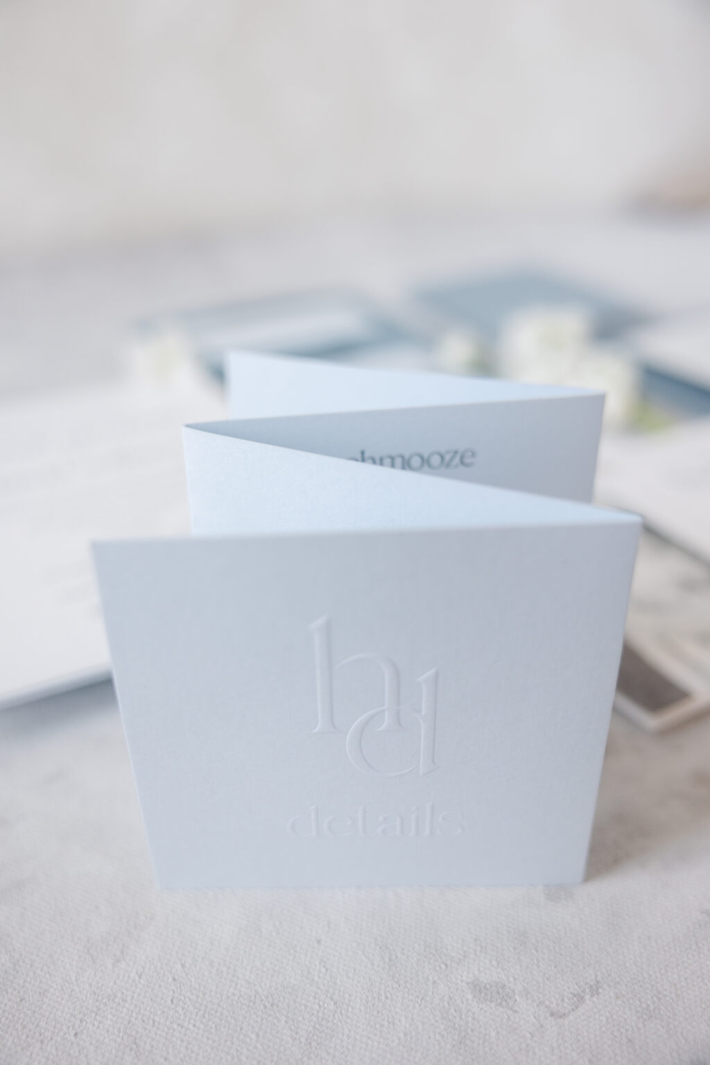
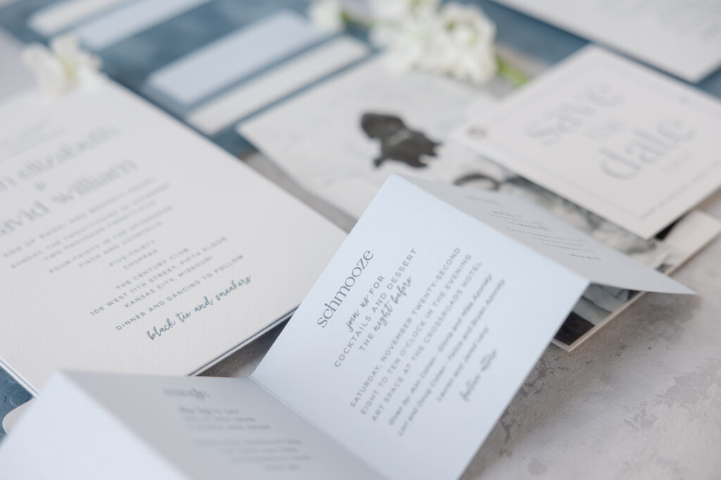
Letterpress-printed stripes give the Shabbat Card a casual tone and distinguish it from the other cards. An elegant monogram on the front panel of the accordion fold details card further defines the refined aesthetic.
Accordion Fold Details Card
letterpress ink: deep blue
fonts: branch + quiverleaf
emboss: blind
paper: bella sky 1-ply
size: 4” x 4” folded, 4” x 16” flat
finishing: score
job: 77381
Program / Menu Cover
emboss: blind
paper: bella cotton 1-ply white
size: sq-6 folded
ribbon: 1.25” wide blue gray
finishing: score, 0.25” hole drill, and assemble with interior pages
Every part of this stationery suite, from the save the date to the invitation and day of pieces, is exquisite and luxurious, and also pleasantly charming and true to both the bride and groom and the special relationship they share. Thank you to Susie from First Impression for including us in such a special moment for your family and for working with us on this amazing wedding stationery.
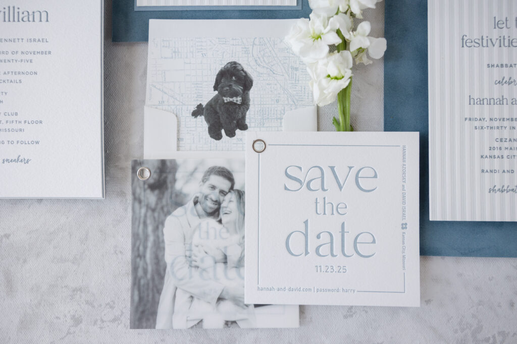
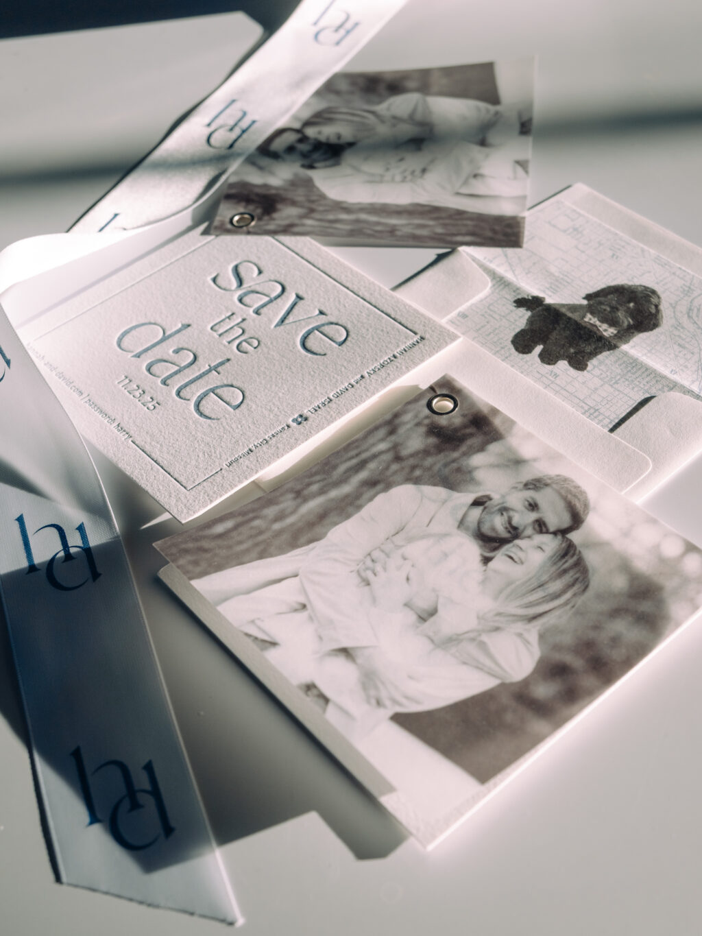
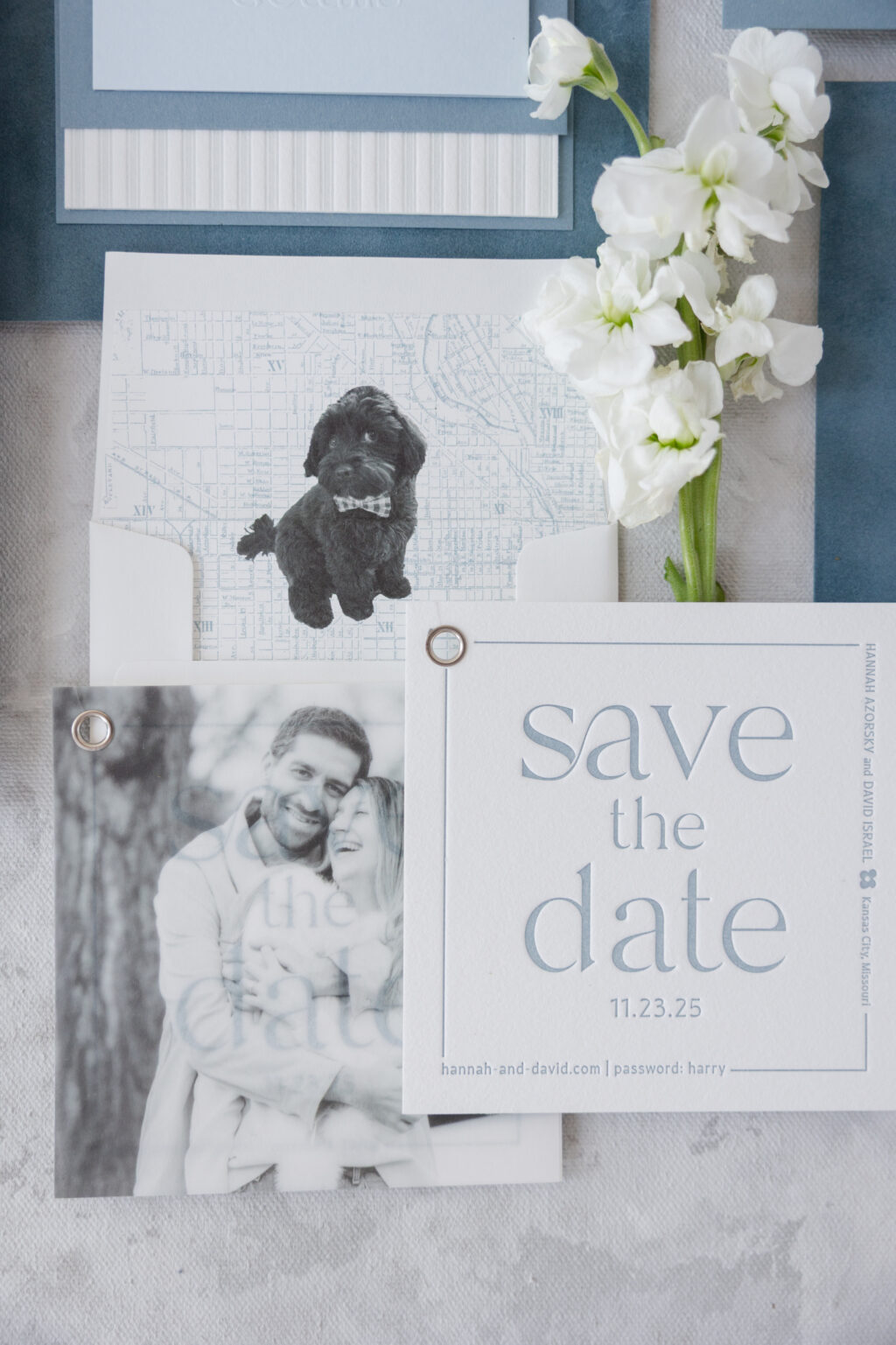
We had the pleasure of working with Hannah and David to create their sophisticated save the dates. This job was extra special because the bride is the daughter of our dear friend Susie of First Impression. The style is minimalist with subtle yet intentional design and plenty of personal details that reflect the couple and their love story. Hannah and David chose our Frances save the date as their inspiration, and we cannot wait to share it with you.
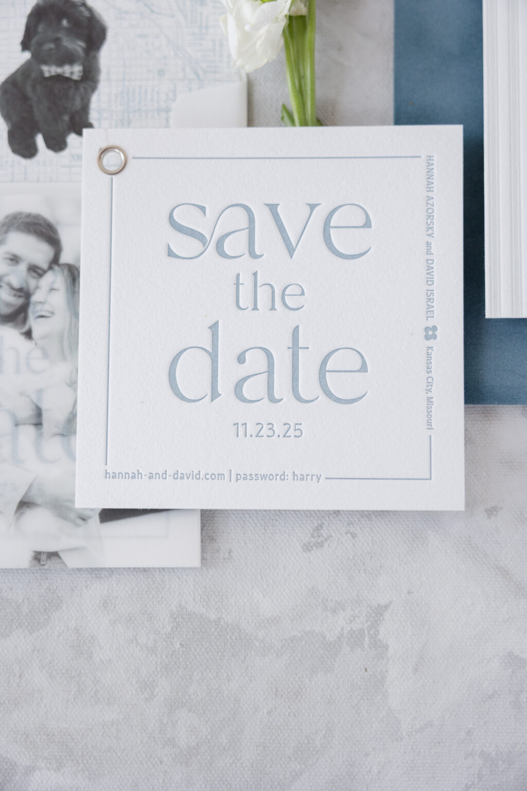
Save the Date
letterpress ink: chambray
fonts: branch + quiverleaf
paper: bella cotton 2-ply white
size: sq-5
finishing: 0.25” hole drill + assemble with vellum overlay
grommet: silver
envelope liner: custom pattern in cmyk + chambray digital on white text
envelope: white cotton text
envelope addressing: chambray digital on the front and the back
job: 75753
Vellum Overlay
digital ink: cmyk
fonts: branch + quiverleaf
paper: 40# vellum
size: sq-5 overlay
finishing: 0.25” hole drill + assemble with save the date
job: 75753
The composition is centered and balanced, creating a sense of calm. The design is letterpress-printed into our thick 2-ply cotton paper. The paper has a decadent texture, and the impression of the printing pressed into the thick stock adds even more of a tactile element, resulting in a luxurious card. Chambray letterpress ink is elegantly understated. The thin line border contrasts with the bold font, creating a soft yet sculptural look. Utilizing a perpendicular orientation of the couple’s names within the border introduces an unexpected, contemporary element.
A lovely candid photo of the couple, digitally printed on vellum, is secured to the card with a silver grommet. The photo of the smiling couple is delightful and the first thing guests see when they take the save-the-date out of the envelope. Since the overlay is made of vellum, the text on the card is partially visible through the photo, so guests receive a sneak peek.
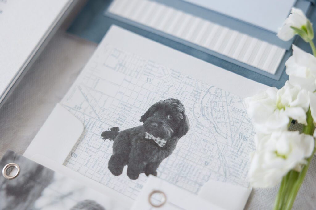
A highly personal detail that showcases the couple’s fun personalities is the custom envelope liner. An image of the couple’s beloved dog greets recipients after they slip the card from the envelope. The adorable pup appears over a map, adding even more personal detail to the design.
It is always a joy to work with Susie of First Impression and bring this vision to life. Check back later this week to see the invitations and day of pieces for Hannah and David’s big day.
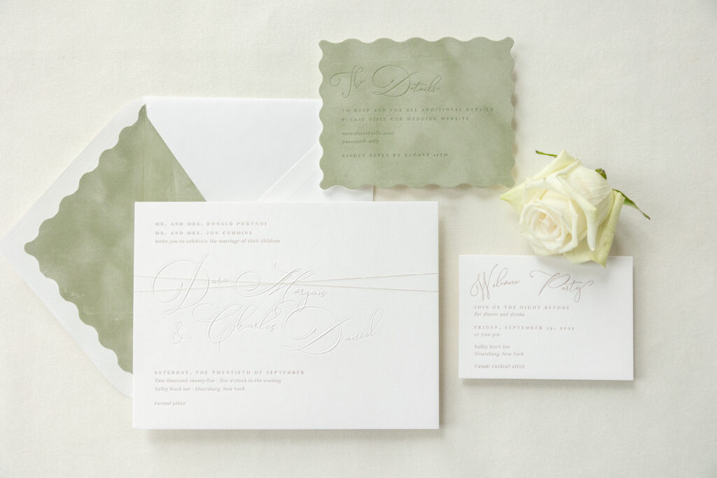
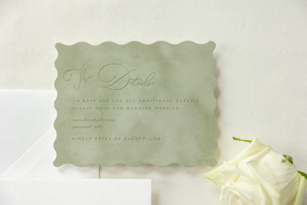
The typography is the star of these contemporary blind emboss wedding invitations. It is modern and fun yet still traditional and perfect for a formal wedding. Dara and Charles worked with our dear friend Melissa of Paper Parfait to customize our Neville design for their nuptials held at Valley Rock Inn & Mountain Club in Sloatsburg, NY.
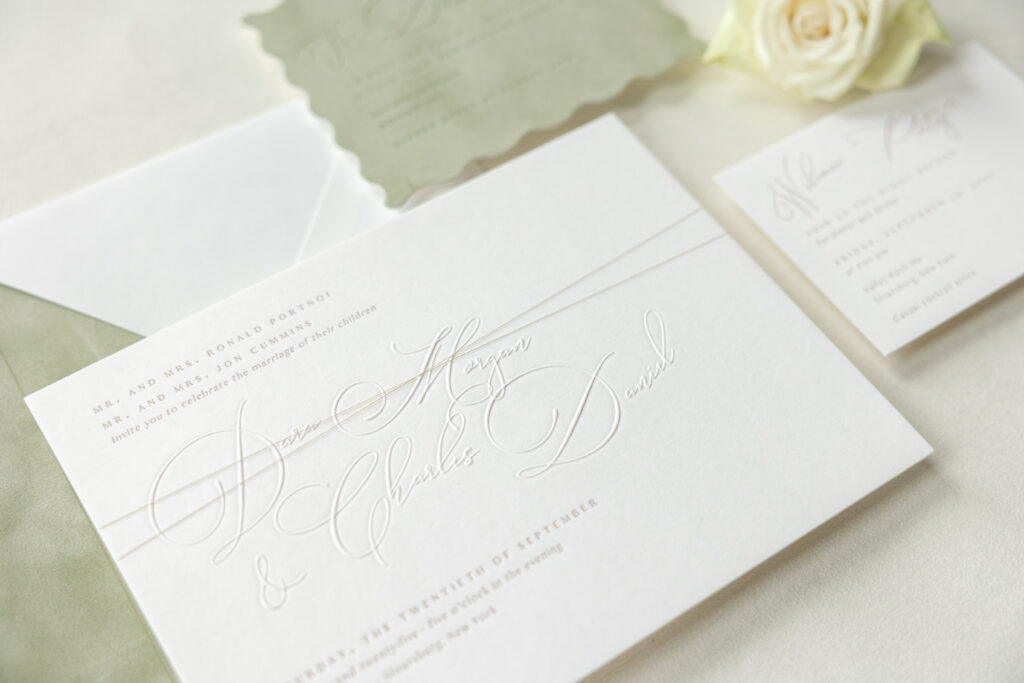
The couple’s names appear in Sophia, an ornate script font that boasts charming flourishes and a flowing form. Each name is aligned independently, creating a cascading wave. The look juxtaposes the formality of the script font with a contemporary layout. The names are blind embossed, a technique that creates a raised impression. The raised detail further highlights the curves of the script font and contrasts the letterpress impression of the supporting text.
Invitation
letterpress ink: toast
emboss: blind
fonts: antique + sophia
paper: bella smooth cotton 3-ply white
card size: f-8
metallic thread: tawny
finishing: assemble with thread
envelope liner: bella asparagus velvet
custom converted envelope: white cotton text pointed flap
envelope die: e-402
envelope addressing: toast digital on the front and the back
job: 76292
A custom envelope elevates and complements the invitation design. The velvet envelope liner features a custom die-cut scallop edge to mimic the layout of the bride and groom’s names on the invitation. The asparagus velvet introduces a whisper of serene color.
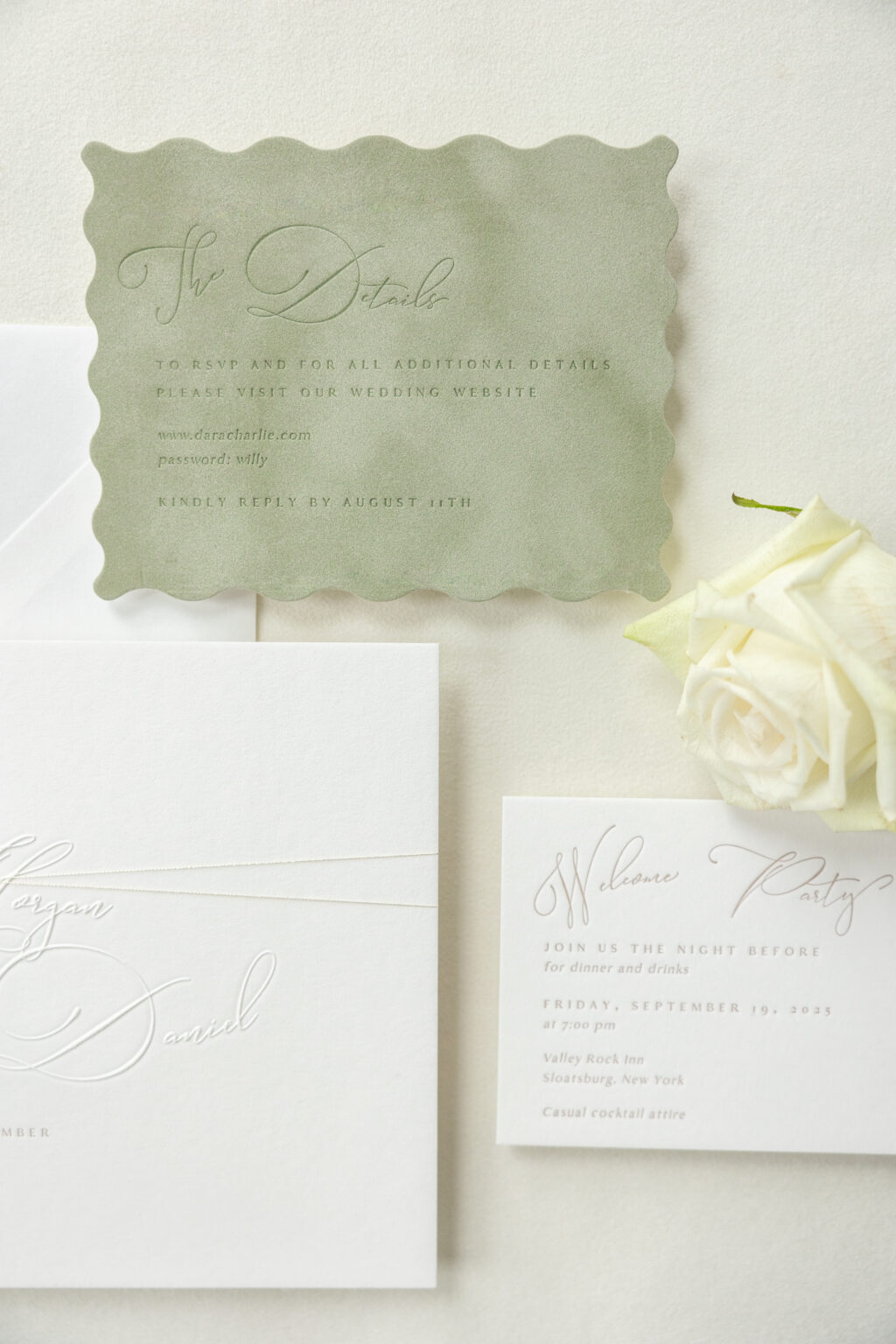
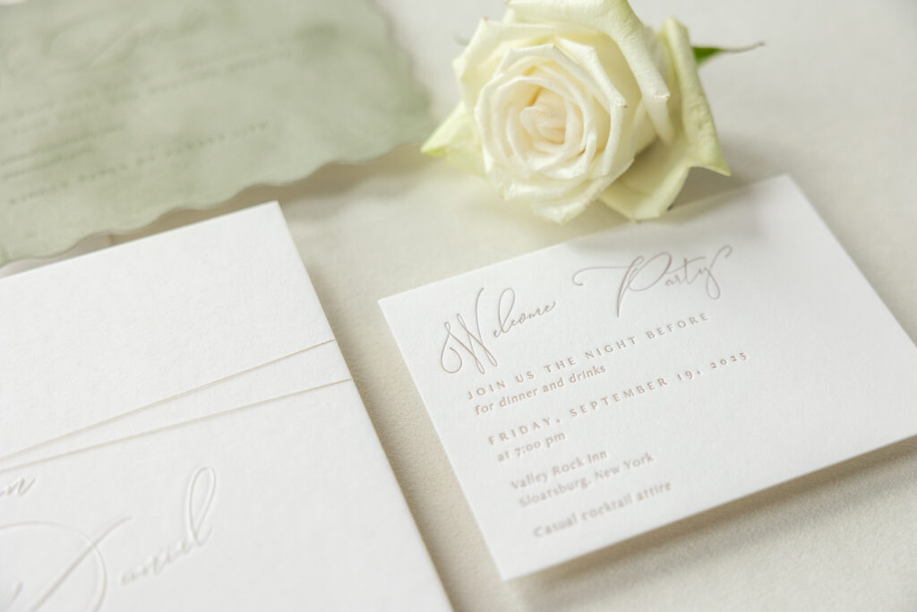
The details card borrows the same script font and formatting as the invitation, and the asparagus velvet and scalloped die-cut shape from the envelope liner, resulting in a fun, whimsical card.
The rehearsal dinner invitation is elegant and adheres to the theme. The swooping font and off-kilter layout add character, while the contrast with the serif font adds an element of grandeur and restraint. To prepare for mailing, the cards were stacked in order of size, with the largest, the invitation, on the bottom and secured with metallic thread, ensuring a lovely presentation.
Are you dreaming of invitations that toe the line between unique and formal? Do you love the look of blind emboss and the texture of velvet? Whether you want contemporary blind emboss wedding invitations or something that captures your love story in a more personal and meaningful way, work with one of our dealers for expert assistance.
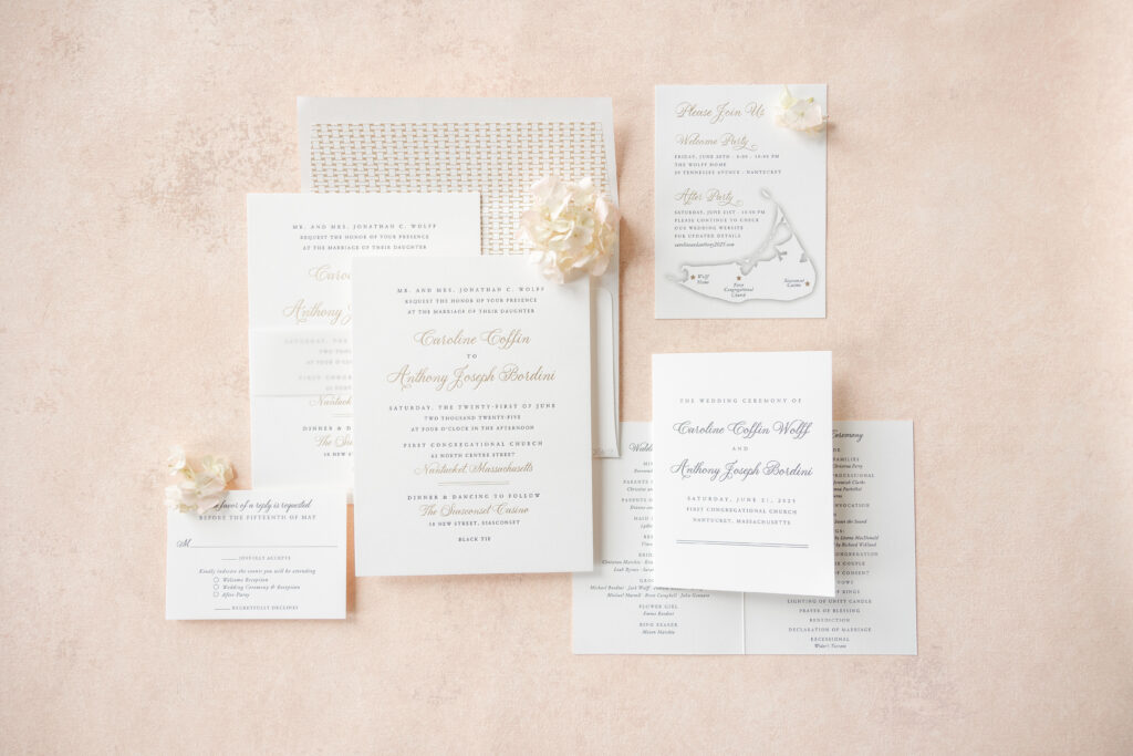
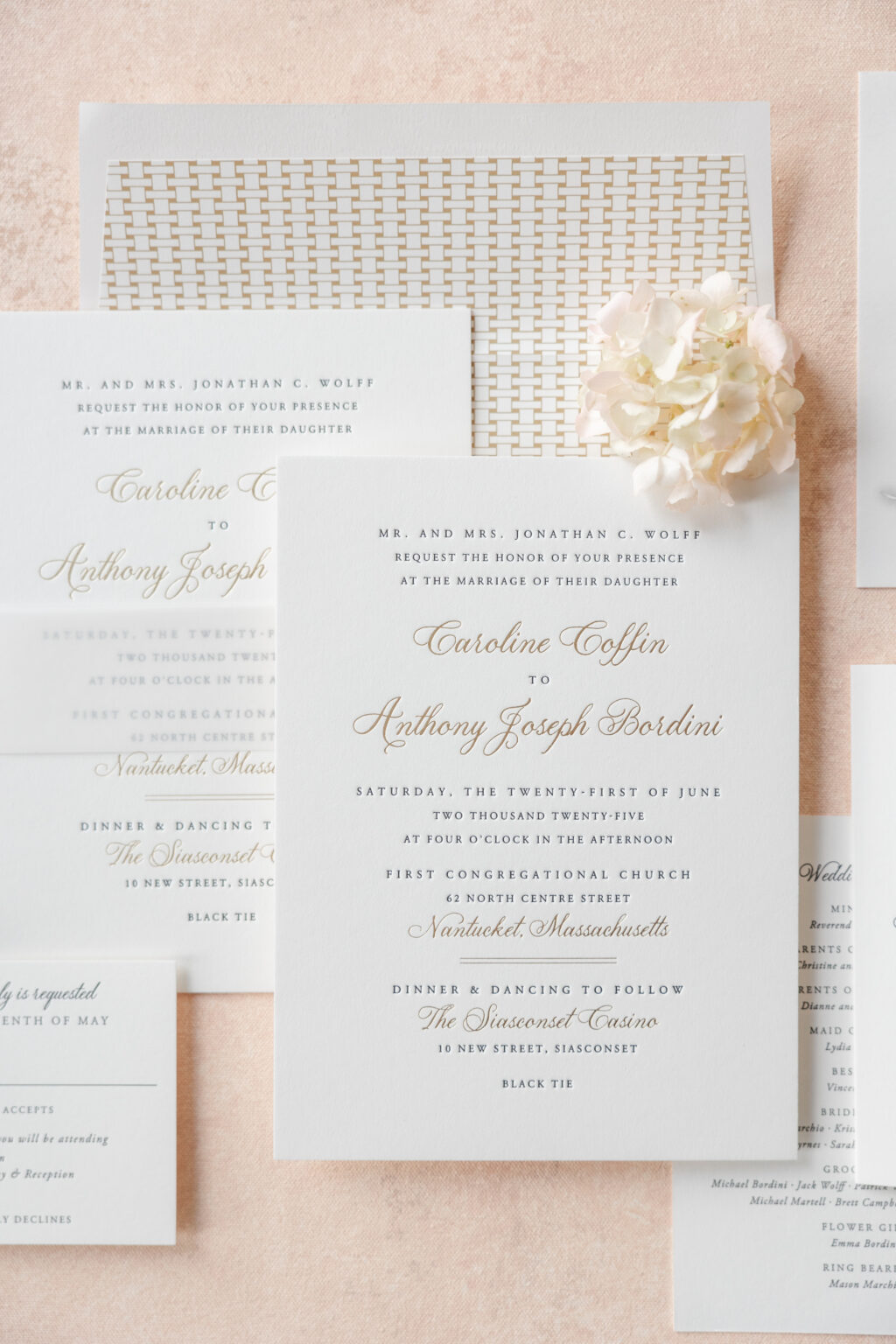
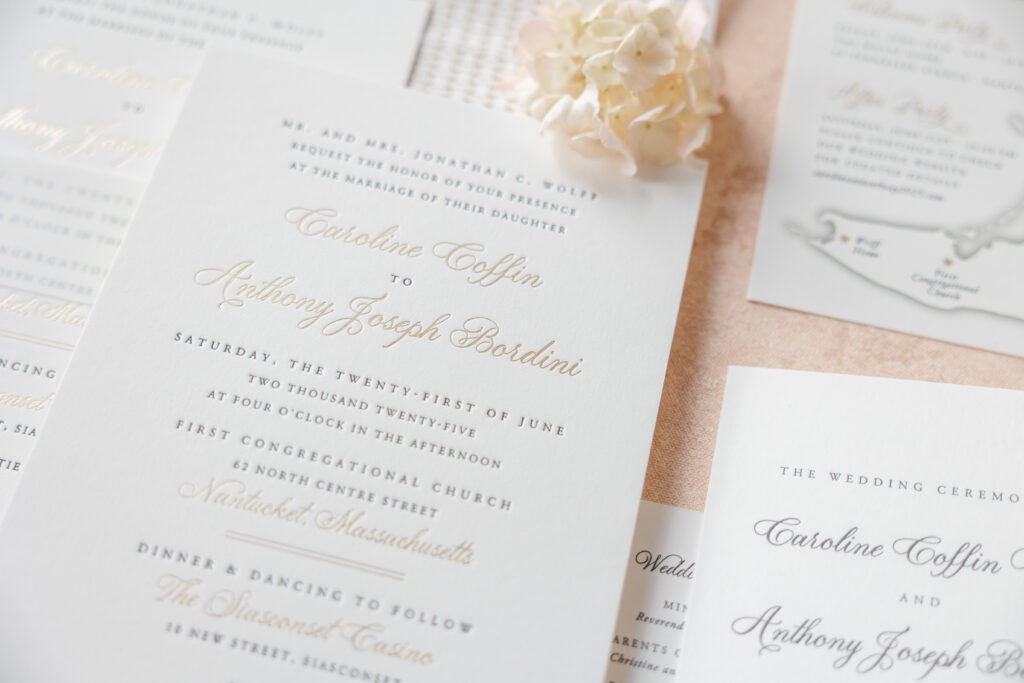
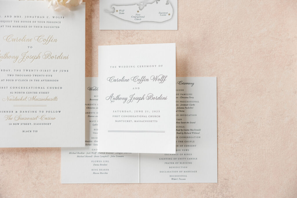
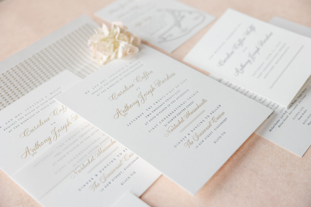
Caroline and Anthony’s coastal wedding invitations are timeless and refined, perfect for their Nantucket nuptials. This couple chose to customize our Chadwick design and worked with our dear friend Heidi of Parchment Fine Papers to create their lovely invitations.
Invitation
letterpress ink: black
foil stamping: champagne matte
fonts: garamond + plaza
paper: bella smooth cotton 2-ply white
card size: f-8
envelope liner: starboard pattern in antique gold digital on white text
envelope: white cotton text
envelope addressing: black digital on the front and the back
job: 75949
Belly Band
paper: 40# vellum
size: f-8 vertical belly band
job: 75949
The layout is symmetrical and balanced, reinforcing that sense of timeless formality. Black letterpress is elegant, and the use of champagne matte foil for select lines introduces gilded glamour. The script font is airy and fluid, and keeps the design feeling fresh. The envelope liner’s woven pattern adds a hint of coastal influence, while antique-gold foil stamping maintains the design’s formality.
Events Card
letterpress ink: black
foil stamping: champagne matte
digital inks: pewter + cmyk
fonts: garamond + plaza
paper: bella smooth cotton 1-ply white
card size: a-6
job: 75949
Reply Card
letterpress ink: black
fonts: garamond + plaza
paper: bella smooth cotton 1-ply white
card size: a-5
envelope: white cotton text
envelope addressing: black digital on the front
job: 75949
Folded Program Cover
digital inks: black (exterior) / black (interior)
fonts: garamond + plaza
paper: bella smooth cotton 1-ply white
card size: a-6 folded
finishing: score
job: 77239
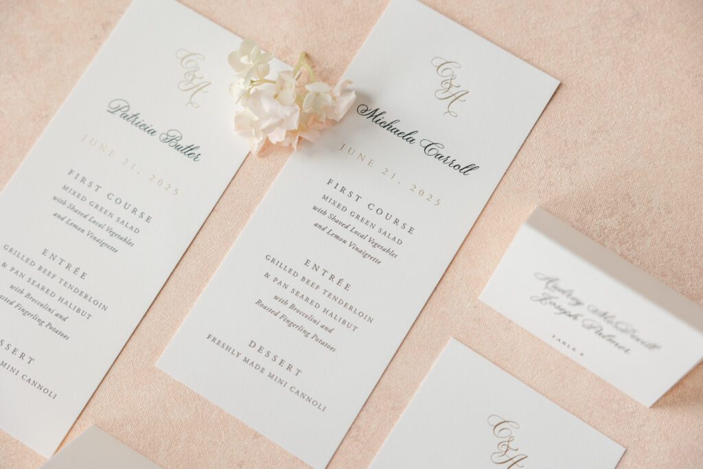
Menu
foil stamping: champagne matte
letterpress ink: black
digital ink: black
fonts: garamond + plaza
paper: bella smooth cotton 1-ply white
card size: 3.5” x 8.25”
job: 77239
Folded Escort Card
digital ink: black
fonts: garamond + plaza
paper: bella smooth cotton 1-ply white
card size: no. 17 folded
finishing: score
job: 77239
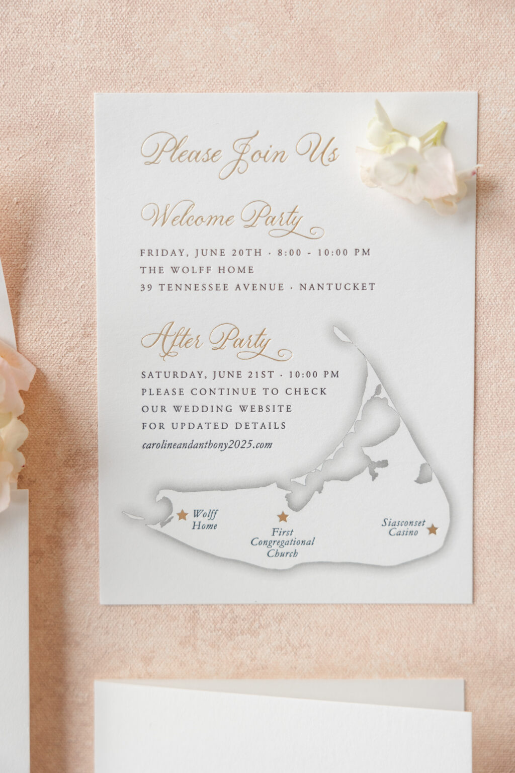
The details card features a map of the island and highlights key locations. This detail adds a personal, cozy touch to the design.
These elegant coastal wedding invitations have us dreaming of summer days near the water. Do you like the idea of a custom map or a stately foil-stamped envelope liner? Work with one of our dealers to receive expert guidance as you design your perfect wedding stationery.
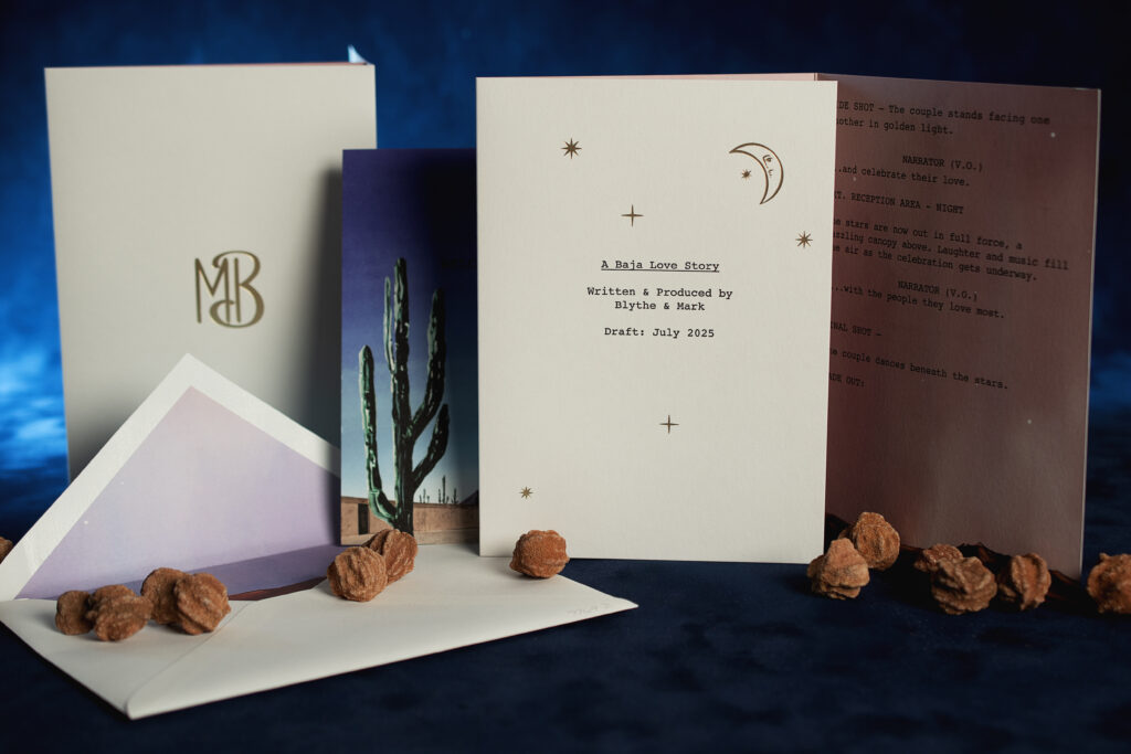
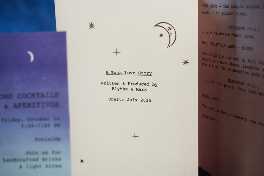
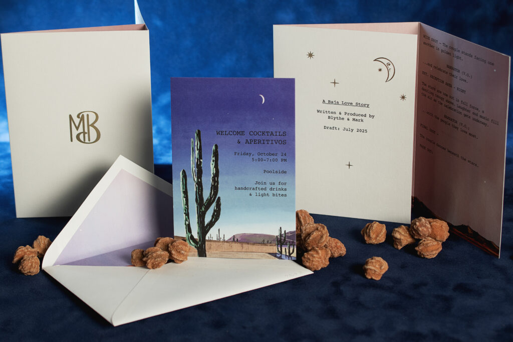
These invitations blend a cinematic storytelling vibe with a moody, Baja aesthetic. The concept is unique and unconventional, but it is also thoughtful, highly personal, and absolutely lovely. The couple, Blyth and Mark, worked with our dear friend Stacey of Union Street Papery to create their striking cinematic desert-inspired wedding invitations.
At its core, the design is very narrative-driven. The invitation is designed to mimic a screenplay, creating a film-like experience for their guests. The booklet format and minimalist typography, complete with stage directions, is a form of elevated storytelling.
Invitation
foil stamping: champagne matte (exterior)
digital ink: black + cmyk (interior) / black (exterior)
font: courier
paper: bella cover white
card size: a-7 c-fold (15.58” x 7.19” open, 5.19” x 7.19” closed)
finishing: score
envelope liner: custom-supplied pattern in cmyk digital on white text
envelope: white cotton text pointed flap
envelope addressing: black digital on the front and the back
job: 77692
Welcome Party Card
digital ink: black + cmyk
font: courier
paper: bella cover white
card size: 4.25” x 6.25”
job: 77692
The color palette leans into deep twilight tones from inky blues to dusty pinks, perfectly setting the desert scene of this destination wedding. An illustrated cactus silhouette against a fading sunset sky adds a strong sense of place, evoking a Baja desert landscape. That gradient sky perfectly captures golden hour slipping into night.
There’s a subtle celestial moment of tiny stars and a crescent moon in champagne matte foil on the first exterior panel. It gives the whole suite a dreamy, under-the-stars intimacy, like a quiet evening in the desert with just a few close people and a lot of atmosphere. The typography is clean and unassuming. A typewriter-inspired font adheres to the theme while subtly emphasizing the landscape artwork.
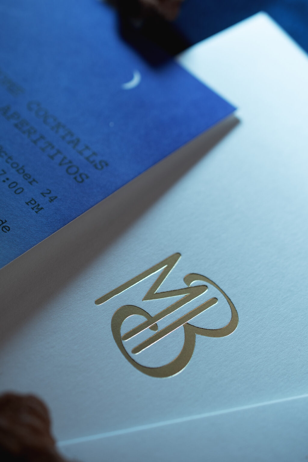
The contemporary monogram, on the back exterior panel, adds a touch of elegance, grounding the otherwise conceptual design.
These desert-inspired wedding invitations beautifully set the scene, allowing guests to envision the experience. Are you dreaming of wedding invitations that invoke moody desert romance or of an intimate, minimalist yet intentional vibe? Work with one of our dealers to turn your vision into your perfect invitations.
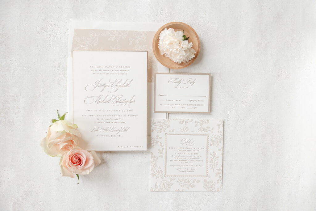
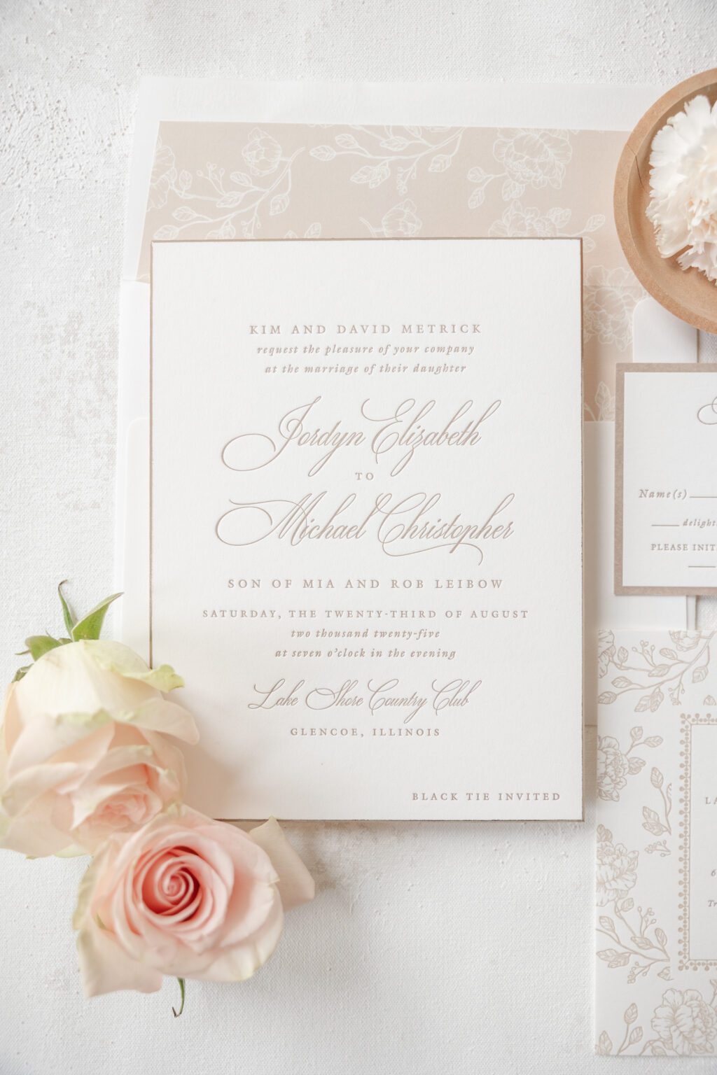
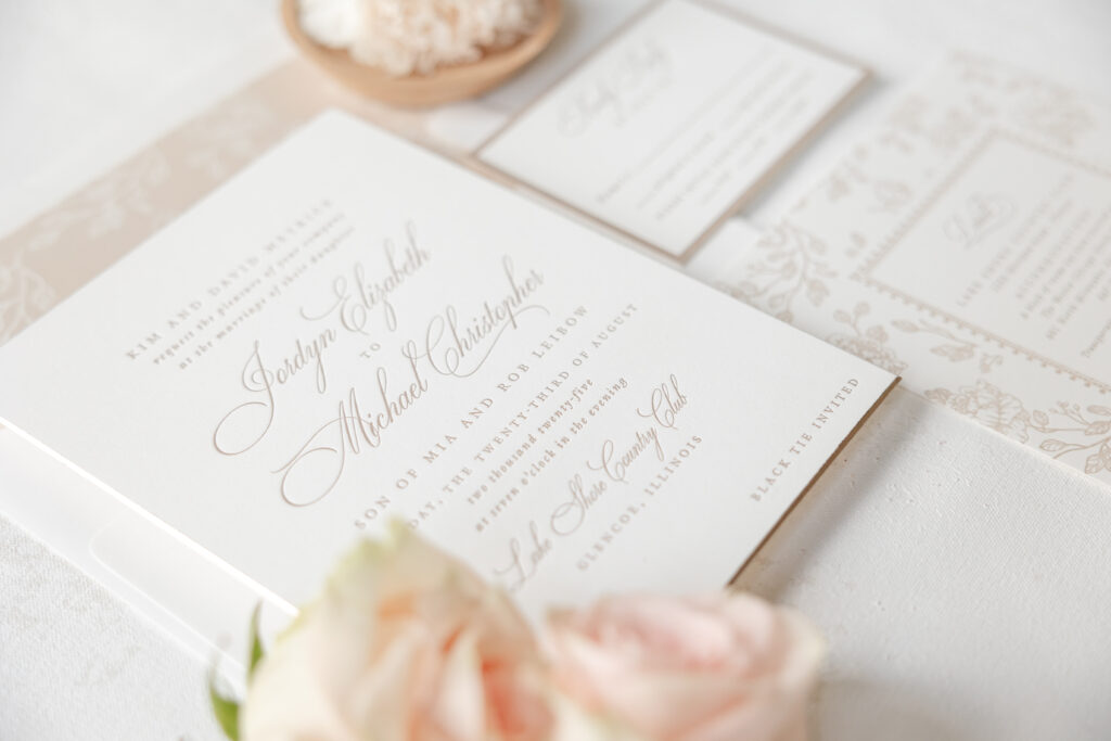
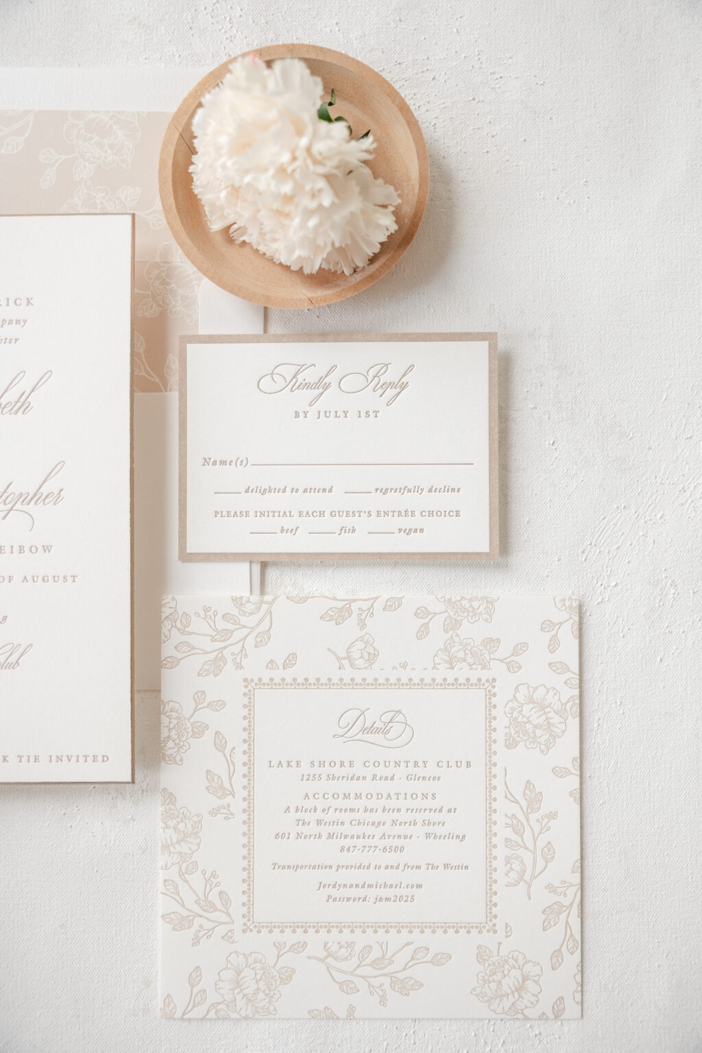
We can’t get enough of the warm, neutral color palette, sophisticated script font, edge beveling, and floral details of this gorgeous stationery suite. Jordyn and Michael worked with our dear friend Carolyn of Quintessence Fine Papers and Gifts to bring these understated letterpress wedding invitations to life. The style is elegant, romantic, and utterly stunning.
Invitation
letterpress ink: toast
fonts: ecatherina + galliard pro
paper: bella smooth cotton 2-ply white
card size: f-8
bevel: 45-degree
foil edge: mink matte
envelope liner: margaret pattern in khaki digital on white text
envelope: white cotton text
envelope addressing: toast digital on the front and the back
job: 75638
Toast letterpress ink evokes a warm, cozy feeling while still leaning into a subtle elegance. The look is gentle and almost ethereal, setting the perfect tone for the graceful, flowing script font. The grand flourishes of the ornate font elevate the design. A foil edge in mink matte enhances the bevel edging while maintaining the poised air of refinement.
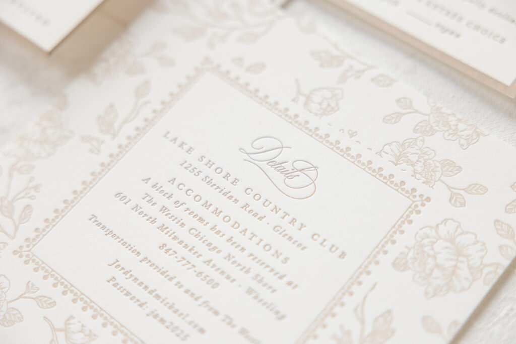
Floral artwork for the envelope liner supports the romantic look. For the liner, the space between the flowers is printed to create the pattern in the void. The technique is reversed and transformed into a wide border for the details card, in which the flowers are printed to create the pattern.
Reply Card
letterpress ink: toast
fonts: ecatherina + galliard pro
paper: bella smooth cotton 1-ply white
card size: a-5
envelope: almond text
envelope addressing: toast digital on the front
job: 75638
Details Card
letterpress ink: toast
fonts: ecatherina + galliard pro
paper: bella almond 1-ply
card size: 6.19” x 4.56”
die-cut shape: bp-127
job: 75638
This custom design is lovely, and it’s always a joy to work with Quintessence Fine Papers and Gifts. Whether you want to customize one of our existing designs or create your own letterpress wedding invitations, work with one of our dealers for guidance and expertise throughout the process.
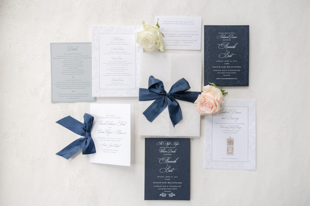
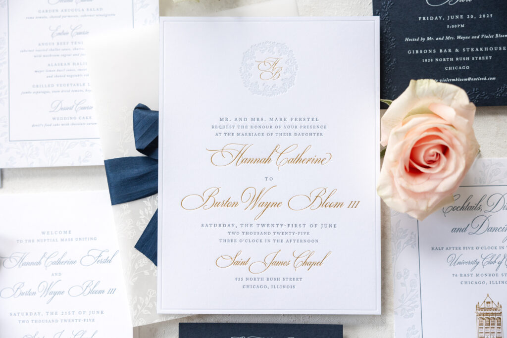
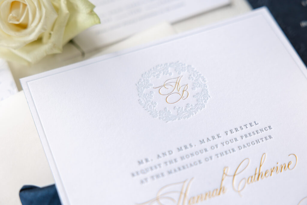
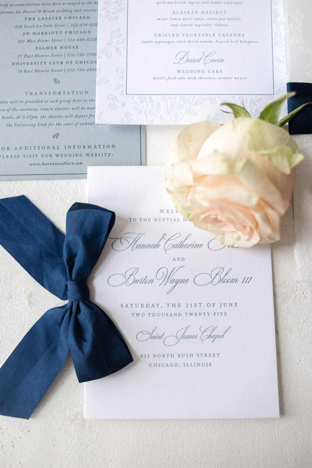
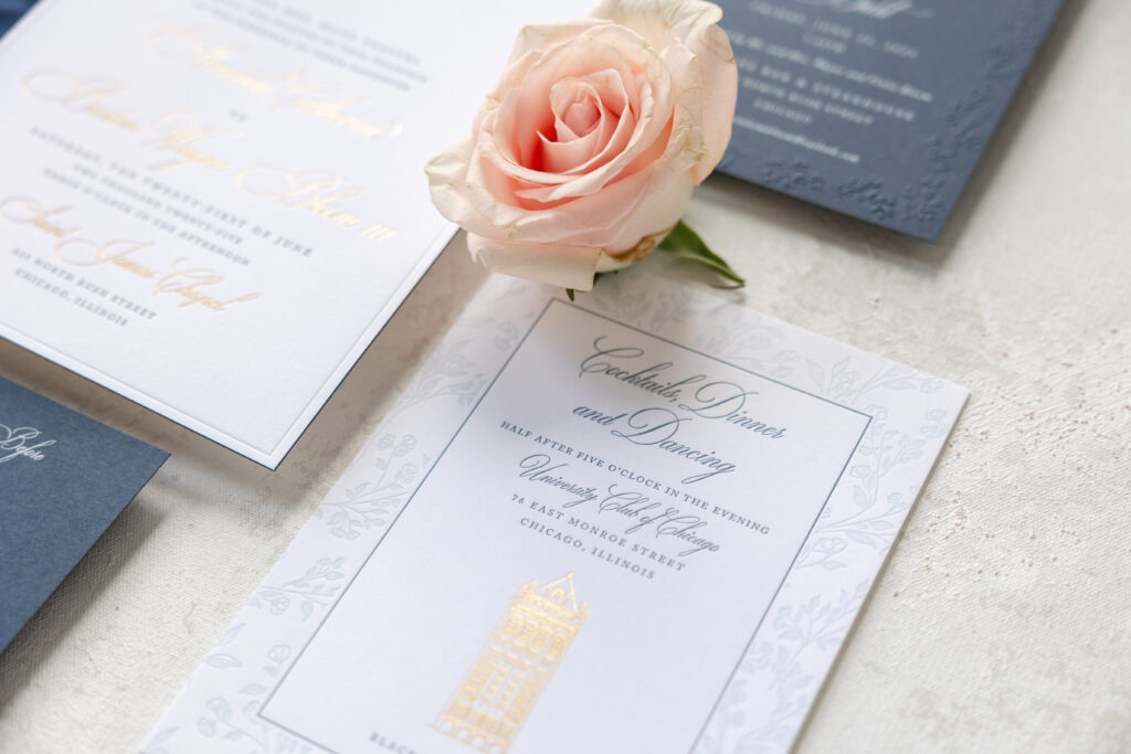
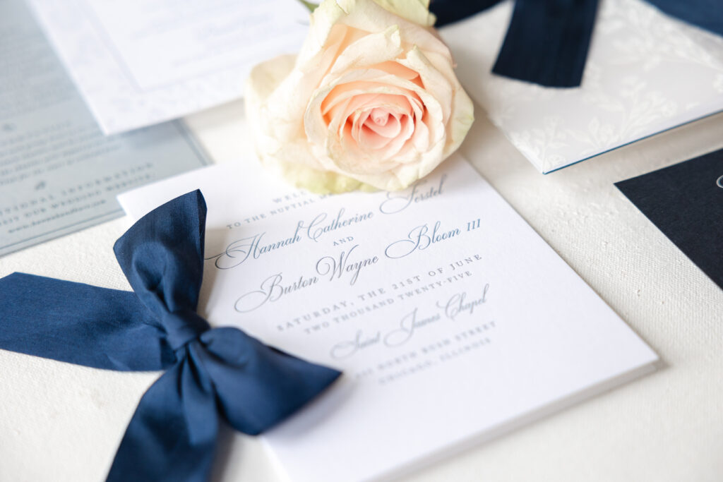
This couple wanted their invitations to be graceful, elegant, and enduring, and they certainly made that happen. Hannah and Burton worked with our dear friend Jena of Big City Bride to customize our Carmichael design. These letterpress and foil invitations are regal, effortless, and peak sophistication.
Invitation
letterpress inks: deep blue + powder blue
foil stamping: gold matte
fonts: caslon + mozart script
paper: bella smooth cotton 2-ply bright white
card size: f-8
edge paint: deep blue
silk ribbon: navy
envelope: white cotton text
envelope addressing: deep blue digital on the front and the back
job: 73775
Gatefold Wrap
digital ink: white
paper: 40# vellum
card size: f-8 vertical gatefold (8.31” x 12.51” flat, 8.31” x 6.24” folded)
job: 73775
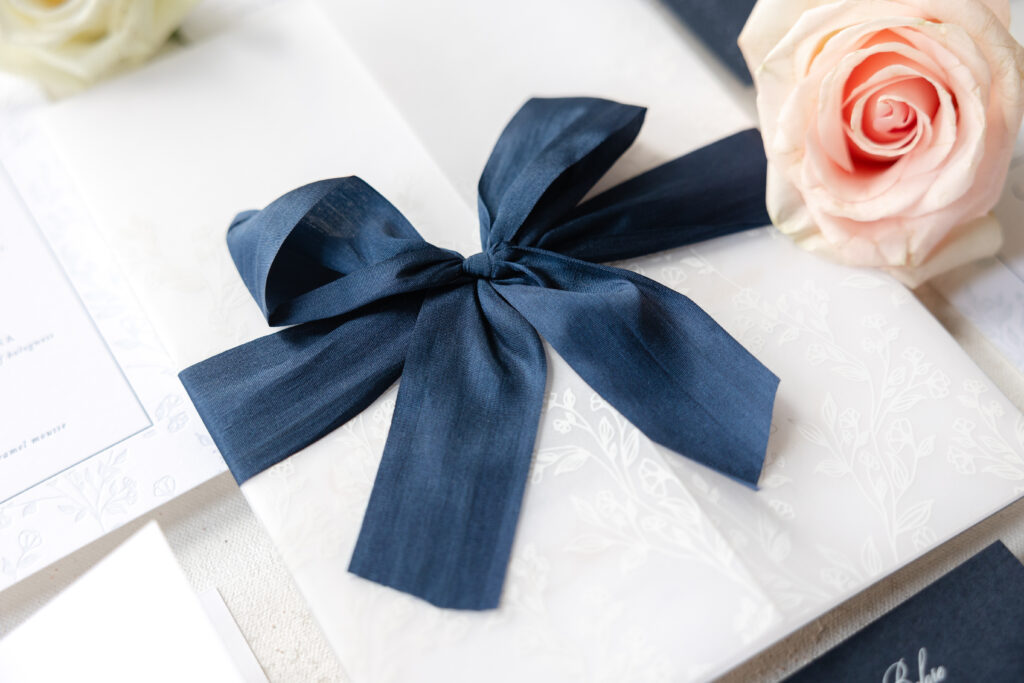
A delicate wreath-inspired monogram adds a personal detail and crest-like feel. A thin line border in powder blue frames the invitation, while edge painting in our deep blue ink, a slightly darker hue, adds depth and a burst of color. A vellum gatefold wraps around the invitation and is secured with a decadent silk ribbon. Floral artwork digitally printed in white adorns the gatefold for a subtle yet impactful look.
Our Bella Smooth Cotton stock in bright white is crisp and plush and holds a deep letterpress impression, making it the perfect foundation for this design. The ornate script font cascades across the paper, adding tradition and romance. The use of gold matte foil for the script text further emphasizes the font’s swooping flourishes.
Welcome Party Card
digital ink: white
fonts: caslon + mozart script
paper: bella dark blue 1-ply
card size: a-6
job: 73775
Reply Card
letterpress ink: deep blue
fonts: caslon + mozart script
paper: bella smooth cotton 1-ply bright white
card size: a-5
envelope: cold text
envelope addressing: white digital on the front
job: 73775
Reception Card
letterpress inks: deep blue + powder blue
foil stamping: gold matte
fonts: caslon + mozart script
paper: bella smooth cotton 1-ply bright white
card size: a-7
job: 73775
Details Card
letterpress ink: deep blue
fonts: caslon + mozart script
paper: bella cloud 1-ply
card size: a-6
job: 73775
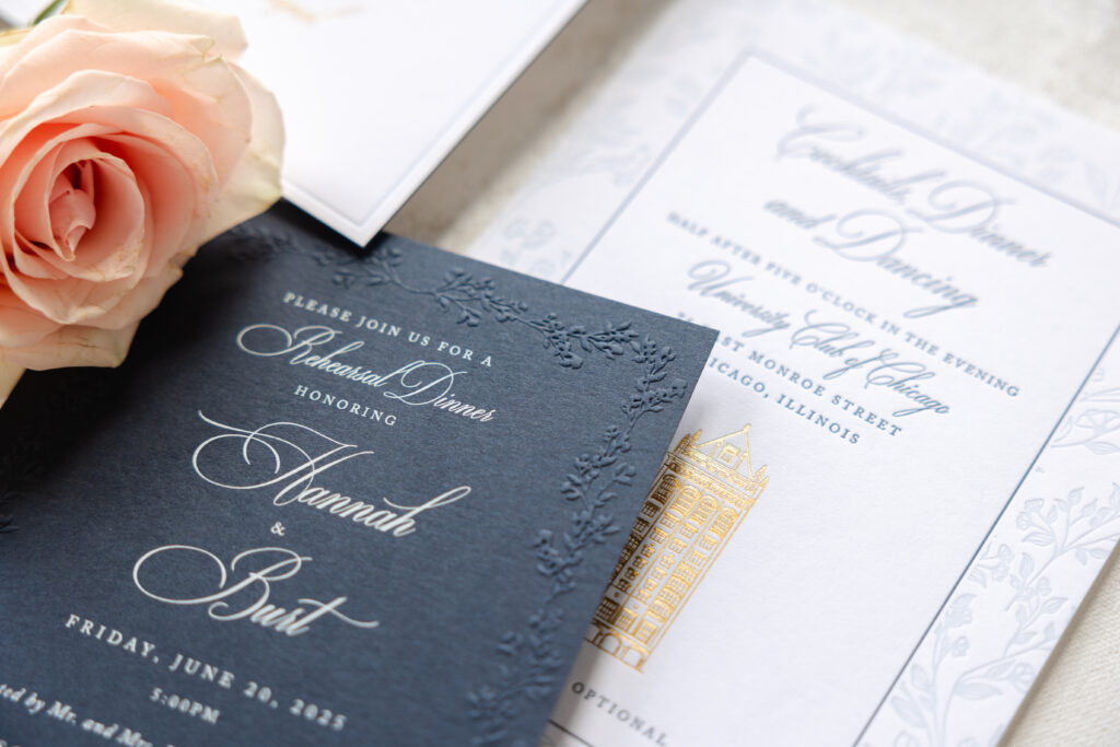
Rehearsal Dinner Invitation
digital ink: white
emboss: blind
fonts: caslon + mozart script
paper: bella dark blue 1-ply
card size: a-6
job: 73775
Design elements from the invitation appear thoughtfully throughout the suite. The welcome party card and rehearsal dinner invite reverse the invitation’s color palette and feature white digital printing on our dark blue stock. The floral pattern from the wreath encircling the monogram and the gatefold is letterpress-printed on the reception card and blind-embossed on the rehearsal dinner invitation. The border on the details card matches the border on the invitation. These deliberate design choices ensure consistency across all of the cards.
It’s always a pleasure to work with Big City Bride, because we know they always have something gorgeous and magnificent for us. Do you need help designing your letterpress and foil invitations? Do you want a crest-like monogram or a vellum gatefold? Work with one of our dealers to receive expert tips and guidance.
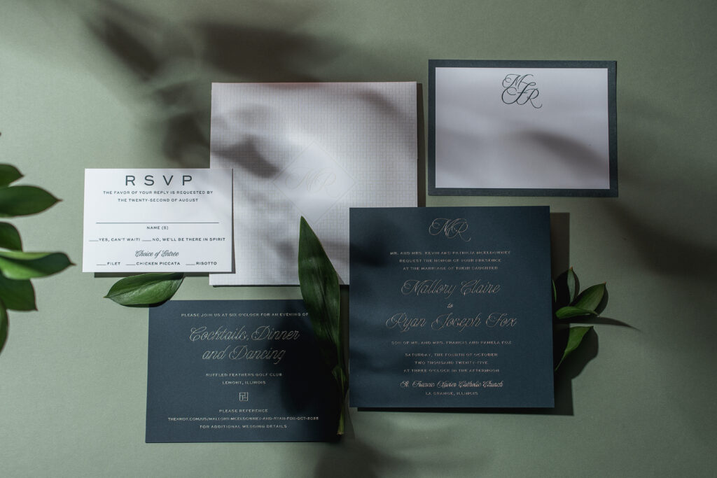
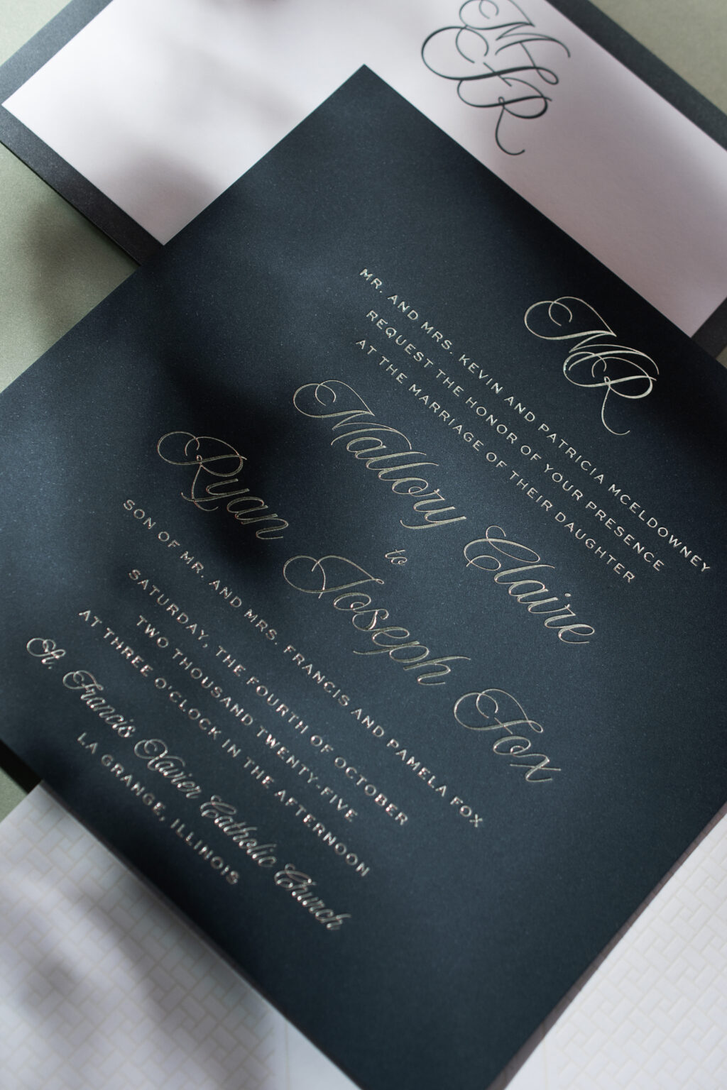
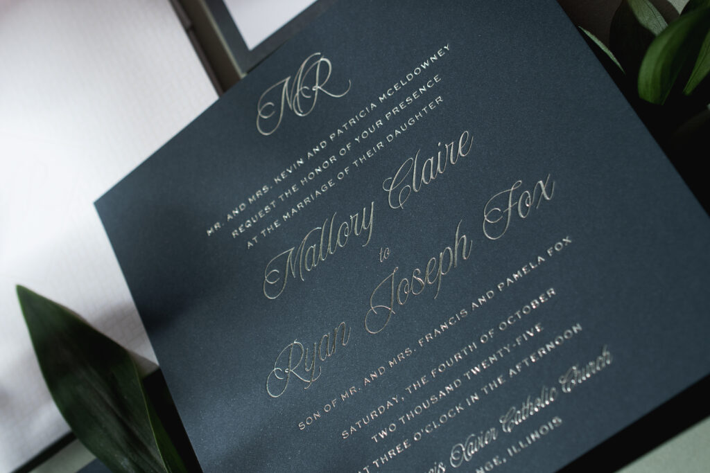
This wedding stationery suite is elegant, tailored, and quietly dramatic, and we love it for that. Mallory and Ryan worked with our dear friend Christy of Eventful Designs to customize our Gwynn design, and the results are stunning. See how this couple created these modern yet classic foil stamped wedding invitations.
Invitation
foil stamping: tawny shine
fonts: new icon + sweet sans
paper: bella evergreen 2-ply
card size: sq-7 for pocketfold
envelope: white cotton text
job: 77251
Reply Card
letterpres ink: holly
fonts: new icon + sweet sans
paper: bella smooth cotton 1-ply
card size: a-5
job: 77251
Reception Card
foil stamping: tawny shine
fonts: new icon + sweet sans
paper: bella evergreen 2-ply
card size: a-6
job: 77251
The square card sets a contemporary tone, and our evergreen 2-ply paper pairs beautifully with tawny-shine foil. The contrast between the glimmer of the foil and the dark paper is timeless but still has a modern edge.
The script font is smooth, fluid, and expressive. A monogram of the couple’s initials at the top is a lovely personal touch. The use of a sans-serif font for the supporting text is clean and minimalist, further emphasizing the drama of the ornate script.
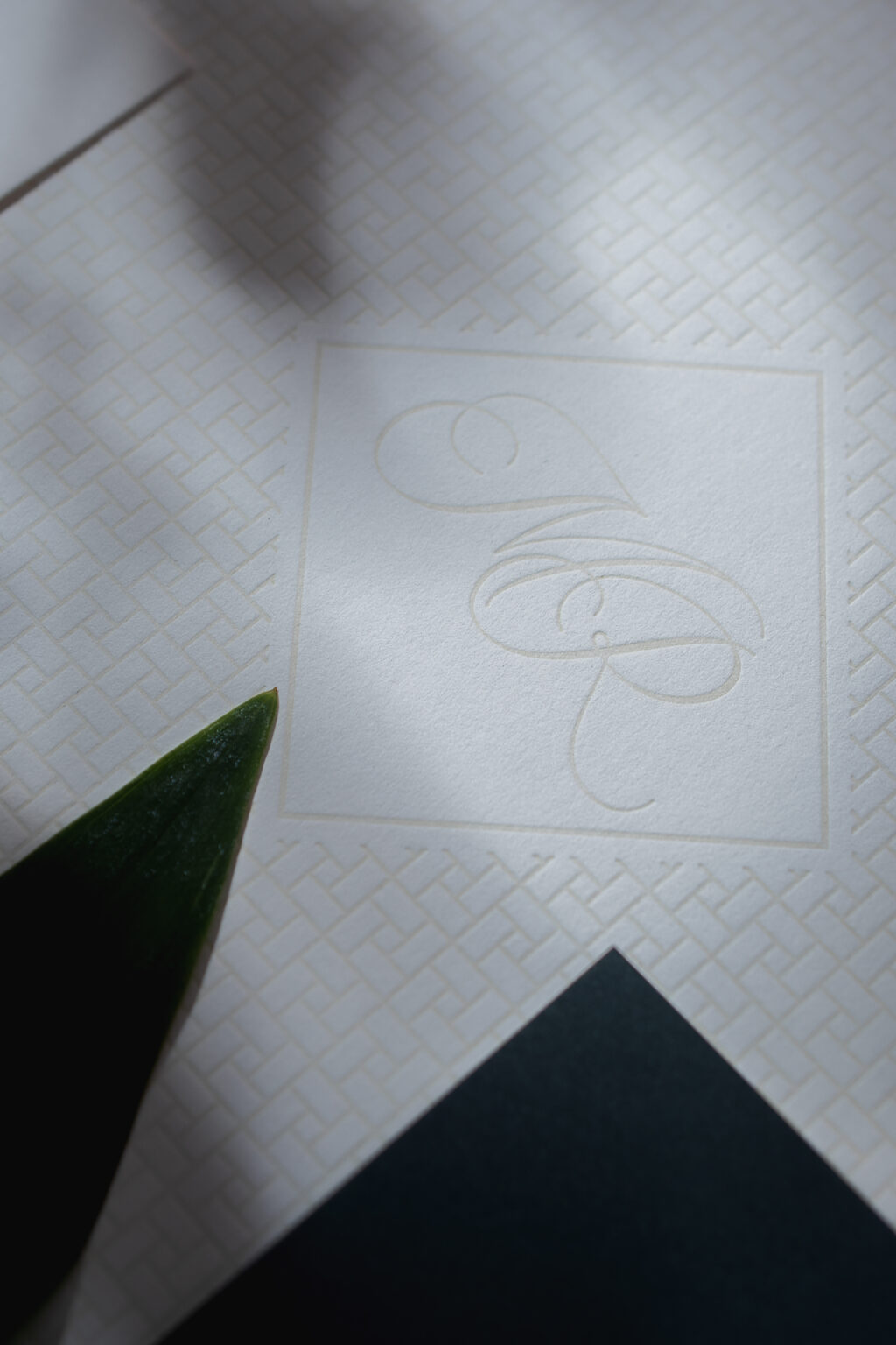
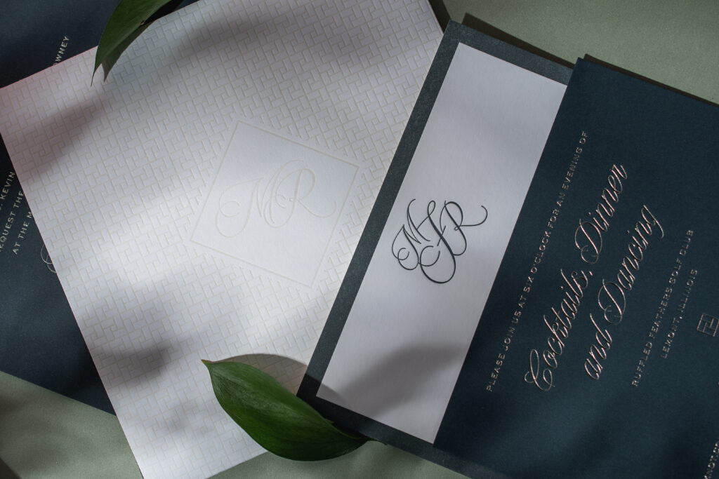
Pocketfold
letterpres ink: sand
fonts: new icon
paper: bella smooth cotton white 1-ply
card size: sq-7 horizontal self-closing pocketfold (6.75” x 15.9” open, 6.75” x 6.75”
envelope: white cotton text
job: 77251
Belly Band
paper: 40# vellum
card size: sq-7 inner belly band (1.75” x 13.75” open, 1.75” x 6.49” closed)
finishing: finish with pocketfold
job: 77251
Flat Thank You Card
letterpres ink: holly
fonts: new icon
paper: bella smooth cotton 1-ply
card size: a-6
job: 77251
Guests get another peek at the monogram on the cover of the pocketfold. This enclosure neatly holds the cards, ensuring a polished presentation when guests open the envelope. The monogram makes one final appearance on the flat thank you card.
Mallory and Ryan took inspiration from our Gwynn design but transformed it into something absolutely beautiful and completely their own. Work with one of our dealers to customize your own design or create the wedding invitation of your dreams.
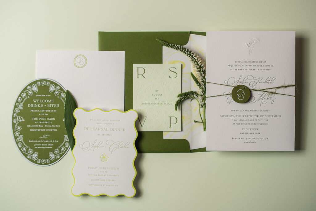
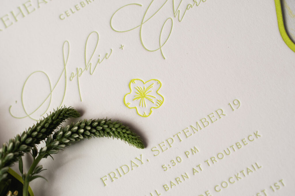
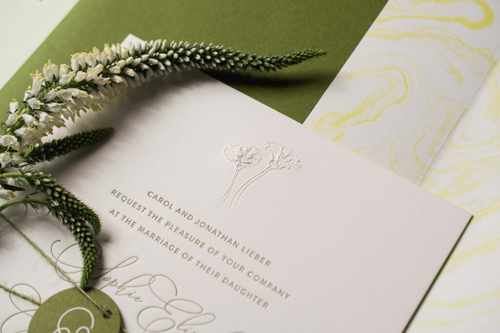
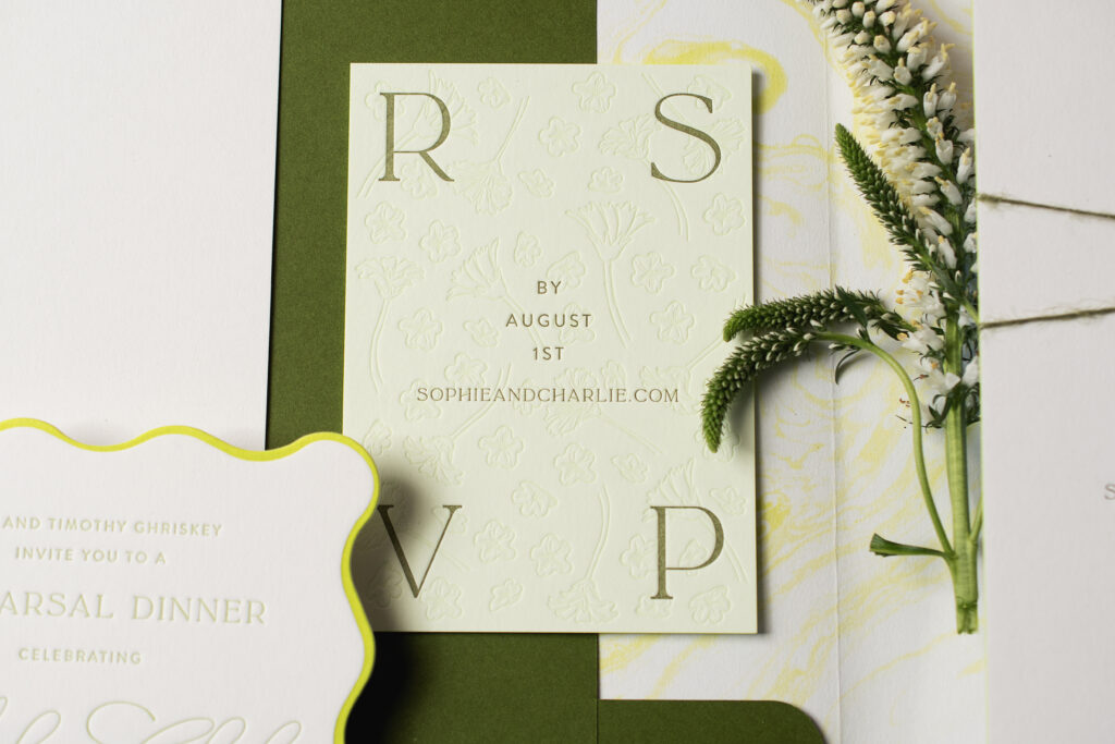
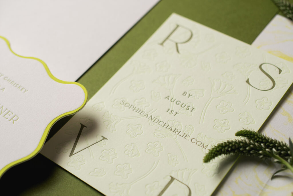
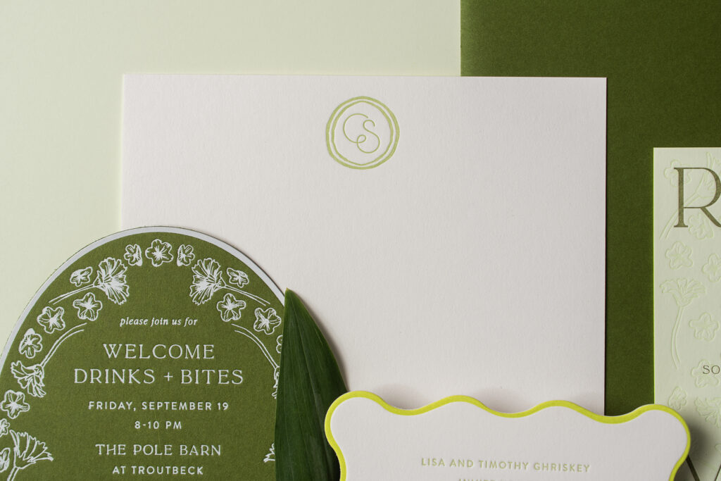
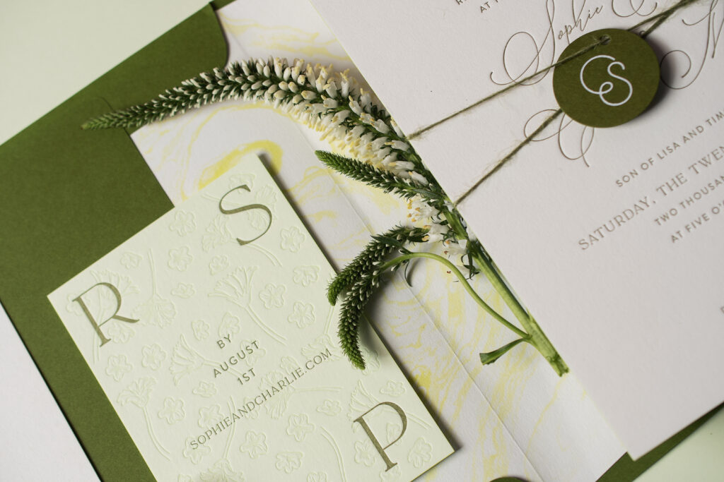
It’s hard even to know where to start with this lovely nature-inspired letterpress suite. Layers of green, sophisticated typography, and fun die cuts all work together to give this suite a fresh, earthy, organic feel that still commands a sense of formality. The design perfectly complements their venue, The Troutbeck. It was a joy to help Sophie and Charles design their stunning wedding stationery, and it was even more of a delight to print this suite.
Everything about this design feels intentional but effortless. An elegant, flowing script font for the couple’s names is romantic. The mix of serif and sans-serif fonts for the supporting text is clean and contemporary. Blind emboss floral artwork centered at the top adds organic charm. Embossing creates a raised area that offers a fun contrast to letterpress printing, which is pressed into the thick 2-ply paper. The finishing touch on the invitation is a tag bearing a custom monogram. The way the couple’s initials are connected is simple and endearing. The tag is secured to the invitation with a jute ribbon (supplied by the client), providing yet another tactile element.
The reply card is on our mint paper and features a floral pattern letterpress printed in mint ink. The coordinating ink and paper create a delightful, subtle, on-trend tonal look. The text is letterpress-printed in hunter, providing greater contrast and readability.
The details card swaps the invitation’s color palette and features white matte foil-stamping on our moss 2-ply paper. This reversal maintains the look and feel of the overall design, while mixing things up. The floral artwork from the invitation and reply card is transformed into a border that hugs the oval shape.
The rehearsal dinner invitation is a vibe. The scalloped-edge die-cut shape is whimsical, and the letterpress-printed border in lime-aid highlights curves while introducing a vibrant burst of color. This card is refined yet bold and lively.
The monogram from the tag also appears on the flat thank you card. The circular border is reminiscent of the tag’s shape. We wish Sophie and Charles the best, and we still can’t get over just how lovely their nature-inspired letterpress invitations turned out. Are you thinking about how to incorporate a custom monogram or fun die-cut shapes into your wedding stationery design? Or do you want to build your design around a pattern? Contact us, and we can help bring your vision to life.
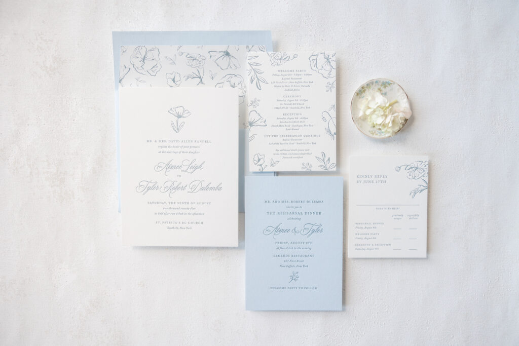
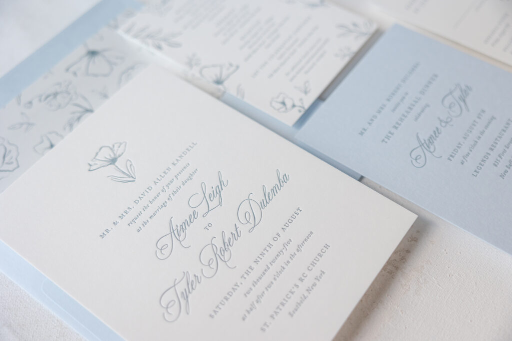
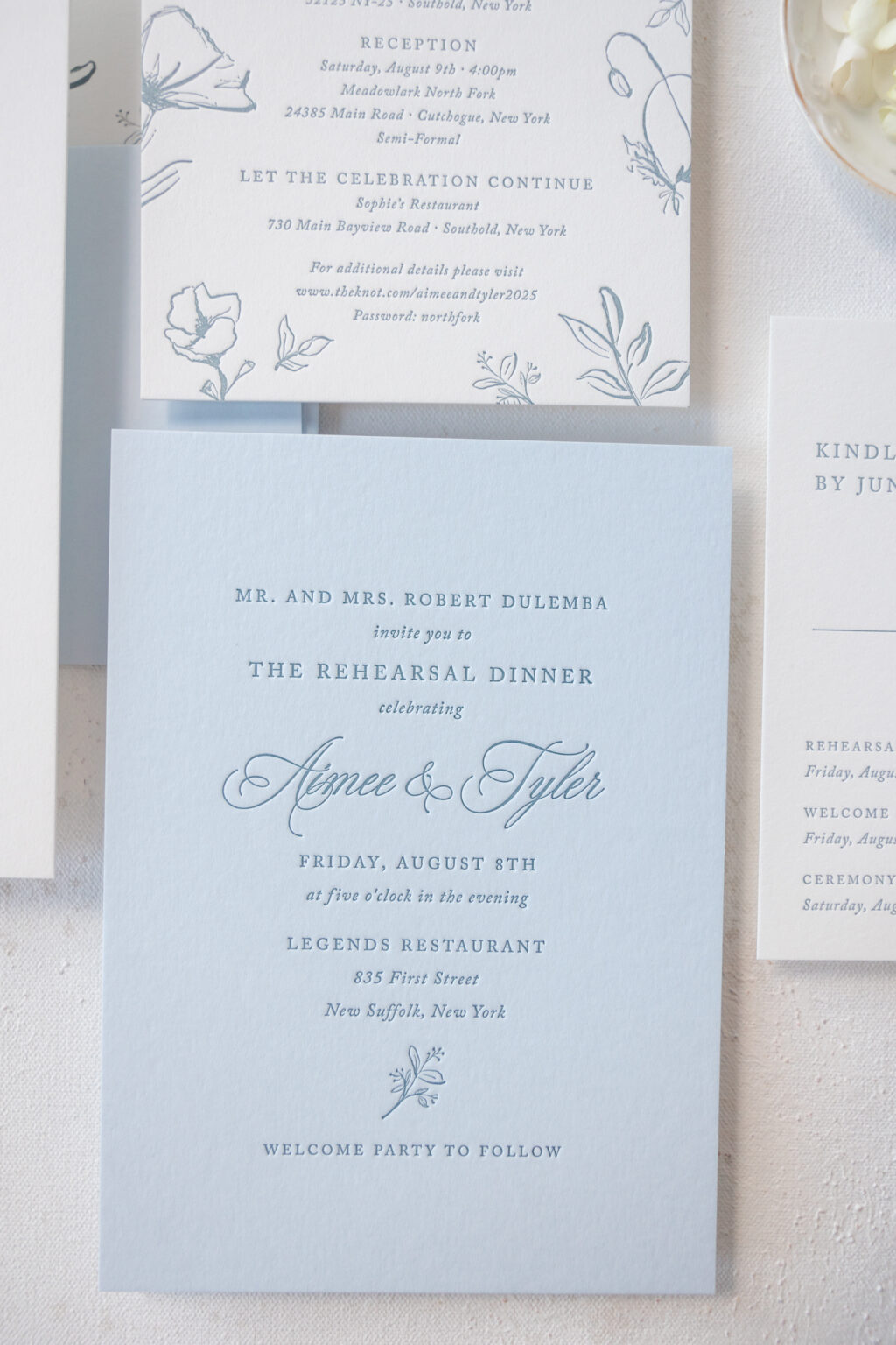
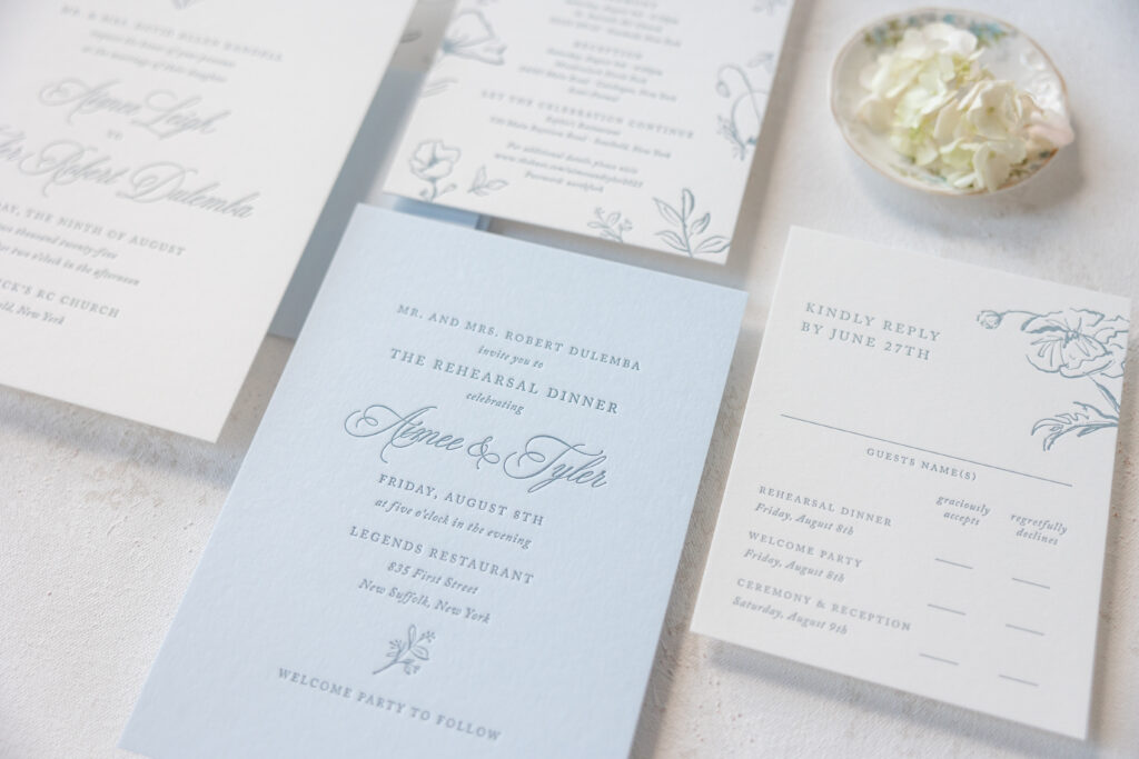
These delicate botanical invitations are refined, airy, and oh-so-romantic, while also maintaining a traditional, timeless feel. The couple, Aimee and Tyler, worked with our friend Liz from Stationer on Sunrise to create these dreamy invitations.
Invitation
letterpress ink: deep blue
fonts: juliette + adobe caslon
paper: bella smooth cotton white 2-ply
card size: f-8
envelope liner: emmerich pattern in deep blue digital on white text
envelope: sky text
envelope addressing: deep blue digital on the back
job: 75559
Rehearsal Dinner Invitation
letterpress ink: deep blue
fonts: juliette + adobe caslon
paper: bella sky 2-ply
card size: a-7
job: 75559
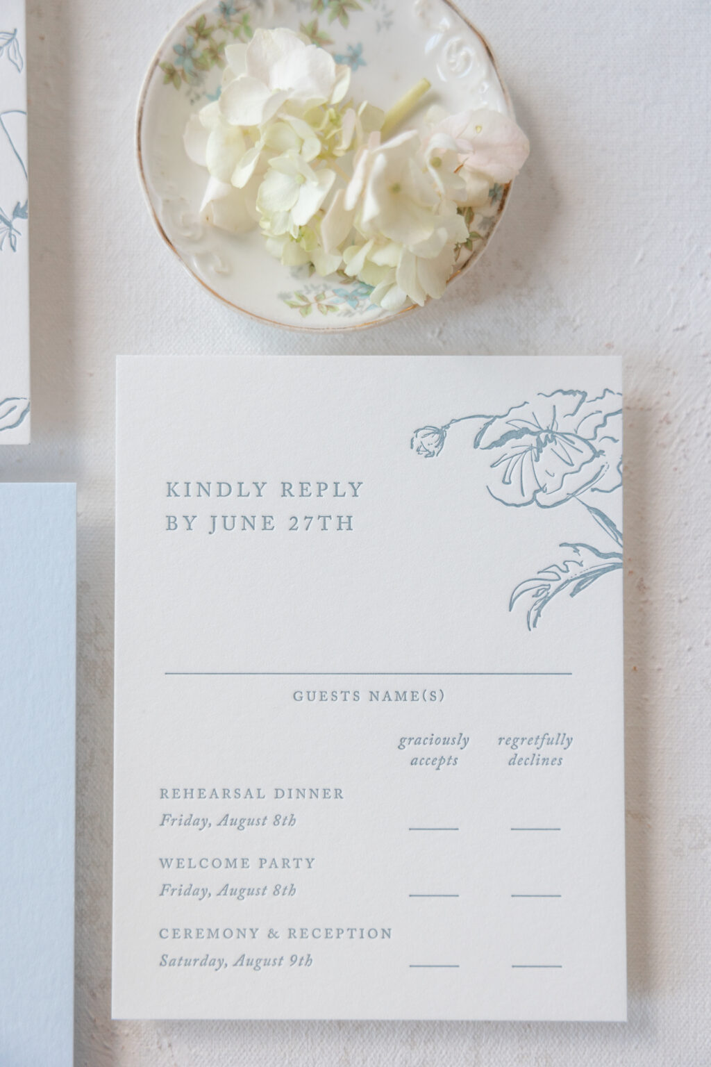
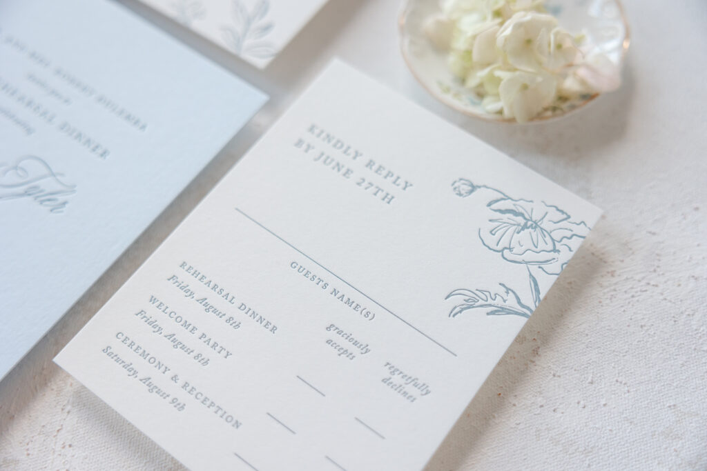
Reply Card
letterpress ink: deep blue
fonts: juliette + adobe caslon
paper: bella smooth cotton white 1-ply
card size: a-2
envelope: white cotton text
envelope addressing: deep blue digital on the front
job: 75559
Details Card
letterpress ink: deep blue
fonts: juliette + adobe caslon
paper: bella smooth cotton white 2-ply
card size: a-6
job: 75559
The layout is inspired by our now-retired Camber design but borrows floral artwork from Emmerich to replace the original’s monogram. Replacing the modern monogram with a floral motif shifts the look to be more graceful and laidback. The couple also chose to swap out the script font from the inspiration design for another, more traditional option. The original font, Adora Bouton, has a swooping, organic feel, while the font in the final design, Juilette, has grand flourishes for a more extravagant look. These design choices are subtle yet fit the couple’s vision, creating exactly what they wanted.
The reply card and details card are largely modeled after the corresponding designs from the Emmerich suite, as well as the envelope liner. Fine-line floral artwork adorns all of the cards, adding consistency across the suite. The artwork is serene and adds an elevated softness.
Whether you are daydreaming of delicate botanical invitations or something contemporary, rustic, vintage, or anything else, we can help make it happen. Contact us or visit one of our dealers to create your perfect wedding stationery.
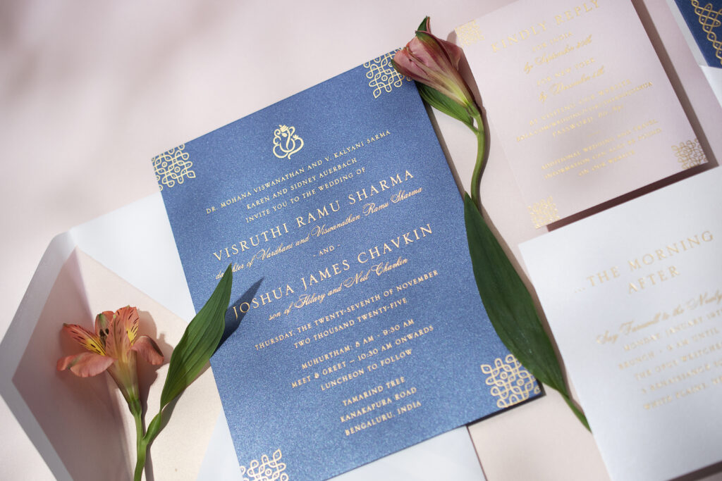
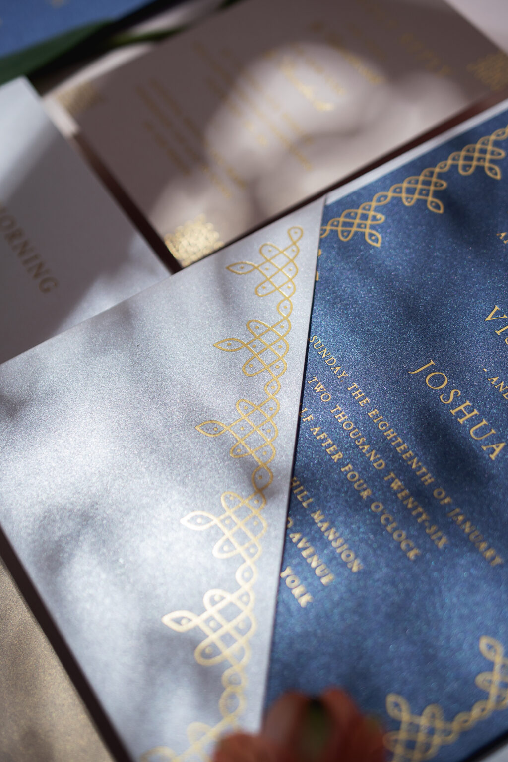
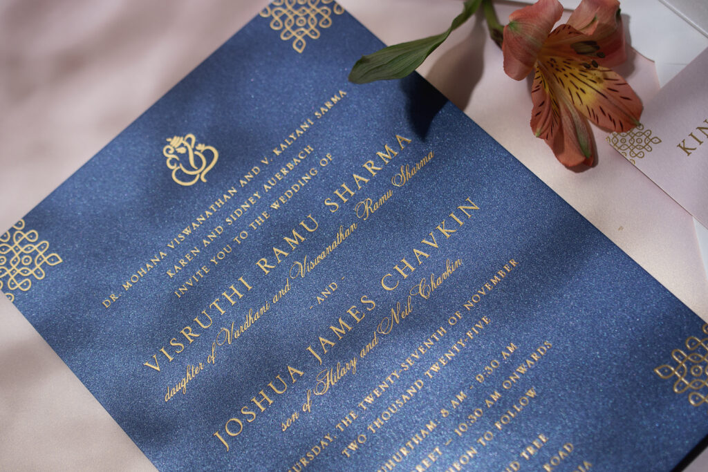
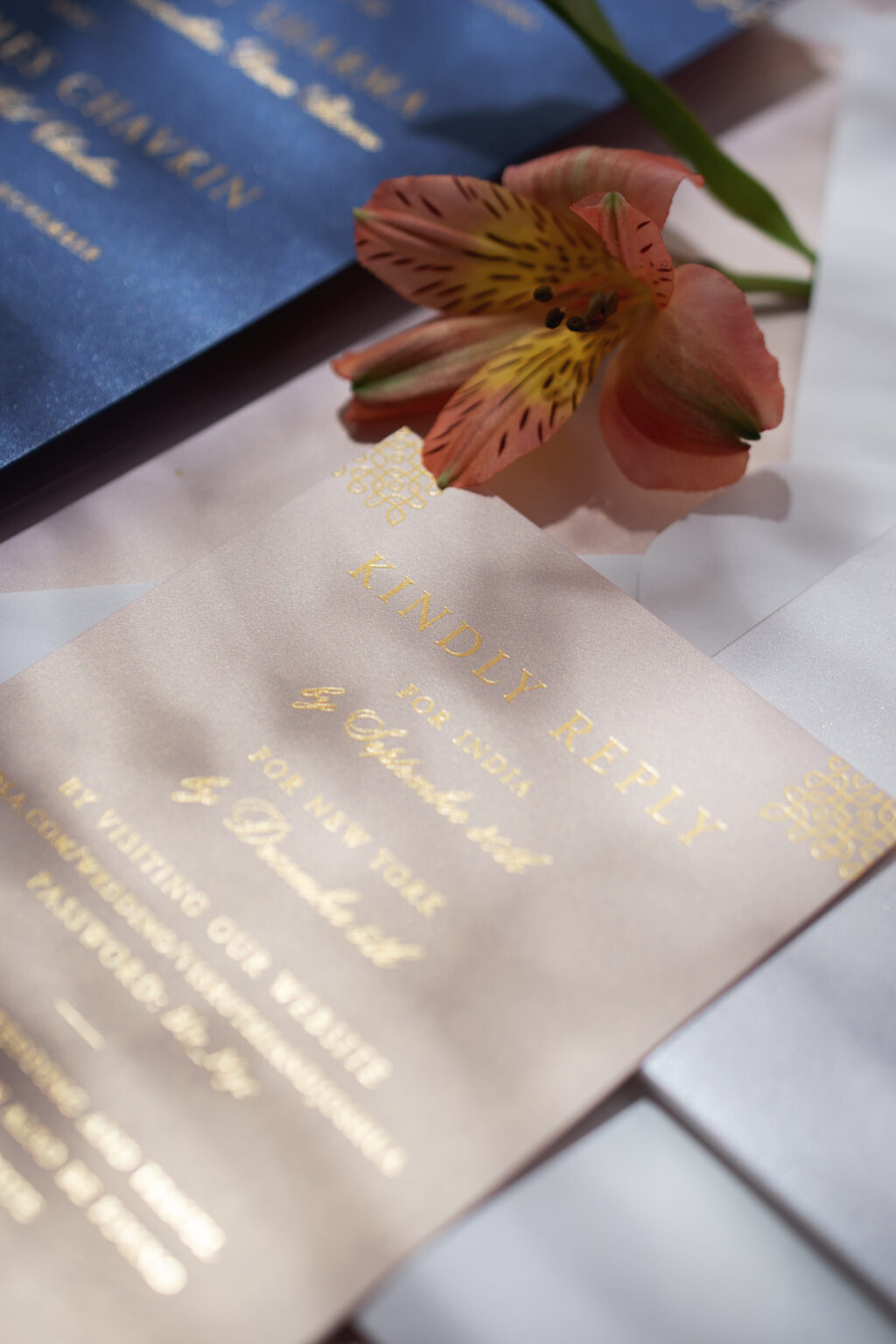
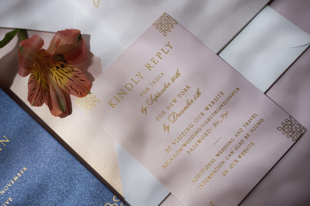
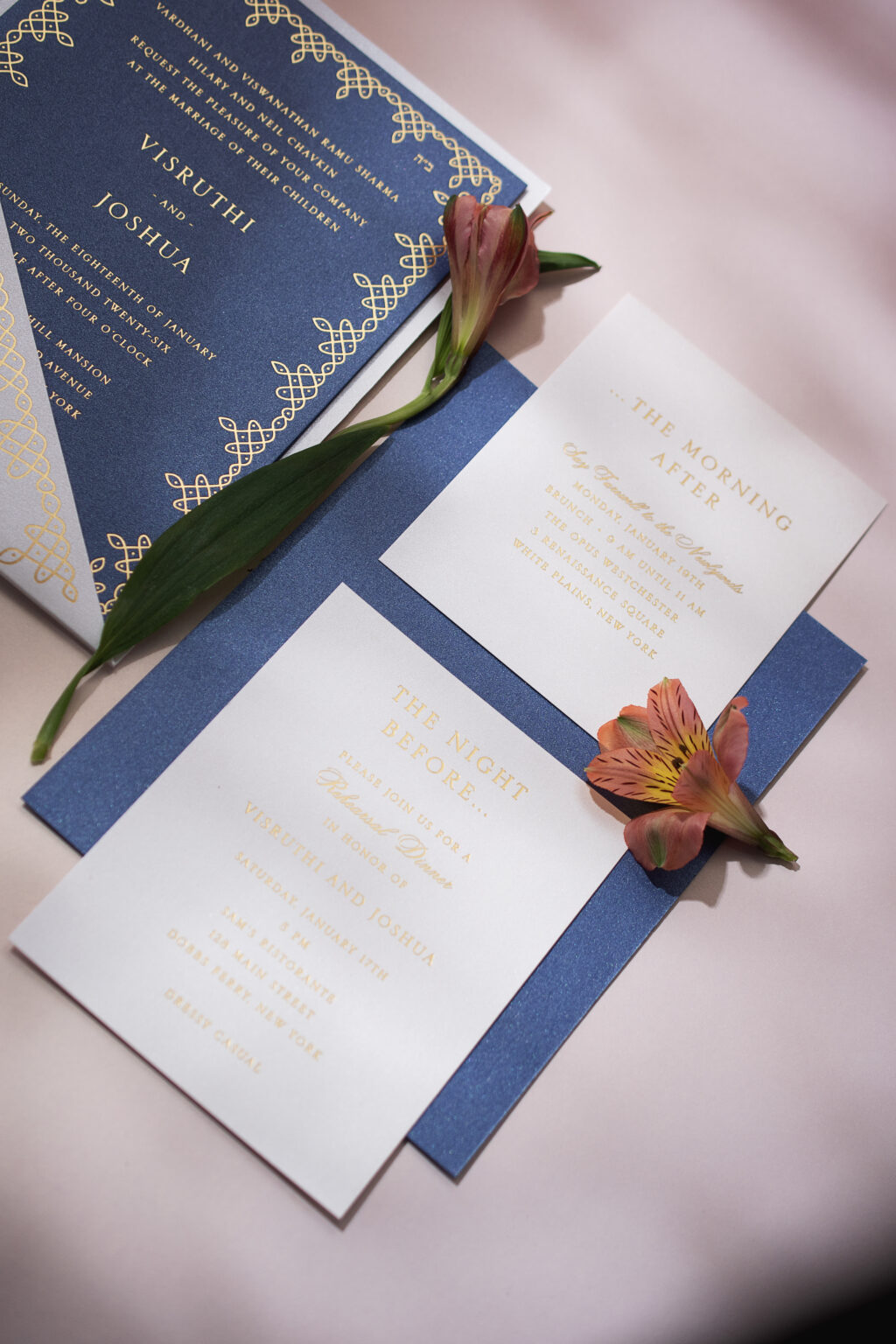
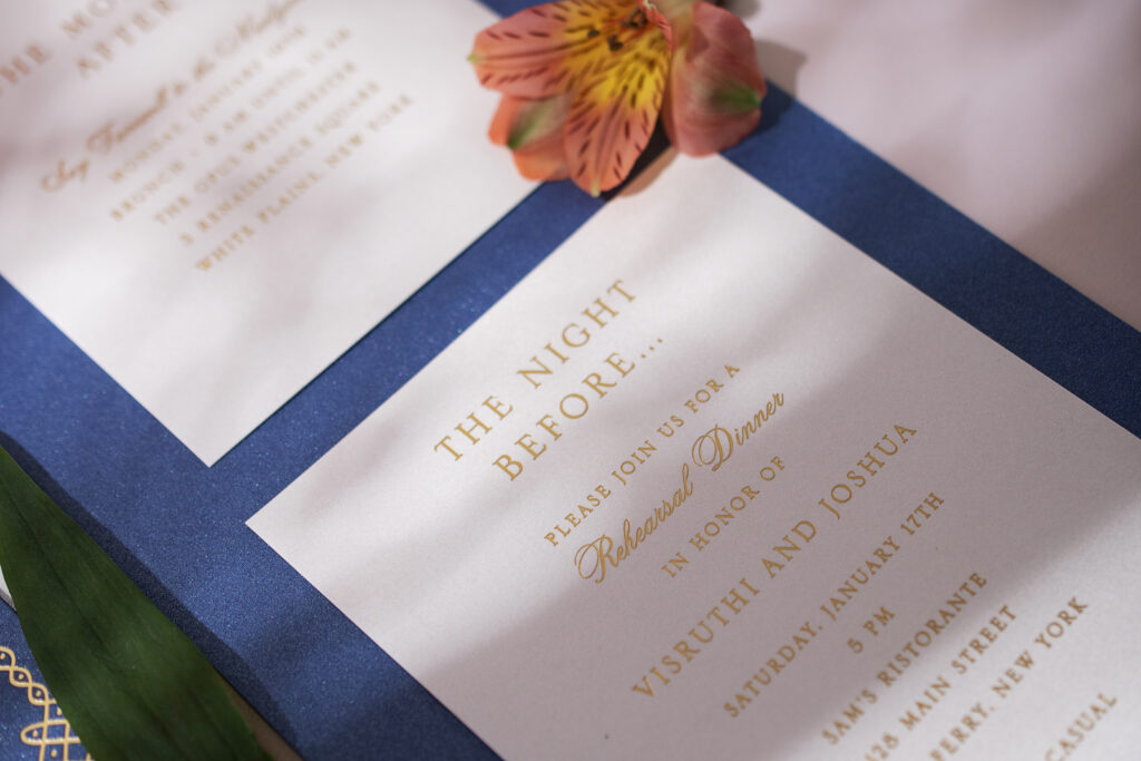
Visruthi and Joshua’s wedding invitation suite is refined and decadent. The design exudes a contemporary feel while still maintaining cultural elements that make the suite personal to the couple and their relationship. Visruthi and Joshua worked with our dear friend Elyse of EAF Fine Papers to create their custom wedding stationery, featuring gold matte foil stamping on metallic paper.
Invitation
foil stamping: gold matte
fonts: serlio + citadel script
paper: bella metallic arctic blue 2-ply
card size: f-8 for pocket panel
envelope liner: metallic primrose (no printing)
envelope: white cotton text pointed flap
envelope addressing: cobolt digital on the front and the back
job: 77098
Pocket Panel
foil stamping: gold matte
fonts: serlio
paper: bella metallic oyster 1-ply
card size: f-8 square pocket panel
die cut shape: bf-91
job: 77098
The shimmering metallic paper is a luxurious foundation for this decadent wedding stationery suite. The invitation is printed on our metallic arctic blue, while the auxiliary cards appear on metallic primrose or oyster. The subtle glimmer adds depth, while gold matte foil stamping further complements the design.
Reply Card
foil stamping: gold matte
fonts: serlio + citadel script
paper: bella metallic primrose 1-ply
card size: a-5
job: 77098
The couple held two ceremonies, so they designed two invitations. The first ceremony, held in India, features detailed artwork accenting each corner. That artwork was expanded into a border on the invitation for the second ceremony, held in New York. Traditional Indian cultural elements and Hebrew text on the respective invitations keep the designs rooted in heritage.
Rehearsal Dinner Invitation
foil stamping: gold matte
fonts: serlio + citadel script
paper: bella metallic oyster 1-ply
card size: 4.25” x 5.5”
job: 77098
Brunch Card
foil stamping: gold matte
fonts: serlio + citadel script
paper: bella metallic oyster 1-ply
card size: 4” x 5”
job: 77098
The detailed line artwork from the invitation is repeated on the pocket panel. This panel secures all of the cards in the suite, ensuring a neat presentation when guests open the envelope. Do you like the idea of dual invitations? Or a pocket panel? Or foil stamping on metallic paper? Work with one of our dealers to create your dream wedding stationery suite.
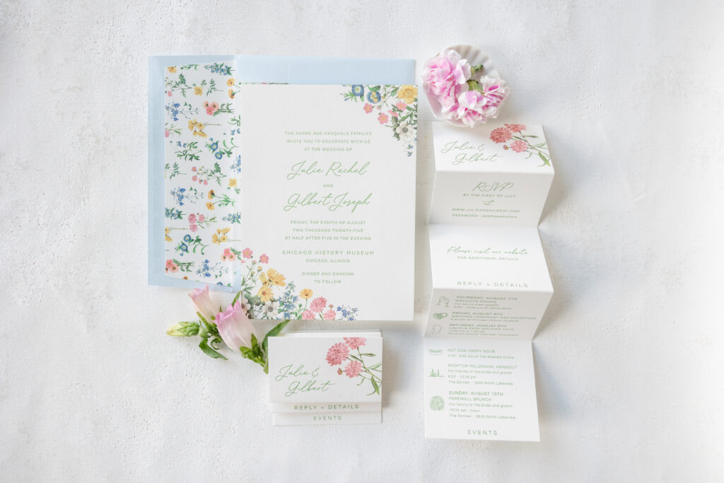
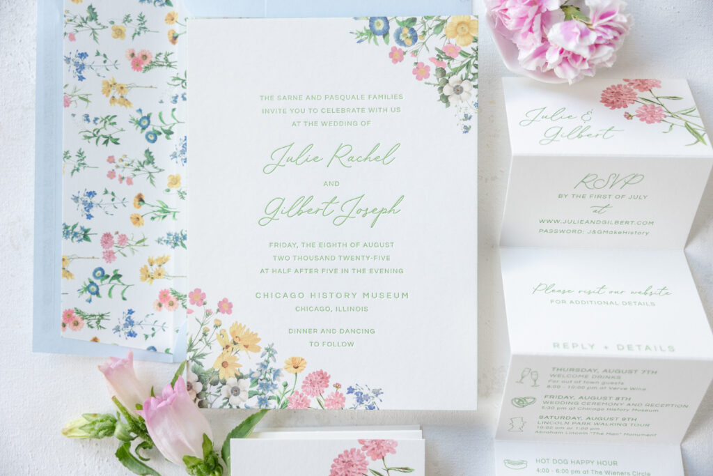
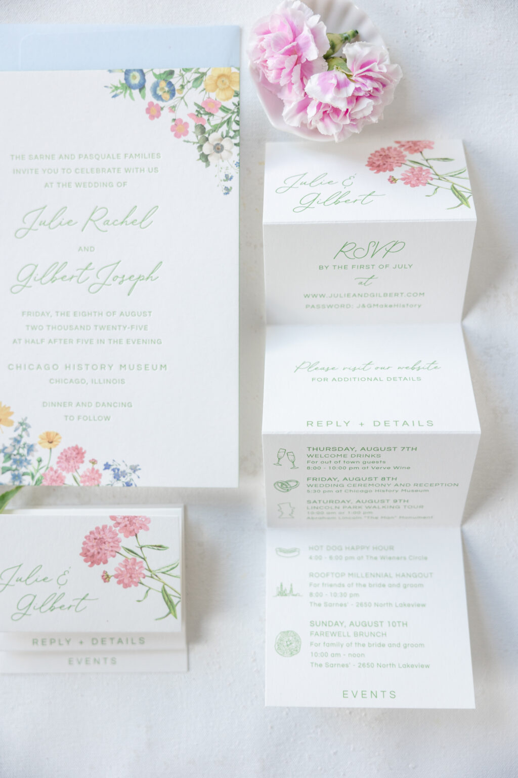
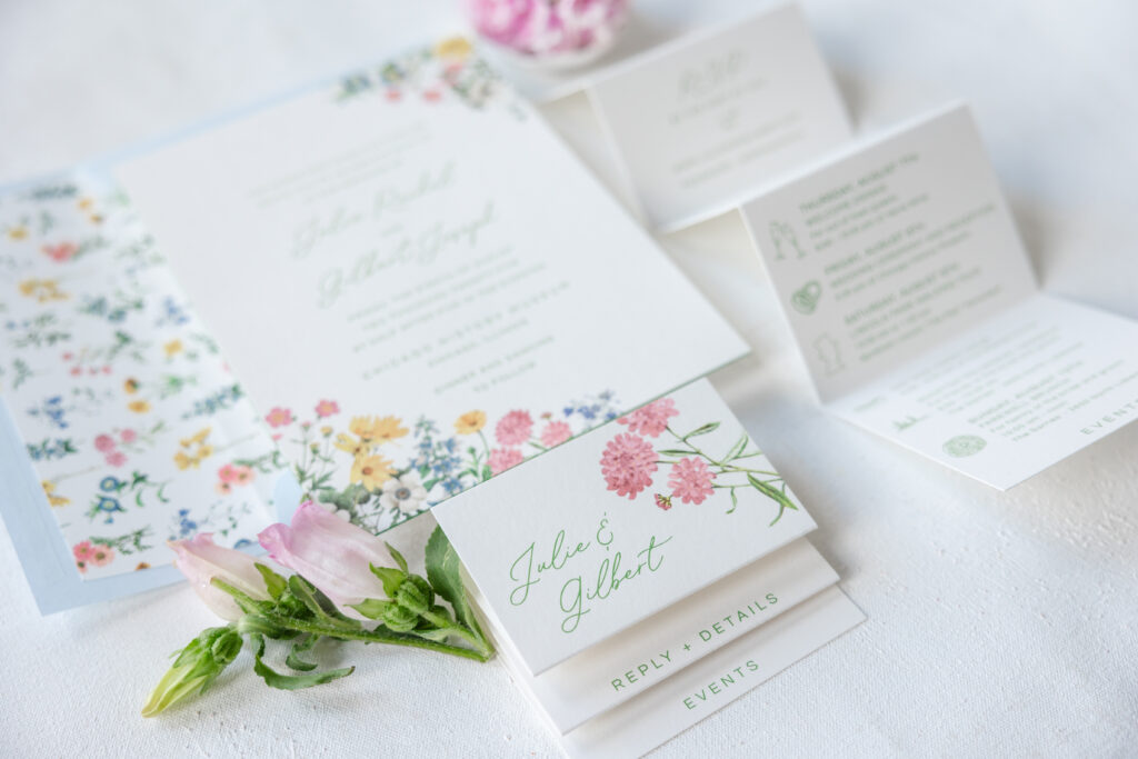
Julie and Gilbert’s wedding invitations feel like summer. Lovely, delicate florals, a romantic script font, and a soft color palette are quietly elegant, seasonally appropriate, and incredibly beautiful. This design merges elements from our Melrose and Hadaway designs, creating something enchanting and unique. This couple worked with our dear friend Karen of XOXO, Frances, to create their garden romance wedding invitations.
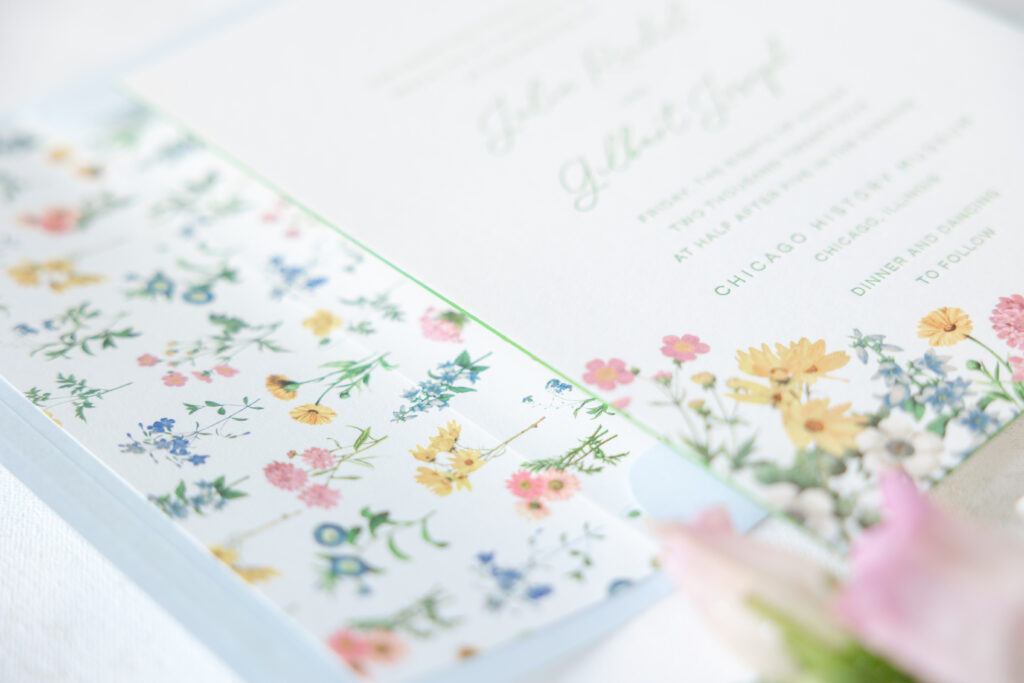
The airy layout is traditional yet laidback and approachable. The script font for the names lends the design a subtle formality while maintaining an affable nature. Our garden letterpress ink softens the look while simultaneously enhancing the botanical vibe. The layout is borrowed from our Melrose design. While the couple liked the floral border from Melrose, it just wasn’t what they had in mind, so they used the envelope liner pattern from Hadaway and repurposed parts of it to create a loose, organic border. The loose arrangement of the flowers is reminiscent of wildflowers naturally scattered, giving the design an effortless, meadow feel.
Invitation
letterpress ink: garden
digital ink: cmyk
fonts: questrial + lily paperie
paper: bella smooth cotton 2-ply white
card size: f-8
edge paint: garden
envelope liner: hadaway pattern in cmyk on white text
envelope: sky text
envelope addressing: garden digital on the front and the back
job: 75085
Details Card
digital ink: garden + cmyk
fonts: questrial + lily paperie
paper: bella smooth cotton 1-ply white
card size: (4” x 14.5” flat, 3.5” x 4” folded)
finishing: score
job: 75085
The details card is as lovely as it is functional. The accordion fold design means guests need to open it, almost like a gift. The various panels include RSVP details, direct guests to the couple’s wedding website, and include an itinerary of the entire wedding weekend. Fun motifs serve as bullet points for the itinerary list while introducing a fun, lighthearted vibe.
Julie and Gilbert did an amazing job of blending classic and contemporary elements to create their lovely garden-romance wedding invitations. As always, it’s a joy to work with XOXO, Frances. Do you need help choosing the perfect inspiration design or designs to create your invitations? Work with one of our dealers to receive expert tips and guidance throughout the entire process.