
the makings of our award-winning design monet
We are over the moon to announce that our Monet design by Sierra Detrick placed Bronze in the FSEA (Foil and Specialty Effects Association) Gold Leaf awards. The design placed in the best use of letterpress category. We’ll let the designer herself Sierra take it from here to tell us a little more about the makings of Monet:
What was the inspiration behind Monet?
I knew I wanted to do something a little more edgy, haphazard almost. I pictured this texturized, vibrant, modern suite in my head when I started. Projects begin by challenging myself internally. I’m usually a little more precise and controlled in my work so I wanted to see if I could create something that was the opposite of that.

How did you decide on the color palette you wanted to use?
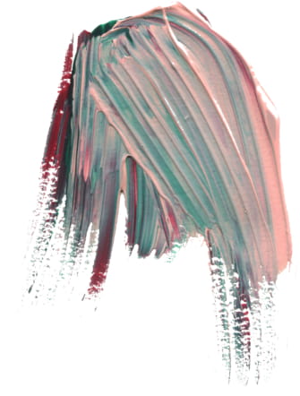
I’m attracted to this fun, crazy late ’80s/ early 90’s vibe coming back on the scene. I thought back to my childhood with color palettes and patterns found in old cartoons like the Rugrats and my mother’s teal bridesmaid dresses with the puffed up sleeves. I felt the maroon grounded out the craziness of the other two colors. I knew the design itself was going to feel more modern so I was set on a retro color palette, but I was nervous about it. I wasn’t convinced it was going to be well-received because it was kinda out there!

What went into the technical process of making Monet?
My technical process was the exact opposite of technical. I went to the store, grabbed some acrylic paint, spread out a bunch of white Bristol paper and went to town for a few hours throwing paint on paper in an uncontrolled manner. I had no idea if this was going to work. I was just playing around and hoping I liked what landed on the page. The spare room in my apartment was covered with these heavily brush-stroked and texturized paintings that took days to dry because the paint was slathered on so thick. You couldn’t walk in that room for about a week.


How did it feel to find out you were nominated for an award and then how did it feel to find out you won Bronze?
I wasn’t in the office the day it was announced to the company so my friend and coworker texted me the news and I instantly started to cry. I was elated to find out I placed Bronze. It made me grateful for the mentorship and encouragement of my colleagues and everyone in the company who brought the suite to life. I have a seriously amazing team behind me that pushes me to be the absolute best designer I can be. Thanks for loving those crazy colors I was freaking out about!

Digital inks: Myrtle + CMYK | Embossing: Blind | Font: Surfside | Paper: Bella Smooth Cotton Bright White Duplexed 2-ply | Invite Size: F-8 | Edge Painting: Myrtle | Liner: Monet pattern in CMYK | Envelope: Bella Cotton Bright White