Our Pinterest contest is still going strong, and we can’t wait to see the new letterpress invitation designs the contest will inspire! The other day we asked which invitation style is your favorite, and now we want to know: which embellishment is your absolute must-have? Are you crazy about hand calligraphy? Can’t live without custom envelope liners? Is foil edging your favorite? Or are letterpress pocketfolds your must-have? Tell us what you love! Don’t see your favorite on this list? Tell us what you’ve gotta have on your invitations in the comments section below! And don’t forget, our Pinterest promotion runs through Monday, February 27, so there’s still plenty of time to enter to win some amazing letterpress prizes!

[poll id=”4″]
We can’t wait to show you our new offerings for next year — we’re introducing over 80 new trend-setting designs that are must-haves for the 2012 wedding season. Our new collection won’t be available until later this month, but we thought we’d give you a little sneak peek to let you know what’s in store for the new year. Think foil stamping (gold! silver! colored metallics!). 7 incredibly talented new designers and calligraphers. Colored envelopes. Letterpress on pocketfolds. Foil edging. New custom calligraphy styles (7 of them!). New inks. New fonts. 2 and 3 color liners. Take a look — it’s true love.


Part of what makes calligraphy letterpress invitations so amazing is that each one is always going to be a little different from every other one we’ve ever made before. With each design being painstakingly written out by hand before being digitized and eventually turned into a printing plate for letterpress printing, there’s always bound to be subtle (and beautiful) variations. But there’s unique, and then there’s unique.
Take for instance this design here, featuring the lavish hand calligraphy of the super-talented Sarah Hannah. This design most closely resembles Sarah’s Magnolia design, but despite the family resemblance they’re clearly not the same animal. The couple’s names on this invitation are much more elaborately embellished than usual and the ornate flourishes along the edges of the original design have been dropped entirely. This look is exactly what the bride was going for, and it was completely doable since Sarah was able to understand what she was envisioning and translate it into beautiful calligraphy.
Printed in black ink on our 2-ply ivory paper and affixed to our opal colored pocketfolds – the end result is devastatingly elegant.
ink: black | calligraphy style: victoria | paper: ivory 2-ply | invite size: f8 | pocketfold: opal | edge painting: black | client coordinator: chris gannon | in-house designer: lindsy aragona


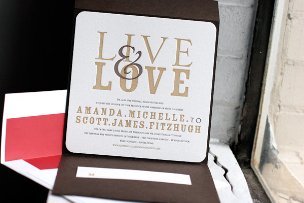
A true storybook romance is played out in this recently letterpress printed Joie de Vivre (by Kamal) invitation suite customization submitted to us by our friends at Smudge Designs.


The first four lines of this adorably whimsical invitation are written in the voice of a narrator.

This creative invitation is letterpress printed in a delightful grouping of our atlantic, mediterranean and wine inks. The letterpressed steel blue pocketfold adds the perfect final touch as the credits start to roll. inks: atlantic +mediterranean+wine | font: streamline | paper: 1-ply white | invite size: f-8 | pocketfold: steel blue |
This design won an honorable mention in our Bella Figura design competition for the first half of 2011. This twice-a-year competition recognizes outstanding and inspired design submitted by our beloved dealers.
We just adore these recently printed letterpress wedding invitations in our Lumos design (by Ben Whitla). The couple chose to adhere their invitation to a striking black pocketfold. These brilliant pocketfold enclosures hold the couples website card. We love how pronounced the bride and groom’s names look in black ink and the antique gold ink makes for an excellent pairing! Perfect for a black and white wedding theme, these invitations have a spot-on contemporary feel (and check out their save the dates in a previous post)!
inks: black + antique gold | fonts: sans capitals + popular | paper: 1-ply white | invite size: a-7 | pocketfold: black | client coordinator: jessica hanaman | in-house designer: kyle laatsch

by Jessica Hanaman, Client Coordinator.
A true story-book romance is reflected in this letterpress wedding invitation of Linden Summer design (by Lindsy Aragona). Completed with a metallic bronze pocketfold, this entire set has a vintage, yet whimsical feel. The invitation and additional pieces are adorned with soft Espresso ink branches and delicate Champagne ink leaves. You cannot help but fall in love.
ink: espresso + champagne | fonts: luster roman | calligraphy style: clermont by debi zeinert | paper: 1-ply ivory | invite size: a-7 | liner: the reverse european formal pattern in espresso ink | pocketfold: bronze | client coordinator: christie jones | in-house designer: lindsy aragona


This couple benefited from our 10% off promotion (10% off if you purchase 6 printed pieces) and our free CHARITY favor card promotion. See more details and the small print here!


by Lindsy Aragona, In-house Graphic Designer.
This simple, chic Bleecker Modern (by Jessica Tierney) letterpress wedding invitation suite is a perfect precursor to any classy yet down to basics wedding. With it’s ultra modern font paired with Aubergine, Charcoal and a hint of Fuchsia edge paint you can’t go wrong, it’s like letterpress poetry. Bundle this all up in a Ash pocketfold and our Modern Canopy envelope liner in fuchsia, you’ll have your guests as excited about them as you are!
inks: charcoal + aubergine | fonts: knockout | paper: 2-ply white | invite size: sq-7 | liner: reverse modern canopy pattern in fuchsia ink| edge painting: fuchsia | pocketfold: ash | client coordinator: christie jones | in-house designer: racheal decker


(more…)
These letterpress wedding invitations feature a customization of our Anthology design in rich, fall colors. They were letterpress printed in espresso and antique gold inks with corner rounding, showcased in an espresso pocketfold. A bright cardinal envelope liner is a pretty coordinating touch for these beautiful fall wedding invitations.


Printed in cheerful fuchsia and persimmon inks, this set features our Esperanza letterpress wedding invitation design, new from our 2010 collection. The couple also opted for a bright fuchsia pocketfold and matching envelope liner. In addition to the invitations, we also printed their letterpress programs, escort cards and personalized thank you notes for a complete suite that is vibrant, colorful and perfectly celebratory.


We printed these letterpress wedding invitations, a customization of our Keswick design, for an upcoming wedding in France. They are printed in espresso and cloud 9 inks and feature a vertical orientation and a pretty espresso pocketfold, making this invitation suite a unique interpretation of one of our most popular designs. We love the pretty letterpress inserts and the letterpress thank you notes we also had the distinct pleasure of printing for this couple, all perfectly coordinated to their event in matching espresso and cloud 9 inks.


