Evangelina and Ian envisioned these gold foil wedding invitations with a blush belly-band that we brought to life. All thanks to the help of our friends at Proper Notice! They decided to use an all-over script font to mimic the look of hand calligraphy. This script was paired with gold matte foil for the entire invitation. The same color palette carried over to the reply card and tag kept everything cohesive. A blush envelope liner, as well as belly-band, added a softer touch to this set. A small tag adhered to the belly-band carried their married monogram letter. Finally, they opted for a clean liner without any pattern to keep the set simple.
Grace and Matthew worked with the Scarlet Letter to create their gold foil save the date tri-folds. They opted for an elegant monogram with an intricate cartouche surrounding it. All the wording printed in Gold Matte made for a cohesive look. A sweet photo of the bride and groom personalized the save the date even further. Accommodation information and other important details allowed guests to get a jump on saving the date in more ways than one! Finally, the envelope also printed with a Gold Matte foil return address tied everything together.
Mary and Kyle worked with the Dandelion Patch to bring these ornate gold foil wedding invitations to life. The intricacies and flourishes within the monogram set the tone for an elegant affair to come. Black letterpress ink allowed the monogram as well as other important elements to stand out. They opted for a simple reply card also in black letterpress using the same fonts to keep everything cohesive. The envelopes themselves created contrast against the invitations in Bella Black. The envelope liner featured an illustration of the venue where the happy couple married this past May.
We worked with Sue Corral Ink to create these neutral letterpress wedding invitations with floral accents for Amanda and James. They opted for a Desert letterpress ink color which they carried through to the reply set as well. The neutral palette allowed for a pop of color on the invitation as well as the envelope liner. They dressed up the monogram with florals around the perimeter of the cartouche. Lastly, the same floral theme carried onto the envelope liner kept everything consistent and harmonious.
Paper Affair Dallas helped us to create these monogrammed letterpress wedding invitations for Catherine and Justin. Inspired by our Annata design, a floral cartouche situated at the top of the invitation held the letterpress monogram. Typography in Antique Gold and Black letterpress inks followed beneath with a traditional structure. The accommodations card as well as the reply card features similar floral imagery imagined in different ways. Finally, the thank you card used the same floral cartouche and monogram to keep everything cohesive.
Our friends at Mulberry Market helped us to these Tawny Matte wedding invitations for Patricia and Christoper. Their June wedding held at St. Agnes Cathedral required an invitation with traditional elements to match. They decided to keep their script font in foil with the rest of the elements in our Prussian Blue letterpress ink. The reply card as well as the reception card followed suit in terms of color palette. To mimic the envelope liner, the details card used a vintage print backdrop with Prussian Blue letterpress ink overtop. Finally, a belly-band kept all the insert cards together with a monogram tag added with a final foil touch.
We spotted Kelly and Drew’s classic monogrammed wedding invitations on Martha Stewart Weddings and we’re excited to share a peek into their day. The couple worked with our friend Heidi at Engraved Images who made their vision of a traditional yet personalized suite come to fruition. From the engagement ring to the envelope liner Kelly imagined and designer Chelsea Culmann brought to life – the couple effortlessly tied their families together in more ways than one. The envelope liner highlighted each state they have roots in, a symbol of the Pentagon where the couple first met, and a Celtic knot to feature their Irish backgrounds. Both the invitation suite and their wedding reflected what it means to bring families together in paper and in person. Be sure to check out even more on Martha Stewart Weddings!
Thanks to the help of our friends at Magnificent Milestones, Sarah and Stephen’s vision for timeless foil stamped wedding invitations came to life beautifully. The wedding was held at the University Club of Chicago, a classic venue which called for an equally classic invitation such as this reflecting an elegant affair to come. The couple chose a design reminiscent of Maeve and it was printed in Gold Matte foil with Bella Blue paper used as the backdrop. Their reply card was kept on the simpler side and printed in Navy letterpress to coordinate with the invitation. Guests will be pleasantly surprised to find the initials of the bride and groom intertwined as they open their envelope to reveal a gold leaf metallic envelope liner.
Foil: Gold Matte | Letterpress: Navy | Fonts: Imprint MT Shadow + AT Sackers Gothic | Design: Custom Created Design | Paper: 1 ply Bella Blue, 1 ply Bella Smooth White | Size: F8 | Customization: 39618 | Magnificent Milestones
During the month of April we’re featuring designs by Amanda Jane Jones on sale for 10% off! Amanda’s designs are modern and clean, with fresh typography. Order any piece – wedding invitations, birth announcements, party invites, business cards, save the dates, you name it – and you’ll save 10%. As always, this promotion can be combined with our 6+ printed pieces discount, so you can save an additional 10%!
Amanda is a freelance graphic designer and art-director based in Chicago. She is the co-creator and founding designer of Kinfolk Magazine. Amanda’s favorite projects to design are books, cookbooks and periodicals, but she also does company branding and web design. Read on to learn more about her path to design!
My mom is a photographer so I’d work as her assistant during the summers. That started my path to the arts. The stress of photographing weddings lead me to study something that was a little more laid back, and that’s why I chose design. I studied at Brigham Young University and then interned at a couple places before joining a design firm after graduation. Two years after working full-time, I jumped ship and started my freelance career. It was terrifying, but it was also one of the best decisions I could have ever made.
I like to think I have a classic / modern mix. I think I lean toward the masculine side of design – and often go with the mantra less is more.
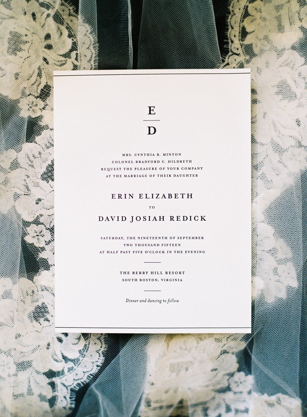
Amanda’s Simple Elegance design, personalized for Erin and David’s real wedding. Photo courtesy of Graham Terhune.
I generally work from home. I’m a newish mom and for me, it’s the perfect situation. I get to be with my daughter during the day and get my work done in the morning, evenings and nap time.
When it comes to finding inspiration, I have a ton of design books – old and new – that I love to flip through. When I’m in a design rut, I’ll put on a new album or go for a walk. Fresh air always seems to fix a brain block.
What I think is great the longer I’m in the design industry is how more and more – it’s ok to break the rules. In college studying design, I was always worried I was “breaking the rules” of design. But really, some of the best stuff out there doesn’t follow any rules.
The fine print: this offer is exclusive to designs by Amanda Jones and does not apply towards the purchase of other designs. Orders must be placed by 11:59pm Eastern on April 30, 2016 in order to receive this offer.
Our friends at Cambridge Street Papers worked with Christina and Stephen on their art deco inspired wedding invitations, customizing our Oberon design for their November wedding. We used the pattern that is subtly printed on the original Oberon design to create a bold border that was foil stamped in tawny matte foil. The couple’s font-inspired duogram was printed at the top of their invitation as well as on their metallic white gold envelope liner, further personalizing their elegant suite.
letterpress ink: black | foil stamping: tawny matte | fonts: danube + sans capitals + geneva | paper: bella cotton white 2-ply | envelope: bella cotton white | metallic liner: white gold with digital printing in black | Cambridge Street Papers | customization# 28578