We worked with our friends at Proper Notice to create Sydney and Samuel’s beautiful wedding invitation suite. The fonts came from our Amante sample, but the couple opted for a more traditional layout to balance the modern fonts. Gray (now dark gray), and light gray (now pebble) papers, and mink matte foil stamping create a wonderful tonal palette. The clear shine foil stamped envelope liner in our floral Louise pattern, is an unexpected floral accent.
foil stamping: mink matte | gaquire + carol sans | paper: bella gray 3-ply + light gray 1-ply | invite size: f-8 | liner: louise pattern in clear shine on gray | envelope: bella light gray | customization #70792
Elissa and Michael worked with our friends at Creative Parties to create their lovely floral invitation suite. We created a custom pattern using our rose 2 + 3 motifs. This pattern was debossed on the invitation card, and repeated in white on light gray on the envelope liner. The cards were letterpressed in taupe, a beautiful compliment to the light gray envelope and liner. Corner rounding the cards added a romantic touch.
letterpress ink: taupe + blind deboss | foil stamping: white matte | fonts: adobe garamond pro, mozart script regular | paper: bella cotton white 1-ply + 2-ply + light gray 1-ply | invites size: f-8 | corners: rounded | liner: custom pattern in white digital on light gray | envelope: light gray | customization #71142
We worked with Tzo Ai of Ang Weddings and Events to create Laura and David’s stunning invitations. Our Kaufman design inspired the fonts, and modern feel. The invitation is foil stamped in white matte on light gray paper, and the enclosures had the opposite coloring. This was achieved by letter pressing in cinder on white stock. A vellum overlay with fresh florals from out Louise design tops the invitation card. A digitally printed liner adds the illusion of linen texture.
letterpress ink: cinder | foil stamping: white matte | fonts: karin and sweet sans | paper: light gray 2-ply + bella smooth cotton white 1-ply | invite size: f-8 | liner: custom linen texture pattern in cinder | envelope: bella cotton white | customization #71275
We worked with our friends at Arabesque of Naples to create these custom holiday cards. We combined crisp gold matte foil and deep red letterpress to create a modern festive card. The gold matte was foil stamped in the pearse design for the envelope liner, to tie the pieces together.
letterpress ink: deep red | foil stamping: gold matte | paper: bella light gray | fonts: ms claudy regular + adobe garamond pro | envelope liner: pearse pattern in gold matte on light gray | envelope: bella cotton white square flap | customization #64769
We were excited to spot Sara and Ryan’s wedding featured in the Weddings section within the Washingtonian! The couple married at the Dumbarton House in Georgetown. We printed their letterpress invitations in Navy and Gold Matte foil as an accent color. The belly-band, envelope liner, and details card insert all printed on Light Gray paper added another color to this set without having to add another ink. This subtle color palette mimicked the sweet setting of their wedding with pops of blue throughout. Be sure to head on over to Washingtonian to see even more pictures from their big day!
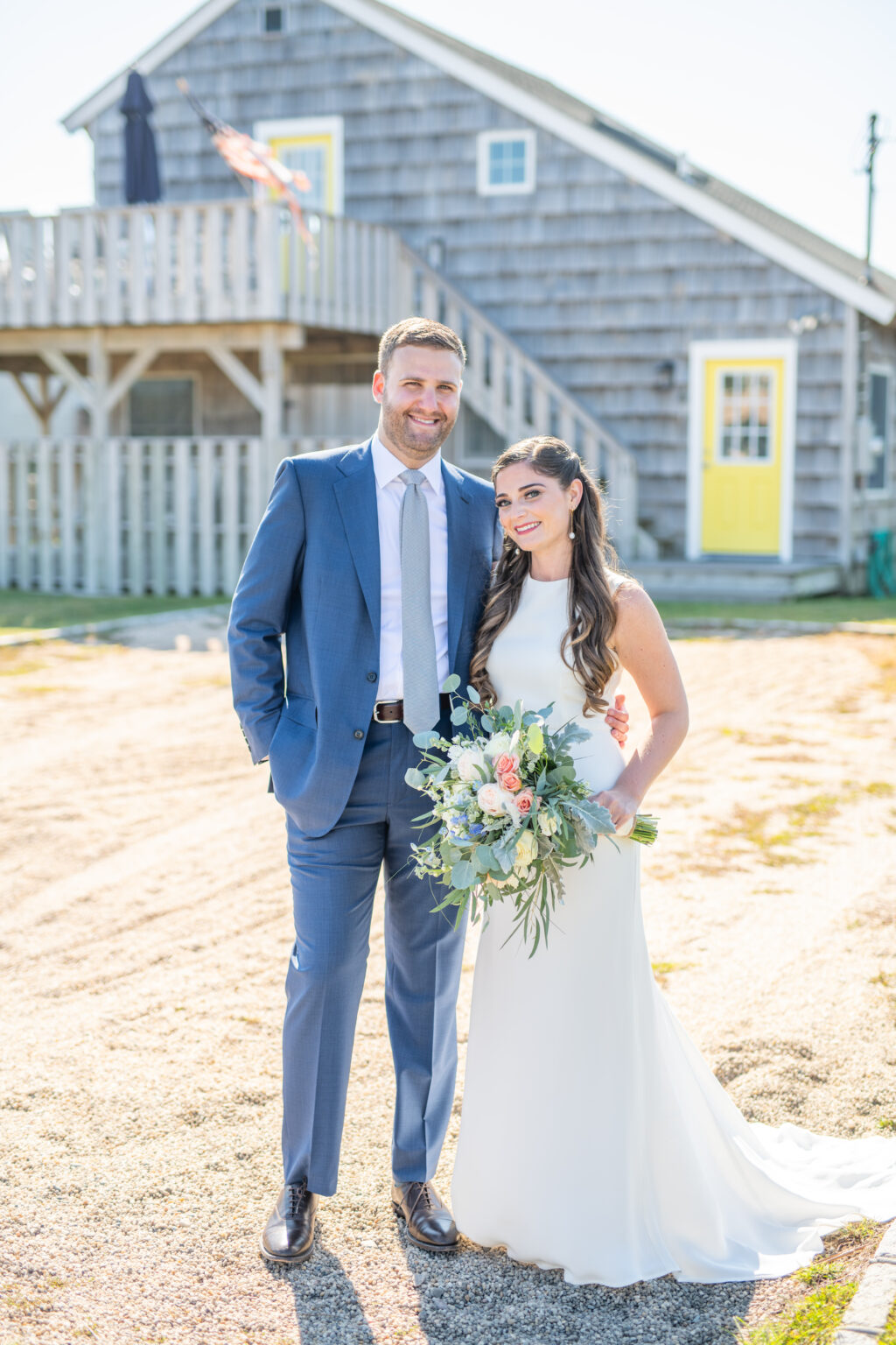
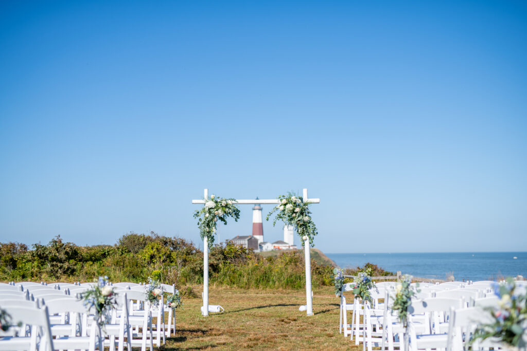
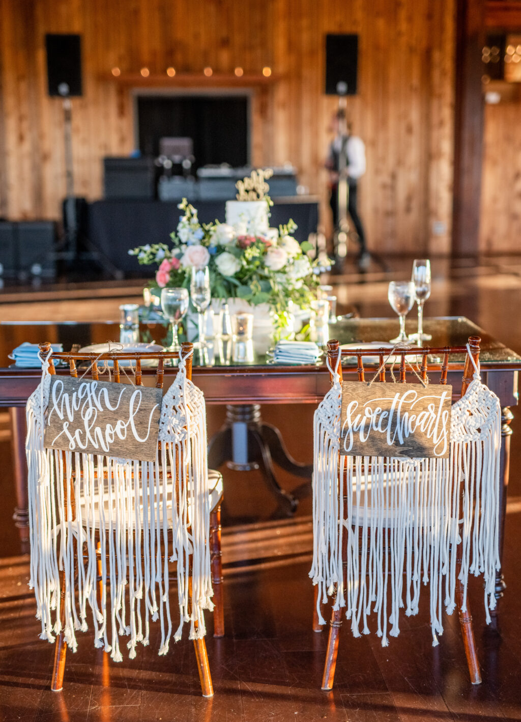
All it takes is a pair of high school sweethearts getting hitched and a set of coastal letterpress invitations to set the stage for a perfect Montauk wedding. The historic Montauk Point Lighthouse served as the backdrop for this happy couple’s wedding day this past September. The celebration continued with views for days at 360º East at Montauk Downs. The invitations easily matched this beachy aesthetic with a clean design paired with a gray color palette. They worked with our Bella Figura – Brooklyn location to bring their vision to life. We will let the bride Brittany take it from here to share more about her big day!
CAN YOU SHARE WITH US A BIT ABOUT YOUR WEDDING AND YOUR INSPIRATION FOR THE EVENT?
The September sun shone brightly against clear blue skies as a gentle breeze floated off the ocean. It was something out of a dream! The distinct natural beauty of Montauk inspired our wedding. Having grown up together in Southampton, New York, just 25 miles from Montauk, we knew we wanted a relaxed coastal vibe. We embraced the setting by incorporating a sea of blues and grays and whites throughout the details of our wedding day.
WHAT ADVICE DO YOU HAVE FOR COUPLES CURRENTLY PLANNING A WEDDING?
Sweat the small stuff! One of our favorite parts of wedding planning was finding ways to weave our love, our story, and our personalities into the details. When Henry and I first started dating in high school, we would often spend summer days collecting shells on the beach in Southampton—so we thought it would be fitting to use hand-calligraphed scallop shells as escort cards as a nod to our early days together. The guestbook was a vintage lighthouse book my mom came upon in a local thrift store. Our signature cocktail was named for our beloved cat, Woodley May. Instead of favors, we donated to the National MS Society, a charity near to our hearts.
HOW DID YOU CHOOSE YOUR INVITATION DESIGN & INK COLORS?
For our wedding invitations, we envisioned a clean design that reflected the casual elegance of Montauk. To bring our vision to life, we chose dark gray letterpress on light gray paper, paired with a white envelope. We had our names printed in an organic script and selected a modern serif font for the rest of the invitation wording. We personalized the envelope liner by adding a white and gray design reminiscent of waves crashing on the coast. The same design was incorporated into our save-the-date cards and menus for visual coherence.
WHAT WAS YOUR FAVORITE MOMENT
I will never forget our ceremony at Camp Hero. I walked down the aisle with both my parents to a string duet playing “Air on the G String”—the same processional song my parents selected for their Montauk wedding more than 30 years ago. My sister and brother and Henry’s best friend stood beside us. Our friend who has known us for more than 10 years officiated with a script we wrote together and a beautiful tribute to our relationship. Henry and I then read hand-written vows, in which we reflected on the thirteen years of laughter, tears, understanding, friendship, and love that had led us to that moment. We ended the ceremony with the breaking of the glass and our guests shouting “Mazal Tov!”
WHAT’S NEXT FOR THE NEWLYWEDS?
After our wedding, we traveled to Peru for our honeymoon, which was filled with adventure, culture, and breathtakingly beautiful sights. For now, we are continuing to enjoy all the wonderful opportunities that living in Brooklyn has to offer.
Our friends at Wynwood Letterpress helped us bring these subtle floral letterpress wedding invitations to life. The suite kept a monochromatic color palette. They used our Bella Light Gray paper for their envelopes as well as Fog letterpress for the typography. Blind debossed drawings of florals anchored the top left as well as the bottom right of the invitation. An envelope liner in our Marble 4 pattern added an unexpected contemporary twist to a floral forward set.
Letterpress: Fog + Blind Deboss | Fonts: Melika and Streamline | Design: Custom Library | Paper: 1 ply Bella Smooth Cotton White | Size: F8 | Liner: Marble 4 in CMYK | Customization: 47244 | Subtle floral letterpress wedding invitations with marble envelope liner Wynwood Letterpress
Our friends at Lion in the Sun helped us to create these coastal letterpress wedding invitations for Kelli and Richard. Our Waterfront design reflected the aesthetic of their New Jersey venue perfectly. Deep Blue and Pool letterpress inks on the invitation set the cooler palette for the rest of the suite to follow. Additions of our Bella Light Gray on the envelopes as well as details card added a touch of softness to the suite as well. Finally, a vintage map envelope liner gave this set an extra touch of personalization.
Letterpress ink colors: Deep Blue + Pool | Fonts: Caleigh & Social | Design: Waterfront | Paper: 1 ply Bella Cotton | Size: F8 | Customization: 42472 | Lion in the Sun
Christina and Pierrick worked with Maddie Merriweather, Inc. to create these sweet foil save the dates for their June wedding. This save the date printed on our Bella Light Gray paper was the perfect glimpse into the couple’s elegant day to come at the Roaring Gap Club in North Carolina. Hand calligraphy elements with a hand-drawn cartouche enclosing the bride and groom to be’s names added personal touches to this save the date.
Foil color: White Matte | Fonts: Caslon, Submitted Calligraphy by Sarah Hanna | Design: Custom Customer Supplied | Paper: 2 ply Light Gray | Size: A6 | Customization: 42111 | Maddie Merriweather, Inc.