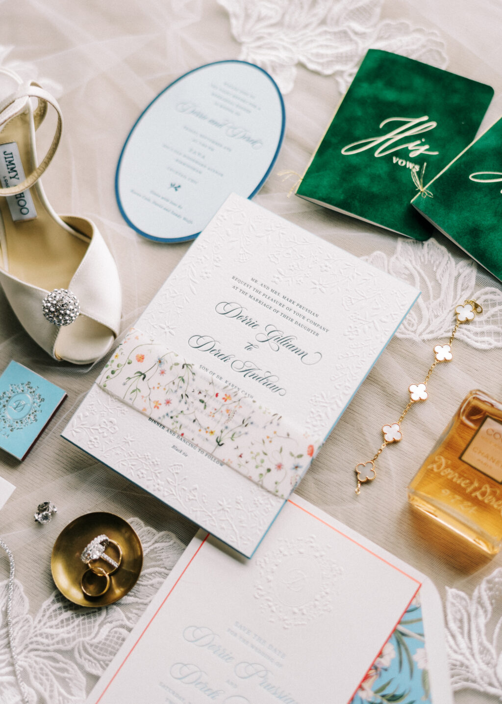
We had the incredible pleasure of working with our friends at Lee’s Paperie to create Dorrie and Derek’s gorgeous wedding stationery. We’ll let Dorrie take it from here to share more about their wedding details!
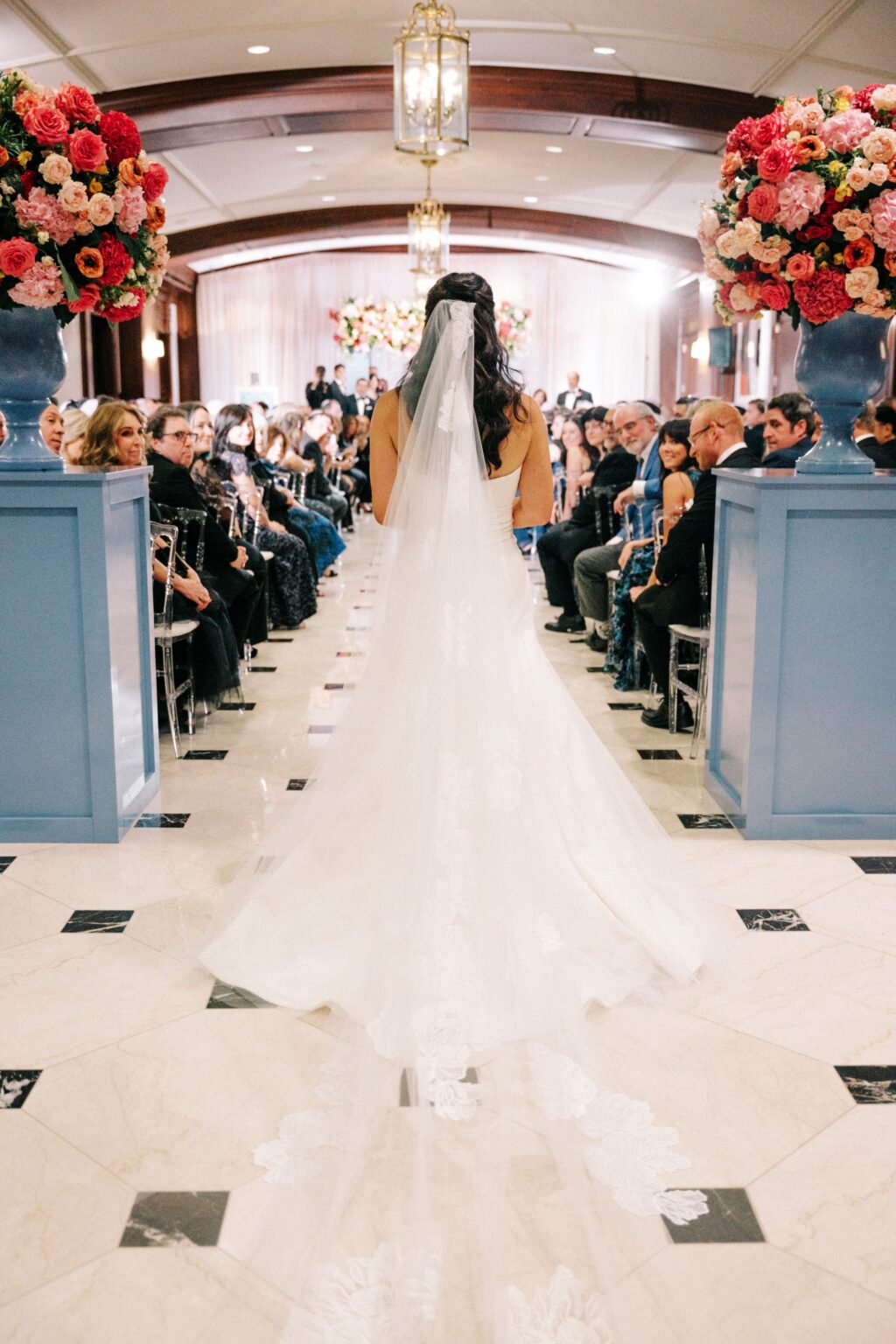
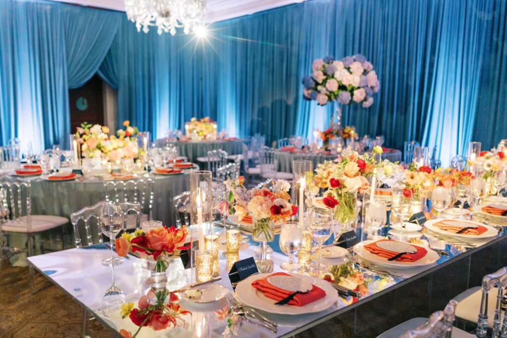
CAN YOU SHARE WITH US A BIT ABOUT YOUR WEDDING AND YOUR INSPIRATION FOR THE EVENT? We got married at The Townsend Hotel in Birmingham, Michigan, a hotel where we have shared many special times together. We wanted the room to feel whimsical while also warm, enchanting and sophisticated.
WHAT ADVICE DO YOU HAVE FOR COUPLES CURRENTLY PLANNING A WEDDING? Embrace every moment of your wedding day. Everyone says it goes by so quickly, and it truly does. It is not often when all of your loved ones are in one room celebrating together!
HOW DID YOU CHOOSE YOUR INVITATION DESIGN & INK COLORS? With lots of help from our wedding planner, Carlyn Roth! She understood our vision from our first meeting and helped us set the tone for the wedding weekend from sending out our save the dates to the invitations and all of the other day of details. We wanted everything to coordinate with each other, and she truly helped us achieve a cohesive look and feel.
WHAT SURPRISED YOU MOST ABOUT YOUR WEDDING? Sneaking away from the cocktail hour to see our room reveal was so amazing. Seeing all of our visions come to life was truly incredible!
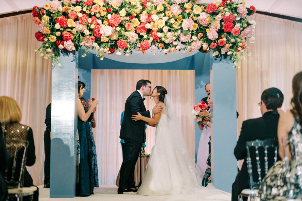
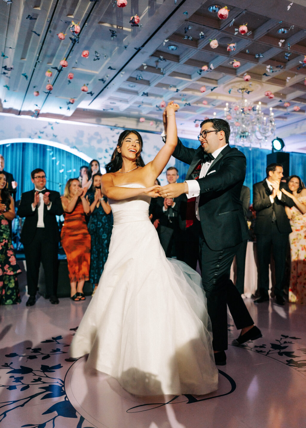
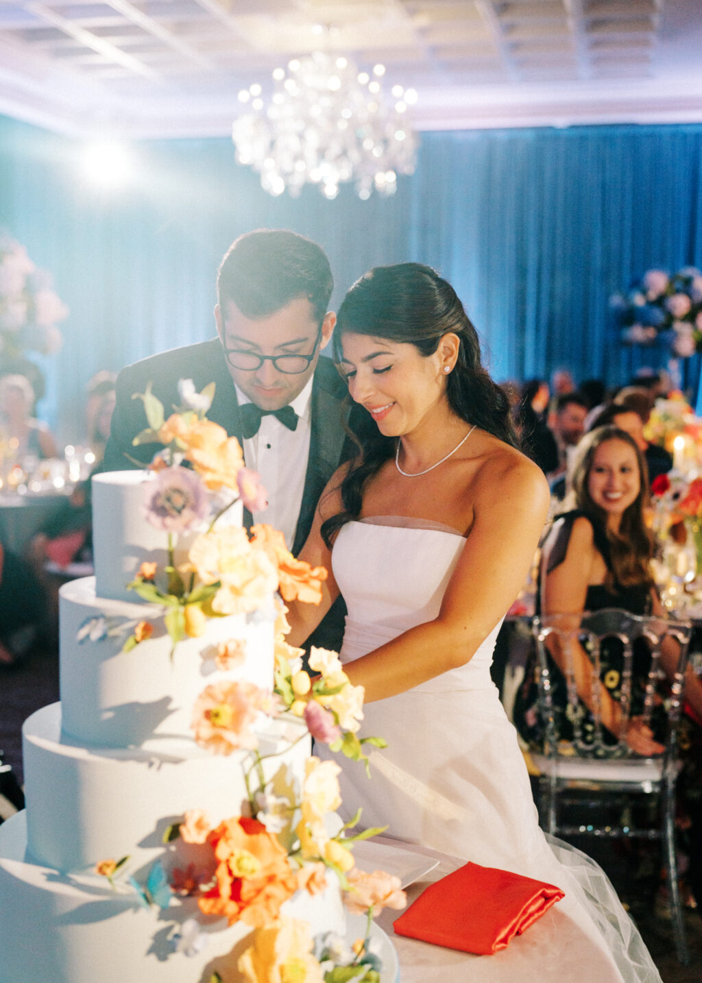
WHAT WAS YOUR FAVORITE MOMENT? Every moment was so special! From our first look, to standing under the chuppah together, to never leaving the dance floor, it is impossible to pick one!
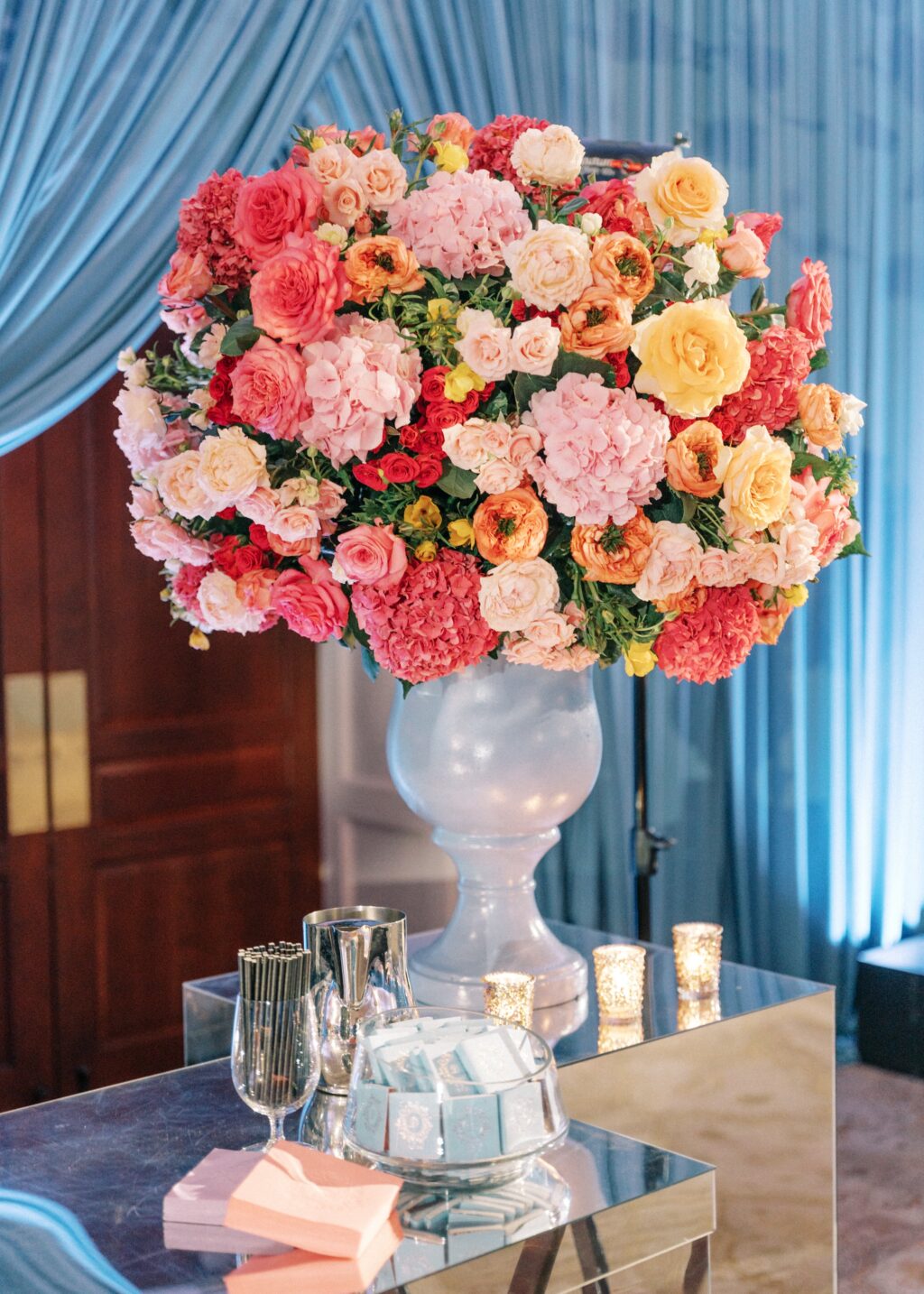
FAVORITE DESIGN ELEMENT OF YOUR BIG DAY? The butterflies and florals hanging from the ceiling, along with our lavender and navy dance floor with our monogram made us truly feel like we were dancing inside a butterfly garden!
WHAT’S NEXT FOR THE NEWLYWEDS? We had a relaxing mini-moon in Mayakoba. Now onto planning our summer honeymoon along the Amalfi Coast!
We love to create unique pieces to celebrate your big day! Contact us to learn more. Let us know the details, and we will get you a quote.
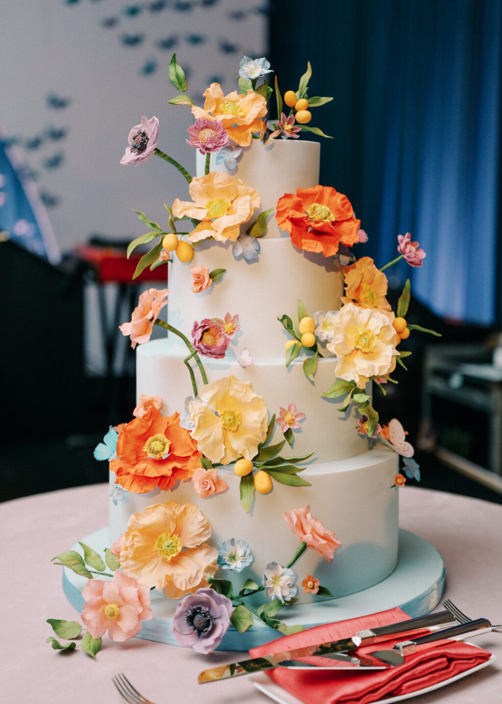
Planner: The Bash Events | Venue: The Townsend Hotel | Photographer: Sean Cook | Videographer: Blue Racer | Florals: Dawn Owen Luxury Design | Dress: Vera Wang | Band: Rendezvous Music | Paperie: Bella Figura and Lee’s Paperie
Save the Dates | letterpress ink: carolina | embossing: blind | fonts: addington cf + aston script + la luxes + mozart | paper: bella smooth cotton white 2-ply | card size: a-7 | bevel: 45º | edge painting: watermelon liner: supplied pattern in cmyk | envelope: bella cotton white | customization #68925
Invitations | letterpress ink: navy | embossing: blind | fonts: addington + aston | paper: bella cotton white 2-ply + 1-ply + bella pastel blue (now sky) 2-ply | invite size: f-8 | bevel: 45º | edge painting: carolina | belly band: 40# vellum + cmyk | liner: navy bella velvet | envelope: bella pastel blue (now sky) customization #70989
Ariel and Cameron worked with our NYC studio to create their wonderfully colorful wedding stationery. Our Delft design inspired the layout, and motifs. The suite was personalized by using a variety of colorful letterpress inks. The envelope liner features a vintage print of a peony. The carolina and garden letterpress inks are repeated on the thank you set and menu. The palette was perfect for a late spring wedding.
letterpress inks: carolina + garden + goldenrod + papaya | digital ink: carolina | fonts: plaza and didot | paper: bella smooth cotton white 2-ply + 1-ply | invite size: f-8 | menu size: 8″ circle die cut | liner: vintage peony pattern in cmyk | envelope: bella cotton white | customizations #70080 + #70671
Meghan O’Brien designed Ryann, part of our 2024 wedding collection and shared her design process:
Before creating Ryann, I knew I wanted to build a suite that would be inspired by coastal New England. While most of our work day to day is done on the computer, it’s nice to be able to get some paints out and have total creative freedom; which is how Ryann got started. I painted an abstract piece, with a slightly Fauvist style using cool-toned blocky colors and painterly brushstrokes. The subject of the piece was a Cape Cod marina with sailboats and hydrangeas. That painting was used for the liner, and the rest of the suite built from that.
I painted a few more coastal motifs in the same style for the details accordion, and then Carolina ink felt like the perfect coastal blue for this suite. The typography is a mix of modern serifs and a vintage script to create visual interest that allows the invitation to stand alone, with no extra motifs.
As with all of our designs, the colors of Ryann can be customized and reimagined. Above, Meghan mocked up a more earthy tone colorway of the invitation and the save the date. The invitation is copper shine on ivory paper with a bevel edge in nutmeg, and the save the date is white matte foil on metallic copper paper with the border blind embossed.
We worked with our friends at Papier Girl to create these gorgeous invitations. Our Zari design was the inspiration. Carolina and cobalt were used in combination with sapphire shine to create a blue color story. The reply card features a flood of carolina letterpress, with knocked out text. The finishing touch is tawny metallic thread.
letterpress ink: carolina : digital inks: carolina + cobalt | paper: bella smooth cotton white 1ply | font: santiago | metallic thread: tawny | envelope liner: classic color in carolina + louise pattern in sapphire shine | envelope: bella cotton white square flap | customization #67474
Lauren and David worked with Debbie at RSVP Today to create these beautiful blue invitations. The suite features a bevel with a Carolina painted edge, RSVP tag, and the watercolor style liner from our Paseo suite. Everything came together to create a perfectly fresh invite suite for a summer wedding.
letterpress inks: carolina + denim | paper: bella cotton bright white 3ply + 1ply, bella smooth cotton bright white 1ply | bevel: 45 degree in carolina | fonts: plaza script + mrs eaves | envelope liner: paseo pattern in pastel pink + carolina + denim on bright white | metallic thread: silver | envelope: bella blue square flap | customization #61496
Jordan and Michael worked with Susie at Pink House Productions to bring their customized version of our Dela design to life. Silver matte foil stamped names perfectly compliment the range of blue tones in the suite. A bright details card printed with a flood of Carolina is stunning, and a multi-toned blue liner ties everything together.
foil stamping: silver matte | letterpress inks: royal blue + denim | digital ink: carolina | addressing: white + royal blue | paper: bella cotton white 2ply + 1ply, bella smooth cotton 1ply | fonts: margarita script + sweet sans | envelope liner: ravi pattern in carolina on white | envelope: blue square flap | customization #62638
From weddings to mitzvahs, we always love seeing different kinds of invitations made for a variety of special occasions come through our shop and bridal showers are no exception to that! The host of this particular day, Joan Bergen, worked with Fete Collection to create these romantic letterpress bridal shower invitations for the bride to be. They chose a color palette of Prussian Blue letterpress and Carolina letterpress with our Bella Blue envelopes to match creating an overall sense of monochromatic harmony. Our popular Sophia script font made sure the bride to be’s name stood out from everything else while hydrangeas printed in Carolina gave this sweet invitation an added touch of romance.