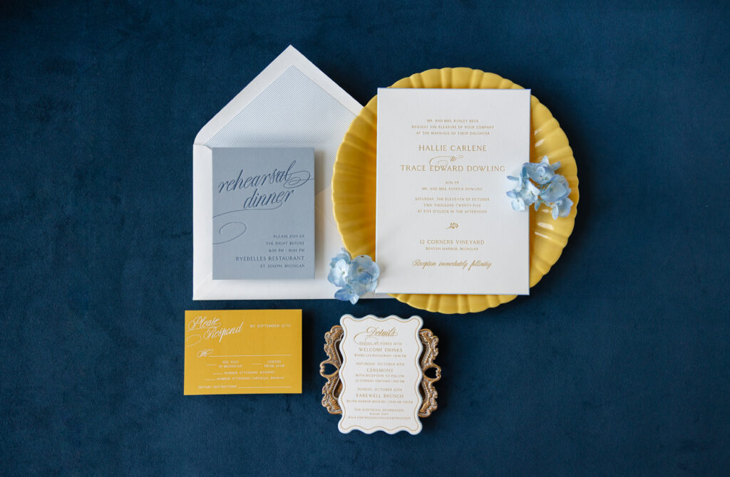
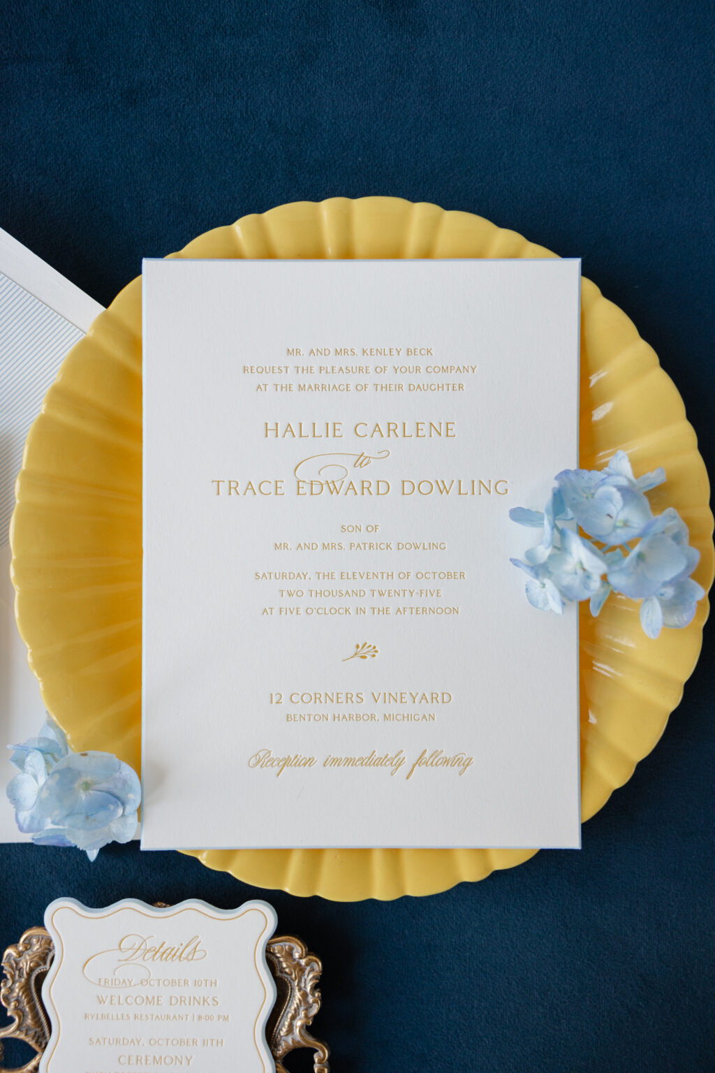
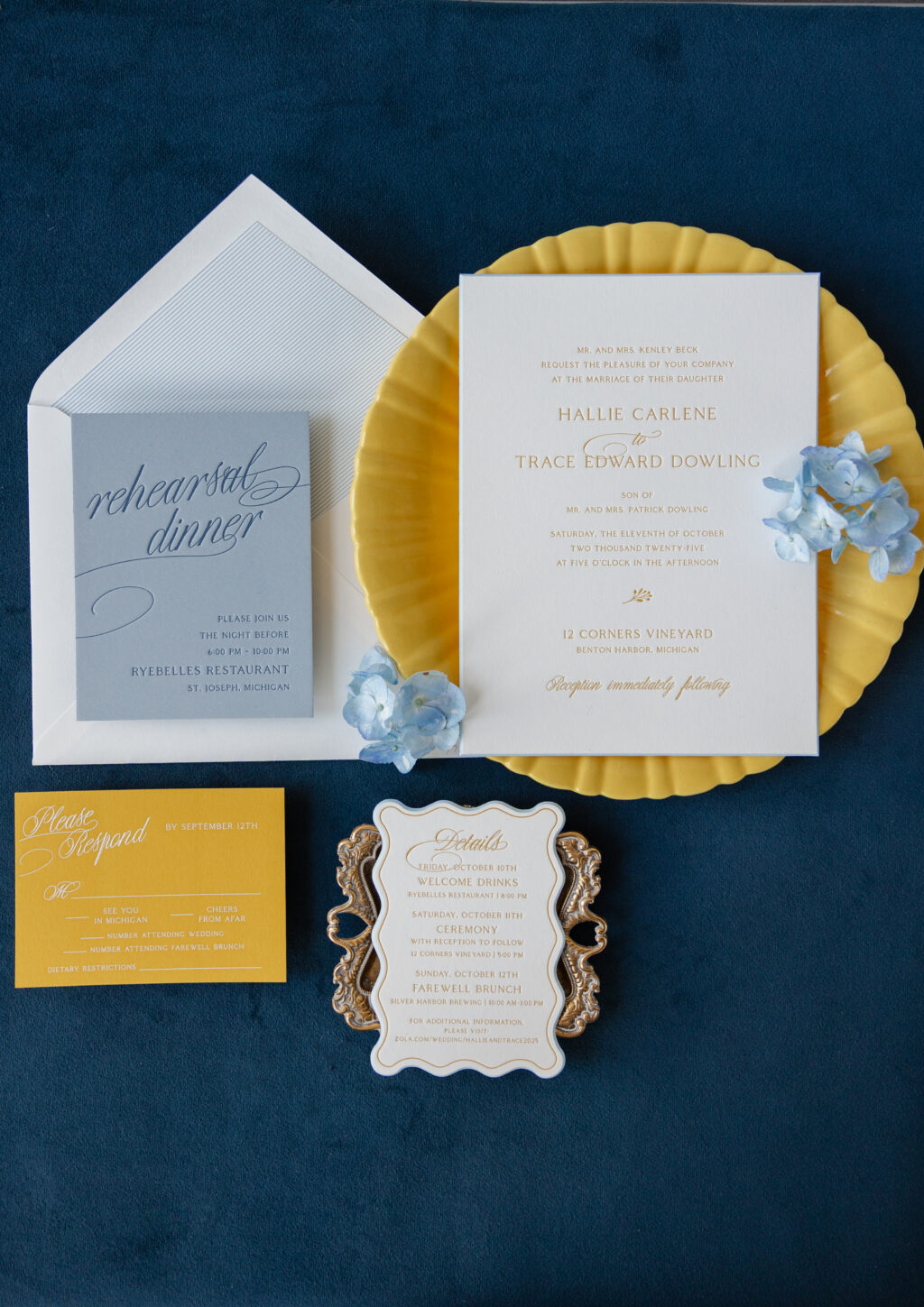
This invitation suite blends a classic wedding stationery aesthetic with a bold, playful color palette and striking typography, perfect for this Michigan wedding. The couple, Hallie and Trace, worked with our dear friend Becci of RSVP in the Village to create their sophisticated wedding invitations.
Invitation
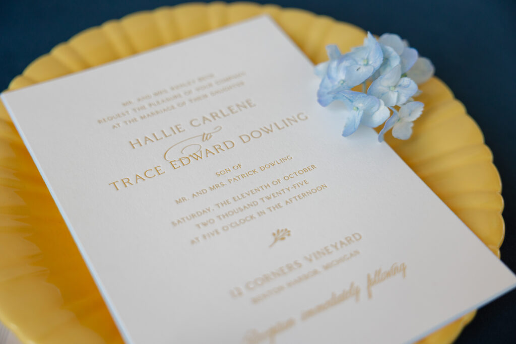
letterpress ink: goldenrod
fonts: coldiac + copperlove
paper: bella smooth cotton 2-ply white
card size: f-8
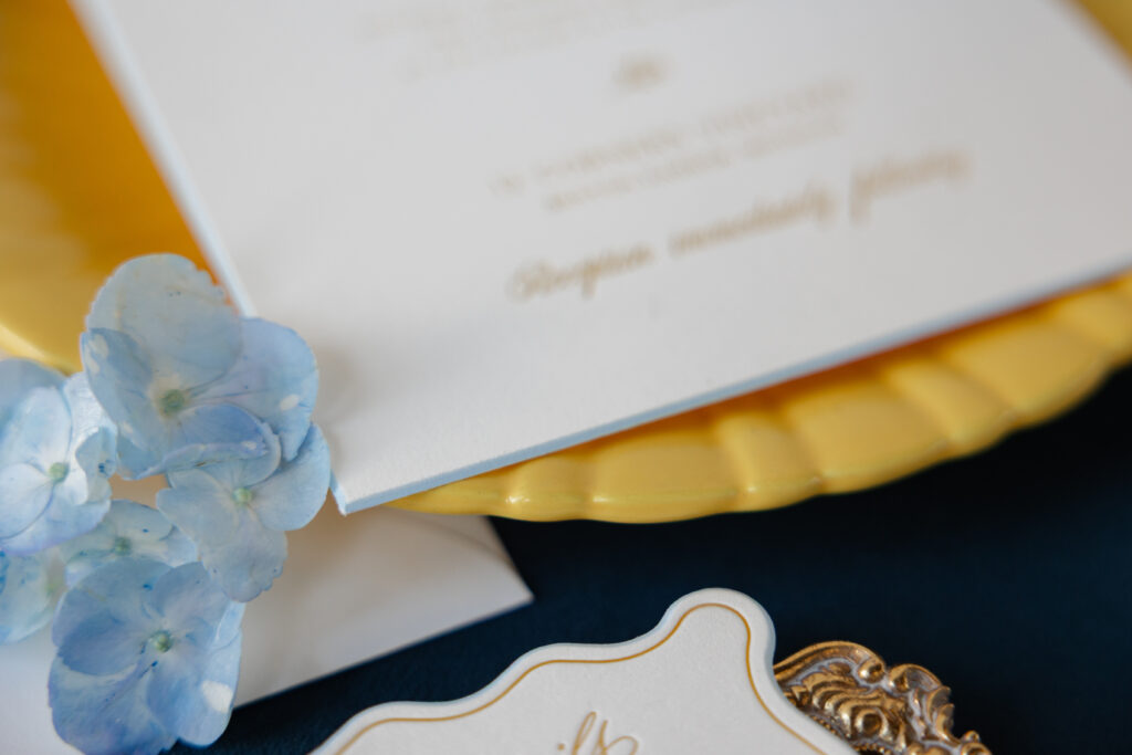
bevel edge: 45-degrees
edge paint: french blue
envelope liner: chesney stripe pattern in french blue digital on white text
envelope: white cotton text
envelope addressing: goldenrod letterpress on the back
job #: 77388
This couple selected different cards from our collection of designs to assemble a truly unique wedding stationery suite. The invitation is a customization of our Burklyn design. The typography is very traditional. It gives the invitation a balanced and symmetrical feel. Goldenrod letterpress ink is stately but also an unexpected burst of color.
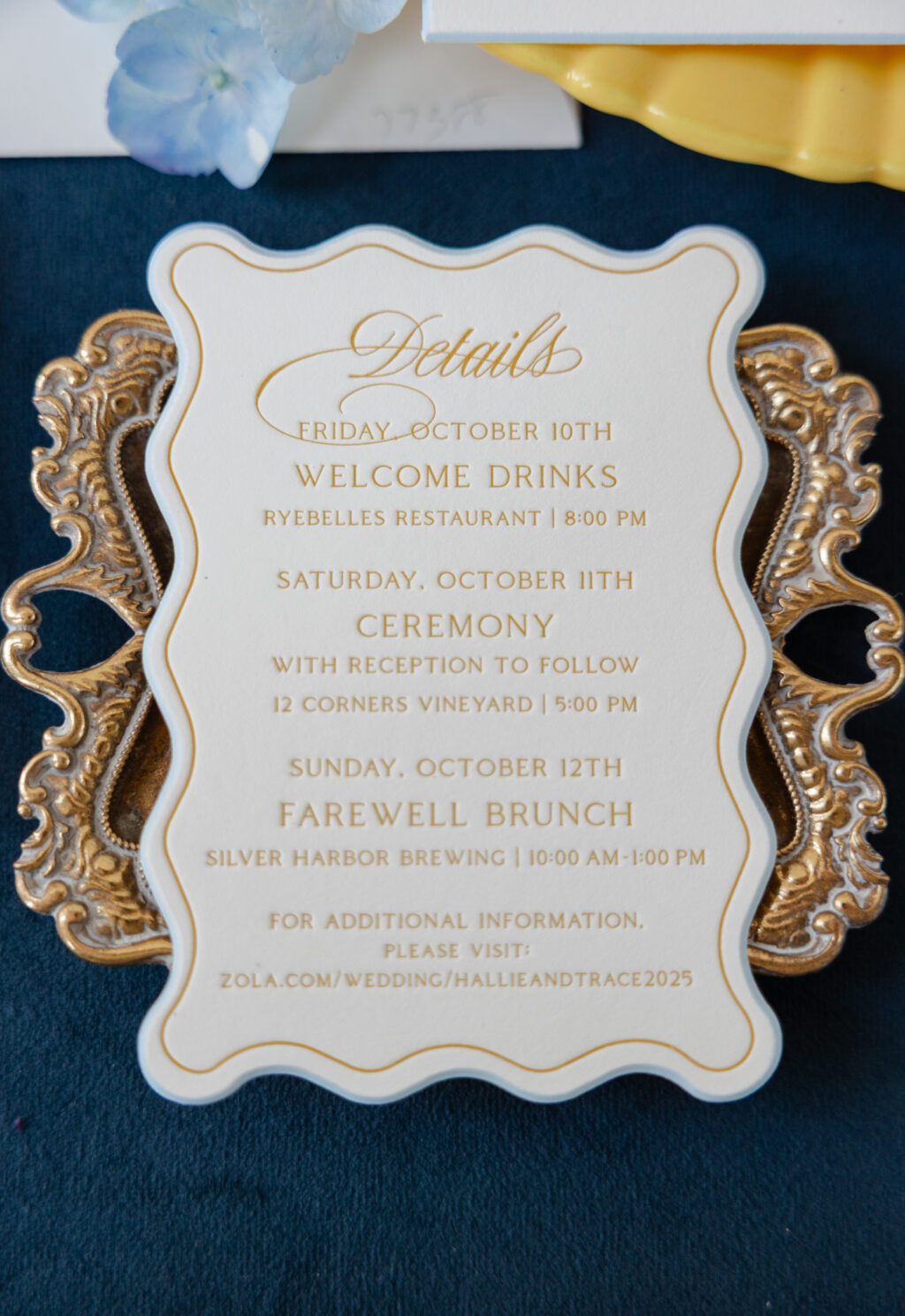
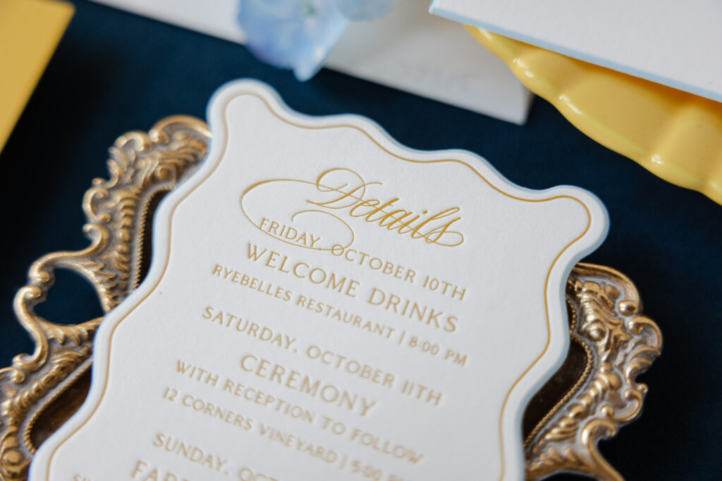
Details Card
letterpress ink: goldenrod
fonts: coldiac + copperlove
paper: bella smooth cotton 2-ply white
card size: a-5
custom shape bevel: 45 degrees
edge paint: french blue
job #: 77388
The details card draws inspiration from the Lainey details card and closely follows the invitation design, featuring goldenrod letterpress on Bella smooth cotton 2-ply paper in white. The standout feature is a custom shape bevel. The scalloped shape is whimsical, and edge painting in French blue highlights the gentle curves and the bevel edge.
The reply card flips the colorway of both the invitation and details card and features white engraving on our maize 2-ply paper. This switch is fun, bold, and vibrant, and upholds the playful vibe.
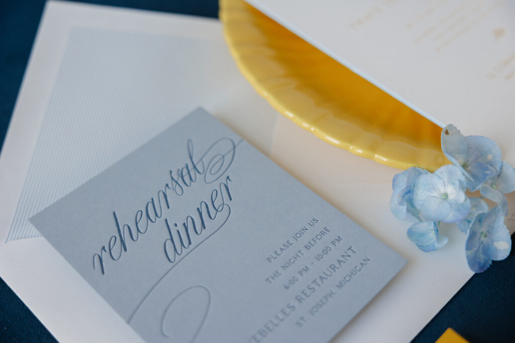
Rehearsal Dinner Invitation
letterpress ink: yale
fonts: coldiac + copperlove
paper: bella cloud 2-ply
card size: a-2
job #: 77388
Reply Card
engraving ink: white
fonts: coldiac + copperlove
paper: bella maize 2-ply
card size: a-5
envelope: white cotton text
envelope addressing: goldenrod digital on the front
job #: 77388
Tonal printing is the highlight of the rehearsal dinner invitation. Yale letterpress ink on our cloud paper is understated for a sophisticated, trendy look. The swooping flourishes of the script font add drama. The reply card and rehearsal dinner invitation feature the same layout as the corresponding pieces in our Harriet suite. While this couple selected cards from various suites, they kept the fonts the same to maintain cohesion throughout.
This wedding invitation suite is charming and elegant, and expertly merges bold color, a sweeping script font, and traditional print methods. Do you like the idea of swapping ink and paper colors across the cards in your suite? Would you love to feature a custom shape bevel? Work with one of our dealers to create your perfect wedding invitations!
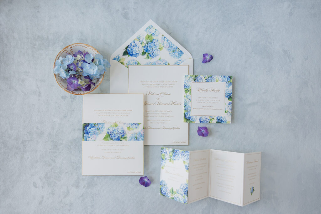
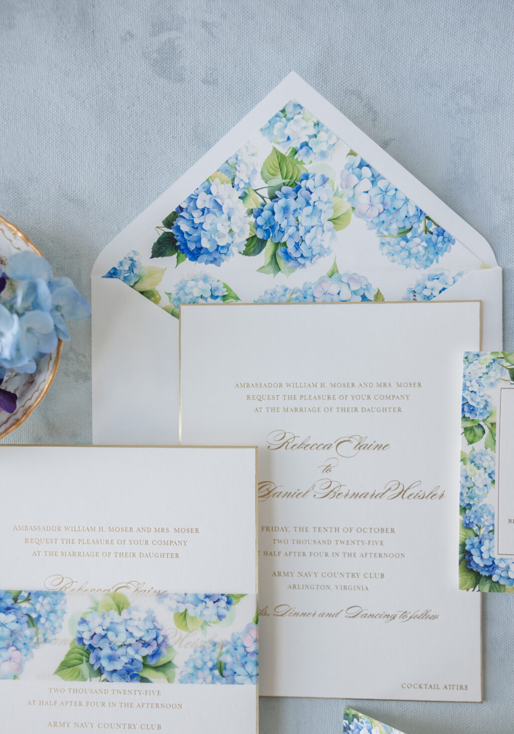
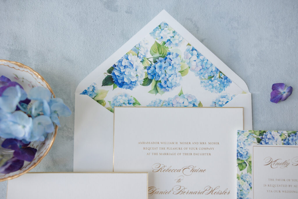
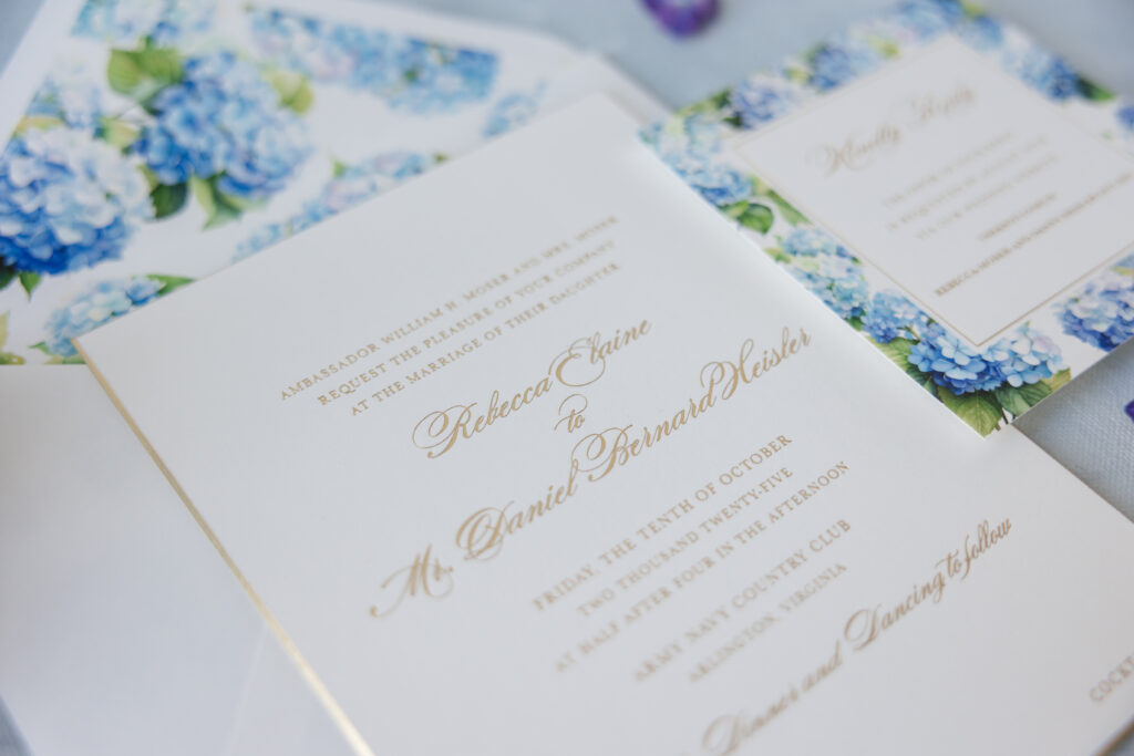
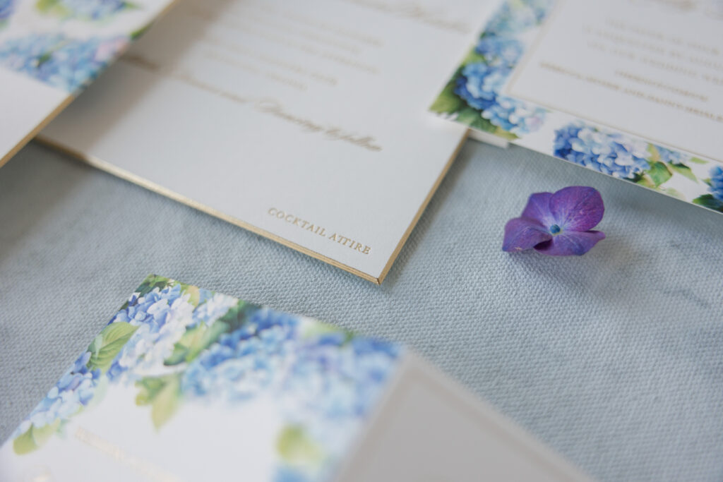
Rebecca and Daniel’s romantic garden-inspired invitations are so incredibly dreamy. Vibrant watercolors, a dramatic font, and delicate foil stamping are all expertly woven together to create a soft, refined aesthetic. The couple worked with our dear friend Virginia of Preppy Pink Pony on this lovely custom suite.
Invitation
foil stamping: champagne matte
paper: bella smooth cotton 2-ply white
card size: f-8
bevel: 45 degrees
foil edge: champagne matte
inner envelope liner: custom pattern in cmyk digital on white text
Inner envelope: white text pointed flap
inner envelope addressing: antique gold digital on the front
outer envelope: white cotton text pointed flap
outer envelope addressing: antique gold digital on the front/champagne matte foil on the back
job #: 77653
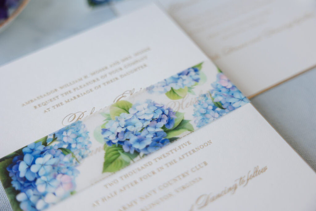
Belly Band
digital ink: cmyk
Paper: 40# vellum
size: f-8 vertical belly band
finishing: assemble around invitation
job #: 77653
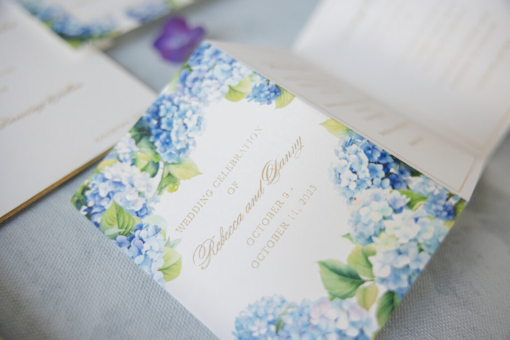
Lush watercolor hydrangeas are the centerpiece, giving the suite a romantic garden quality with a slightly nostalgic feel. Bountiful blooms grace the vellum belly band and envelope liner, creating a delicate, airy palette.
An elegant, sweeping script font is paired with refined serif text, creating a formal, timeless look. Champagne matte foil maintains the formal, dignified look, while adding glimmer. Our decadent, 2-ply smooth cotton paper holds a crisp impression and showcases the looping, delicate flourishes of the script font. The invitation features a bevel edge gilded in champagne matte foil to accentuate the slope while maintaining the refined aesthetic.
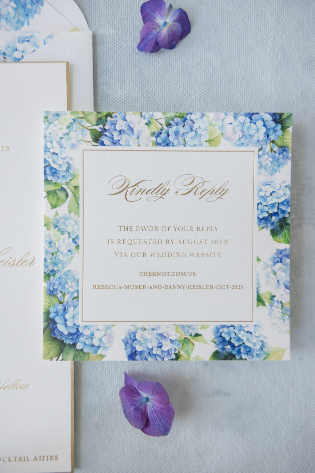
The reply card and details card are lovely on their own and further complement the set, featuring even more hydrangea artwork. The reply card’s foil-stamped framed border adds a graceful, delicately romantic quality without feeling overly ornate.
Reply Card
digital ink: cmyk
foil stamping: champagne matte
paper: bella smooth cotton 1-ply white
card size: sq-5
job #: 77653
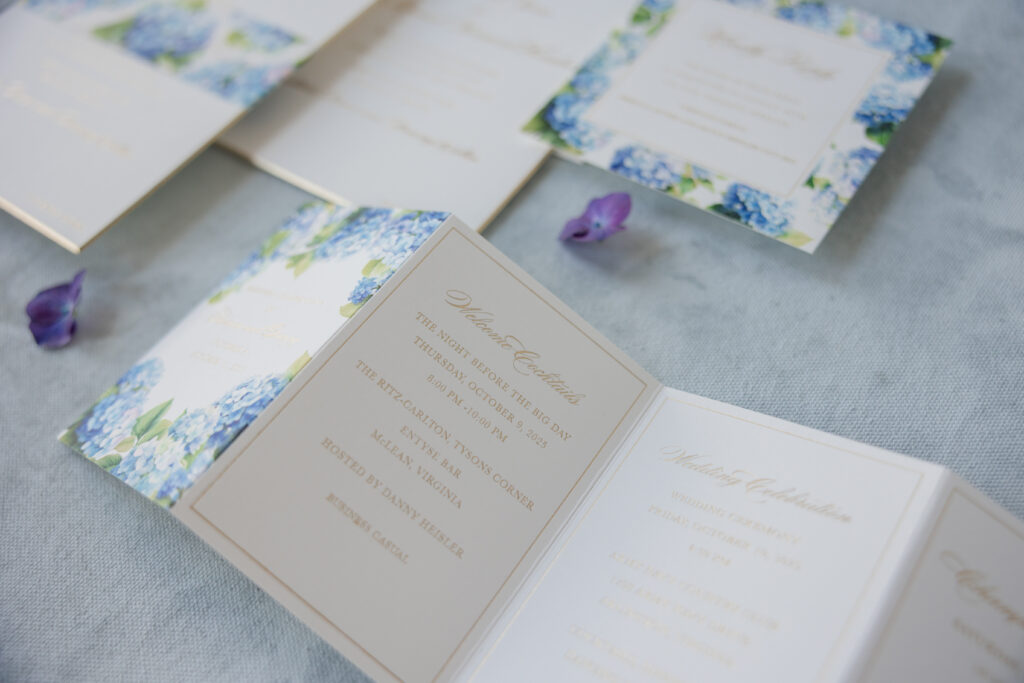
Details Card
digital ink: cmyk
foil stamping: champagne matte
paper: bella smooth cotton 1-ply white
card size: accordion card (13.52” x 4.75” flat, 3.38” x 4.75” folded)
finishing: score
job #: 77653
The details card walks guests through the weekend itinerary in a very informative and functional way. This card features plenty of watercolor hydrangeas on the front and the same framed border on each panel.
It was a joy to work on these romantic garden-inspired invitations, and we can help bring your vision to life. Work with one of our dealers to design your custom invitation suite!
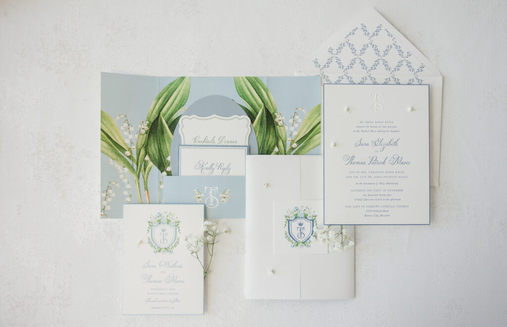
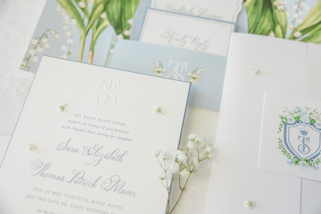
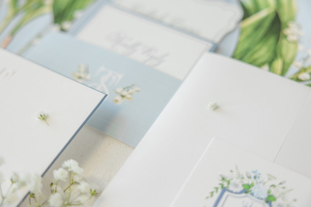
It was an absolute pleasure to work with our friend Susie of First Impression to create both the save the date and invitation suite for Sara and Thomas. This couple had some lovely, creative ideas, and we were thrilled to help bring their vision to life.
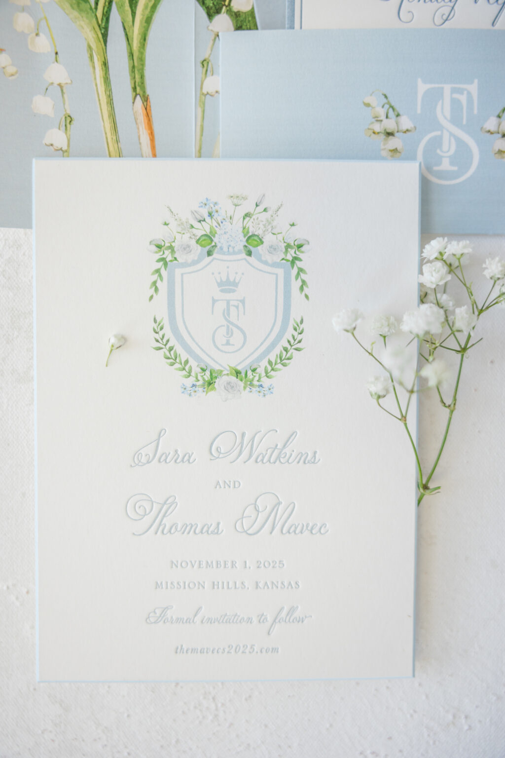
Save the Date
letterpress ink: chambray
digital inks: chambray + cmyk
fonts: serlio lh + petunia script
paper: bella smooth cotton 2-ply white
card size: a-6
bevel edge: 45-degree
edge paint: french blue
envelope liner: denton lattice pattern in chambray digital on white text
envelope: white cotton text
envelope addressing: chambray digital on the front and the back
job #: 75512
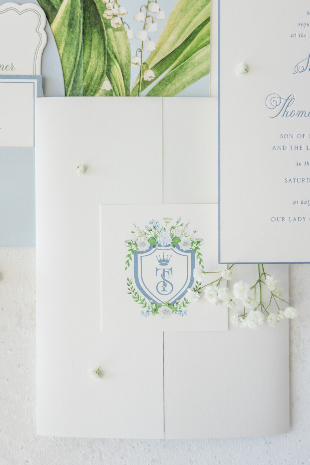
Sara and Thomas knew they wanted a crest for their save-the-date. So they sent us their ideas, and our design team crafted a custom crest that they loved, and, to be honest, we love it too. There’s a lovely romance in the way the couple’s initials are intertwined. The shield border provides structure, which is offset by the artfully placed floral and foliage swags. This crest is refined and romantic, adding a beautiful personal touch to the design. The crest appears in various forms throughout the invitation suite, adding a sense of consistency to the overall design.
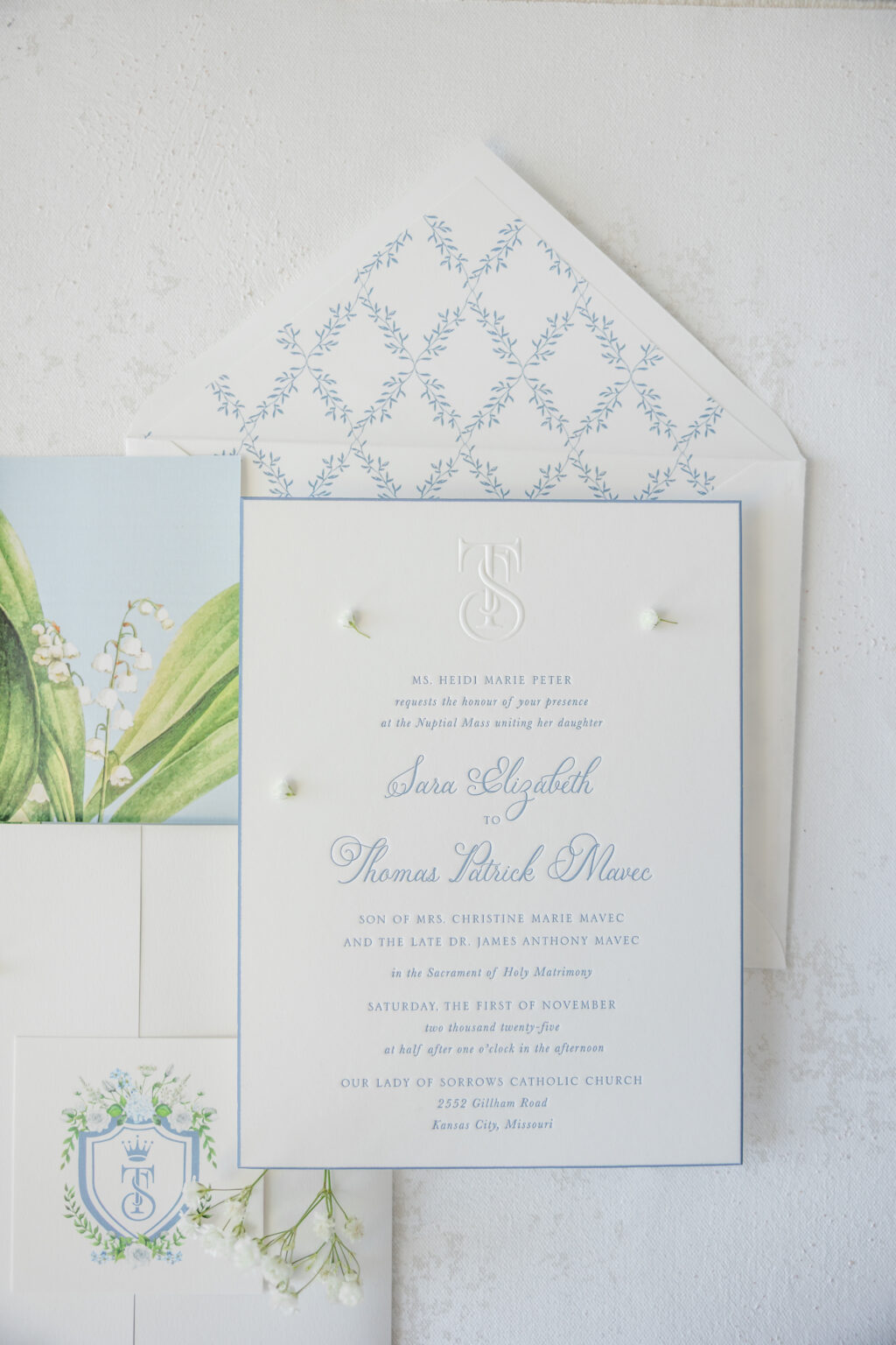
The invitation closely follows the save the date design. Both cards have a traditional layout, use the same fonts, and feature beveling and edge painting. The invitation features the monogram from the crest done in blind emboss, creating a raised area. The monogram is a subtle focal point, and the raised artwork creates an interesting dynamic with the letterpress text that is pressed into the 2-ply paper.
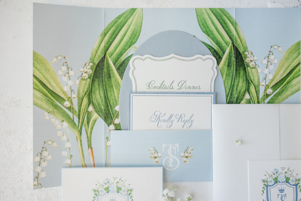
This couple presented us with an inventive idea for a custom pocketfold, and we made it happen. The gatefold-inspired design features an interior pocket on the back panel, so the auxiliary cards are stashed behind the invitation, ensuring the invitation is the first thing guests see when they open the custom pocketfold. The monogram also appears on the pocket, and the full crest is digitally printed on a tag that secures the pocketfold.
From a custom crest to a custom pocketfold, there is a lot to see in this save the date and invitation suite, and all of it is lovely. Would a crest be the perfect addition to your save the date or invitation? Do you like the idea of a pocketfold to neatly secure all the cards in the suite? Work with one of our dealers to create your dream wedding stationery!
Staci and Brandon worked with our friends at Simply Invitations to create their perfect wedding invitation suite. The Adina and Triton designs combined to make something completely unique. Black letterpress and platinum shine foil stamping are used throughout, in addition to subtle debossed florals. A classic color platinum shine envelope liner ties everything together, and makes the invite stand out.
letterpress inks: black + deboss | foil stamping: platinum shine | paper: bella cotton white 3ply + 1ply | bevel: 45 degree in platinum shine | fonts: adora bouton + poetica | envelope liner: classic color in platinum shine envelope: bella cotton white square flap | customization #58509