We are thrilled to share our brand-new Celebrations Release with you! This release features 20 new designs and celebrates all of life’s milestones. Think birthday, anniversary, and retirement party invitations, as well as bridal and baby shower invitations, graduation and moving announcements, and more! These designs help you celebrate life’s most momentous events.
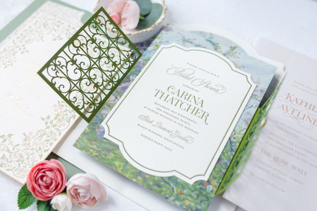
Carina features a lovely laser-cut gatefold resembling the intricate scrolls of a Victorian-era fence. A silk ribbon secures the gatefold for a decadent finishing touch. Guests are treated to a moment when they untie the bow and reveal the invitation.
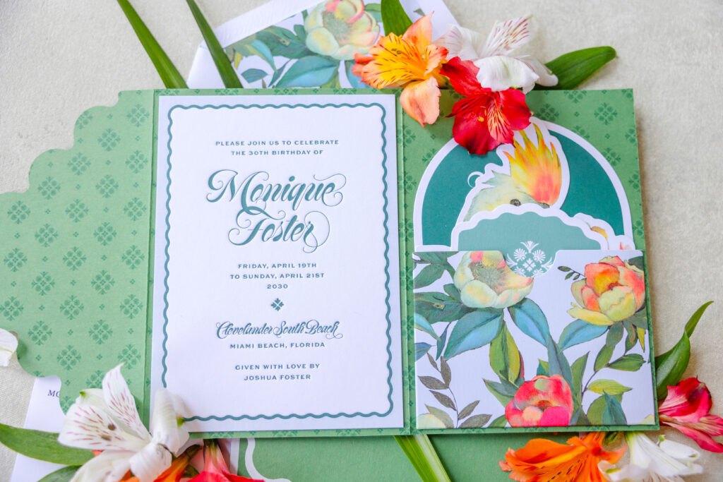
Our Monique design has a tropical flair that immediately sets the tone for a memorable gathering. A bold font immediately catches the eye, while the gentle curves of the scallop border mimic the font’s flourishes and anchor the design. The auxiliary cards feature fun die-cut shapes, especially the cockatoo-shaped accommodations card. A custom folder neatly secures all of the cards.
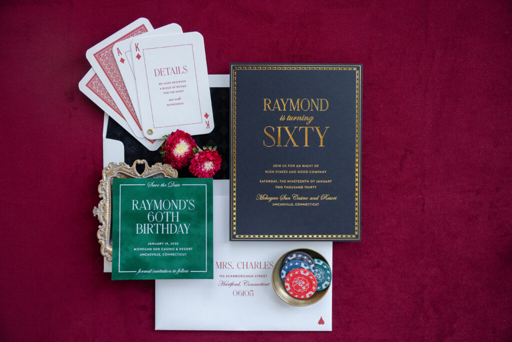
Our Raymond design is stately yet a lot of fun. The save the date subtly sets the tone for this casino-themed party with our alpine velvet, which mimics the look of a felt top poker table. The invitation features gold shine foil on our ultra black paper, which is elegant and complements the formal typography. The details and reply cards cleverly resemble playing cards. A grommet holds these cards together for a fun presentation.
You can see all of the designs in our Celebrations Release here. As with all our designs, you can customize each one to fit your occasion and style.
As small affairs and elopements fill our feeds, be inspired by this funky fresh palette! Announcing life’s milestones has never been more exciting with our Sundry design. This customization uses a colorful palette to brighten up somebody’s mailbox or even their day when they receive it. We imagine this paired with a patterned envelope liner to push that unique design envelope even further!
letterpress ink: calypso | digital inks: watermelon, persimmon, pastel pink, aquamarine, garden, clover, pastel blue, myrtle | font: opulent brush + bell mt | paper: bright white | invite size: A7 | liner: fleck ink pastel pink | original design + customization by Racheal Bumbolo
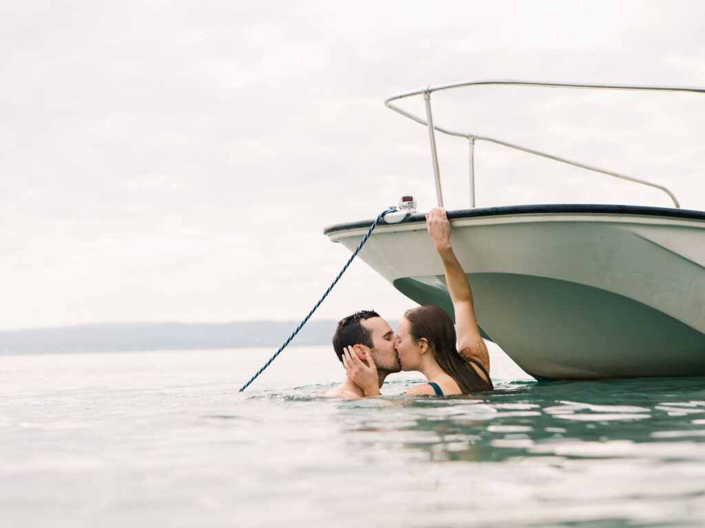
The Little Harbor Club in Michigan was the back-drop as well as the inspiration behind Liz and David’s September wedding. We created personalized letterpress wedding invitations for the couple using David’s venue illustration. The invitation printed in all Hunter letterpress ink paired with insert cards to match kept everything neutral and monochromatic. This tonal color palette allowed the illustration to do all the talking. The couple started their day taking a dip with the photographer in tow and ended with their nearest and dearest by their side! We’ll let Liz and David take it from here to share even more of the little details:
What was your favorite moment from your wedding day?
This is a very difficult question. There were more than one for sure, but when David and I woke up on our wedding day- we took my dad’s boat out and went for a swim. Our photographer came along and shot the whole thing and those photos are some of my favorite of the whole day.
How did you choose your invitation design and ink colors?
We knew we wanted to incorporate a drawing by David on the invitation. I wanted something that looked classic but modern- I actually had a hard time deciding on ink colors but in the end I went with my gut.. which is usually green. Our whole wedding was quite neutral. All the men were in black tuxes (except for David who wore midnight blue). And our flowers were all white and green. My shoes had red roses on them, that was the only pop of color!
What was the inspiration behind your wedding?
As David and I started to plan our wedding, we knew it was going to look a little different than the traditional schedule. What we envisioned was a timeless dinner party affair. We had 62 guests and a short and sweet outdoor ceremony followed by a multi-course served dinner with wine pairings that David and I chose. I was so very blessed to be surrounded by talented loved ones, David drew an illustration for our invitations and my sister turned that illustration into a ceramic tile for all our guests. September 2018 was also the month my parents celebrated their 30th wedding anniversary and they had their rehearsal dinner where our wedding was!
What was your favorite design element?
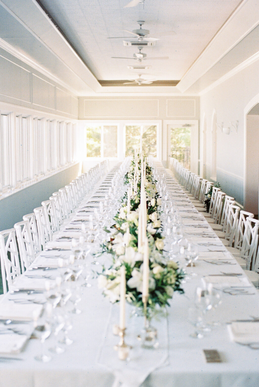
Probably our table! The whole setup was perfect – 31 people on each side. Taper candles, lots of glassware, custom tiles at each setting. Incredible food and wine, gorgeous florals. I could have sat there all night long.
What surprised you most about your wedding?
How wonderful the whole weekend truly was. I didn’t expect it to go poorly of course, but I think I was surprised at how magical it all felt! I couldn’t believe when Rachel, our wedding coordinator, told us it was time to make our exit. Also Michigan weather can be unpredictable especially in September, we were graced with the most beautiful sunny weekend!
Any advice to future couples planning their own wedding?
Everyone says the same thing, “enjoy it because it goes by so fast!” This is true. I would also say to revel in the magic of watching it unfold before your eyes.