We printed these black and gold wedding invitations for Kimberly and Daniel’s Miami Beach wedding. Our friends at Papery and Cakery helped them customize our Joie de Vivre design with hand calligraphy, a contemporary layout and custom fuchsia envelopes that perfectly matched the painted edges of their cards. A chevron envelope liner printed in gold shine foil and cute bow ties on their menu provided touches of festive fun.


letterpress ink: black | foil stamping: gold shine | font: streamline | hand calligraphy style: victoria | paper: bella smooth cotton white 2-ply | edge painting: fuchsia | envelopes: supplied | foil stamped liner: classic chevron pattern in gold shine | Papery and Cakery | customization #31767
Save
Save
We printed this customization of our Heatherly design in prussian blue and silver shine foil for a springtime wedding in Switzerland. The couple worked with us at our flagship store in New York City, opting to use the save the date layout in place of the invitation to keep the overall look simple and sweet.


letterpress ink: prussian blue | foil stamping: silver shine | font: garamond | paper: bella cotton ivory 2-ply | foil edging: silver shine | Bella Figura NYC | customization #33551
Save
We collaborated with our friends at invited on these digital and gold foil baby shower invitations based on our Glamorous Swash design. We kept the diecut shape and gold matte foil as seen on the wedding invitation design but made a simple color change to pool ink for the watercolor image. Stars from our motif library and an ode to a favorite nursery rhyme were whimsical touches that made for a very sweet invitation celebrating Jessica and her baby to be.


foil stamping: gold matte | digital inks: pool + amber | fonts: aster + moravia | paper: bella smooth cotton white 1-ply | diecut shape: charleston | envelope: bella cotton white | liner: elegant ombre pattern in amber | invited | customization #32117
Save
Our friends at Union Street Papery helped Jeanne and Beau select black envelopes for their invitation suite, and then provided them to us for printing. They also supplied the hand calligraphy that we then added to this #10 layout, along with a handdrawn border for a super sleek, modern look.


letterpress ink: black | foil stamping: tawny matte | fonts: moravia | hand calligraphy: supplied | paper: bella smooth cotton ivory 1-ply | envelopes: supplied | Union Street Papery | customization #32482
Save
Julie and Robert kept things simple and opted for typography wedding invitations for their Hawaiian wedding. Our friends at Sweet Paper helped them select our Maeve design, and we printed it horizontally in geranium and charcoal inks. Our island-inspired tavish pattern was printed without ink on the exterior of their pocketold and a flood of pale gray ink was digitally printed on the interior.
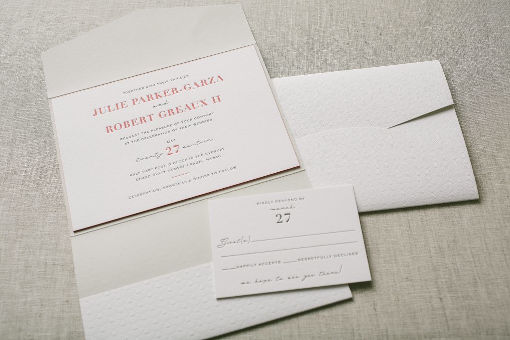


letterpress inks: charcoal + geranium | fonts: didot + sans capitals + riviera | paper: bella cotton 2-ply | edge painting: geranium | pocketfold: exterior blind debossed in tavish pattern; interior digitally printed in classic color pattern | Sweet Paper | customization #31288
Save
We worked with our friends at Ipanema Press on the design and printing of these Damask wedding invitations for a winter wedding at Oheka Castle. Brittany and Nicholas chose a crisp palette of black letterpress and gold matte foil and used blind deboss to highlight the damask pattern. Ipanema Press supplied the monogram and silhouette of Oheka Castle that we incorporated into the suite as well as the gold shimmer paper for the envelope liners. The romantic script font was carried throughout the suite, including their digitally addressed envelopes.
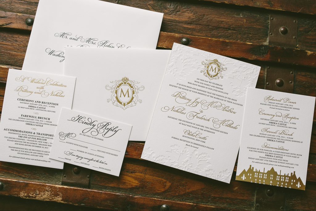
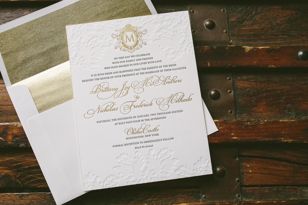

letterpress inks: black + blind deboss | foil stamping: gold matte | fonts: parisian + times new roman | paper: bella cotton white 1-ply + 2-ply | foil edging: gold matte | envelope: bella cotton white | liner: supplied | Ipanema Press | customization #30022
Bailey and Drew fell for our Nightingale design while looking for vineyard inspired wedding invitations at our flagship store in New York City. To give their suite a more elegant, less rustic feel they kept the artwork and typography simple and added Debi Zeinert’s hand calligraphy to highlight their names on the invitation. Digital guest addressing in matching charcoal ink made sure even their envelopes coordinated with the rest of their suite.


letterpress ink: charcoal | foil stamping: gold matte | paper: bella cotton white 1-ply + 2-ply | foil edging: gold matte | digital addressing ink: charcoal | Bella Figura NYC | customization #31782
Save
Our Designer of the Month for September is Amy Graham Stigler! Amy’s designs tend to have a classic, romantic look, often pairing gorgeous script fonts or hand calligraphy accents with elegant florals or swirling motifs. Many of the designs in Amy’s collection are best-sellers, including her brand-new Leyton and Hadley suites, and her ever-popular Chatsworth and Ravenna designs. During the month of September, you can save 10% on any order featuring one of Amy’s designs, from save the dates and wedding invitations to birth announcements or holiday cards. Combine our designer of the month promotion with our 10% discount for ordering 6 or more printed pieces for added savings! Remember, each of our designs is completely customizable, so you can change the layout, colors, and more to make a design your own. Click here to start shopping Amy’s collection today!


The fine print: this offer is exclusive to designs by Amy Graham Stigler and does not apply towards the purchase of other designs. Discount is applied automatically – no code required. Orders must be placed by 11:59pm Eastern on September 30, 2016 in order to receive this offer.
With the help of our friends at Prickly Pear Press we printed these fun and festive rehearsal dinner invitations for Haley and Tripp, using our Modern Revelry design as inspiration. Their bold color palette of cobalt and gold shine foil was used throughout the suite – even on the cobalt edges of the invitation and menu. We digitally printed their guests’ names on the placecards, too!


letterpress ink: cobalt | foil stamping: gold shine | fonts: marilyn + streamline | paper: bella cotton ivory 1-ply + 2-ply | edge painting: cobalt | envelope: bella cotton ivory | foil stamped liner: sullivan stripe pattern in gold shine | variably printed placecards: cobalt + antique gold digital inks | Prickly Pear Press | customization #33856
Save
Gisselle and Thomas worked with our friends at The Windmill Paper Boutique to transform our Vessa design into orchid wedding invitations for their Coral Gables nuptials. They added romantic flourishes from our library to the invitation and reception card and included a map on the backside of the accommodations card to help guests navigate between the church, the venue and recommended hotels. To keep all of the enclosure cards organized they included a pocketfold, foil stamped on our metallic white gold paper in an orchid pattern from our library.


letterpress ink: charcoal | foil stamping: gold matte | fonts: aiden + poetica + vessa | paper: bella cotton ivory 1-ply | diecut style: charleston | pocketfold: metallic white gold with gold matte foil stamping | The Windmill Paper Boutique | customization #30976
Rebecca and Eric customized our Paleo design with ultra modern typography and a horizontal orientation. They added copper shine foil to the invitation and kept the accessory pieces simple in charcoal letterpress. A custom color was used to edge the 2-ply invitation and add a bold pop of color to the envelope liner. Thanks to Pulp and Ink for these linear wedding invitations!


letterpress ink: charcoal | foil stamping: copper shine | fonts: didot + copperplate | paper: bella cotton 1-ply + 2-ply | edge painting: custom pms 321 | envelope: bella cotton white | liner: custom pms 321 | Pulp and Ink | customization #32444
Save
We fell in love with these foil stamped floral first birthday party invitations from our friends at Kathleen Cooper Fine Papers. The custom watercolor blooms created a sweet border around the photo of Ava and Olivia that we adhered by hand. Fawn letterpress and tawny matte foil added dimension and shine to the card while our Lincoln diecut shape and a coordinating floral envelope liner further personalized this adorable invitation set.


letterpress ink: fawn | foil stamping: tawny matte | digital printing: cmyk | fonts: submitted | paper: bella smooth cotton 1-ply white | diecut style: lincoln | envelope: bella cotton white pointed flap | envelope liner: custom pattern in cmyk | www.KCfinepapers.com | customization #33647
Save
