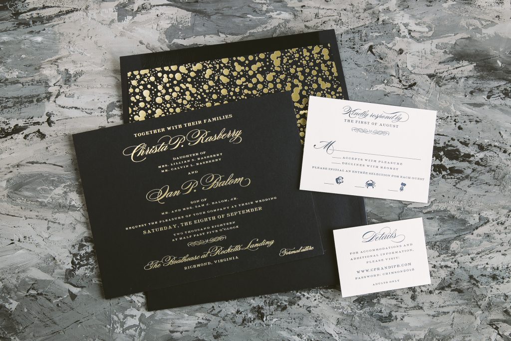
We are always excited to see the Deveril customizations that come through our shop. These gold matte foil wedding invitations kept the understated feeling of the original design. The reply as well as details cards printed in Navy letterpress kept the color palette consistent with the Bella Blue backdrop of the invitation. Christa and Ian chose to add a touch of playfulness to their suite through the envelope liner. They did so by choosing our geometric Ardea pattern printed in Gold Matte foil. Finally, the couple worked with our flagship store in Manhattan who helped bring their invitation vision to life.
Foil color: Gold Matte | Letterpress color: Navy | Fonts: Impression + Danube | Design: Deveril | Paper: 2 ply Bella Blue (old) + 1 ply Bella Smooth White | Size: F8 | Envelope liner: Ardea pattern in Gold Matte | Customization: 43382 | Bella Figura NYC – Manhattan
We’re excited to introduce this nature inspired letterpress design called Pressed by Sierra Detrick. We’ll let Sierra take it from here to share more about her vision came to life. “I wanted to pair a naturalistic feel with something very traditional. I actually took a walk around my neighborhood and picked up greenery that I found interesting. A big thanks to all my friendly neighbors who let me hijack some of their plants! From there, I flattened each article, rolled over them with ink and pressed them onto paper. I did this many many many times. I’m in love with color, intricate pieces of art and anything derived from nature.”
Calling all engaged couples! We are over the moon to announce that we will be participating in the upcoming Bridelux Atelier. The event will be held on Sunday, January 13th from 11 A.M. to 6 P.M. at The InterContinental New York Barclay Hotel. There in the heart of the city, you’ll find anything and everything wedding related. From bridal gown designers to destination wedding specialists (and stationery of course!), we couldn’t be more thrilled to be part of this event. Stop by to see our customizable designs up close and personal with calligraphy in action by the one and only Virginia Lucas Hart. Come visit us at the event for a chance to win $500 towards your invitations. Head on over to Instagram (@bellafigura) and Facebook (@bellafiguraletterpress) to win two tickets to the Bridelux Atelier! In order to be eligible, follow either account and let us know how that certain somebody popped the question or tag an engaged duo who are near and dear to your heart.
Our Cora design served as the template for Hanae and Drew’s Floridian inspired wedding invitations in gold foil. They worked with our friends at Wynwood Letterpress who helped their invitation vision come to life. Shades of blue botanicals created an organic watercolor frame. Further, this element added a softer side to a more structured typography layout in Gold Matte foil. Finally, a custom envelope liner pattern featuring watercolor palms enhanced the Floridian feel of this suite.
These modern black letterpress wedding invitations featuring a playful script accent set a contemporary tone. The couple worked with our friends at Penny Post who helped shape this Splash customization. Originally, the design featured a vertical layout, but they decided to change it up by using a horizontal canvas. Similarly, the set-up of the reply and details cards mimicked the overall design of the invitation as well. As the final touch, a solid Hunter green envelope liner added a splash of color to this tonal set.
The season of engagements and save the dates is now upon us! We worked with Silberman Brown Stationers to create these photo save the dates with copper foil accents. Becky and Andrew married in Leavenworth, Washington this past September. A village in the Cascade Mountains surrounded by Alpine-style buildings, Nutcracker Museum displays as well as all the trees you could possibly imagine. It’s safe to say they needed a save the date that would match this aesthetic. Pictured in the middle are Becky and Andrew front and center walking through the rugged terrain. This image certainly set the stage for their wedding day to come. Copper Matte foil used as the border around the photo and for some of the typography added a metallic accent. Last but not least, watercolor tree imagery topped off the design.
Our flagship store helped Mia and Joseph create these letterpress celebration invitations with rose gold accents. Inspired by our Townsend design, they chose Pale Gray as well as Cobblestone inks which created a cool color palette. A Pale Gray border used around the perimeter of the invitation added a subtle design element on the front. While on the reverse, guests can find our Damask pattern in Pale Gray ink. The same pattern repeated on the envelope liner kept the suite consistent and eye-catching.
Jenna and Richard worked with Paper on the Avenue to create these floral letterpress invitations in garden and pewter. Inspired by our Wildflower design, they kept the color palette monochromatic. Script typography brought the attention to the bride and groom to be. Finally, a reply card also printed in garden kept everything cohesive as well as the return address on the envelope. The night before a wedding certainly requires celebration and an invitation in order to do so!
Letterpresscolor: Garden + Pewter | Fonts: Barocca and Moravia | Design:Wildflower | Paper: 2 ply Bella Cotton | Size: F8 | Customization:42855 | Paper on the Avenue
Inspired by our Culver design, these celebratory letterpress invitations honored all those who work for Joanie and Brian Allen. Sea Mist, as well as Pool ink colors, kept the design monochromatic and clean. On the reverse, employees names created a unique pattern in Sea Mist letterpress. Overall, this set led with typography as the driving design element. Thanks to the help of our friends at Uptowne Papers for helping us pull this together!
Letterpress color: Sea Mist + Pool | Fonts: Helvetica and Trend Sans One | Design: Culver | Paper: 2 ply Bella Cotton | Size: F8 | Liner: Custom Pattern in Pool l | Customization: 43647 | Uptowne Papers
We worked with our friends at Ipanema Press to create these crisp black letterpress wedding invitations. Above the letterpress, a blind embossed monogram added dimensional texture. Whereas, a pop of copper foil used on the reply as well as website cards introduced metallic accents. An envelope liner finished the set off in a custom pattern shining in copper foil. Finally, a menu printed in copper and black letterpress ink kept everything cohesive.
We’re also happy to announce that we are extending our day of promotion through December 2019!
We used our new Bella Royal paper as a backdrop to this modern foil stamped new year card. Opaline Shine, as well as Silver Matte, added a reflective quality to the layout. To give the design geometric interest, snowflake shapes anchored the corners of the card. For those of you who may be running behind on holiday cards, a new year card is a solution that celebrates what’s to come! What ways will you come up with to say “Happy New Year” using our Hodges design?
AS A FRIENDLY REMINDER:
Two promotions for the holiday season: free envelope addressing along with complimentary rush service on all custom holiday orders. Order deadline: December 14, 2018. Approval submission deadline: 3 PM EDT for any holiday rushes and any red rushes.
It’s the season of engagements that require celebration and invitations! Take a peek at these watercolor engagement party invitations. Christina and David worked with Windmill Paper Boutique who helped bring their vision to life. Inspired by our Wardell Modern design, they added a blue backdrop as well as Rose Gold Shine accents. Finally, a solid foil liner shining brightly completed the engagement set.
Letterpress color: Black | Foil stamping color: Rose Gold Shine | Fonts: Allyson + Gotham | Design: Wardell Modern | Paper: 2 ply Bella Smooth Cotton | Size: SQ-6 | Liner: Classic Color in Rose Gold Shine | Customization: 43879 | Windmill Paper Boutique