Jeanne and Philip worked with our friends at Seaside Papery to create their invitation suite. The overlay crest was created from our library using our Build Your Own Crest frames and motifs. On the invite card, we used the fonts from our Vienne v.2 suite, and added a digital floral background. The Baptism card and envelope are in Bella plum, and perfectly compliment the purple florals throughout.
letterpress ink: regalia | foil stamping: prism shine | digital inks: cmyk | papers: bella smooth cotton white 1ply + bella plum 1ply + 40# vellum | fonts: maison de fleur + mrs eaves + garamond | envelope liner: custom pattern in cmyk | envelope: bella plum | customization #66489
We worked with our friends at Ink Papery to create these custom baroque inspired birthday party invitations. A supplied metallic gold envelope, and oversized square invite catch the eye. The gold matte foil stamping is the prefect color to set the mood for a luxurious evening.
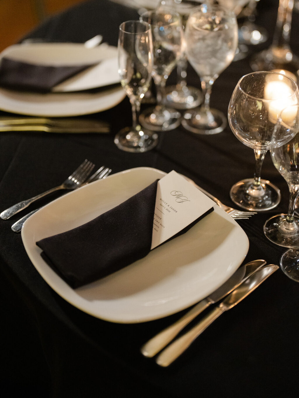
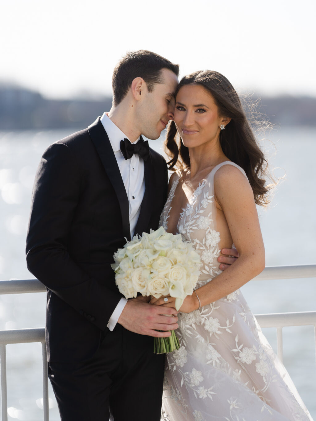
Mariana at our NYC studio worked with the wonderful Molly and Jason to bring their wedding stationery to life. They customized a version of our Elatus v.2 suite, updating with deep blue throughout. We’ll let Molly take it from here to share more about their wedding details!
CAN YOU SHARE WITH US A BIT ABOUT YOUR WEDDING AND YOUR INSPIRATION FOR THE EVENT?
Our wedding was at the Lighthouse at Chelsea Piers on 4/1/23. Our venue was on the water overlooking the Hudson River with a view of Hoboken/Jersey city. We really wanted the quintessential black tie New York City wedding with an invite that was subtle and refined, yet elegant. Jason loves modern aesthetic and our invites were the perfect mix of modern and classy.
WHAT ADVICE DO YOU HAVE FOR COUPLES CURRENTLY PLANNING A WEDDING?
Work together as a team and try to listen to each other’s opinions. And don’t worry about the weather – it will work out exactly as it’s meant to. Our weather forecast showed 97% of thunderstorms with damaging winds in the area. Needless to say I was freaking out. Jason stayed positive and that 3% came true – it was a beautifully sunny 72 degree day. We got so lucky for the 1st day of April.
HOW DID YOU CHOOSE YOUR INVITATION DESIGN & INK COLORS?
We got married on the water in early April. We wanted the design and colors to match the spring feel of our wedding but also knew the invites would be sent out in the winter, so we wanted to make sure they weren’t too florally or summery. The chambray blue was the perfect color that represented springtime. We also wanted to have a monogram of our initials that carried over throughout our wedding (napkins, photobooth monogram, etc.).
WHAT SURPRISED YOU MOST ABOUT YOUR WEDDING?
How quickly it passes after spending 1.5 years planning. Savor the moment!
WHAT WAS YOUR FAVORITE MOMENT?
My favorite moment was our first look. Jason hysterically cried seeing me for the first time (as I knew he would). He didn’t want to see my dress prior to our wedding day so he was in awe when he first saw me.
FAVORITE DESIGN ELEMENT OF YOUR BIG DAY?
Our favorite design was the twinkle lights over the dancefloor. We didn’t stop receiving compliments on them! I also loved how our florist repurposed our Chuppah florals and used them for the head table on the dancefloor.
WHAT’S NEXT FOR THE NEWLYWEDS?
We just got back from our honeymoon in Hawaii and Japan. It was the trip of a lifetime. Next, we plan to enjoy life 🙂
letterpress ink: deep blue | paper: bella smooth cotton bright white 2ply + 1ply | fonts: addington + aston script | envelope liner: custom liner in deep blue | envelope: bella cotton bright white square flap | customization #65513
We worked with our friends at Simply Beautiful Events to help Grace and Philip create their beautiful invitation suite. We paired our handmade white, steel blue, and soft blue papers with chambray, denim and shale letterpress. This created a beautiful soft tonal effect throughout the suite. All the shades of blue and gray were brought together in the customized elegant garden envelope liner.
letterpress inks: chambray + denim + shale | paper: bella handmade white + handmade steel blue + handmade soft blue | fonts: athelas block and compendium script | envelope liner: elegant garden pattern in denim + pastel blue + powder blue + chambray + shale | envelope: bella cotton white pointed flap | customization #67135
We worked with Susie of Pink House Productions to create Sarah’s awesome and colorful Mitzvah invitation suite. Our Shayla Mitzvah suite was the starting point, updated with fuchsia, navy and regalia letterpress. To make the the rainbow shine more impactful, a classic color flood creates a show-stopping liner.
While we most often print invitations or holiday cards, we love creating personal stationery too! Nicola worked with our friends at Lee’s Paperie to create this stunning stationery. Calligraphy letterpressed in pool, with a matching beveled edge are stunning against the custom liner. Our vintage lily of the valley pattern pops against a background of sea mist digitally printed at 25% opacity.
letterpress ink: pool | paper: bella smooth cotton bright white 2ply | calligraphy style: willa | envelope liner: lily of the valley pattern in cmyk + sea mist 25% | edge: 45º bevel + edge paint in pool | envelope: bella cotton bright white square flap | customization #66934
Vellum is a unique, semi- translucent paper and is compatible with digital printing and foil stamping. We can score this paper, as well – making it an option for belly bands, overlays, and more.
We can use vellum to create tall or standard height belly bands as seen on our Duval and Ichabod suites
Our Ninette v.2 celebration invitation features a digitally printed gatefold wrap
Vellum can also be used to create overlays- our Ines save the date and Harro details cards feature grommeted overlays
Overlays can alternatively be tied on with ribbon, or metallic thread, like in our Valley suite
We worked with our friends at Shindig Paperie in Fayetteville, Arkansas to bring Marissa and Brant’s invitations to life. Our Euphrasia suite is the inspiration, updated with cedar shine foil stamping, and blind embossing. Striking blue envelopes with a foil stamped metallic liner are the perfect backdrop to highlight the subtle sophistication of the cards.
embossing: blind | foil stamping: cedar shine | paper: bella cotton white 2ply + 1ply | fonts: addington cf regular + italic, slight regular, faroe thin | envelope liner: euphrasia pattern in cedar shine on nude | envelope: bella blue square flap outer | customization #59547
We worked with our friends at Please and Thank You Paper Co to create this beautiful suite for Emma and Daniel. A supplied family crest pairs perfectly with traditional fonts. Supplied pistachio envelopes are the perfect compliment to the custom color letterpress accents and edge painting. The suite has a timeless elegance, while the pops of light green keep it current.
letterpress inks: pewter + pms 7485u | paper: bella cotton white 2ply + 1ply | fonts: trajan pro + aston script | edges: corner rounded + edge painting in pms 7485u | envelopes: bella cotton white pointed flap + supplied pistachio euro flap | customization #66310
We worked with our friend Jill at Wordshop in Denver to create this awesome Bar Mitzvah suite. Purple shine foil and cobalt letterpress combine to create a loud and original color palette, perfect for the event theme. The cobalt is carried through the enclosure cards. The purple shine features again in the full flood envelope liner, the perfect highlight the guitar motif on the invite card.
We worked with our friends at Union Street Papery to create Meghan and Louis’ beautiful wedding invitation suite. Gold foil stamped palm motifs set the stage for the iconic Fairmont reception venue. A reception card on supplied rouge paper and flamingo edge painting are the perfect summer compliment to the suite.
letterpress ink: holly | foil stamping: gold matte | digital printing: cmyk | paper: bella smooth cotton white 2ply + 1ply, supplied rogue cover | edge painting: flamingo | fonts: ravensara sans regular + medium, burges script | envelope liner: palm pattern in gold matte on holly | envelope: bella cotton white square flap | customization #61177
We worked with Jill of Jilly P Invitations and Gifts to bring these gorgeous baby shower invitations to life. The Maisey design was the starting point, keeping the cherry blossom letterpress. We swapped garden letterpress for gold matte foil stamping to create a more elevated look. The invite is finished with our rose quartz ribbon tied in a bow. An envelope liner in matching cherry blossom is the perfect compliment to this sweet shower invite!
letterpress ink: cherry blossom | foil stamping: gold matte | paper: bella smooth cotton 2ply | fonts: ms claudy + mrs eves | envelope liner: classic color in cherry blossom | envelope: bella cotton white pointed flap | ribbon: rose quartz with bow | customization #66089