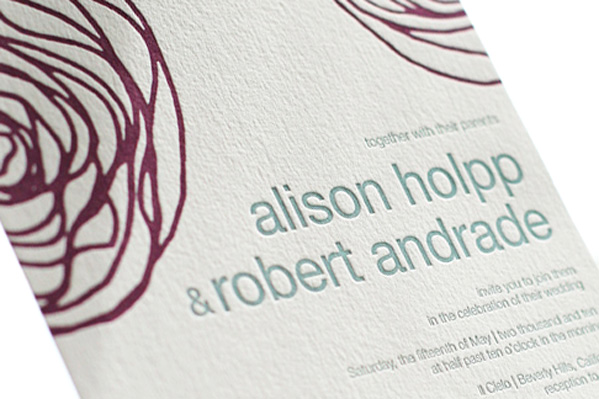
These letterpress wedding invitations showcase our Spinnerette design, one of our favorites from our 2010 collection. A fresh color combination of aubergine and pool inks give this design a contemporary look that’s playful and modern, perfect for a casual summer wedding.

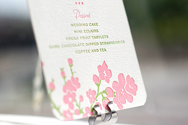
This letterpress dinner menu features our Mimosa design, printed in blush and clover ink colors. This couple opted for a vertical, tea-length menu with rounded corners. We love this color palette, so fresh and perfect for spring or summer.


Printed in cardinal and pewter inks, this letterpress wedding invitation is our Lovebirds design. With a chic pewter envelope liner, we love that this couple chose to print both their names and “love” in red – a perfect symbol of their upcoming marriage.


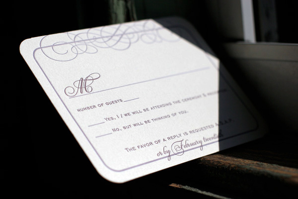
We love this customization of our popular Keswick letterpress wedding invitation design. Letterpress printed on our ivory paper, the couple chose an elegant combination of amethyst and lavender inks. Corner rounding is the perfect finishing touch for this sophisticated set.


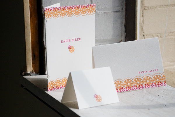
Printed in cheerful fuchsia and persimmon inks, this set features our Esperanza letterpress wedding invitation design, new from our 2010 collection. The couple also opted for a bright fuchsia pocketfold and matching envelope liner. In addition to the invitations, we also printed their letterpress programs, escort cards and personalized thank you notes for a complete suite that is vibrant, colorful and perfectly celebratory.


As promised, we wanted to share the Pride & Prejudice inspiration shoot we recently worked on with Anne Sage of The City Sage that appeared in the last issue of Nonpareil Magazine and also on Style Me Pretty. We just love these incredible images are by talented wedding photographer extraordinaire Lisa Lefkowitz. All of the paper goods were our Cameo design letterpress printed in celadon and cream.


(more…)
Earlier in the year we were excited to be contacted by one of our favorite bloggers and stylists, Anne Sage of The City Sage, about collaborating on a Pride & Prejudice themed photo shoot for Nonpareil Magazine. Needless to say, this was one opportunity we couldn’t pass up! We printed letterpress wedding invitations, menus and escort cards all in our Cameo design, which features a sweet vintage-inspired silhouette design. (Our favorite part about Cameo? We customize it with your silhouettes at no charge!) We printed all of the pieces in celadon and cream inks for a soft, romantic feel just perfect for a wedding at Pemberley Estate. The shoot was designed around the concept of a wedding breakfast reception and the reply cards asked guests to write in their request for a favorite waltz.


See the shoot here in Nonpareil Magazine and stay tuned tomorrow for many more photos right here!
This pretty customization is a letterpress Bat Mitzvah invitation suite, printed for a springtime celebration. The set features our floral Erra design, printed in fuchsia and pumpkin inks on our soft 1-ply cotton paper. We just love this combination of bright, fun colors – and the fuchsia envelope liner adds the perfect finishing touch.


This morning we wanted to share an inspiration board inspired by our current Design of the Month, Hendrix by Jessica Hische. We envisioned a pretty, outdoor celebration where guests are invited to dine al fresco in a fragrant garden or open field. Colorful flowers, sweet summery details and pops of color in peach, pink, green and teal make this look both elegant and playful.
 Don’t forget that between now and August 15th, all orders of our Hendrix design over $1000 will receive free letterpress thank you notes! Check out the details here.
{Row 1: Martha Stewart Weddings, Martha Stewart Weddings, photo by Benjamin Edwards Photography via The Sweetest Occasion. Row 2: April Smith Photography via Once Wed, Martha Stewart Weddings. Row 3: Letterpress wedding invitations by Bella Figura, Martha Stewart Weddings, Kate MacPherson via Twigs & Honey. Row 4: photo by Megan W Photography via The Sweetest Occasion.}
We loved seeing these gorgeous photos by Jonathan Young from Leticia and Mark’s recent wedding sent over by one of our amazing Bella Figura calligraphers, Patricia Mumau of Primele. Leticia and Mark were married in June at the picturesque Blue Hill at Stone Barns just outside of New York City and chose our New Calligraphy letterpress invitations by another of our long time favorite calligraphers, Debi Zeinert of The Blooming Quill. The invitations were printed in cardinal ink and the couple then worked with Patricia for the calligraphy addressing and gorgeous escort cards featuring crisp white ink on red envelopes. We love the rich, vibrant jewel tones Mark and Leticia chose for their celebration and the fun pairing of Debi and Patricia’s calligraphy. Thank you for sharing, Patricia, and congratulations, Leticia and Mark!


{Photos by Jonathan Young.}
In celebration of Hendrix, our July Design of the Month, we wanted to share one of our favorite recent customizations of this gorgeous design. We printed these letterpress wedding invitations in a pretty combination of espresso and aquamarine inks for a late summer wedding in California. We just adore this customization for it’s cheerful sophistication and modern sensibility meets sweet vintage feel.


Today we’re exited to introduce you to July’s Design of the Month – Hendrix by Jessica Hische. It’s pretty, playful and a touch whimsical, and one of our favorites from our 2010 collection. We think it’s perfect for a garden party wedding or an outdoor celebration under the stars. As our Design of the Month, all orders of our Hendrix design over $1000 placed between now and August 15 will receive free letterpress thank you notes – don’t miss out! (Flat thank you notes, letterpress printed to match your invitations with unprinted envelopes.)

Meet the Designer – Jessica Hische
In honor of our Design of the Month, we thought a little Q & A session with the talent behind the design was in order. Brooklyn-based Jessica Hische is an incredibly inspiring designer, typographer and illustrator. In addition to her amazing art prints and Buttermilk, her first typeface of which we just can’t get enough, we are obsessed with her blog and her Daily Drop Cap project. Without further ado, meet Jessica Hische.

What was the inspiration behind Hendrix?
My friend, illustrator John Hendrix, had a baby girl and commissioned me to design his baby announcement, which I letterpressed for he and his wife in exchange for one of his original drawings. The Hendrix wedding invitation design takes elements from the original announcement and tweaks it and expands it to a full wedding suite. Everyone loved the original design so much I was so happy to be able to share it with others!
When did you know you wanted to be a designer? How did you get your start?
I actually didn’t know what graphic design was until I was in college. I always knew I wanted to do something art related, I just didn’t really know exactly what that was until I took my first design class in my sophomore year at Tyler School of Art. I loved that design isn’t really self-expressionistic — it is about solving problems and doing what is appropriate for a client / project.

{Jessica notes, “I love breakfast.”}
If you were an ice cream flavor, what would you be?
This is a tough one! I think the closest one might be Ginger, but if “Almond Croissant” was an ice cream flavor I’d be that.
What’s your favorite PMS shade?
PMS Warm Red U or something a bit more orangey.
What’s the most memorable vacation you’ve ever taken?
I was invited to speak at the Semi-Permanent Conference in Sydney this year and went a week prior to vacation with my boyfriend. It was the most fun vacation I’ve ever been on. All we did was eat amazing food, drink amazing coffee and get our pictures taken with koalas.

(more…)
