As part of our Do Good in March promotion (where we’re giving you the chance to win free letterpress invitations just for doing good!), we’re hoping to inspire others to create some good in the world. Wondering what counts as something you could do that’s considered “good”? Lots of things – we’re letting you decide! But if you need some ideas to help get you started, our eco-partners, designers and staff have some amazing ways to spread the love. Have some ideas of your own? Tell us in the comments section below!
Practice the Amazon Conservation Association’s green living tips. Check out these great tips for simple things you can do to help protect the rainforests.
Lighten your (wedding’s) footprint with The Conservation Fund. There’s no doubt your guests will flock from miles away to be a part of your big day, but did you know that guest travel is likely the largest piece of your wedding’s carbon footprint? The Conservation Fund’s Go Zero program can help measure your impact and then plant trees in protected parks and wildlife refuges that will trap CO2 as they grow. Want help creating a custom footprint for your wedding or destination? Email cgombos@conservationfund.org today.

Plant a tree with American Forests. Depending on where you live, you may be able to plant trees on your own — if not, consider making a donation to the American Forests Global ReLeaf program — they’ll plant a tree for every $1 dollar you give.
Recycle your cell phone with Earthworks. Keep the toxic metals that cell phones contain out of landfills. Earthworks has a program called Recycle My Cell Phone, which enables consumers to send in their old phones. They will make sure the phones are reused or that the components are responsibly recycled. There are 2 ways to participate: either send your phone directly to Earthworks, or visit Earthworks’ partner’s website, Cell Phones for My Cause – they’ll pay the shipping if you’ve got 20 phones or more to send in. You can send in a single phone, or hold a cell phone drive and send in a boxful!
Some of our designers have really great ways to help others — keep reading for more great ideas!
The Left-Handed Calligrapher Nicole Black donates to the North Texas Food Bank – where every $1.00 donated helps to provide 3 healthy and nutritious meals to those without. And as a bonus – during the month of March, the SuperBowl XIV host committee will match the first $1 million donated, doubling your efforts to eliminate hunger in North Texas. You can volunteer your time, too — food banks are always in constant need of volunteers to help run donation centers, food banks, administrative needs, educational services and special events. If you’re not in North Texas, donate to Feeding America – every dollar you donate helps provide 8 meals to families struggling with hunger.
Master calligrapher Kelle McCarter and her husband support a worthwhile cause that’s close to their hearts — they support The Golden Retriever Rescue of the Rockies in Golden, Colorado. This group rescues abandoned and abused golden retrievers and finds loving homes for hundreds of them each year. Kelle and her husband have adopted two dogs from the rescue (below) and they are the loves of their lives! A portion of the proceeds from Kelle’s new magazine “Paperswell” will go directly to GRRR to support its commendable work. Visit www.goldenrescue.com to make a contribution or adopt a pet today.

Patricia Mumau reads aloud to children whenever she can – it’s not just for parents! We all have kids in our lives that can benefit from a little story time. You can also touch base with your local library to see if they need volunteers to read to children, or stop by your local children’s hospital and spend some time reading to young patients. If you’re looking for a little more direction, Jim Trelease for years was a dedicated advocate of reading aloud to children and wrote an excellent book, The Read-Aloud Handbook. He currently maintains a website with articles, booklists, and helpful links.
Elizabeth and David Mandel support a new museum that is being built in Atlanta (and David has taken on the role of the Design and Content Manager) called The Center for Civil and Human Rights. Their mission: To continue the universal search for a secure human existence in a way that inspires vigilance and leadership among future generations. Check with your favorite local museum to find out how you can volunteer your time.
Jamie Bertsch takes part in a great mission each year called the FEED Project – by purchasing a beautifully made bag (made using fair labor), you can commit a set donation that provides school meals to children. You can choose, based on your donation, to provide food for a set amount of time or up to an entire year.


Our staff is always busy doing good, too! Check out what our team does to help out:
Tiffany Button – lead client coordinator here at Bella Figura – finds opportunities to spread the love whenever she hosts a party. She encourages her guest to bring something to the party for the less fortunate — for an upcoming baby shower that she’s helping to plan, she’s asked guests to bring books for a local library in need. It creates a nice balance — you’re able to honor the guest of honor while keeping the less fortunate in mind.
Racheal Decker, a graphic designer on our team here, is teaming up with a group of friends this spring to donate to Operation Shower, an non-profit organization dedicated to celebrating and honoring military families. The group provides joyful baby showers for military families to ease the burden of deployment.
Christie Jones, one of our client coordinators, and her husband help out at a new nonprofit called Hope Print, which helps the refugee community right here in Syracuse, New York. The organization helps refugees with housing, ESL, and basic needs.
Lead designer Jess Tierney donates money and supplies to local animal shelters on a regular basis and volunteers her time when she can. If you’re looking to help your local shelter, you can donate money, time, or resources: drop off blankets, towels or toys that aren’t needed — every little bit helps! Or, start your new family together by adopting a furry friend — you’ll be loved forever! Visit the ASPCA to find out more today.
Graphic designer Sarah Walroth donates to the Alzheimer’s Association and plans to give a donation in lieu of favors in honor of the guests at her upcoming wedding to help support their valuable research efforts and help generate awareness. You can do the same by visiting www.alz.org, or choosing a different cause that means a lot to you.
Chris Gannon and Sean Mahady, both client coordinators, are committed to the community — Chris regularly makes it a point to pick up items left on the side of the road and bring them to our local recycling center, OCCRA, to make sure they’re properly disposed of, and Sean helps his elderly neighbor by shoveling his driveway in the winter time.
Graphic designer Lindsy Aragona loves being around children and likes to volunteer at a local children’s hospital to help kids find hope through art, storytelling, and the best medicine of all — laughter!
Be sure to tell us what you do to “do good” in the comments section below!
As part of our “Do Good in March” promotion (where you have the chance to win a grand prize of 100 free invitations and everyone who enters gets 25 free invitation sets with the purchase of 50 or more!), we’re hoping to inspire others to get out and do good this month. Service work can mean the world to the people you help, but you’d be amazed at how good it will make you feel, too! We rounded up some of our favorite quotes to inspire you and have paired them up with some of our favorite designs — check them out!
Modern Garden

Anais

Jack and Jill

Flit
 (more…)
This customization of our Joie de Vivre design by Kamal is the perfect introduction to your festive, dance-all-night wedding celebration! Fun colors and a bold font give this a playful party feel. For an extra pop, replace the navy liner with metallic blue pearl and go with a fuchsia shine foil edge.
joie de vivre customization = inks: aquamarine + navy | fonts: eros + herald | paper: white | invite size: sq-7 | liner: classic color in navy ink | original design by Kamal | customized by in-house designer Sarah Walroth

(Photo Credits: Green Wedding Shoes).
Bright inks that pop and neon that glows are going to be huge this year! These fun and funky colors add a lively feel to any of our letterpress wedding invitations and are sure to spark excitement about your big day to all your guests. But figuring out how to incorporate these intense colors into your own invitations can be challenging. So we’ve come up with some helpful tips to bring in bright colors!

Want to go all out with big, bright color in your invitations? You’ve got lot’s of amazing options to consider, but some of our favorite letterpress ink combinations that make a statement are: Cornflower and Watermelon inks for a sweet and summery look (like our Modern Fete design); ocean inspired Garden and Aquamarine inks; Jade and Sea-side inks for a destination wedding or Hot Pink and Day-glo inks (like Storybook Romance) that scream chic and contemporary. Pair the color in your invitations with an equally bold patterned or metallic envelope liner. You can use the same colors from your invitations to keep things consistent or spice it up with a complementary color to brighten things up even more. Then top it all off with some edge painting. Again, you can use one of the colors from your set or really up the contrast with a bright new color for an extra eye-catching look!
If neon and bright colors make you a little nervous, and you’re hesitant to put them on your actual invitations, consider adding some vibrant edge painting or foil edging to add a splash of color to an otherwise neutral palette. Adding a colorful edge is a great way to incorporate a bold color you love in moderation. If you’re feeling a little more daring, bring in the brights to your envelope liners. You can add some flare to an otherwise traditional invitation by choosing a graphic pattern in a bright color to really let your personality shine!
No matter what amount you use, adding bright, beautiful colors to your letterpress wedding invitations will surely make a lasting impression!
Bold colors and tattoo like motifs can add a lot of spunk to your wedding invitations. We paired prussian blue and surf inks on this Urban Ink letterpress customization and focused on the word “LOVE.” Edgy invites can still be romantic!
urban ink customization = inks: prussian blue + surf | font: greenwich | paper: white | invite size: f-8 | liner: sinclair in cardinal | corner rounding | original design & customization by Lindsy Aragona |

Photo Credit: Jessica Vallecorsa
Today is the last day to enter our Pinterest contest — have you submitted a board yet? We’ve seen so many great entries, and our lead designers will begin the judging process this week! Since there are lots of different styles, colors, and themes that can be taken into consideration when it comes to designing wedding invitations, we want to know what you love! Should the winning design be something muted or do you want to see neon inks? Are brights more your style or should we pick something classic? Completely smitten with foil stamping? Let us know! And don’t forget to follow us on Pinterest and submit your entry today — you could win some amazing letterpress prizes!

[poll id=”5″]
One of this year’s hottest trends in wedding invitations is big, bold color! Think unique and daring combinations that really grab your eye. Since we’re color crazy over here at Bella Figura, this trend brings big smiles to our faces. Bold hues add a huge dose of personality to your invitations and will be sure to wow your guests!
Here are some of our favorite bold color combinations for your wedding invitations that will be sure to leave everybody talking!
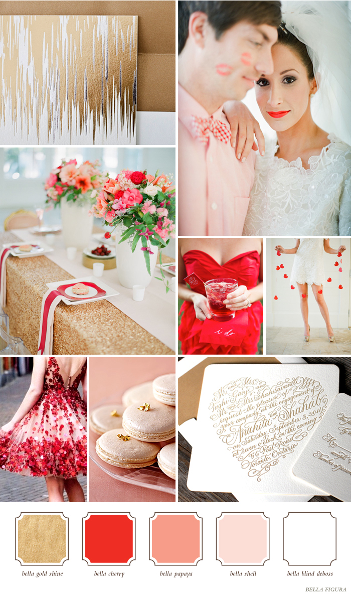
Metallic Gold, Bright Red, Soft Pink and Sweet White This modern pairing is bold and graphic with a soft and romantic twist. The shimmering gold accents along with bright pops of radiant red make for a sophisticated and chic event, while the soft pink and white shades add a touch of femininity and grace. Perfect for the contemporary bride looking to add a splash of elegant glamour to her big day!
Garden Greens and Ocean Inspired Aquas This simple and sophisticated palette is such a breathe of fresh air! Clean and calming bright blues pair perfectly with earthy and vibrant shades of green to create an attention grabbing look. What’s wonderful about these shades is they work for every kind of wedding too! From minimalist and modern to chic and casual to even vintage inspired glamour, it all looks gorgeous!

Neon Pink, Orange and Green with Natural Neutrals These hot and trendy hues are sure to add the wow-factor to your big day! Neon Pink and Day-Glo orange pair perfectly together in vibrant harmony. Add a splash of electric Lime-aid to spice things up even more! Neutral Sand helps balance out these big shades to keep things looking chic and contemporary.

Are you using a bold color combination for your wedding invitations? Tell us about your favorite color combinations in the comments section below!
PHOTO CREDITS
Board#1- top row from left: Bella Figura Fugue design, Lauren Kinsey Fine Art Wedding Photography via The Wedding Chicks, second row: Lauren Kinsey Fine Art Wedding Photography via The Wedding Chicks, Adam Barnes via Southern Weddings, Lauren Kinsey Fine Art Wedding Photography via The Wedding Chicks third row: pinterest, Martha Stewart Weddings via Ritzy Bee, Bella Figura Amor design
Board#2- top row from left: Bella Figura Mitty Calligraphy design, J.Crew Spring 2012 via Glitter Guide, second row: Caught the Light via 100 Layer Cake, Dave Richards Photography via Style Me Pretty, Cupcake Social, third row: Johnny Miller via Martha Stewart Weddings, Caught the Light via 100 Layer Cake, Bella Figura New Calligraphy design
Board#3- top row from left: Bella Figura Storybook Romance design, 1.Art Beauty Life via Brooklyn Bride, second row: Fancy Girl, Jose Villa via 100 Layer Cake, 1.Art Beauty Life via Brooklyn Bride, third row: Wear Color, Bright Bazaar, Bella Figura
Our Pinterest contest is still going strong, and we can’t wait to see the new letterpress invitation designs the contest will inspire! The other day we asked which invitation style is your favorite, and now we want to know: which embellishment is your absolute must-have? Are you crazy about hand calligraphy? Can’t live without custom envelope liners? Is foil edging your favorite? Or are letterpress pocketfolds your must-have? Tell us what you love! Don’t see your favorite on this list? Tell us what you’ve gotta have on your invitations in the comments section below! And don’t forget, our Pinterest promotion runs through Monday, February 27, so there’s still plenty of time to enter to win some amazing letterpress prizes!

[poll id=”4″]
Hand calligraphy is a gorgeous way to add a unique, personal touch to your letterpress wedding invitations. Whether you’re adding a line of calligraphy accents to emphasize names or a venue, or creating the entire invitation with hand-crafted calligraphy, it’s a completely sophisticated way to set your invitations apart from the rest. We offer over 15 hand calligraphy styles from our 6 master calligraphers, and styles range from traditional and formal to modern and laid-back. If you plan to pair hand calligraphy with a font for your invitations, it’s best to find styles that complement one another. Here are our favorite pairings for calligraphy styles and fonts based on 4 popular wedding styles.
FORMAL
A formal wedding invitation works best when an all caps font like Impression is paired with an elegant hand calligraphy style like Spencerian. The combination of this regal font with the flourished Spencerian calligraphy style immediately creates a classic and beautiful invitation.

VINTAGE
You can create the perfect vintage invitation by simply using a romantic calligraphy style like Victoria. Pull inspiration from love letters written in the 19th century and your invitations will certainly take on an old world feel. If you’re looking to pair Victoria calligraphy with a font, we think it looks beautiful with Utrecht (like in the Delambre Classic design).

MODERN
Modern, fun and quirky, this customization comes to life with vibrant hues and the Mitty calligraphy style. If your event is a bit informal and playful, look for a calligraphy style that reflects just that. Pair the Mitty hand with Jubilant for a modern look if you only want to use a few lines of hand calligraphy (see our Modern World design for an example!)

DESTINATION
This beach inspired customization is perfect for a destination wedding! We paired a light, airy font called Henry with the Harrison calligraphy style, which in itself captures the feeling of the ocean.

We love the look of letterpressed hand calligraphy on a wedding invitation, and a perfect finishing touch is hand calligraphed envelopes. For a completely coordinated set, you can work directly with any of our master calligraphers for envelope addressing!
Photos from Style Me Pretty
Bella Figura offer two kinds of envelope liners for your letterpress wedding invitation suite: metallic liners and patterned liners. Adding our eco-friendly envelope liners to your set will bring color and sophistication to your letterpress wedding invitations. Choose from 8 shimmering metallic envelope liner options (all of our metallic liners are FSC-certified!) to add some glitz and glam, or go the custom route. Our patterned envelope liners are completely customizable, so you can mix and match any of our patterns and inks to complement your invitation set, making them truly one of a kind!
With all of our amazing options, it can be challenging to choose the perfect liner that is right for your set. So to help, we’ve narrowed down some of our favorite liner and color combinations that work well with lots of our letterpress wedding invitations!
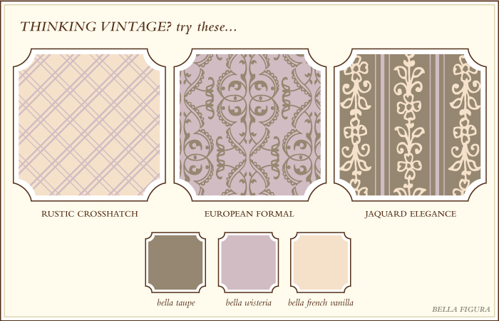
Thinking Vintage? Consider our Rustic Crosshatch, European Formal or Jaquard Elegance patterns. Other patterns we like for a vintage invitation set: Elegant Ombre, Vintage River, Vintage Stripes or Simple Lace in ink colors like Shell, Amethyst, Hazel or Olive.
Thinking Formal? Our Formal Flourish, Traditional Oxford and Simple Chess patterns work beautifully for a fancy invitation set. Other patterns we love for a formal set: Refined Mosaic, Modern Floral, Vintage Diamond or Classic Color in ink colors like Camel, Lavender, Pool or Espresso.

Thinking Modern? Bold, funky patterns like our Antique Geometrics, Chic Combs or Classic Chevron patterns add flair to modern invitation sets. We love these patterns for a modern invitation set, too: Modern Herringbone, Sea Stripes, Modern Light or Simple Geometrics in ink colors like Cherry, Fuchsia, Chartreuse or Black.

Thinking Unique? Make sure your invitations make a statement with a liner pattern like Modern Canopy, Rustic Woodstock or Sante Fe, and print your liners in three colors. Other patterns we like are: Retro Marble, Chic Combs, Moroccan Charm or Sweet Polka in ink colors like Yolk, Watermelon, Mustard or Jade.

Thinking Destination? The Moroccan Charm, Sea Stripes or Elegant Chainlink patterned envelope liners make a lovely accent to a destination wedding invitations. Other liner patterns we love for a destination wedding set: Elegant Ombre, Refined Mosaic, Modern Light or Natural Woodgrain in ink colors like Champagne, Garden, Surf or Mediterranean.

Still not seeing something you love? We can create a custom pattern for you based on the elements from your wedding invitation design, or we can create something totally from scratch too! *(There is an additional design charge for this service)
Once you place an order with us, you will also get a free design consultation, where you’ll have a chance to talk to one of our designers about all of your invitation choices. So if you’re not sure what patterns and ink colors to pair up for your invitation design, don’t worry! (And if you need help now, just ask!)
The Connected letterpress wedding invitation compliments this rustic wedding day. The wide outdoors paired with pops of purple jewel tones is the perfect fit for this happy bride.
Connected customization = inks: espresso + aubergine | fonts: gill + norah | paper: white | invite size: f-8 | liner: rustic woodstock pattern in celadon ink |original design by Elizabeth and David Mandel | customized by in-house designer Brenda Fox |
embellishment suggestions: edge painting: espresso | foil names in fucshia shine

(Photo Credits: Delbarr Moradi)
We’re getting ready to start designing invitations for our mid-year 2012 release, and we want to design the letterpress invitations of your dreams! So we’re holding a contest on Pinterest to help inspire our lead designers, and we’re giving you the chance to win some amazing letterpress prizes.
Our lead graphic designers Jessica Tierney and Sarah Walroth will judge the entries, and the top two boards will inspire two brand new Bella Figura invitation designs that the judges will create! These Pinterest inspired designs will be released in summer 2012. In addition to inspiring two of our new designs, the #1 board will win free letterpress coasters, and the 1st runner-up will win a $100 gift certificate from Smock!
Need a Pinterest invite? Email hello@bellafigura.com and we’ll send you one right away. Not sure what to start pinning? Check out this sample pinboard that Jessica Tierney put together with images that inspired her Storybook Romance design!

The entry period runs from February 20 through February 27, and the winner will be announced in early March. No purchase is necessary to participate, and the contest is open to pinners worldwide!
Grand Prize: 150 free, 2-color custom letterpress printed or 1-color foil stamped coasters on our new, 100% recycled coaster stock. Choose from any of our 300+ designs and have coasters printed up for your big day. Still finalizing wedding plans? Already married? Print save the date information on your coasters, create coaster business cards or save the printing for your next big party!
The fine print: Coaster order must be placed within 1 year. Additional coasters, custom design, extra ink colors, double-sided printing or rush orders will incur fees. Prize must be redeemed within 1 year.
1st runner up: A $100 gift certificate for smockpaper.com — Smock is our sister company and BFF, and carries gorgeous, eco-friendly letterpress stationery essentials. Pick out notebooks, letterpress stationery, keepsake boxes and more in colorful patterns.
Want to help spread the word? Repin the image below. Happy Pinning!

