Would you look at this one? What do we have here? Why, here we have a fine example of Beth Barr‘s Damask design, which we’ve printed in a combo of pewter letterpress ink and silver matte foil. Striking, isn’t it?
letterpress ink: pewter | foil: silver matte | font: impression | calligraphy: Victoria by Sarah Hanna | paper: 2-ply white | size: f8 | customization #: 15479 |

In case you haven’t heard, Amy Graham Stigler’s
Boardwalk design is the January
design of the month (and on sale for 10% off through 1/31/13!). Amy gave us the details on the inspiration behind this invitation design.
“The colors of this suite were inspired by anemones – one of my favorite flowers. I love the contrast of the pale pink petals & black center. The style is sweet meets modern. I wanted a design that was pretty and playful but had a chic edge (so it didn’t get too saccharine!). This wedding is perfect for a vibrant, fun-loving couple with lots of style.”

Image credits, clockwise from right: cake | bow-tie | macarons | bouquet
Count your lucky stars as they shine above you on your special day. Celeste, with all its mid-century vibes creates the perfect excuse to go all out with the decor.

(Photo Credits: Style Me Pretty)
Your letterpressed wedding invitations are truly the sneak peak for what your guests can expect on your big day – and these romantic and perfectly flourished Delambre Classic invitations will tell guests they’re invited to an elegant affair.
inks: navy + pewter | font: utrecht | calligraphy: victoria hand calligraphy, by Sarah Hanna | custom calligraphy monogram | paper: 1-ply white | invite size: f8 | customization #: 15685 |

This customization of our brand new Classic Manhattan letterpress wedding invitation design is inspired by the charm of distressed brick and busy sidewalks.
classic manhattan customization = inks: charcoal + watermelon | fonts: grace + harlow + jubilant | paper: ivory | invite size: f-8 | liner: tavish pattern in pewter and charcoal inks | original design by Brenda Fox | customized by in-house designer Sarah Gluchacki |
embellishment suggestions: edge painting: charcoal
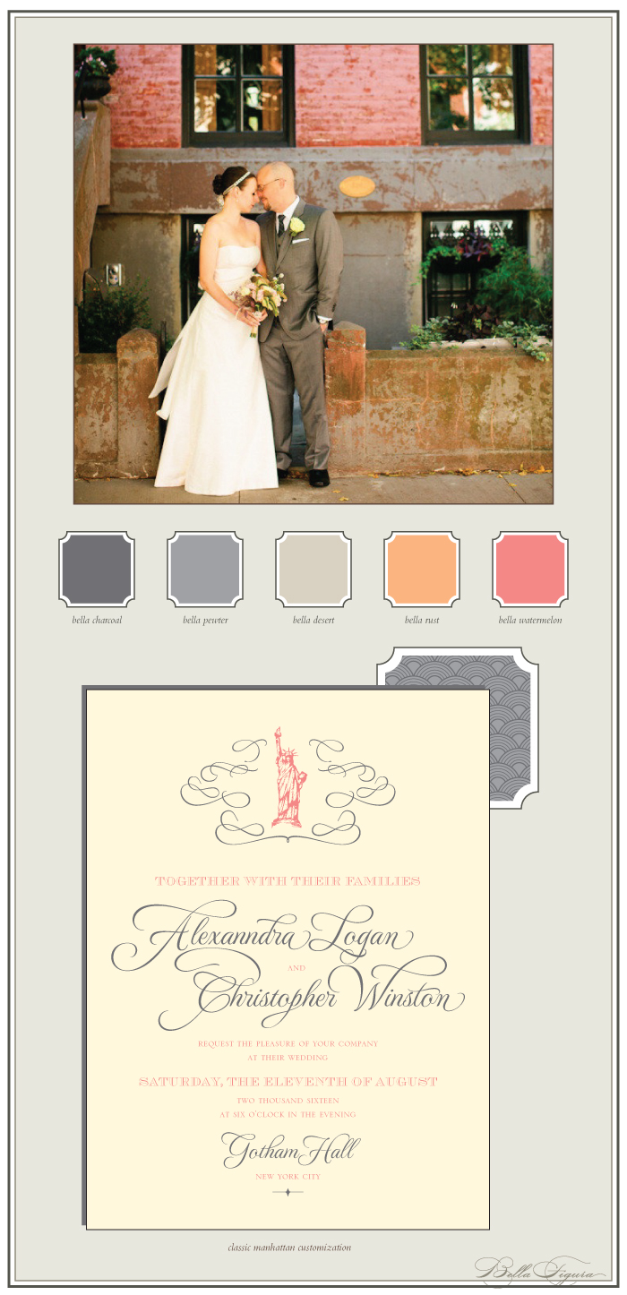
(Photo Credits: Lindsay Madden Photography)
One of the most difficult things about designing thank you cards is that they need to be dynamic, yet uncomplicated at the same time. What better way to achieve this than using neon ink? The Day-glo text nearly shouts out from these cards and still leaves plenty of space to write a personal note.
ink: day-glo | font: avante garde gothic | paper: 2-ply white | card size: a6 | customization #: 15855 |

Our Keswick design is typically shown in our SQ7 size but this couple had other ideas! Gone is SQ7 and in is our F8 size. All pieces are shown with amethyst & antique gold letterpress inks. Tying the whole set together is the beautiful envelope liner used for both the invitation and reply envelopes.
letterpress ink: amethyst + antique gold | fonts: parisian + moravia | paper: 1-ply ivory | card size: F8 | customization #: 15234 |

Our Romantic Floral design by Lindsy Aragona looks perfect as a letterpress and foil invitation. The combination of inks do not disappoint and we love that this invitation is for a cocktail party. Thanks go out to our friends at Seaside Papery.
letterpress ink: prussian blue | foil: copper shine | fonts: amalfi + nadine | paper: 1-ply ivory | invite size: SQ7 | customization #: 15299 |

Today we’re kicking off a new series called Bella Bride, where we’ll show different ways to tie in amazing wedding day details (like the dress, reception decor, flowers, and more) with our wedding invitation designs to give you ideas and inspiration! We’re starting things off with Boardwalk, our featured design of the month (which is on sale for 10% off through the end of January!). For the bride in love with chevron, our Boardwalk design would be perfect. We see a reception filled with lush florals and trendy chevron decor.

(Photo Credit: Style Me Pretty)
Have you heard? Our new collection of letterpress wedding invitations is here and filled with new offerings for 2013! What’s new? Two new die-cuts (check out our romantic Charlotte and stately Anderson designs to take a peek). We now offer 4-color envelope liners too — create colorful liners with up to 4 of your favorite hues. Choose from one of over 40 patterns, or turn a cityscape or vintage map of your wedding location (or any location!) into a custom envelope liner. We’ve also got new foil stamping colors — 7 of them! — including sophisticated neutrals (like pearl, a soft white foil, and tawny, a beautiful taupe foil) as well as lovely pastels (mint! lilac! pink!). Take a look at the new designs today, or use our free personal shopper service and one of our invitation experts can help you get started!

We’re loving these oversized program panels that we printed for our friends at Byrd + Bleecker. We also letterpressed folded thank you cards for this couple. Adding hand calligraphy in the Clermont style adds a personal touch to these whimsical pieces.
ink: garden | font: jubliant block | calligraphy: clermont hand calligraphy, by Debi Zeinert | paper: 2-ply white + 1 ply white | program size: 8 x 8 | thank you note size: A5F | corner rounding | customization #: 15556 + 15774 |

In case you haven’t heard, our January design of the month is Boardwalk, so from now through the end of the month, you can save 10% on everything in the Boardwalk suite! Not sure if the Boardwalk design is right for you? Think again! Our design team put together a few customizations to get you inspired and show different ways this design can work for you. Everything about this design is completely customizable — change the fonts, ink colors, orientation — you name it!
Our first Boardwalk customization takes on a vintage look with olive and fern inks, and incorporates the chevron pattern from the original design all over the invitation.

Need something more modern for your big day? This festive #10 customization features vibrant jewel tones, modern fonts and a calligraphy monogram for a more modern celebration.

Planning a classic wedding with traditional touches? This simplified approach to Boardwalk uses more formal fonts and a slightly different take on the original frame for a more sophisticated look.
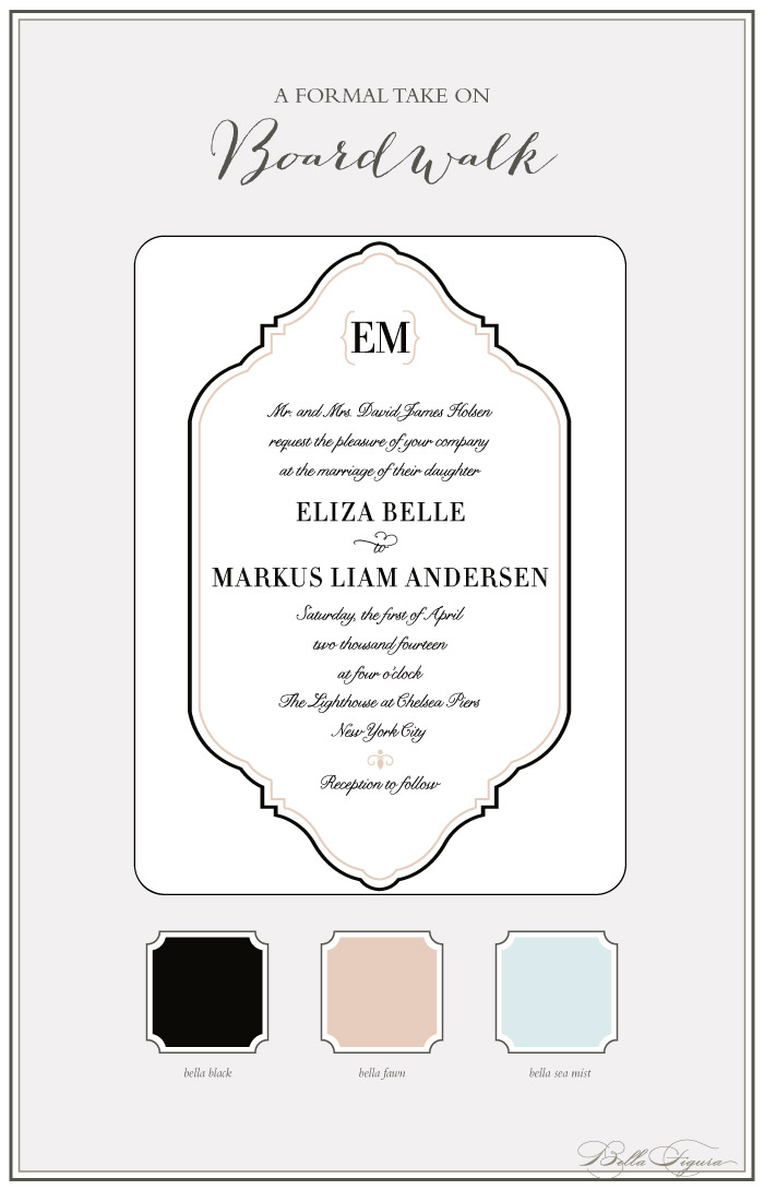
Still not sure how to make this design work for you? Take a look at the entire Boardwalk suite and be inspired by the other pieces (like the menu, social notes, and more) for your own special occasion!