Let the seashore inspire your wedding decor! Muted shades of sand and coral paired with natural beachy elements can make for a whimsical yet elegant wedding. Pair this style with our hand-calligraphed Antigua letterpress wedding invitation for a chic, laid-back look. We would like to think that the Antigua grew amongst clams, oysters, starfish and scallops but in reality we hand printed these beauties on our antique printing presses. Take the beauty of this design one step further and have Maybelle hand-calligraph your invitation envelopes for a completely coordinated invitation set.

(Photo Credits: Style Me Pretty)
These Peacock Full invitations (by Kamal) feature a combination of our gold matte foil and black letterpress ink – and this vision is executed without fail. Just take a look at the incredible detail in the peacock’s feathers – these are overflowing with exceptional beauty.
letterpress: black | foil: gold matte | fonts: spencer + bejeweled | paper: 1-ply white | size: F8 | customization #: 16121 |

Pairing the modern Neros design elements with bold colors like prussian blue and metallic fuchsia make for a fun and funky, yet sophisticated invitation.
neros = inks: prussian blue | foil: fuchsia shine | fonts: bejeweled | paper: white | invite size: F-8 | liner: modern canopy in chartreuse | original design by Jessica Tierney | customized by in-house designer Lindsy Talarico

(Photo Credits: Best Destination Wedding)
Aimee O’Boyle‘s Istanbul Lace design lends itself to being foil stamped really well – it’s just so decadent and ornate. Combined with some soft shell letterpress ink and a striped liner, this set’s quite a looker.
letterpress ink: shell | foil: gold matte | paper: 2-ply white | card size: f8 | envelope liner: sea stripes pattern in shell | customization #: 16096 |

Are you planning a tone-on-tone color palette with fresh, romantic hydrangeas for your floral arrangements? Our Leigha Spring design has the perfect touch of traditional elegance and it’s letterpress printed with the most gorgeous texture an invitation can have. Create a wedding that your family and friends will never forget with this timeless invitation.

(Photo Credits: Style Me Pretty)
Today we’re going behind the scenes and chatting with one of our designers, Ian Koenig. Ian is the designer of Neo Luna, our February design of the month (on sale through 2/28 for up to 20% off!), and was kind enough to share a little inspiration behind this design, how he got started and where he’s drawing inspiration from these days.
Tell us a little bit about yourself and your work.
I currently live in Chicago with my wife Melinda and our four-year old son Lukas. I work at VSA Partners and teach design at the Chicago Portfolio School.

What was your inspiration behind the Neo Luna design?
Neo Luna was a continuation of an idea I had in an earlier design called Anais which was to try to get as much color into a design through an array of rules. With Neo Luna, I wanted to have a bit more fun than I did with Anais so I made the language and typography a bit more playful and introduced the Cupid idea through the arrow and heart elements.

Where do you see yourself in 5 years?
Still having Friday night movie nights with my family, still working at VSA, still teaching and still designing invitations for you guys!
Who are you inspired by?
My current design loves: A Montreal-based firm named Paprika; The Book Cover Archive; the art direction of John Gall’s Nabokov book cover series; Designspiration; the illustrator Jonas Bergstrand; the designer Paul Sahre, the album All Day by Girl Talk.
How did you get into design? Was there a defining point in your life that helped shape you as a designer?
During my last semester in college, I took my first art studio class. With two weeks to go before graduation, I was on my way to class and saw the graphic design student’s work on the walls. I knew instantly I could do this type of work and was then a bit bummed that I had not made that walk four years earlier!
I rediscovered design a little while later after I quit my first real job. A friend of a friend was opening a children’s restaurant and I offered to draw him a logo. He liked it and gave me the opportunity to design the uniforms, menus, signage and the business cards. That small introduction to design was all I needed. I am still hooked.
A sea-side wedding complimented in sweet pastels is the perfect event for our Charlotte letterpress wedding invitations.
charlotte customization = inks: prussian blue + sea-side | fonts: gotham + social | paper: ivory | invite size: f-8 | liner: sweet polka in wisteria ink | original design by Jessica Tierney | customized by in-house designer Brenda Fox |
embellishment suggestions: foil stamping in silver matte
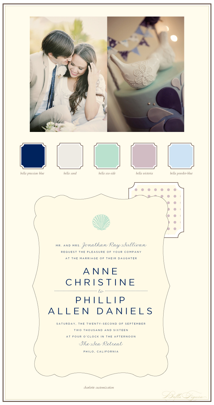
(Photo Credits one | two)
A shimmery little invite suite we printed for the great team over at Elizabeth Grace. This set isn’t based on any one of our designs in particular since it was custom created and the design files were submitted based on the client’s ideas.
letterpress ink: pewter | foil: gold shine | fonts: submitted | paper: 1-ply white | invite size: f8 | customization #: 16068 |

This gorgeous customization of our Emile design takes beauty to a whole new level by using additional motifs from our design library. The combination of silver shine foil and lavender letterpress work perfectly on each piece, as the hand calligraphy accents add a personal touch.
letterpress ink: lavender | foil: silver shine | font: baskerville | calligraphy: Lady M, by Kelle McCarter | paper: 2-ply white | size: f8 | customization #: 15598 |

Sandy beaches, bare feet and cool blue hues are perfect for a New England destination wedding. If you are hoping to wow your guests and give them a taste of the chic summer celebration you’re planning, then Montauk is your design. Crisp and cool with classic type, this design looks beautiful in cobalt letterpress ink (but you can choose any of our 50+ letterpress inks if you’d like!).

(Photo Credits: Style Me Pretty)
The Tara design (by Ben Whitla) has always been a popular one when it comes to celebrating a Bat Mitzvah – and this one’s in a cool color palette we’re excited to share. Letterpressed in papaya and charcoal inks these invitations overflow with a sweet and vintage character.
inks: charcoal + papaya | fonts: moravia + billhead + knockout + pyramid | paper: 2-ply white | invite size: f8 | customization #: 15720 |

Lovely lace and a bit of fun, bold colors make our Ursula design an easy pick for your upcoming “I do’s”!
urusla customization = inks: coral + charcoal | font: jubilant | calligraphy: maura hand calligraphy | paper: white | invite size: F8 | liner: diego in jade | original design by Aimee O’Boyle | customized by in-house designer Racheal Bumbolo |
embellishment suggestions: edge paint in jade

(Photo Credits: ruth eileen photography)