If you’re dreaming of shimmering metallics and elaborate tablescapes for your big day, we have just the wedding invitation for you! Our Whisper invitation design flaunts the bride and groom in a bold way: an oversized font makes their names stand out, while the remaining invitation text is simple yet extremely sophisticated. Pair this design with elegant gold details and romantic pink flowers for a wedding day that overflows with romance!

(Photo Credit: Style Me Pretty)
Our letterpress wedding invitations have received some amazing publicity lately, so today it’s time again to say thank you to the amazing editors who have shined the spotlight on Bella Figura this spring! Our first feature is from Martha Stewart Weddings, where we created foil stamped and letterpress wedding invitations for one of their gorgeous real weddings. Megan, the bride, submitted the artwork for us to print — we love the glamorous outcome!

Inside Weddings featured our Pinterest-inspired design, A Bientot, in their spring 2013 issue.

Weddings by The Ritz-Carlton Magazine featured an elegant customization of our Amor design by Sarah Hanna in their January – June 2013 issue.
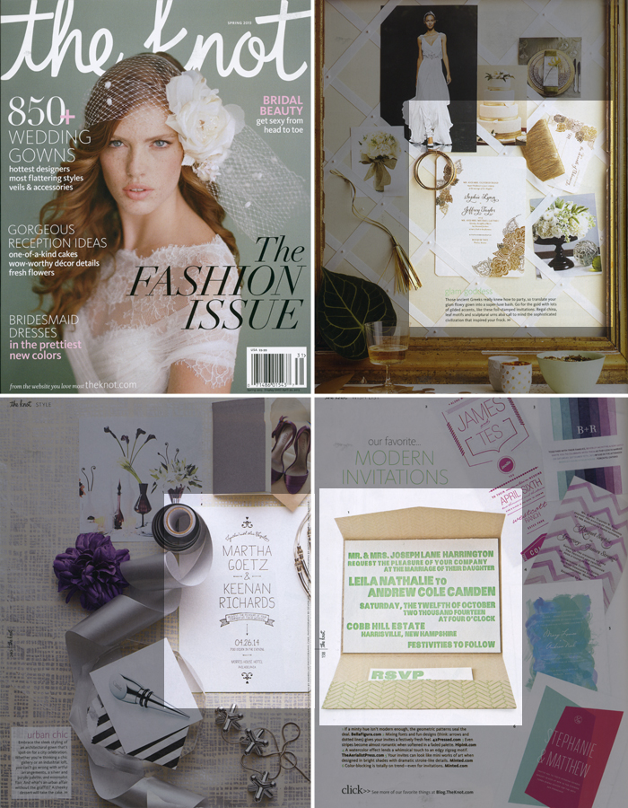
Several of our letterpress wedding invitations were featured in the spring issue of The Knot: our popular gold foil stamped Divya Formal invitation, the modern Dash invitation, and our minimalist Alton invitation were all shown throughout this issue.
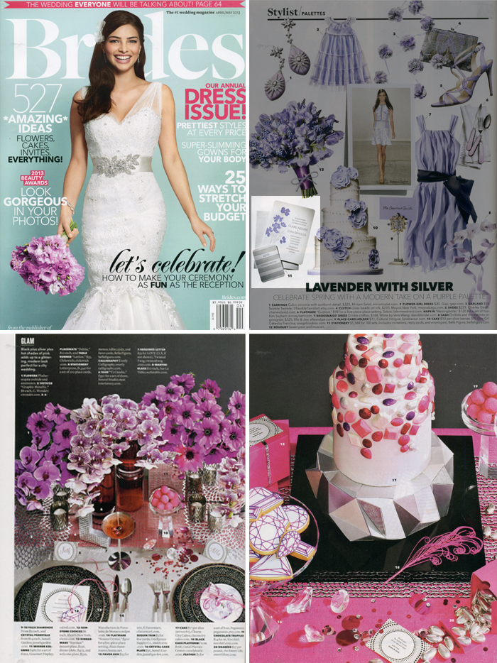
Brides magazine featured Bella Figura in several of their recent issues: first, a lovely lavender customization of our Lenox Botanical design was featured in the April / May issue, along with menus, place cards, and favor cards from our Circolo suite.
(more…)
We’re loving this classic and understated customization of our Deveril design (by Beth Ann Seal). The invitation is kept a bit more sophisticated printed in only charcoal letterpress, meanwhile the save the date incorporates our fuchsia shine foil stamping. Our friends at Paces Papers sent along this sensational set for us to print – and we send many thanks!
ink: charcoal | foil: fuchsia shine | fonts: danube + submitted font | paper: 2-ply white | invite size: f8 | save the date size: A6 | foil edge in fuchsia shine | liner: metallic opal | customization #: 16688 |

It’s hard to believe that it’s July already, but that means it’s time for a new Design of the Month! Save 10% on everything in our Vintage Beach suite from now through July 31: letterpress wedding invitations, save the dates, baby announcements, party invites, business cards, social stationery or anything else you can dream up! You’ll save 20% if you order 6 printed pieces or more at the same time! Vintage Beach is perfect for a seaside wedding, but with a few tweaks this breezy design can be transformed to work for any event. Take a look at the customization ideas our design team came up with below: 


If you have questions or need more ideas on how to customize, please be in touch – we’d love to work with you!
The fine print: promotion is exclusive to the Vintage Beach design suite and does not apply to the purchase of other designs. Orders must be placed by 11:59pm EST on July 31, 2013 in order to receive the promotion.
Here is a timeless take on our Viceroy design that is simply perfect for a bright summer affair. For this customization, we took the tropical branches and leaves from the Viceroy Save the Date, paired it with clean modern fonts and added splashes of bight colors – think tropical, sunny getaway!
Viceroy customization = inks: lime-aide + taupe | fonts: eames + bureau | paper: white | invite size: F8 | liner: modern herringbone in taupe | original design by jessica tierney | customized by in-house designer racheal bumbolo |
embellishment suggestions: edge paint in fuchsia

Photo credits: amanda watson photography
Our classic Helena design by Debi Zeinert features exquisite hand calligraphy that is turned into gorgeous letterpress wedding invitations. We love the way Judy Paulen Designs helped us dream up this two color variation.
inks: charcoal + jade | calligraphy: Helena by Debi Zeinert | paper: 2-ply white | invite size: F8 | foil edging: teal shine | liner: metallic silver | customization #: 16816 |

A barn wedding wouldn’t be complete without homespun details: think burlap table runners, vintage family heirlooms and photos for decor and buckets of fresh, locally grown flowers. Add hand calligraphy accents to your invitations to continue the handmade look. Our Chapin design features whimsical folk art paired with Patricia Mumau‘s beloved Harrison hand — perfect for a rustic wedding!

(Photo Credit: Style Me Pretty)
Sometimes all a letterpress invitation design needs is a little tweak to add a unique and personal touch. That was the case for the Lush design. LetterHeads changed the font and added some silver edge painting on the invitation and that’s all it took to make this design the perfect choice!
inks: sand + charcoal | fonts: parisian script + copperplate | paper: 2-ply white | printing: letterpress | edge painting in metallic silver | metallic liner: silver | invite size: F-8 | customization #: 16020 |

A simple fruit like the sweet and juicy summer peach can be used as inspiration for your wedding color palette, decor, menu and invitations. A simple, yet adorable, peach motif, taken from the Charlotte suite, is shown here in a 1-color watermelon letterpress customization.
Charlotte = inks: watermelon | fonts: keeva + gotham | paper: white | invite size: SQ-7 | liner: country gingham in shell | original design by Jessica Tierney | customized by in-house designer Lindsy Talarico
Photo Credit: Kiss the Groom
Switching up the letterpress colors on our Linden Summer design to fit a natural palette transforms this simplistic design. For a wedding at a nature center Poeme couldn’t have picked a better pairing.
inks: clover + umber | fonts: buttermilk + luster roman | paper: 1-ply ivory | size: SQ7 | corner rounding | customization #: 16877 |

This customization branches out in a number of ways from the standard Gilded Romance design. Thanks to a perfect understanding of what goes where and how to balance the ink and foil throughout the set, each piece compliments each other quite nicely.
letterpress ink: yolk | foil: silver shine | fonts: daisy + impression + aiden | calligraphy: Revolution by Debi Zeinert | paper: 2-ply white | printing: letterpress + foil | edge painting: yolk | foil edging: silver shine | liner: modern herringbone in yolk | invite size: F-8 for pocketfold | customization #: 16292 |

A back drop of the lush mountain side and a return to nature on this joyous day- is reflected in this customization of the Refined Newport invitation.
Refined Newport customization = inks: desert + sand + taupe | fonts: memphis + Conquerer | paper: white | invite size: f-8 | liner: classic color in shell ink | original design by Sarah Gluchacki | customized by in-house designer Brenda Fox |
embellishment suggestions: Lincoln die cut

(Photo Credits: Kelli Nixon Photography)