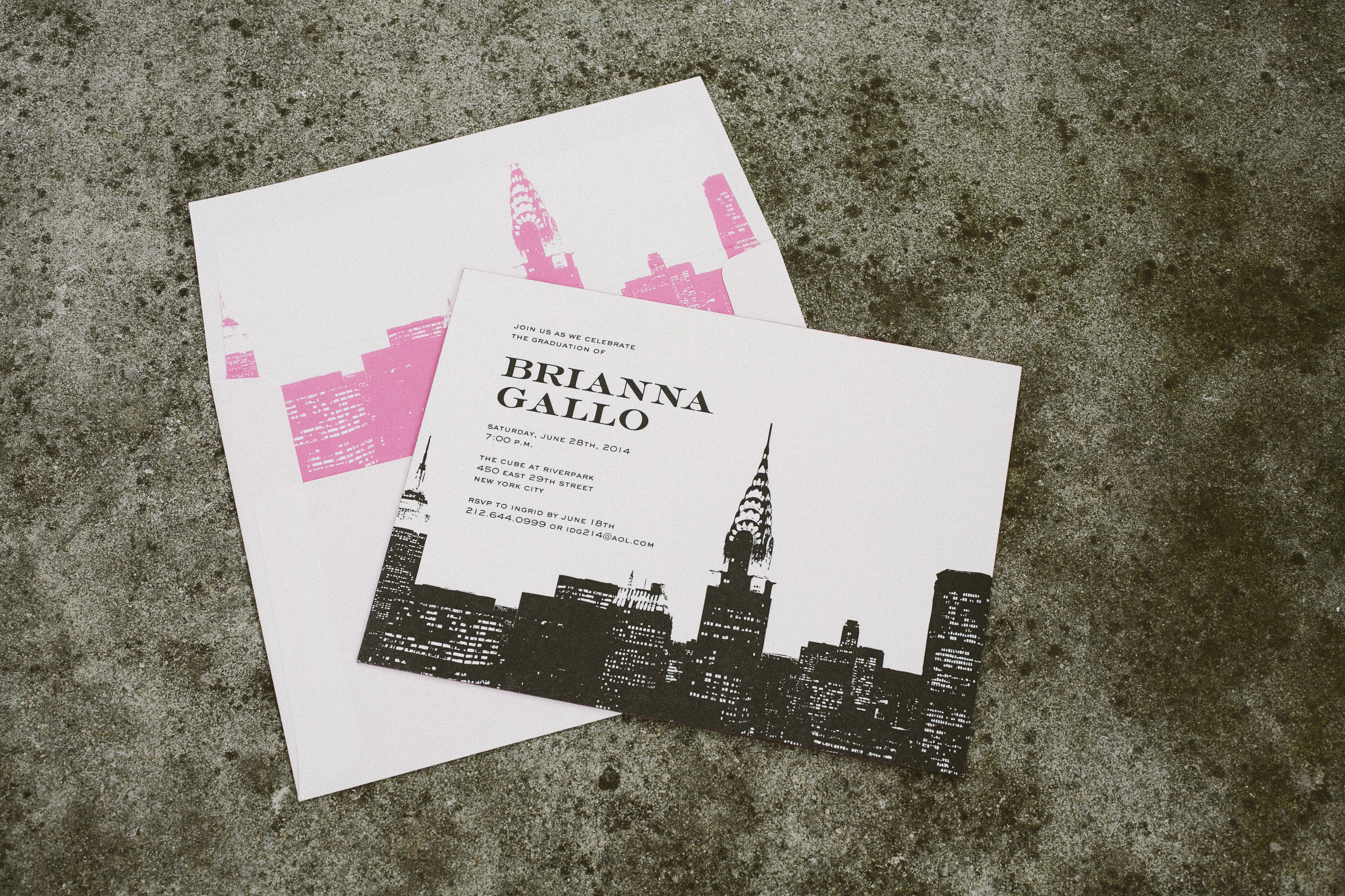
Our Charmed New York design was reimagined for Brianna’s graduation celebration, complete with fuchsia shine foil edging and a fuchsia cityscape liner from our collection. Classic black ink and modern fonts complete these gotham inspired letterpress graduation invitations.
letterpress ink: black | paper: bella cotton 2-ply white | foil edging: fuchsia shine | envelope: bella cotton white | digital liner: new york 2 pattern in fuchsia | Reed Cohen | customization #23743
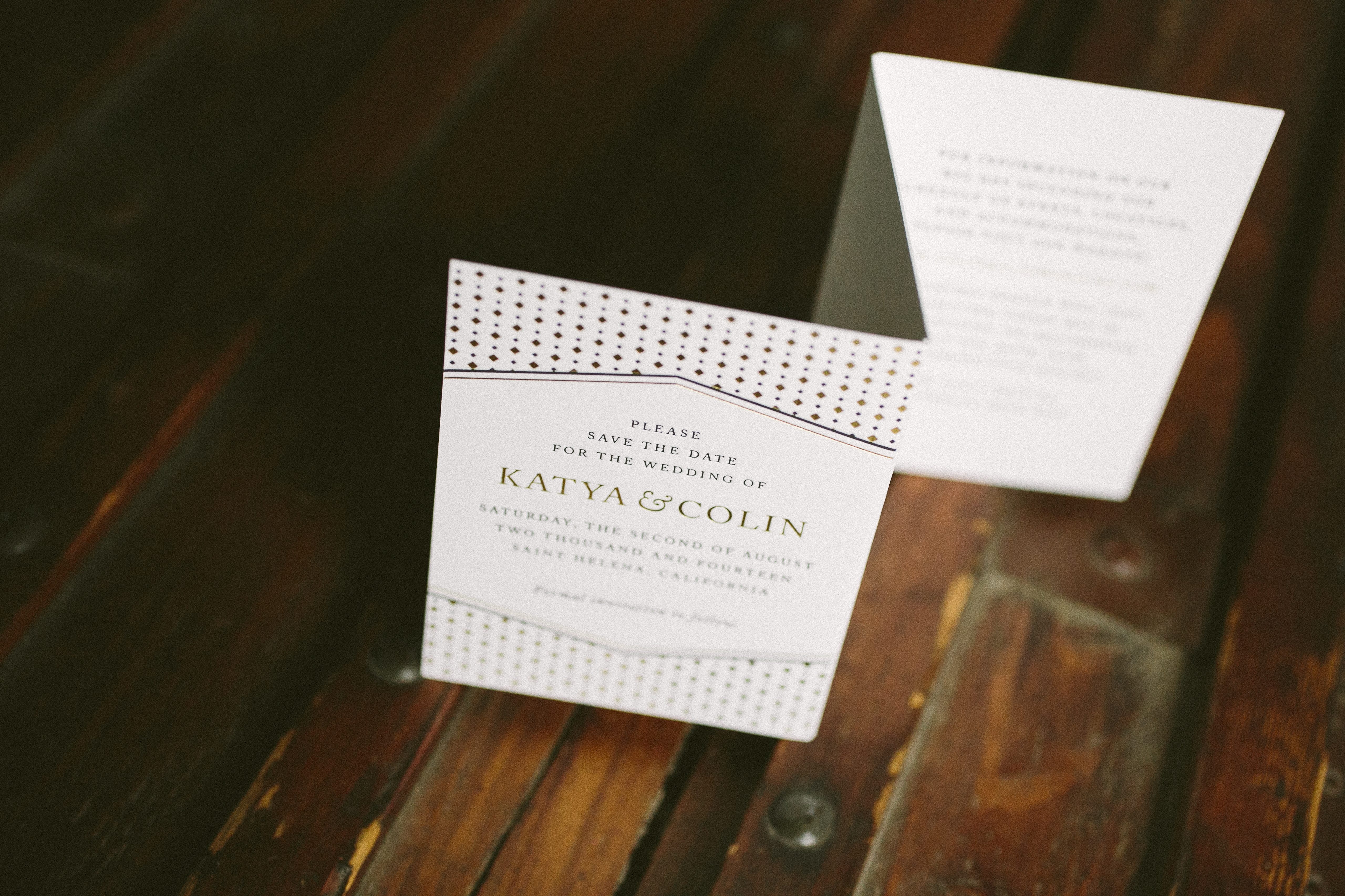
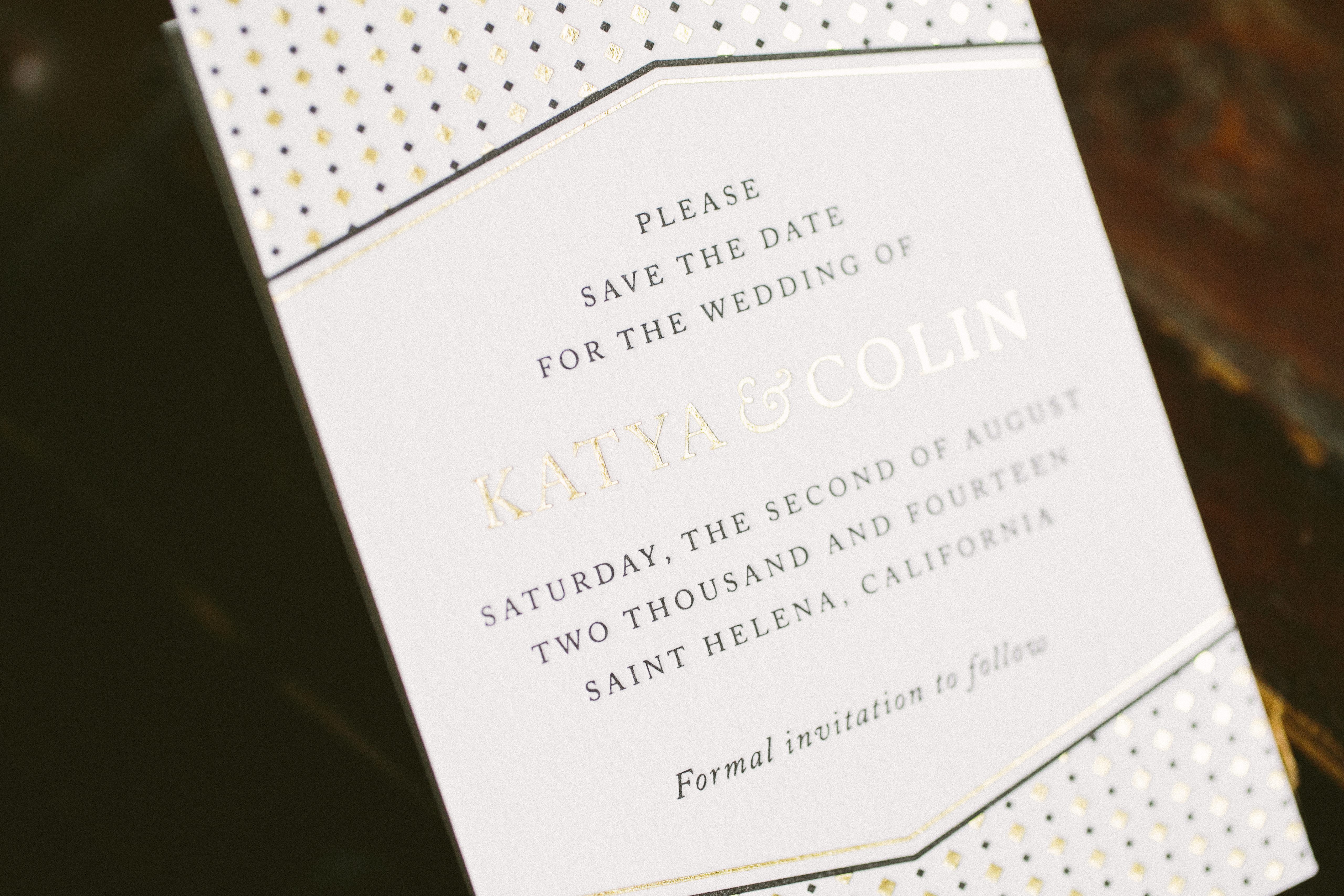
Each one of our 325+ designs has accompanying pieces (like reply cards, menus, coasters and more) and any one of these pieces can be used as inspiration for another – like Katya and Colin’s tri-fold letterpress and gold foil save the dates. They used the reception card design from our Odeon suite to not only express their wedding style but fill guests in on the particulars – like their website, accommodation information and a tactful way to ask that the children stay home.
letterpress ink: black | foil stamping: gold matte | font: cambridge | paper: bella cotton 1-ply white | Union Street Papery | customization #20785
Estee and Craig customized our Ouette calligraphy wedding invitations by opting for oversized calligraphy and a fun yet functional events card. Charcoal letterpress ink was accented with metallic silver edge painting and a black patterned envelope liner, keeping the overall feel classic with a modern twist.
letterpress ink: charcoal | font: utrecht | paper: bella cotton 1-ply + 2-ply white | diecut shape: lincoln | edge painting: metallic silver | hand calligraphy style: maura | envelope: bella cotton white | digital liner: elegant garden pattern in black | customization #24136
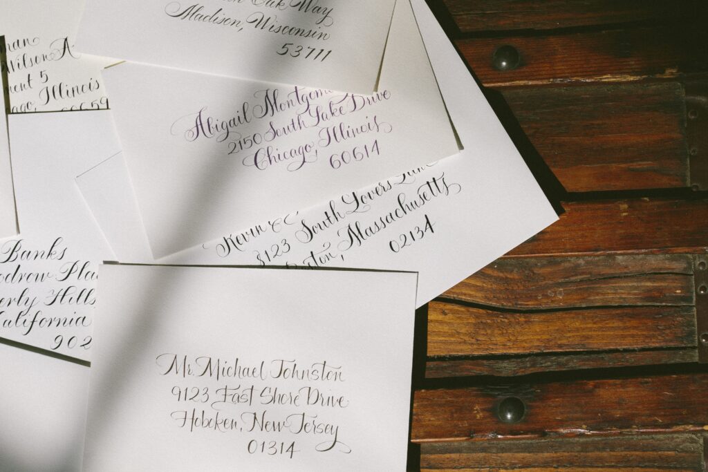
We’re excited to announce that our May Designer of the Month is Debi Zeinert! Debi is a gifted calligrapher who’s been in the business for 35 years. Starting this month, in addition to our ongoing promotion (10% off ANY piece featuring a design by Debi — invitations, save the dates, you name it!), Debi is also offering Bella Figura customers an exclusive offer: save $25 for calligraphy addressing on any order, or save $50 if your order features Debi’s calligraphy in the design! Here’s a peek at some of Debi’s hand calligraphed envelopes, and her new for 2015 Sterling invitation design — check out the rest of her collection today!
The fine print: this offer is exclusive to designs by Debi Zeinert and does not apply towards the purchase of other designs. Orders must be placed by 11:59pm Eastern on May 31, 2015 in order to receive this offer. Calligraphy addressing services must be booked separately with Debi Zeinert at The Blooming Quill.
We created a custom take on our Sweet Henriette invitation by Racheal Bumbolo for the summer 2015 edition of New York Weddings magazine. We letterpress printed the invitation in mesa ink and added gold shine foil stamping on our ivory paper for the feature, which is all about beautiful blush tones for summer weddings. Many thanks to New York Weddings for the feature!
Please join us this Saturday for a trunk show! We’re heading to Madison, New Jersey for a trunk show event at Cambridge Street Papers. Trunk show attendees can take advantage of a special offer: buy 75 invitations or more, get 25 free! Email cambridgestpapers@yahoo.com to reserve an appointment today!
*The fine print: buy 75 get 25 promotion applies to wedding orders and can include invitations, reply cards, save the dates, menus, programs, or any other wedding-related stationery item.
Lauren and James gave our Ravenna design a sweetly romantic makeover for their Valentine’s Day nuptials. Their palette of charcoal and dusty pink letterpress inks and rose gold shine foil highlighted hand calligraphy accents and a coordinating letterpress printed pocketfold. We loved the delicate sophistication of these elegant wedding invitations.
letterpress inks: charcoal + dusty pink | foil stamping: rose gold shine | font: moravia | paper: bella cotton ivory 1-ply | hand calligraphy: spencerian style | Papery of Philadelphia | customization #25235
To celebrate the christening of their son, James and Antonia chose our Viceroy design in sea-side letterpress ink and gold matte foil. Our chic combs envelope liner in black and antique gold added a masculine feel to these luxuriously modern baby christening invitations.
letterpress ink: sea-side | foil stamping: gold matte | fonts: streamline + marilyn | paper: bella cotton white 2-ply | envelope liner: chic combs pattern in black + antique gold | customization #25674
Anna and Daniel customized our Traditional Palm beach wedding invitations for their recent Key West wedding. Silver shine and indigo shine foils made for a cool and contemporary palette, while the foil stamped pocketfold showcased their names and a vintage map of the Florida Keys.
Two of our new designs for 2015 – Cordelia by Kelle McCarter and Blush by Mariel Mirra – were featured recently by Four Seasons Weddings! The feature highlighted one of our favorite ways to customize: hand lettering. Blush features hand calligraphy accents by Elizabeth Hardin, while Cordelia features some of Kelle’s own Maura styled calligraphy accents. Many thanks to Four Seasons for including us in this great round-up!
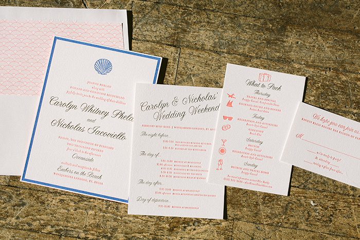
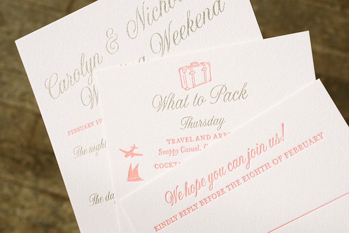
This colorful customization of our Nautilus design stylishly sets the tone for Carolyn and Nicholas’ Caribbean destination wedding. A beachy color palette of coral and cobalt letterpress inks and tawny matte foil was used on the invitations and accessory cards that included a weekend itinerary and packing suggestions for guests. Our tavish patterned envelope liner was the finishing touch on these beach wedding invitations.
letterpress inks: coral + cobalt | letterpress ink: tawny matte | fonts: moravia + supplied | paper: bella cotton white 1-ply + 2-ply | edge painting: coral | envelope liner: tavish pattern in coral | Papel New York | customization #26217
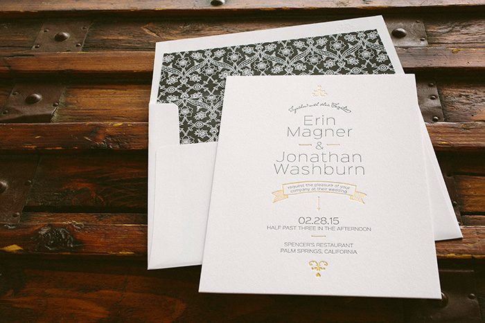
We love our Dash design for any less formal but still elegant affair. Erin and Jonathan didn’t stray far from the original design but did accent the design’s motifs in gold matte foil and added our simple lace patterned liner, adding just enough flair to their black and gold wedding invitations.
letterpress ink: black | foil stamping: gold matte | fonts: quill + submitted | paper: bella cotton white 1-ply + 2-ply | envelope liner: simple lace pattern in black | Sweet Paper | customization #26014