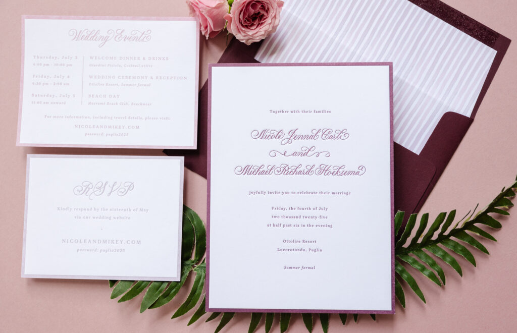
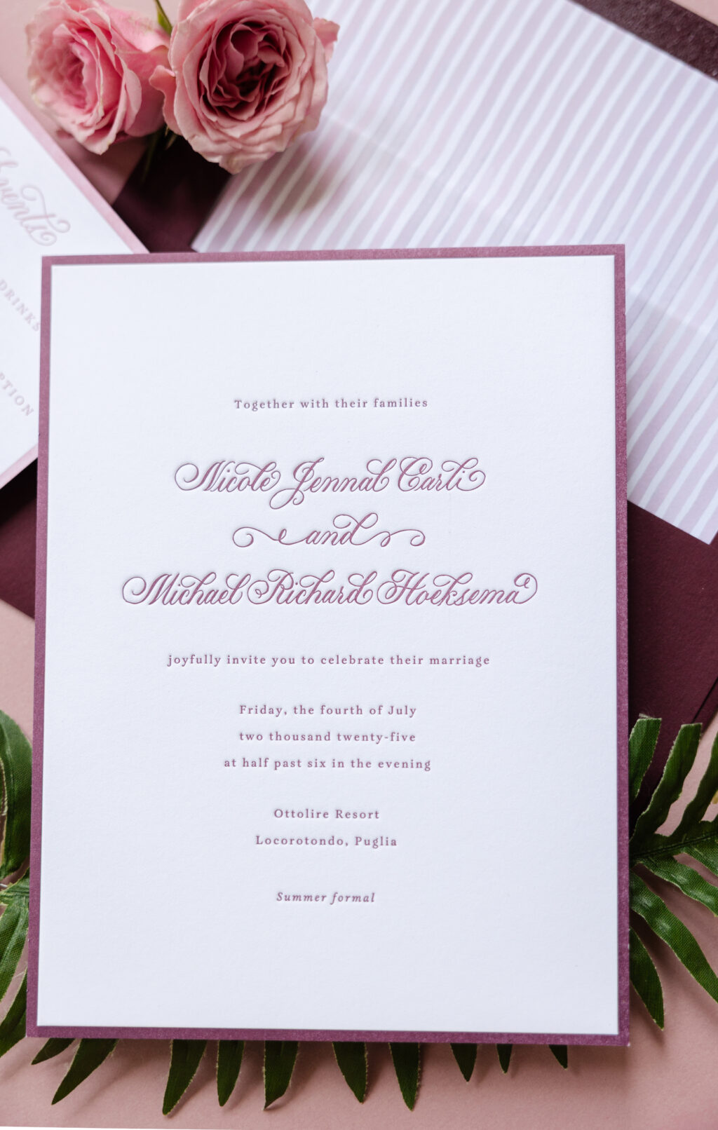
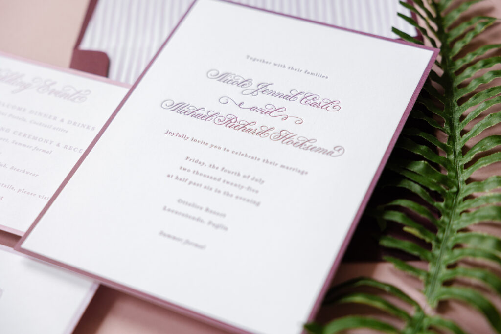
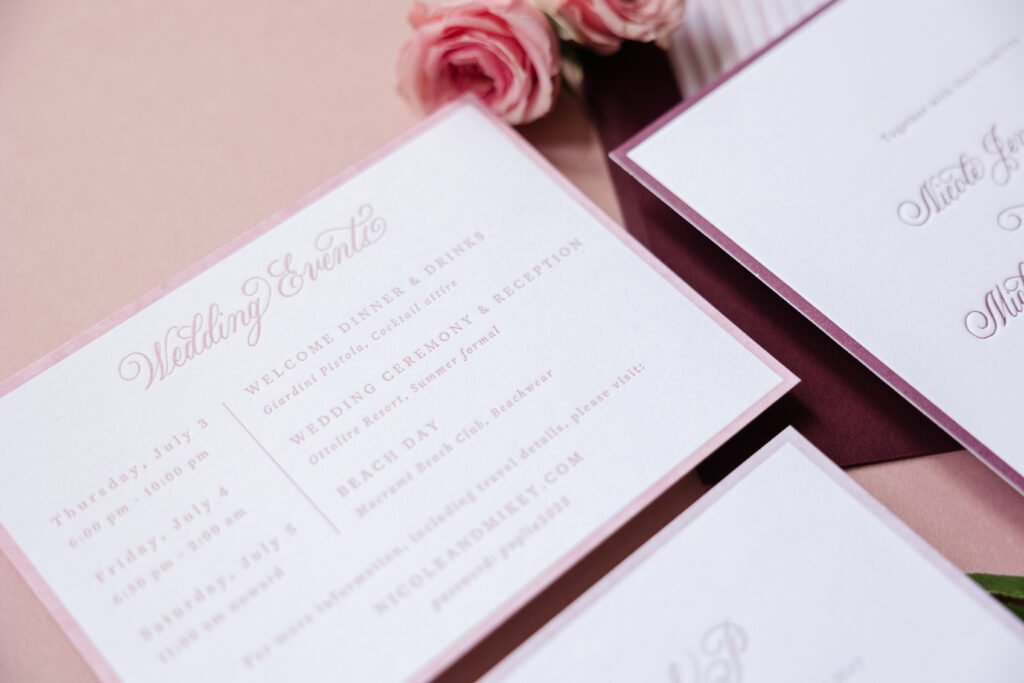
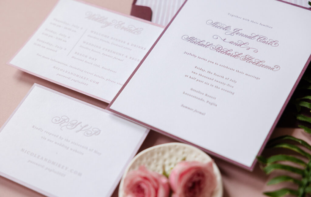
Nicole and Michael worked with our Bella Figura NYC store to customize our Hadaway design for their destination wedding. The nuptials were held at the Ottolire Resort in southern Italy, and these letterpress invitations, complete with hand calligraphy, captured the romance of the couple’s love story and the region.
Invitation
letterpress ink: bordeaux
hand calligraphy: serena by Virginia Lucas Hart
font: aria text g2 regular/italic
paper: bella smooth cotton 2-ply bright white
size: f-8
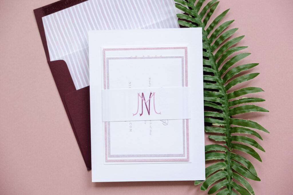
finishing: assemble with mounting card and belly band
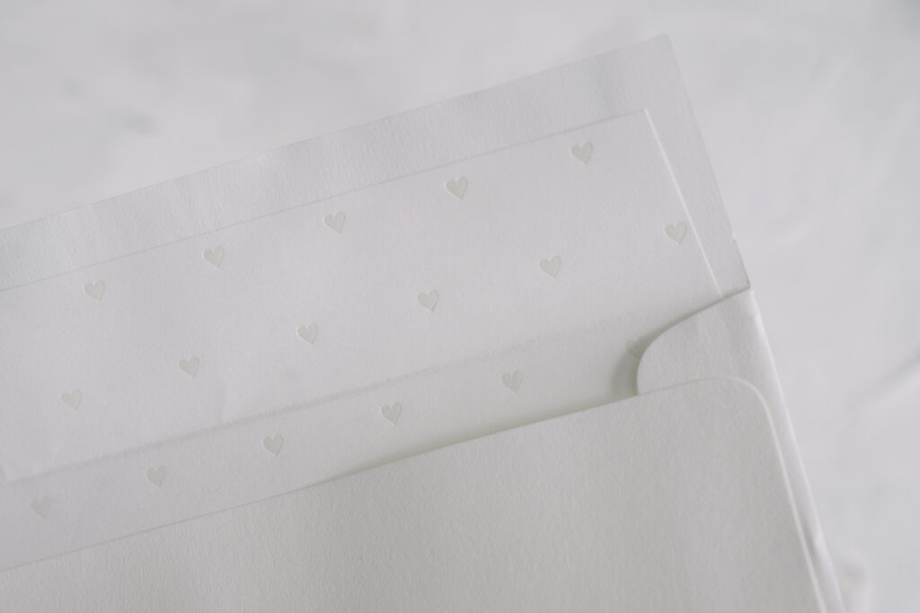
envelope liner: custom-supplied pattern in cmyk digital on bright white text
envelope: bordeaux text
envelope addressing: white digital on the front and the back
job: 75047
The overall color palette creates a look that feels both charming and refined. The rich letterpress border adds depth and formality, while the delicate hand calligraphy by Virginia Lucas Hart introduces a sense of timeless romance. The mix of flowing calligraphy for the names and clean serif text for the details strikes that perfect balance between traditional and contemporary.
The striped envelope liner adds a playful, preppy touch, infusing the design with a lighthearted vibe. Paired with the deep burgundy envelope, the look feels cohesive.
A mounting card with a belly band is adhered to the back of the invitation. A custom monogram featuring the couple’s initials adorns the belly band, which secures the reply and details cards. This ensures all cards are held in place within the envelope and allows for a neat presentation.
Mounting Card
paper: bella smooth cotton 1-ply bright white
size: 4.81” x 6.44”
job: 75047
Belly Band
digital ink: cmyk
paper: bella smooth cotton bright white text
size: 1.75” x 6.42” open, 1.75” x 4.87” assembled
job: 75047
The invitation design is carried over to the reply card and details card. Lighter tones of letterpress ink, Old Rose and Wisteria, appear on each card, creating an ombre-like effect across all of the cards.
Details Card
letterpress ink: old rose
hand calligraphy: serena by Virginia Lucas Hart
font: aria text g2 regular/italic
paper: bella smooth cotton 1-ply bright white
size: a-6
job: 75047
Reply Card
letterpress ink: wisteria
hand calligraphy: serena by Virginia Lucas Hart
font: aria text g2 regular/italic
paper: bella smooth cotton 1-ply bright white
size: a-2
job: 75047
This entire suite is polished, romantic, and effortlessly chic. We wish Nicole and Michael the best. Are you daydreaming about hand calligraphy and romantic invitations? Do you like the idea of a mounting card with a belly band to secure auxiliary cards? Contact us or work with one of our dealers to create your dream invitations.
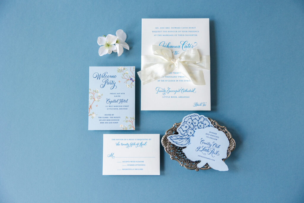
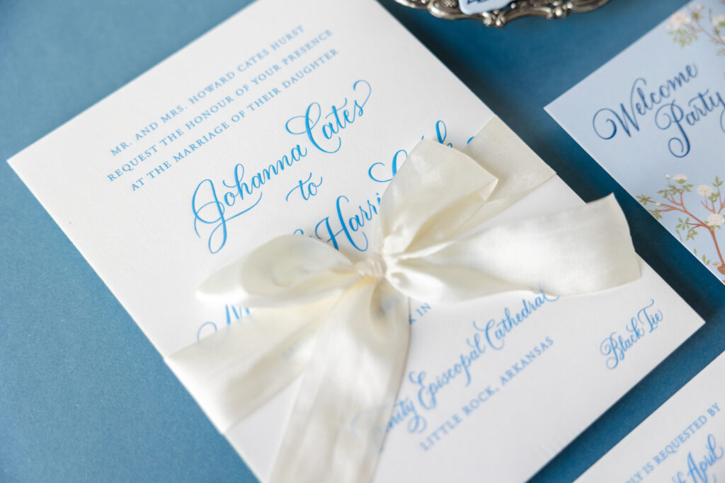
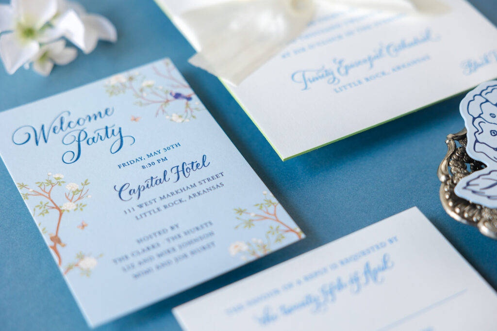
Josie and Harris worked with our dear friend Mickey from The Social Type to create these absolutely lovely invitations. Engraving, hand calligraphy, and silk ribbon, along with a charming die-cut details card, all work beautifully together to elevate the look of this suite.
Invitation
engraving ink: carolina
hand calligraphy: opulent by Debi Zeinert
font: adobe garamond
paper: bella smooth cotton 3-ply white
size: custom cut 5.88” x 8.06”
edge paint: clover
silk ribbon: mother of pearl
job: 75468
Reply Card
engraving ink: carolina
hand calligraphy: opulent by Debi Zeinert
font: adobe garamond
paper: bella smooth cotton 1-ply white
size: a-5
job: 75468
Hand calligraphy in the Opulent style by Debi Zeinert ensures the invitation stands out. The flowing calligraphy was done specifically for this stationery suite, with each card including at least a couple of lines. The use of calligraphy throughout the suite ties all the pieces together from a design standpoint while adding a touch of extravagance to each card.
The invitation features engraving, a classic printing method that creates a raised impression. That raised impression really stands out on our luxuriously thick 3-ply paper. This printing method also emphasizes the swirls and flourishes of the hand calligraphy.
Clover edge painting gives the invite an extra and unexpected pop of color. The mother-of-pearl silk ribbon tied in a generous bow adds a romantic, almost gift-like presentation. It’s tactile and traditional, signaling formality and intention.
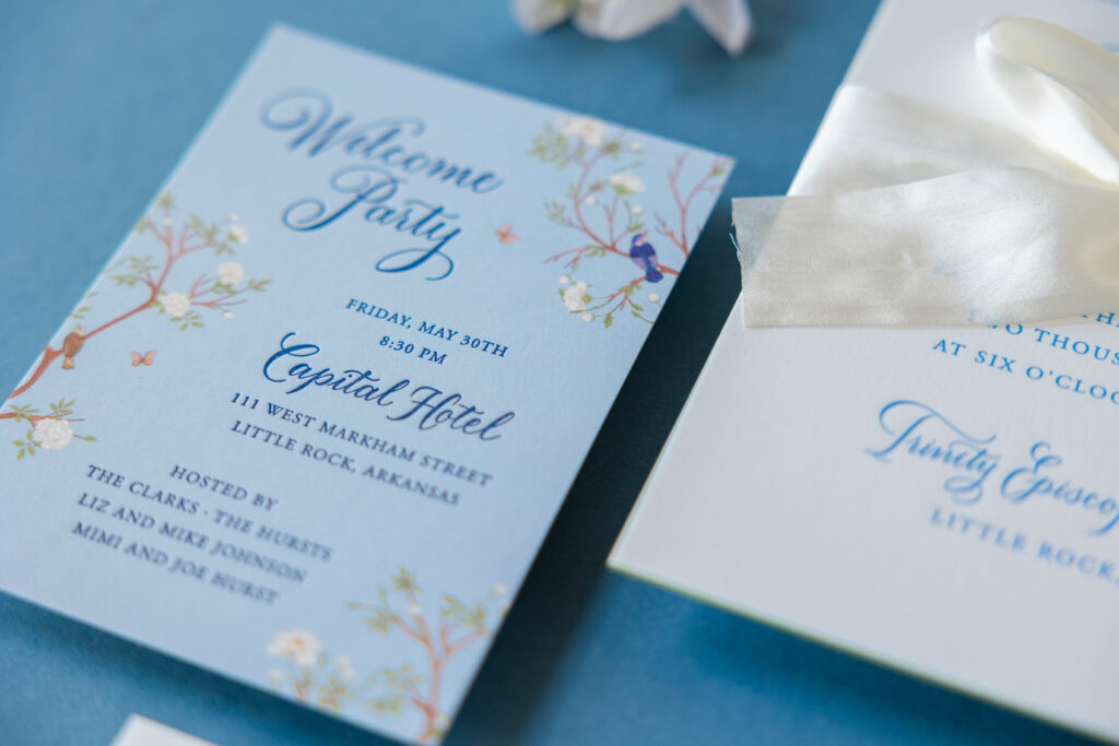
The delicate floral and bird illustrations on the welcome party card introduce a subtle charm that sets the tone for this springtime wedding.
Welcome Party Card
letterpress ink: royal blue
digital ink: powder blue + cmyk
hand calligraphy: opulent by Debi Zeinert
font: adobe garamond
paper: bella smooth cotton 1-ply white
size: custom cut 3.94” x 5.44”
job: 75468
Details Card
letterpress ink: royal blue (front) / royal blue (back)
hand calligraphy: opulent by Debi Zeinert
font: adobe garamond
paper: sky 2-ply
size: 4” x 3.5”
die cut: cd-619
job: 75468
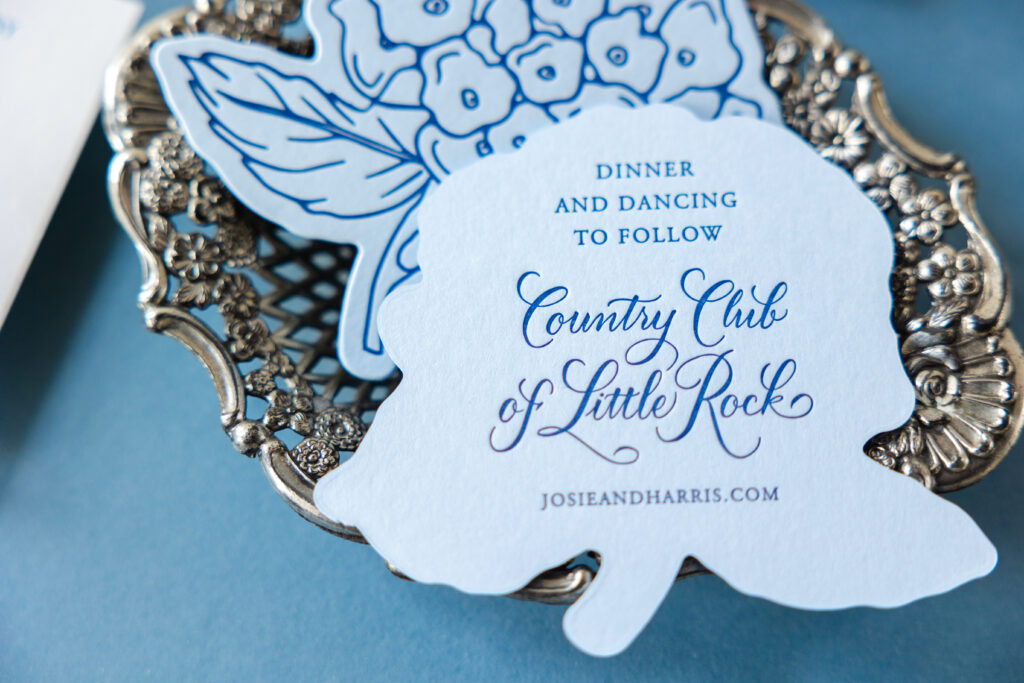
The hydrangea-shaped reception card is a standout detail. That die-cut silhouette brings personality without sacrificing elegance. This card features our Sky 2-ply paper, letterpress-printed in royal blue on both sides. The tone-on-tone printing is gorgeous and on trend.
This engraved wedding invitation suite is warmly inviting. All the details are stunning on their own, but together they create something truly special. Locate one of our dealers to create your own custom wedding invitations.
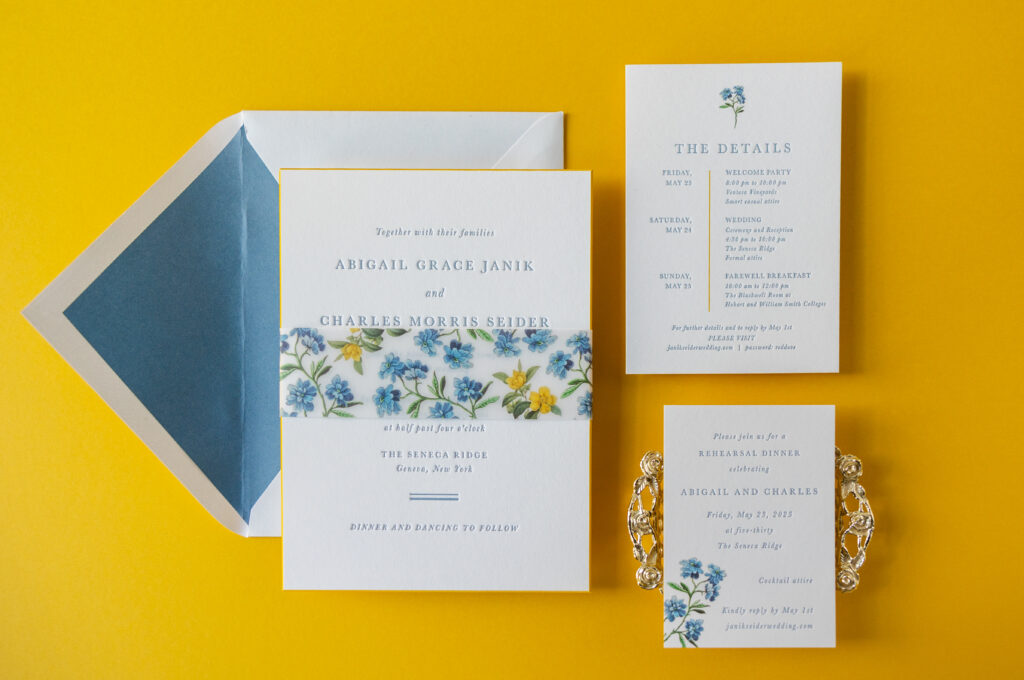
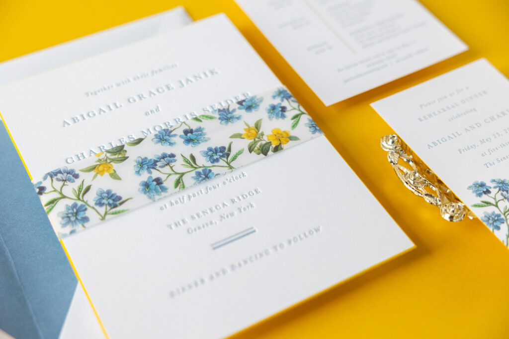
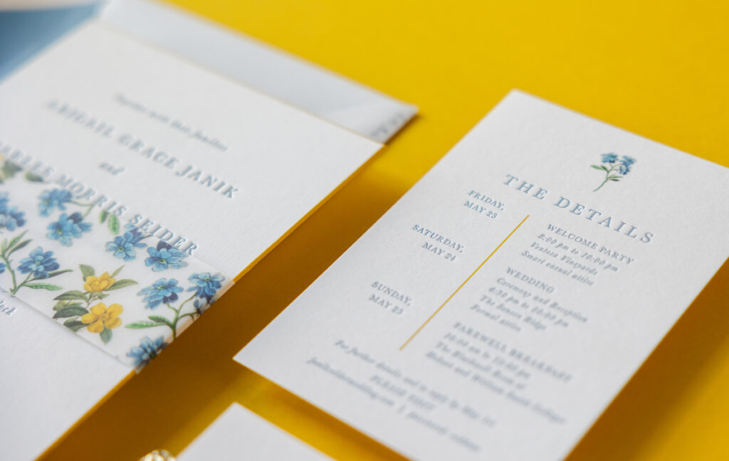
Delicate botanical illustrations paired with a springtime-inspired color palette and an elegant, stately design made us fall in love with these invitations. The couple, Abigail and Charles, worked with our dear friend Laura of Fine Lines of Katonah to customize our Burklyn design for their special day.
Invitation
letterpress ink: chambray
font: baskerville
paper: bella smooth cotton 2-ply white
size: f-8
bevel: 45-degree
edge paint: goldenrod
envelope liner: storm text (no printing)
envelope: white cotton text pointed flap
envelope addressing: deep blue digital on the back
job: 75419
Belly Band
letterpress ink: chambray
digital ink: cmyk
paper: 40# vellum
size: size: f-8 vertical belly band (1.75 x 13.25 open, 1.75 x 6.24 closed)
job: 75419
The typography is elegant and formal. Even the beveled edges give the invitation a traditional feel, but edge-painting the 45-degree bevel in our goldenrod ink adds color and a fun sense of whimsy. Edge painting also helps the bevel edges stand out.
The floral pattern on the belly band was created especially for this invitation and is composed of the blue flower motif from the inspiration design suite and the yellow flower motif, which is part of our available artwork. We can create patterns using our existing motif library or based on your direction. Do you want a flower that isn’t part of our collection? Or do you want to change the color or remove leaves from one of our existing floral motifs? Let us know.
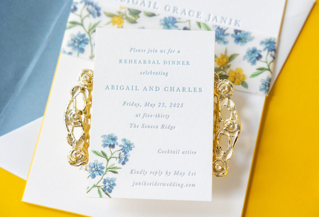
The floral accent on the rehearsal dinner invitation gives the card a bit more of a casual feel, but it’s still lovely. The details card has a slight modern feel, thanks to the vertical line digitally printed in goldenrod that separates the dates from the events. The floral artwork at the top and the edge painting tie the overall design to the other pieces.
Rehearsal Dinner Invitation
letterpress ink: chambray
digital ink: cmyk
font: baskerville
paper: bella smooth cotton 1-ply white
size: a-5
edge paint: goldenrod
job: 75419
Details Card
letterpress ink: chambray
digital inks: goldenrod + cmyk
font: baskerville
paper: bella smooth cotton 1-ply white
size: 4.25” x 6”
edge paint: goldenrod
job: 75419
It’s the kind of wedding suite that feels just as perfect for a vineyard or lakeside venue as it would for an estate or backyard affair. The look is elevated, timeless, and deeply romantic. Do you want to include bevel edges or a custom pattern in your dream invitations? You can work with us or one of our dealers to create your perfect invitation design!
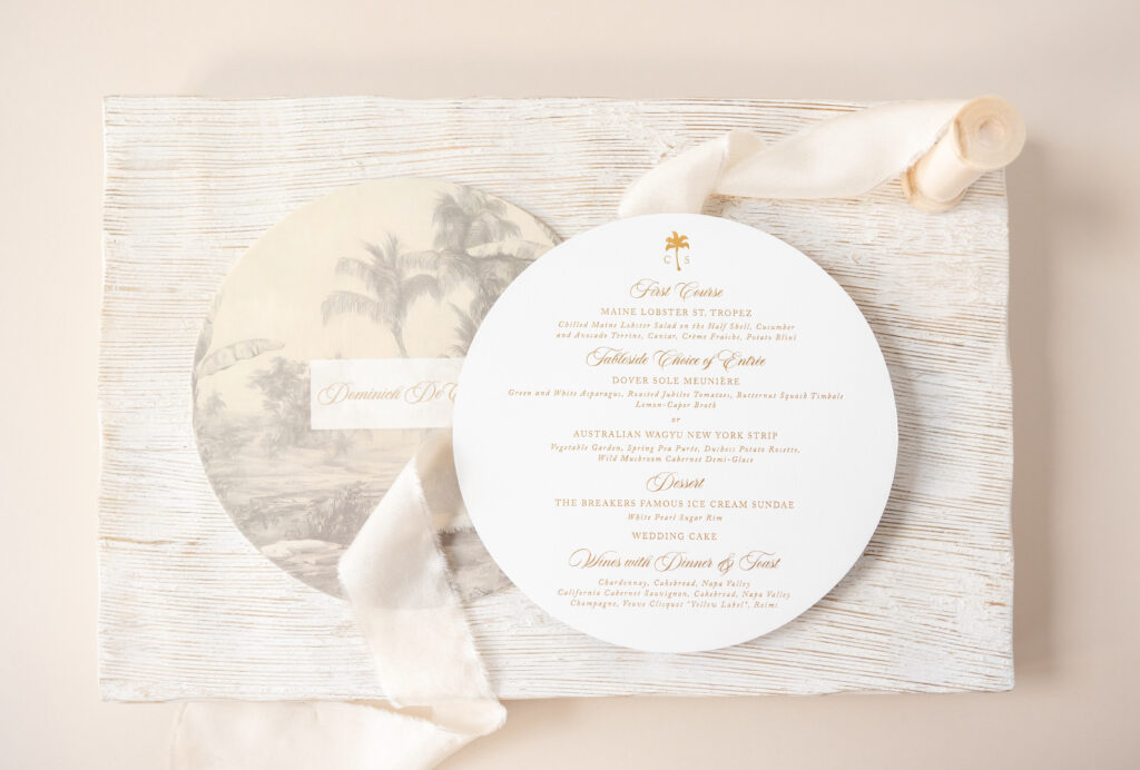
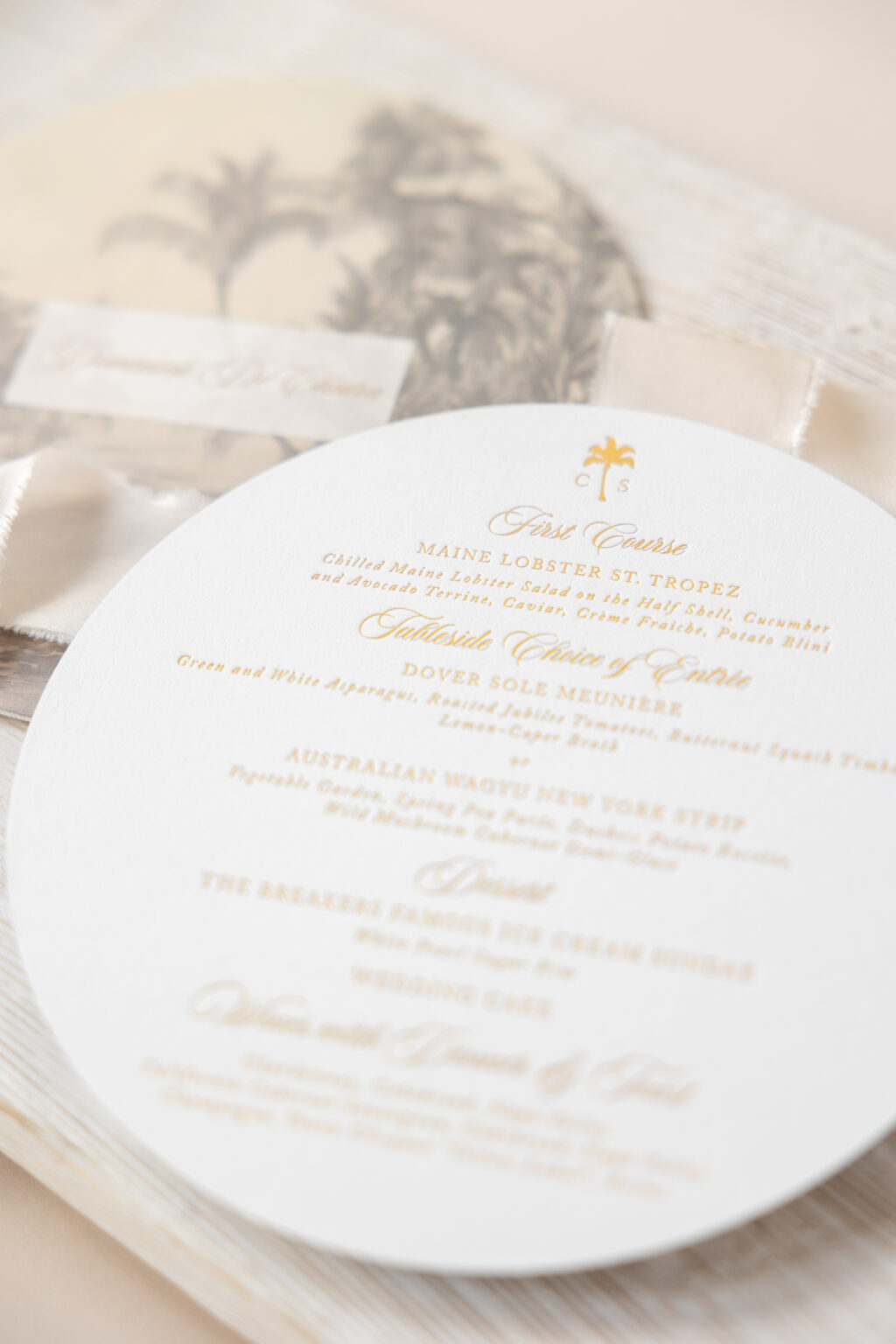
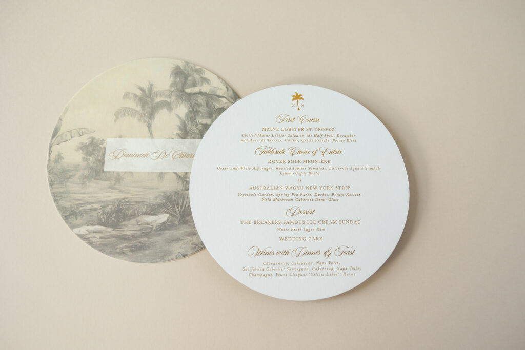
These menus evoke an old-world tropical elegance with a hint of glamour, and we love them for that. We worked with our dear friend Heather of Posh Parties & Paper to create this custom-designed foil-stamped menu for Christina and Sam’s nuptials.
The menu text appears in gold matte foil for an elevated and luxurious look. Our 3-ply Bella smooth cotton paper holds a deep impression, while the pillowy-soft texture adds a tactile element.
Menu
digital inks: antique gold + cmyk (front)
foil stamping: gold matte (back)
font: aston script + adobe caslon
paper: bella smooth cotton 3-ply white
size: 7” circle
die cut shape: bp-11
job: 75941
A custom monogram featuring a palm tree and the couple’s initials adorns the top. This monogram also appears throughout other stationery pieces in the suite, creating a sense of consistency. The flowing script font is formal yet romantic, and the serif font keeps everything classic and balanced.
Digital printing appears on the reverse side. The muted toile illustration in the background adds depth, nostalgia, and a touch of Old Florida charm. The artwork is refined and relaxed, reinforcing the quiet luxury tone. Each menu bears a guest’s name in our antique gold digital ink. Customizing each piece with variable printing adds a personal, inviting touch.
The circular die-cut shape immediately sets it apart. The menu is soft, refined, and unexpected. The circle shape also nests beautifully in a place setting, creating a welcoming atmosphere for guests.
This foil-stamped menu feels intimate and intentional. It is polished, worldly, and timeless. It was a joy working on all of the stationery pieces for Christina and Sam’s big day, and it’s always a pleasure working with Posh Parties & Paper. Would foil stamping, toile artwork, or variable printing help set the tone for your wedding stationery? Work with one of our dealers to create the perfect stationery for your big day.
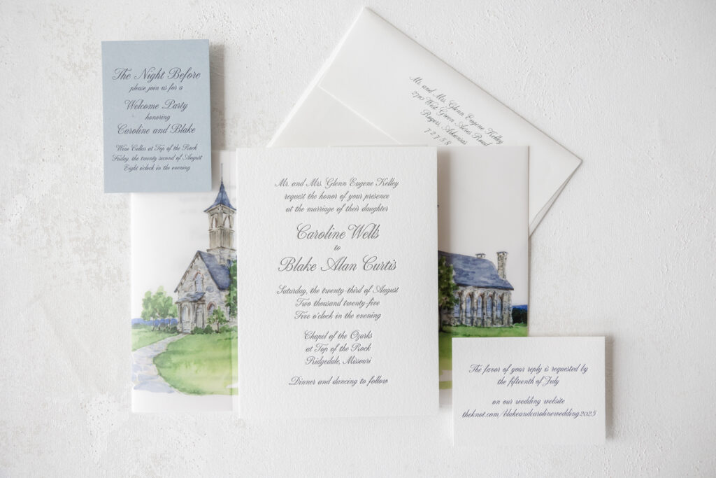
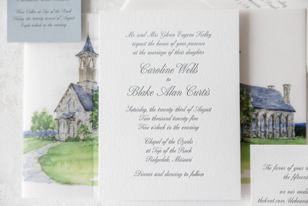
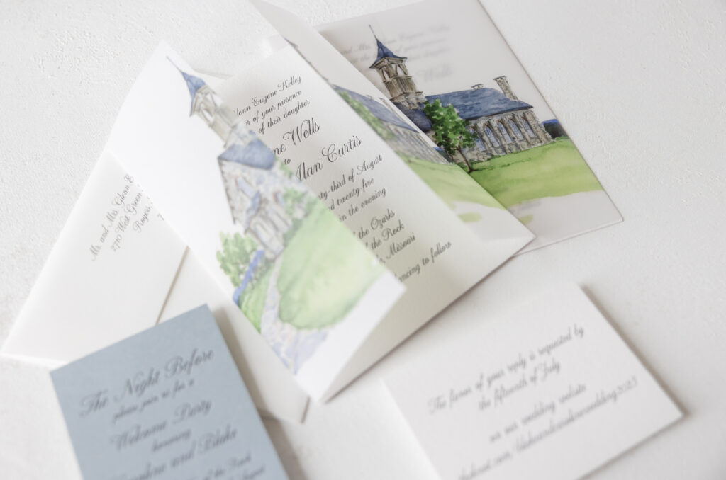
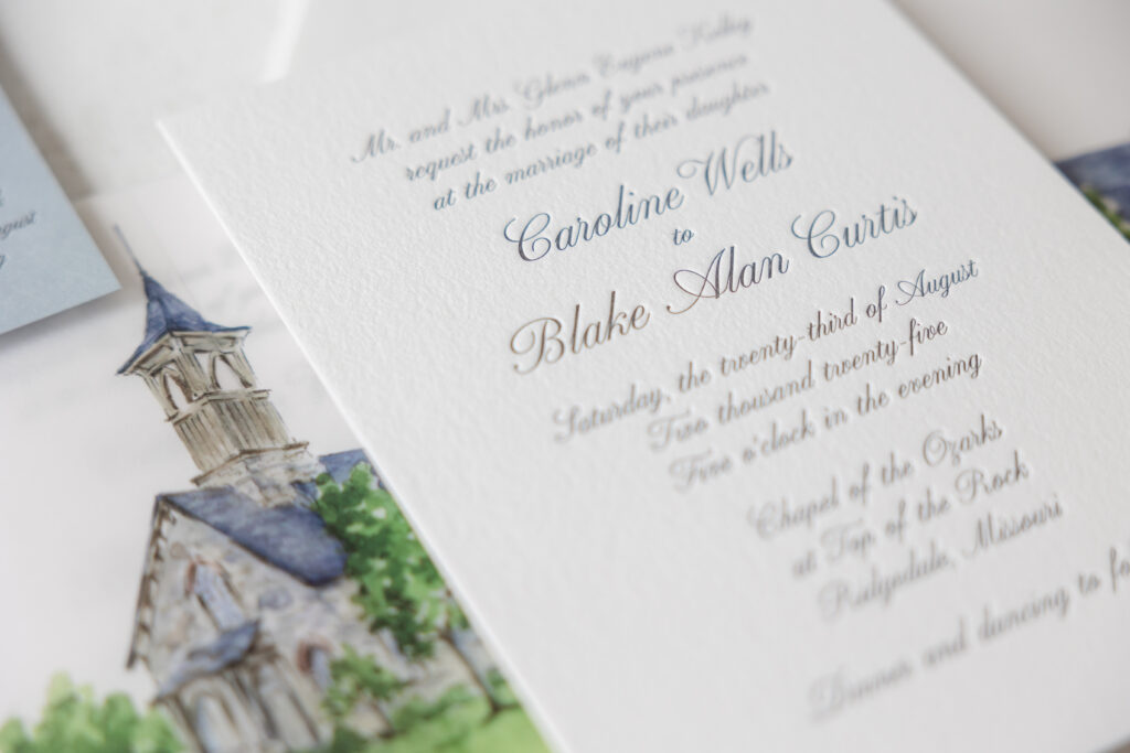
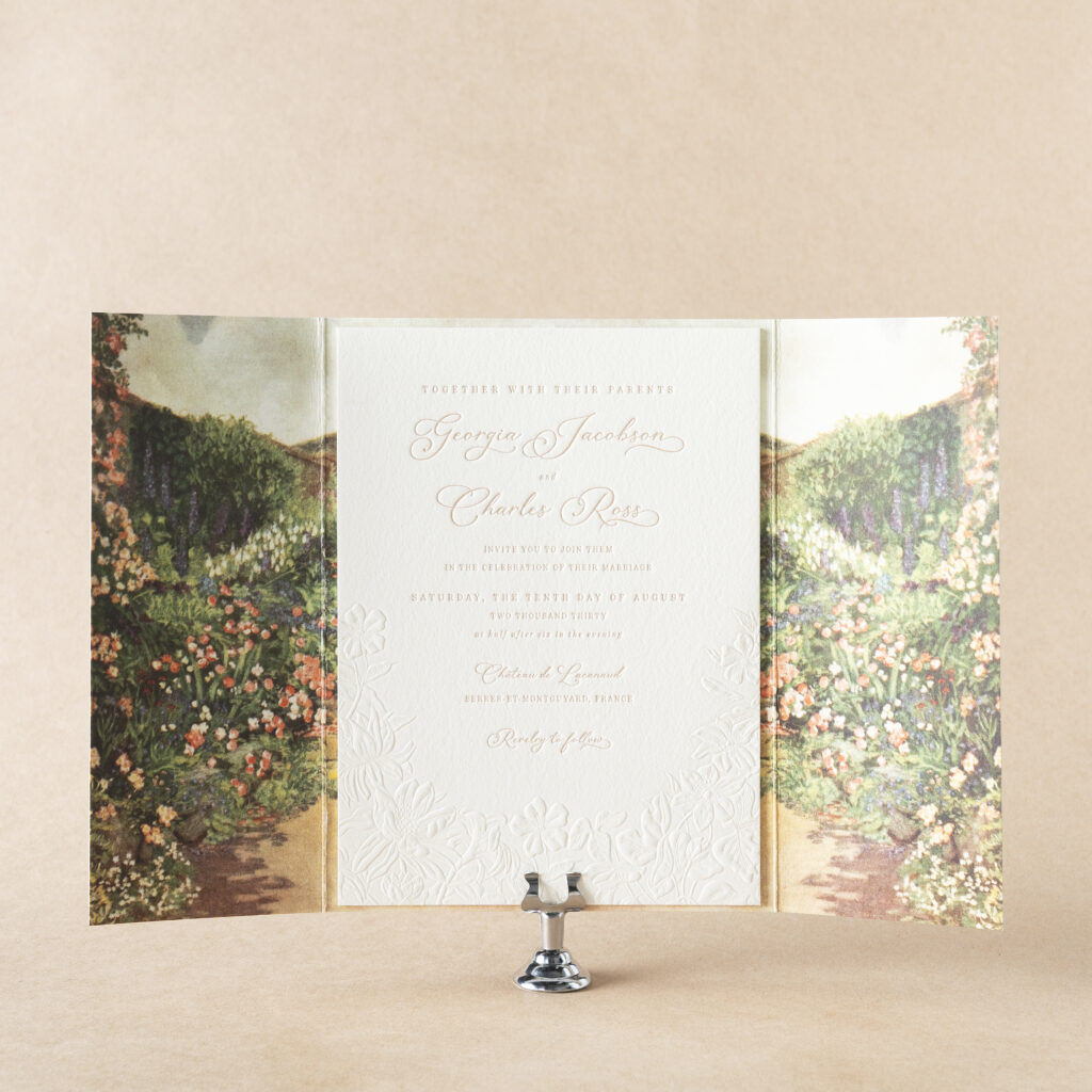
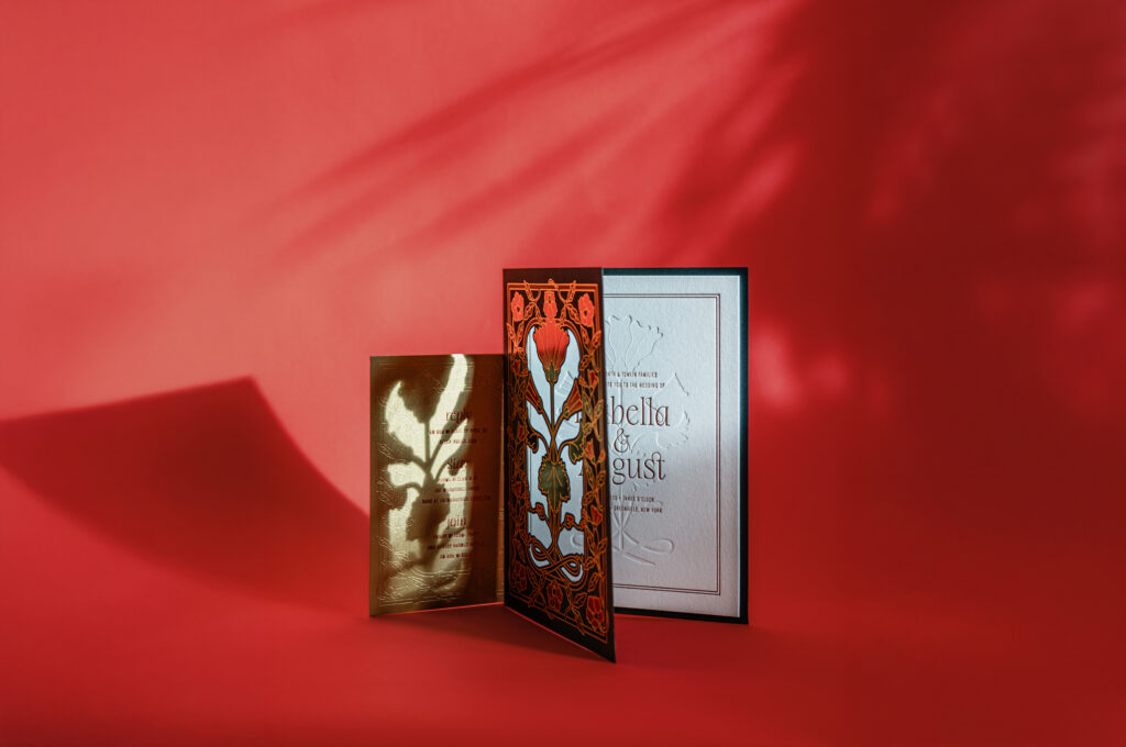
Caroline and Blake wanted something timeless, romantic, and refined for their invitation suite, and that is certainly what they received. This couple worked with our dear friends at Shindig Paperie to create these elegant letterpress invitations that feature an absolutely stunning watercolor-inspired gatefold.
The focal point of this wedding stationery suite is the chapel illustration. The artwork is digitally printed on our 40# vellum and features delicate, airy washes of green and blue. The details of the chapel are painstakingly replicated, from the coloration of the stacked stone to the window frames. The brushwork gives it an almost ethereal or storybook quality. The artwork captures the chapel’s graceful, serene nature. The placement of the chapel on the gatefold allows the invitation to peek through, offering guests a subtle glimpse as soon as they open the envelope.
Invitation
letterpress ink: black
font: altesse std regular
paper: bella cotton 2-ply white
card size: f-8
envelope: white cotton text
envelope addressing: black digital on the front and the back
job: 75491
Gatefold Wrap
digital ink: cmyk
Paper: 40# vellum
size: f-8 vertical gatefold (8.31” x 12.51” flat, 8.31” x 6.24” folded)
finishing: score
job: 75491
Reply Card
letterpress ink: black
font: altesse std regular
paper: bella cotton 1-ply white
card size: a-5
job: 75491
Rehearsal Dinner Invitation
letterpress ink: black
font: altesse std regular
paper: cloud 1-ply
card size: a-5
job: 75491
The invitation’s typography reinforces that classic tone. A flowing script font creates a formal feel while maintaining a light and airy effect. The generous spacing and centered layout add to the overall sense of quiet sophistication.
The addition of our Cloud stock for the rehearsal dinner and welcome party card introduces just enough contrast to keep the suite feeling fresh.
This letterpress invitation suite sets the tone for a graceful, heartfelt celebration. It was a pleasure to work on Caroline and Blake’s invitations. Whether you want a charming gatefold, custom artwork, or tips to create something custom that fits your vision, our dealers can make it happen.
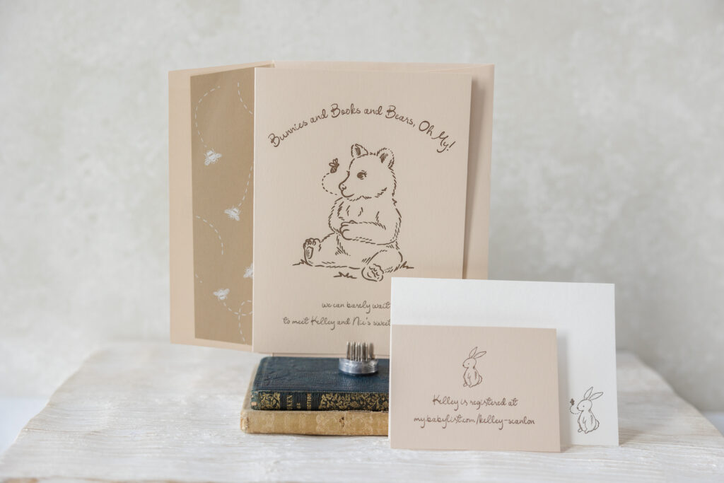
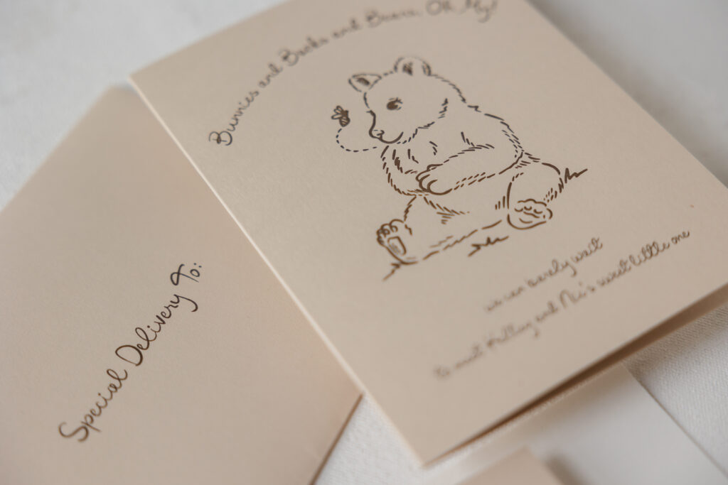
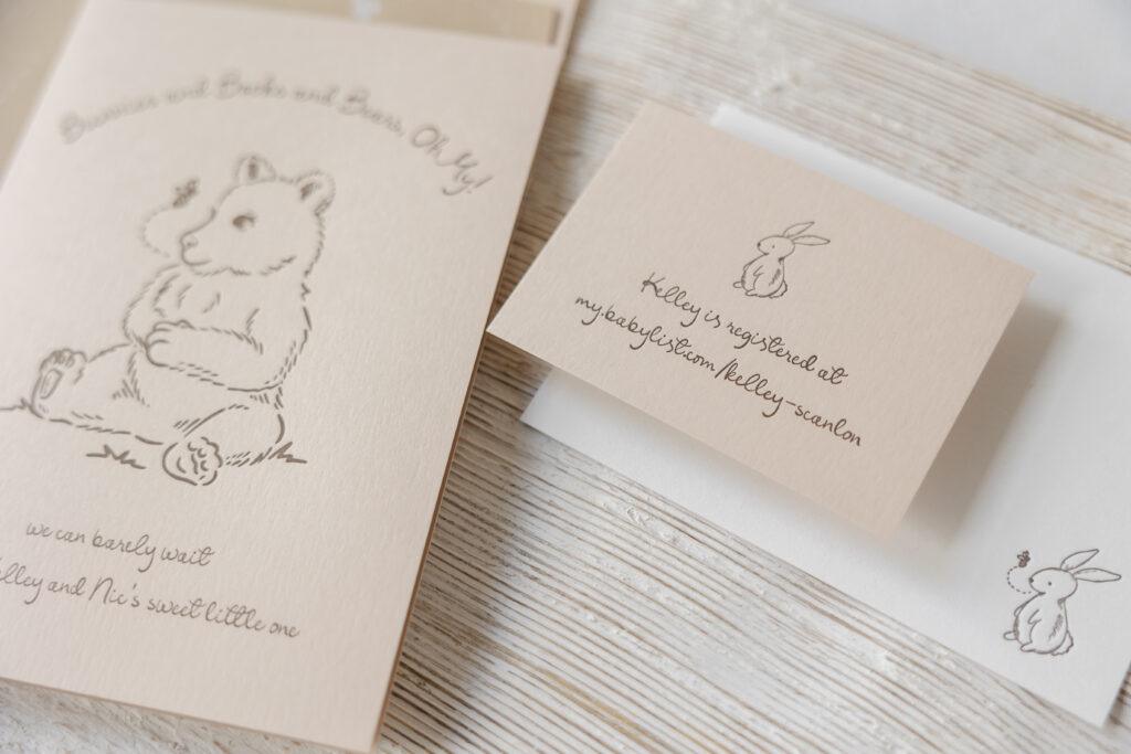
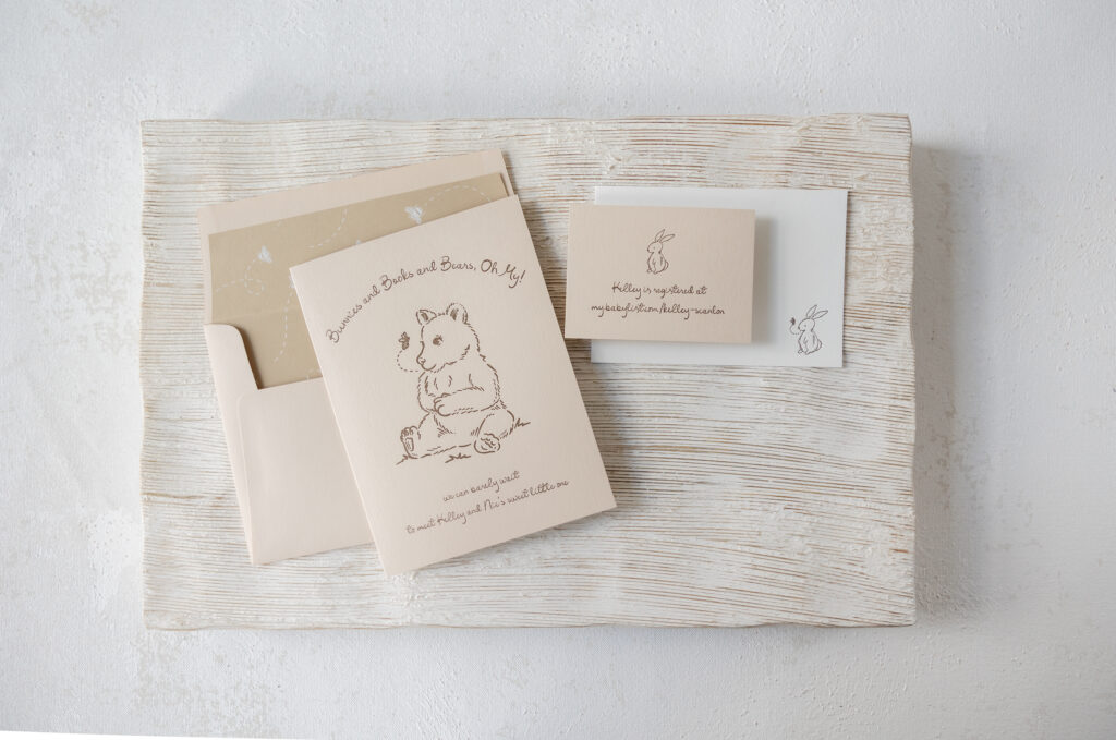
Sweet, storybook-inspired artwork and a muted color palette give these adorable letterpress baby shower invitations an understated, yet cohesive look. We worked with our friends from Catherine Gretta Affairs of Distinction to create this lovely card for Kelley and Nic’s new arrival.
envelope liner: custom pattern digitally printed in white on latte text
envelope: almond text
envelope addressing: espresso digital on the front and the back
job: 75629
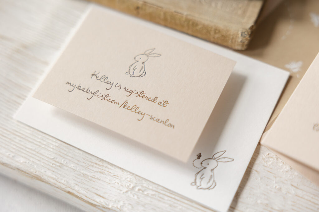
Registry Card
letterpress ink: espresso
font: eternal blossom
papers: almond 1-ply
card size: no. 17
job: 75629
Insert Card
letterpress ink: espresso
font: eternal blossom
papers: bella smooth cotton 1-ply white
card size: a-5
job: 75629
The front of the card is adorned with darling bear artwork, while a rabbit appears on both the registry and insert cards. The Serengeti Baby Bear motif and the Potter Rabbit motifs are found in the ‘Baby’ category of our motif selection. The delicate lines of the baby bear and bunny illustrations are minimal but expressive. They feel whimsical without being cartoonish. The use of espresso letterpress ink keeps the look warm and refined, giving it a classic, almost pen-and-ink storybook vibe.
The script font is light, airy, and softly curved, creating a look that is friendly yet elegant. The typography complements the illustrations instead of competing with them. The arched text adds a classic invitation touch that feels traditional and relaxed.
The bee artwork from the baby bear motif inspired the envelope liner pattern. White digital ink on our latte stock is subtle and supports the neutral color scheme.
These letterpress baby shower invitations are cozy and timeless. The design leans into a classic, nursery-inspired look while also introducing a modern feel. Are you looking for baby shower invitations or stationery? Work with one of our dealers to receive expert assistance throughout the design and ordering process.
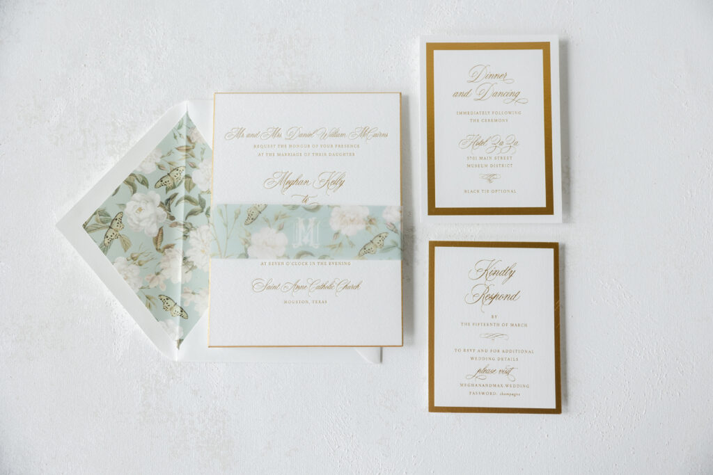
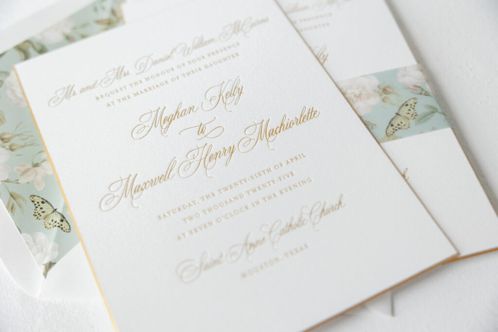
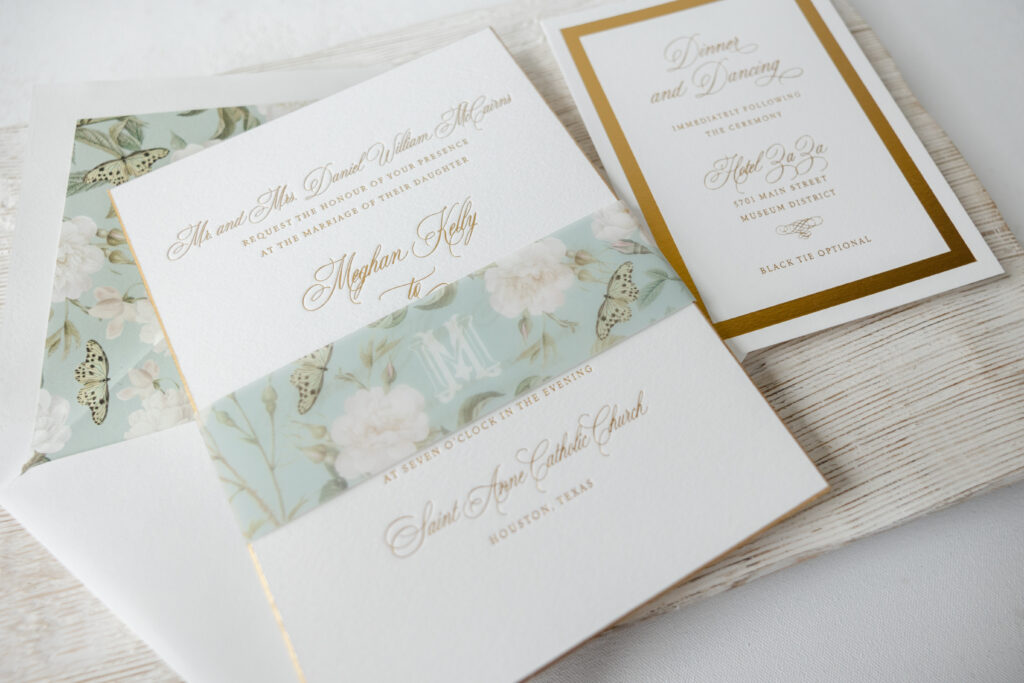
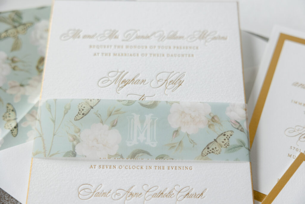
Meghan and Maxwell worked with our dear friend Rachel of Bering’s to design their traditional foil-stamped wedding stationery, befitting a black-tie affair. These invitations are elegant and timeless, and feature some whimsical detailsm including a bevel edge in foil, to elevate the overall look.
Invitation
foil stamping: gold matte
fonts: juliette + vendetta
papers: bella cotton 2-ply white
card size: f-8
bevel: 45-degree
foil edge: gold matte
envelope liner: elidge pattern digitally printed in mineral + cmyk on white text
envelope: white cotton text pointed flap
envelope addressing: antique gold digital on the front and the back
job: 75327
Belly Band
foil stamping: mineral + cmyk
papers: 40# vellum
card size: f-8 vertical belly band (1.75” x 13.25” open, 1.75” x 6.24” closed)
job: 75327
The typography has a refined feel, thanks to the serif and script fonts. Gold matte foil lends the design warmth and a sense of luxury. The invitation has a 45-degree bevel edge, gilded in matte gold foil. The use of foil highlights the crisp lines and slope of the bevel.
The reply card and reception card have the same sense of understated luxury. The thick foil-stamped borders frame the text and create consistency between these cards. To add interest, the foil border on the reply card runs along the edge. On the reception card, the foil border is set within the edge of the card.
A soft floral pattern on the belly band and envelope liner balances the formality of the design. Muted colors and delicate roses surrounded by butterflies are romantic and whimsical. The pattern lends the design a dreamy element.
Reception Card
foil stamping: gold matte
fonts: juliette + vendetta
papers: bella cotton 1-ply white
card size: a-6
job: 75327
Reply Card
foil stamping: gold matte
fonts: juliette + vendetta
papers: bella cotton 1-ply white
card size: a-2
job: 75327
A custom monogram lends the belly band some personal flair. The interlocking double ‘M’ monogram represents the couple, Meghan and Maxwell. This personal detail is unique and a lovely display of the couple.
The design is thoughtfully composed. All the details work together to create wedding stationery that is elegant yet personal. It is always a joy to work with Bering’s. Our dealers are highly skilled and can assist you throughout the design process, helping you create the wedding stationery of your dreams.
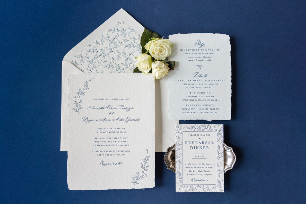
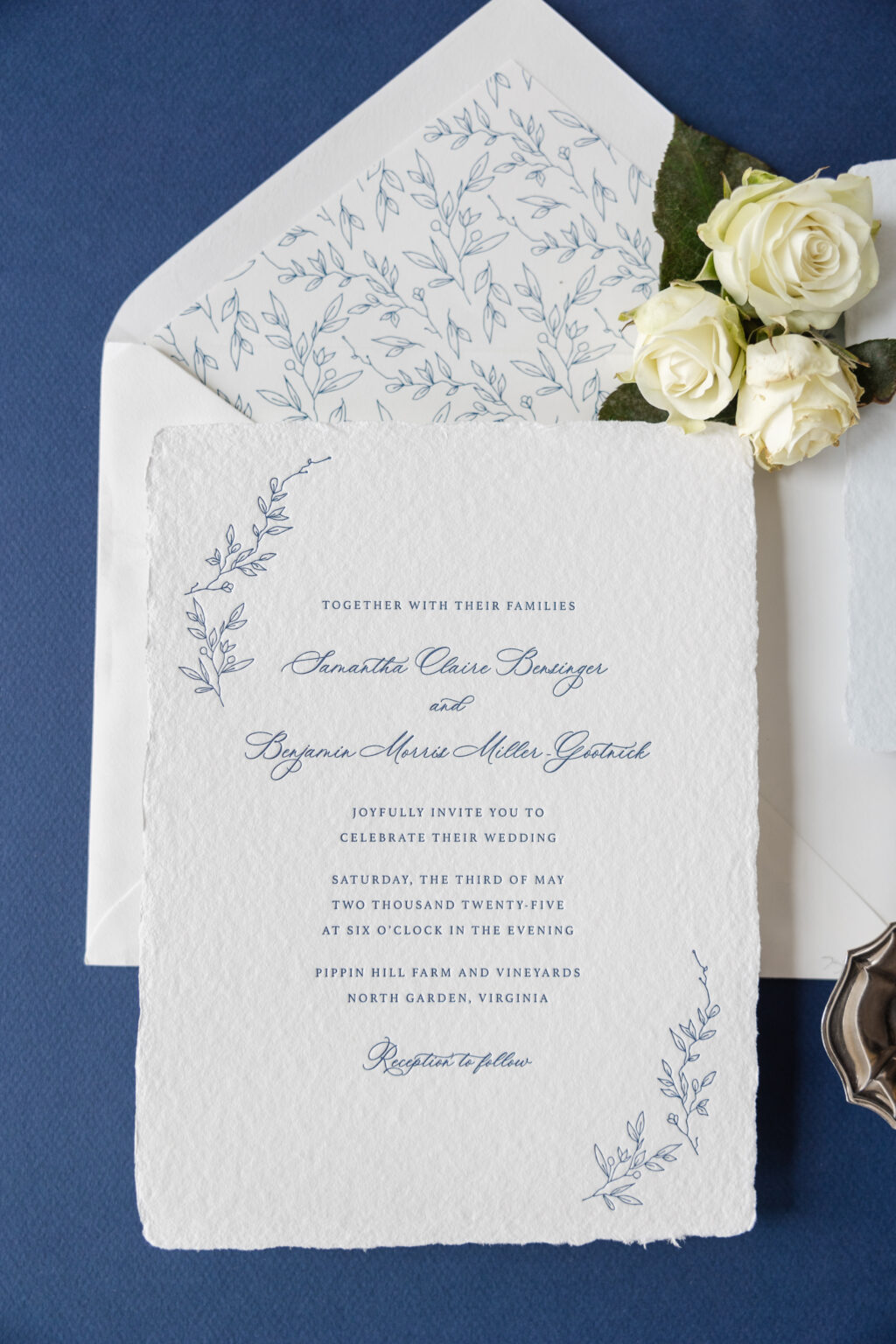
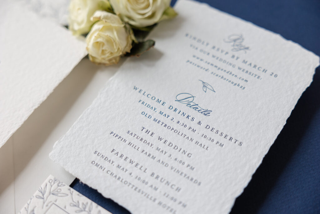
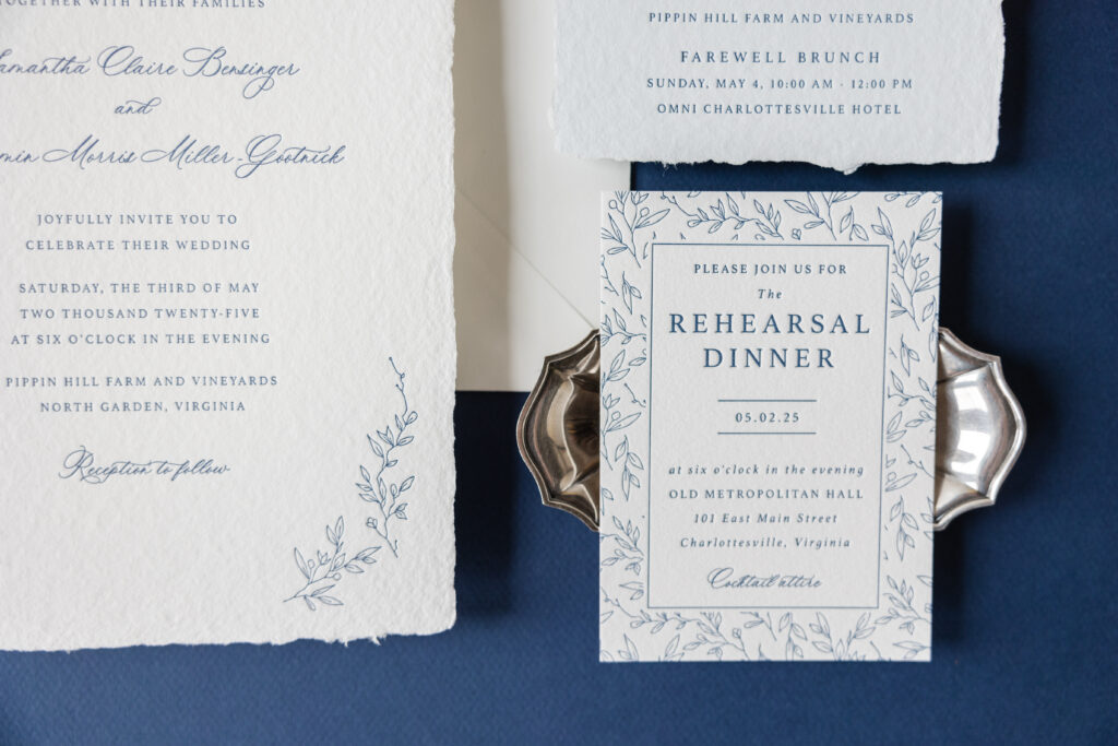
Samantha and Benjamin wanted something elegant and classic with a touch of nature to celebrate their wedding, which was held in a vineyard. They were able to do just that with these letterpress invitations with botanical accents on handmade paper. This invitation beautifully merges our Leone and Novella designs. Please note that our Novella design is retired, which means we no longer maintain samples. You can still borrow elements from this design, or use it as is for your stationery.
Invitation
letterpress ink: navy
fonts: ms claudy + athelas
papers: bella handmade white
card size: f-8 deckle edge
envelope liner: novella pattern digitally printed in navy on white text
envelope: white cotton text pointed flap
envelope addressing: navy digital on the front and the back
job: 75327
Details Card
letterpress ink: navy
fonts: ms claudy + athelas
papers: bella handmade soft blue
card size: a-6 deckle edge
job: 75327
Handmade paper has a wonderful texture, and the deckle edge always catches the eye. We love letterpress printing on this stock because it beautifully holds the impression, creating even more texture. The navy color palette is crisp and traditional, especially on white paper. The foliage accents create a loose border that frames the text. The botanical line illustrations came from the envelope liner pattern. The same botanical artwork appears in some capacity on all the cards. Using the same illustrations across all pieces creates a cohesive feel.
Rehearsal Dinner Invitation
letterpress ink: navy
fonts: ms claudy + athelas
papers: bella cotton 1-ply white
card size: a-5
job: 75327
The look is elevated and formal yet approachable. It was a delight to work with Samantha and Benjamin, and we wish them the best. Do you want to learn more about our handmade paper, or do you want to find subtle yet impactful botanical accents for your wedding stationery design? Work with us to learn more and create your perfect wedding invitations!
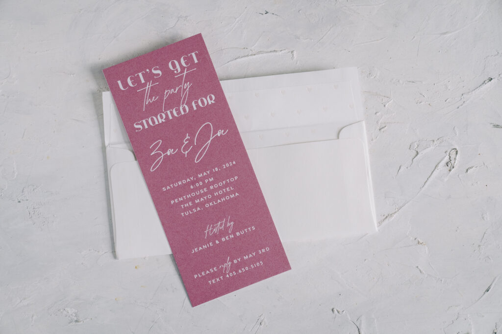
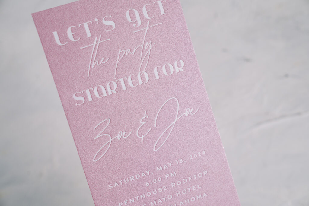
We worked with our dear friends at No Regrets in Oklahoma to create Zoe and Joe’s engagement party invitations. The sleek design is contemporary with hints of romance.
Invitation
foil stamping: white matte
fonts: jeanne moderno + abramo script + gravesend sans
papers: azalea 2-ply
edge painting: white
card size: no. 10
envelope liner: sweetheart pattern foil stamped in pearl shine on white text
envelope: white cotton text
envelope addressing: charcoal digital on the front and the back
job: 71261
The layout is minimal, creating a contemporary feel. The fonts effortlessly shift among a thin sans serif, a bold serif, and a loose script. This design choice adds contrast and flow while maintaining structure. The use of a No. 10-size card is unexpected but lends the design an upscale, chic vibe. White matte foil stamping on our metallic Azalea paper softens some of the modern elements with a touch of romance.
The darling envelope liner features tiny hearts foil-stamped in pearl shine for a subtle glimmer.
These engagement party invitations are stylish and joyful, perfect for a rooftop party. Do you want modern invitations with subtle hints of romance? Or do you love the look of white matte foil on metallic paper? Whatever you have your heart set on can become a reality when you work with one of our dealers.
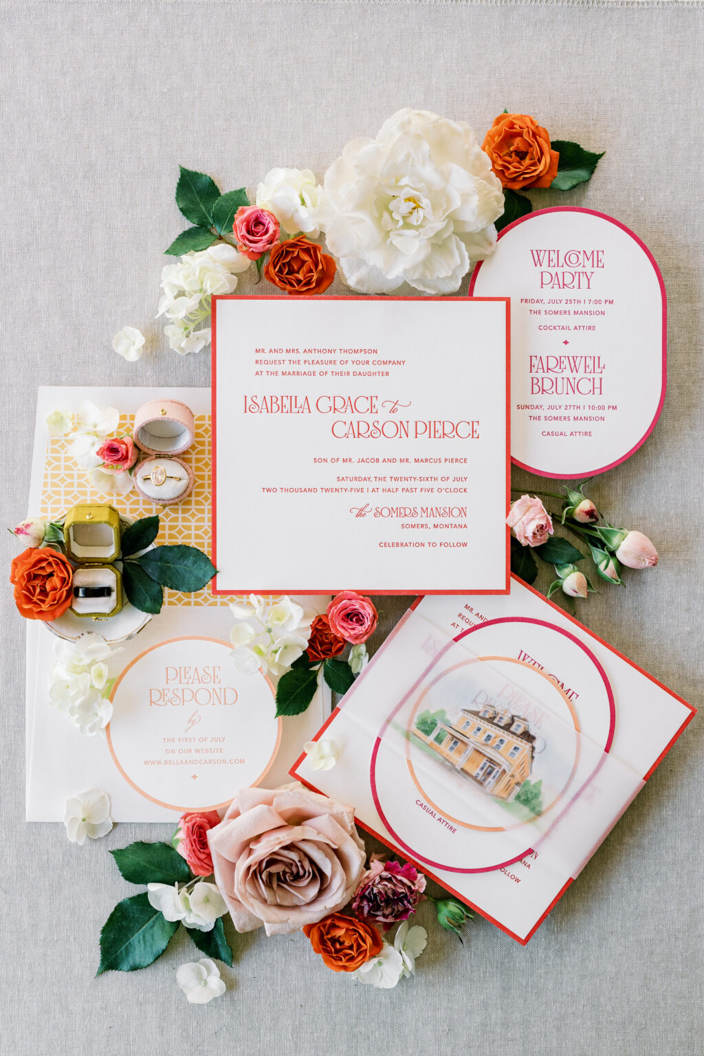
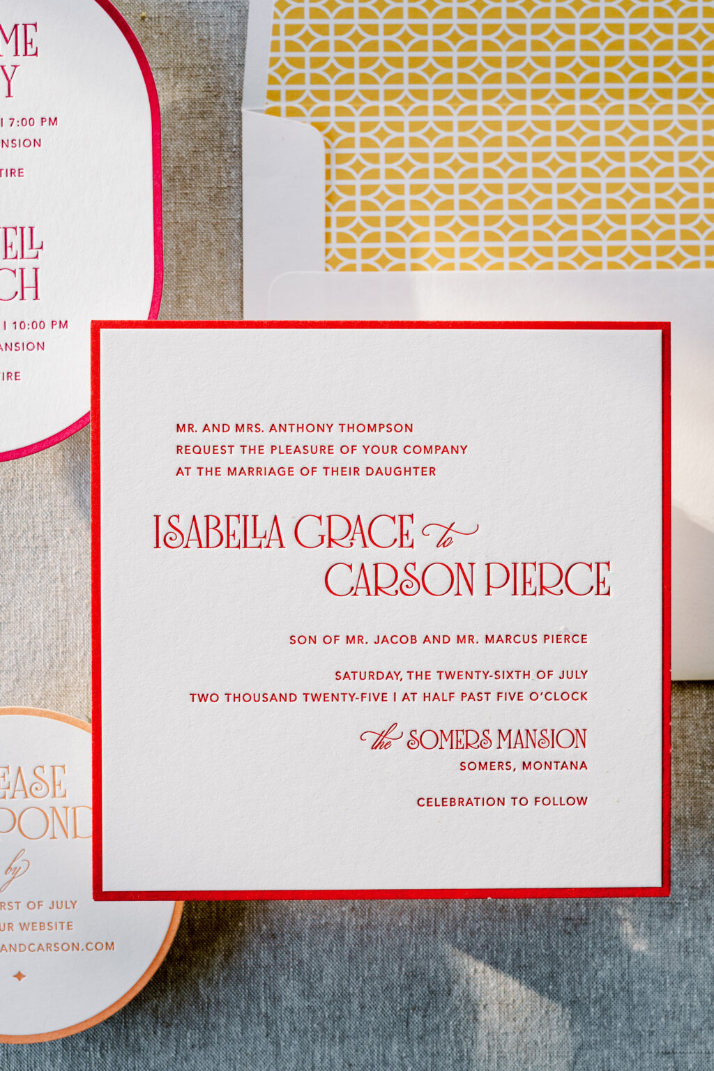
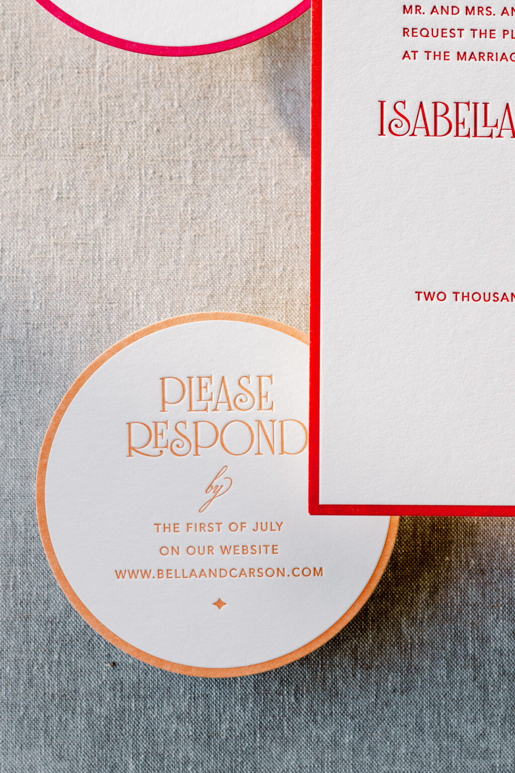
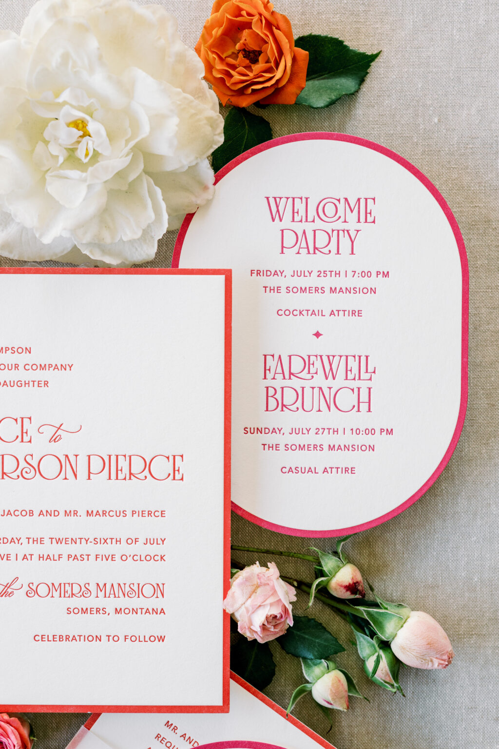
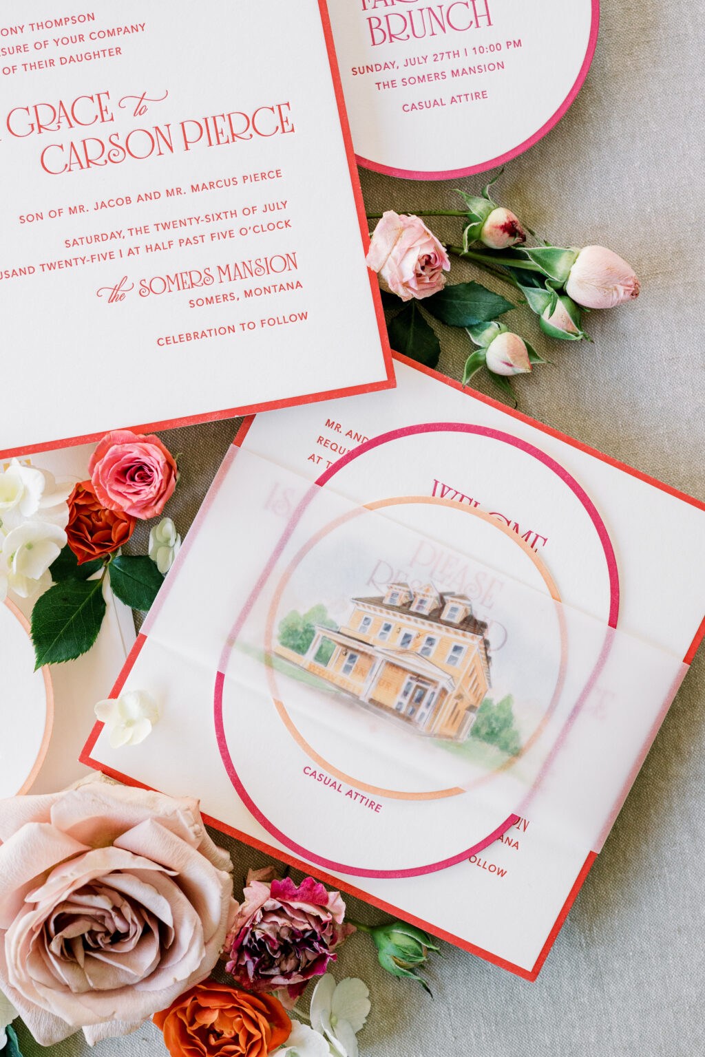
We have another one-of-a-kind design to share with you, courtesy of our friend Janeil of Seventh and Anderson. Not too long ago, we partnered with Janeil to create two wedding stationery suites for a styled shoot. We already highlighted the garden party-inspired design, and we cannot wait to share the second design, which features layered die-cut shapes, a vibrant color palette, and a watercolor illustration of the venue.
Invitation
letterpress ink: chili
fonts: avenir + solingen + ecatherina
papers: bella smooth cotton 2-ply white
card size: sq-7
envelope liner: lexsa pattern digitally in cmyk on white text
envelope: white text
job: 77887
This design is bold and modern, yet it still has an underlying romantic feel. The layout is traditional, but the whimsical font is contemporary and fun, while still maintaining a formal sense.
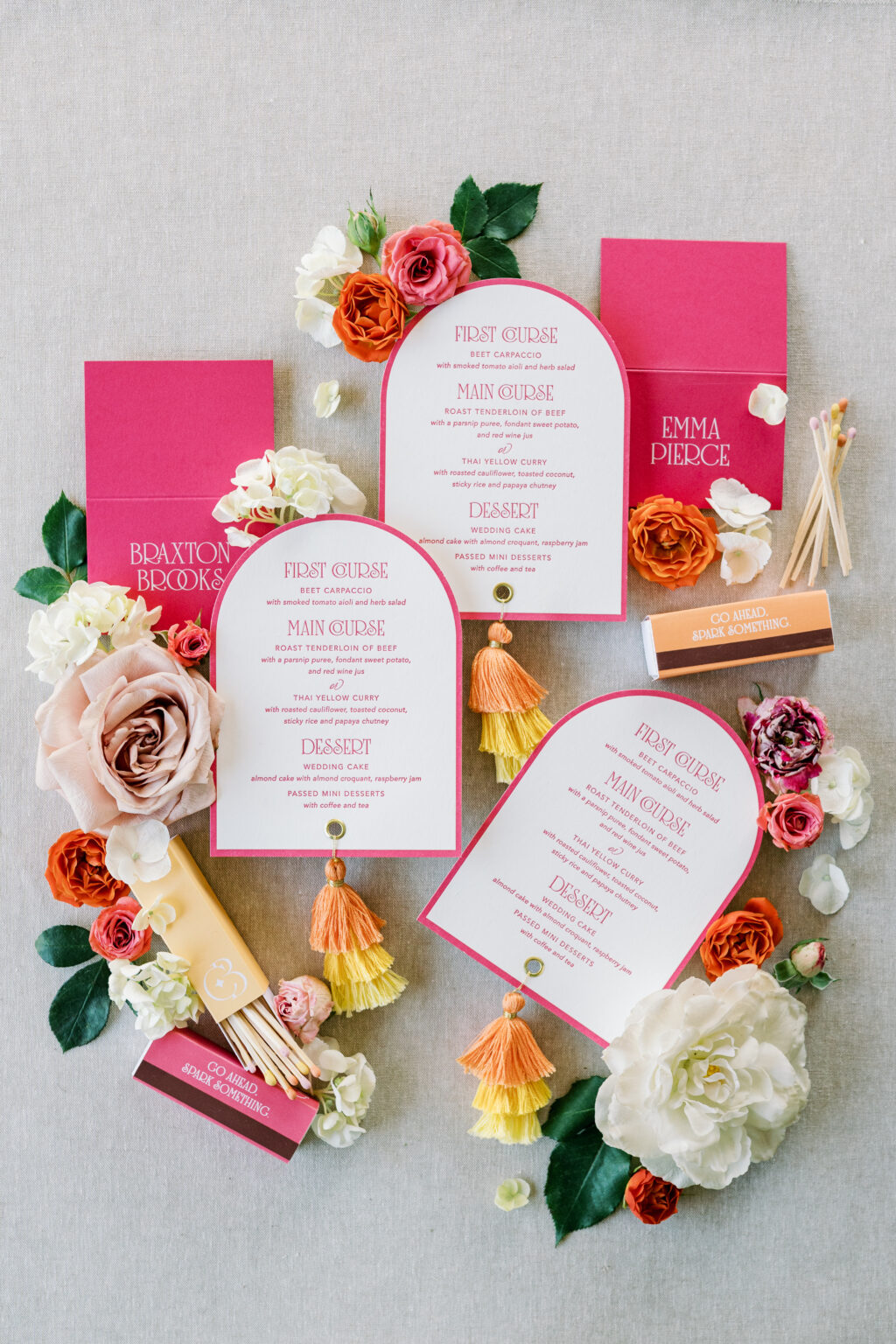
Reply Card
letterpress ink: persimmon
fonts: avenir + solingen + ecatherina
papers: bella smooth cotton 1-ply white
card size: 4-inch circle
die cut shape: sm-33
job: 77887
Each card in the suite is a different size and shape. The thick letterpress border on each card creates a cohesive element while highlighting the different shapes. Each card also features a different complementary color, further creating a sense of consistency while introducing vibrant energy and a cheerful, approachable vibe.
Details Card
letterpress ink: punch
fonts: avenir + solingen + ecatherina
papers: bella smooth cotton 1-ply white
card size: a-6
die cut shape: bf-113
job: 77887
The cards neatly stack and are secured together with a vellum belly band. A watercolor illustration of the venue is digitally printed on the belly band, adding a fun, personal touch.
Menu
letterpress ink: punch
fonts: avenir + solingen + ecatherina
papers: bella smooth cotton 1-ply white
card size: a-6
die cut shape: cd-179
finishing: 0.25” hole drill and gold grommet
job: 77887
Folded Place Card
digital ink: white
fonts: avenir + solingen + ecatherina
papers: punch 1-ply
card size: no. 17 folded
job: 77887
Belly Band
digital: cmyk
papers: 40# vellum
card size: sq-7 (2.75” x 14.25” open, 2.75” x 6.74” closed)
job: 77887
This suite is cheerful, bold, and romantic. The design is perfect for a summer wedding at an estate or mansion. The look blends tradition with personality. It feels festive and welcoming, elegant but not overly formal, and very much made to celebrate.
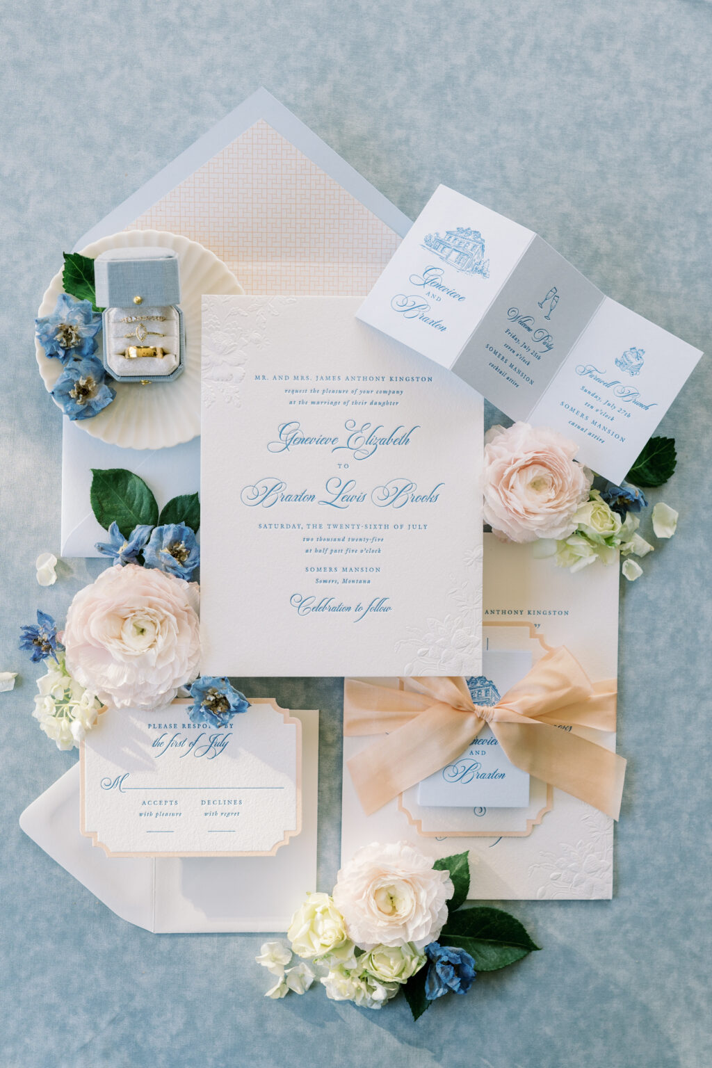
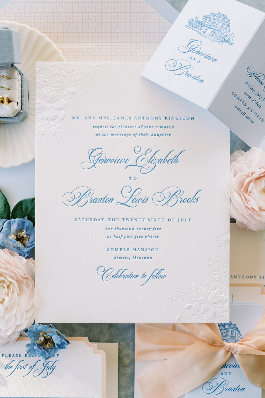
We had the pleasure of working with our dear friend Janeil of Seventh and Anderson to create two very different but equally lovely suites for a styled shoot. First up is a soft, romantic look that is timeless. Sculpted, embossed accents add stunning depth and a sense of luxury, while the delicate color palette is sophisticated and graceful.
Invitation
letterpress ink: wedgewood
sculpted emboss: blind
fonts: switzerland + galliard
papers: bella cotton 2-ply white
card size: f-8
silk ribbon: peach champage
finishing: assemble with ribbon
envelope liner: gywnn pattern digitally printed in bellini on white text
custom converted envelope: sky text
job: 77887
Reply Card
letterpress inks: wedgewood + bellini
fonts: switzerland + galliard
papers: bella cotton 1-ply white
card size: a-5
die cut style: lincoln
die cut shape: bf-13
job: 77887
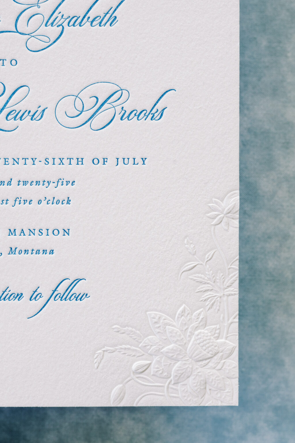
This suite is inspired by a garden party with lots of refined elegance. The use of letterpress printing, which presses into the thick, luxurious stock, is juxtaposed with the sculpted, embossed floral pattern that serves as an accent. Embossing creates a raised impression, and sculpted embossing adds different heights within that raised area. This technique features a high level of detail, beautifully showcasing the intricacies of the flowers and foliage of the artwork.
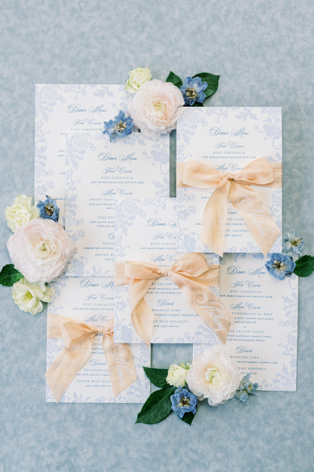
Menu
letterpress inks: wedgewood + french blue
fonts: switzerland + galliard
papers: bella cotton 1-ply white
card size: a-7
job: 77887
These garden party invitations are a custom design, but they feature the same sculpted embossed plate from our Braxton V.2 design. While this invitation is very similar to the Braxton V.2 design, the overall look and vibe are different, and demonstrate how the details make a difference.
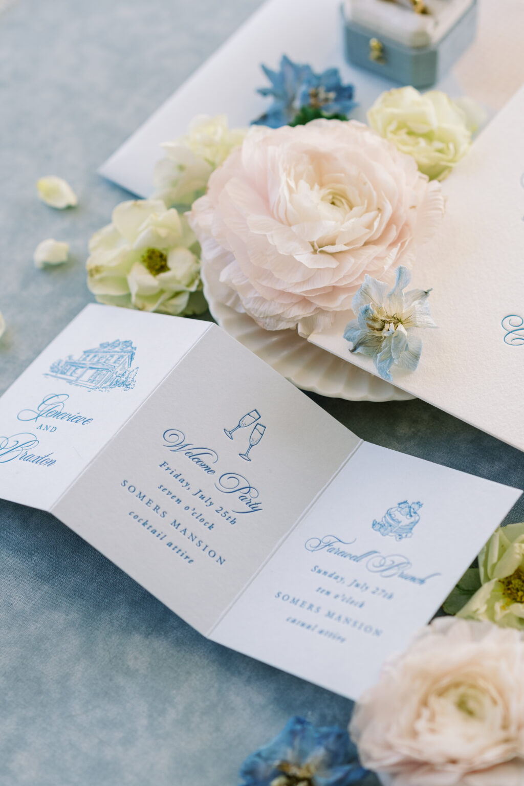
Details Card
letterpress inks: wedgewood
fonts: switzerland + galliard
papers: sky 1-ply
card size: z-fold card (7.5” x 3.48” open, 2.5” x 3.48” closed)
finishing: score
job: 77887
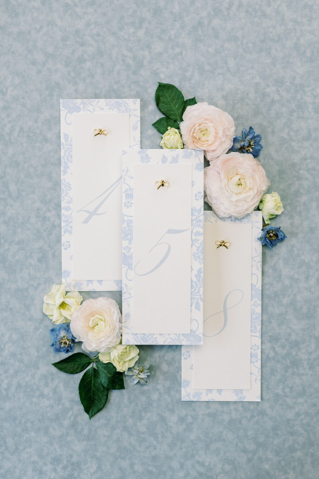
Pattern Card (backing for table numbers)
letterpress inks: french blue
fonts: switzerland + galliard
papers: bella cotton 1-ply white
card size: no. 10
job: 77887
This design is polished and romantic, perfect for a classic estate, mansion, or garden wedding with a formal yet warm atmosphere. It feels traditional without being stuffy, and luxe without being flashy. It was an absolute joy to work with Janiel on this design. Check back to see the second design, which takes things in a completely different yet still exciting direction.
We are so excited to share our brand-new wedding release with you! The 2026 release includes 30 new wedding designs and features lots of sculpted embossing, blind embossing, and debossing mixed with all of our print methods and papers. We added new engraving inks and lots of new die-cut shapes, additional piece enclosures, new envelope shapes, and mailers. Among these new and exciting offerings, the one that perhaps stands out the most is laser cutting.
There are so many eye-catching designs and lovely details. You can see everything new here, but keep reading to see some highlights from our latest wedding release.
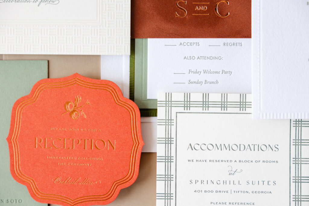
Die Cut Shapes
Die-cut shapes add character and a memorable touch to a card or the entire suite. We have a wide selection of die-cut shapes, and we can easily create new ones. Our 2026 wedding release includes lots of fun die cuts from the Yasmin and Valerie invitations or the reception card from the Monroe suite.
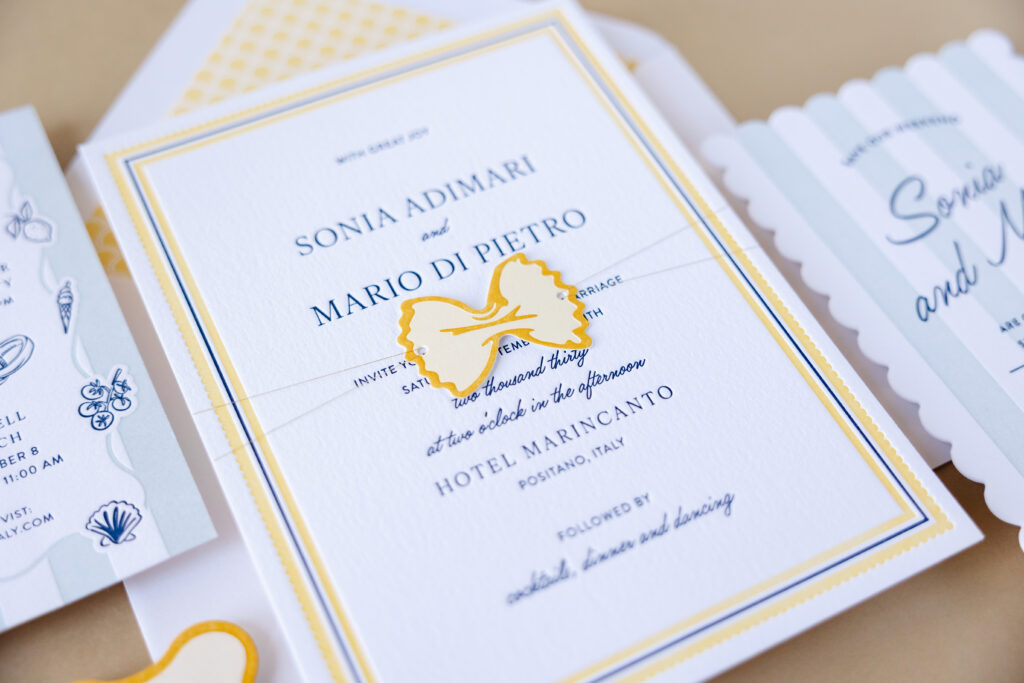
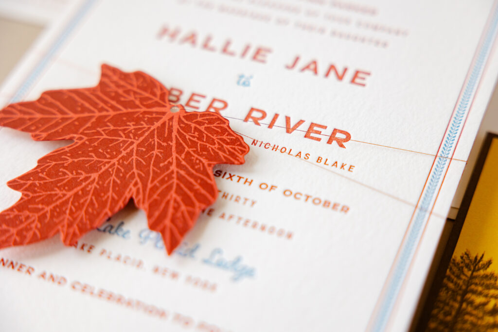
There are also lots of fun tags, from the farfalle-inspired tag of Italo to the maple leaf tag from Scout.
Sculpted Embossing
Sculpted embossing is a technique that creates a raised, dimensional surface. Our Delevingne suite is full of lovely instances of sculpted embossing. Detailed floral artwork on the invitation is subtle yet stately. New for this release, we’re also offering sculpted embossing for envelope liners, and the same floral pattern from the invitation is enlarged and appears on the liner.
Laser Cutting
We recently added laser cutting to our available print methods, and it has been tremendously fun and inspiring. This technique is excellent for creating patterns and highly detailed artwork. The belly band of the Vayda design is a stunning example of what we can do with laser cutting. You can also see laser cutting in action on the Talavera save the date, the extravagantly tropical pocketfold for Hiriata, and the moody pocketfold for Tomlin.
There is so much to see in this release, and these highlights are just some of the new offerings. Check it out to see all of the dreamy details. We are so happy to share this with all of you, and we hope you love it as much as we do!