
Letterpress Programs
-
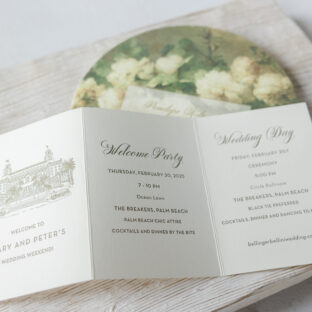 Day Of Pieces for Palm Beach Wedding
 -
 Get With the Program! Handdrawn Letterpress Program Panels
 -
 We’ve got your program covers covered – letterpress style!
 -
 Bella Figura Real Wedding: Sionne & Nick
 -
Letterpress Programs: Wording Tips for Same sex Couples
-
 Purely Fragrant Mimosa Letterpress Programs, Menus, and Table Numbers
 -
 Mimosa Letterpress Reception Pieces
 -
 Claddagh Letterpress Wedding Invitations & Programs
 -
 Letterpress Ceremony Programs
 -
 Vintage Inspired Calligraphy Invitations
 -
 Urbanity Letterpress Wedding Reception Pieces
 -
 Esperanza Letterpress Wedding Invitations