Learn More About Custom Envelopes
The envelope is the first thing your guests see when they receive your save the date, invitation, announcement, or holiday card. There are plenty of ways to customize your envelope to make it a cohesive part of your invitation suite. Here’s what you need to know about envelopes and find out how to make a memorable first impression with custom envelopes.
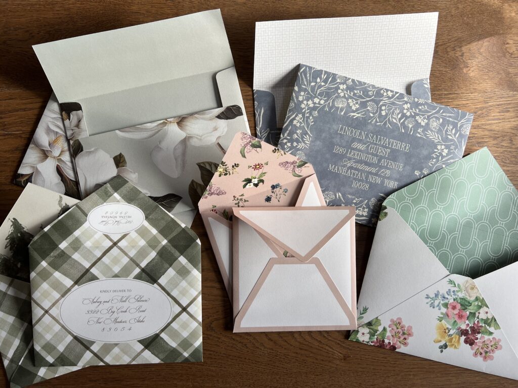
Envelope Basics
We offer both traditional pointed flap envelopes and modern square flap envelopes. Most of our envelopes are available in white, bright white, and ivory, as well as many of our color papers, but contact us to double-check availability. You can always customize your envelope by adding a liner. Choose from a metallic stock, or add digital printing or foil stamping. We offer a wide selection of liner patterns in a range of styles. We can also create a custom envelope liner pattern. Let us know what you’re thinking, and our talented design team can bring your vision to life.
Handmade Envelopes
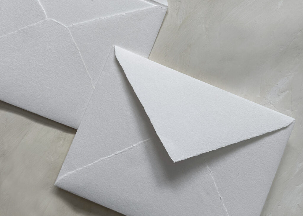
Create a perfectly coordinated set when you select inner and outer envelopes made from our handmade paper. Enjoy the consistency of a deckled edge on the envelope, as well as the cards held within. We now make outer envelopes using our handmade paper to fit inner envelopes made from the same stock. We have white handmade envelopes in stock.
Custom Envelopes

That’s right–all our cotton, smooth cotton, and color papers can be transformed into envelopes. We convert our envelopes in-house, so we can create custom pieces. Let us know the size and style you need for your job, and we can provide you with a quote.
The envelope is an important part of your invitation, so give it the attention it deserves with something as unique and one-of-a-kind as your printed piece. Please contact us to check availability or learn more about creating a custom envelope design.