
Edge Painting
-
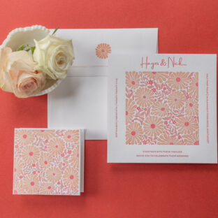
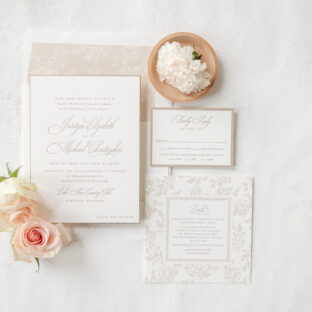 Understated Letterpress Wedding Invitations
 -
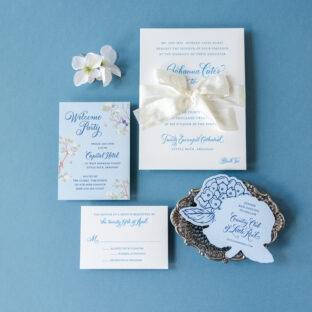
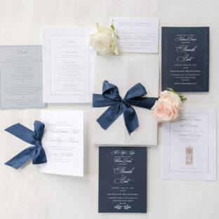 Regal Letterpress and Foil Invitations
 -
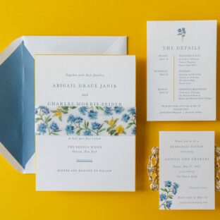
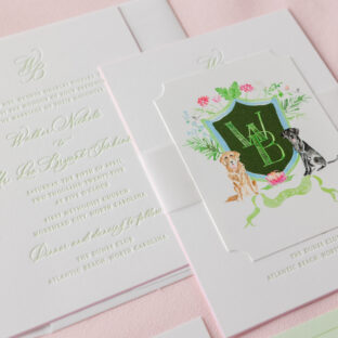
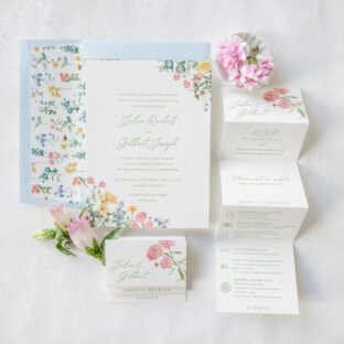 Garden Romance Wedding Invitations
 -
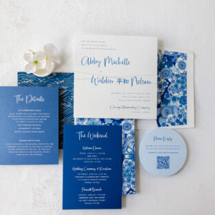
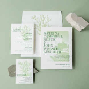 Minimalist Mediterranean Wedding Invitations
 -
 Modern Retro-Inspired Wedding Invitations
 -
 Engraved Wedding Invitations with Hand Calligraphy
 -
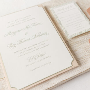
 Refined Letterpress Wedding Invitation with Bevel Edges
 -
 Letterpress Wedding Invitations with Chiyogami Accents
 -
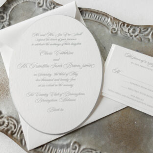 Oval Engraved Wedding Invitations
 -
 Southwest Inspired Letterpress Wedding Invitations
 -
 Stunning Letterpress Wedding Invitation Suite
 -
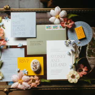
 Watercolor Crest Invitation Suite