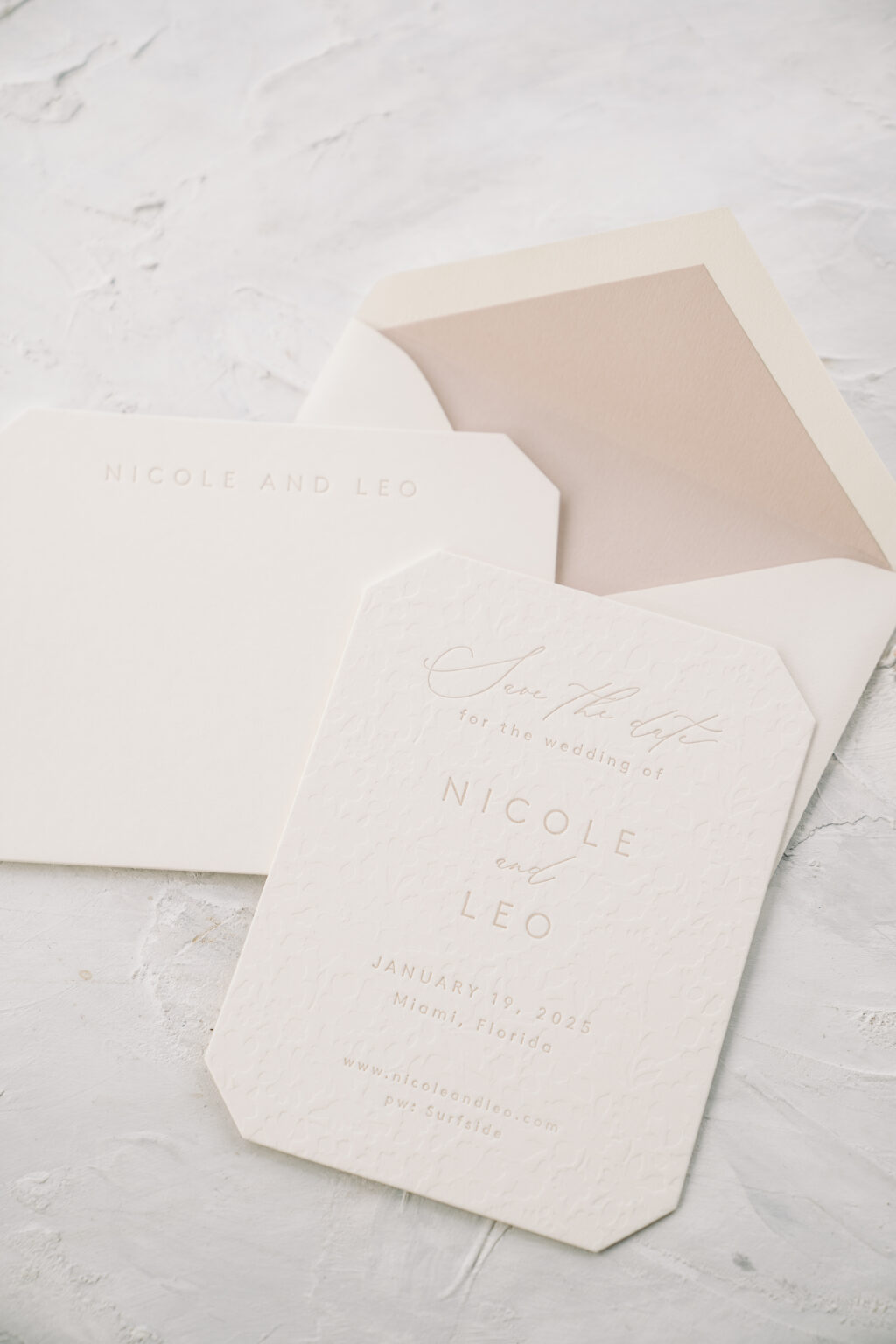
This save the date is elegant and understated, thanks to khaki letterpress and blind deboss accents. The couple, Nicole and Leo, worked with Bella Figura NYC to create not only a lovely save the date but also coordinated social stationery in the form of a flat thank you card.
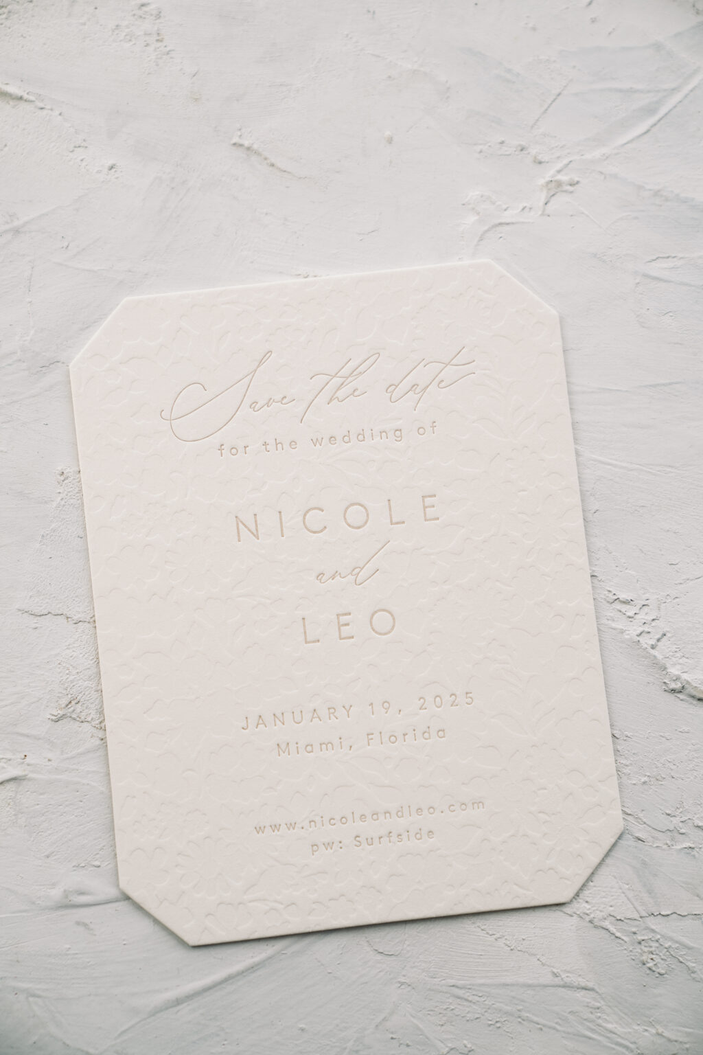
The design is based on our Lawrence save the date. Nicole and Leo’s interpretation is the same size and die-cut shape. They eliminated the serif font from the original and utilized the script font more. The khaki letterpress on our ivory paper is very subdued, setting a tranquil tone, while the blind deboss pattern printed across the entire card adds a tactile element.
Save the Date
letterpress: khaki
deboss: blind
font: brown + beloved gray
paper: bella smooth cotton ivory 2-ply
card size: a-2
die cut shape: franklin (BF-71)
liner: khaki text
envelope: ivory cotton text pointed flap
envelope addressing: cinder digital on the front and back
job #70833
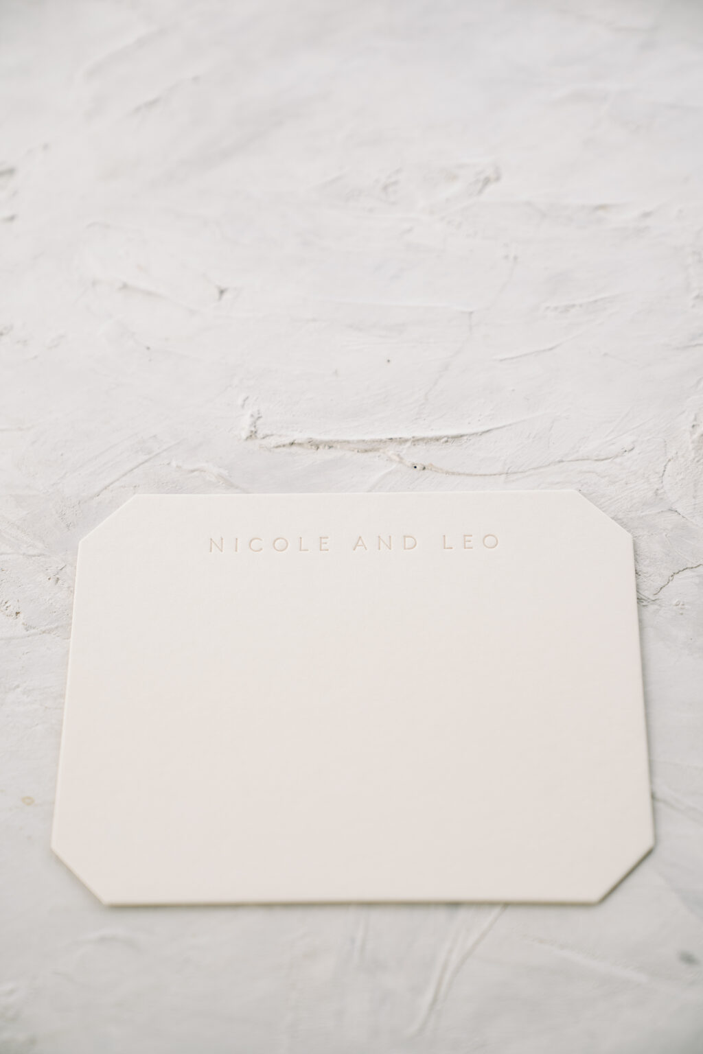
The couple decided to print coordinating thank you cards at the same time. The thank you card design closely mimics the save the date. The blind deboss pattern appears on the back of the thank you card, maintaining consistency across the pieces while allowing for a smooth surface to write a note. The save the date and flat thank you card are the same size, so one style of envelope works for both.
Flat Thank You Card
letterpress: khaki (front)
deboss: blind (back)
font: brown
paper: bella smooth cotton ivory 2-ply
card size: a-2
die cut shape: franklin (BF-71)
liner: khaki text
envelope: ivory cotton text pointed flap
envelope addressing: cinder digital on the front and back
job #70833
Are you interested in a save the date or in need of social stationery? Contact us to customize one of our existing designs or to create something entirely new and one-of-a-kind.
Paper Affair Dallas helped us to create these monogrammed letterpress wedding invitations for Catherine and Justin. Inspired by our Annata design, a floral cartouche situated at the top of the invitation held the letterpress monogram. Typography in Antique Gold and Black letterpress inks followed beneath with a traditional structure. The accommodations card as well as the reply card features similar floral imagery imagined in different ways. Finally, the thank you card used the same floral cartouche and monogram to keep everything cohesive.
The windy city was the back-drop to Jennifer and Michael’s wedding this past September. The couple worked with Magnificent Milestones who helped bring their Chicago skyline wedding invitations to life. Silver Matte foil and Shale letterpress ink kept the color palette cool and harmonious. The suite contained a corresponding reply card, details card, as well as a monogrammed thank you set to match. Finally, the pocketfold printed with a geometric pattern kept all the pieces together. The couple also took advantage of our day-of promotion and ordered matching programs, menus and place-cards.
Our Townsend design has sparked many customizations and we’re excited to share Hayley and Gregory’s version. Their silver foil wedding invitations with calligraphy created an elegant impression for the event to come. Sarah Hanna’s Honoured style shining brightly in Silver Matte foil adds a personalized accent to the set. The remainder of the text as well as the border printed in Charcoal letterpress keeps a cool color palette. The reply card, rehearsal dinner card, and a coordinating thank you card also contain the same border. Finally, to finish the suite, they added an envelope liner in our geometric pearse pattern. Thanks to the help of Papery and Cakery for bringing this suite together!
Foil color: Silver Matte | Letterpress color: Charcoal | Hand Calligraphy: Custom Honoured by Sarah Hanna | Fonts: Utrecht | Design: Townsend | Paper: 3 ply Bella Cotton White | Size: F8 | Envelope liner: Pearse in Charcoal | Customization: 42145 | Papery and Cakery