Our wedding release is easily one of the things I look forward to most each year. It’s a time to explore new styles from trendy to timeless, spotlight new offerings from our library, and push the boundaries of what we can do.
The open-endedness can truthfully be a bit daunting for me. Sometimes, a concept comes together quickly; other times, it takes a while to come to fruition. Regardless, the start of the process for me is always the same — a trusty Pinterest board. I start by pinning anything that catches my eye: patterns, color palettes, artwork, photos, anything. From there, I sort through everything, grouping what feels cohesive, allowing me to see the things I’m drawn to and start to conceptualize my new designs for the wedding release.
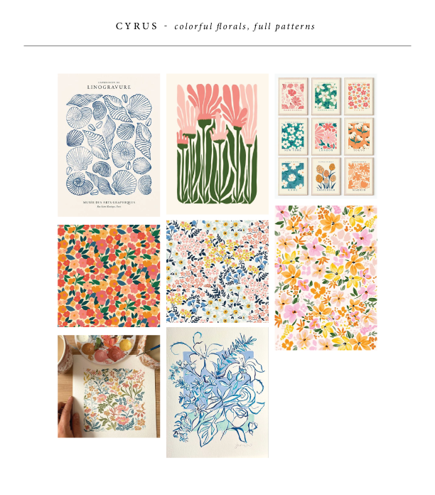
Cyrus
Cyrus was born from dense florals, fun colors (I had to use our new Verdigris, Lilac, and Rouge inks here!), and modern typography. Creating these florals that fit together like puzzle pieces was quite the challenge, but it brings almost an art print feel to the set.
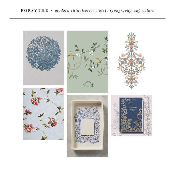
Forsythe
Forsythe was one of those ones that came together quickly — my inspiration led me to an updated, modern chinoiserie feel. A delicate, hand-drawn floral branch is utilized throughout the set. The soft blue inks beautifully contrast with the pale ribbon and velvet accents. Our belly band assembly set up on the back of the invitation has been a hit. The custom die-cut tag felt like the perfect way to elevate that.
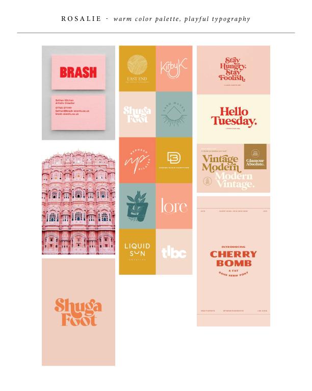
Rosalie
Rosalie came from a color palette that seemed to catch my eye — soft pink and bright red. This was the perfect place to show off our new Ballet paper and Chili ink, with tonal accents in Bellini. I knew whatever direction this took, it had to be fun and playful. A vintage Palm Springs vibe felt right, with cheery illustrations and whimsical typography.
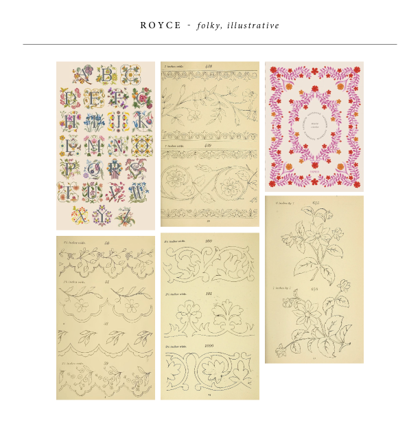
Royce
Royce was the last design to come together, but it may just be my personal favorite. This set came alive from vintage embroidery transfers that I stumbled upon. I started with the flower digital illustrations you see on the folder, invite, and save the date. Then, I created the additional borders for the other pieces. It feels a little chaotic, but at the same time, cohesive. My favorite part about this is easily the folder — I think it perfectly showcases the entire set without one piece overpowering the other.
Our 2025 Spring Collection is here! This mini release includes five re-imagined versions of some of our popular designs. These designs feature plenty of motifs, unique die cuts, and new offerings, like custom-converted envelopes. See more of our Spring Collection and get inspired!
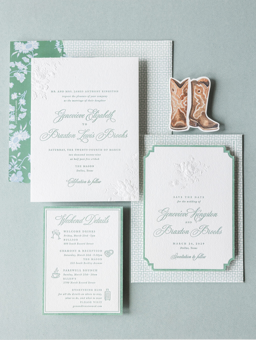
Braxton V.2
Blind sculpted embossing creates a contoured appearance, giving the floral accents on the Braxton V.2 save the date added dimension. Our Lincoln die cut, coupled with the script font, further elevates the look and sets the tone for a lavish affair.
The same floral accents from the save the date are repeated on the invitation, but this time, the floral artwork adorns opposite corners instead of being centered. Using the same artwork maintains consistency, but breaking it up keeps things new and fresh while giving the invitation a balanced feel.
The after-party card is much more casual and features a fun die cut in the shape of cowboy boots.
Invitation
letterpress ink: verdigris
sculpted embossing: blind
fonts: itc galliard pro + mozart script
paper: bella cotton white 2-ply
invite size: f-8 (tier 3)
custom converted envelope: bella cotton white text
envelope printing: braxton v.2 floral pattern in verdigris + french blue dg (interior) + gwynn pattern in verdigris (exterior)
Save the Date
letterpress ink: verdigris
sculpted embossing: blind
fonts: itc galliard pro + mozart script
paper: bella cotton white 2-ply
card size: a-7 (tier 3)
diecut style: lincoln
After Party Card
letterpress ink: verdigris (back)
digital ink: cmyk (front)
fonts: itc galliard pro + mozart script
paper: bella smooth cotton white 1-ply
card size: custom cut 3 x 3.25 (tier 1)
diecut style: bf-143
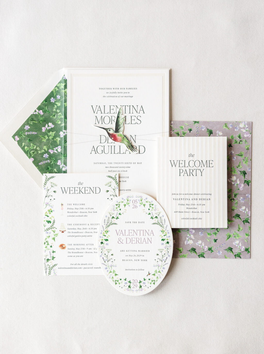
Derian V.2
The floral accents and charming hummingbird die cut of Derian V.2 are perfect for a garden-themed wedding. The front of the invitation is stately and formal, while the back printing is a subtle and fun way to incorporate a personal touch and the darling floral pattern. The same floral pattern appears on the back of the invitation and the envelope liner, with a different background color.
The stripes on the welcome party card are reminiscent of the border on the invitation, creating a connection between these cards.
liner: derian v.2 ivy vines pattern in vine + cmyk
metallic thread: amethyst
envelope: bella cotton ivory pointed flap
digital addressing inks: cypress + cmyk
Welcome Party Card
letterpress inks: cypress + sand
font: ivy presto
paper: bella smooth cotton ivory 2-ply
card size: a-2 (tier 1)
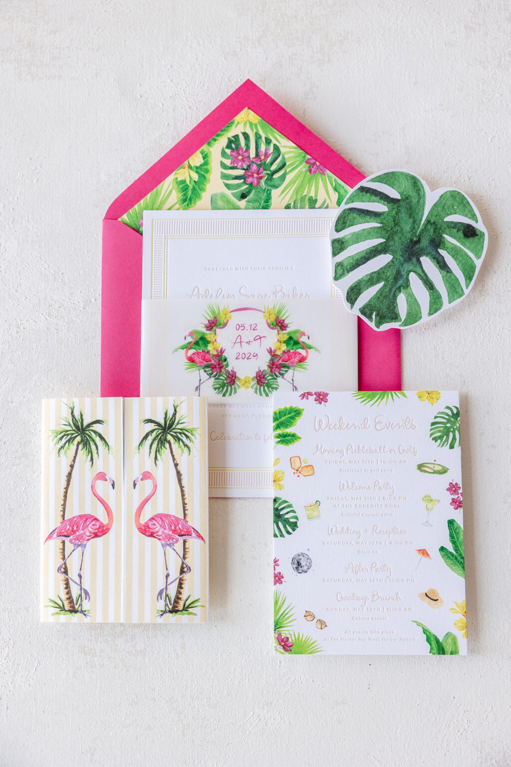
Duval V.2
Duval V.2 has a tropical flair. The names appear in the Eternal Blossom font, which is a casual font with a grand presence. The vellum belly band features a crest with the bride and groom’s initials for a touch of whimsy and a burst of color.
This design has two fun die cuts: the reply card, which is shaped like a monstera leaf, and the rehearsal dinner card, which is shaped like a clamshell. Digital printing on the front helps bring these die-cut shapes to life.
gatefold size: 9.31 x 6.19 flat, 4.62 x 6.19 closed
Reply Card
letterpress ink: bellini (back)
digital ink: cmyk (front)
font: eternal blossom + sweet sans
paper: bella smooth cotton bright white 1-ply
card size: custom cut 4.4 x 4.69 (tier 1)
diecut style: bf-146
Rehearsal Dinner Card
letterpress ink: bellini (back)
digital ink: cmyk (front)
font: eternal blossom + sweet sans
paper: bella smooth cotton bright white duplexed 2-ply
card size: custom cut 4.69 x 4.3 (tier 1)
diecut style: bf-145
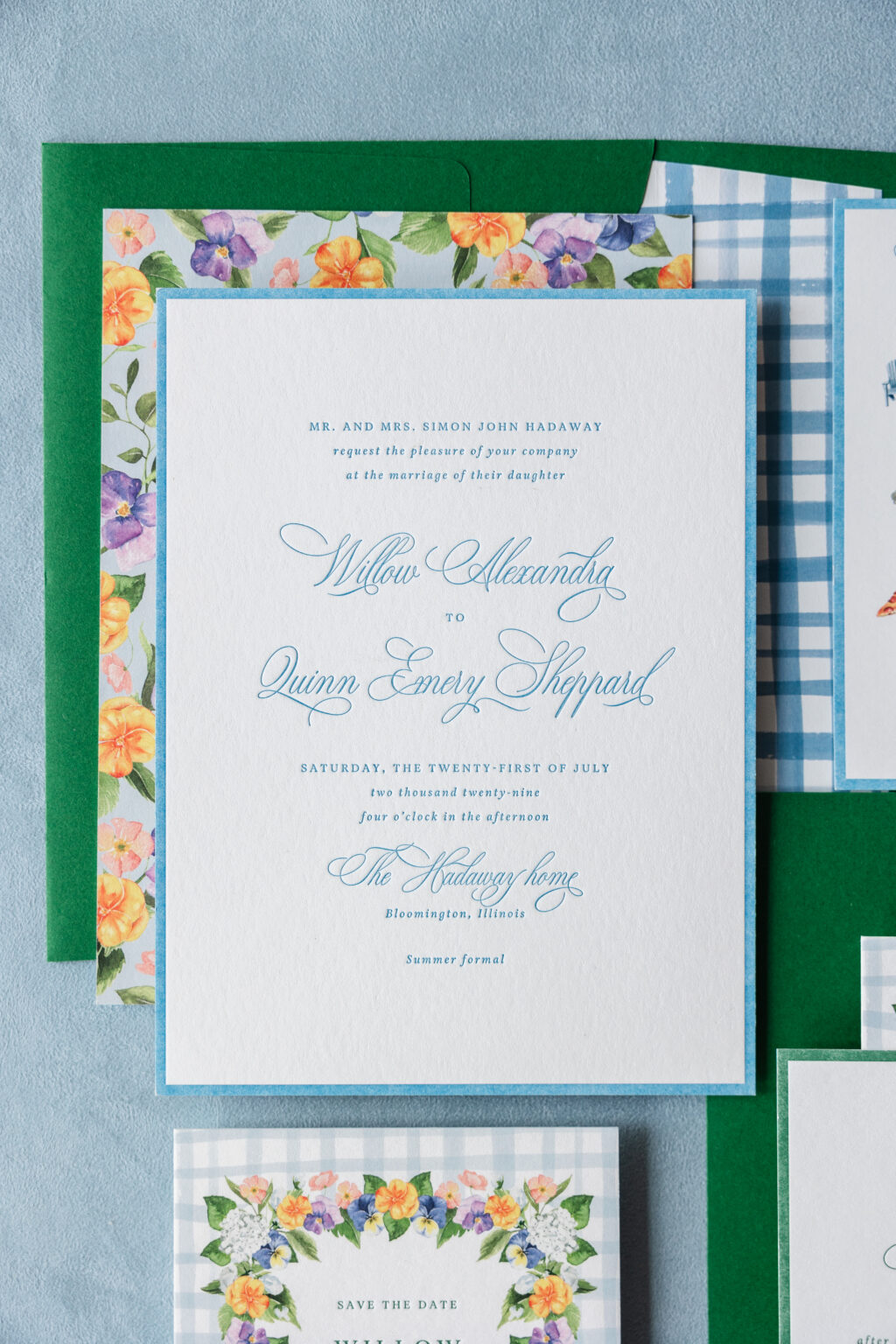
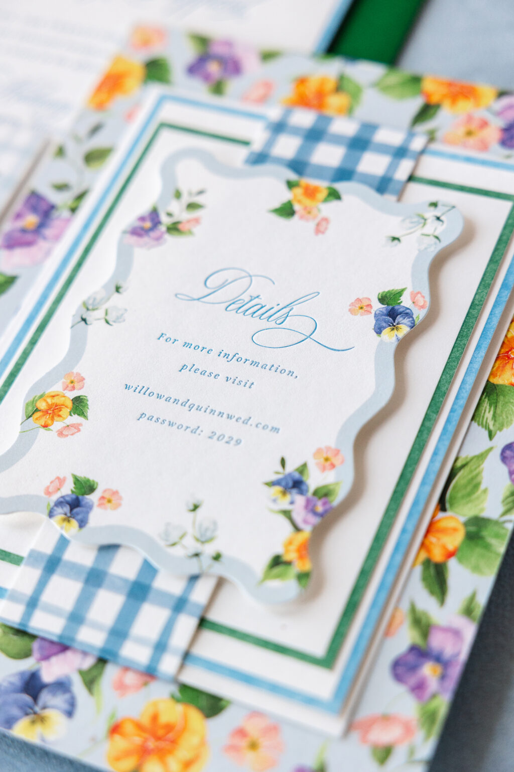
Hadaway V.2
Hadaway V.2 embodies a spring vibe. Wedgewood letterpress printing coordinates with the rustic gingham-patterned liner and belly band. The floral border on the save-the-date reappears on the mounting card, creating a cohesive feel across the various pieces. Motifs representative of the events listed on the details card are fun, informative, and help set the tone for the weekend.
Invitation
letterpress ink: wedgewood (front)
digital inks: wedgewood (belly band) + powder blue + cmyk (back)
fonts: aria text + stipa willington
paper: bella smooth cotton white duplexed 2-ply (card) + 1-ply (belly band + mounting card)
invite size: f-8 (tier 3)
mounting card size: custom cut
belly band size: custom cut 1.75 x 8 flat, 1.75 x 6.45 assembled
liner: jenson stripes gingham pattern in wedgewood
custom converted envelope: leaf text
digital addressing ink: white
Details Card
letterpress ink: wedgewood
digital inks: powder blue + cmyk
fonts: aria text + stipa willington
paper: bella smooth cotton white 1-ply
card size: a-5 (tier 1)
diecut style: cd-620
Events Card
letterpress ink: wedgewood
digital ink: cmyk
fonts: aria text + stipa willington
paper: bella smooth cotton white 1-ply
card size: a-6 (tier 2)
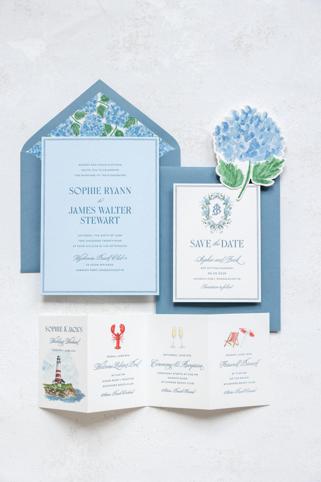
Ryann V.2
Ryann V.2 rounds out our Spring Collection and showcases everything central to a coastal New England affair. The invitation features yale letterpress ink on 2-ply sky paper for a timeless and elegant appearance. The envelope is custom converted from using storm text and bears a liner pattern created from overlapping hydrangea blooms. Hydrangeas also appear as part of the crest on the save the date and as a die-cut website card. The accordion fold details card relays useful information for guests and features watercolor motifs.
Invitation
letterpress ink: yale
fonts: 1769 display + wordless script + questrial
paper: sky 2-ply
invite size: f-8 (tier 3)
edge painting: yale
liner: ryann v.2 hydrangea pattern in cmyk
custom converted envelope: storm text pointed flap
digital addressing ink: white
Details Card
letterpress ink: yale
digital ink: cmyk
fonts: 1769 display + wordless script + questrial
paper: bella smooth cotton white 1-ply
card size: a-5 13.52 x 4.75 flat, 3.38 x 4.75 folded (tier 3)
Our 2025 Spring Collection is timeless and on-trend, and effortlessly demonstrates how to blend different printing methods and embellishments to create something one-of-a-kind. Did any of these designs or aspects of these designs catch your eye? Contact us to learn more and start working on your custom wedding invitation.