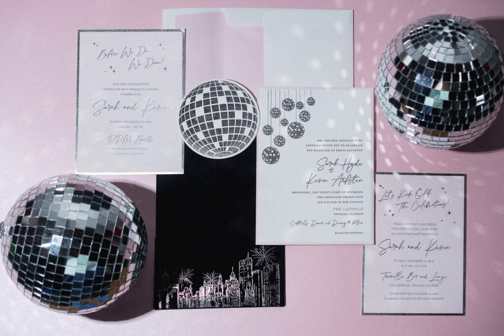
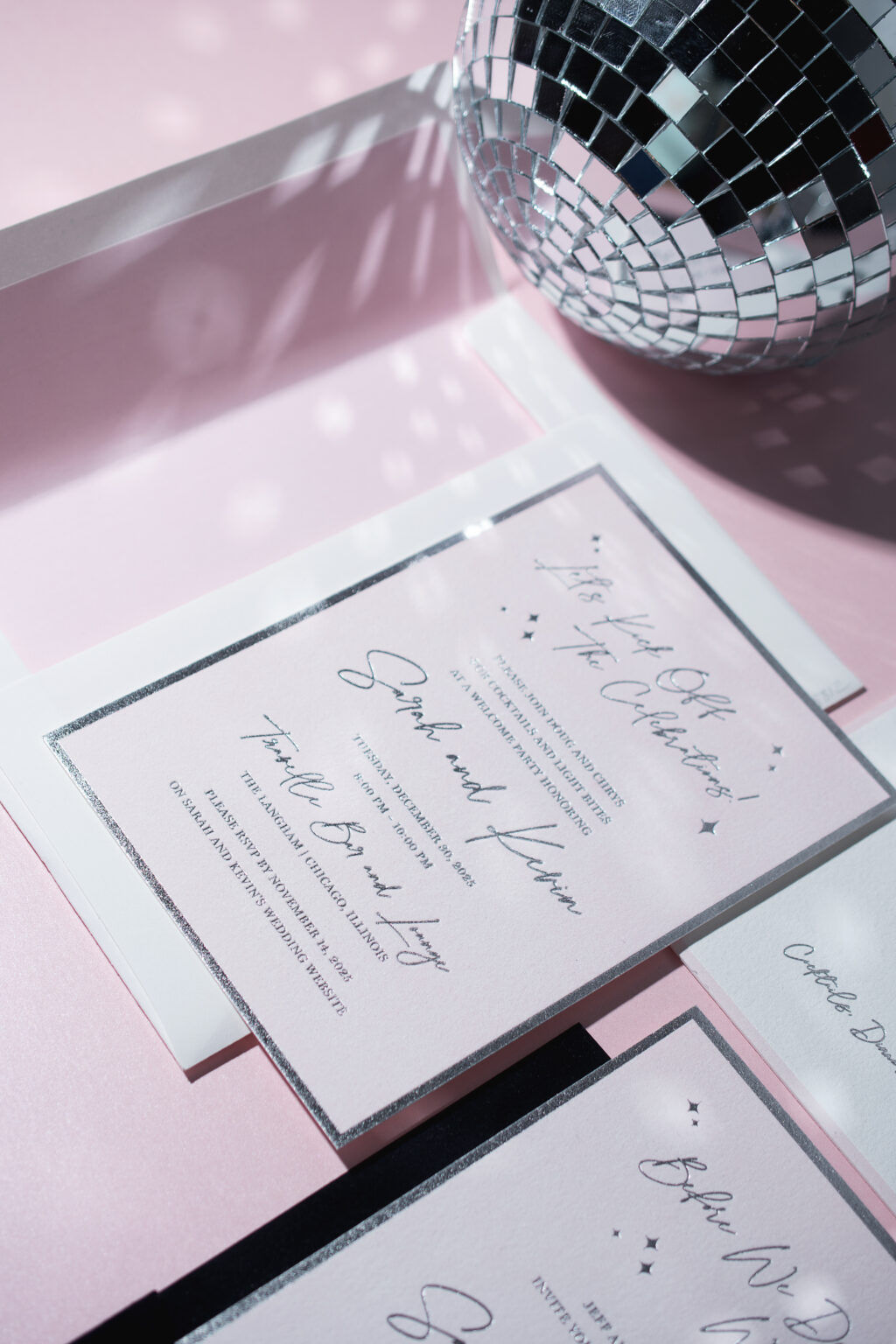
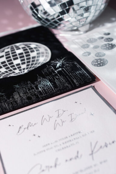
Happy New Year! We’re excited to share this modern, disco-glam invitation suite, brought to us by our dear friend Christy from Eventful Designs. This custom-designed suite features chic disco balls in silver shine foil and a dreamy velvet pocket panel with a hand-illustration of the Chicago skyline! See more of these glam New Year’s Eve wedding invitations.
Invitation
letterpress ink: black + PMS 9300U
foil stamping: silver shine
papers: bella cotton 2-ply white
card size: f-8 for pocketfold
envelope liner: classic color pattern digitally printed in PMS 9300U on white text
envelope: white cotton text
job: 777242
Reply Card
letterpress ink: black (back)
foil stamping: silver shine (front)
papers: bella cotton 2-ply white
card size: 4-inch circle
die cut: bp-23
job: 777242
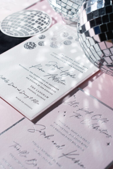
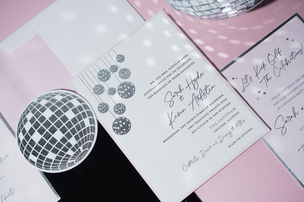
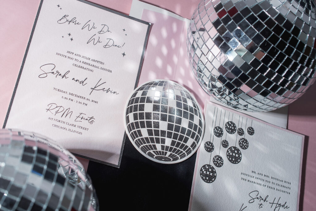
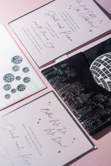
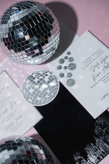
The invitation features disco-ball artwork that corresponds to the circular die-cut reply card. Silver shine foil stamping mimics the mirrored surface, adding sparkle, dimension, and a celebratory feel to these pieces. The double-sided reply card features black letterpress printing on the reverse (not shown in the pictures).
The bride and groom’s names appear on the invitation in silver shine foil, while the remaining text appears in black letterpress. A thick border is letterpress-printed in a delicate pink hue, introducing romance and glamour and balancing the modern sophistication of the black letterpress and silver foil.
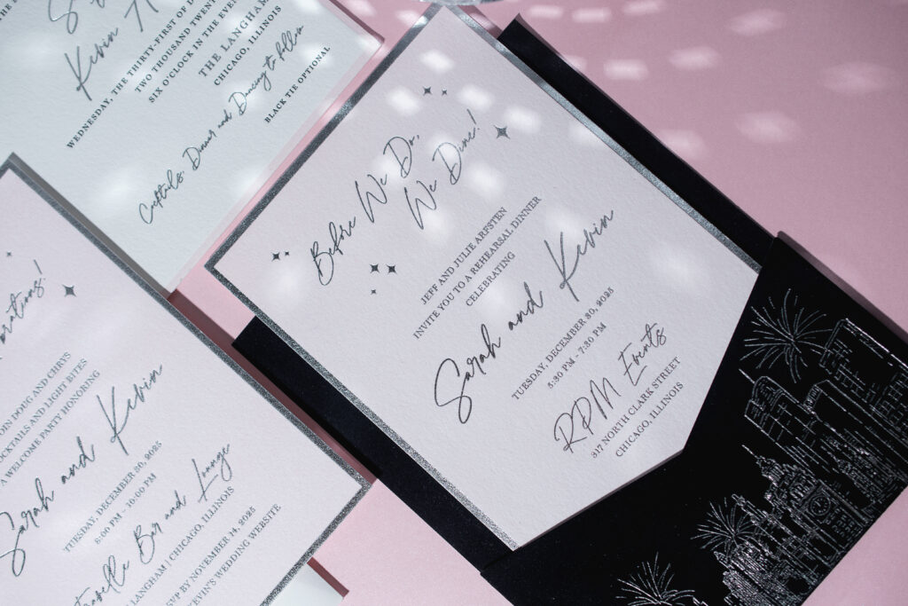
The rehearsal dinner invitation and welcome party card flip the look of the invitation. These cards are letterpress-printed with a pink flood. This technique creates the look of color paper while ensuring a perfect color match to the invitation and the envelope liner. These cards are then foil-stamped in silver-shine foil, complete with a thick border framing the text.
Rehearsal Dinner Invitation
letterpress ink: PMS 9300U
foil stamping: silver shine (front)
papers: bella cotton 1-ply white
card size: a-7
job: 777242
Welcome Party Card
letterpress ink: PMS 9300U
foil stamping: silver shine (front)
papers: bella cotton 1-ply white
card size: a-7
job: 777242
The pocket panel is next level. This piece is an F-8-sized card with a pocket adhered to it, creating a spot to stash all the cards in the suite for a neat, stylish presentation. The panel features our Bella velvet in Midnight. The velvet stock is adhered to our Ultra Black 1-ply stock to give the piece structure. The pocket bears a custom illustration of the Chicago skyline, complete with fireworks!
Pocket Panel
foil stamping: silver shine
papers: bella velvet midnight (pocket and panel front) / ultra black 1-ply (pocket and panel back)
card size: f-8 vertical back pocket
finishing: duplex velvet to ultra black stock, then adhere the pocket to the panel
job: 777242
The celebratory design is fun and luxurious, and perfect for a New Year’s Eve wedding. Congratulations to Sarah and Kevin! Do you want glamorous invitations with the shimmer of foil or a stunning velvet pocket panel? Would a city skyline illustration set the tone for your celebration? Locate one of our dealers to browse samples and swatches and receive expert guidance.
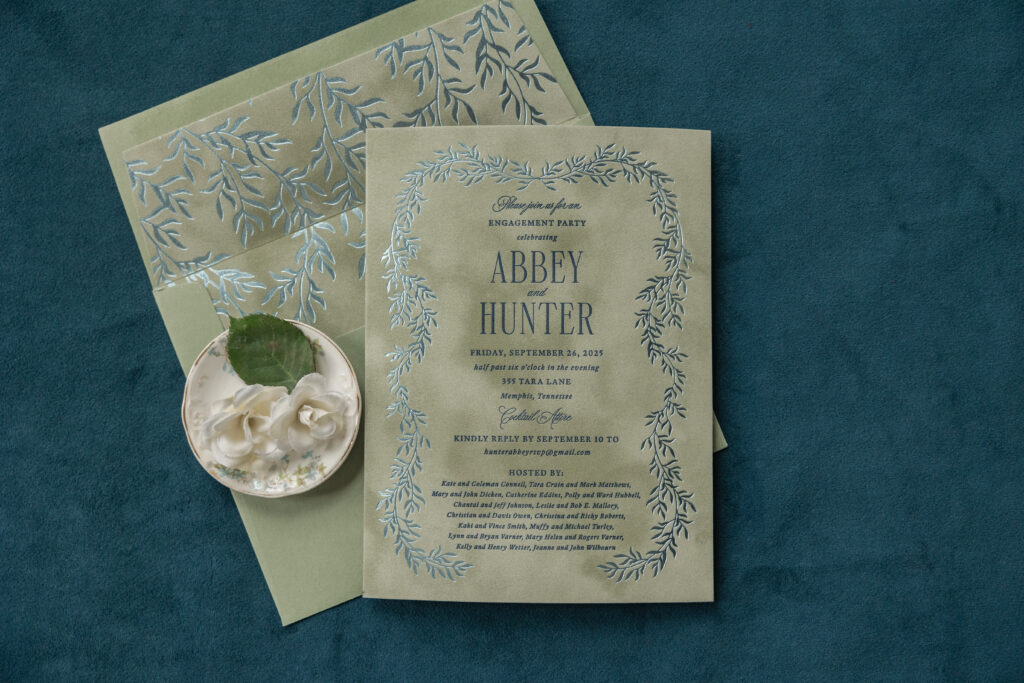
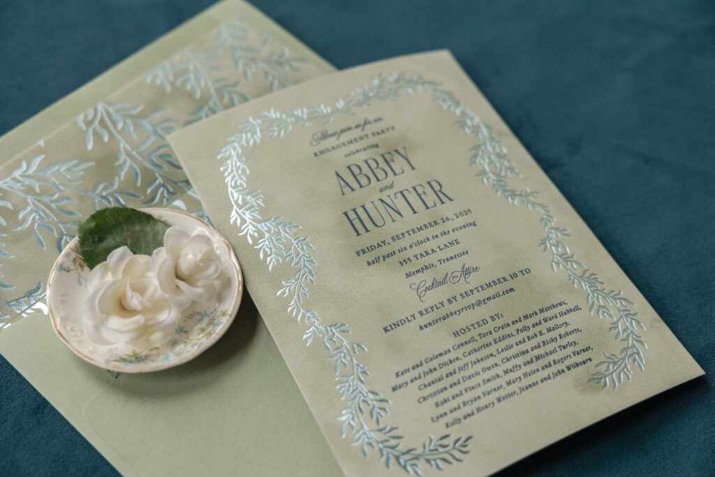
These engagement party invitations have a refined botanical design that is classic and elegant with a touch of vintage charm. Our velvet stock adds warmth and texture and holds a crisp impression for both the letterpress printing and foil stamping. This invitation is a customization of the welcome party card from our Kinsley design and came to us from our dear friend Lindsey at Mrs. Post Fine Stationery & Gifts.
envelope liner: kinsley pattern in ice shine foil on asparagus velvet
envelope: spruce text
envelope addressing: navy digital on the back
job: 77876
Velvet paper is soft and dreamy and introduces a wonderful texture. The cascading foliage in the design is almost rustic and complements the velvet’s texture. The branches gently bend and curve, creating a delicate wreath-like frame that encircles navy letterpress-printed text. The sheen of our ice shine foil elevates the design, creating a luxurious, upscale vibe. The velvet front is duplexed, or adhered to our spruce paper in 1-ply, giving the card structure and a more substantial feel.
A reimagined version of the foliage artwork appears as a pattern on the envelope liner. Velvet stock in asparagus is again paired with foil stamping in ice shine for a cohesive feel. The look is formal but still relaxed.
Congratulations to Abbey and Hunter on their engagement, and as always, it’s a pleasure to work with Mrs. Post Fine Stationery & Gifts. Are you thinking about romantic, garden-inspired engagement party invitations? Or do you want your invitations to feature the glimmer of foil against the texture of velvet? Locate one of our dealers to see samples and swatches and receive expert guidance.
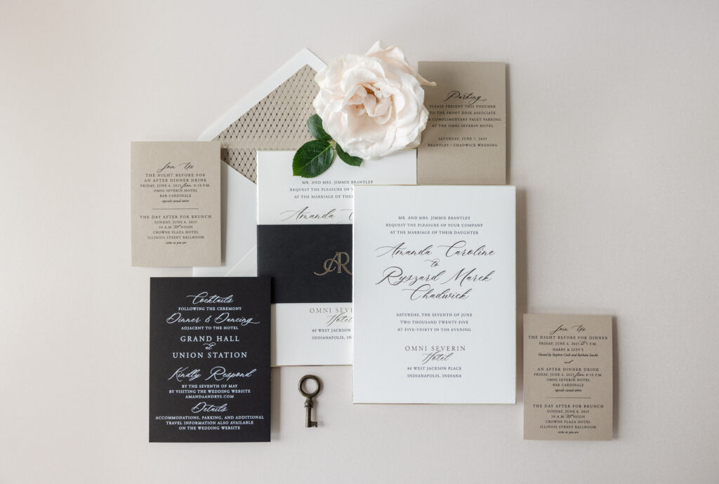
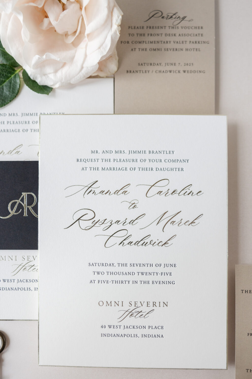
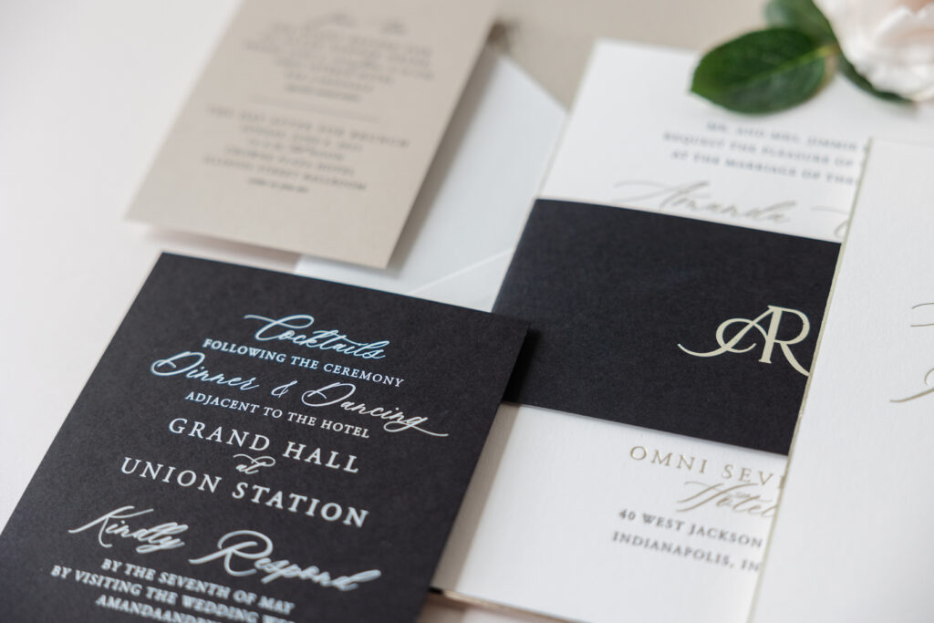
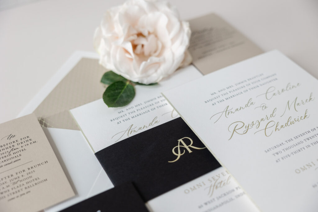
Amanda and Ryszard’s wedding invitation suite has a classic, refined, and timelessly elegant style with a modern luxury twist. This couple worked with our dear friend Kristyn from Oliver’s Twist to create these sophisticated and formal invitations.
A clean, minimal layout with generous white space draws the eye to the bride and groom’s names, set in a modern, sweeping script font. The use of foil stamping further emphasizes the couple’s names and adds some glimmer and contrast to the black letterpress printing. The same color foil, tawny shine, also appears on the beveled edge, highlighting the sharp 45-degree angle.
Invitation
letterpress ink: black
foil stamping: tawny shine
font: slight + garamond
papers: bella smooth cotton 2-ply white
card size: f-8
bevel: 45-degree
foil edge: tawny shine
envelope liner: richmond pattern in tawny shine foil on metallic sand text
envelope: white cotton text pointed flap
envelope addressing: black digital on the front and the back
job: 76120
Belly Band
foil stamping: tawny shine
font: slight + garamond
papers: ultra black text
card size: f-8 vertical belly band (3 x 13.25 open, 3 x 6.24 closed)
job: 76120
The wide belly band, featuring the couple’s initials in tawny shine foil, adds an upscale vibe. The way the monogram merges the letters is symbolic and romantic and completely fits the look and feel of these bevel and foil-edge wedding invitations.
The envelope liner is neutral and subtle. Our Richmond pattern, which is both formal and geometric, is foil-stamped in tawny shine on our metallic sand text-weight stock. The look is elegant and perfectly coordinates with the entire suite.
Reply Card
digital ink: white
font: slight + garamond
papers: ultra black 1-ply
card size: a-6
job: 76120
The reply card switches up the color palette from the invitation and features white digital printing on black stock. The design is modern and dramatic while maintaining the formal aesthetic. The event card follows suit by featuring black digital printing on our metallic sand stock. Multiple versions of the event card were printed to address the various events held during the wedding weekend.
Event Card
digital ink: black
font: slight + garamond
papers: metallic sand 1-ply
card size: a-5
job: 76120
It was a joy to work on Amanda and Ryszard’s bevel and foil-edge wedding invitations. The suite is refined and modern while featuring classic design elements. Are you dreaming of luxurious wedding invitations or a custom monogram? Work with one of our dealers to see ink and paper swatches and receive expert guidance to create the perfect invitation set for your big day.
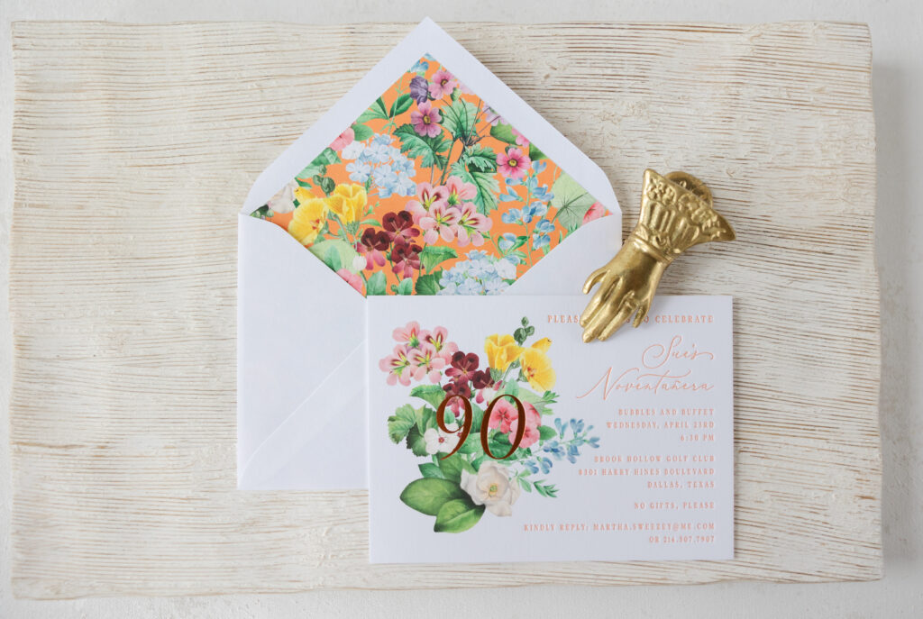
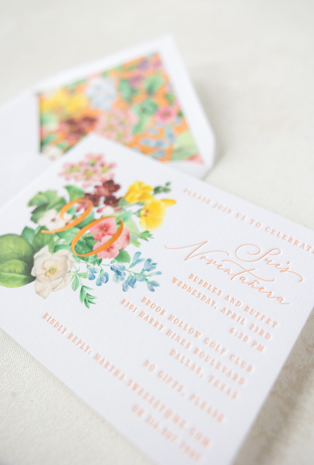
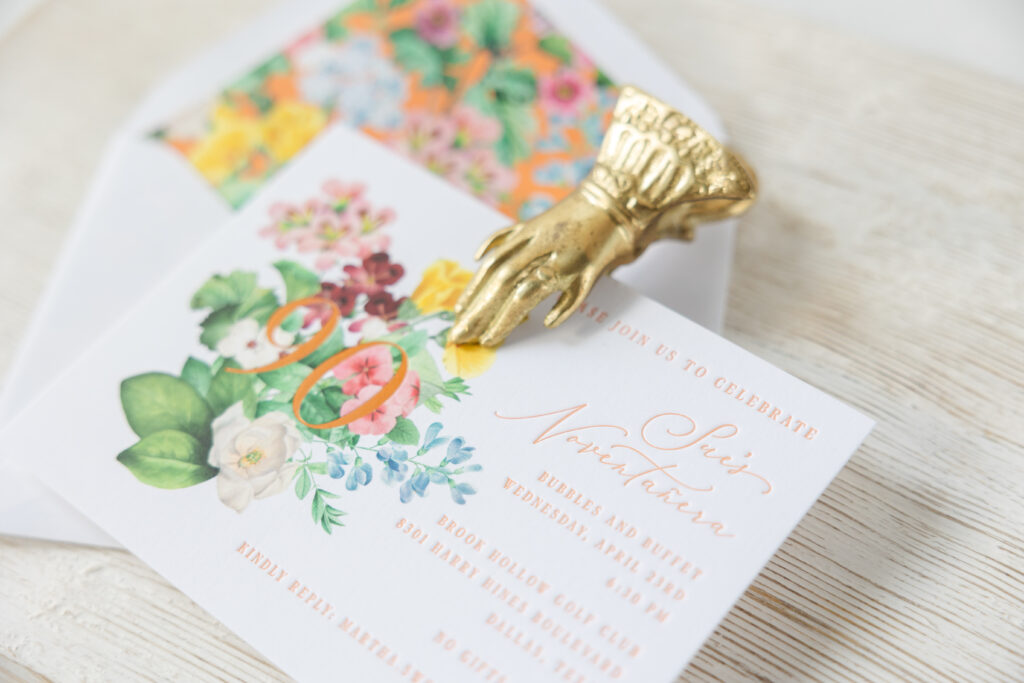
We worked with our dear friends at Ellis Hill to create these bright, cheerful, and garden-inspired birthday party invitations. This invitation blends vintage floral artwork with modern typography for a classic yet still contemporary look. The card is modeled after our Gweneth save the date design, and it’s a great example of how our designs can be customized for various events.
Invitation
letterpress ink: persimmon
foil stamping: copper matte
digital: cmyk
fonts: white garden + dark paradise
papers: bella smooth cotton bright white 2-ply
card size: a-6
envelope liner: gweneth pattern in cmyk + persimmonin digital on bright white text
envelope: bright white cotton text pointed flap
envelope addressing: cmyk + persimmonin digital on the back
job: 75870
Bold floral artwork introduces a celebratory tone and anchors the design. The guest of honor’s age is foil-stamped in copper matte over the digitally printed floral bouquet. The overlapping foil adds some glimmer and contrast against the lush, detailed flowers. Our Bella Smooth Cotton paper, in bright white, perfectly complements the bold, vibrant florals and the letterpress printing in our persimmon ink. The refined, flowing script font announces Sue’s Novetañera, or 90th. The supporting text appears in a serif font and is clean, structured, and easy to read, balancing the ornate florals.
The envelope liner is a statement piece on its own and showcases the lively, full-coverage floral pattern. The liner pattern uses the same floral artwork from the card over a digital flood of our persimmon ink, and is borrowed from the Gweneth invitation.
This birthday party invitation is joyful, celebratory, and absolutely perfect for such a milestone event. We hope Sue had the happiest of birthdays, and thank you to our dear friends at Ellis Hill for entrusting us with this job. Are you in need of invitations for an upcoming event? Contact us to start creating your invitations, or work with one of our dealers for expert guidance.
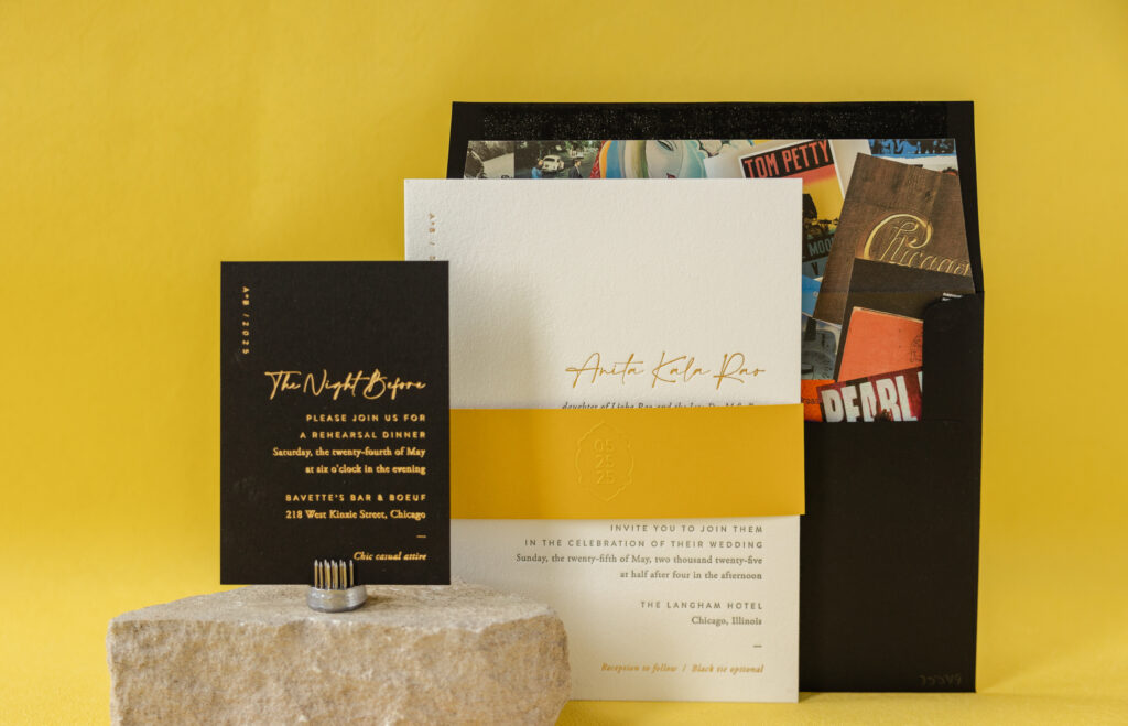
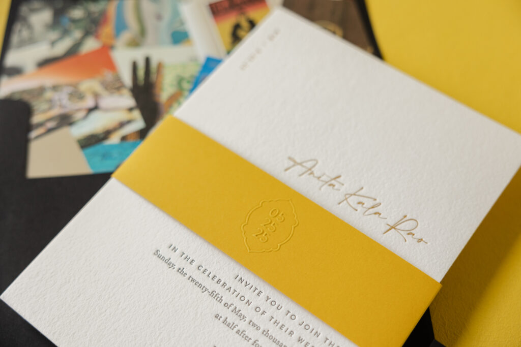
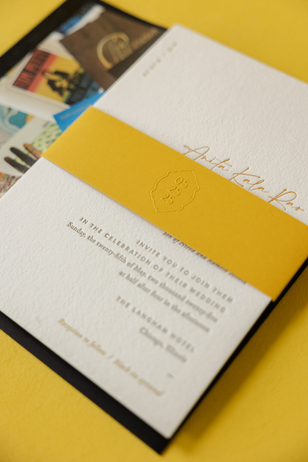
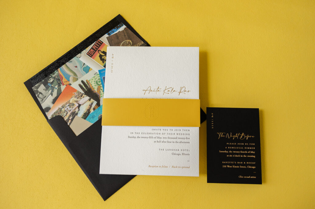
When our dear friend Erin from Smitten Boutique sent us this invitation design, we knew it would be stunning. This invitation is modern and sophisticated with a luxe edge and is paired with a one-of-a-kind envelope liner. These invitations are a custom design, loosely based on our now-retired Augusta. We no longer maintain samples when a design is retired, but we can still borrow elements or replicate the entire look for your custom invitations. See more and get the details on Anita and Brian’s luxe wedding invitations.
Our maize 1-ply is bold yet warm, ensuring the belly band stands out. The event date appears in blind emboss for a subtle, yet impactful look. The use of the cartouch around the date and the placement in the center of the belly band are very traditional choices; however, the vertical formatting of the date, which is edgy and modern, provides contrast.
Invitation
letterpress ink: dark gray
foil stamping: gold matte
fonts: amalfi coast + brandon
paper: bella cotton white 2-ply
card size: f-8
liner: custom-supplied pattern in cmyk on white text
envelope: ultra black
envelope addressing: white digital on the front and the back
job: 75549
Belly Band
emboss: blind
fonts: brandon
paper: maize 1-ply
card size: f-8 vertical (1.75” x 13.25” open, 1.75” x 6.24” closed)
job: 75549
The mix of fonts keeps the look contemporary while still being black-tie appropriate. Placing the couple’s initials and event date in the top-left corner is unexpected and a nice personal touch. Including this detail in gold matte foil is glamorous.
The initials and date are repeated on the rehearsal dinner invitation. This card features gold matte foil stamping on our ultra black stock, which drastically ups the glamour factor.
Rehearsal Dinner Invitation
foil stamping: gold matte
fonts: amalfi coast + brandon
paper: ultra black 2-ply
card size: a-5
job: 75549
Possibly, the standout piece of this wedding invitation suite is the envelope liner. The client supplied the artwork, which consists of many iconic album covers. This is a highly personal design choice that perfectly represents this music-loving couple. It’s a fun detail that is sure to capture guests’ attention.
Anita and Brian’s wedding invitations are chic and formal with a touch of modern glamour. The design is also fun and personal to the couple. It was an honor to help bring this vision to life, and as always, it is a pleasure to work with Smitten Boutique. Do you want to create invitations that are contemporary yet formal with a hint of luxe glamour? Or do you have an idea for an eye-catching envelope liner? Locate one of our dealers to see samples and swatches, and receive expert design tips and guidance.
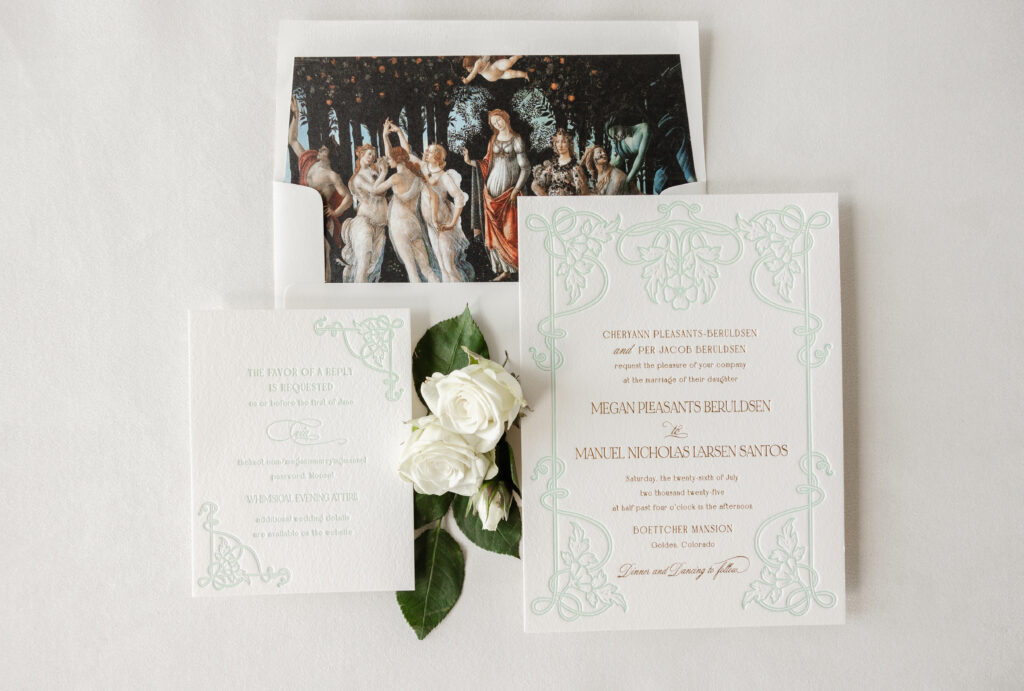
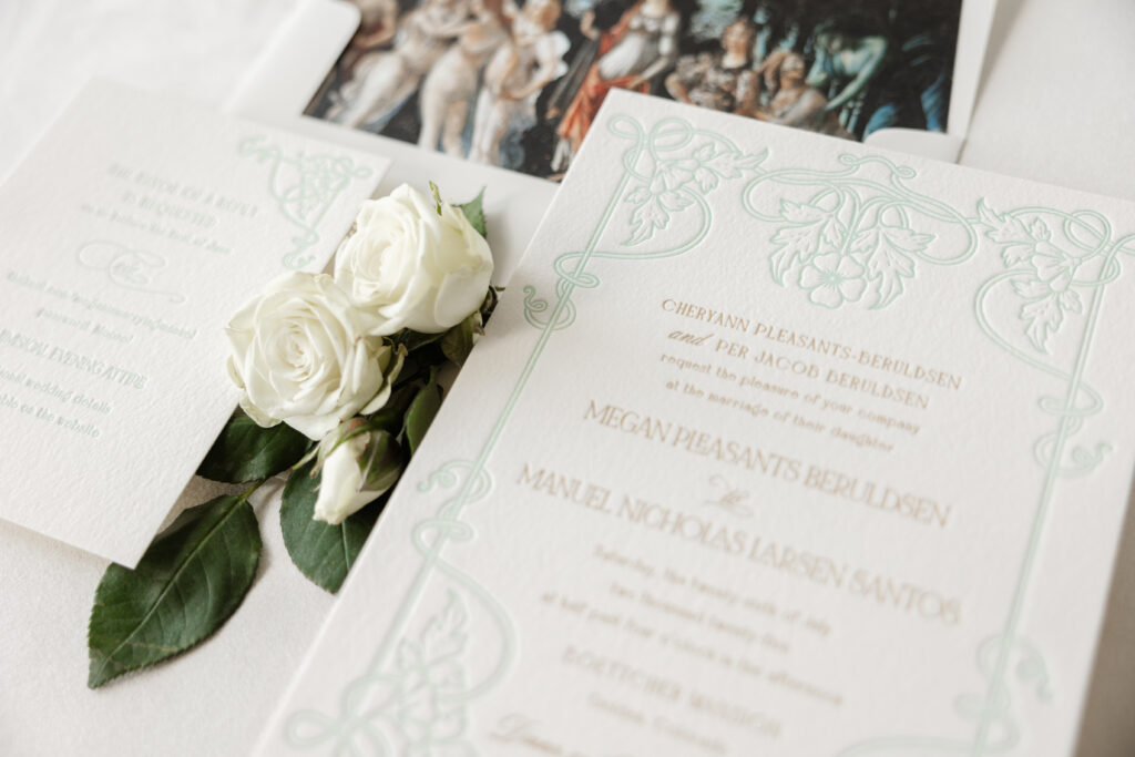
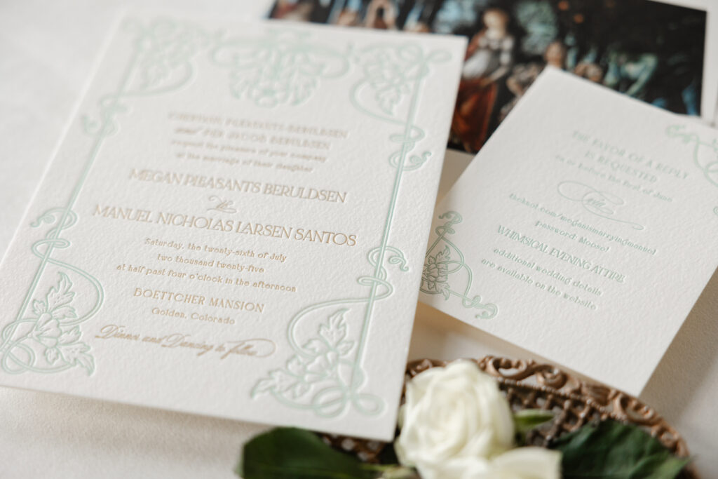
Megan and Manuel worked with our dear friend Hollis of Bering’s to create their stunning letterpress and foil-stamped wedding invitations. They chose to customize our Matilde design for their Colorado nuptials. The final design features unique details that speak to the couple and set the tone for their special day.
envelope liner: customer-supplied pattern in cmyk digital on ivory text
envelope: ivory cotton text
envelope addressing: antique gold digital on the front and the back
job: 76290
Reply Card
letterpress ink: sea mint
fonts: bigilla bold, mozart script regular, noir et blanc regular
papers: bella cotton ivory 1-ply
card size: a-2
job: 76290
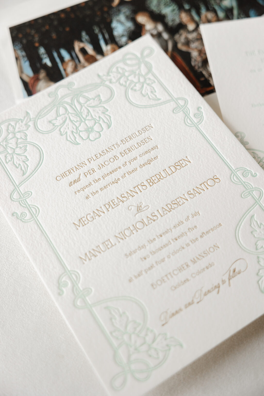
The intricate frame on the invitation appears in our sea mist letterpress ink. The light color allows the text, which appears in gold matte foil stamping, to stand out. The three fonts work together perfectly to introduce a fanciful, playful vibe while still maintaining a formal feel. The floral and foliage artwork beautifully coordinates with the garden elements of the artwork featured as the envelope liner.
The envelope liner features La Primavera, an artwork by Italian Renaissance artist Sandro Botticelli. The painting, believed to have been completed between 1477 and 1482, is located in a gallery in Florence and depicts a group of mythological figures in a lush garden setting. The painting is often interpreted as being a celebration of love.
The frame from the invitation was reimagined for the reply card. Breaking apart the artwork and using components of it in two corners maintains the consistency and formality without being identical. The reply card features the same fonts used in tandem to create an eccentric feel, perfectly suited for this whimsical affair.
Megan and Manuel’s letterpress and foil wedding invitations are lovely and personal, and it was a pleasure to help bring this couple’s vision to life. Whether you want to create an aesthetic with typography, use artwork for the envelope liner, or add personal details to celebrate you and your partner, we can help make it happen. Contact us to learn more or work with one of our talented dealers to create your dream wedding invitations.
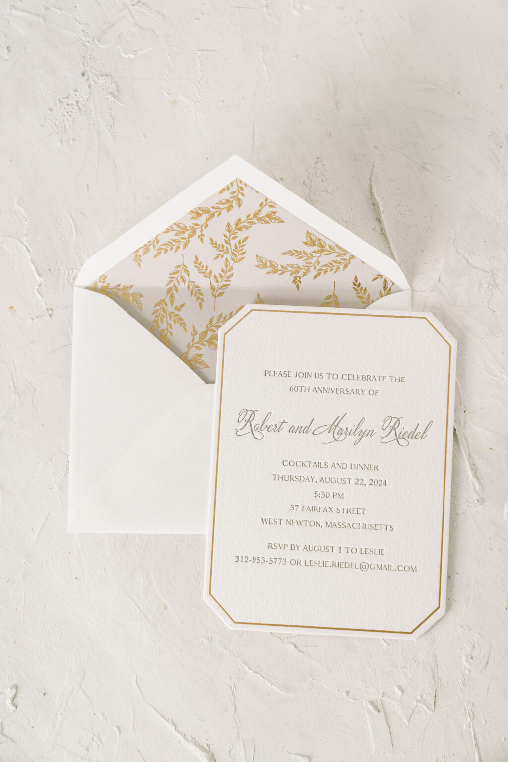
Everything about these stylish anniversary party invitations is timeless and elegant, from the die-cut shape to the combination of letterpress printing and foil stamping, and the foil-stamped envelope liner. We had the pleasure of working with our friend Lisa from Mark Harris Stationers to create these lovely die cut anniversary party invitations celebrating Robert and Marilyn.
Our Bella cotton paper is plush yet firm and holds a deep impression. Gold matte foil stamping creates a border that mimics the shape of our Franklin die-cut, accentuating the die-cut shape. Robert and Marilyn’s names appear in a script font that is formal yet still has a contemporary edge. The font’s flourishes add drama and contrast against the straight lines of the foil-stamped border.
Invitation
letterpress ink: pewter
foil stamping: gold matte
fonts: velvet hammer, antique regular, garamond
paper: bella cotton white 2-ply
card size: a-6
die cut style: franklin
die cut shape: BF-49
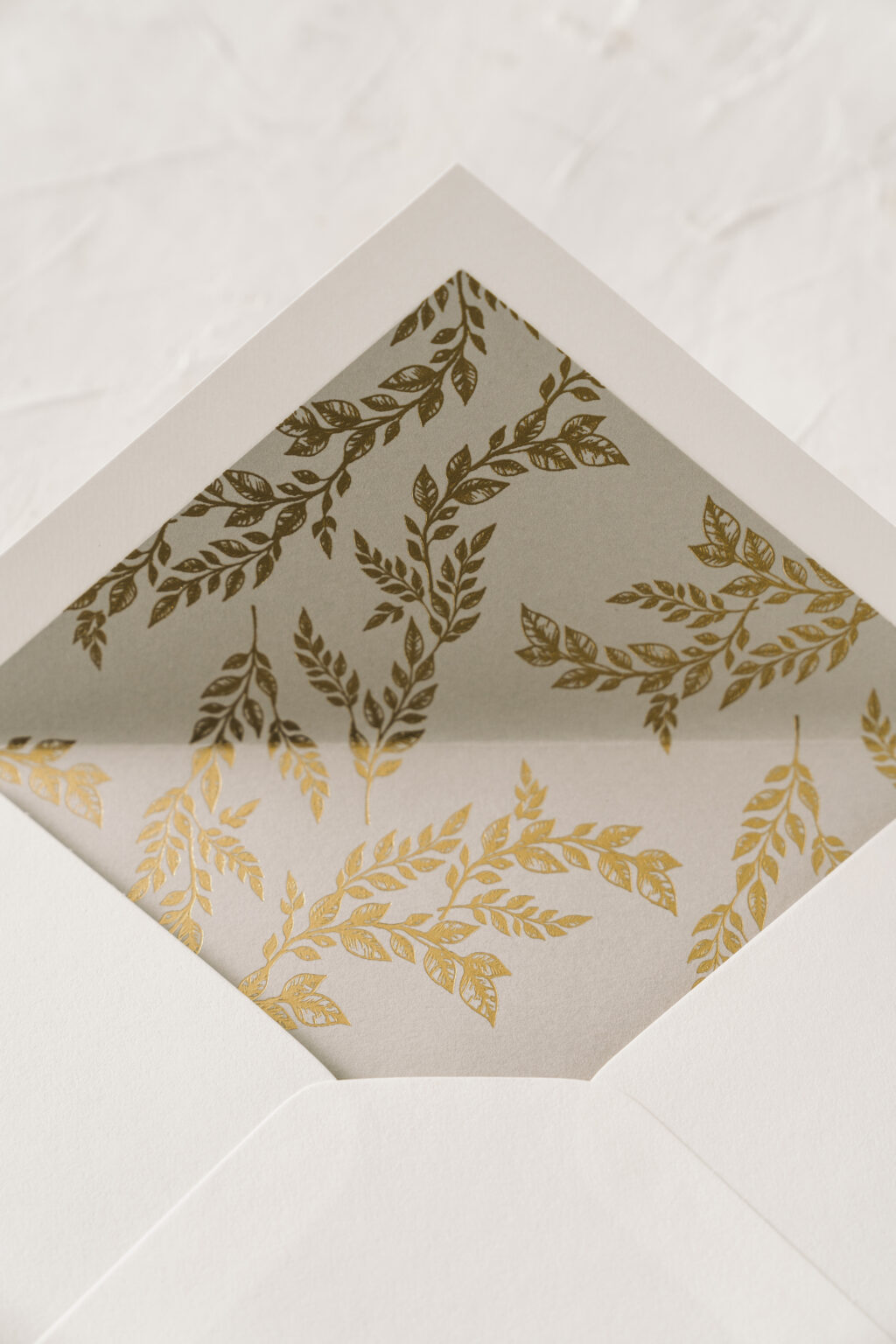
liner: marseille pattern in gold matte foil on light gray text
envelope: white text pointed flap
envelope addressing: pewter digital on the front and pewter letterpress on the back
job: 72325
The envelope liner features gold matte foil stamping on our light gray text, which beautifully coordinates with the pewter letterpress printing on the invitation.
It was a pleasure to create these custom die cut anniversary party invitations. Do you need invitations for an upcoming milestone celebration? Or are you interested in selecting the perfect die-cut shape or fonts for your design? Work with one of our dealers to receive tips and expert guidance on creating your custom invitations.
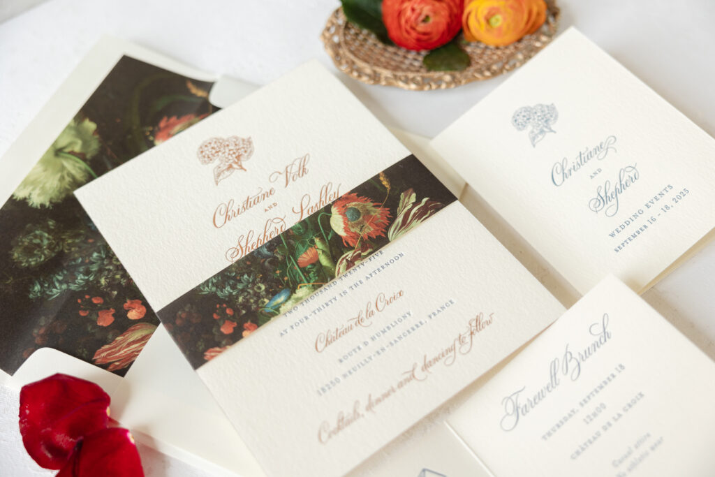
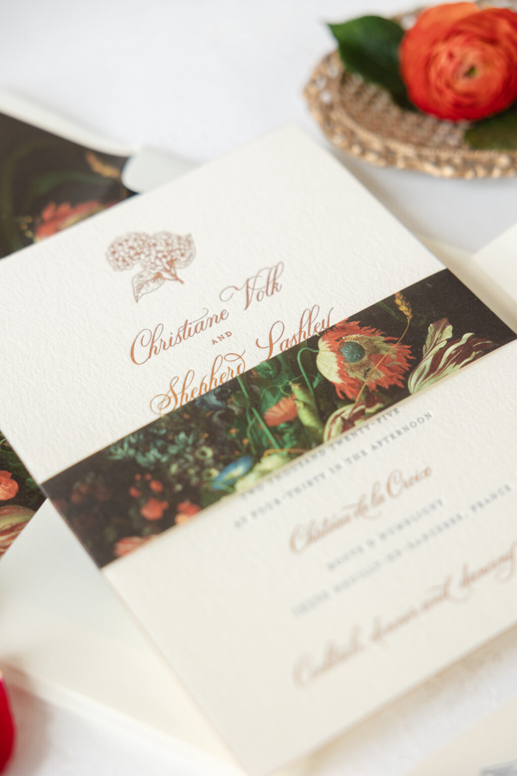
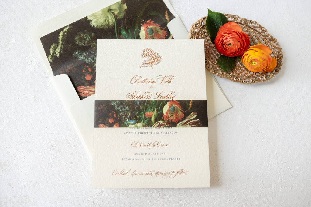
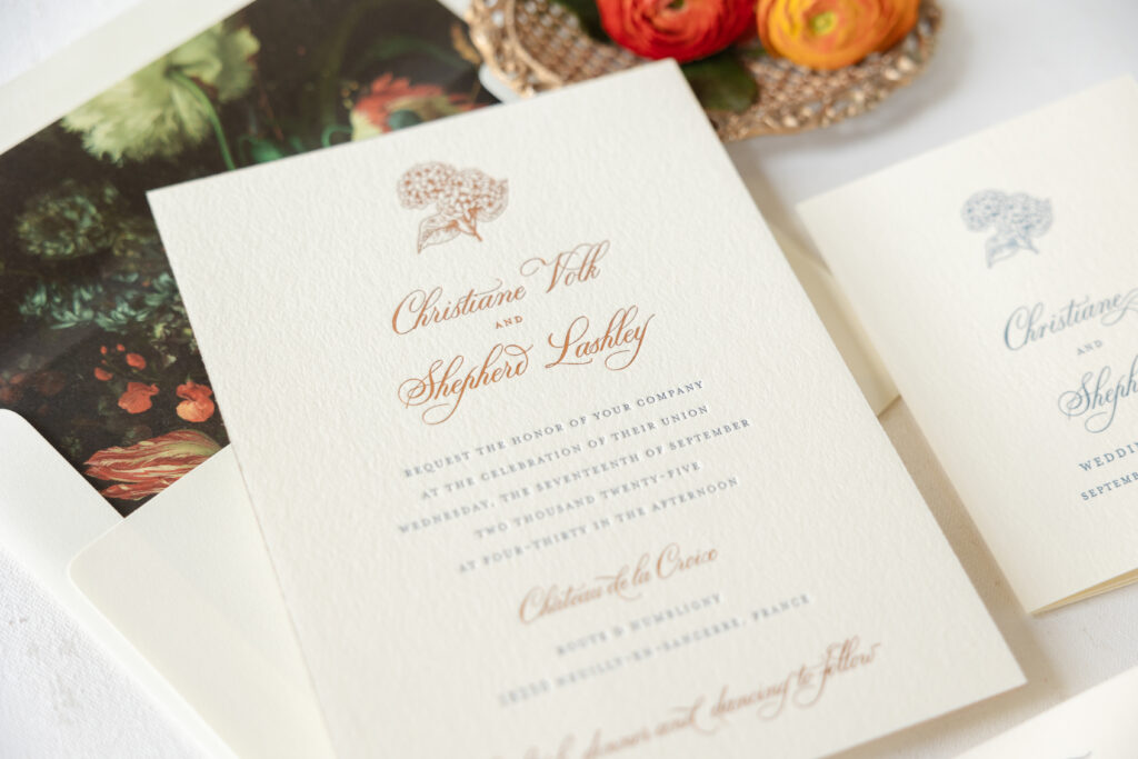
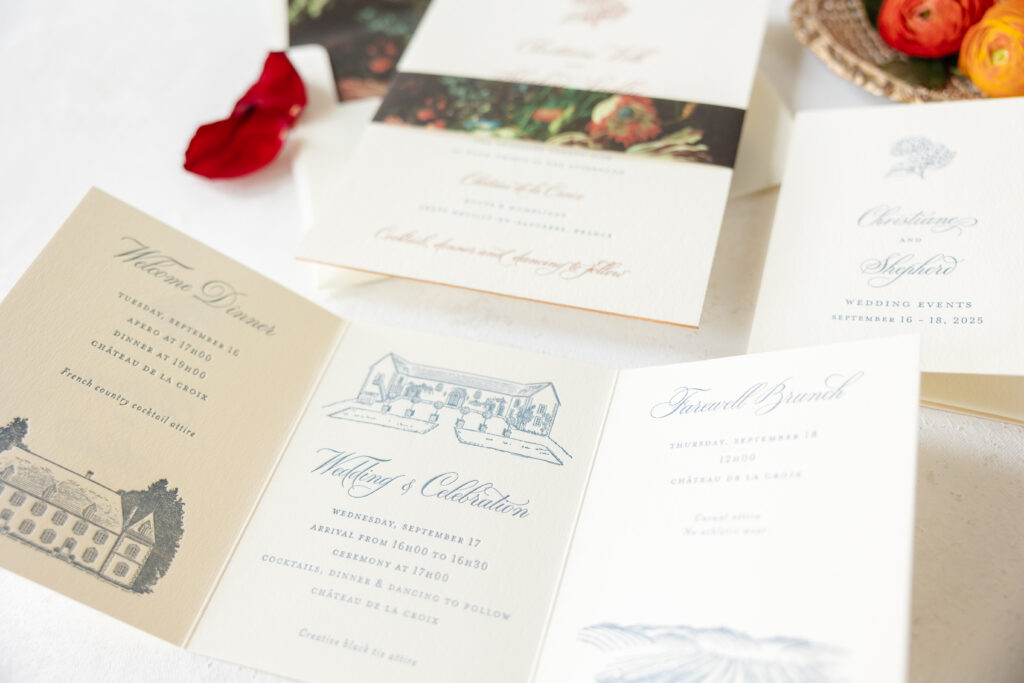
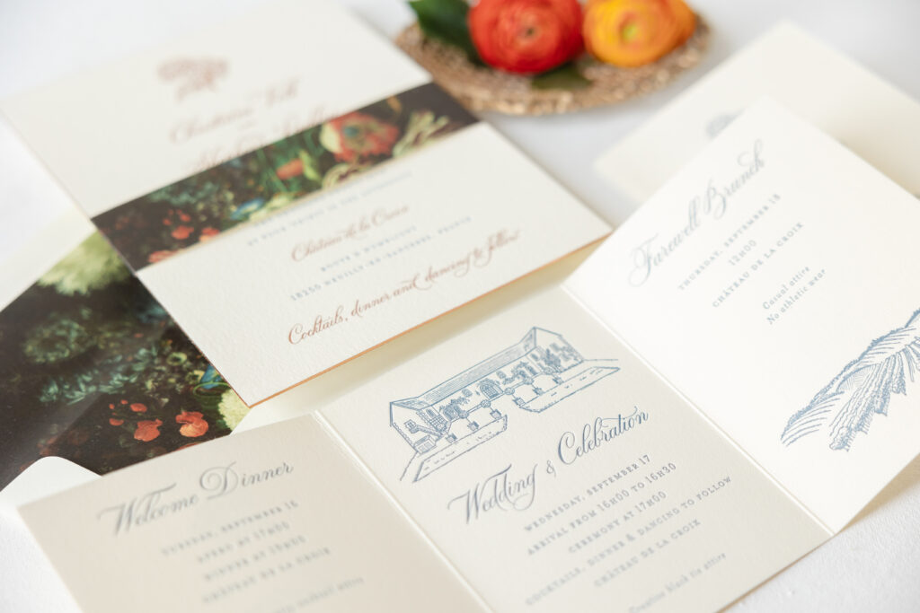
Everything about Christiane and Shepherd’s wedding invitation suite is charming and dreamy. This couple said ‘I do’ at Château de la Croix, located in the French Riviera, and their wedding stationery struck the perfect balance between a rustic French countryside feel and a black-tie affair. We were so happy to work with our dear friend Stacey of Union Street Papery on these French Riviera estate wedding invitations.
Invitation
letterpress ink: yale
foil stamping: copper matte
fonts: bodega + mrs eaves
paper: bella cotton ivory 2-ply
foil edging: copper matte
card size: f-8
envelope liner: viola pattern in cmyk
envelope: white cotton text
digital envelope addressing: yale digital on the front and the back
job: 75972
Belly Band
digital ink: cmyk
paper: ivory text
card size: f-8 vertical belly band (1.5 x 13.25 open, 1.5 x 6.24 closed)
job: 75972
The invitation features copper matte foil stamping and yale letterpress ink on our Bella cotton ivory 2-ply paper. The ivory stock has a soft texture but still holds a deep letterpress impression. Our viola pattern appears on the liner and the belly band. This rustic floral pattern has a refined yet moody vibe. We offer a wide array of patterns that make excellent envelope liners, and all of them can also be repurposed for use on belly bands, the back of cards, gatefolds, or anywhere else. The edges of the invitation are lined in copper matte foil, introducing a sense of glamour.
The tri-fold details card merges style and functionality. Yale letterpress printing appears on both the front and back, coordinating with the invitation. Illustrations of the venue adorn several panels, while the first panel features the same floral motif that appears on the invitation.
Details Card
letterpress ink: yale (front) / yale (back)
fonts: bodega + mrs eaves
paper: bella cotton ivory 1-ply
card size: a-2 tri-fold card (5.44 x 12.56 open, 5.44 x 4.19 closed)
finishing: score
job: 75972
These custom estate wedding invitations boast so many wonderful details, including custom artwork of the venue, foil edging, and a decadent floral belly band. Whether you’re daydreaming about a chic French countryside aesthetic or another look that perfectly aligns with your big day, we can make it happen, or you can work with one of our highly skilled dealers to receive the guidance and assistance you need.
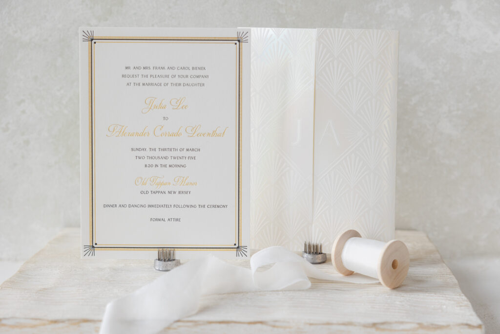
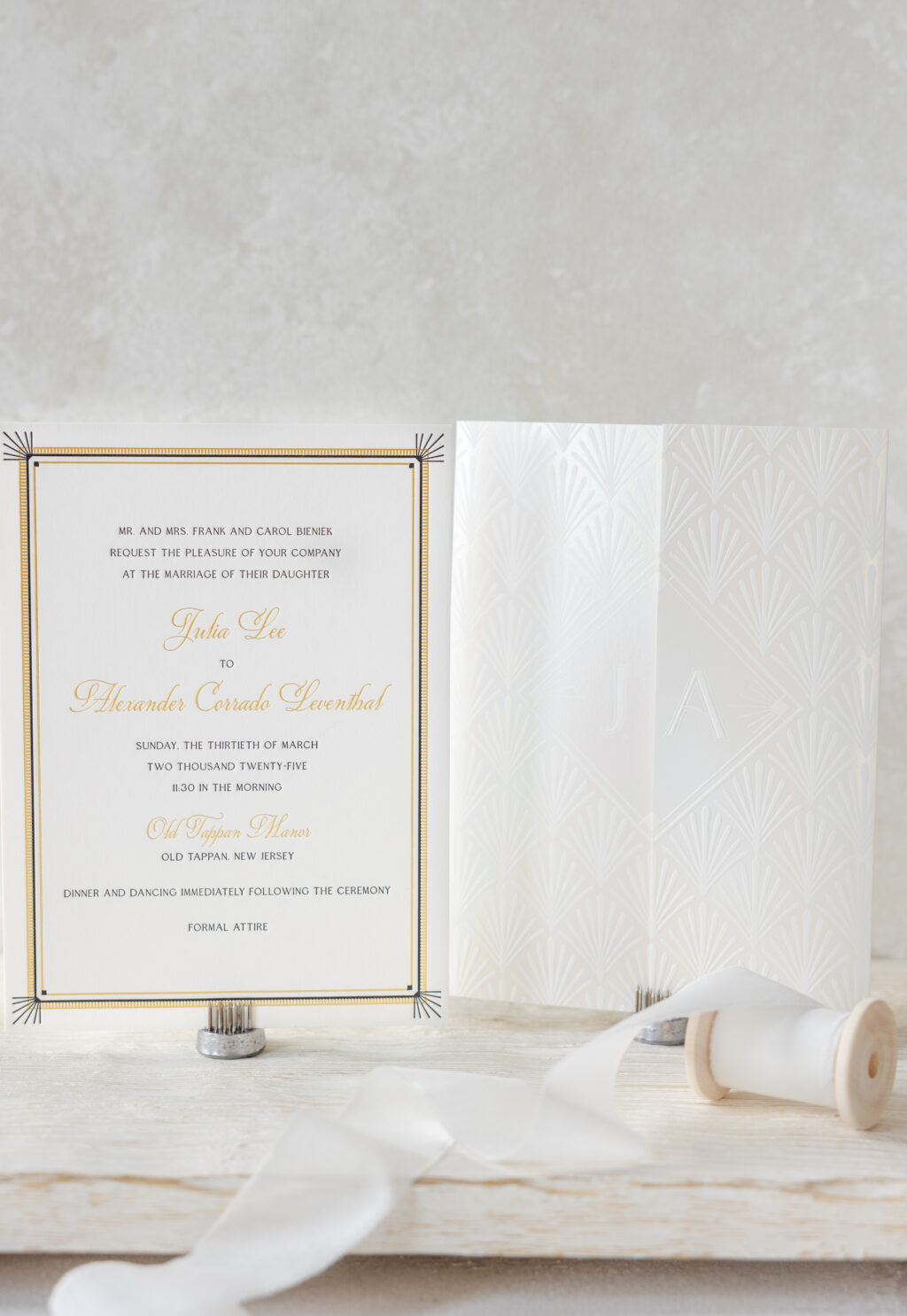
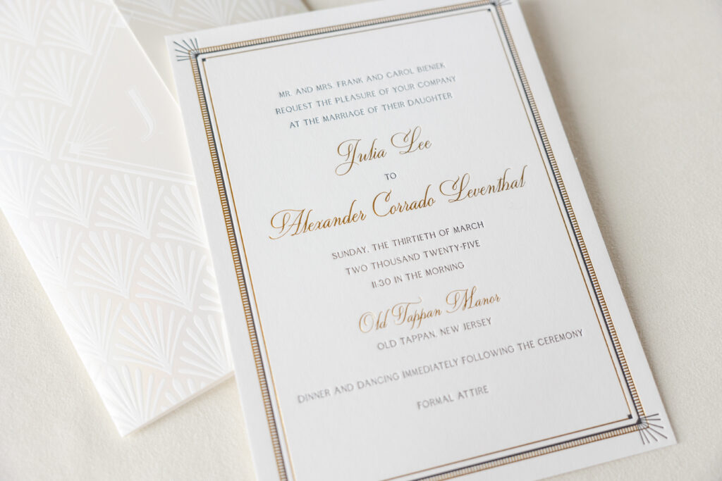
Julia and Alexander worked with our dear friend Sheryl of Arabesque of Naples to create their custom Art Deco wedding invitation. The invitation is lovely and glamorous, and it is also paired with a stunning foil-stamped gatefold that elevates this invitation suite.
Invitation
letterpress ink: black
foil stamping: gold matte
fonts: quita + edith
paper: bella smooth cotton white 2-ply
card size: 5.81” x 7.94”
inner invitation envelope: white cotton text
outer invitation envelope: white cotton text
digital envelope addressing: black digital on the front and the back
job: 73989
Gatefold
foil stamping: opaline shine
fonts: edith
paper: bella smooth cotton white 1-ply
size: 11.77” x 7.94” flat, 5.87” x 7.94” folded
finishing: score
job: 73989
The invitation features a delicate border with thin, alternating lines in gold matte foil and black letterpress, along with a ladder-like pattern in foil. Letterpress sunbursts accent the corners. The frame is geometric and highly detailed, and does an excellent job of drawing the eye to the text. The text also alternates between letterpress and foil stamping, with the names appearing prominently in a larger script font and foil-stamped in gold matte.
The gatefold is a showstopper. This enclosure features an Art Deco shell pattern on the exterior. The bride and groom’s first initials appear on the front, but on opposite sides of the opening, lining up perfectly when the gatefold is closed. Opaline shine foil gives the gatefold an ethereal quality.
We are delighted to have had the opportunity to bring Julia and Alexander’s vision to life, and we wish them all the best. Do you have your heart set on an Art Deco wedding invitation or a luxurious gatefold? Locate one of our dealers so you can see samples and receive expert tips and guidance to create your custom invitations!
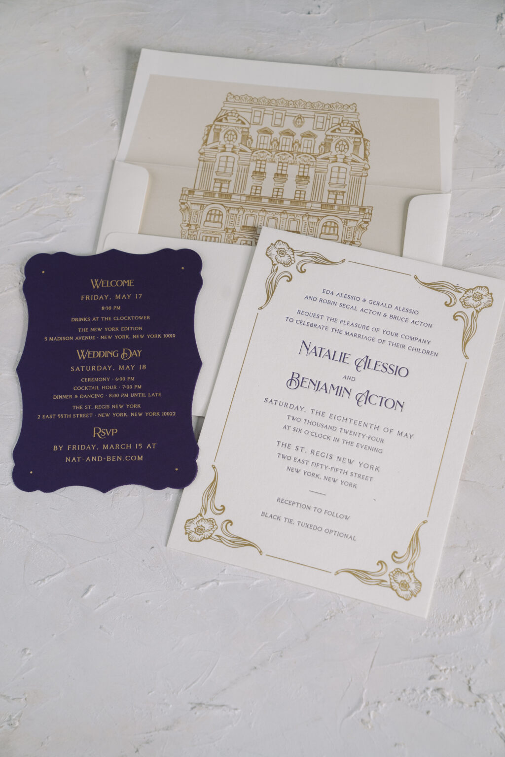
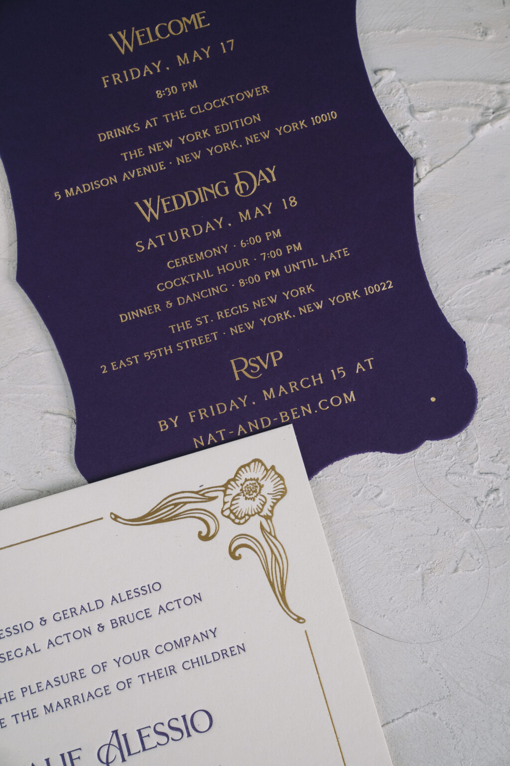
Natalie and Benjamin chose our Mirabella design for the nuptials, which was a perfect choice for their big day. The couple worked with our NYC store to create their letterpress and foil wedding invitations, and the results are stunning.
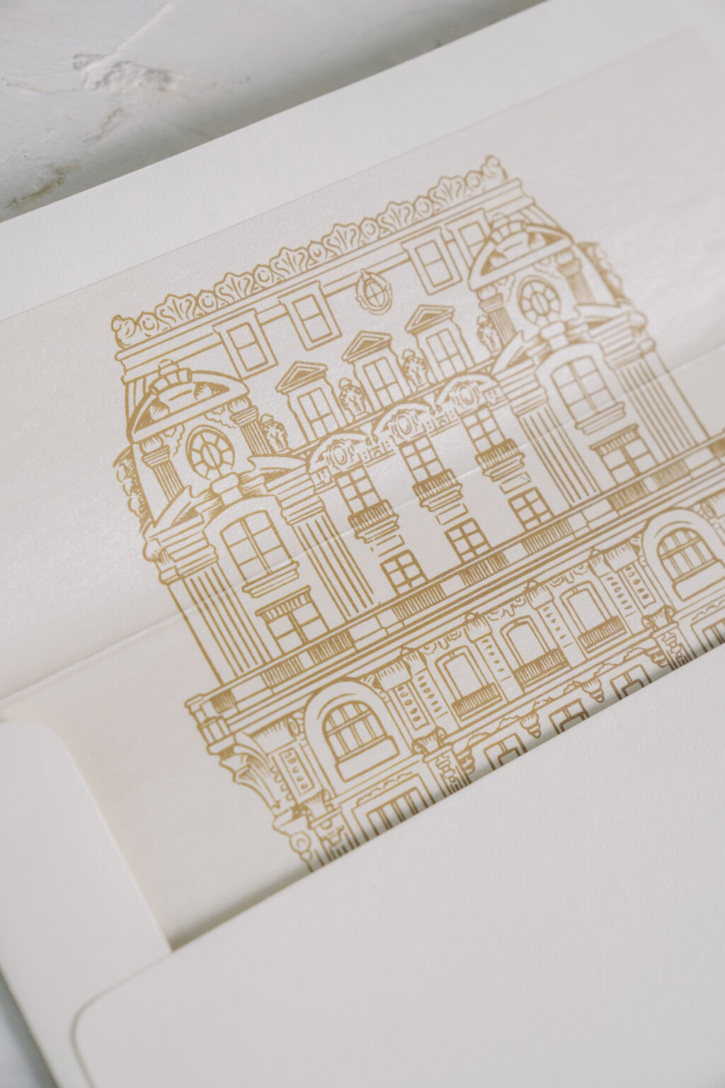
The grandiose invitation design perfectly set the tone for Natalie and Benjamin’s wedding, which was held at the St. Regis New York. This iconic venue is an excellent example of Beaux Arts architecture, and the extravagant foil-stamped frame of the invitation beautifully coordinates with the venue. The venue even made an appearance on the custom envelope liner. An illustration of the St. Regis New York appears in antique gold digital printing on the liner.
Invitation
letterpress ink: plum
foil stamping: gold matte
fonts: brilon 1.2 + coldiac regular
paper: bella smooth cotton ivory 2-ply
card size: f-8
liner: custom pattern in antique gold digital
envelope: ivory cotton text
digital envelope addressing: plum digital on the front and the back
job: 70367
The details card is on our plum 2-ply paper, and exclusively features gold matte foil. The result is ornate and lavish, and makes the perfect addition to this invitation suite. The couple printed two versions of the details card (only one is pictured). One version included details regarding the rehearsal dinner, eliminating the need for a standalone rehearsal dinner invitation, allowing for a more streamlined invitation suite.
Details Card
foil stamping: gold matte
fonts: brilon 1.2 + coldiac regular
paper: plum 2-ply
card size: a-6
diecut shape: charleston (BF-3)
job: 70367
Do you dream about elegant letterpress and foil wedding invitations? Are you interested in including Beaux Arts-inspired design elements or finding interesting ways to represent your venue? We are here to help, or you can work with one of our dealers to receive expert tips and assistance creating your perfect invitations!