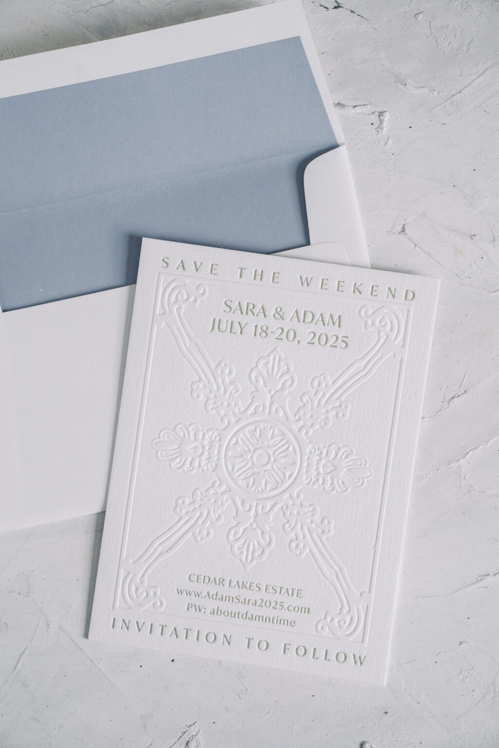
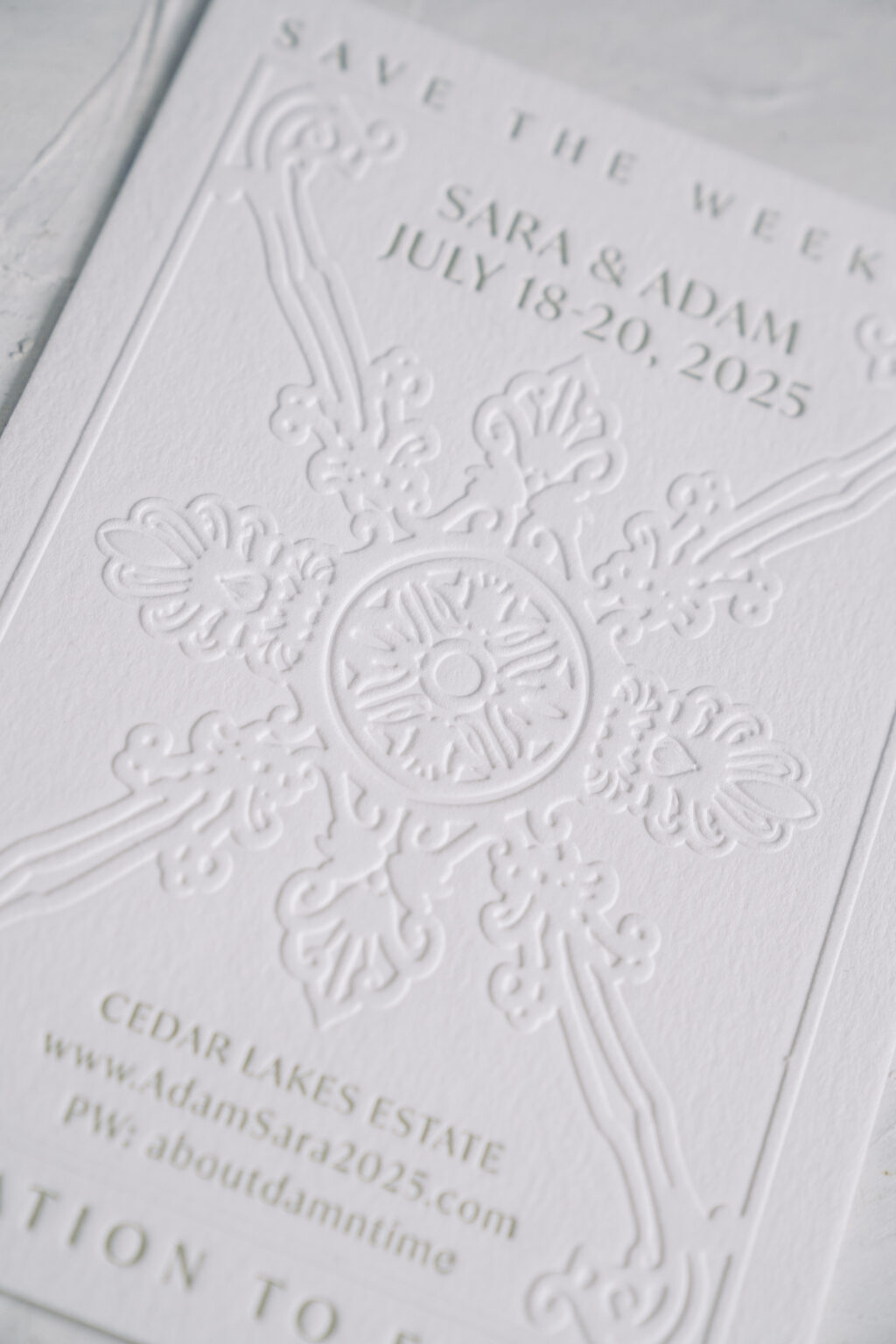
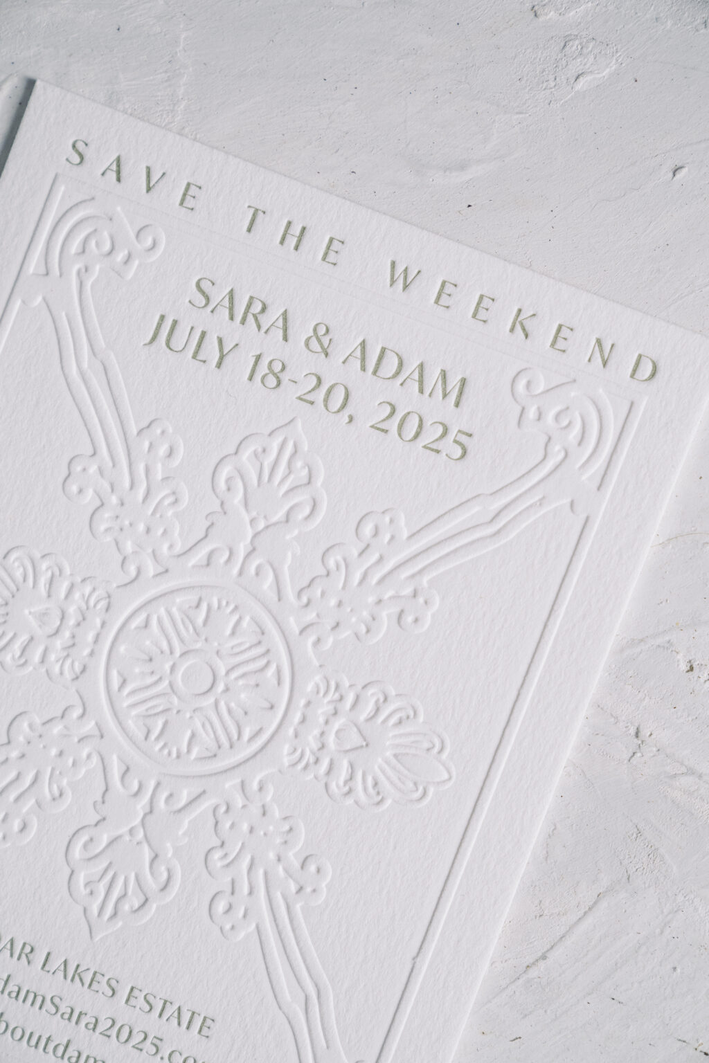
Sara and Adam created a memorable save the date that was sure to get their guests excited about the invitation. A bold custom illustration is the standout feature of this card. The presentation is soft and tailored, and the design is completely custom.
The gorgeous, symmetrical crest has an old-world medallion-style feel. The raised detail of the embossing stands out on our 2-ply paper. No ink is used for a blind emboss, so the texture of our cotton paper stands out, and the lack of color gives the ornate artwork an almost minimalist feel. The raised artwork contrasts with the letterpress text, which is pressed into the paper, adding an extra layer of visual interest.
Save the Date
letterpress ink: spruce
emboss: blind
paper: bella cotton 2-ply white
size: a-6
envelope liner: cloud text
envelope: white cotton text
envelope addressing: vine digital on the front and the back
job: 73032
A member of our design team took care of the illustration based on direction from the couple. We offer custom illustration services, so let us know what you have in mind, and we can make it happen.
The cloud text envelope liner keeps things simple while adding a whisper of color, but still keeping the focus on the card. This entire design radiates an understated luxury.
Contact us to talk through your vision, and let’s create your custom save the date!
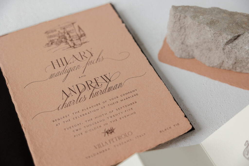
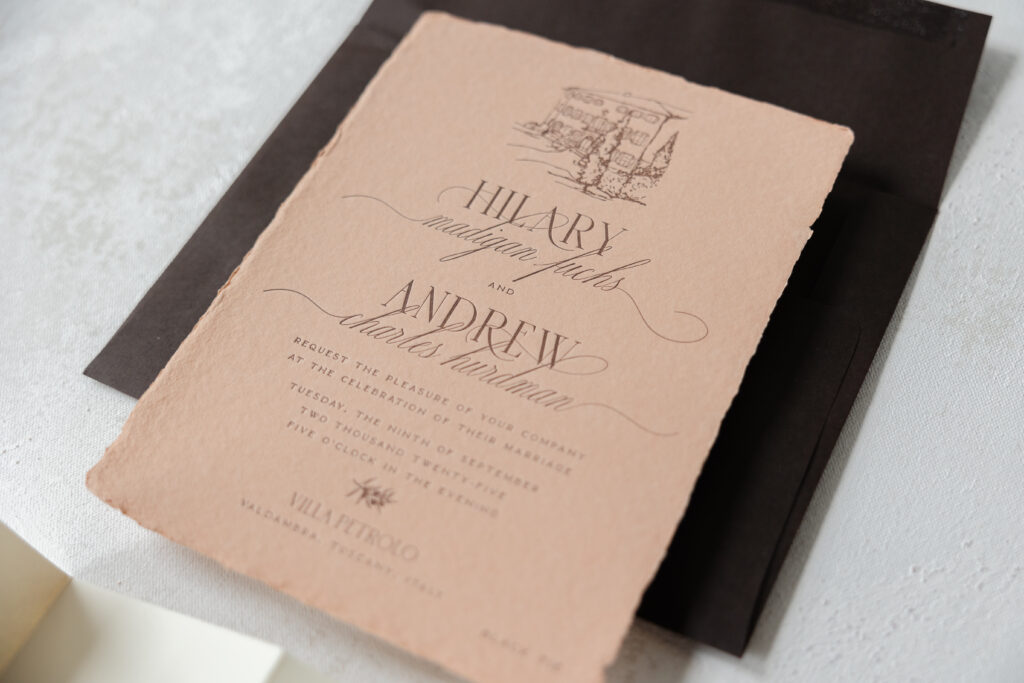
Hilary and Andrew created these dreamy letterpress invitations for their Italian villa wedding. This invitation suite has a rustic, artisanal feel and is brimming with old-world elegance. The couple worked with our dear friend Mel from Arni Paperie to create these luxurious and romantic letterpress invitations.
Our handmade paper is specially made for us and features a soft texture and deckled edges. The deckled edges are the result of the papermaking process and add charm and an artisanal quality to the overall design. Our handmade paper holds a crisp letterpress impression, and the terracotta color is a recent addition to our paper lineup. The terracotta paper of the invitation is paired with the deep tone of our walnut text envelope to reinforce the natural and sun-washed look of the Tuscan venue.
Invitation
letterpress ink: ganache
fonts: margarita script + sauvage + karin
papers: bella terracotta handmade
card size: f-8 deckle edge
envelope: walnut text
envelope addressing: ivory digital on the front and the back
job: 74577
The typography features a combination of refined serif fonts and a flowing script font to create a sophisticated, romantic contrast. The gentle swashes and curves of the margarita script font add movement and a classic feel.
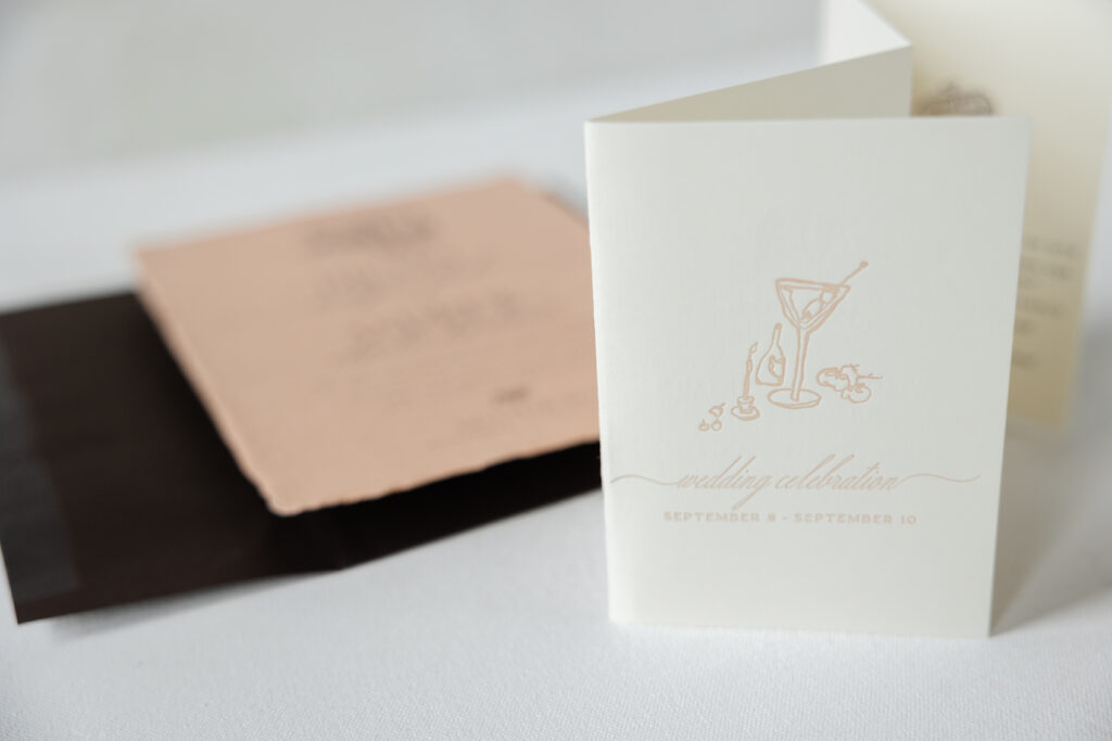
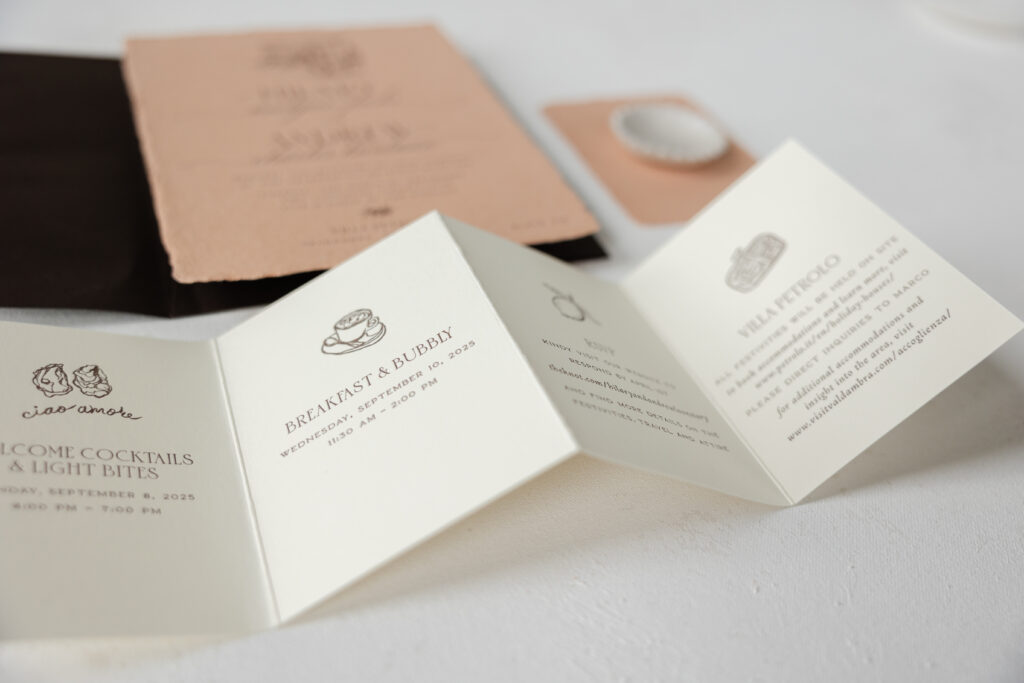
The talented bride created the sketches of the venue on the invitation, and the artwork featured on the folding details card. This is a lovely personal touch that highlights the charming details of this destination wedding. We can accept custom artwork for your invitations, and our design team can help you ensure the files are properly set up for us when creating your invitations and other pieces. We can also create custom illustrations for you! Let us know what you have in mind, and we can bring your vision to life.
card size: custom 4-panel roll fold card (13.33 x 4.75 open, 3.38 x 4.75 closed)
finishing: print on both sides and score
job: 74577
Blank Notecard
papers: bella terracotta handmade
card size: a-5
job: 74577
Best wishes to Hilary and Andrew on their wedding, and it’s always a pleasure to work with Arni Paperie. If you want an invitation that is timeless and full of personal details, or if you want to feature our handmade paper or custom artwork, we can make it happen. Contact us to learn more or reach out to one of our dealers for one-on-one help designing your dream wedding invitations.
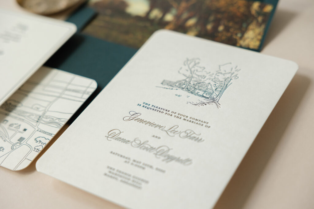
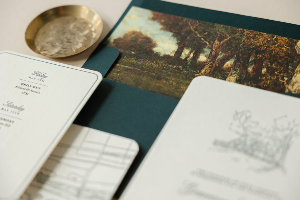
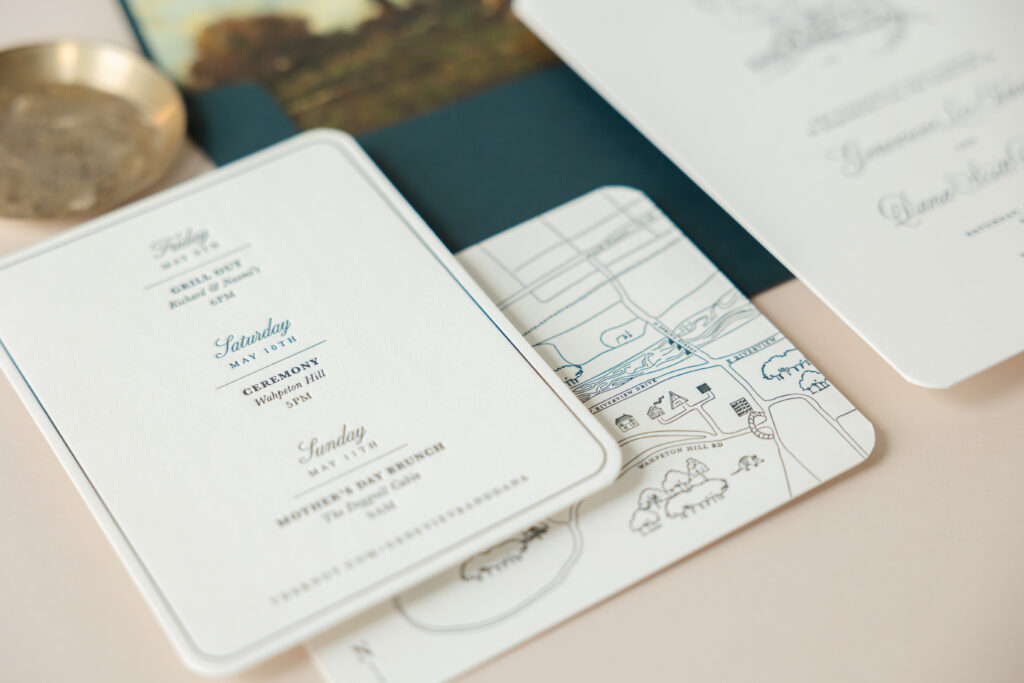
Genevieve and Dana worked with our dear friend Lindsey of Mrs. Post Fine Stationery & Gifts to create their contemporary yet charming letterpress wedding invitations. This design holds extra meaning for the pair because one half of the happy couple is a graphic designer who personally designed their invitations, including both of the illustrations.
The invitation features a traditional layout. The bride and groom’s names are highlighted in an elaborate script font while the remaining text appears in a serif font. The standout feature of the invitation is a custom illustration of a building from the wedding venue. The building peaks out from the trees, setting the tone for an intimate celebration. Both the text and the illustration are letterpress printed in our holly ink. The dark green color suits this outdoor wedding perfectly, and our 2-ply smooth cotton paper leaves a deep impression. Rounded corners give the card a contemporary look, while still maintaining a sense of formality.
Invitation
letterpress ink: holly
paper: bella smooth cotton ivory 2-ply
card size: a-7
finishing: corner rounding
liner: cosette forest pattern in cmyk on ivory text
envelope: evergreen
envelope addressing: white digital on the back
job: 75721
Details Card
letterpress ink: holly (front) / holly (back)
paper: bella smooth cotton ivory 2-ply
card size: a-2
finishing: corner rounding
job: 75721
The details card features the same aesthetic. A thin line border on the front of the card hugs the curve of the rounded corners. A darling hand-drawn map on the back of the details card highlights the locations of various events held during the wedding weekend.
We’re always happy to create an invitation or customize one of our designs, but it’s special when we’re given the opportunity to bring someone’s vision to life. We wish all the best for Genevieve and Dana, and thank you again to Mrs. Post Fine Stationery & Gifts for bringing this wedding suite to us. Would you like to include illustrations on your invitations or a map on the details card? We have a skilled team of graphic designers who can create custom artwork for your invitations and other items in your suite. Contact us to learn more or work with one of our dealers to receive expert assistance as you design your invitations.
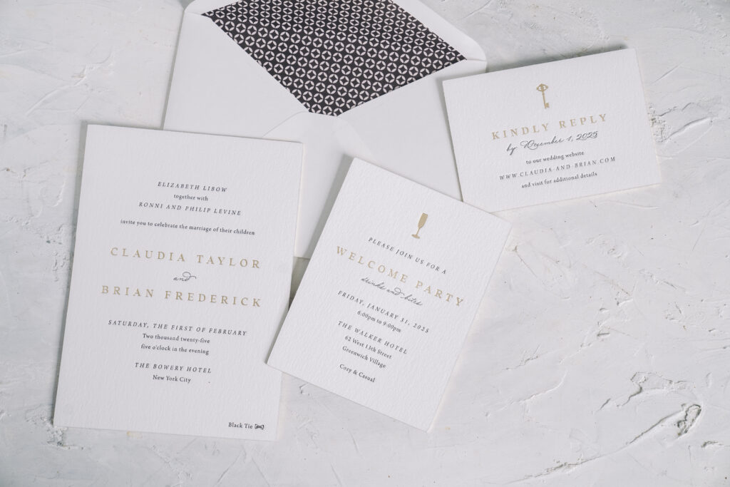
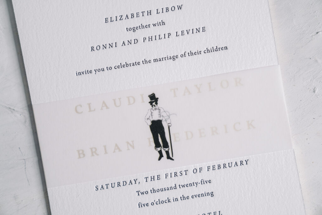
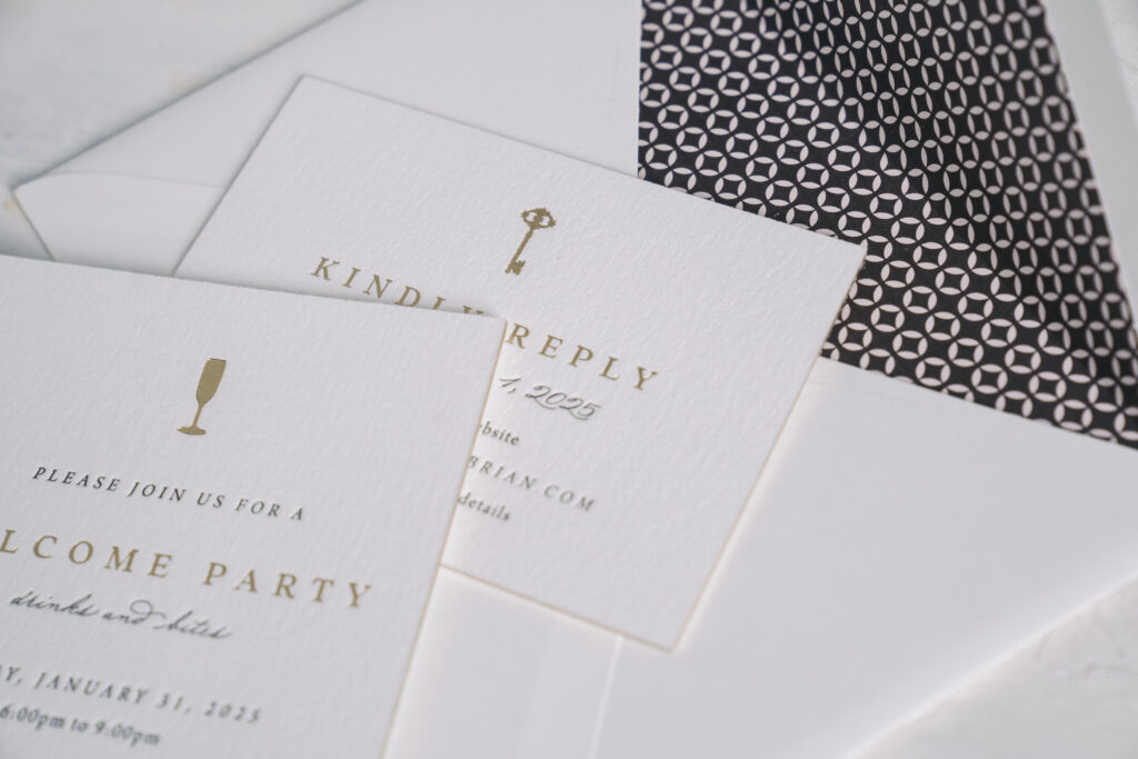
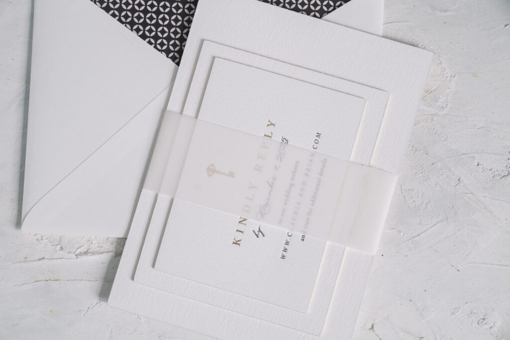
Claudia and Brian worked with our NYC store to create their custom wedding invitation suite. The design is refined and classic, while a belly band with a custom illustration introduces a fun, personal touch.
Our 2-ply cotton stock holds a deep impression to showcase the black letterpress printing and champagne matte foil stamping. The foil edge, also in champagne matte, adds an extra glimmer. The envelope liner is a custom pattern in dark gray digital on our ballet text, for a subtle use of color.
The wedding was held at The Bowery Hotel, so what better detail to include than an illustration of the Bowery Boy, the logo of this decadent hotel? The vellum belly band is just large enough to cover the bride and groom’s names when it is on the invitation, although the names are still visible through the 40# vellum. The jaunty Bowery Boy is centered on the belly band and is likely the first detail guests notice when they remove the invitation from the envelope. The belly band is more than a whimsical detail; it’s functional, securing all the cards in the suite and creating a bundle that neatly fits inside the envelope.
Invitation
letterpress: black
foil stamping: champagne matte
font: arno pro + addington CF + madison street pro
paper: bella cotton white 2-ply
card size: a-7
foil edge: champagne matte
liner: custom pattern in dark gray digital on ballet text
envelope: white cotton text pointed flap
envelope addressing: black digital on the front and back
job #73267
Belly Band
digital: black
paper: 40# vellum
size: A-7 vertical belly band (1.75 x 11.25 open, 1.75 x 5.24 closed)
job #73267
Details Card
letterpress: black
foil stamping: champagne matte
font: arno pro + addington CF + madison street pro
paper: bella cotton white 2-ply
card size: a-2
foil edge: champagne matte
job #73267
Reply Card
letterpress: black
foil stamping: champagne matte
font: arno pro + addington CF + madison street pro
paper: bella cotton white 2-ply
card size: a-5
foil edge: champagne matte
job #73267
There are so many ways to incorporate your venue into your wedding stationery, from a custom illustration to a die-cut card. We can help you add fun and personalized details to your invitations that represent you and your partner, or your venue, or whatever else you want to highlight. Reach out to get started designing your custom invitations!
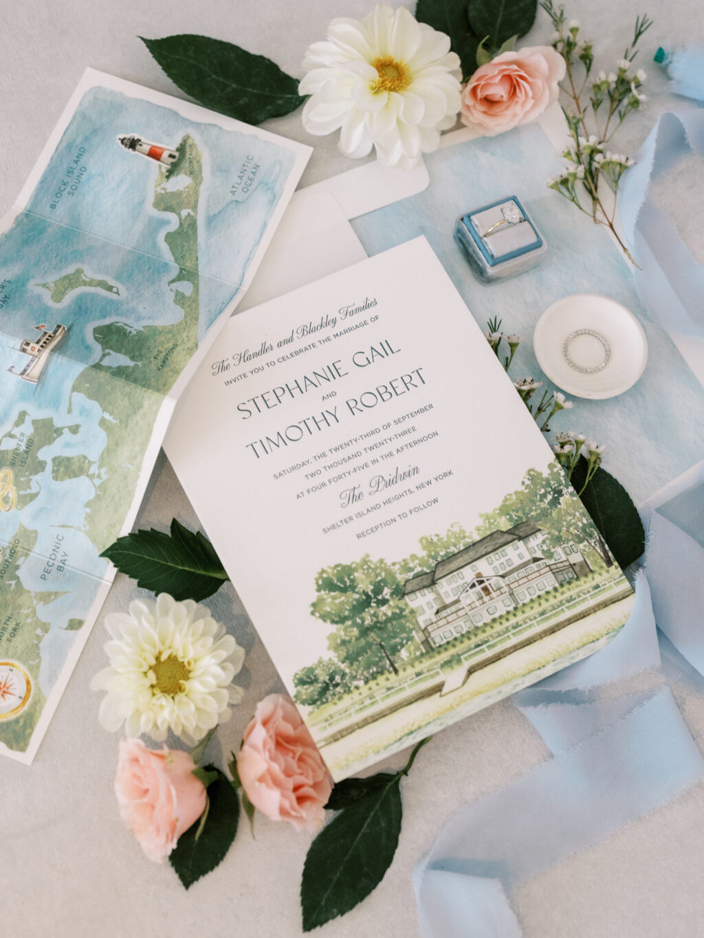
It’s always a joy to work with Arni Paperie, and it was extra special when we found out what Stephanie and Timothy had in mind for their wedding invitations.
The text is letterpress printed in deep blue ink on our luxurious 2-ply smooth cotton paper. The standout feature of this wedding invitation is the illustration of the venue, the Pridwin Hotel. A custom illustration of this iconic beachfront hotel graces the bottom of the invitation. We also created an accordion-fold details card that features a map of the North and South Forks of Long Island, including Shelter Island, the location of the festivities.
We created these custom illustrations based on direction and insight from the bride and groom. They had a vision, and we worked to bring that vision to life and create something completely unique.
Invitation
Letterpress: deep blue
Digital: CMYK
Fonts: altesse, classico + gotham
Papers: bella smooth cotton 2-ply white
Card size: f-8
Liner: CMYK
Envelope: bella cotton white
Digital return and guest addressing: deep blue digital
Job: #67279
Details Card
Digital: CMYK Process + Deep Blue / CMYK Process + Vine + Deep Blue
Paper: bella smooth cotton 1-ply white
Size: 13.52 x 4.75 (flat)
Finishing: Score
Job: #67279
A custom illustration is a great way to add a personal touch to your invitation, envelope liner, details card, or any part of your suite. Artwork can be repurposed on multiple pieces to create a cohesive element that pulls everything together. Contact us to learn more!
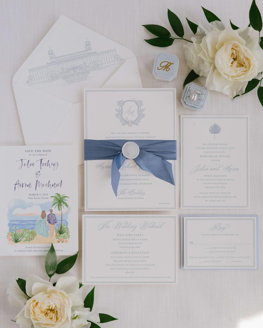
We always look forward to working with our friends at Masi Events, and we were excited to see the event photos after we completed the printed pieces for Julia and Aaron’s wedding. This Palm Beach wedding was classy, elegant, and full of Old Florida charm. See more of the stunning details in Style Me Pretty.
All of the items, from the save the date to the day-of pieces, are custom-designed. The darling save-the-date boasts a charming illustration of the couple. The digitally printed artwork is beachy and casual and pairs nicely with the script font.
The custom-designed invitation suite is more formal and stately. The invitation, reply card, details card, and rehearsal dinner invitation all feature text in chambray letterpress framed in a double-line border.
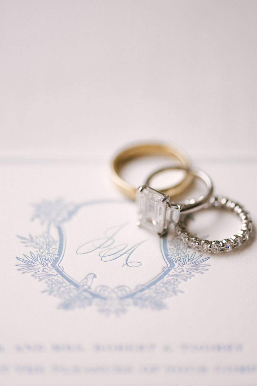
The invitation features a whimsical crest containing the couple’s first initials. Subtle details, such as palm fronds and a pair of parrots perched on the border of the crest, tie into the opulent Palm Beach wedding venue. The inner envelope liner also features an illustration of the venue. A decadent silk ribbon tied around the invitation adds a lovely finishing touch.
Invitation
Base design: Custom
Letterpress: chambray
Paper: smooth cotton 2-ply white
Card size: F-8 for Inner Envelope Card
Embellishment: Blue Gray Silk Ribbon
Inner Envelope: F-8 inner pointed flap with chambray digital printing on front and digitally printed custom liner
Outer Envelope: F-8 outer pointed flap with chambray digital guest address on front and chambray letterpress return address on flap
Customization: Job #68663
Save the Date
Base design: Custom
Digital: navy + CMYK process
Paper: smooth cotton 1-ply white
Card size: No. A-7
Envelope: A-7 pointed flap with digitally printed navy guest and return addresses
Customization: Job #66145
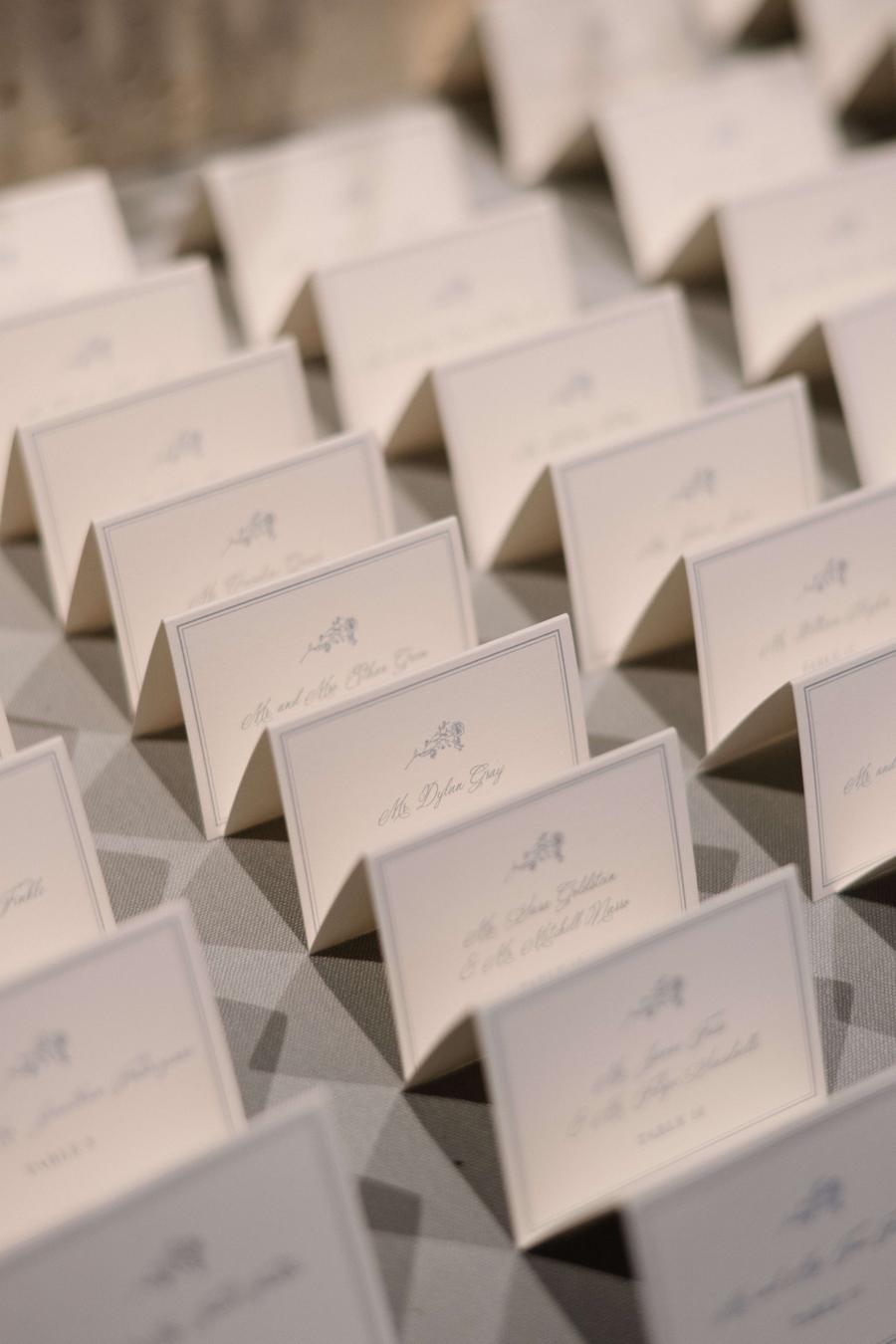
There is so much more to this stunning suite! We also printed the folded program cover, menu, escort, and table cards. The day-of pieces are digitally printed in chambray to match the invitation’s letterpress printing.
Folded Escort Card
Base design: Custom
Digital: chambray
Paper: smooth cotton 1-ply white
Card size: No. 17 folded card
Customization: Job #70666
Table Card
Base design: Custom
Digital: chambray
Paper: smooth cotton 1-ply white
Card size: A-2 card
Customization: Job #70666
Best wishes to Julia and Aaron, and congratulations to Masi Events for once again doing a fabulous job! Are you interested in creating something completely unique and custom? Like a save the date with a custom illustration or a sophisticated crest with personal and charming details? Contact us to learn more!
We had the pleasure of working with Nathalie and Victor to bring their beautiful wedding stationery to life. Inspired by our Aiden design, our designer Katie Magee illustrated The Wheatleigh Hotel. The gold matte foil stamping and antique gold and handmade ivory paper combine to create a wonderfully romantic, neutral palette. It always wonderful to see just how well an invitation suite sets the tone for the wedding itself.
We can’t think of a better year to spread some holiday cheer than this year. We’re excited to share an inside look into the creation of a personalized holiday card. Kara Gordon of Magnificent Milestones worked with us to make this one extra special. Kara shared, “Similar to a family photo, I think an illustration makes a holiday card truly unique. My (current) favorite illustration is the family home. For many of us, it’s where we live, work and learn. There is a new appreciation for our homes this year: it’s time to pay tribute!” To turn a classic holiday card into something a little more unique, our graphic designer Katie Magee illustrated the home of Nick, Whitney and Josie. The family opted for our Lawson Holiday card design as the backdrop for their illustration. We will let Katie take it from here to describe what goes into making custom artwork as well as more thoughts from Kara. We can’t wait to see what holiday creations come through our shop next!
Q: What is the most rewarding part of illustrating for specific client customizations?
Answer from Katie: For me, I love seeing the client’s vision come to life. We’re often illustrating something of importance to them, be it their home or wedding venue, a beloved pet, or maybe a favorite flower, so it feels really great to help them incorporate something that’s truly personal to them into their stationery.
Q: Tell us about the process behind creating a client-specific illustration. What are the behind the scene steps?
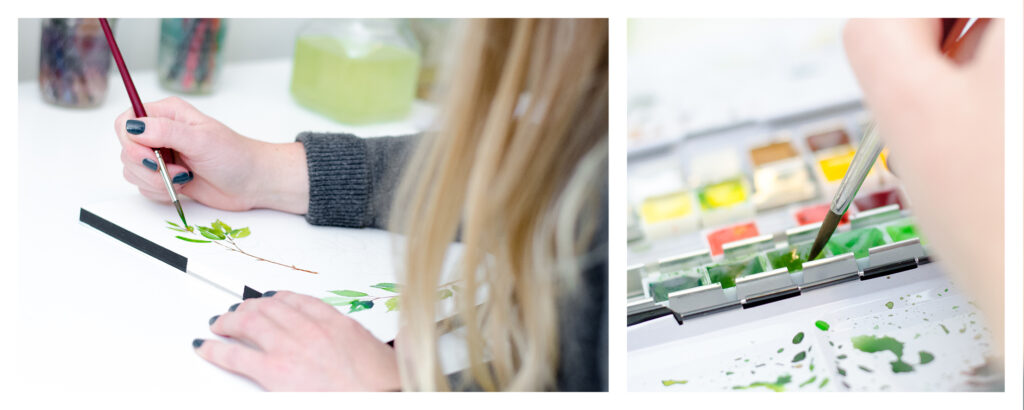
Answer from Katie: Line illustrations are a fairly simple process – mainly just making sure I have a good, high-resolution reference photo to work from, and then getting to work drawing on my iPad! Watercolor illustrations require a bit more setup, including lightly sketching out the illustration in pencil, making sure I have all the colors I need in my palette, and then building up layers of color to create the illustration. It also requires more time and patience with waiting for the layers of paint to dry.
Q: What kind of instructions help you most from a client to make the illustration the best it can be? What do you need to hear from them?
Answer from Katie: It’s always helpful for them to provide as much detail as possible! Do we need to omit anything from the reference photo? Will we be changing the color of anything? If it’s a line illustration, do they want it more on the minimal side, or with lots of detail? Each illustration is different, but providing us with as much detail as possible helps us to get things right the first time.
Q: What do you hope for once an illustration is finally complete?
Answer from Katie: Simply that it brings joy to the client! Nothing makes me happier than knowing that I was able to bring their vision to life.
Q: Why do you think people should continue to send out holiday cards each year, specifically this year?
Answer from Kara of Magnificent Milestones: I love sending and receiving holiday cards every year… but this year is undoubtedly different. There are friends and family members that I haven’t seen in over 7 months so I will be racing to the mailbox this holiday season. It’s different than a text or a Facebook post that receives a quick glance. These cards are on display for the entire holiday season and put a smile on my face every time I walk by them.