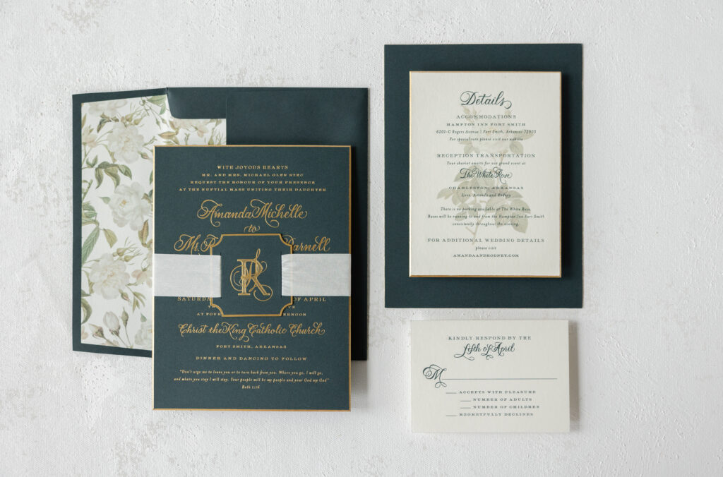
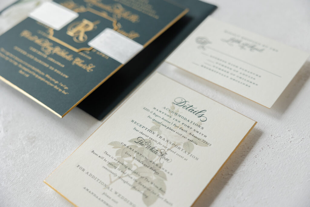
This custom-designed wedding invitation suite features hand calligraphy, a darling tag emblazoned with a monogram, and luxurious details, such as beveling, foil edging, and silk ribbon. We worked with our dear friend Mickey from the Social Type on this extravagant suite.
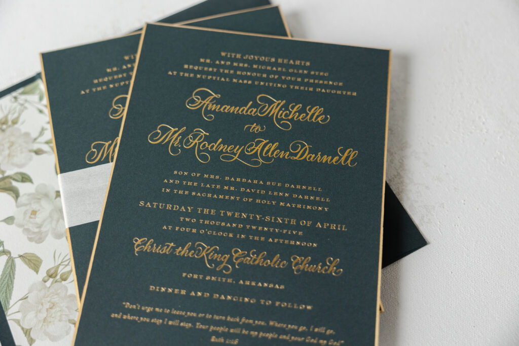
This invitation suite is lovely, but the use of hand calligraphy elevates the look. The couple chose the Wisteria hand by our dear friend, Debi Zeinert. Adding hand calligraphy to your invitation suite tacks on a few days to the design process, as the calligrapher requires time to create the artwork; however, the results are well worth it. Please note that revisions require additional turnaround time. The calligraphy looks dazzling, and the gold matte foil highlights the flourishes. The serif font maintains the formality of the look and beautifully coordinates with the hand calligraphy.
Invitation
foil stamping: gold matte
hand calligraphy: wisteria
font: impression
papers: evergreen 3-ply
card size: f-8 for inner envelope
bevel: 45º
foil edge: gold matte
job: 75437
Envelope
inner envelope liner: custom elide pattern in cmyk on ivory text
inner envelope: evergreen text
outer envelope: evergreen text
envelope addressing: gold matte on the back
job: 75438
Tag
foil stamping: gold matte
font: impression
papers: evergreen 2-ply
card size: 2.5” x 2.5”
diecut shape: cd-563
silk ribbon: mother of pearl
finishing: assemble with ribbon around the invitation
job: 75437
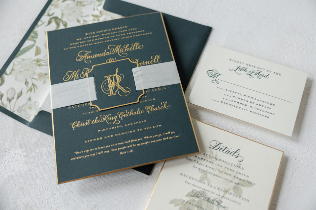
A die-cut tag bearing the bride and groom’s initials is secured around the invitation with silk ribbon. The tag features the bride’s initial in extravagant hand calligraphy, intertwined with the groom’s initial, which appears in a regal serif font.
Gold matte foil is also used to accentuate the beveled edge on both the invitation and the details card. The glimmer of the foil extenuates the 45º edge. The envelope liner is also custom and was designed using the Elide rose motif. The floral envelope liner softens the overall look of this suite while adding a hint of romance.
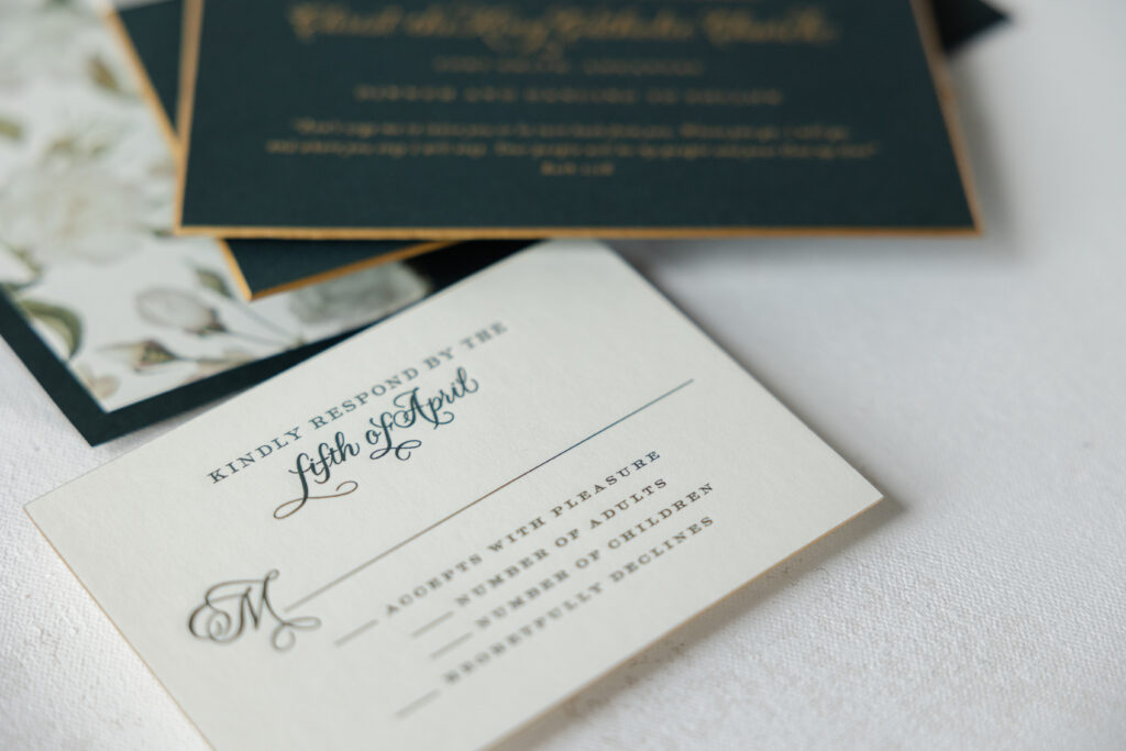
Reply Card
engraving ink: holly
hand calligraphy: wisteria
font: impression
papers: bella smooth cotton ivory 2-ply
card size: a-5
foil edge: gold matte
envelope: evergreen text
envelope addressing: gold matte digital on the front
job: 75437
The details card features engraving, which is a print method that uses etched metal plates to create a raised impression. The engraved text appears over digitally printed floral artwork.
Details Card
engraving ink: holly
digital ink: cmyk
hand calligraphy: wisteria
font: impression
papers: bella smooth cotton ivory 2-ply
card size: a-6
bevel: 45º
foil edge: gold matte
job: 75437
Whether you want classic, formal wedding invitations with modern luxury accents, such as beveled edges accented with foil, hand-calligraphy details, or a touch of romance with a floral liner, we can make it happen. Work with one of our dealers to receive expert guidance and assistance in creating your dream wedding invitations.
We are thrilled to finally be sharing a sneak peek at our new Flora Collection! These floral patterns were created earlier this spring in collaboration with Kate Ignatowski and Photosynthesis Floral Design, and will be available in stores and online very soon. We paired these pretty new patterns with some of our existing invitation designs to give you an idea of some of the new possibilities — take a look!
Our die-cut Elliotte calligraphy wedding invitations by Elizabeth Hardin feature olive letterpress ink on our white cotton paper and pair beautifully with our soft yellow and white Flora pattern #8.
The modern Belperron design by Kelle McCarter is printed in classic black ink and includes oversized hand calligraphy accents— we love how it looks with the dramatic, deep purple Flora liner #46.
The soft gray color palette on one of our best-selling designs, Colette, pairs perfectly with Flora pattern #2.
These new Flora patterns pair nicely with our ivory paper, too! Leyton, a modern classic by Amy Graham Stigler from our 2016 collection, is printed in tawny matte foil on our ivory paper — we matched it up with Flora pattern #10 for an English garden feel.
We paired Splash, a modern letterpress wedding invitation from our 2016 collection, with Flora pattern #7.
Hadley, another new suite from Amy Graham Stigler, looks stunning next to the deep purple roses in Flora pattern #9.
The playful calligraphy accents from Elizabeth Hardin on our Madison Chic suite complement the light, feminine flowers in Flora pattern #3.
And last but not least – how pretty is our light peach ink next to Flora pattern #13?! We love the Southern charm of our Calligraphy Monogram design next to this soft peach rose!
Your letterpressed wedding invitations are truly the sneak peak for what your guests can expect on your big day – and these romantic and perfectly flourished Delambre Classic invitations will tell guests they’re invited to an elegant affair.
inks: navy + pewter | font: utrecht | calligraphy: victoria hand calligraphy, by Sarah Hanna | custom calligraphy monogram | paper: 1-ply white | invite size: f8 | customization #: 15685 |
Our Ashwell letterpress wedding invitation design is another design from our 2010 collection so we especially loved printing this beautiful invitation suite. Showcasing a lovely custom monogram, this customization is a classic pairing of black ink on our ivory cotton paper with corner rounding for the perfect finishing touch. The coordinating letterpress coasters are a perfect addition to any reception and carry the design details seamlessly through the event from start to finish.
From the perfect letterpress invitations to the place cards at the reception, we love working with couples to create really fun letterpress pieces that perfectly coordinate with the look and feel of their day. Custom letterpress place cards, which can also be used as escort cards, are the perfect way to tie in the colors and motifs of your invitations and are one of those finishing touches that just make an event really shine.
These cute little place cards feature our Joyful Yarrow design printed in pewter and yarrow inks. They are decidedly modern and playful, but still incredibly chic.
A much more formal take on the traditional place card, these pretty cards feature a custom calligraphy monogram printed in espresso ink. These letterpress place cards are the definition of elegant.
Continuing our letterpress calligraphy love fest…here are a few more calligraphy treats.
Black ink seems so right for calligraphy invitations – it’s the original letterpress ink from hundreds of years ago, and black has stayed in fashion ever since. This is the Classic Calligraphy design using the Spencerian calligraphy style, letterpress printed on our 2-ply cotton paper. Totally timeless. And notice how special each of the first letters of the bride’s and groom’s names are – I love how the “L” of the bride is intertwined already with the “P” of the groom.
We often do calligraphy invitations in one color — but wow, when you add a second color–and add that to a custom monogram in fact — what an effect! The butterfly monogram is sweet and sophisticated and uses the bride & groom’s first letters of their first names. More black ink — how can you go wrong there? — but the garden green ink ads a bit of fun. This is another variation on the Classic Calligraphy design, Spencerian style.
Stay tuned for a very cool calligraphy save the date — in green!