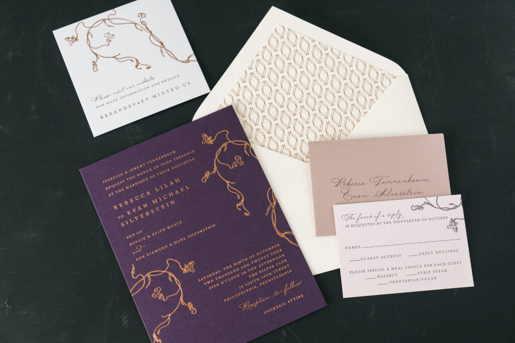
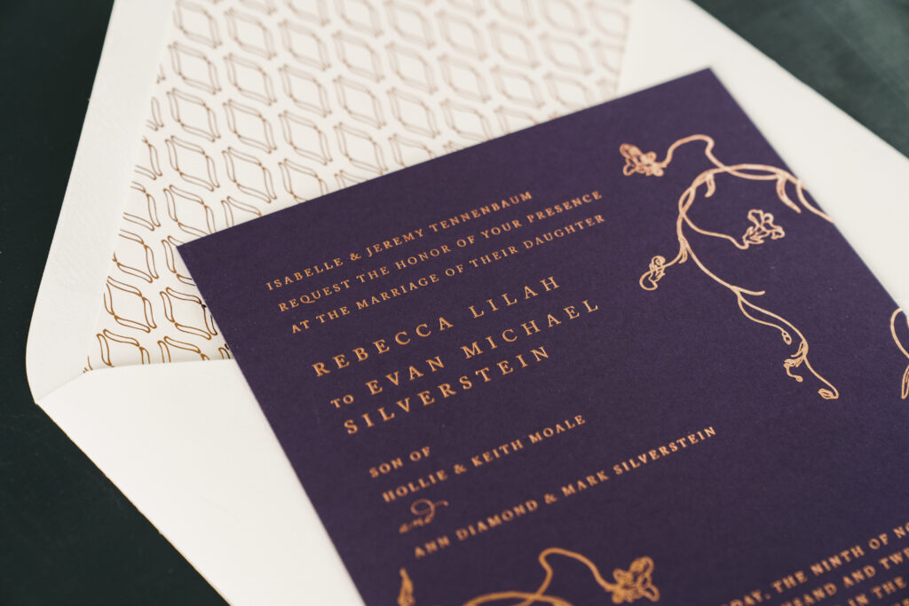
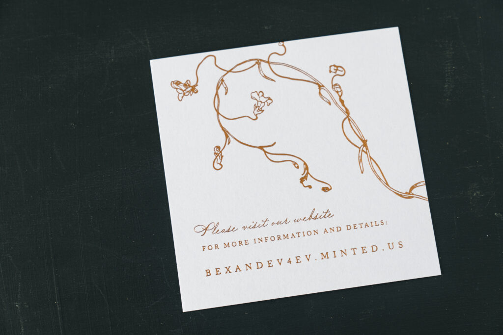
Rebecca and Evan sought a modern yet romantic design for their wedding invitations, and they found it in our Fiona design. This couple worked with our dear friend Alexandra of Alexandra Partow Events to create these dreamy invitations, which blend rich jewel tones with shimmering foil.
The meandering floral artwork of this invitation design weaves around the refined serif font text, adding a romantic aesthetic and a touch of sophistication. The curved pattern of the envelope liner is both organic and geometric, providing consistency with the overall design. The use of pastel pink paper for the reply card and sky stock for the website card introduces additional color, and complements the dark plum hue of the invitation.
Invitation
foil stamping: copper matte
font: adobe caslon + madison street pro
papers: plum 2-ply
card size: f-8
envelope liner: biltmore pattern in copper matte foil on ivory text
envelope: ivory cotton text pointed flap
envelope addressing: plum digital on the front and the back
job: 72411
Reply Card
letterpress ink: ink
font: adobe caslon + madison street pro
papers: pastel pink 1-ply
card size: a-5
envelope: old rose text
envelope addressing: plum digital on the front
job: 72411
Website Card
foil stamping: copper matte
font: adobe caslon + madison street pro
papers: sky 1-ply
card size: sq-5
job: 72411
These foil stamped wedding invitations are contemporary and sophisticated, yet also romantic and artistic, setting the tone for a luxurious ceremony and reception. Work with one of our dealers to create your dream foil stamped wedding invitations.
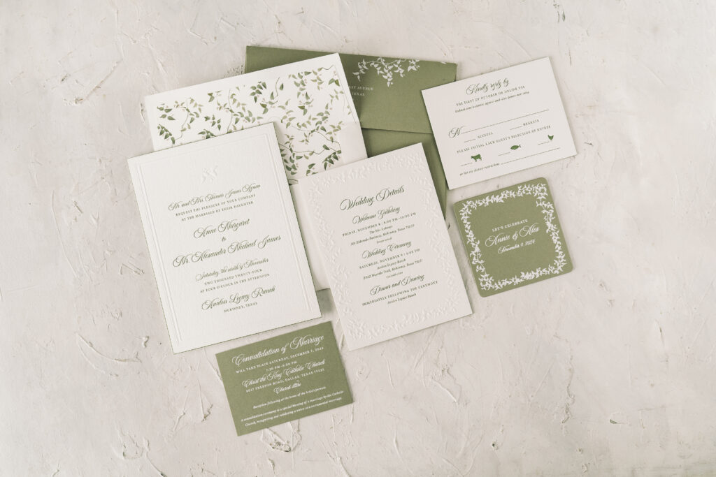
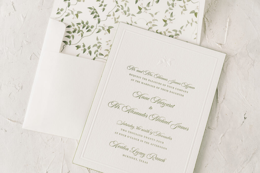
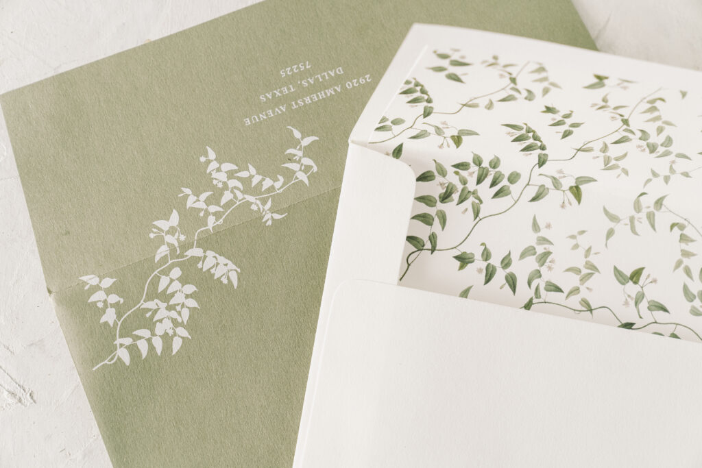
These letterpress and blind emboss wedding invitations feature a refined, classic aesthetic. The couple, Anne and Alexander, worked with our dear friends at Needle In A Haystack to create their truly lovely invitation suite.
Invitation
letterpress ink: vine
emboss: blind
fonts: aston script + addington
papers: bella cotton white 3-ply
card size: f-8
edge paint: vine
inner envelope liner: everly pattern in cmyk on white text
inner envelope: white cotton text
outer envelope: spruce text
outer envelope addressing: white digital on the front and the back
job: 72293
Reply Card
letterpress ink: vine
fonts: aston script + addington
papers: bella cotton white 2-ply
card size: a-2
edge paint: vine
envelope: white cotton text
envelope addressing: vine digital on the front
job: 72293
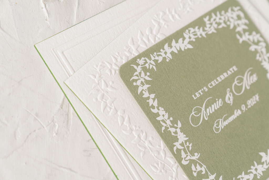
This customization is based on our Braxton design and features our luxurious 3-ply Bella cotton stock. The thick, textured paper showcases the depths of the letterpress impression and the crisp blind emboss border and artwork. The double line border, consisting of both a thin and a thick line, adds an air of formality to the design. The typography is a mix of elegant script and traditional serif fonts. The text is printed in a soft, muted green ink that complements the natural theme.
Insert Card
foil stamping: white matte (front)
digital ink: white matte (back)
fonts: aston script + addington
papers: spruce 2-ply
card size: 4” x 4”
die cut shape: sm-31
job: 72293
Details Card
letterpress ink: vine
emboss: blind
fonts: aston script + addington
papers: bella cotton white 2-ply
card size: a-7
edge paint: vine
job: 72293
Convalidation Card
foil stamping: white matte
fonts: aston script + addington
papers: spruce 2-ply
card size: a-5
job: 72293
At the top, a delicate embossed motif adds a touch of sophistication. The foliage accent uses part of our Everly Vine nature motif. The same artwork appears on the outer envelope, as well as on the border of the details card and the insert card. You’ll also see the foliage and reaching vines as the envelope liner. The Everly pattern appears under the category of floral patterns. Many of our motifs already exist as patterns, or we can create a pattern for you using one of our motifs. The reverse is also possible; we can dismantle a pattern to create a border or a motif.
This letterpress and blind emboss wedding invitation suite combines a traditional look with nature-inspired charm, perfect for a sophisticated affair. Locate one of our dealers to receive expert tips and help to create your dream invitations.
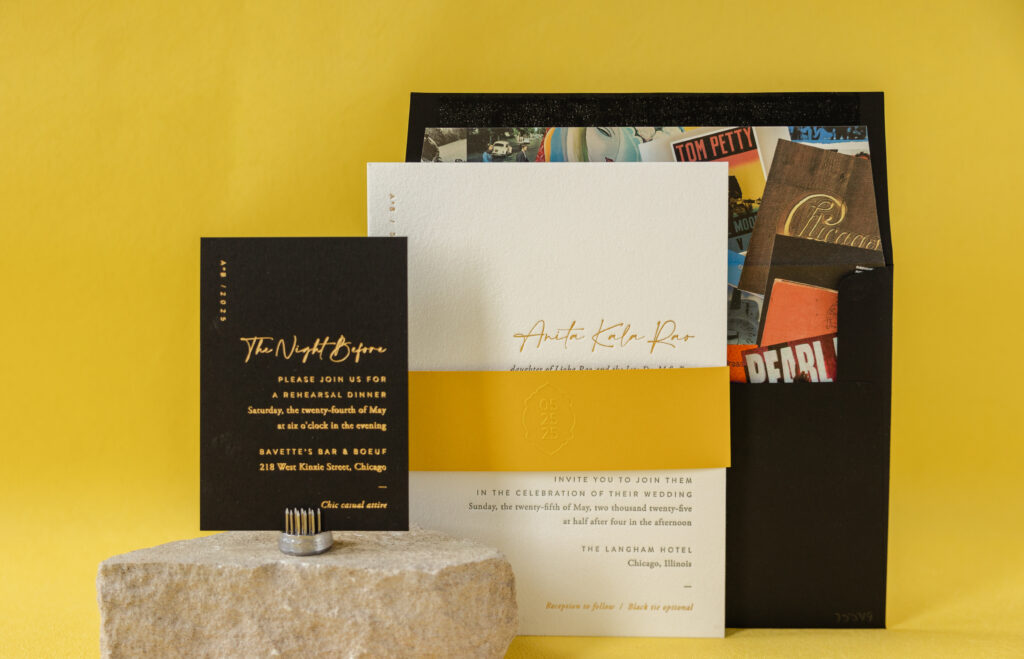
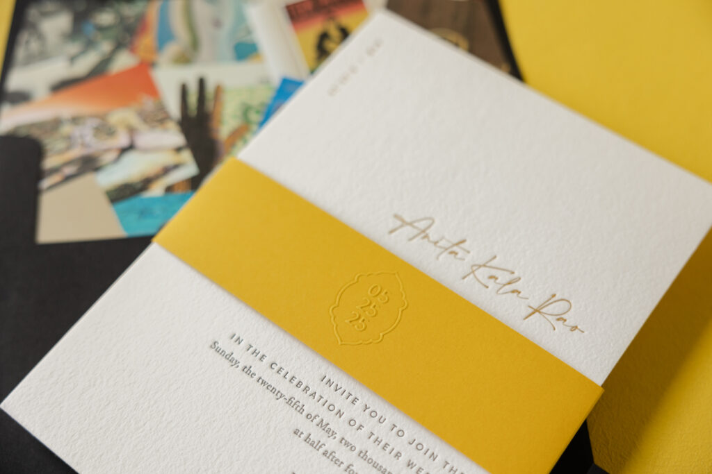
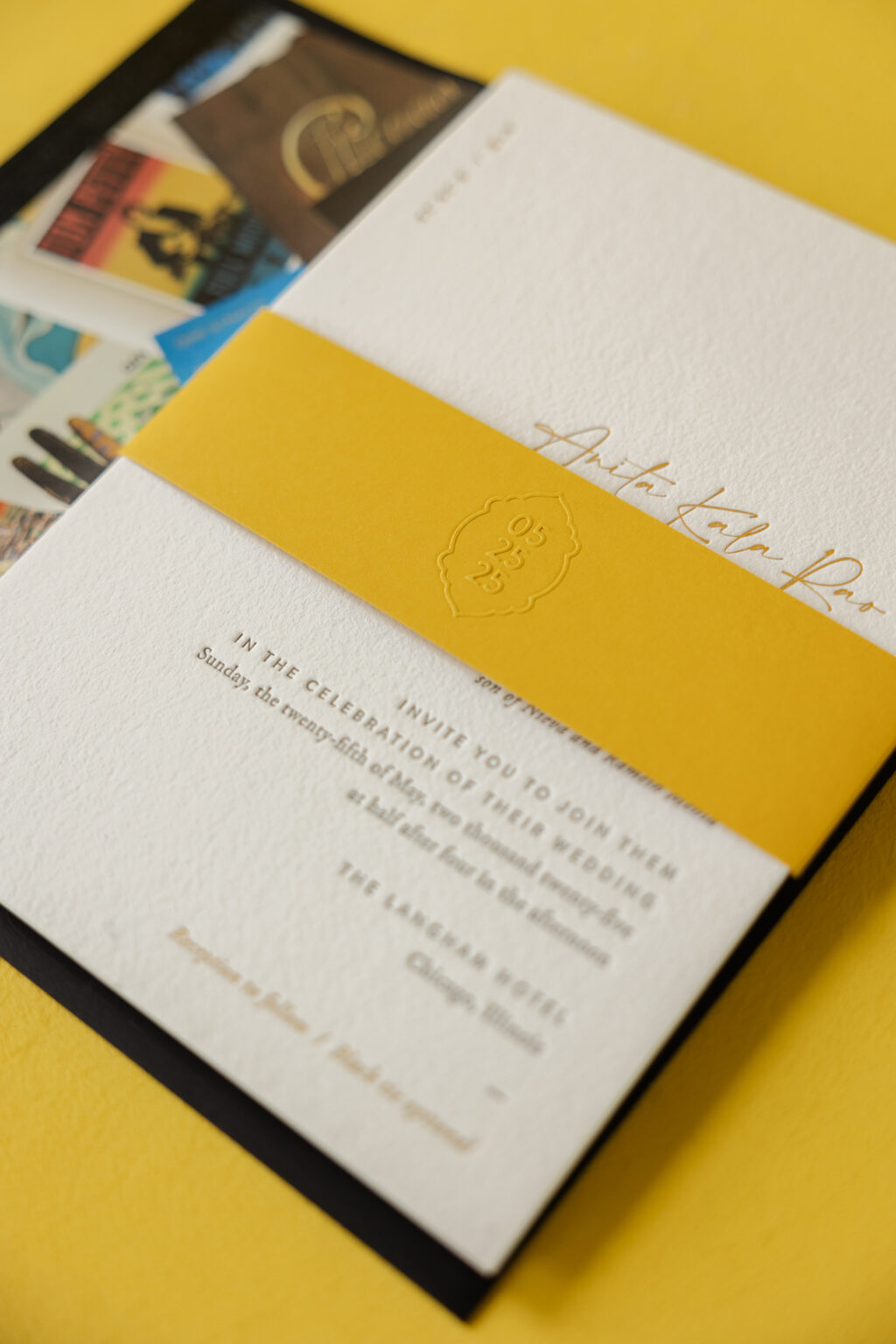
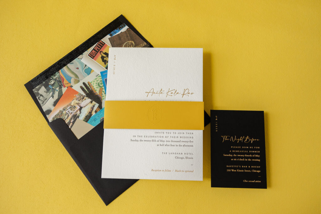
When our dear friend Erin from Smitten Boutique sent us this invitation design, we knew it would be stunning. This invitation is modern and sophisticated with a luxe edge and is paired with a one-of-a-kind envelope liner. These invitations are a custom design, loosely based on our now-retired Augusta. We no longer maintain samples when a design is retired, but we can still borrow elements or replicate the entire look for your custom invitations. See more and get the details on Anita and Brian’s luxe wedding invitations.
Our maize 1-ply is bold yet warm, ensuring the belly band stands out. The event date appears in blind emboss for a subtle, yet impactful look. The use of the cartouch around the date and the placement in the center of the belly band are very traditional choices; however, the vertical formatting of the date, which is edgy and modern, provides contrast.
Invitation
letterpress ink: dark gray
foil stamping: gold matte
fonts: amalfi coast + brandon
paper: bella cotton white 2-ply
card size: f-8
liner: custom-supplied pattern in cmyk on white text
envelope: ultra black
envelope addressing: white digital on the front and the back
job: 75549
Belly Band
emboss: blind
fonts: brandon
paper: maize 1-ply
card size: f-8 vertical (1.75” x 13.25” open, 1.75” x 6.24” closed)
job: 75549
The mix of fonts keeps the look contemporary while still being black-tie appropriate. Placing the couple’s initials and event date in the top-left corner is unexpected and a nice personal touch. Including this detail in gold matte foil is glamorous.
The initials and date are repeated on the rehearsal dinner invitation. This card features gold matte foil stamping on our ultra black stock, which drastically ups the glamour factor.
Rehearsal Dinner Invitation
foil stamping: gold matte
fonts: amalfi coast + brandon
paper: ultra black 2-ply
card size: a-5
job: 75549
Possibly, the standout piece of this wedding invitation suite is the envelope liner. The client supplied the artwork, which consists of many iconic album covers. This is a highly personal design choice that perfectly represents this music-loving couple. It’s a fun detail that is sure to capture guests’ attention.
Anita and Brian’s wedding invitations are chic and formal with a touch of modern glamour. The design is also fun and personal to the couple. It was an honor to help bring this vision to life, and as always, it is a pleasure to work with Smitten Boutique. Do you want to create invitations that are contemporary yet formal with a hint of luxe glamour? Or do you have an idea for an eye-catching envelope liner? Locate one of our dealers to see samples and swatches, and receive expert design tips and guidance.
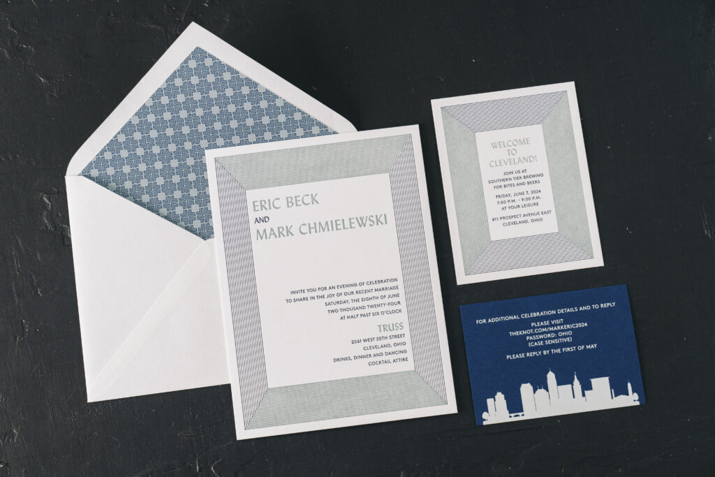
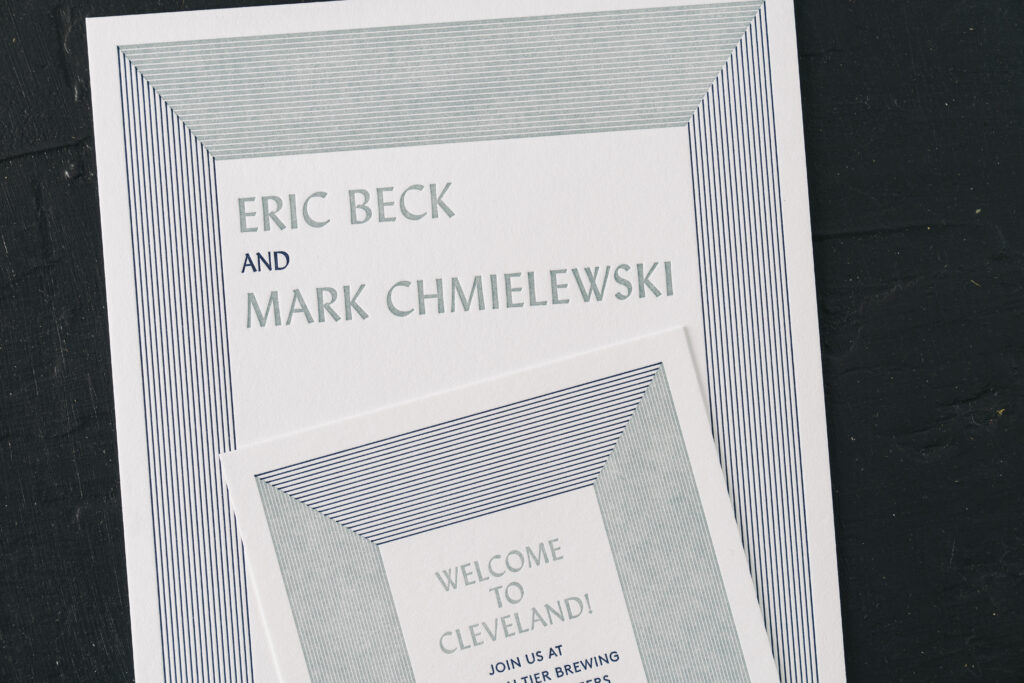
Eric and Mark wanted something minimalist with a modern art deco feel for their invitations, and they found it with our Lexsa design. We worked directly with this couple to create their dream wedding invitations for their Cleveland wedding at Truss.
This design has a modern art deco aesthetic with a geometric twist. The clean lines and crisp typography create a look that feels both sophisticated and contemporary, while the use of fine parallel lines and block framing adds depth. The color palette features two complementary shades of blue, adding to the refined, understated elegance of the design. Even the layout of the text is edgy, with the couple’s names in the top-left corner and the wedding details in the bottom-right corner. Using the alternate corners provides balance while incorporating the blank portions into the design and maintaining a contemporary look.
Invitation
letterpress inks: royal blue + chambray
fonts: lydian bt roman + brown std regular
papers: bella smooth cotton bright white 2-ply
card size: f-8
envelope liner: amante pattern in chambray + royal blue digital on bright white text
envelope: bright white cotton text pointed flap
envelope addressing: royal blue digital on the front and the back
job: 70603
Welcome Party Card
letterpress inks: royal blue + chambray
fonts: lydian bt roman + brown std regular
papers: bella smooth cotton bright white 1-ply
card size: a-2
job: 70603
The welcome party card closely mimics the invitation design, although there are a few key differences. The blue hues that make up the border are swapped from the invitation to the welcome party card. This design choice maintains consistency, ensuring the cards coordinate while introducing an interesting visual effect. All the text is centered on the welcome party card, which is a better fit for the smaller card.
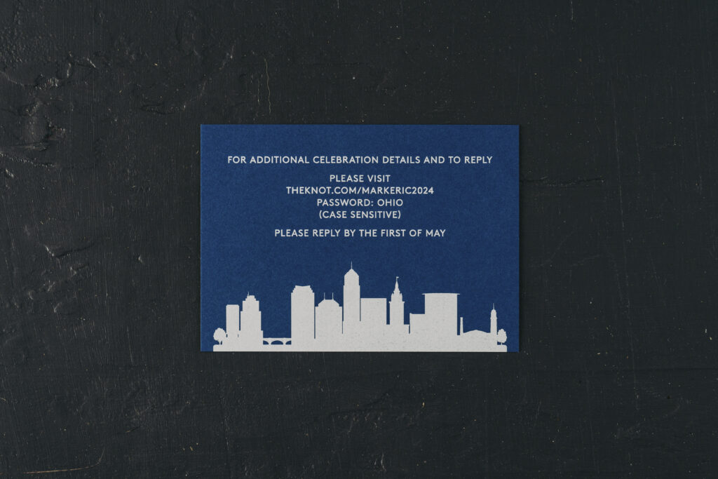
The details card features the Cleveland skyline printed in crisp white on our royal 1-ply stock. This card features a more stripped-down design, only featuring the less extravagant of the two fonts.
Details Card
digital ink: white
fonts: brown std regular
papers: royal 1-ply
card size: a-5
job: 70603
Working with Eric and Mark was a pleasure, and it was a joy to see how they reimagined this design for their modern art deco letterpress wedding invitations.
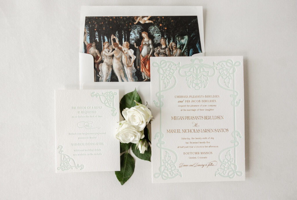
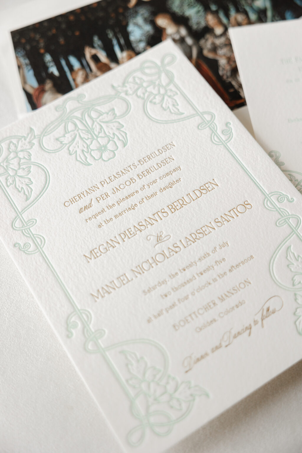
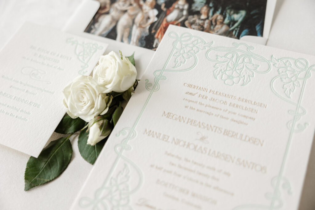
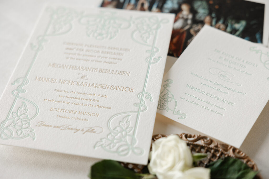
Megan and Manuel worked with our dear friend Hollis of Bering’s to create their stunning letterpress and foil-stamped wedding invitations. They chose to customize our Matilde design for their Colorado nuptials. The final design features unique details that speak to the couple and set the tone for their special day.
envelope liner: customer-supplied pattern in cmyk digital on ivory text
envelope: ivory cotton text
envelope addressing: antique gold digital on the front and the back
job: 76290
Reply Card
letterpress ink: sea mint
fonts: bigilla bold, mozart script regular, noir et blanc regular
papers: bella cotton ivory 1-ply
card size: a-2
job: 76290
The intricate frame on the invitation appears in our sea mist letterpress ink. The light color allows the text, which appears in gold matte foil stamping, to stand out. The three fonts work together perfectly to introduce a fanciful, playful vibe while still maintaining a formal feel. The floral and foliage artwork beautifully coordinates with the garden elements of the artwork featured as the envelope liner.
The envelope liner features La Primavera, an artwork by Italian Renaissance artist Sandro Botticelli. The painting, believed to have been completed between 1477 and 1482, is located in a gallery in Florence and depicts a group of mythological figures in a lush garden setting. The painting is often interpreted as being a celebration of love.
The frame from the invitation was reimagined for the reply card. Breaking apart the artwork and using components of it in two corners maintains the consistency and formality without being identical. The reply card features the same fonts used in tandem to create an eccentric feel, perfectly suited for this whimsical affair.
Megan and Manuel’s letterpress and foil wedding invitations are lovely and personal, and it was a pleasure to help bring this couple’s vision to life. Whether you want to create an aesthetic with typography, use artwork for the envelope liner, or add personal details to celebrate you and your partner, we can help make it happen. Contact us to learn more or work with one of our talented dealers to create your dream wedding invitations.
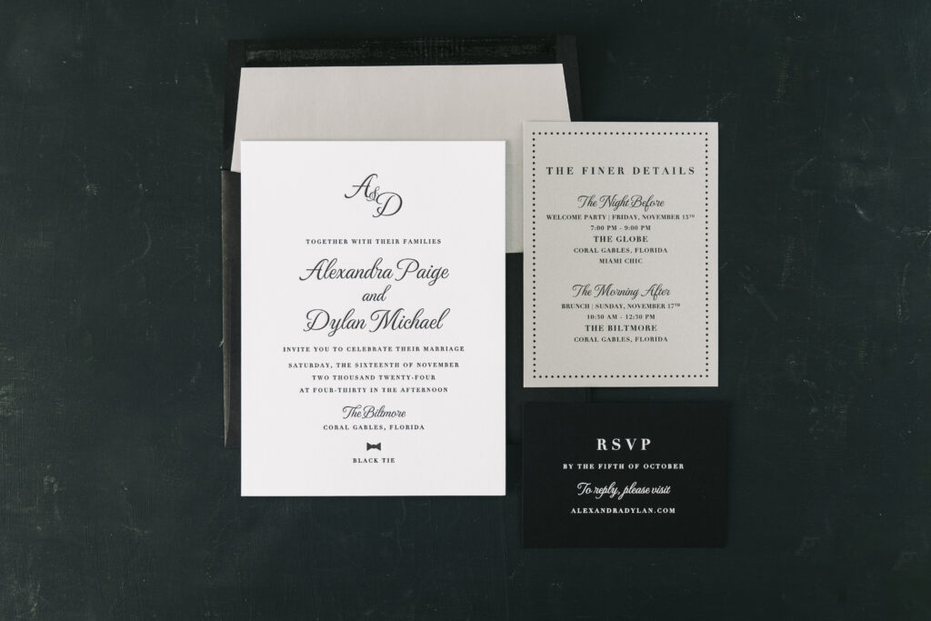
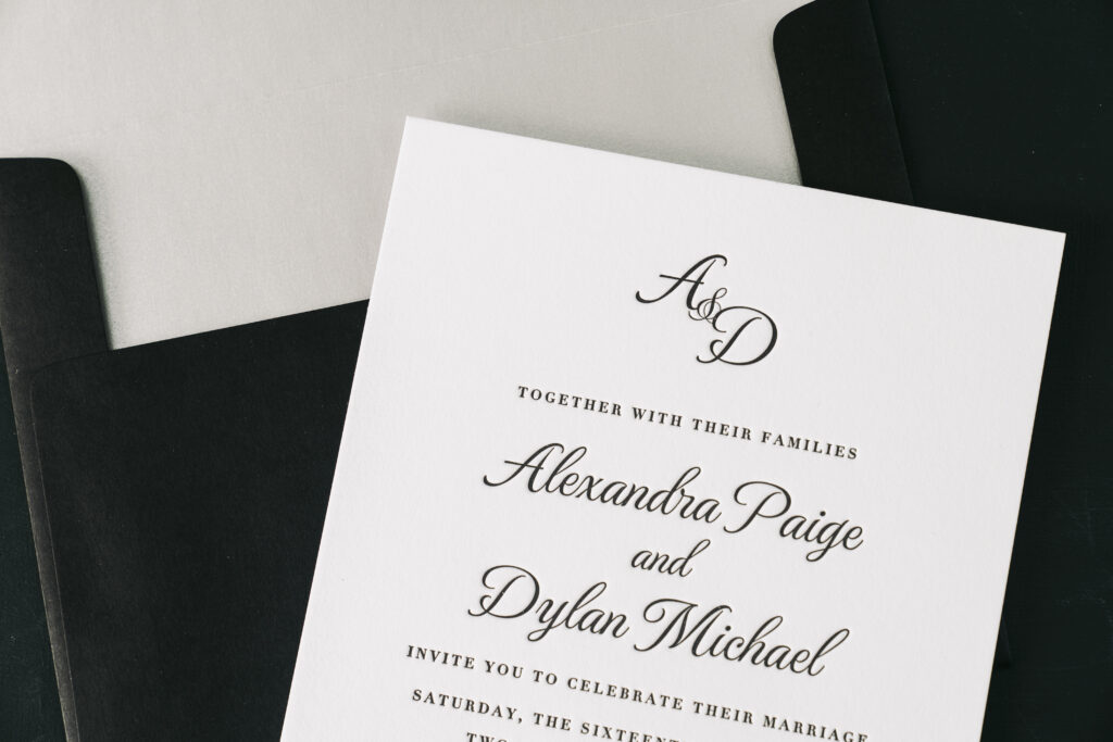
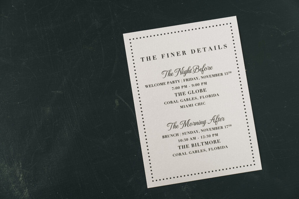
These invitations are formal and timeless yet feature personal touches and hints of glamour, making them perfect for an event held at The Biltmore Hotel in Coral Gables, Florida. We worked with our friend Dara of Dear Friends to create these black-tie letterpress wedding invitations for Alexandra and Dylan.
Black letterpress on our bright white, smooth cotton paper is classic and timeless. Our smooth cotton paper has a luxuriously textured yet pillowly feel and holds a crisp letterpress impression. The bride and groom’s initials appear at the top of the invitation, adding a personal flair, while the script font keeps things formal. The envelope liner is an understated metallic silver and adds a burst of glamour.
Invitation
letterpress ink: black
font: montecarlo pro + didot bold
papers: bella smooth cotton bright white 2-ply
card size: f-8
envelope liner: metallic silver text
envelope: black text
envelope addressing: white digital on the front and the back
job: 72707
The reply card boasts crisp white printing on black text. Digital printing ensures the white is opaque and there is no paper show through, or rather, the dark paper is not visible through the light color ink.
Silver paper adds a touch of sophistication and Miami glam to the welcome party card. The dot border is playful, while the overall design remains consistent with the invitation and maintains its look and feel.
Reply Card
digital ink: white
font: montecarlo pro + didot bold
papers: black 1-ply
card size: a-5
job: 72707
Welcome Party Card
digital ink: black
font: montecarlo pro + didot bold
papers: silver 1-ply
card size: a-6
job: 72707
Best wishes to Alexandra and Dylan, and it is always a delight to work with Dear Friends. Whether you need black-tie letterpress wedding invitations, you want to see our smooth cotton paper in person, or get expert guidance picking the perfect font, our dealers are an excellent resource. Find a dealer near you to create your dream wedding invitations.
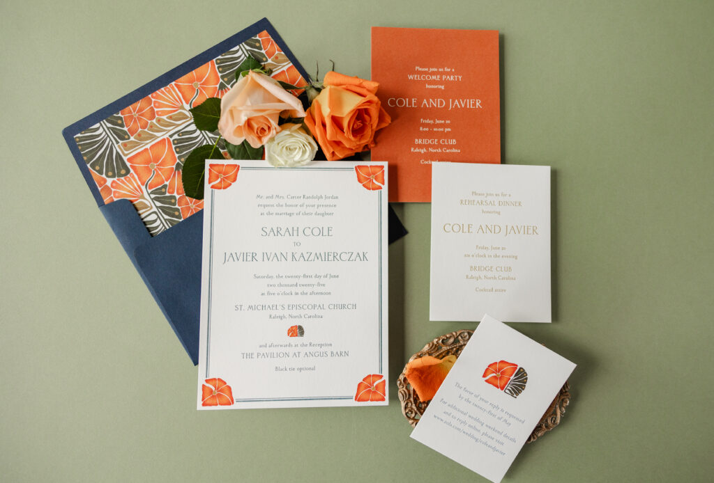
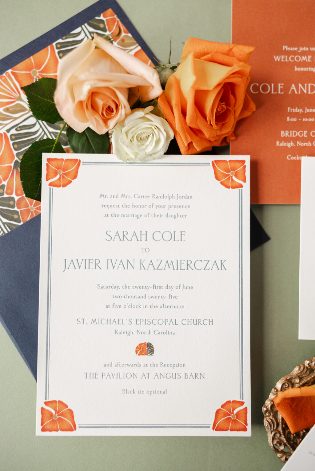
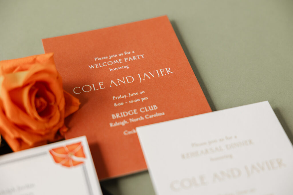
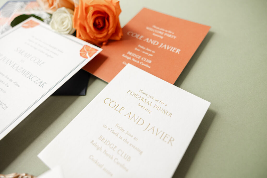
These dazzling invitations feature a bold color palette and custom artwork. We worked with our friend Leslie from If It’s Paper to create these brilliant invitations for Sarah and Javier’s wedding weekend.
Invitation
letterpress ink: deep blue
digital ink: cmyk
font: hv cedarwood
papers: bella smooth cotton white 1-ply
card size: f-8 for inner envelope
inner envelope liner: custom supplied pattern in cmyk on white text
inner envelope: dark blue text
outer envelope: white cotton text
inner envelope addressing: white digital on the front
outer envelope addressing: deep blue digital on the front and the back
job: 76191
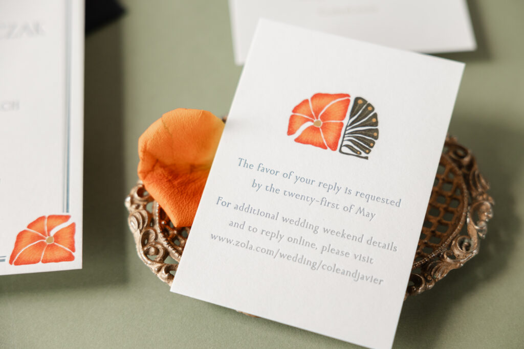
The envelope liner features artwork supplied by the client, and everything was designed around this brilliant flower and leaf artwork. A single font appears throughout the entire suite, creating a streamlined look that allows the customer-supplied artwork to stand out. The invitation features a double-line border, lending the invitation a traditional look. The vibrant flowers in each corner break up the border. These floral accents add whimsy while maintaining the formality of the design. Near the bottom of the invitation, between the ceremony and reception information, appears a motif made by merging the flower and leaf artwork into a standalone emblem. This symbol, which is custom and unique to these invitations, also appears on the reply card.
Reply Card
letterpress ink: chambray
digital ink: cmyk
font: hv cedarwood
papers: bella smooth cotton white 1-ply
card size: a-5
job: 76191
The welcome party card features our smooth cotton 1-ply paper in white with a digital flood in our mesa ink. This card is printed in reverse, meaning everything except the text is printed. This technique creates the appearance of white text on color paper. The white text is the color of the paper without any printing. The mesa ink coordinates beautifully with the flowers on the invitation and the envelope liner.
Welcome Card
digital ink: mesa
font: hv cedarwood
papers: bella smooth cotton white 1-ply
card size: a-6
job: 76191
The rehearsal dinner invitation features letterpress printing in goldenrod, which expands on the color palette of the suite. This card features the same font and a similar layout as the other cards, ensuring it aligns with the overall aesthetic.
Rehearsal Dinner Invitation
letterpress ink: goldenrod
font: hv cedarwood
papers: bella smooth cotton white 1-ply
card size: a-2
job: 76191
It’s always a joy to work with If It’s Paper, and it was an honor to create these letterpress wedding invitations with custom artwork for Sarah and Javier. Do you have a vision for a completely custom invitation design? Get in touch with one of our dealers, and they can help you through the design process.
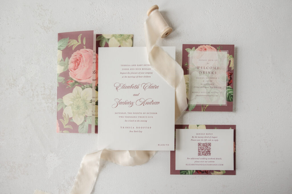
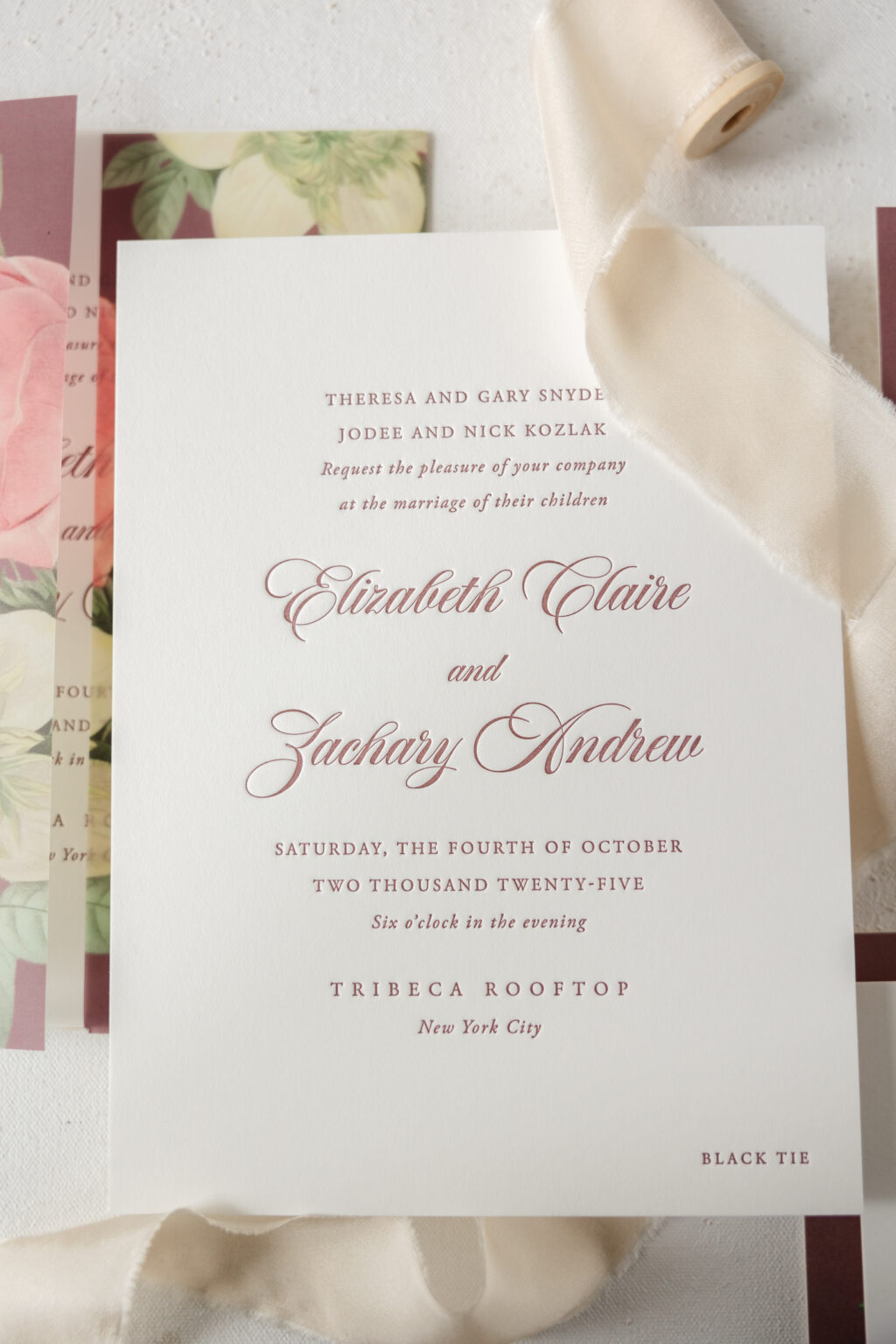
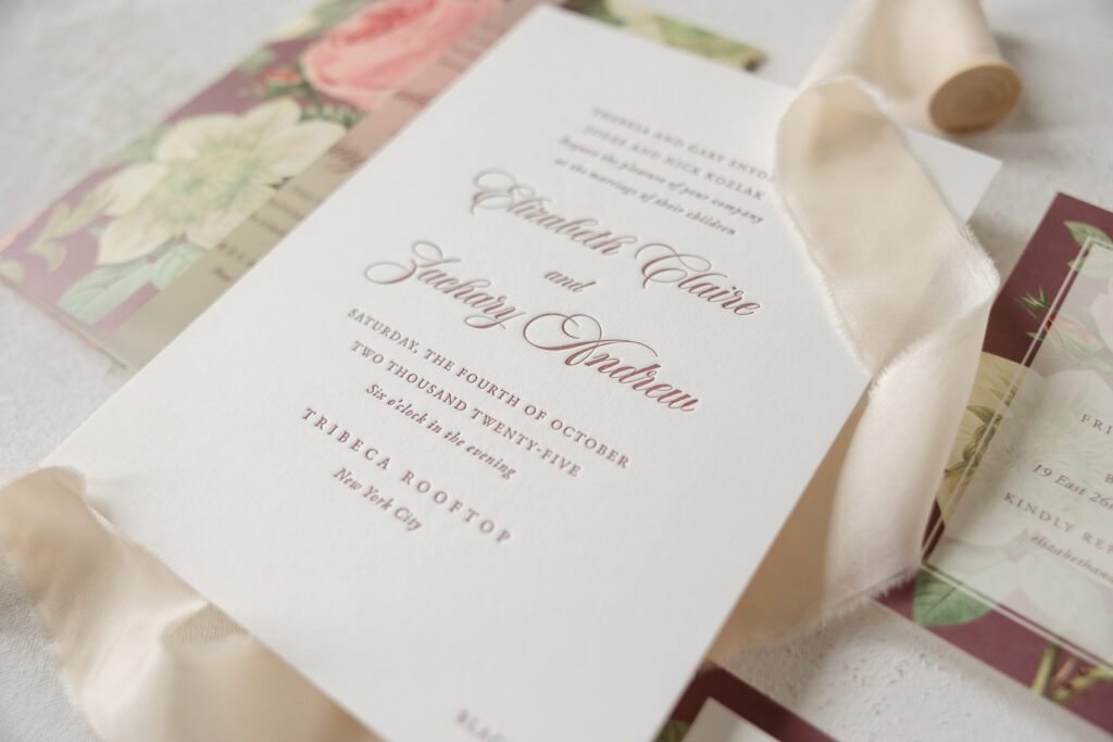
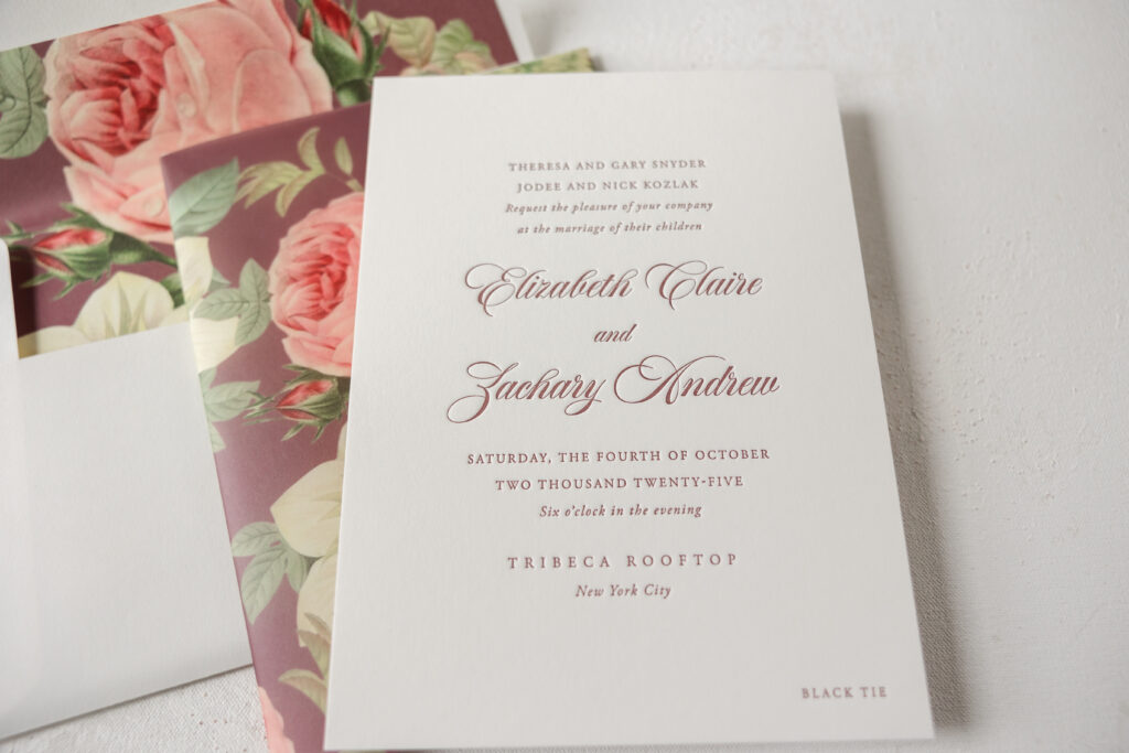
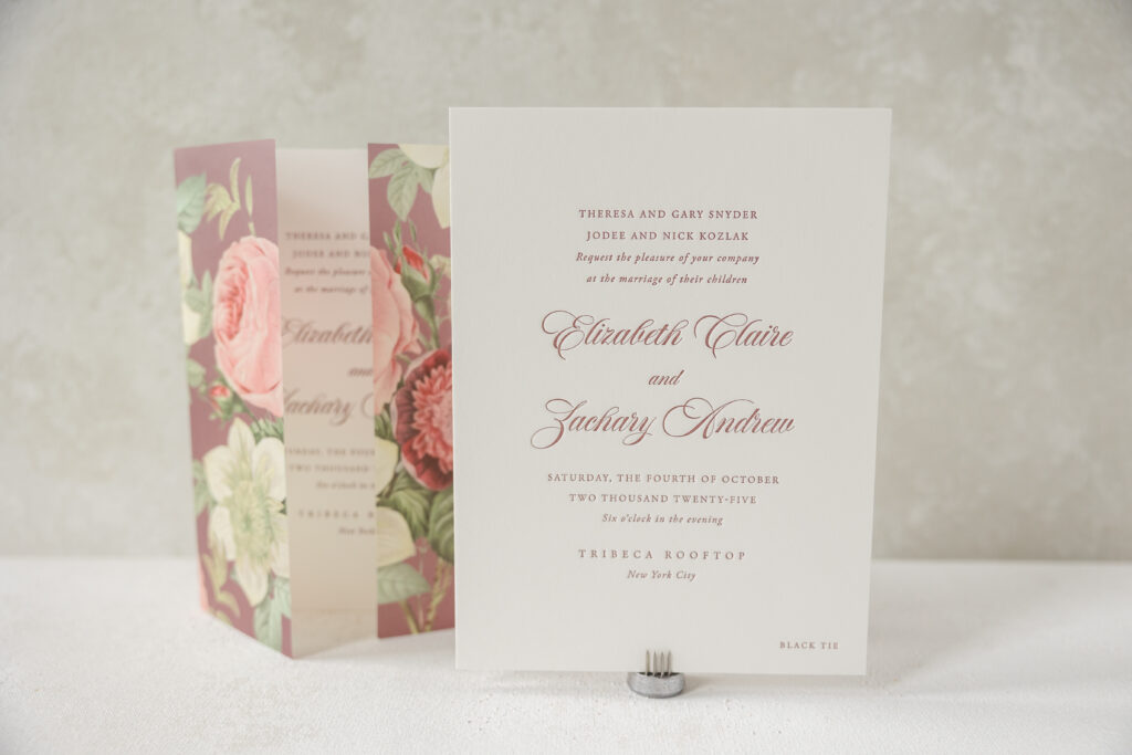
Elizabeth and Zachary worked with our dear friend Ellen from Proper Notice to create these charming, vintage rose-inspired letterpress wedding invitations. The entire suite is lovely, from the vellum gatefold to the vintage artwork, which work together to give the cards a classic, elegant vibe.
Invitation
letterpress ink: rosebud
fonts: garamond + script
papers: bella smooth cotton white 2-ply
card size: f-8
envelope liner: vintage rose pattern in cmyk + rosebud digital on white text
envelope: white cotton text
envelope addressing: rosebud letterpress on the back
job: 74218
Reply Card
letterpress ink: rosebud
fonts: garamond
papers: bella smooth cotton white 1-ply
card size: a-5
job: 74218
The letterpress wedding invitations are timeless and feature a traditional layout. Our smooth cotton paper is luxuriously soft and holds a deep and crisp letterpress impression, which really showcases the flourishes of the script font used for the bride and groom’s names. A vellum gatefold wraps around the understated invitation. A vintage rose pattern is digitally printed on the gatefold, elevating the entire look. The gatefold makes the invitation almost like a present that the guests get to unwrap. Guests are also treated to the rose artwork on the envelope liner.
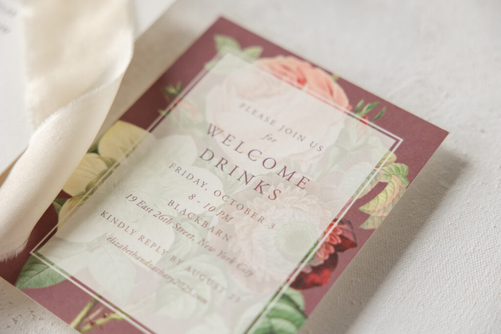
The welcome drinks card appears in digital printing with the same floral artwork as the gatefold and envelope liner. The text appears on a semitransparent white box. This design keeps the text clearly legible while letting the vintage artwork underneath peek through.
Welcome Drinks Card
digital ink: cmyk + rosebud
fonts: garamond + script
papers: bella smooth cotton white 1-ply
card size: a-2
job: 74218
The reply card features a more simplified design, similar to the invitation. A QR code on the reply card makes it quick and easy for guests to reply. This straightforward layout is a good choice, because it allows guests to focus on the QR code and replying.
Gatefold
digital ink: cmyk + rosebud
papers: 40# vellum
card size: f-8 vertical gatefold (8.31” x 12.51” flat, 8.31” x 6.24” folded)
finishing: score
job: 74218
Is there a pattern or artwork that you love and want to incorporate into your invitation suite? Do you want to include a QR code on your reply card? Or are you thinking about adding a vellum gatefold to your invitation? All of this is possible when you work with us or one of our dealers. Find a dealer nearby to see samples, swatches, and more!
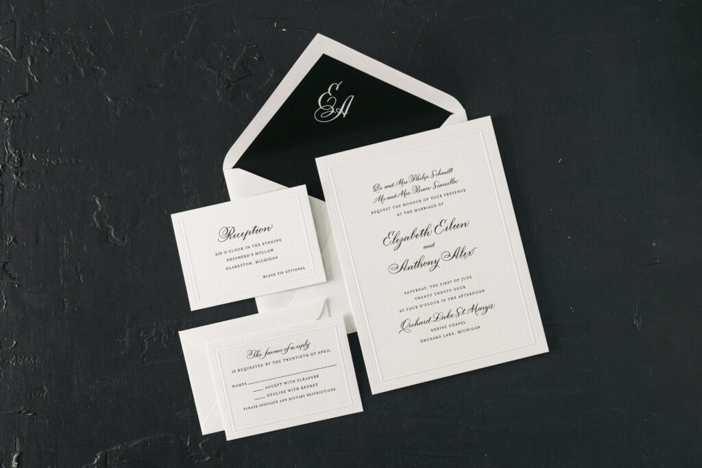
The hand calligraphy on Elizabeth and Anthony’s invitation suite is swoon-worthy, but that’s not all these elegant invitations have going for them. This couple worked with our dear friends at Lee’s Paperie to create their dream invitations. From a custom envelope liner to an unexpected surprise on the reception card, see what makes these wedding invitations with hand calligraphy so stunning.
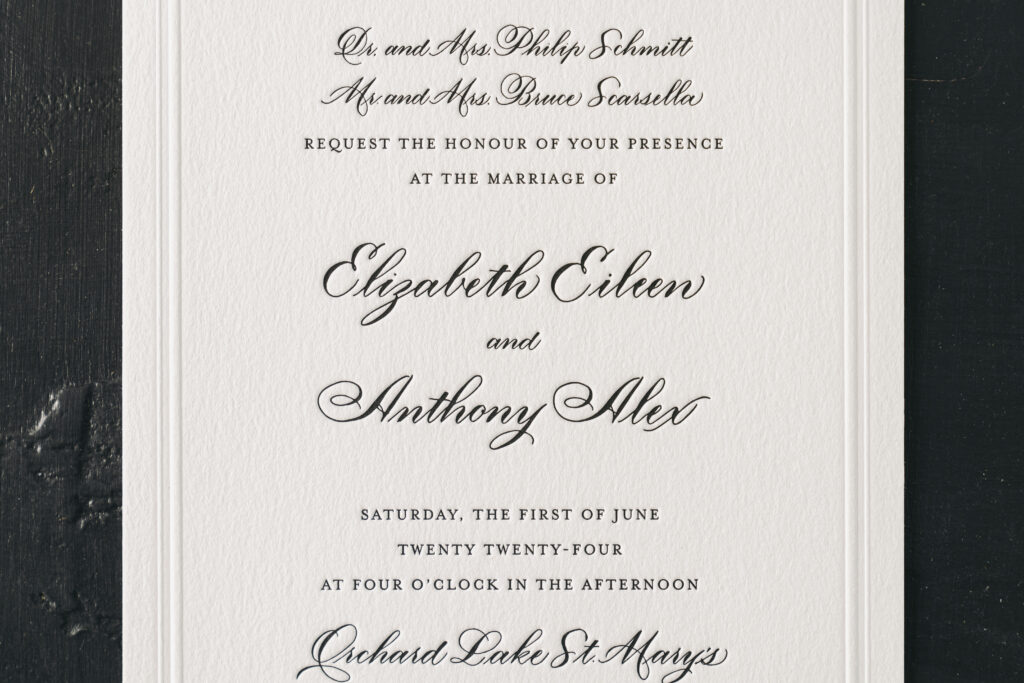
This chic and classic invitation suite is a customization of our Braxton design. They overall design of the invitation is similar to the inspiration with the difference being the use of black letterpress for all of the text. The Oliva hand by Nicole Black is graceful and elagently flows across the invitation, as well as the reply card and the reception card. The remaining text appears in a serif font that adds to the formality while complementing the curves and flourishes of the hand calligraphy.
Invitation
letterpress ink: black
emboss: blind
fonts: mrs eaves
hand calligraphy: olivia by Nicole Black
papers: bella cotton white 2-ply
card size: f-8
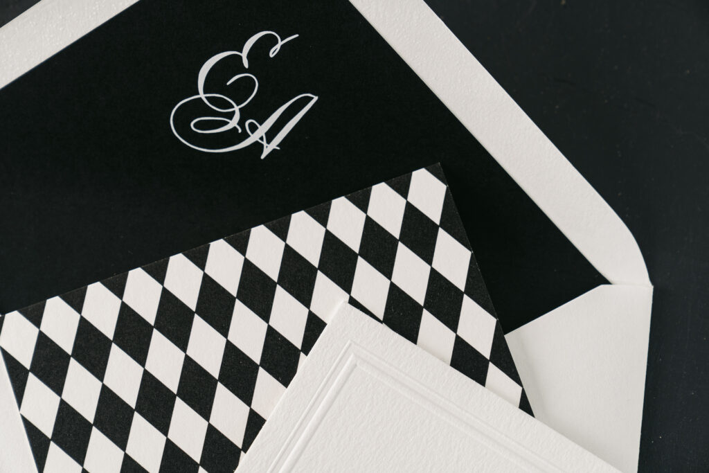
envelope liner: custom monogram digitally printed in white on black text
envelope: white cotton text pointed flap
envelope addressing: black letterpress on the back
job: 70675
Reply Card
letterpress ink: black
emboss: blind
fonts: mrs eaves
hand calligraphy: olivia by Nicole Black
papers: bella cotton white 1-ply
card size: a-5
envelope: white cotton text pointed flap
envelope addressing: black letterpress on the front
job: 70675
Reception Card
digital ink: black
fonts: mrs eaves
hand calligraphy: olivia by Nicole Black
papers: bella cotton white 1-ply (front) + bella cotton white 1-ply (backer)
card size: a-5
finishing: flush mount front and backer together
job: 70675
The blind emboss double line border provides a subtle yet refined look. Embossing creates a raised impression and smoothes the texture of our decadent cotton paper. The crispness of the border plays off the pillowy texture of the paper.
The envelope liner features the couple’s first initials hand calligraphed, creating a charming monogram. The monogram is digitally printed in white ink on black stock, the reverse of the printing on every other piece in the suite, which features black ink on white stock.
The reception card is unique because it was printed as two cards, a front and a backer, which were then mounted or duplexed together. The back of the reception card bears a geometric harlequin pattern that is playful yet befitting a black-tie affair.
These wedding invitations with hand calligraphy were a joy to work on. We wish the best to Elizabeth and Anthony, and thank you to Lee’s Paperie for bringing this job to us. Do you have visions of hand calligraphy or back patterned suite cards? Reach out to share your ideas or work with one of our dealers to receive expert assistance bringing your ideas to life.
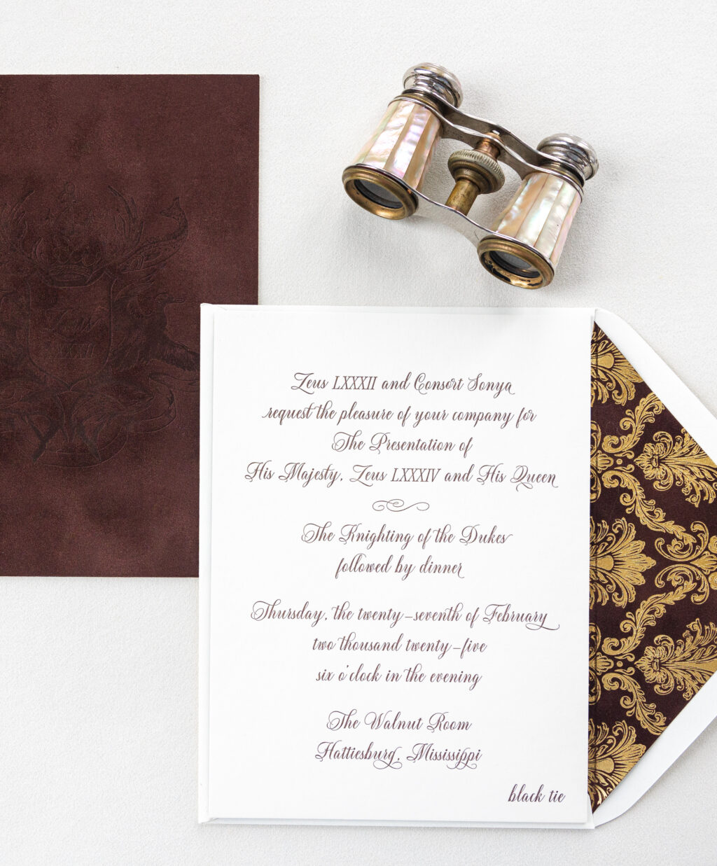
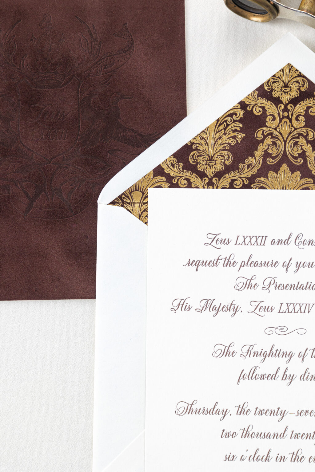
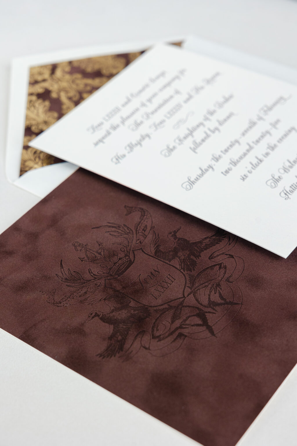
These extravagant custom letterpress invitations with velvet backers and liners are absolutely stunning. We worked with our friends at Walnut Square Gifts and Stationery to create these custom invitations for The Mystic Crewe of Zeus, a community organization, and the oldest Mardi Gras krewe in Hattiesburg, Mississippi.
liner: eris pattern in gold matte foil on bella velvet cocoa
envelope: ivory text pointed flap
envelope addressing: ganache letterpress on the back
finishing: duplex front and back
job: 74935
These cards feature our lavish 2-ply Bella smooth cotton paper in ivory. The front is adhered or duplexed to a velvet backer, creating a decadent 3-ply card. Both sides of the card feature letterpress printing in our ganache ink. The front features text in a sweeping script font, while the back of the card bears a custom crest in honor of Zeus LXXXIV, a member of The Mystic Crewe of Zeus. Velvet is luxurious, providing a tactile element to the card, and it also holds a crisp letterpress impression. The tonal look created by ganache ink on cocoa velvet is subtle but still very impactful.
The liner perfectly exemplifies a regal aesthetic with gold matte foil stamping on our Bella velvet in cocoa. Using cocoa velvet for the card backer and the envelope liner creates consistency. Gold matte foil in the Eris pattern is both stately and grand.
These letterpress invitations with velvet backers are traditional yet very on trend. It was an honor to create these custom-designed cards. If you need an invitation for an upcoming event or want to feature a velvet backer or a foil-stamped velvet liner on your invitation, we can make that happen. Locate one of our dealers to see samples and swatches and receive expert guidance.
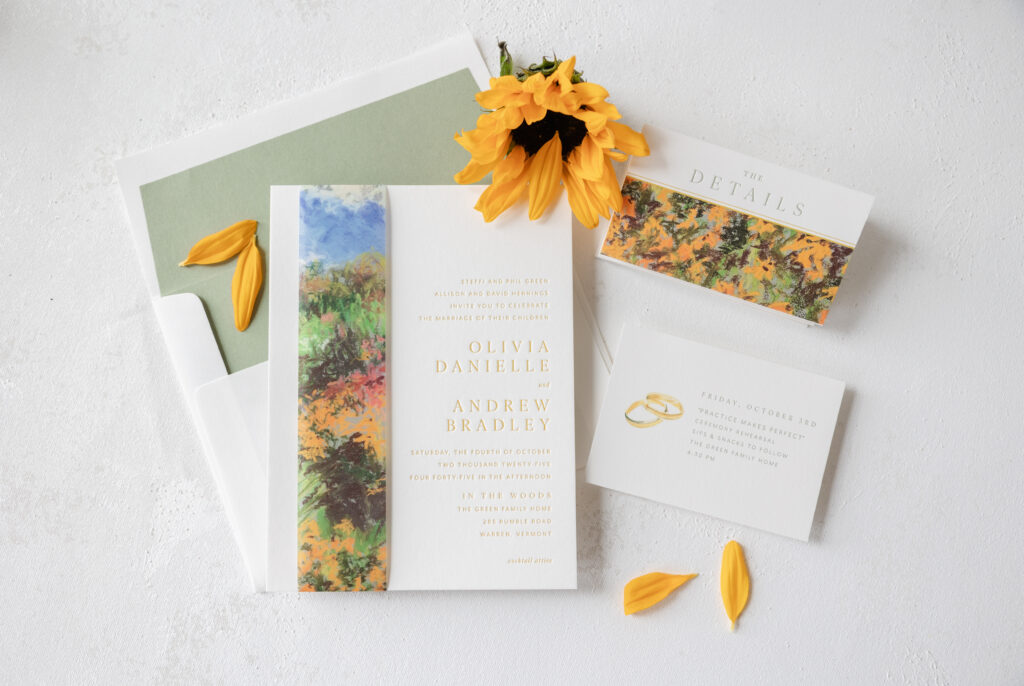
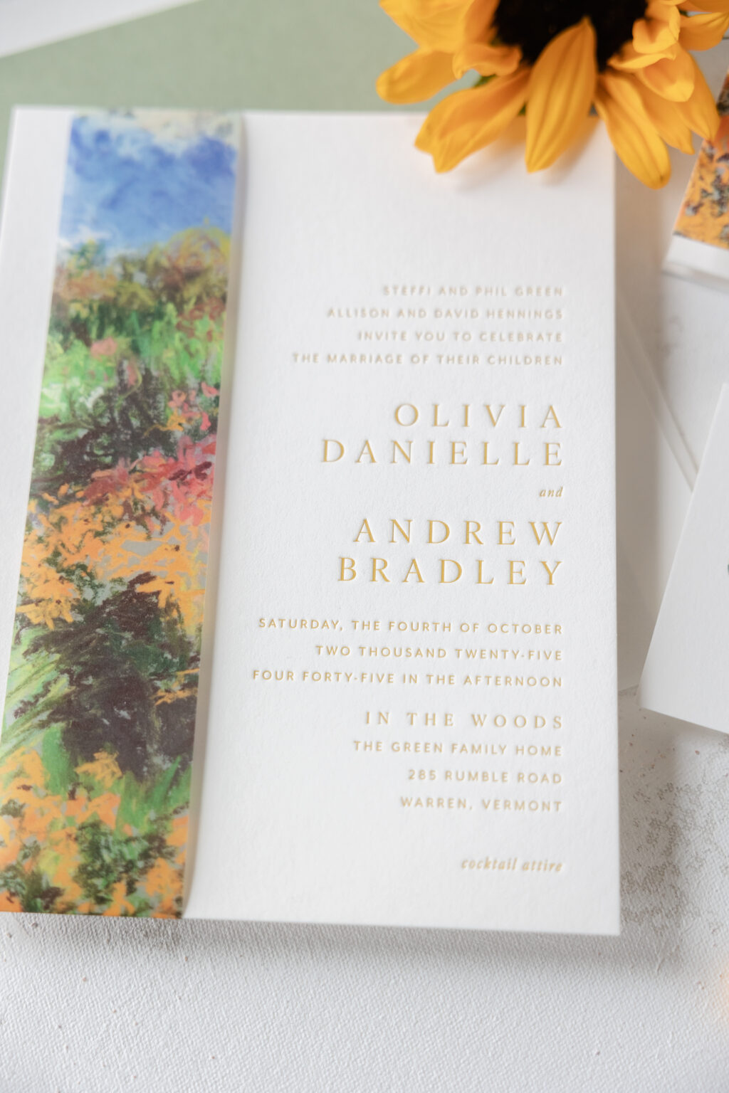
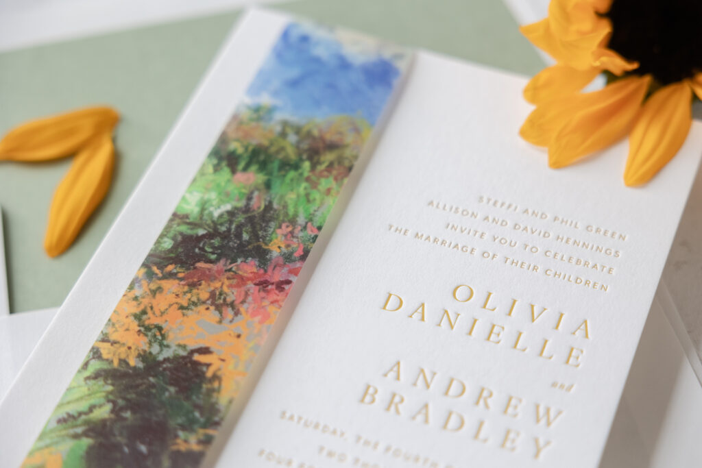
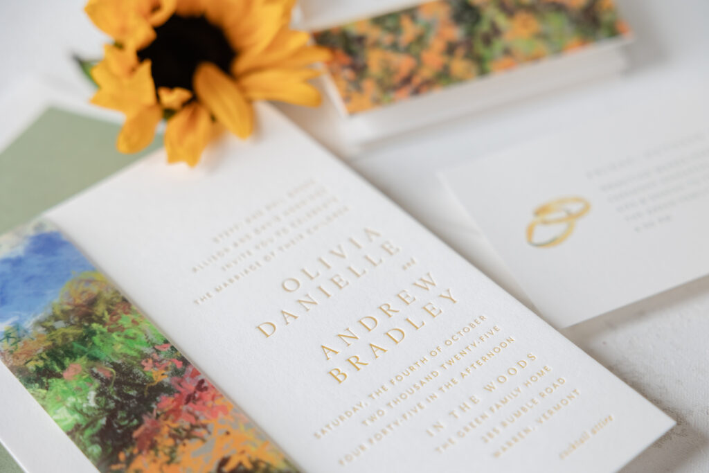
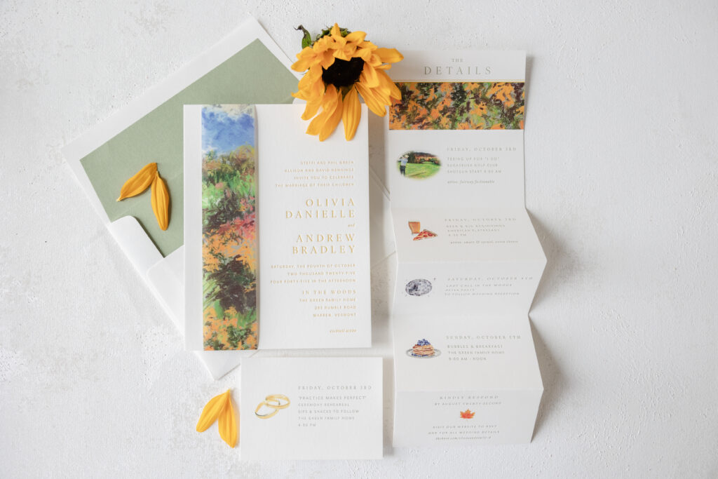
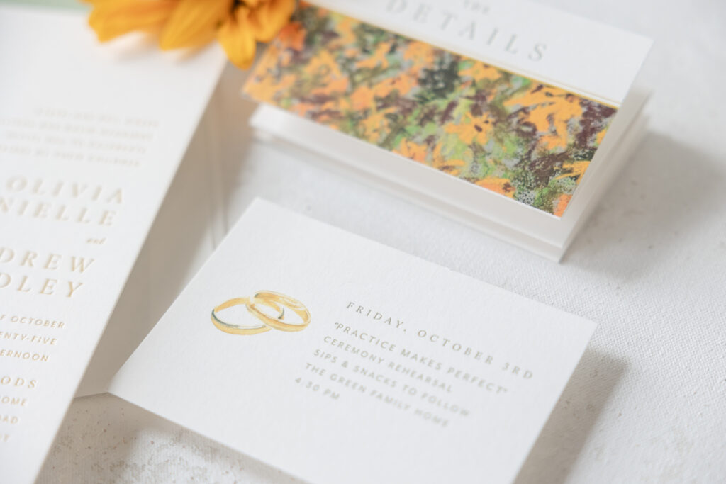
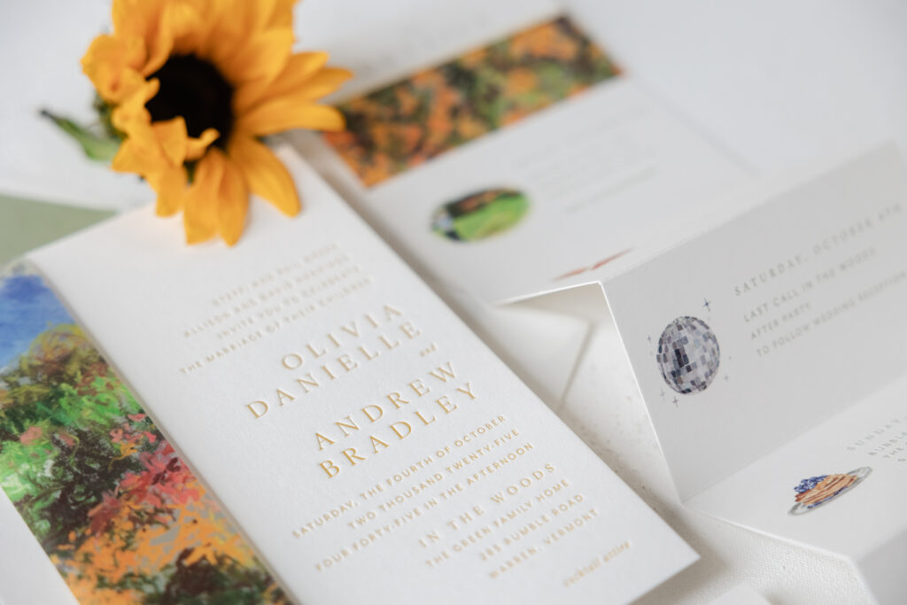
These lovely bucolic wedding invitations set the perfect tone for a fall wedding in Vermont. Olivia and Andrew worked with our dear friend Staci of Sincerely Staci to create their letterpress wedding invitations, which feature a colorful belly band and a stunning accordion fold details card.
Invitation
letterpress ink: goldenrod
fonts: ivy ora + mr eaves mod
papers: bella smooth cotton white 2-ply
card size: f-8 (8.19” x 6.19”)
envelope liner: spruce text (no printing)
envelope: white text
envelope addressing: spruce digital on the front and the back
job: 76505
Belly Band
digital: cmyk
papers: 40# vellum
card size: f-8 vertical tall belly band (1.75” x 17.11” open, 1.75” x 8.24” closed)
finishing: assemble with the invitation
job: 76505
The inspiration behind these invitations is our Sedna design. The couple chose to maintain the invitation layout and keep the same fonts, but then they got creative. While they kept the belly band, they swapped out the Art Deco shell pattern of the inspiration design for artwork depicting a nature scene. The belly band secures all the cards in the suite when in the envelope. In this instance, it also introduces vibrant pastoral artwork. When wrapped around the invitation, the belly band also covers a part of the invitation that is void of printing. This attention to detail allows the pieces to complement one another.
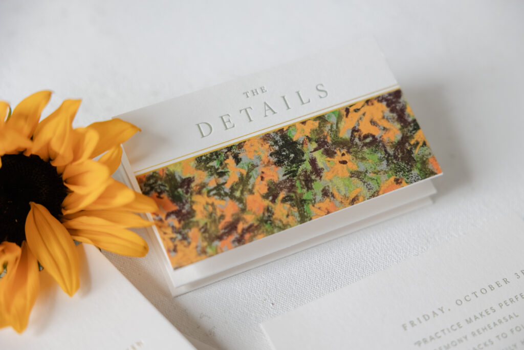
The details card is equally stunning. This 6-panel accordion fold card features the full rundown of events during the wedding weekend. Everything from the Friday golf outing through Sunday brunch is represented on a panel. Each panel features artwork or a motif from our design library, with a hand-drawn look that coordinates with the custom artwork on the first panel. The final panel provides reply details, allowing this piece to serve as both a details card and an RSVP card.
Details Card
letterpress ink: spruce
digital: cmyk
fonts: ivy ora + mr eaves mod
papers: bella smooth cotton white 1-ply
card size: 6-panel accordion fold – 16.25” in x 4.75” flat; 2.71” x 4.75” folded
job: 76505
The rehearsal dinner invitation takes a much more simplified approach, while still coordinating with the other pieces. Spruce letterpress printing matches the envelope liner, while a digitally printed wedding band motif serves as the only adornment. This card is understated and charming.
Rehearsal Dinner Invitation
letterpress ink: spruce
digital: cmyk
fonts: ivy ora + mr eaves mod
papers: bella smooth cotton white 1-ply
card size: a-5
job: 76505
Olivia and Andrew started with an inspiration design but completely made it their own, designing lovely letterpress wedding invitations that perfectly represented their wedding weekend. Work with one of our dealers to create the wedding stationery of your dreams. Whether you want an artful belly band or an informative and stylish details card, or anything else, our dealers are experts who can guide you through the design process.
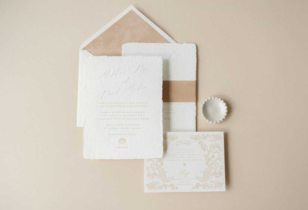
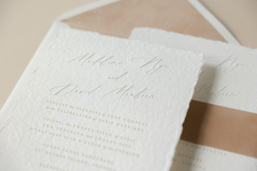
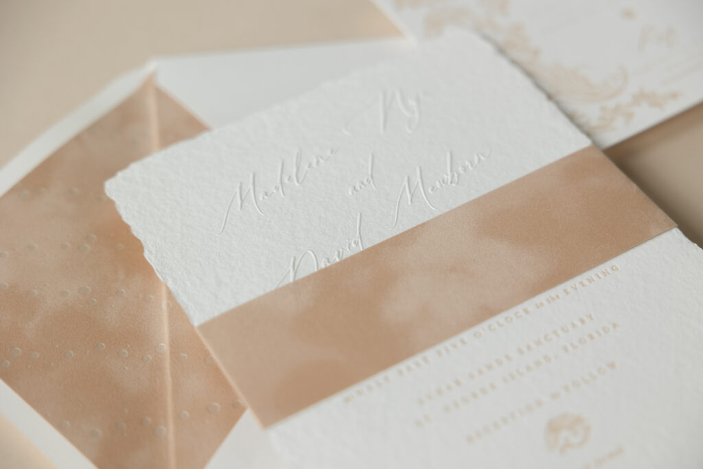
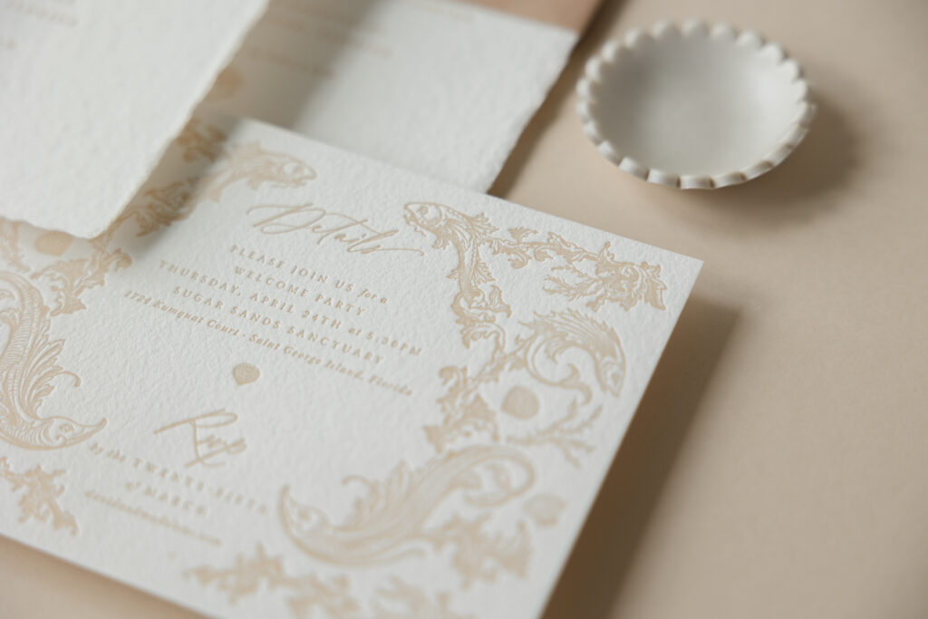
Elevated beach charm makes this invitation, featuring a blind emboss on handmade paper along with dreamy velvet accents, a beautiful wedding suite. The bride and groom, Madelene and David, selected our Toussaint design and worked with our dear friend Jessica at Rock Paper Scissors in Tennessee. Some subtle yet impactful design choices made this invitation the perfect fit for a wedding on the sandy shores of St. George Island, Florida.
Embossing is a technique that bumps the artwork out from the paper, creating a raised texture. This design features the couple’s names in Vintage Heirloom, a dramatic script font, printed in blind emboss, which further highlights the elegant curves of the font. The natural texture and deckle edge of the handmade paper give these invitations an organic feel, while still maintaining an air of elegance. A velvet belly band in camel coordinates with the letterpress ink on the invitation and reply card.
Velvet also appears on the inner envelope liner. The liner is foil-stamped with our opaline shine foil in the Thalassa pattern on Bella velvet in camel. The combination of opaline shine foil on camel velvet mimics the look of waves washing across a sandy beach.
Invitation
letterpress ink: camel
emboss: blind
fonts: vintage heirloom + warnock
papers: bella handmade white
card size: f-8
inner envelope liner: thalassa pattern in opaline shine foil on bella velvet camel
inner envelope: white cotton text pointed flap
outer envelope: white cotton text pointed flap
inner envelope addressing: camel digital on the front
outer envelope addressing: camel digital on the front and the back
job: 73783
Belly Band
papers: bella velvet camel
card size: f-8 vertical belly band (1.75 x 13.25 open, 1.75 x 6.24 closed)
finishing: apply peel-and-stick adhesive
job: 73783
Adding a liner to an inner envelope ensures guests can enjoy the design of the liner. Traditionally, the outer envelope is sealed, and the inner envelope is left unsealed. The outer envelope will be cut or torn when opened, leaving the inner envelope liner intact and in perfect condition.
Details Card
letterpress ink: camel
fonts:
papers: bella cotton white 1-ply
card size: a-6
job: 73783
The details card is entirely original and drastically changes course from the inspiration suite. Detailed fish artwork adorns the card. A fish motif from the details card appears near the bottom of the invitation, creating consistency between the two cards.
This couple did an amazing job of designing wedding invitations that are elegant, while still maintaining a beachy vibe. Best of luck to Madelene and David! Are you thinking about blind emboss on handmade paper or decadent velvet accents? Locate one of our dealers, and they can help turn your vision into the perfect invitations for your wedding.